78% of holiday shoppers used the internet to research gifts last year, and 40% of all holiday shopping happened online, according to Google's data and research from the 2014 holiday season.

That means a lot of eyes are going to be on your website in the upcoming weeks. The smartest marketers will prepare for this not only for by prepping their website for higher-than-normal traffic on the back end, but also by giving their website design a dose of holiday cheer.
It all starts with the homepage: The first page many people will see when they come to your website. How have other companies redesigned their homepages for the holidays? Let's take a look.
Note: Businesses change their homepages on a regular basis. The examples below may not be current.
12 Examples of Holiday-Themed Homepage Design
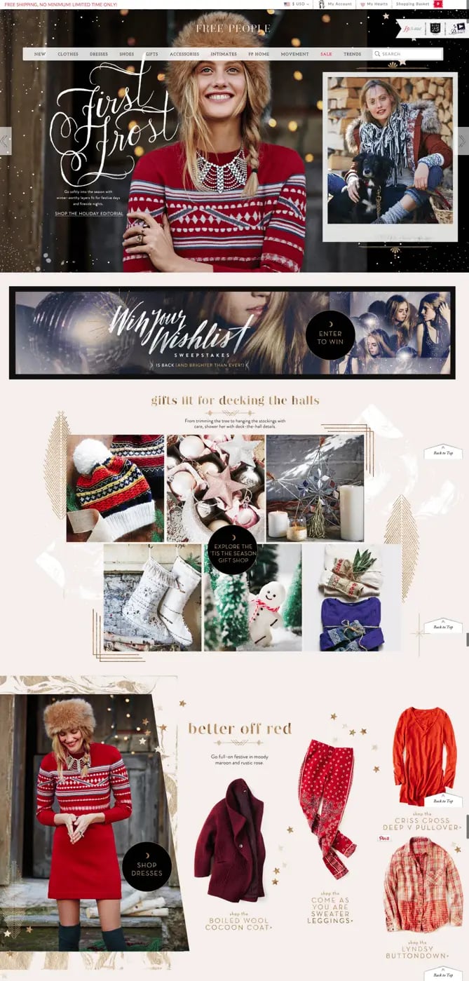
1) Free People
When your business has a loud personality like American bohemian retail company Free People does, making a big first impression on your homepage can be a great thing. Free People's redesign is all-encompassing, starting with a large, high-definition image of a model wearing some of their latest winter apparel.
We especially love the embellished font they used in the headline, "First Frost." For certain brands, decorative fonts like these can be a great seasonal touch to the style of your homepage. (Get tips for using fonts in your web design in our free do-it-yourself design guide.)
2) IRONMAN
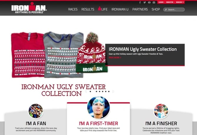
You don't have to completely change the look and feel of your normal website just for the holidays. IRONMAN's homepage redesign is a great example of small changes going a long way. In fact, all they changed was the header image and text, promoting their IRONMAN ugly sweater collection.
So while it's easy to get caught up in making sweeping changes, returning users will appreciate your site if it looks familiar to them and works in the ways they expect it to.
3) Sephora
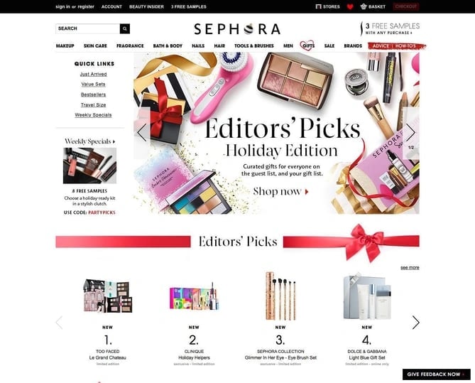
Like IRONMAN, Sephora didn't make many changes to the overall look and feel of their website. What they did do was feature a holiday edition of their editors' picks, specially curated for different gift recipients, price ranges, categories, and so on.
By putting editors' picks front and center, Sephora is reminding customers how much the company values their customers' success. Plus, we love the simple red bow banner -- it's a cute, festive way to separate modules on the page.
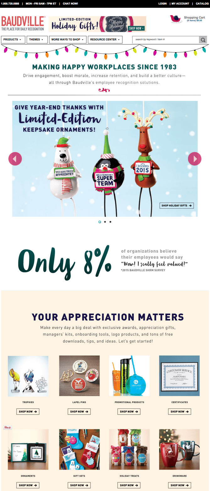
4) Baudville
While seasonal website redesign is often dominated by B2C companies, a few B2B businesses have been known to dress up their website a bit too. Baudville, an employee recognition solution, is one of them.
The changes they made to their website are simple, yet powerful. The banner of colored lights is displayed on most pages of their website, and the sleigh icon beside their shopping cart replaces the normal cart icon we see during the rest of the year.
While some web designers like to add a ton of new elements to their holiday designs, Baudville shows you don't have to. Something as simple as a string of lights around your logo, snow along the top and/or bottom of your page, or a "Happy Holidays" note in your navigation menu can be enough to warmly welcome users to your site during this time of year.
5) Magnolia Bakery
Magnolia Bakery's holiday homepage design features gorgeously soft hues of traditional winter colors like green and blue. Users are greeted with a seasonal product image beside a festive flavor of the month. Mmm, gingerbread. Again, this webpage is an example of a business staying true-to-brand with an added holiday touch.
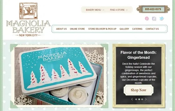
Image Credit: Blue Fountain Media
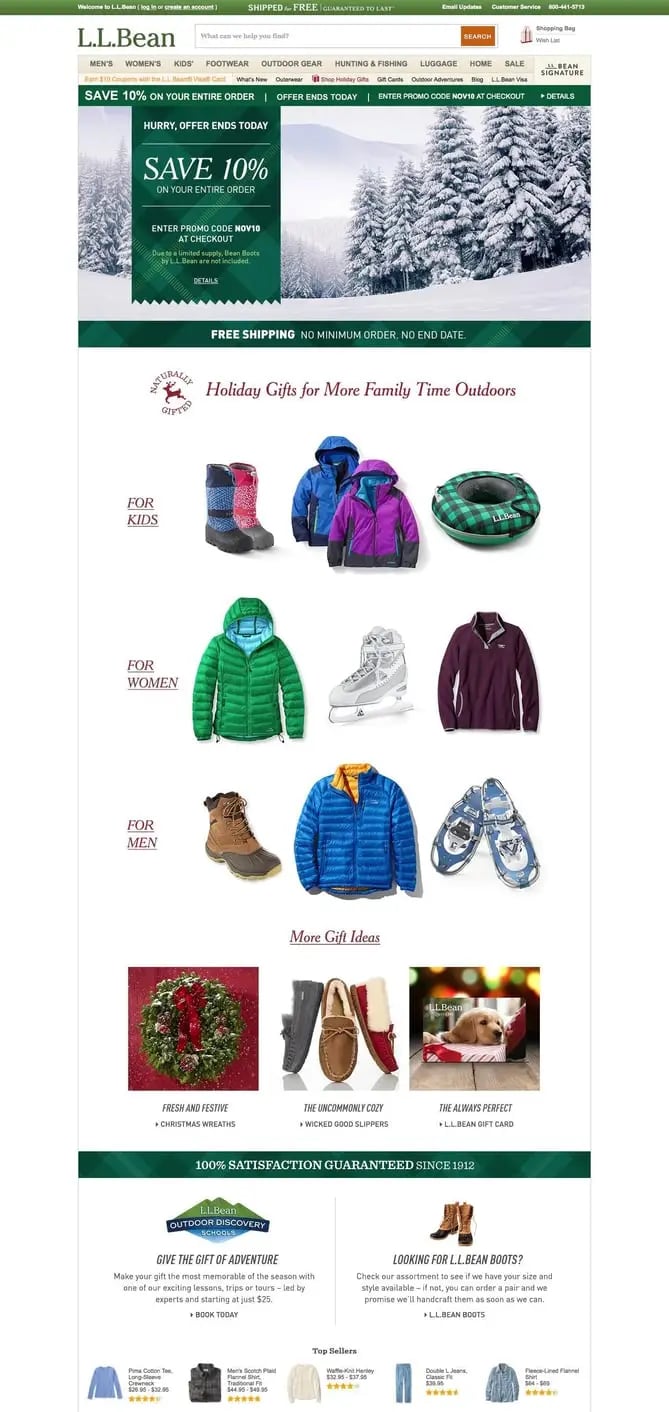
6) L.L. Bean
For a U.S. outdoor retail company like L.L. Bean, the holidays mean winter -- which means cold. (For most of us, unfortunately.) They keep the holidays out of their seasonal redesign completely: The featured photo on their homepage is a picture of the mountains and pine trees covered in show, which is in keeping with their outdoorsy theme. Below is a list of holiday gift ideas. For the more adventurous types, they've added a call-to-action near the bottom of the page for "giving the gift of adventure," which promotes the lessons, trips, and tours the company offers in addition to clothing.
If you're more attracted to a winter-themed seasonal redesign, consider using winter-themed stock photos for your homepage. You might also consider cooling down the color scheme of your whole site for the holiday season. This means using cooler tones like blues, purples, and greens to give it a more "wintery" feel. (You can read more about cool color schemes in this blog post about color theory.)
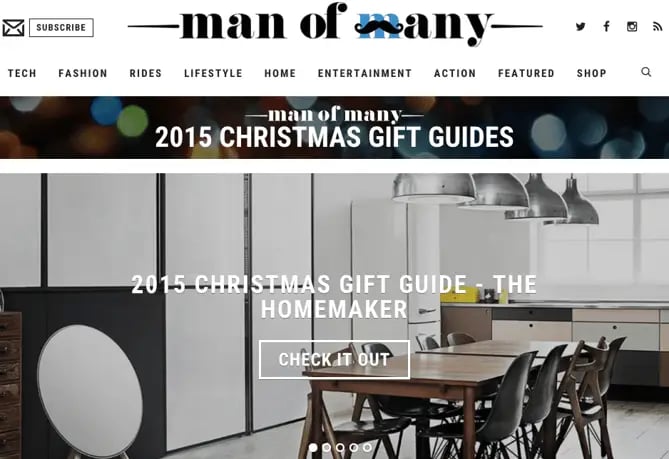
7) Man of Many
Festive banners don't have to be bright reds, greens, and golds to exude holiday cheer. Man of Many found a great way to incorporate typical holiday colors by darkening an image of holiday lights in the banner at the top of their homepage. The image they put behind their "2015 Christmas Gift Guide" call-to-action is delightfully minimal, too: No trees or candles or holly decorating the kitchen table. They did a great job of staying true to brand while still offering great holiday resources for their customers.
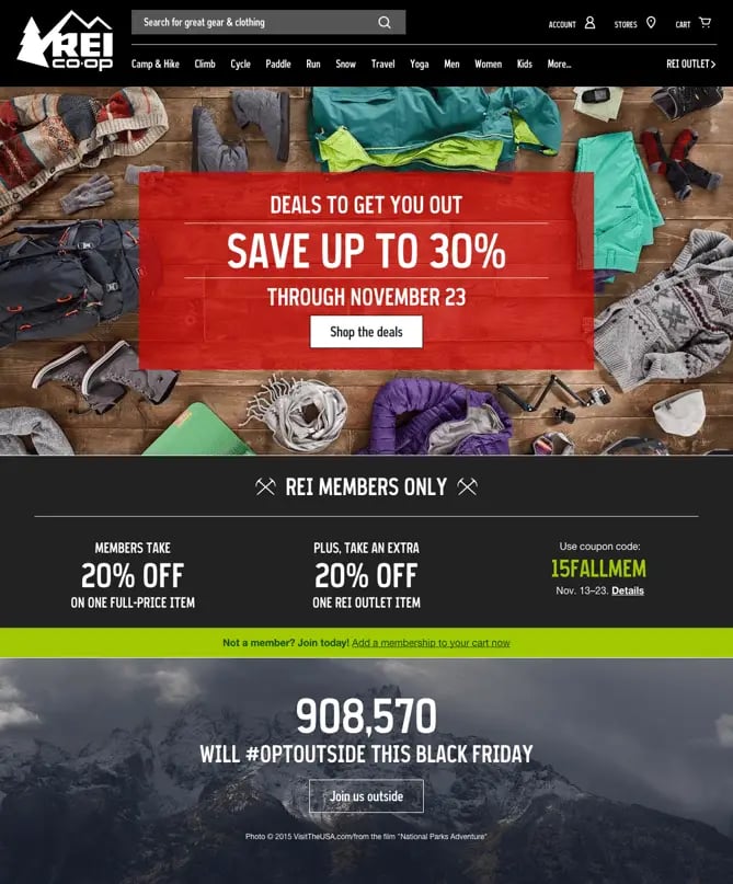
8) REI
REI is the master of messaging in this seasonal redesign. The primary call-to-action isn't just "Deals to save you money!" or "Deals to get you to buy from our website!" No, these are "Deals to get you out" -- as in, deals that encourage people to buy so that they can go enjoy the outdoors. Thanks to this positioning, their message feels less like a way to make money, and more like a movement to get people outside.
Scroll below the fold and they hit the point home with their 2015 #OptOutside campaign. As part of a movement to get Americans exploring the outdoors on their day off, rather than spending it shopping, they decided to close down their stores on Black Friday. That's a powerful message that backs a powerful mission statement: "to empower, educate, and outfit for a lifetime of outdoor adventure and stewardship."
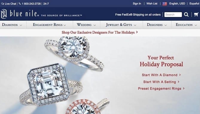
9) Blue Nile
When you're in the business of engagement rings, what are you really trying to sell over the holidays? The perfect holiday engagement, of course. Their message is the same as it is during the rest of the year: Pick a diamond, look at settings, or check out preset engagement rings. But the subtle message in the header of those calls-to-action is holiday-specific: "Your Perfect Holiday Proposal."
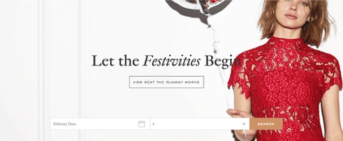
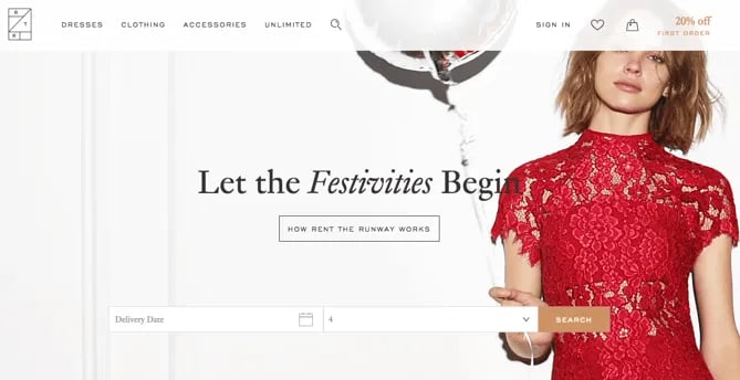
10) Rent the Runway
The image and header on Rent the Runway's website are very much in line with the company's typical branding: A model wearing a gorgeous dress in front of a neutral background, accompanied by a coy message.
However, in this case, the model is wearing a festive, red, lace dress, and the header reads, "Let the Festivities Begin." This is both attractive to first-time visitors who are greeted with simple imagery and user experience, as well as returning users, who expect a design like this but still appreciate the added holiday touches.
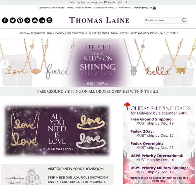
11) Thomas Laine
Not only does Thomas Laine center their homepage messaging around gift giving, a hallmark of the holiday season, but they also clearly promote their holiday shopping dates just below the fold. What a great way to solve for their customers and show they care about helping people get their gifts shipped on time.
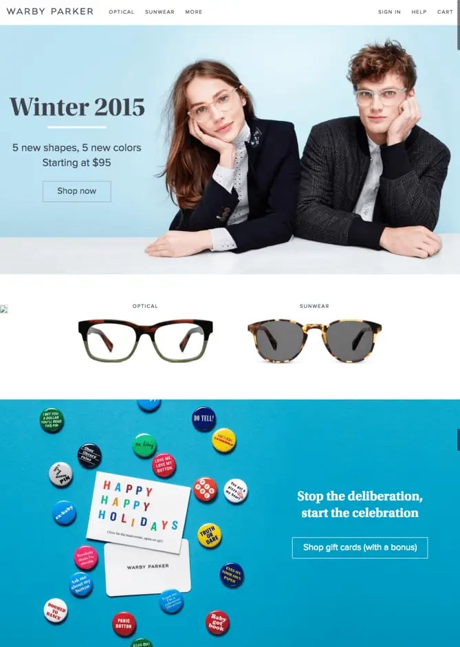
12) Warby Parker
Warby Parker stuck to the basics of beautifully simple design in their seasonal homepage redesign. "Winter 2015" is the simple headline, which showcases a man and a woman dressed in winter apparel, set in front of a cool, blue background and a whole lot of negative space.
While their primary call-to-action is still their usual "Shop Now," you'll notice a secondary call-to-action as you scroll that offers gift cards. We love how they included the copy "(with a bonus)" on that CTA, which compels users to click to see what the surprise is. Spoiler alert: Turns out you get a crop of decorative holiday buttons with every physical gift card. Everyone loves a free gift, especially around the holidays!
Finally, Warby Parker's responsive design gives mobile users a pleasant holiday shopping experience. According to Google, 53% of people who shopped online in 2014 used smartphones or tablets, up from 41% in 2013. The numbers are expected to rise this year, especially now that more people are searching Google on their smartphones than on desktop, so be sure your website is mobile-friendly in time for the holidays.

(To see more examples of ways ecommerce businesses have redesigned their websites for the holidays, check out this library of examples on Crayon.co.)
Oh, and one more thing: As you plan your own website design strategy for the holidays, be sure to plan and prepare your site for higher-than-normal traffic. The last thing you want is for your site to go down during a time when you hope to be doing great business.
Download more holiday marketing resources to help your business succeed this season from HubSpot's #HolidayHub.
This post originally appeared on the Marketing section. To read more content like this, subscribe to Marketing.