
There is no golden formula when it comes to successful content marketing. But data can point us in the right direction.
One of most common questions we hear is: Will an increase in publishing frequency also result in an increase in shares?
It might seem like a no brainer. If you publish more content, there will be more content to share, and so share volume will increase. But that is not always true.
An increase in the number of posts does not always correlate with more shares or more views. If you trade quality for quantity, you could be reducing the individual impact of your content.
To give some insight in to the right publishing frequency, we pulled some data together from Uprise.io, which looks at the best content from the top publishers and gives you the ability to make informed decisions based on data from your industry.
In this example, we looked at the top 15 publishers from the marketing industry and the top 15 from the tech industry.
Marketing Publications
For this analysis, we used the date range January 1, 2015 to July 1, 2015.
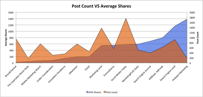
Post Count vs. Average Shares
The post count is the average number of posts published each week and the shares is the average shares per post.

If we take the Hubspot Marketing blog as an example here, it shows that the average share number versus the amount of posts published each week is really strong, indicating that the content being produced is not only high quality but also highly shareable. Even though the Hubspot Marketing blog is not producing the most content out of these 15 publishers, the content is successful in terms of social sharing.
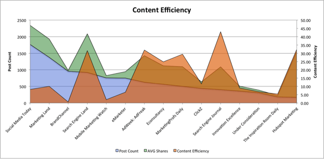
Content Efficiency
To understand how effective the publishers' content is we created a content efficiency score. The score is calculated by dividing the amount of average shares per post by the average number of posts published per week. This enables us to have a benchmark for how well the site's content is doing when put side by side with other publishers. The orange area on the graph represents the content efficiency score.

What is interesting here is that the most efficient content according to the benchmark score is not from publishers that are publishing the highest amount of posts. This could indicate that the quality of the content being produced by the publishers with higher efficiency scores is providing more value for the audience.
Tech Publications
We also analyzed the top 15 tech publications. These publishers create a higher volume of content and on average, see a higher average of shares per post. This may be due to the fact that many of the topics covered in tech appeal to a wider audience.
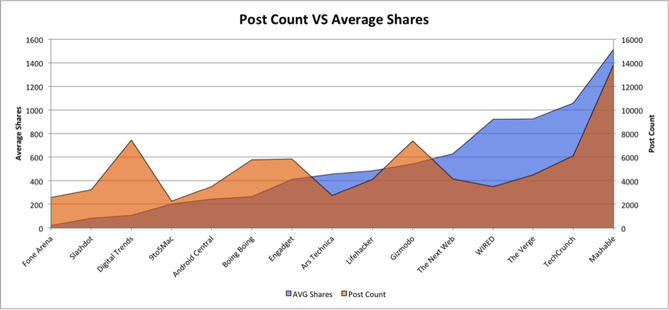
Post Count vs. Average Shares
The analysis of the tech industry follows the same date range of January 1, 2015 to July 1, 2015 and looks at the same metrics as those used in the marketing publications section, with post count being measured on an average per week basis.

As you would expect, Mashable and TechCrunch are in the top end for both post count and average shares. Note that Mashable has by far the highest average post count and share average. Interestingly both Digital Trends and Gizmodo both published more posts than TechCrunch for this date range, but TechCrunch has a higher average share number.
We can see a similar pattern within the tech publication industry that shows that a lower number of posts, which we assume are higher quality, generally see higher average shares per post.
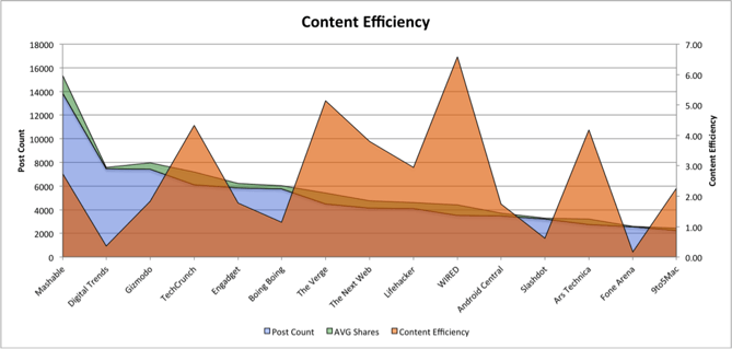
Content Efficiency
We also analyzed the content efficiency of tech publishers.

This is where it gets interesting. The top publishers for the post count and average shares analysis are completely different when the content efficiency score is overlayed. If we take Mashable and TechCrunch as examples from this graph, in terms of content efficiency, TechCrunch comes out on top. This is because for the date range of the analysis, Mashable published 13,836 posts whereas TechCrunch only published 6,111, less than half the amount of posts. The average share count for each post was 1,515 for Mashable and 1,059 for TechCrunch.
Although Mashable published more content overall, TechCrunch sees similar share numbers, indicating the publisher is not getting as as much out of its content.
It’s About Quality
If you want to use the same approach within your industry to get an idea of where the sweet spot is for the amount of posts you ideally need to be aiming for, try this methodology to see how your publishing frequency and sharing data overlaps.
Remember: It is not necessarily about the amount of content you are writing; it is about whether the content you do produce provides value and resonates with your audience.


