
LinkedIn Pages allow users to discover, follow, and find new roles at their favorite businesses. But they’re not just useful for job seekers and professionals. If you own a business, organization, or other institution, you can use LinkedIn Company Pages to connect with your audience and strengthen your brand image.
A lot happens on LinkedIn. People post updates, professionals seek new jobs, salespeople pitch prospective customers, and LinkedIn members of all kinds connect, chat, and build relationships. With more than 800 million members, this level of activity comes as no surprise.

LinkedIn Company Pages provide a unique way for your organization to stand out from the noise — important noise, but noisy nonetheless. We developed this guide to help you master your LinkedIn Company Page.
LinkedIn Company Pages
LinkedIn Company Pages are pages dedicated to individual companies, organizations, and institutions. They allow LinkedIn members to discover and connect with individual companies and learn more about each organization’s brand, products or services, career opportunities, and more.
LinkedIn Company Pages were developed to give your company a home base and reach your audience on the network.
If you haven’t built a LinkedIn Page for your business yet, you’re missing out on new connections, followers, employees, and customers.For an in-depth guide on why creating a LinkedIn company page is essential for your business and how to get started, check out our video.
What to Post on a LinkedIn Company Page
Creating a LinkedIn presence for your company expands your brand trust and awareness. Here are a few ideas for what to post on your LinkedIn page to maximize your ROI.
1. Share company updates and news.
LinkedIn, like any other social network, features a content stream on which people share and discuss important articles and updates. Your Page is a perfect place to post your company updates and news for customers, employees, investors, and fans to review and share.
2. Post open jobs and connect with potential employees.
LinkedIn is a professional social network, meaning users benefit from work and career-related updates, connections, and interactions. LinkedIn members are primed to discover and discuss job opportunities, including the ones at your company. If you have any open roles, LinkedIn is the perfect place to share them.
In fact, LinkedIn provides Career Pages — a space separate from your Company Page that’s dedicated to open jobs, recruiting, and employer branding.
.png)
How To Use LinkedIn For Business And Marketing
Take control of your LinkedIn strategy with this free guide. You'll learn about...
- LinkedIn Company Pages
- Optimizing for Search.
- LinkedIn Analytics.
- And More!
3. Build a community.
Every social network boasts its own ability to foster a sense of community, and LinkedIn is no exception.
Your LinkedIn Company Page is a place to build a community of LinkedIn members who are interested in your business, updates, and jobs. Here, they can connect and collaborate on their shared interest in your company. Post interesting questions, behind-the-scenes information, and unique updates to engage your audience and build camaraderie on your Page.
4. Grow and keep your brand's image consistent on social media.
If you’re active on other social networks, having a presence on LinkedIn can help you grow your audience elsewhere. Most social networks allow you to link to and from your LinkedIn page to boost recognition and increase your number of followers.
Additionally, some of your audience may only be active on LinkedIn, so creating a Page would give you a chance to connect with new potential customers and employees.
5. Improve your discoverability on search engines.
LinkedIn Company Pages rank on search engine results pages (SERPs) like any other website or social network. Creating a Page gives your company another opportunity to be discovered by those searching for your products, services, or brand.
LinkedIn Company Pages vs. LinkedIn Groups
Another popular feature on LinkedIn is LinkedIn Groups, where like-minded people digitally gather to discuss common topics, industries, or (in some cases) companies. Many users get these two features confused.
LinkedIn Company Pages are the equivalent to your "website" on LinkedIn; you create it on behalf of your company, and it belongs to you (as a business owner and/or marketer). You’re responsible for updating your Page and posting new content and updates. Other LinkedIn members can follow your Page and engage with your content.
On the other hand, LinkedIn Groups are collaborative networks that can be created and engaged with by any LinkedIn member. Some groups are private while Open Groups can be read or joined by anyone.
Now, a company can create a LinkedIn Group for certain internal teams or subgroups, but LinkedIn Groups can’t necessarily replace LinkedIn Company Pages.
How to Create a Company Page on LinkedIn
Whether you already have a LinkedIn account or are new to the platform, creating a LinkedIn Company Page is easy. Follow these steps to get started.
1. Navigate to the LinkedIn Pages home page or to LinkedIn.com.
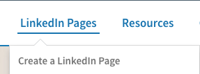
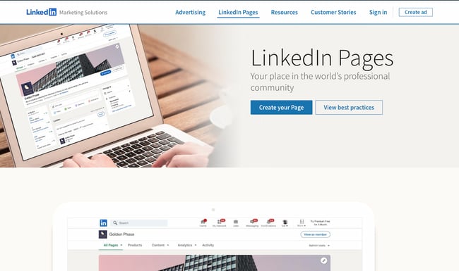 LinkedIn has a public-facing site where you can start the process for creating your own Page. Click the blue button that says “Create your Page.” Alternatively, hover over the LinkedIn Pages option in the top menu and click “Create a LinkedIn Page”.
If you’re not already signed in, you’ll be prompted to sign in. Be sure to do so with the account where you’d like to manage the page. But if you happen to sign in to the wrong account, don’t worry; you can add more admins after you set up your page. We’ll cover how you can do that later.
Starting from LinkedIn.com
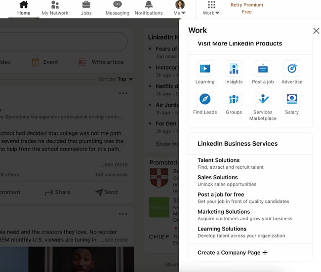
If you’d prefer to start from your LinkedIn feed, navigate to LinkedIn.com.
Once you reach your feed, tap the “Work” button in the navigation bar.
Click “Create a Company Page +” at the very bottom.
 2. Select the type of Page you’d like to create.
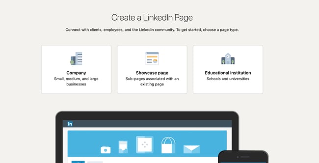 After clicking “Create a Company Page”, you’ll be taken to a page where you can decide what you’re creating. You have three options:
- Company: A good fit for small-to-enterprise businesses, as well as non-profits, government agencies, and other non-educational organizations.
- Showcase page: A “sub-page” that’s connected to an existing LinkedIn Page. Not recommended if you’re setting up your first Company Page.
- Educational institution: A good fit for schools and universities.
If you’re a business owner or employee, choose “Company.”
3. Input your business name, LinkedIn public URL, and website.
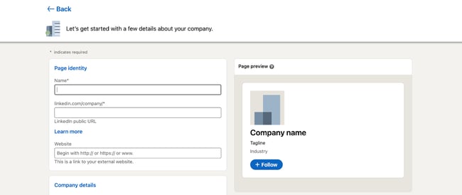 Now comes the fun part: Actually creating the page. LinkedIn guides you through this process, and it prompts you to first fill out the basics.
- Name: Enter your entire company name to improve discoverability and searchability.
- LinkedIn public URL: As you fill out your Name, LinkedIn will automatically input your URL to match. Ideally, your URL will be your company name; this keeps your online identities consistent. For example, HubSpot’s LinkedIn Page URL is www.linkedin.com/company/hubspot. If your company name isn’t available, choose a URL that’s similar and still identifiable, such as one of your social media handles and/or a shortened version of your brand name.
- Website: Enter your company’s website. Although not required, this information is critical as it connects LinkedIn followers to your company website.
4. Add your industry, company size, and company type.
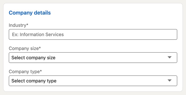 LinkedIn requires additional details for you to build your page. These are essential to improve searchability and helps you build your brand image in your specific industry.
- Industry: Start typing in your industry and choose one from the drop-down menu. If you can’t find it, continue searching until you find a generally good fit. This information helps LinkedIn categorize your company for Page visitors.
- Company size: Choose your company size from the ranges provided. The ranges start from 0-1 and go up to 10,000+.
- Company type: Choose your company type from the options provided: Public company, self-employed, government agency, non-profit, sole proprietorship, privately held, and partnership. If you’re not sure, reach out to your company stakeholders.
How To Use LinkedIn For Business And Marketing
Take control of your LinkedIn strategy with this free guide. You'll learn about...
- LinkedIn Company Pages
- Optimizing for Search.
- LinkedIn Analytics.
- And More!
5. Add your final profile details, such as your logo and tagline.
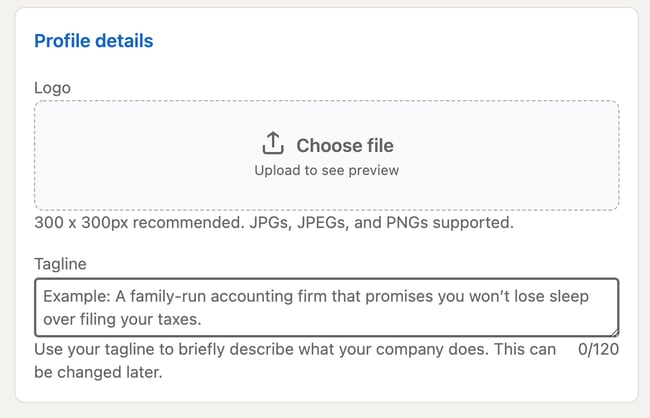 While these fields are optional, they can help you save time later. You’ll have less work to do in your LinkedIn Page Admin area.
- Logo: Upload a high-quality logo that matches the logo on your other social media accounts. This is important so new followers can recognize your brand and Page. It must be 300 x 300px.
- Tagline: In 120 characters, briefly describe what your company does. Consider using the same tagline from your other social media accounts. You can change this information later.
6. Preview the result and click “Create Page.”
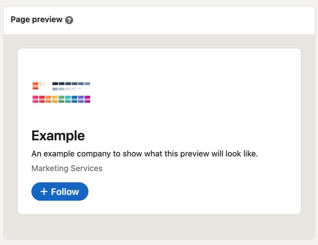 On the right-hand side, you’ll see a preview of the details you’ve provided. Take a look to ensure everything looks correct.
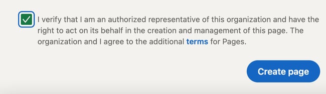
When you’re finished, check the checkbox at the bottom confirming you’re an authorized representative and click “Create Page.”
7. Complete your LinkedIn Page in the Admin dashboard.
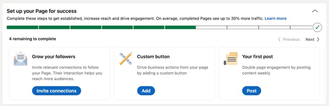 The final step will show you the Admin View of your LinkedIn Company Page. This is essentially the behind-the-scenes dashboard from which you can make changes to your Page.
If you’re building your Page from scratch, you’ll see that LinkedIn provides a helpful checklist of actions to complete. These tasks will also unlock new features such as Content Suggestions and Invite to Follow that can help grow your Page.
Let’s walk through the important tasks to complete in this step.
- Description: Add an About Us section that describes your company. It should be longer than your tagline. This is the place to include relevant keywords and phrases that can help people discover your Page on LinkedIn and through search engines. This section can be up to 2,000 words. LinkedIn also allows you to create taglines and descriptions in multiple languages.
- Location: Add at least one location for your company. You can add multiple locations and name each one. Consider at least adding your headquarters or central company location.
- Cover photo: Add a cover photo that will engage and entice visitors to check out your Page. Many brands upload another orientation of their logo or their latest marketing or advertising campaign graphics. This photo must be 1,128 x 191px.
- Hashtags: Hashtags provide a unique way to connect with followers and engage with posts. Add up to three hashtags that are related to your company, industry, and audience. They will be added as Community Hashtags to your Page.
You can also add a company phone number, the year your company was founded, and any LinkedIn Groups you want to show on your Page.
Voila! Your LinkedIn Company Page is now created and ready to share. Continue poking around your Page to complete all fields and features. The following section of LinkedIn Page best practices will help you use your Page to connect and grow.
How to Manage Your Company Page on LinkedIn
Once you create your LinkedIn Company Page, your work is done ... right? Nope. Honestly, creating the Page is the easiest part. Managing and posting on the page is what takes more time, work, and creativity.
As we'll talk about below, the first thing to do is determine your Page admin. This person will be responsible for creating (or delegating) the content posted on your Page.
Work with your team to plan much of your LinkedIn content upfront. Gather ideas from your other social media accounts, or chat with your leadership, product, and HR teams to get ideas for company, product, and job updates to share.
Encourage your coworkers to create LinkedIn accounts of their own, as their engagement and participation can help drive traffic to your Page.
Lastly, keep an eye on the LinkedIn Company Page analytics. See who's visiting and engaging with your Page and what kind of content they prefer. Over time, this will help you determine where to best spend your creative energy.
LinkedIn Company Page Admin
Who is your LinkedIn Company Page admin? Answer this question before moving further in this article. You need at least one, although we'll discuss in the section below how (and why) to add additional Page admins.
LinkedIn offers a variety of admin roles, and your Page should have at least one of each to avoid losing access to your Page. Moreover, this admin (or team of admins) are the ultimate managers of all content posted on your Page. They should ensure all content is on brand and consistent with your other social networks and website content.
How To Use LinkedIn For Business And Marketing
Take control of your LinkedIn strategy with this free guide. You'll learn about...
- LinkedIn Company Pages
- Optimizing for Search.
- LinkedIn Analytics.
- And More!
Let's talk about some more best practices for LinkedIn Company Pages.
LinkedIn Company Page Best Practices
- Complete all Page details with in-depth information about your company.
- Add important Page admins.
- Keep your images up-to-date.
- Share engaging content with your followers at least once a week.
- Use Content Suggestions to share relevant content.
- Engage with your audience.
- Post interesting, eye-catching visuals.
- Customize your call-to-action.
- Involve your employees.
- Post content from (or mention) partners and other companies.
To make the most out of your LinkedIn presence, it’s essential to follow best practices for LinkedIn Pages. Follow these tips and techniques to maximize the impact of your efforts.
1. Complete all Page details with in-depth information about your company.
 A fully completed LinkedIn Company Page will help you engage users more effectively and earn more follows and shares. Take the time to fill out every Page detail, even those that aren’t required.
Each LinkedIn Company Page has a series of tabs. These include:
- Home: The Home tab includes a snapshot of all the other tabs in your LinkedIn Page. It provides a short version of your “About” page, lists 2-3 of your recent posts, includes “People highlights” for each individual Page visitor, and more.
- About: The About tab gives you the opportunity to explain what you do and why you do it in more detail. You’ve likely already filled out most of this info, such as your website and industry, but consider adding your specialties and other locations as well.
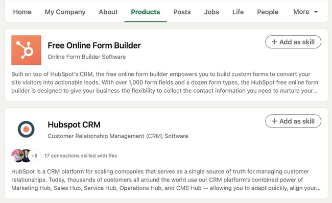
- Products: Some companies will benefit from listing products on their LinkedIn page. It’s especially useful if your product can also double as a skill that people can add to their LinkedIn profile (such as Microsoft Excel, for instance). Only certain types of companies can add products to their Page.
- Posts: This is the section of your Page where your updates are published, equivalent to an Instagram or Facebook feed. It includes text posts, images, videos, articles, documents, and ads.
- Jobs: The Jobs tab only apples to you once you’ve posted jobs on LinkedIn. Posting a job is completely free and essential if you’d like to use your LinkedIn Page to attract top talent.
- Events: Like the Jobs tab, this will only appear after you’ve added an event to LinkedIn. You don’t necessarily need to add events during the Page setup process, but you can consider doing so to strengthen your company brand and reach more prospects.
- Videos: This tab includes a feed of your most recent videos.
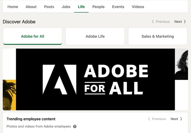
Your LinkedIn Page also includes a “People” tab, which lists all of your current employees. If you purchase Career Pages for your LinkedIn Page, you’ll also get a “Life” tab, where you can provide more detail on the employee experience at your company and even feature content made by your employees.
The more details you provide about your company, the easier it will be for people (a.k.a. potential customers) to discover and connect with you. It will also serve to educate those who are interested in working for or investing in your company.
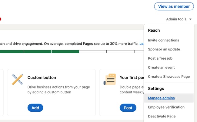
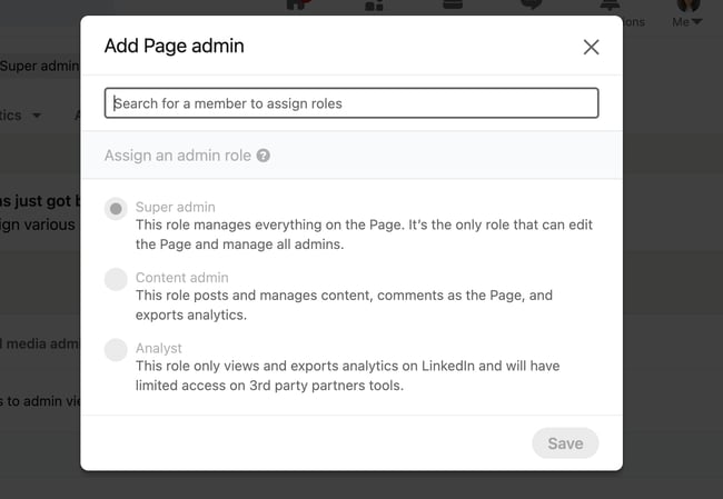
2. Add important Page admins.
Maintaining a LinkedIn Company Page can be a lot of work, especially if your team is already manning multiple social networks and accounts. Once you create your Page, don’t forget to add more Page admins to give other people permissions.
To add new Page admins, click “Admin tools” in the top right corner of your Company Page, then click “Manage admins” under Settings.
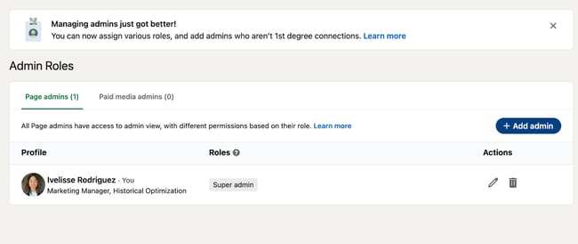
The page will allow you to manage all your Page administrators. As you can see, there are several types of admins you can add to your Page:
- Super admins have access to all permissions.
- Content admins can edit the Page’s content and publish posts.
- Curators can see content suggestions and create recommended content.
- Analysts can access the Page’s performance analytics and export data.
LinkedIn explains them in detail here.
To add an admin, simply click the “+ Add admin” button in the admin management page.
 In the pop-up, type in the person’s name, choose their admin role, and click “Save.”
3. Keep your images up-to-date.
Your Page logo and cover photo are very important; they visually introduce and engage anyone who visits your Page. Keep these images up-to-date with your latest branding and marketing materials.
Not only is this critical for presenting a unified social presence, but it ensures your LinkedIn company page also matches your website, blog, and other digital marketing materials. There’s nothing worse than visiting a LinkedIn Page and not knowing whether it’s the brand you were looking for. You can avoid that pain point for your LinkedIn visitors by keeping everything up-to-date.
You should also update your imagery regularly because of marketing campaigns, upcoming holidays, or current events. For instance, many companies release a new, rainbow-colored version of their logos in honor of Pride Month.
Updating your employer branding can make you look more current and engaged. As a result, you’ll boost brand awareness and help new customers, employees, and fans discover your brand on LinkedIn.
How To Use LinkedIn For Business And Marketing
Take control of your LinkedIn strategy with this free guide. You'll learn about...
- LinkedIn Company Pages
- Optimizing for Search.
- LinkedIn Analytics.
- And More!
4. Share engaging content with your followers at least once a week.
Like any social network, you can’t expect to simply create your account and be finished. Building your LinkedIn Page is only half the battle; you must also consistently post content to successfully engage, inform, and market to your audience.
Download this free ebook to access templates, guides, and infographics on how to use LinkedIn for business, marketing, and networking.
.png?width=375&name=Image%20Hackathon%20%E2%80%93%20Square%20(25).png)
Consider posting updates to your products and services, job openings, trends or news that involve your brand, and behind-the-scenes content featuring employee life, product development, or other unique content.
If you feel intimidated by having to post often, you can use a tool such as HubSpot’s social media management tool within Marketing Hub to streamline the process. Alternatively, you can download a free social media content planning template to jumpstart your posting schedule.
![The Social Media Content Calendar Template Every Marketer Needs [Free Template]-4-3](https://blog.hubspot.com/hs-fs/hubfs/The%20Social%20Media%20Content%20Calendar%20Template%20Every%20Marketer%20Needs%20%5BFree%20Template%5D-4-3.png?width=650&height=499&name=The%20Social%20Media%20Content%20Calendar%20Template%20Every%20Marketer%20Needs%20%5BFree%20Template%5D-4-3.png)
Download Your Free Social Media Content Calendar Template
If you post regularly, you’re 6X more likely to convert customers than if you don’t. So be sure to nurture your followers with targeted content that helps them solve for their pain points.
5. Use Content Suggestions to share relevant content.
LinkedIn also provides a handy Content Suggestions tool to help you discover topics and content your audience is already engaging with on the network.
Tap “Content” in the top menu of your Page, and update the filters as they apply to your audience.
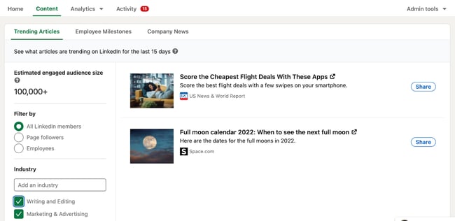
Immediately, you’ll see a content stream based on your chosen topic and audience parameters. You can edit the filters further in the left menu, and you can add or take away content topics along the top. This tool shows you the engagement rates of popular or trending content and makes it easy to share new updates with your audience.
6. Engage with your audience.
Don’t forget to engage with your audience, too. Like, comment on, and share things posted by your followers and connections. This will remind them there are humans behind your brand’s LinkedIn Company Page.
The good news about this is that you can and should use your brand voice to engage with others. There’s no need to be overly formal and stiff — the purpose of engaging is to show your brand’s more human side.
Engaging with your audience is also essential so that viewers don’t feel like a robot is behind your Page. Since LinkedIn is a more professional platform with more “distance” (i.e, businesses don’t often post selfies or personal memos), it’s critical to close that distance by liking, commenting, and responding to your own posts and other users’ posts.
Now, you don’t want to be as informal as you might be on, say, Instagram, but you should always feel free to showcase your brand’s voice and personality.
7. Post interesting, eye-catching visuals.
Text-only content is unlikely to engage all members of your LinkedIn Page. Be sure that at least 50% of your posts feature an engaging visual, whether an infographic, illustrated statistic, or quote graphic. Even a GIF or meme can be a fun addition to a text-heavy feed.
Also, consider adding short videos. Even if these videos repeat your text-based posts, they'll engage with your more visual audience and keep folks engaged on your Page.
According to HubSpot Research, short-form video will continue to see explosive growth, even outside of TikTok. Because of TikTok’s popularity, more users are expecting similar content across other social media platforms, including LinkedIn. You can take advantage of this trend by posting short videos on your Page.
HubSpot Research has also found that video has the highest ROI of any media format. Even if you only post a short, informational clip, its payoff can be incredibly valuable, and you don’t need expensive gear. Simply use your phone and an online video editing tool.
8. Customize your call-to-action.
On your LinkedIn Company Page, under your logo and next to the Follow + button, you’ll find a call-to-action (CTA). This CTA is an essential element that will allow you to draw in more leads and get more clicks. Plus, someone who visits your website is more likely to click the Follow button.
It’s a great way to engage visitors from the get-go without them needing to scroll.
While you can use a CTA that says “Visit website,” LinkedIn allows you to customize this CTA to better engage your followers and audience. To do this, click “Edit page” on your admin view.
A pop-up box will come up. Under Header, click “Buttons.”
Make sure the “Custom button” option is turned on.
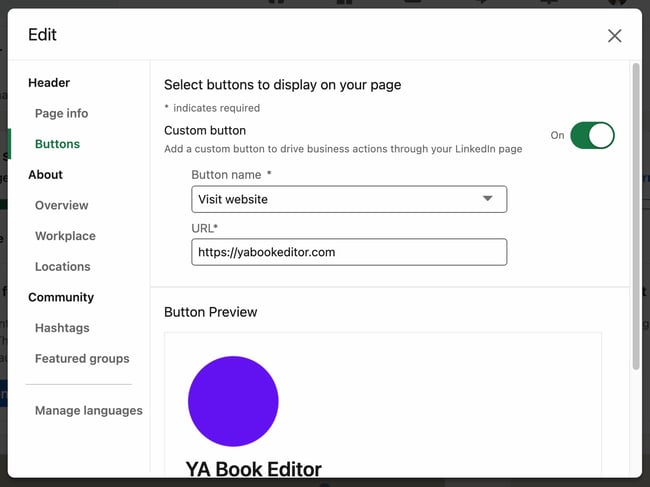 Choose a button name from the drop-down menu and enter a URL. Use this setting to direct followers to your website, landing pages, event registrations, and more.
9. Involve your employees.
Your employees are some of your best brand advocates. This is especially true on LinkedIn, where employees have an average of 10x more first-degree connections than a company has followers.
Involving your employees will also humanize your brand, a growing trend in marketing that’s slated to continue growing. According to HubSpot Research, 89% of brands will continue investing in content that humanizes them and reflects their values, showing its high ROI. One way to effectively reflect your values is to engage and involve your employees on your LinkedIn Page.
As you develop your Page, encourage your employees to follow and engage with it. Also, ask each employee to list your company as an employer, as this will link their profile to your Page and vice versa. This is helpful when growing a new Page audience of customers and potential employees.
How To Use LinkedIn For Business And Marketing
Take control of your LinkedIn strategy with this free guide. You'll learn about...
- LinkedIn Company Pages
- Optimizing for Search.
- LinkedIn Analytics.
- And More!
10. Post content from (or mention) partners and other companies.
If you partner with other companies, such as for co-marketing campaigns, feature them on your Page often. Not only does this engage other companies and leaders, but it also promotes your content to your partner's audiences.
Partner campaigns can also humanize your brand and expose you to those who may not have heard of you before. It builds brand awareness and makes you look more engaged, which is essential for a successful LinkedIn Page.
For every post that you share about your company, share one focused on another company, your employees, or even your customers. Case study interviews are also great opportunities, as well as webinars co-hosted with another brand.
11. Post new job openings on LinkedIn.
Adding job openings to your LinkedIn Page can make you look more engaged and attract more followers. While a job candidate may not be a sales prospect, they’re a hiring prospect, and new hires can and do make excellent word-of-mouth advocates. They can talk about you with other colleagues who could then follow you, and so forth.
The good news about posting jobs on LinkedIn is that they don’t require a lot of work. For one, if the job is already live in your hiring portal, then you can simply copy and paste it over onto LinkedIn and publish it for free. It will remain live for 21 days before you have to pay to extend it.
For two, shorter job postings perform better than longer job postings. In fact, LinkedIn reports that 150 or less words are more effective than longer postings. So even if you don’t have a job posting yet, you can simply whip one up and let LinkedIn do the rest.
12. Use LinkedIn Ads.
Once you have a LinkedIn Page, the natural extension is running LinkedIn Ads. Not only will you reach more people and attract more followers, you’ll increase your general presence on LinkedIn.
LinkedIn Ads are a smart choice because many prospects are not yet ready to buy. In fact, LinkedIn reports that most are not. By using LinkedIn Ads, you can slowly nurture passive buyers who aren’t yet ready to make a purchase.
In addition, you can use both organic and paid campaigns to increase your ROI. You have a potential to see 61% higher conversions and lower the cost per conversion by 12% by having both a LinkedIn Page and by running LinkedIn ads.
One type of LinkedIn Ad you can use are Document ads. These ads show guides, tip sheets, ebooks, case studies, and infographics to an audience that’s ideally hungry for this information. They then click through to your landing page, and voila — there you have a new lead.
Create Your LinkedIn Company Page Today
Most customers trust social media over advertising — including social media for brands and companies. Your LinkedIn Company Page contributes to this statistic, and, in turn, helps bolster your brand awareness, trust, and social activity. Use this guide to develop your LinkedIn Company Page and start engaging with new customers, employees, investors, and followers.
Editor's note: This post was originally published in August 2017 and has been updated for comprehensiveness.