Calls-to-action (CTAs) are one of the most critical inbound marketing tools. Whether they take the form of anchor text links, images, or buttons, CTAs are what motivate and direct your visitors to take a desired action, usually on a landing page. This could mean anything from registering for an event, downloading content and converting into leads, or encouraging prospects to move further down your marketing funnel toward sales-readiness.
But not all calls-to-action are effective at converting your visitors. And because we've worked with so many marketers over the years, we've seen our fair share of lackluster and underperforming CTAs in our day. So to help you get a handle on some of the most critical CTA best practices, this post -- and the accompanying SlideShare -- will uncover the good, the bad, and the ugly of calls-to-action, so you can learn what works (and what doesn't) with CTAs.

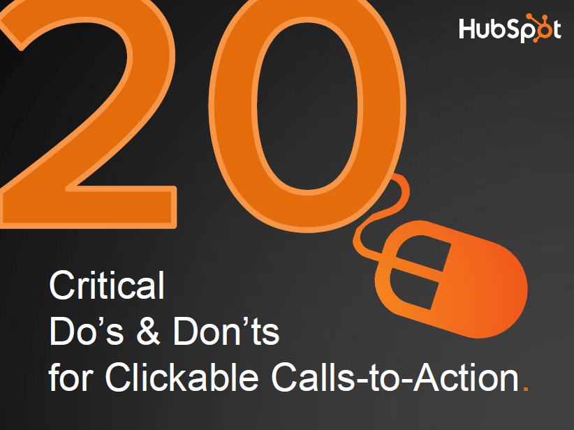
20 Critical Do's and Don'ts for Compelling Calls-to-Action
1) DON’T use “submit” on your form buttons.
DO use valuable and actionable copy, such as “Download Now,” “Get Your Free Trial,” “Speak to an Expert,” or “Buy Now.”
Why? Think about it: No one likes to "submit" to anything. By stating the value of what the visitors will receive by clicking the button, you will reduce anxiety and friction and, thus increase clickthroughs.
2) DON’T hide your CTAs where no one can see them.
DO place your CTAs above and below the fold and within the visitor's “eye path.”
Why? Calls-to-action are worthless if no one can see them! Don’t make the mistake of neglecting to position important calls-to-action front and center so visitors miss them altogether.
3) DON’T use the same or similar colors in your CTAs as the page's background color.
DO use bold, contrasting colors in your CTAs so they don't blend in with the page.
Why? If your CTA uses colors similar to those of the background -- whether on a page, in an email, or within any other channel, it will blend into the page, making it difficult for visitors to notice. Simple as that!
4) DON’T use teeny, tiny CTAs that no one will notice.
DO make them big and bold.
Why? So they stand out! It’s important to make CTAs one of the bigger, more prominent objects on a page to increase the likelihood of clickthroughs.
5) DON’T make the design of your CTAs look flat.
DO make them look “clickable” and button-like by adding bevels, shadows, and hover effects.
Why? Online visitors are conditioned to recognize clickable elements like buttons and links. Use copy or design to indicate that visitors should “click here.”
6) DON’T use CTAs in the wrong place at the wrong time.
DO use CTAs that relate to the content on the existing page, or align with the buyer’s interests and needs.
Why? Many marketers make the mistake of pushing a CTA too soon or with the wrong audience. Matching the CTA with the lifecycle stage or interests of the visitor will make for a more effective call-to-action and increase clickthroughs.
7) DON’T be too wordy.
DO make sure CTAs are clear, simple, and uncluttered.
Why? Attention spans are short. Get to the point quickly.
8) DON’T use vague, cliché, or passive language.
DO use compelling and actionable copy that conveys the value being offered.
Why? The most effective calls-to-action tell visitors what to do (e.g. click here, download now, get your XYZ). Use words that convey action so there's no question about it.
9) DON’T oversell and under-deliver.
DO set the right expectations about what visitors will receive.
Why? Many calls-to-action make fake promises. Just think of decades' worth of Mad Men type advertising. Visitors have high expectations that your CTA will deliver what’s promised.
10) DON’T link your CTAs to your homepage.
DO direct each CTA to its own dedicated landing page that restates the offer and copy from the CTA.
Why? A homepage is a dumping ground for all miscellaneous traffic. CTAs give you the opportunity to increase conversions by driving visitors from a particular channel or source to a specific landing page that is closely tied to the CTA. This reduces friction because visitors will know they landed in the right place. Bringing them directly to the homepage will make them feel lost and reduce the likelihood they'll convert.
11) DON’T use too many CTAs on one page.
DO use only one primary and one secondary CTA only.
Why? Calls-to-action are meant to stand out and direct visitors to one desired course of action. If there are too many messages shouting out them, then suddenly nothing stands out.
12) DON’T forget to build trust through design and copy.
DO use data or testimonials to validate your proposition.
Why? Visitors have little trust in everything the internet tells them. The best ways to build trust are through professional design, social proof, or customer case studies and testimonials.
13) DON’T miss opportunities to promote your CTAs.
DO place a CTA in everything you do.
Why? Every channel or platform you use in your marketing is an outlet to promote a call-to-action, whether in email, a blog post, social media, or on thank-you pages.
14) DON’T use the same CTAs for too long.
DO experiment with and A/B test your CTAs to know what design, copy, and placement works best.
Why? A call-to-action can get stale very fast in the fast-changing web, and you can’t guarantee the same CTA will work forever. Testing is a critical part of creating effective CTAs.
15) DON’T forgot to search engine optimize your CTAs.
DO add keyword-rich ALT tags so your CTA adds search value to the page.
Why? A CTA, when taking the form of an image, is a great opportunity to add more relevant keywords to your site so your website gets found in search engines.
16) DON’T use Flash or complicated animations.
DO use CTAs that are mobile-optimized so any device can see them.
Why? More and more people around the world are surfing the internet on mobile devices -- not just PCs. If your CTA can’t been seen on phones or tablets, you’re missing a huge chunk of potential conversions.
17) DON’T use branding as the only objective of your CTA.
DO use CTAs to offer something of value.
Why? Branding in CTAs are a waste of time and money. No one cares about your logo or fancy tagline. Give them something they -- not you -- want.
18) DON’T use the same CTA for everyone.
DO use personalization and dynamic content.
Why? Because everyone is different! Create different CTAs for different personas and audiences. Personalization is one of the best ways to improve the effectiveness of your CTAs. (Hint: Smart CTAs can help with this.)
19) DON’T cram your CTAs into little spaces.
DO give them room to breathe by utilizing white space.
Why? Making sure there is plenty of white space around a CTA is another great way to make sure it stands out and doesn’t get lost in the clutter.
20) DON’T obsess over a pixel-perfect design.
DO master the copy of CTAs, because that’s what really gets visitors to take action.
Why? While it’s important for CTAs to have a professional design, even the best-looking designs fail. The most effective CTAs get content right first and foremost, by using compelling copy that creates trust, urgency, and value.

What other CTA do's and don'ts would you add to this list?


![How the HubSpot Blog Generates Leads [+ How Yours Can, Too]](https://blog.hubspot.com/hubfs/17_Lead%20Generation.png)

![28 CTA Templates to Design Clickable CTAs in PowerPoint [Download]](https://blog.hubspot.com/hubfs/cta-template.jpg)

![What is a CRO Test? [+ the 5 Steps to Perform Them Yourself]](https://blog.hubspot.com/hubfs/conversion-rate-optimization-tests_4.webp)

![How to Add Slide-In Calls-to-Action to Your Blog Posts [Tutorial]](https://blog.hubspot.com/hubfs/Slide-in_CTAs.webp)