
 We live in a multi-screen world. I remember growing up as a kid in the 80s and our family of five had exactly ONE screen in our lives. It was the family television (a Sony Trinitron I believe) and we used it to watch TV, VHS tapes and the computer (we had a Commodore 64).
But times have changed… a lot. The other day I was sitting in the living room with my family. Between my wife, our baby daughter and myself, we were all surrounded by screens. We had 2 smart phones, an iPad, an iPod, a LED TV, a Macbook, a Wii U controller AND a baby monitor.
8 screens in JUST one room.
What’s even crazier is that every single one (besides the baby monitor) is capable of browsing the internet. Add that to the fact each one has a different resolution.
This can create a really tricky situation for the modern web designer. Why? Your work of art needs to look sweet on a plethora of devices.
So what’s the modern marketer to do?
One option is just to ignore mobile screens since most people still DO browse the internet on traditional computers, but this isn’t proactive and really limits the shelf life of your next website build.
Statistics suggest that mobile traffic is going to continue to increase over time, which makes sense given the popularity of the new, handheld devices. In fact, according to Mashable, in 2013, 17.4% of web traffic has come through mobile, representing more than a 6% increase since 2012 when 11.1% of traffic came from mobile.
The Challenge
What is a web designer to do with all of these options available for Internet enabled devices? We once focused our attention on catering to smart phone users and provided them with a completely separate mobile version of a website. While this was effective on some level, it was a completely separate web property and required additional development resources, and ultimately costs. The content also needed to be maintained on both versions, which only made things more complex.
The idea of targeting specific devices and resolutions in this day in age is ludicrous. There are more resolutions, phones and platforms then you can list. If you took this approach, by the time you finished targeting and coding for each specific device, your website would be out of date, and it would be time for a redesign. Sounds efficient, right? We didn’t think so.
However, interestingly enough, the challenge exists on both ends of the resolution spectrum. Not only are more and more people viewing web content on limited displays (such as smartphones or tablets) but they are also viewing content on really high-resolution displays (such as HDTVs).
The “Non-Ideal” Solution
At a bare minimum, we need to focus on compliance. If we are OK with users having to pan and zoom to view web content on their mobile device (which we really shouldn’t be) then, all we need to do is make sure our sites have some base line compliance. Here’s what you should do:
- Avoid Flash, Quicktime or any other plugins that might not be available to a mobile user
- Don’t exceed 960px wide or people will be in scroll city
- Don’t use fonts smaller then 11px
- Make sure primary site navigation is fairly large
But the real question is, is this good enough? Are we willing to settle for this solution?
The Ideal Solution
The ideal solution in this case is Responsive Design. The overarching idea of Responsive Design is to build a single web property that has the ability to dynamically change its display based on the device it is used on (regardless of hardware or software platform). This applies to both low-resolution devices as well as really high-resolution devices.
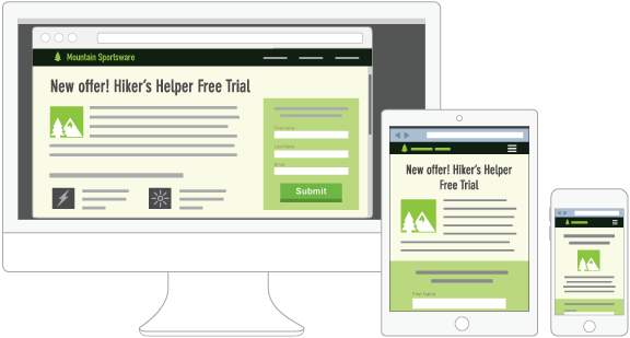
The picture above shows responsive design in action. It shows how the website designed with responsive design appears on multiple devices. Remember, it’s still the same website (we haven’t designed a separate mobile friendly version), but no matter what device our end customer is using, the site is optimized.
The reality is that Responsive Design is more the idea of having a single website that renders well on a multitude of devices. It’s still in its early years, but we are seeing more and more sites developed that are responsive.
There is a great debate in the development world on what the best way is to go about making your site responsive. The solution we’ve rested on here at New Breed, as have many of our colleagues, is starting our websites with the Twitter Bootstrap framework.
This framework uses a 12-column grid system, which allows for a responsive site. Many of the themes and platforms we have seen (including the HubSpot COS) are leveraging this framework and we have been impressed with the results (and ease-of-use from a development standpoint).
The Execution
Now that we’ve hopefully piqued your interest and you can see why responsive design is important, we want to show you how you can implement it within your own organization.
Responsive design begins with your website, but quickly becomes a deeper part of your marketing strategy. How you may be wondering? First off, as we mentioned in this post responsive design is an essential component of your web presence that is becoming more and more necessary as internet browsers change their behavior.
The first step when contemplating a redesign of your website using responsive design is to look at your analytics. What types of devices are your visitors using to access your site? If you still have an audience that primarily uses their desktop, then responsive design might not be a necessary shift for you to make. But on the flip side, if your traffic has changed their behavior and are now using tablets and mobile devices to access your site, then you could greatly benefit from a responsive website.
Take a look at the charts below, which compare our actual traffic sources from this time last year to now. These charts represent the massive shift that is happening online.
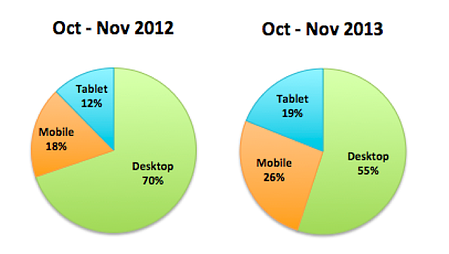
If your charts look anything like this, then we encourage you to consider redesigning your site with responsive design for a few reasons. When your site is responsive, here are six positive effects you can expect to see:
1) Increased Conversions
In our previous post on the Insiders Blog, we talked about how you can maximize conversions with a sales ready website. This is the same methodology – if your website is sales-ready (i.e. there are clear conversion paths mapped to your buyer personas), you will be on your way to maximizing your conversions.
Part of having a sales-ready website is having the website designed to be responsive. Since a responsive website caters to the specific device a visitor is using, the overall experience with your company is improved and the user is not as likely to go to your competitor.
2) Lower Bounce Rates
More often then not, if a visitor is browsing your site on a mobile or tablet device and the site is not responsive, they’re going to leave (i.e. "bounce"). That means when they hit your homepage and they have to pinch to zoom or scroll around to find the search box (as an example), they will just get frustrated and move on to something else. This can have a dramatic affect on your bounce rate – in a bad way.
By having a responsive site, these users won’t have to worry about pinching and scrolling to find what they’re looking for. The site will adapt to whatever device they are using. In turn, they’ll likely click around and visit more pages, decreasing your bounce rate in the process.
3) Increased Page Rank
We spoke about this earlier, but search engines (particularly Google) are now favoring responsive sites in search results. Specifically, if a user is searching from their mobile device, Google is more likely to serve them a relevant website that is mobile responsive.
Their ultimate goal is to give the searcher exactly what they are looking for, and that means reducing the likelihood they will be disappointed by not being able to find what they’re looking for.
4) Stronger, Unified Online Presence
Most companies that cater to mobile visitors have a mobile specific site. This site lives on a subdomain and sometimes looks different then the main site. It still fits within the brand standards (at least it should), but it doesn’t feel like the same website.
But with a responsive site, you don’t have to worry about that. You designed your main site to begin with, so it will look the same (despite pieces having shifted around slightly) on various devices.
5) Decreased Development Costs
With a responsive site you no longer have to build a separate site for mobile. That means your development costs could literally be cut in half. Same goes for your maintenance costs. We all know it isn’t free to maintain a website, so with two websites running, you’re paying twice the maintenance costs. Even though it might be an expense up front to redesign your site, you'll be saving money in the long run.
6) A Competitive Advantage
If you competitors haven't embraced responsive design yet, your company has an opportunity to gain a competitive advantage. Stand out from your competition – and better yet, take the visitors that are leaving their non-responsive sites and convert them into your own customers!
Conclusion
Now, more than ever before, it is essential that our website is accessible across multiple devices. As our customer’s behavior is changing, we need to evolve with them, and we feel that optimizing your website using responsive design is a no-brainer. Not only will you be saving time (and headaches), but you’ll also be reducing your development costs, and your website will have an optimized display on every device.
Google is also paying more attention to sites that have been optimized for mobile and are even giving these sites higher rankings. With the ever-changing world of search, having a mobile-optimized website will increase online visibility.
If you’re still not convinced, think about it this way: People are visiting your site from their mobile devices, regardless of whether you want them to or not. Your site is built to optimize conversions and generate leads, but when that person using their smartphone or tablet gets to your site and can’t find what they’re looking for or bails out because they have to scroll around, then you could be losing out on converting them into a lead. Basically, you’re leaving money on the table.

Originally published Dec 12, 2013 10:00:00 AM, updated January 18 2023
Related Articles