In July 2014, a study analyzing the SEO of the top 500 retailers for Internet Retailer's Mobile 500 guide found that the mobile adoption rates across those top 500 retailers were as follows: 59% use dedicated mobile sites, 15% use dynamic serving, 14% had no mobile presence, just 9% were responsive. In all, that's less than 50 of the top 500 retailers using responsive, and that is still about a 3x increase from 2013 adoption rates.

Of course, if that study were to be run again this summer, responsive is likely to take up a larger chunk of that mobile-friendly pie. After all, Google’s most recent algorithm update penalizes brands not effectively addressing their mobile consumers’ needs via a mobile-ready site.
For many retailers, addressing the Google algorithm update meant installing responsive design as a catch-all to not lose their Google ranking –– and that’s a great thing for both those brands and their customers. We are currently at the internet tipping point in which mobile and desktop use runs parallel. Mary Meeker predicted this moment in 2008, and a wealth of other experts agree with her that desktop internet use will continue to level off as mobile rises.
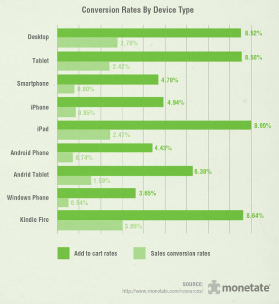
What took the ecommerce industry, then, so long to respond to the rise in power of mobile internet? No, it isn’t that the ecommerce industry is slow, nor that it was unaware of the trend. Instead, it came down to the numbers: mobile visitors convert at drastically lower numbers than desktop visitors. Lower conversions means lower revenue, even if you site traffic is up.
Don’t lament these ecommerce companies just yet, though, for being so money focused. The majority of ecommerce companies on the web are small businesses, and with so many options on how to scale their online store, these store owners must make the most profitable decisions.
Now that Google has effectively forced the ecommerce industry to address the mobile browsing trend, here are a few ways online stores can combat low mobile conversions.
Timing Matters
According to comScore, while mobile internet usage continues to rise, timing has a lot to do with what device you use, and when.
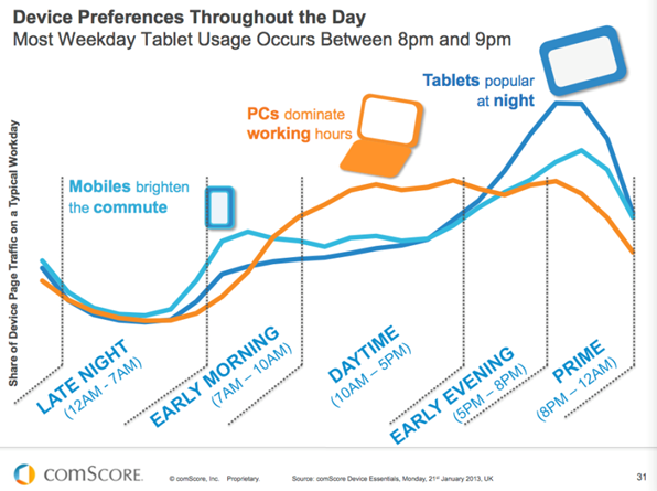
If you’re looking to talk to anyone aged 18 to retirement, you’ll want to make sure all of your social posts between 7 a.m. and 10 a.m. and 5 p.m. to 8 p.m. are mobile friendly. What does mobile friendly mean here? Short posts (less than 100 characters) with links to pages that are responsive and easy to use while on a smartphone. Why? Because commuting hours see the highest number of mobile internet users and you want to optimize for any potential conversions.
During work hours, on the other hand, most people are on desktop, following their own industry news and taking a couple five to ten minute breaks. Give these users content and links that provide useful, actionable information or offer a quick, convenient method to purchase. Retargeting here works well.
Responsive Might Not Be Enough for Ecommerce
Yes, Google now basically requires it for you to rank on mobile search and it is certainly wise for your ecommerce site to indeed be responsive. After all, even during work hours people are using their phones to shop (we are all innocuous shoppers), and you don’t want to lose out on a sale simply because your site wasn’t convenient for a mobile browser.
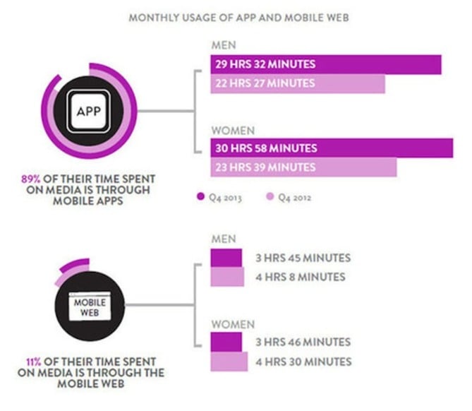
That said, mobile app usage far outpaces mobile internet usage and it’s ideal for your ecommerce site to be both responsive and either have an app or be included in an app.
There are multiple services that can help your brand create a mobile app quickly. Of course, there are also marketplace apps, if you will, that function much like the online marketplaces you are familiar with including eBay, Amazon and Etsy. These mobile marketplaces include apps like Shopkick, on which brands including Walmart, Crate & Barrel, Macy’s and more already have a presence.
In other words, whether your create a branded mobile app or join a marketplace, having a presence in an app increases the possibility for mobile conversions and can help prove the business case for staying mobile-focused first.
To wrap up, responsive design is incredibly important not just for ecommerce sites, but for all sites on the web. Finally, we are moving away from creating one-stop-shop websites that function only on one device, browser or the like. The internet’s purpose has always been to democratize information –– and now, its helping ecommerce businesses democratize their product offering across possible touchpoints.


![Why You Need a Responsive Web Design and How to Do It [+ Examples]](https://blog.hubspot.com/hubfs/responsive-web-design-1.jpg)


![The Definition of Responsive Design [In Under 100 Words]](https://blog.hubspot.com/hs-fs/hub/53/file-597040093-jpg/Blog-Related_Images/Homepage_Images/responsive-design-1.jpg)