Good things happen when you create killer calls-to-action. I would even argue that your website can't be successful unless you produce great calls-to-action.

The ideal CTA, however, isn't always easy to think of. Sometimes, you need a little nudge in the right direction.
If you're sick of "click now" CTAs that aren't working, improve your game with these surefire call-to-action formulas.

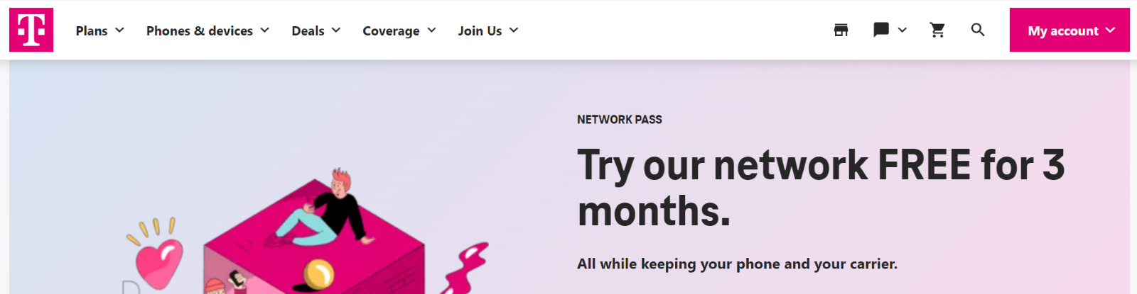
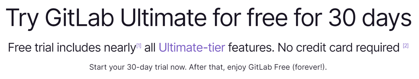
1. Try it free for [TIME].
The word "try" is a soft term. It implies little risk. For this reason, it can be extremely effective, especially for downloadable products or apps.
Many SaaS companies or service providers use this CTA. Here's an example from T-Mobile:
Take a look at another powerful example from GitHub:
2. Get started now.
This phrase is a simple and short CTA. It's a great choice if you have limited space in your CTA button but want something that makes an impact. A user can get started on a sign-up process, download, or something similar. Be sure to set the context in the remainder of your CTA so a user knows what they're starting.
Here's a CTA that prompts users to get started with ClickTime's time-tracking software:

3. Order your [PRODUCT]/shop today/now.
The word "today" is similar to the word "now." Remember, instant gratification is a universal appeal for just about any CTA. If you are promising something today, it's much more likely to produce action.
Here is a perfect example from Away Travel:

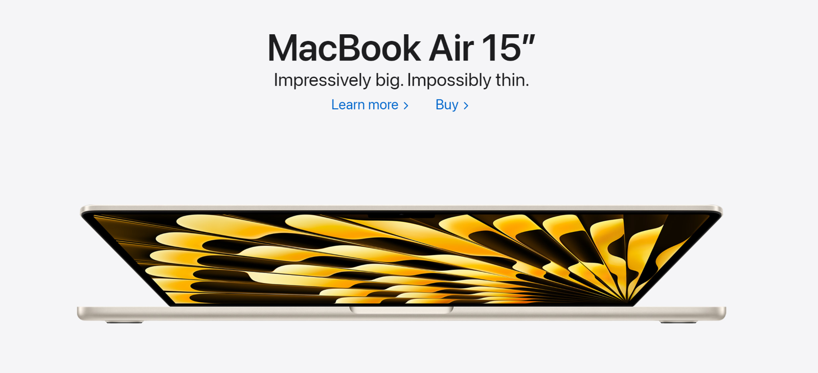
4. Learn more.
This classic CTA is short and direct. It appeals to one of the most fundamental of all internet users' needs: the desire for information.
A learn more CTA works best if you have an informational product or a multi-step funnel that informs users before asking for the sale.
Here's an example from Apple:
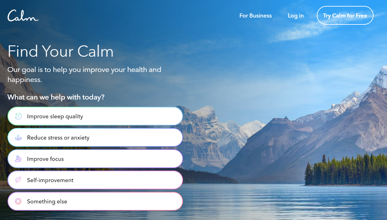
5. Sign up for a free [trial, membership, etc.].
This isn't quite as strong as the immediate benefits promised by the other CTAs, but it is a great technique nonetheless.
The power of the CTA is in that single word: free.
Meditation and sleep app, Calm, uses this exact CTA on their site:
6. Start your free trial now.
This variation on the CTA above adds the word 'now' to put sizzle in the action.
We can see it used here by Sparkyard, a digital learning platform:
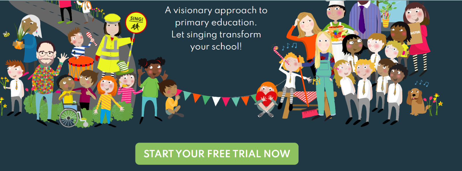
I prefer the "start now" approach because it appeals to the desire for instant gratification. Although a concept like "sign up for a free trial" works, it's not nearly as direct. If you use the phrase "sign up", users may expect a period of delay.
7. Send me the [PRODUCT/SERVICE] right now.
Notice the word "me." First-person CTAs use words like "me," "my," and "I." They are powerful because the user feels a sense of connection to the concept.
This CTA relies heavily on the first-person and tends to invoke a sense of urgency. "Right now" reinforces this concept.
8. Get [BENEFIT OF SERVICE] today only.
This CTA makes an impact because of the "today only" phrase. Using that phrase promotes a sense of scarcity and may be just the thing to convert a site visitor who is on the fence about converting.
Also, don't gloss over the benefit of your product or service. When you explain the direct and positive result that your product can have — or the exact problem it can solve — people are more likely to respond favorably.
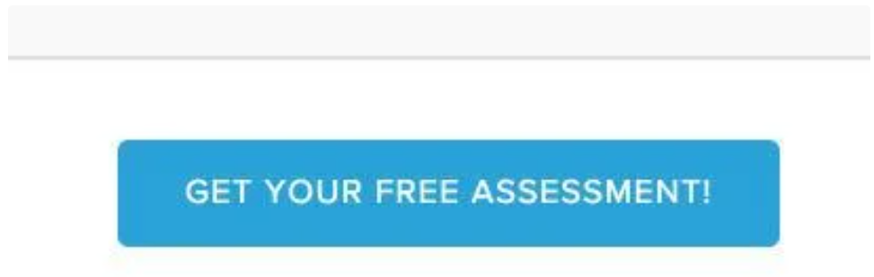
9. Get your free [SOMETHING].
The power of "free" as an adjective is on full display in this short-and-sweet CTA. Obviously, you'll need to offer something free, but it shouldn't be hard to come up with an ebook, webinar, trial, or some other benefit that encourages users to convert.
For instance, HubSpot offers complimentary assessments to marketing professionals. Here's the CTA:
10. Subscribe now.
It's common but still effective.
Some of the best CTAs are just like that — short, sweet, and to the point. You don't need to say a lot to get the user to do a lot.
Ideally, most of your persuasion has happened in your accompanying copy rather than in your CTA button. With the stage set, a straightforward two-word CTA should do the trick.
11. See how it works.
This CTA uses more of a discovery-oriented approach and can be very effective. The term helps promote curiosity and reduces much of the risk associated with more vague CTAs like "buy" or "subscribe."
"See how it works" is like taking a car for a test drive. It's easy, fun, and risk-free.
This CTA works best for SaaS. Check out the example below to see what I mean:

12. Talk to us.
This is slightly more compelling than "contact us." You can see an example of this on Onclusive's homepage:

13. Experience the benefit of [PRODUCT/SERVICE].
"Experience" is a sensory word. When you use this term in conjunction with an emotional benefit, you've got a powerful CTA on your hands. This is an example from IMRCorp.com:
Make sure that you provide a highly desirable benefit of the product or service. This CTA will only be as effective as the benefit you attach to it.
14. Get [DISCOUNT] while supplies last.
Increasing urgency is a proven tactic for increasing the likelihood of a user's action. If you can boost the user's sense of time or supply — limited, running out, etc. — then you will increase their desire and need to click the CTA.
Print ads use this phrase in mailers and newspapers.
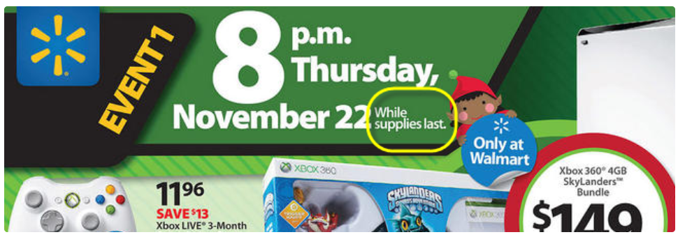
It works equally well as a stand-alone CTA button.
15. Get [PRODUCT/SERVICE] today, and get [ADDED BONUS OR BENEFIT].
Throw in a free something, and your conversion rates are sure to rise. Adding an additional benefit on top of the CTA allows you to increase motivation.
16. Only [NUMBER OF AVAILABLE PRODUCTS OR SPOTS] available. Lock in your order now!
Limiting anything is the best way to increase its potential power.
For example, if you're holding a virtual webinar or event, let your audience know that there may not be enough spots for everyone.
There's a psychological impact to this technique. When you limit availability, you raise the perceived value of the product or service.
What makes a CTA work?
The formulas above are great examples of how you can drive conversions on your website, but they're not the "be all, end all" of CTAs. Ultimately, the goal of a CTA is to grab your site visitors' attention — and there are a limitless number of ways you can do that.
It's important for you to grasp the general principles of what makes a CTA work. As the old saying goes, "Give a man a fish, you feed him for a day. Teach a man to fish, and you feed him for a lifetime."
Many marketing experts will place importance on the shape, size, and color of your CTA. While those do help conversions to an extent, they're not as important as ensuring your CTA urges visitors to action.
When crafting your CTAs, think about these key points:
- Why are users visiting your site?
- What specific problem do they have?
- What solution are you providing to solve it?
Keep this formula in mind as you write: problem + solution + action.
Generating your own unique CTAs is a great way to stay ahead of your competition and stand out in the crowd. If you consider these questions and stick to this formula, you'll have other companies in your industry coming to you as the CTA master!
Using AI to create CTAs
Since the creation of platforms like ChatGPT, many marketing experts are using AI to improve their efforts. Many are having success with the platform, but — like with all new technology — it makes sense to proceed carefully during the early stages.
There are still many things we don't know when it comes to the limitations of AI platforms. And while they can be useful in helping you create effective CTAs, you need to be aware of some of the shortcomings and disadvantages of AI marketing and ensuring you're always editing or proofreading the AI's CTA.
There are endless options for creating an ultra-compelling CTA. How do you pick or create the right one?
The solution to finding the perfect CTA is not to randomly try everything on this list. The solution is to sequentially test the CTAs that are most likely to impact your conversions.
CTAs are the powerhouse of your website's conversions. Weak, ineffective, and cliché CTAs will give you low conversion rates. Pick one or two from this list, test them, and watch your conversions rise.


![How the HubSpot Blog Generates Leads [+ How Yours Can, Too]](https://blog.hubspot.com/hubfs/17_Lead%20Generation.png)

![28 CTA Templates to Design Clickable CTAs in PowerPoint [Download]](https://blog.hubspot.com/hubfs/cta-template.jpg)

![What is a CRO Test? [+ the 5 Steps to Perform Them Yourself]](https://blog.hubspot.com/hubfs/conversion-rate-optimization-tests_4.webp)

![How to Add Slide-In Calls-to-Action to Your Blog Posts [Tutorial]](https://blog.hubspot.com/hubfs/Slide-in_CTAs.webp)