
Have you ever spent a big chunk of time analyzing your marketing data, only to realize partway through that you didn't approach the analysis correctly? This happens to me from time to time, and trust me -- I know how frustrating it can be. I find myself wishing I could go back in time and warn my past self about the mistake so I could avoid losing all those hours.
Trial and error is the nature of analysis, though. When we're combing and manipulating data in search of an unknown answer, we're bound to approach our analysis incorrectly sometimes.
But you never have to start from scratch. Most of the time, there's someone out there who's done an analysis similar to the one you're hoping to do. Wouldn't it be nice if you could learn from their mistakes so you didn't have to make them yourself?
That, my friends, is exactly why I've written this blog post. In this post, I'll cover 10 common analytics mistakes marketers make and what you can do to avoid them. Check 'em out so you won't have to waste precious hours of your day doing these types of analyses the wrong way.
10 Analytics Mistakes You Can Learn to Avoid
1) Thinking low numbers are always a bad thing.
When you see a low number in your marketing analytics, your gut reaction might be, "Oh no!" After all, low numbers for things like traffic and leads can be cause for concern. But don't let your gut fool you: A low number doesn't always mean a bad thing.
For one, there are certain metrics where low numbers are actually really good. Do your emails have a decreasing unsubscribe rate? That means your email content is more appealing to your audience. Is your customer acquisition cost going down? That means that your marketing efforts are becoming more efficient. Don't assume that a low number means you or your team is not successful.
Secondly, low numbers can sometimes be the best teaching tool by highlighting a marketing channel that isn't working. While this information may be frustrating, it's also very telling -- and something you can learn a lot from. Knowing this might guide you to focus your efforts better by investing more in other marketing channels, campaigns, or efforts.
For example, let's say you're analyzing how well your social media channels are performing. When you dig into the analytics, you find you're getting a good amount of traffic from Twitter, Facebook, and LinkedIn. But once you look at the conversion rates ... uh oh. You see that Twitter has the lowest conversion rate from visitor to contact, and Facebook has the lowest conversion rate from contact to customer:
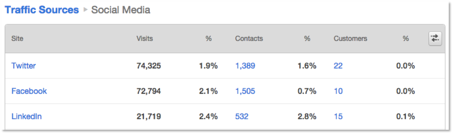
If your goal for your social media efforts is driving customer conversions, the low number of 0.7% for Facebook tells you that it isn't your most effective channel. For your company, LinkedIn is four times as successful in driving customer conversions than Facebook. Even though this is a low number, it's a great opportunity for you to reinvest your marketing efforts in LinkedIn instead of Facebook.
2) Confusing correlation with causation.
At times, you may have seen two metrics increase (or decrease) at the same time -- maybe even at the same rate. At first glance, you may think that these metrics moving together indicates that they are directly correlated with each other. But be wary: This can be extremely misleading. It's entirely possible that the metrics were totally unrelated.
Take a look at the Google Trend chart below, which shows the number of times the terms "inbound marketing" and "yoga workout" were searched on Google over the last few years. See how both lines are moving up and to the right at roughly the same rate?
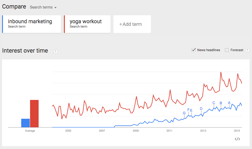
If you didn't know the two terms prooobably weren't related, you might mistakenly think their similar increase in popular was related and that causation played some factor. But, of course, they aren't: Correlation does not imply causation.
As you look at your metrics, you'll certainly want to look for places where one metric caused another to increase or decrease. But don't blindly assume that two metrics that increases and decreases are related -- you'll have to dig further to determine whether or not that's true.
3) Confusing visits with views (and vice versa).
Visits and views may sound similar, but they're actually quite different. Every marketer should know the difference off the top of their head, but it's especially important for those of us dealing with visit and view numbers on a regular basis.
A visit is when a website visitor comes to your website from an external URL. In Google Analytics, the visit ends after a user is inactive for 30 minutes or more -- and only one visit is attribuetd even if a person goes to multiple pages on your site while they're there. In other words, one visitor can accrue multiple pageviews during one visit. In HubSpot, the visit ends when someone leaves a domain by visiting an external site or closing his or her browser. (Click here to learn more about the differences between Google Analytics and HubSpot.)
A pageview (in Google Analytics) or a view (in HubSpot) is counted when your page is loaded or reloaded by a browser. It's counted based on the number of times the tracking code on your website pages are reloaded. If someone comes to your website and visits five pages before leaving, they will count as one visit but five views.
(For clarification on more web traffic terms, read this blog post.)
4) Confusing leads with marketing qualified leads (MQLs).
While we're on the subject of mixing up marketing terms, here's another common one: leads versus MQLs.
A lead is anyone who's filled out and submitted a form from one of your landing pages.
A marketing qualified lead (MQL) is a lead judged more likely to become a customer compared to other leads based on lead intelligence. What makes a lead "qualified" varies from company to company, but it could be someone who has requested a demo a sales consultation. An MQL typically makes it known that they're not just curious in your product or service, but actually interested in potentially buying your product. A clear definition for what constitutes an MQL is a critical part of aligning your sales and marketing teams.
When you do your reporting, it's really important to keep these buckets separate. Why? Because the content and marketing channels your team uses to nurture a lead may be very different than what they use to nurture an MQL. For instance, leads might receive more educational material and only some preliminary information about your company, while MQLs might receive information about how your offering relates to their interests.
5) Bucketing all traffic together.
Traffic to your website comes from multiple channels, including organic search, referrals from other websites, direct traffic, paid traffic, email marketing, social media, and more. But not all traffic is created equal -- and it shouldn't be treated that way.
If you have 1,000 visits to your website in a given month, you should always break that up into smaller pieces representing different marketing channels. What percentage came from organic search? How about email? How is that number and percentage increasing and decreasing month-over-month?
Knowing these specific numbers will help you understand where to invest your time and resources. If social media generated traffic to your website that converted into leads, it's a good indication that you should continue to invest in your social media efforts. If your email marketing generated few visits and had an even smaller conversion rate, you may want to slow down on email and invest more in the channels that are generating traffic and conversions.
6) Choosing the wrong types of graphs to communicate your results.
Data visualization is a powerful way to communicate your results to your team or your audience. But if you aren't visualizing your data properly, then you won't just confuse your audience -- you could mislead them entirely.
There are many ways to mess up your data visualization, but a common one is using the wrong type of graph or chart to represent your data. Are you trying to show the progress over a period of time? Use a line or bar graph. Trying to show how many people in your customer base are from different geographies? You probably want to use a pie graph. But if you were to use a pie graph to show progress over a period of time ... you'll have people scratching their heads.
Before you create a graph and send it to others, think about the ultimate goal for building it in the first place. What do you want to communicate? Are you measuring something over a period of time, or measuring parts of a whole? Thinking through these questions ahead of time will help you avoid any redos.
(For more on creating charts and graphs in Excel, read this blog post.)
7) Comparing data points unnecessarily.
In the marketing analytics world, it's critical that you compare apples to apples and oranges to oranges. The hard part is knowing what's an apple and what's an orange. But even if one of your web pages is getting higher traffic than another one, or one of your CTAs is seeing higher conversion rates than another one, that doesn't mean it makes sense to compare them to each other.
For example, let's say you have 200 visits to a web page from email marketing, and another 150 visits to that same web page from mobile devices. Does that mean you should be invest more in email marketing and not as much in mobile marketing? No, it doesn't. Email marketing and mobile marketing are very different: While email marketing is used to deliver a message, mobile marketing is the device used to deliver that message. Many of us open our emails through our mobile devices, so it isn't a good idea to compare the two channels since they work hand-in-hand.
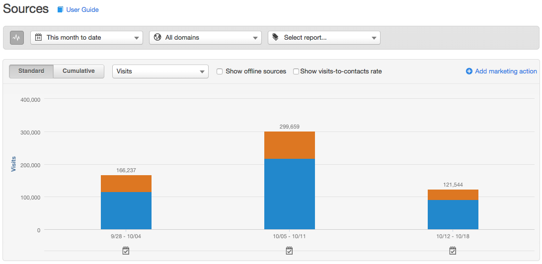
If you want a marketing channel to compare email marketing to, you can use direct traffic, organic search, or paid. Take a look at the graph below. The orange represents email marketing, and the blue represents direct traffic. These are metrics that you can compare against each other to help you decide where to invest your marketing resources.
8) Counting internal website visits toward your goal.
Every day, many people from your own company visit your website -- whether they're reading a blog post, seeing how an image looks on the homepage, or just browsing around. Even though they're part of your company, they may still count as traffic coming to your website unless you specify otherwise. This can be very deceiving as you're analyzing not only the amount of traffic coming to your website, but where that traffic is coming from. Most people at your company will come from direct traffic since they know what page they are looking to go to.
To avoid skewing your data this way, you'll need to exclude your IP address. If you're a HubSpot customer, here are instructions on how to do this. If you're not a HubSpot customer, you'll need to get instructions from your software provider.
9) Equating more time on a page with higher engagement.
The general wisdom used to be that the longer a person spent on a web page, the more engaged they were with your content and company. But the more we've all learned about user experience, the more we've found that this is not usually the case. If a website visitor remains on your page for a long period of time, it could actually mean they're having trouble finding what they are looking for -- meaning you have a UX issue to address.
For example, let's say someone arrives on your home page looking for one of your landing pages. They scroll through the navigation, but don't see any option to read content. So they scroll down the page they're on and, lo and behold, they notice a few links to what seem like content offers! But after opening those pages, they still haven't found what they're looking for. So they return to the home page and scroll down some more, reading all of the various links and calls-to-actions. At this point, they've spent a good couple of minutes on your page, but they're ultimately dissatisfied. They've wasted time and still haven't found that darn landing page. This is an example of someone spending more time on a page, but not being more engaged with your content.
So if you see visitors are spending long periods of time on some of your pages, don't just assume they're loving the content. Dig in -- and conduct user testing if you can -- to see if people are actually engaged with your content, or if it seems like they're just having trouble finding what they're looking for. You don't want to scare away people who can't find the right content, and you'll want to fix that UX issue so you don't lose potential leads.
10) Not pulling actionable takeaways away from your data.
The sad truth is, many marketers pull data for the sake of pulling data they can report to their team or their boss.Throughout the month, they report on where their traffic is coming from. At the end of the month, they report on the number of leads generated. At the end of the year, they report on the revenue generated from various marketing efforts.
The biggest mistake marketers make, though, is not pulling actionable takeaways from that data. If you're running a campaign, and halfway through the campaign you see the efforts on social media are effective but the efforts on email marketing are not, you should readjust your efforts so you're investing a significant chunk of time beefing up the social media side. Switching gears while running a campaign is more than okay -- in fact, it's encouraged.
While you report to your team or to your managers about your marketing efforts, pull out the actionable next steps you can take as a result of the data. If you aren't pulling data for that purpose, it isn't worth pulling the data at all.
What are other analytics mistakes you wish you knew about sooner?


![A Simple Guide to Marketing ROI [Formula & Examples]](https://blog.hubspot.com/hubfs/a-simple-guide-to-marketing-ROI.webp)