 The smartphone revolution is here and your organization cannot ignore it. 83% of Generation Y respondents to a recent study said they have smartphones. And according to StatCounter Global Stats, global mobile traffic represents 13% of internet traffic, up from just 1% in 2009.

You do not want to ignore this channel of increasing traffic.
When thinking about your nonprofit’s website and how these Millennials are interacting with your organization, do not forget the mobile experience. Try to avoid these six problems when redesigning or updating your nonprofit's website.
Problem #1: I don’t understand what your organization does.

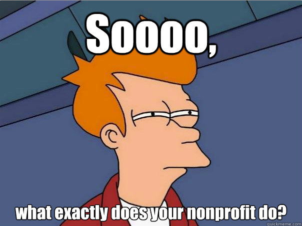
Solution: Even if your site is mobile responsive, which means it adjusts itself to fit the screen of any mobile device or tablet, communicating what you do to your visitors should be a top priority. Having a captivating image and a short text overlay of your mission statement is a great idea for space above the fold (what you see first without scrolling down) of your website. The text should be short and sweet (i.e. the length of a tweet).
Just because your current consitutents and your staff know what your organization does, doesn’t mean you should ignore stating the obvious for your new visitors.
Problem #2: I can’t easily find how my donation will impact the mission.


Solution: Below your mission statement on your homepage, or at least as one of the first tabs in your navigation, should be an explanation of what a donation would do for your mission. This could be as simple as equating a dollar amount to something tangible.
Or, you can show highlights of your impact from previous years. If you have fundraisers or volunteers, share their stories, or record one for a video, and feature it on the homepage. Make sure to include how that individual's contribution impacted something specific. If you have project sites across the country or the world, use Google Earth Outreach, which allows you to create a map of your project locations with Google Maps and embed it on your website. This is a great way to show physical proof of your organization's work.
Problem #3: You’re asking me to donate before you tell me what your organization does.

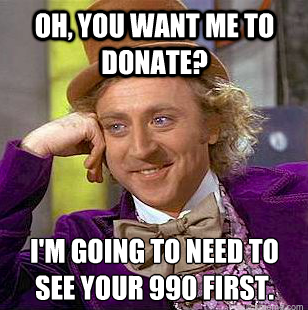
Solution: You wouldn't ask someone to marry you on the first date, so why ask someone to donate before giving them more information about your organization? Priming your new audience with content about you and even your supporters is a great way to break the ice. Feature stories from your blog on your homepage to keep your content up to date. Keep your donate button in the top navigation or under a tab called “Ways to Give.” But don’t have it be the first thing people see when they view your site on a mobile device.
Problem #4: I can’t find your About Us page easily.


Solution: Have your About Us page be the first tab in your navigation. Remember, not all of your visitors know about you. What if they're coming from a link on, say, your friend's social media profile? For any new traffic, it’s the first place your new visitors want to go to learn more about your organization, staff, and board members.
Problem #5: The information you do provide about your organization isn’t legible.

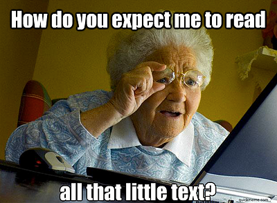
Solution: Whether your website is mobile responsive or not, make sure your text is big enough to read. There are a number of products that allow you to adapt your current website to fit all mobile devices to minimize this problem. If visitors can't read about your mission, how are they going to be able to understand what you do and how they can impact your mission?
Problem #6: When you do give me information, you’re overloading me with text.


Soluton: Make sure your content is easy to scan. Blocks of paragraphs turn visitors off and are usually never read in full, anyway. Make the content on your homepage short, sweet, digestible, and even visual (with images or videos). Try to break down the important points into bullets to engage vistiors faster.
Has your organization taken the next step to optimize your website for mobile?
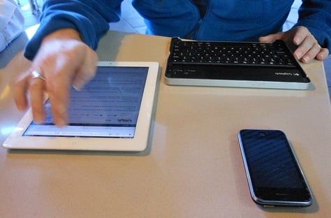
Image credit: mikecogh

![10 Best Mobile Friendliness Tests [+ What Does it Mean to be Mobile Friendly?]](https://blog.hubspot.com/hubfs/mobile-friendliness-test.jpg)


![The Marketer's Guide to Mobile [Free Kit]](https://blog.hubspot.com/hubfs/Mobile%20Marketing%20Guide.jpg)
![How & When People Use Their Favorite Devices [Infographic]](https://blog.hubspot.com/hubfs/multiple-screens.jpeg)
![How Internet Behavior is Changing Around the World [Infographic]](https://blog.hubspot.com/hubfs/internet-behavior-shifts.jpeg)
![The State of the Mobile Experience: How People Use Their Phones Today [Infographic]](https://blog.hubspot.com/hubfs/00-Blog_Thinkstock_Images/Mobile_Experience.jpeg)