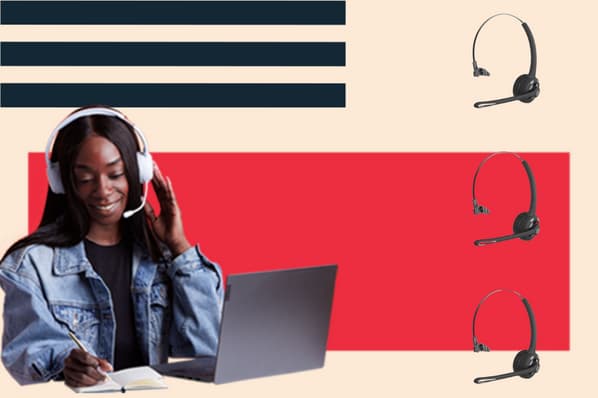
Take a look at the two sales proposals below. If you had to send one to a client right now, which one would you choose?

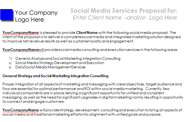
Image source: SocialMediaProposal.com
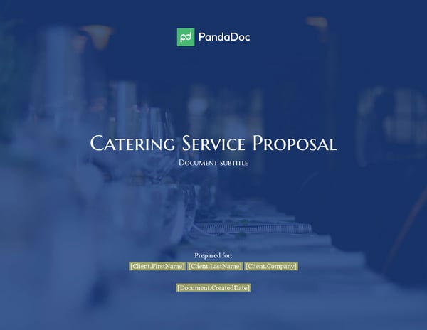
Image source: PandaDoc
If you’re leaning towards the one on the bottom, you’re not alone.

Nothing is certain in this life except death, taxes, and that every client in the world would prefer to receive the sales proposal on the right. Here’s why:
The sales proposal on the bottom looks nicer because it employs the design principles of balance, emphasis, and scale.
Never heard of ‘em? That’s alright with us.
We’re going to break down these three design principles for you. Our end goal is simply to empower you and your sales team to tactfully apply them in some way, shape, or form the next time you create a contract and get it signed.
Fire up ye olde Netflix and stream The Joy of Painting with Bob Ross, because we're getting artsy-fartsy up in here.
Balance
Images in your design carry weight. Of course, we can’t physically feel how heavy they are, we’re talking about visual weight. To keep things balanced, think of your document as a playground and your design as a seesaw. If one side is too heavy, it’ll pull the reader’s eye directly to that heavy part.
The image below is a perfect example of this.
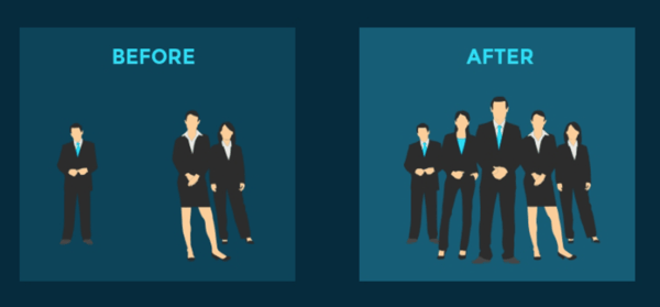
Image source: Visme
In the “before” design, the seesaw is unbalanced. All of the weight is on the right side of the page, and the guy on the left is hardly noticeable.
In the “after” design, the seesaw is balanced. It’s living its best life in seesaw equilibrium. It isn’t tipping one way or another because the visual weight of the images is the same on both sides.
Got it? Good. Although, the documents you’ll be designing will probably include fewer people and more words, so let’s see what that looks like.
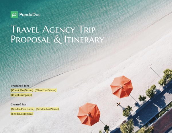
Image source: PandaDoc
This is the grown-up version of our seesaw example. It goes on wine tastings, just refinanced its student loans, and never runs out of toilet paper. It also knows that balance can be achieved through asymmetry.
“Wait, what?” you ask, “Isn’t asymmetry the opposite of what we just talked about?”
Short answer: No.
Asymmetrical images are the opposite of mirror images, they move beyond the concept of visual weight. Instead of seeing a reflection of weight (like we did in the first example) you see something that evenly distributes elements, like color, size, thickness, or white space.
This means that the visual weight of three smaller objects can offset the weight of one larger object. For instance, if a mama panda were sitting on one end of a seesaw, her weight would be offset if her three baby pandas sat on the other end. This is because balance with asymmetry has been achieved.
In the visual above, think of the broad stretch of ocean with text as the mama panda, and the two umbrellas and shady tree-lined boardwalk above as her babies. The brighter colors and use of shading carry more weight than lighter colors, which is why the image still looks balanced even though water and text take up more real estate on the page.
Emphasis
(Featuring Bob)
You want to grab your client’s attention the second they open your document.
Our second design principle is pretty self-explanatory. In fact, it’s something you’ve probably used before in the form of bold text, underlined headings, or italicized quotes. You can easily make your point with words, but how do you emphasize the importance of an image?
The example below should answer that question.
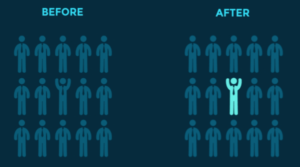
Image source: Visme
Adding emphasis to an image creates a focal point. It grabs your client’s attention and uses its outdoor voice to say, “Hey, look over here!” without overpowering the rest of the design (i.e., unbalancing the seesaw).
Check out the guy in the “after” design, let’s call him Bob. He’s in the center. He’s a contrasting color. His arms are reaching for the sky. He is excited.
He is your focal point.
Now let’s visit the cool aunt version of the example above.
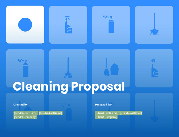
Image source: PandaDoc
Here’s an example of emphasis that employs a few different techniques.
If you’re in need of a quick way to emphasize a point within your design, it’s easy to cop to contrasting colors. They certainly do the job. Just look at our last example, the most striking difference between the “before” and “after” designs was coloring in Bob.
But using contrast to draw emphasis to your design isn’t limited to just light vs. dark (value contrast). It can bleed over into contrast between hues, saturations, patterns, and textures, as we see in the cleaning proposal above.
The emphasized point is the bright white tile with the bold circle, instead of the hazy blue tiles with thinner cleaning supply images. Your eye is drawn to the white, which is carried into the title of the proposal. Your client knows where to look in the document. We suggest you start workshopping a witty reply when they ask, “who’s your graphic designer?”
Scale
The old adage, “Size matters,” is still true. In the design corner of the world, size is king.
Scale is the sizing of elements and is sometimes referred to as a standard of measurement.
It’s a simple and effective way to draw greater attention to select images and text. It’s why I’ve chosen to use different font sizes in this article, and why headlines in a newspaper appear in larger fonts, too. Something to keep in mind when creating your next contract is that the larger the image or text, the stronger the message.
Another element of scale is accurately sizing images. You might’ve heard the phrase “drawn to scale”. Not exactly sure what that means? The image below helps visualize the saying.
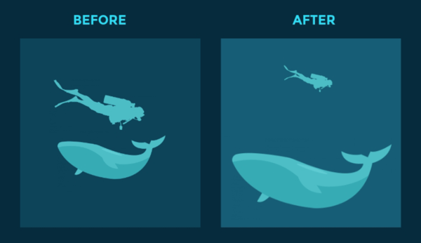
Image source: Visme
Whales are not the same size as people.
The “after” design corrects the depiction of human- to-whale ratio as seen in the “before” design, per the request of one insulted scuba diver.
The fundamental takeaway from this principle is that a single object, no matter how large or small, or of human or whale variety, has scale until it is compared to another. Using multiple images allows us to create balance in the design and focus on dominant elements, in this case, the whale.
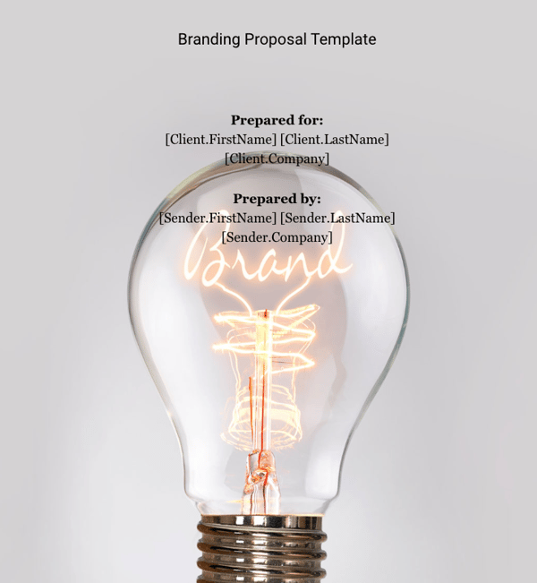
Image source: PandaDoc
Scale gives way to depict objects as larger than life, or bring a large object down to fit on a piece of paper.
Take the image above, for example.
The “brand” light within the bulb is the focus. Imagine if the “brand” text were smaller, the design wouldn’t be nearly as effective. The proposal text itself is even taking a back seat to the light bulb, a perfect example of using scale to draw focus.
As a salesperson, your job isn’t to meticulously design every single document your organization uses. Your job is to get deals signed and meet revenue quotas.
But, just because you’re focused on the green, doesn’t mean you can’t add some color to conversations with the creatives at your company and close more deals in the process.
If you’re still holding onto the narrative that you suck at art and there’s no way you could ever design a good looking document, take a deep breath and ... KISS?
“Keep it simple, stupid.” This sassy saying is loosely translated as ‘less is more’ in design speak. You can think you suck at art and feel like imposter Picasso while KISS-ing. In fact, the design principles of balance, emphasis, and scale support the very notion of keeping it simple.
A single flower, a BIG word in the center of the page, or a bright pop of color is all you need to seal the deal with a KISS.
By keeping balance, emphasis, and scale in mind, you can now look at a document’s layout and discern whether there’s an effective or ineffective use of design principles, and start sending contracts with style.
At the end of the day, if you take away nothing at all from this article, always remember to: Seal the deal with a KISS
Design a proposal that will close and integrate PandaDoc with HubSpot today.


![Confused About I.E. vs. E.G.? When to Use Each [With Examples]](https://blog.hubspot.com/hubfs/ie-vs-eg-fi%20%281%29.jpg)