ARIA accessibility enables web authors to describe UI components in ways that assistive technologies can understand, making them accessible to assistive technology users. Let's explore what ARIA is and how it improves web accessibility.

Ideally, the internet should be for everyone. But certain functionality used in websites is not available to some users with disabilities, especially those who rely on screen readers and those who can’t use a mouse.
The problem? HTML.

The previous version of HTML — HTML4 — lacked tags that semantically described certain user interface widgets, like sliders, menus, and progress bars. As a result, developers resorted to using generic elements like “div” to create these widgets. While they looked fine to users who could view the screen, they were problematic for users who couldn’t.
.png)
Website Accessibility Checklist
This checklist will help you make the following more accessible on your website:
- Web Pages
- Navigation
- Video & Media
- And More!
What is ARIA?
ARIA — short for Accessible Rich Internet Applications — is a set of roles, states, and properties which can be added to HTML to describe the meaning and purpose of common user interface elements that don’t have semantic tags in HTML. By supplementing HTML in this way, ARIA attributes make web content and applications more accessible to people using assistive technologies.
For example, ARIA provides roles like “checkbox” and “menu” to describe the type of widget being presented. ARIA also provides properties to describe the state that widgets are in, like “checked” for a checkbox or “haspopup” for a menu.
Because ARIA controls the rendering of assistive technology users’ non-visual experience, the W3C Web Accessibility Initiative (WAI) says that, functionally, ARIA roles, states, and properties are like CSS for assistive technologies.
Now that we understand what ARIA is, let’s go over how to use ARIA to make your site’s underlying HTML more accessible.
ARIA Accessibility Guidelines
Before using ARIA, it's important to take the time to understand and apply the ARIA accessibility guidelines below. These are based on the guidelines provided by the Accessible Rich Internet Applications Working Group of the WAI in the Authoring Practices 1.2 specification.
1. Use native HTML elements when available.
ARIA was designed to fill a gap in HTML4. However, many semantic tags were later added in HTML5. Web authors should always prefer using the correct semantic HTML element over using an ARIA role, state, or property.
For example, web authors should use the HTML5 <nav> element instead of the adding the ARIA role=”navigation” to a div element.
2. Meet the user’s expectations of a given ARIA role.
The first guideline is simple: if you use an ARIA role, you need to ensure it behaves like the user expects. For example, if you add a <div> element and define its ARIA roles as “button,” then you need to incorporate the JavaScript necessary to provide the keyboard interactions expected for a button.
3. Use ARIA to add — not take away — accessibly semantics.
Assistive technologies need certain information to derive the meaning and purpose of user interface elements. This information is known as accessibility semantics.
When done right, ARIA provides accessibility semantics. When done wrong, it overrides accessibility semantics.
ARIA can provide this required info in two ways: by cloaking the original content or by adding meaning to it. For example, let’s say you have a navigation menu with several menu items. These items each represent and are linked to an important page on your site so that users can click on one of those items — like “About” — and be taken to that corresponding page.
In HTML, these navigation items would be anchor or <a> elements. But to convey to assistive technologies, and those using assistive technologies, that these are menu items and not links, you’d add the ARIA role “menuitem.” This would cloak the original semantics in order to make the HTML more accessible to assistive technology users.
ARIA can also enhance the original content to describe a user interface component in a way that assistive technologies understand. For example, the aria-expanded attribute conveys that a menu is not just a menu, but an expandable one.
The power of ARIA is also its danger. Web authors can override accessibility semantics when using ARIA incorrectly. For example, if a web author created a table element and then added the ARIA role “log” to it, assistive technology users would not be able to perceive it as a table.
Website Accessibility Checklist
This checklist will help you make the following more accessible on your website:
- Web Pages
- Navigation
- Video & Media
- And More!
ARIA Accessibility Examples
The WAI provides a whole suite of web standards for using ARIA in HTML. There are dozens of roles, states, and properties available for defining accessible user interface elements, including:
- Alert and message dialogs
- Breadcrumbs
- Buttons
- Carousels
- Grids
- Links
- Menus, menu bars, or menu buttons
- Sliders
- Tables
You can find examples for any of the elements above in the WAI Authoring Practie 1.2 specification. Below we’ll limit our focus to three elements: an alert, button, and listbox. The first will show how to use an ARIA role. The second will show how to use ARIA states, and the third how to use ARIA properties. Let’s take a look at these examples below.
ARIA Role Example
In this example provided by the WAI, the alert button — when clicked — triggers a message.
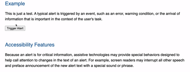
In the HTML below, you can see the button element followed by a div element with an ARIA role set to “alert.” This role identifies the div element as the container where alert content will be added or updated.
ARIA State Example
In this example provided by the WAI, the button is an accessible toggle button that can be either off or on. When this specific example button is pressed, the icon changes from a “sound on” to a “sound off” icon.
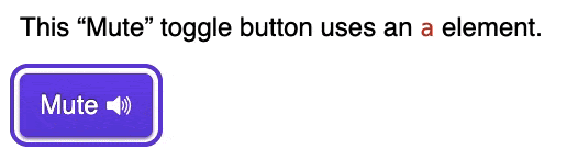
In the HTML below, you can see an ARIA role and two ARIA attributes being used. The ARIA role identifies the anchor element as a button widget. Because it’s a toggle button specifically, it has an aria-pressed state. When the button is toggled off, then the value of the state is false. When the button is toggled on, the state is true.
The other aria attribute — aria-hidden— is applied to the SVG file. Set to “true,” the aria-hidden attribute removed the SVG element so screen readers don’t read it out. Since this icon is purely decorative, removing this element can improve the experience for assistive technology users.
ARIA Property Example
In this example provided by the WAI, the listbox is scrollable and allows the user to select one item from a list of choices.
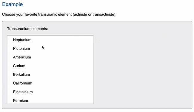 In the HTML below, you can see two ARIA roles and and an ARIA attribute. The ARIA role set to “listbox” identifies the unordered list element as having listbox behaviors and containing the listbox options. Every list item has an ARIA role set to “option,” which identifies each selectable element containing the name of an option.
The aria-labelledby property is set to the same value as the id name of the span element, which contains the listbox label. This provides the assistive technology user with a recognizable name of the object.
Adding Necessary Semantics with ARIA
Understanding and using ARIA roles, states, and properties in your markup can help you create websites with complex user interface elements that are accessible to all users, including those who rely on screen readers and those who can’t use a mouse. Once you’ve gotten down the basics of ARIA, you can start following other web accessibility guidelines to make your site fully compliant.


![Best Fonts for Accessibility and Visually Impaired Users [ADA-Compliant Fonts]](https://blog.hubspot.com/hubfs/ada-fonts.jpg)
![10 Most Common Website Accessibility Issues [+Examples]](https://blog.hubspot.com/hubfs/accessibility%20issues%20.jpg)