When creating a digital product, you have to structure your content and functionality in a way that users understand. Users should be able to quickly and easily find the information they’re looking for — the practice of organizing content this way is called information architecture.

Making information easy for visitors to find is more than just good website navigation — though that’s a major part of it. It’s about the entire structure of your site: what information displays on the homepage, where your product catalog is, how users access it, and so on.

So, don’t base your website’s content structure on guesswork. In this post, we’ll take a deep dive into information architecture — what it means, its principles, examples, and tools you can use to create it.
Keep reading, or jump to the section you’re looking for:
- What is information architecture?
- Why Information Architecture is Important
- Information Architecture Systems
- Information Architecture Principles
- Information Architecture Diagram Examples
- What is the difference between Information Architecture and UX?
- How to Create Information Architecture for Your Website
- Information Architecture Template
- Information Architecture Tools
What is information architecture?
Information architecture (IA) is the practice of structuring and presenting the parts of something — whether that’s a website, mobile app, blog post, book, or brick-and-mortar store — to users so that it’s easy to understand.
For the user to be able to make sense of content, structure it with two major factors in mind: the user’s context and the user’s needs.
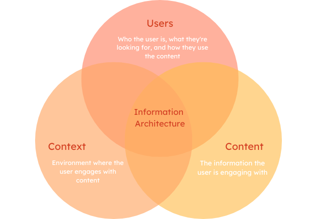
Context is the environment in which the user engages with the content. To figure out the context, consider where, when, why, and how the user is seeking out and engaging with your content.
Structure content according to the user’s needs, as well as their goals, behaviors, and expectations. To identify these, you must know who the user is (ie. who will be consuming the content), what value the content provides them, and how they actually use the content.
Why Information Architecture is Important
Information architecture is central to user experience online. Information architects add structure and navigation systems to simplify complex information for users.
Well-planned information architecture makes it easy and fun to engage. Whether you're playing a game on your mobile phone or scrolling a B2B website, it helps you find what you need to reach your goals.
To better understand why information architecture is useful, it’s a good idea to start with how the human brain works.
UX, IA, and Cognitive Psychology
Cognitive psychology is the study of processes that happen inside the human brain. Cognitive science and psychology look at these human habits:
- Memory
- Attention
- Learning
- Decision-making
- Perception
- Problem-solving
- Creative thinking
Studying cognitive psychology can give you insights that can help improve user experience and design. Let’s talk about some of the most common cognitive principles for design.
Mental models
People create mental models to understand and interact with the world. Each mental model is unique and changes constantly, as we collect more information.
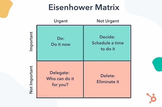
Mental models are the personal version of the world you have in your head. Applying models to different tasks and situations can help you better solve problems for your users. For example, the Eisenhower Decision Matrix is a mental model of time management. It simplifies the act of prioritizing work tasks.
Gestalt principles
Put roughly, gestalt is the German word for "shape." But like most words that cultures share, there is more to the translation. The term gestalt also talks about the way a shape or object reacts to the space around it and how a collection of things can be greater than the sum of its parts.
Gestalt principles help you design for users with concepts like proximity, similarity, closure, continuity, and figure-ground. You can learn more about this principle in this post about the law of proximity, or by watching the video below:
Cognitive load
Cognitive load is the approximate amount of information a working memory can hold at once. A human mind can only remember a limited amount at any given time. That makes it essential to create instructions that don't overload it.
It's also useful to remember that outside events and situations can also impact your users' cognitive load.
For example, during the 2020 pandemic, many people had a hard time focusing. This "brain fog" often extended to simple and routine tasks due to increased cognitive load.
Recognition Patterns
The human brain records information like events, people, and places. Recognition patterns make it easier to pull up that stored information.
They also create logical comparisons with new data as you take it in. Recalling patterns helps you guess what might happen next, assuming that it will align with what you've seen happen before.
So, when you visit a website you might expect parts of that site to match other websites you visit. Designers use these assumptions to improve the user experience.
How IA Can Impact Your Business
Great information architecture is valuable because it helps users find information quickly. This means that the IA on your site could impact:
- Lead generation
- Employee performance
- Hiring
- Marketing ROI
- Customer service
And information architecture isn't just helpful online. It keeps you from getting lost on the subway, helps you reach your new dentist's office on time, and keeps you from walking into the kitchen at your favorite restaurant.
But IA is a powerful force in digital products because if you get lost on a website, there's no one waiting there to help you find your way. If you get lost on an ecommerce site you're likely to leave and never come back. That means you don't get the product you wanted and that company doesn't get your business.
Information architecture lets you get involved in the decision-making process on your site. It helps you give users what they're looking for with every click. And it establishes a logical framework that builds trust.
So, what do information architects do that make IA so valuable?
Information Architecture Systems
Information architecture involves research, planning, and communication. And information architects’ work often starts with a complex mass of information. When they finish, they have an informational structure that is clear and easy to navigate.
To build out this complex structure, an information architect typically performs a range of tasks including user research, card sorting, content inventory, site mapping, and labeling. IAs may repeat some of these steps later in the UX design process with different objectives.
The information architect’s goal is always to understand the user. They want to understand their needs and goals and how they look for information. Then they create a structure to meet those needs, goals, and behaviors.
Moving through this process requires expert knowledge of four different systems: organization, labeling, search, and navigation. The goal is to design each system to meet the user’s needs.
Organization systems
Organization systems, also called classification systems, categorize information. A system can be:
Hierarchical: Organized by importance, often visually
Sequential: Organized with a logical path, like a step-by-step checkout process
Matrical: Organized by the individual user, like a choose-your-own-adventure of internal links
There are also other ways to organize information. Alphabetical, chronological, topical, or user-segment-based organization systems are all popular online.
Organization systems divide and organize information. Information architects use research, inventories, and analysis to create categories.
Labeling systems
Labels create a relationship between the user and the content. Information architects create labels with headings and subheadings for each category.
Labels are words chosen to represent information that the reader can’t see, but that they can guess.
So, labels offer context that helps your users understand where to find more information. Labels need to be easy to understand and feel familiar to your audience. This helps your website communicate efficiently.
For example, say a site visitor lands on a homepage and wants to know about a company’s mission, values, history, and leadership team.
Instead of putting all that on the homepage, an information architect might use the label "About" in the top navigation. Because they see "About" labels on other websites, visitors can guess what it means on that website too.
Search systems
An IA’s search system covers how users look up information. For digital product information architecture, a search system typically includes a search engine, filters, and other tools. It also includes how search results display. Results might show chronologically by date, alphabetically by title or author, or based on popularity.
Navigation systems
An IA’s navigation system refers to how users can move through a site’s hierarchy and access the information they’re looking for.
A navigation system might include:
- Main navigation interface
- Sub-navigation menus
- Breadcrumbs
- Pagination
Navigation helps users find specific information. It's a collection of different pieces that form patterns that visitors recognize. For example, in hierarchical navigation, users navigate from top to bottom.
During this stage, information architects decide how users will navigate through a site and how pages on the site connect.
Now let’s look at some important guidelines to follow when designing information architecture.
Information Architecture Principles
The eight principles of IA were first proposed by information architect and UX designer Dan Brown in a 2010 issue of the Bulletin of the American Society for Information Science and Technology. His aim was to define a set of "guidelines based in universal truths that provide a sketch of what makes any information architecture good."
These principles have been widely adopted in the IA field and can help guide your designs. Below is a brief description of each principle with some examples.
The Principle of Objects
According to this principle, pieces of content, like objects, are unique and dynamic. They have their own attributes, behaviors, and life cycles.
Information architects should consider these attributes to best use that content. For example, you might want to archive product pages of retired items or simply re-categorize them.
Before you begin thinking about how to organize and structure content, you have to figure out the kinds of content you’ll create. Will you be creating blog posts and product pages primarily? What about videos? Do you want to embed videos within blog posts or product pages?
Once you find the content types you’ll have and how they relate to each other, then you can begin mapping how to best provide this information to visitors.
The Principle of Choices
The principle of choices is about limiting the number of choices for the user to only the most meaningful and relevant. These choices should relate to a particular task.
For example, if you have an email opt-in form popup, there should only be three choices for the user: opt-in, not opt-in, or close the popup. This reduces the level of cognitive effort required of the user, improving their experience.
The beauty company Alaffia provides a great example of such a popup.
-Jul-13-2022-04-24-04-86-PM.webp?width=649&height=323&name=information%20architecture%20(update%20722)-Jul-13-2022-04-24-04-86-PM.webp)
The Principle of Disclosure
According to this principle, only disclose what is necessary for the user to understand what they’ll find next and make a decision.
Take the newsletter opt-in form popup from above. Ideally, you’d include a short headline and a sentence of description to try to convince visitors to opt in, and that’s it. If they do opt in, you might redirect them to a landing page or send a welcome email with more information, but only at that step.
Or, consider the Google search results page. Besides providing 10 results for your search query, it also includes a "People also ask" box. This box only shows the related search queries. To see the answer, you have to click the arrow to expand the box.
-Jul-13-2022-04-24-07-11-PM.webp?width=650&height=201&name=information%20architecture%20(update%20722)-Jul-13-2022-04-24-07-11-PM.webp)
The goal is to provide users with only a certain amount of content at a time so it’s easy to digest.
The Principle of Exemplars
According to the principle of exemplars, you should provide examples of content for things that aren’t necessarily clear or intuitive upon reading.
Ecommerce sites are a great example of this. Take Jungalow’s home page — it shows images for the categories "wallpaper" and "plants + planters." While the category names are clear, the visuals help readers understand the colorful, bohemian products they can expect if they click one of the links.

The Principle of Front Doors
The principle of front doors is the idea that your website or application has multiple access points. Not all visitors will land on your homepage first — they could arrive on a product page, blog post, or landing page, so you have to construct your website accordingly.
By placing navigation aids and important information and elements on different pages, you’ll ensure that visitors know where they are on your website. It also makes the steps they can take next clear, no matter where they first arrive.
Nude Barre perfectly exemplifies this principle. Besides a navigation header with drop-down menus and a search box, there’s a big footer at the bottom of each page. This footer contains important navigation links as well as a short description of the company. Users can easily understand what the company does, find the information they’re looking for, or browse wherever they are on the site.

The Principle of Multiple Classification
According to the principle of multiple classification, users should have many ways to browse the content on your site. This is important because people prefer different methods for finding information.
Some, for example, may prefer to browse your site by category using sub-navigation menus. Others may prefer to search by keyword using a search bar. Others still may scroll down to your footer to find the navigation options, and so on.
Here’s a look at the fitness website Ailey Extension. It provides:
- A navigation bar with sub-navigation menus
- A search bar
- Breadcrumbs
- A footer with navigation links
-3.webp?width=648&height=309&name=information%20architecture%20(update%20722)-3.webp)
The Principle of Focused Navigation
The principle of focused navigation means that navigation menus and aids should be consistent across your site and only contain relevant content.
If, for example, you use breadcrumbs on your blog, then you should use breadcrumbs everywhere on your site. Or, say you have a primary navigation menu with Products and Services links and each has its own submenu. Then you should only list products under the Products link and services under the Services link. Otherwise, you’ll confuse visitors.
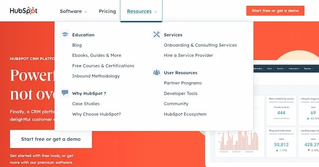
Check out HubSpot’s homepage below. You can see a well-organized sub-navigation menu that clearly outlines which links belong to Education, Services, and so on.
The Principle of Growth
The principle of growth says you should construct your IA so it can accommodate your site as it scales.
This means you should be able to add new content within a section as well as add new sections as a whole. Here’s a helpful illustration:
-Jul-13-2022-04-24-06-68-PM.webp?width=578&height=58&name=information%20architecture%20(update%20722)-Jul-13-2022-04-24-06-68-PM.webp)
Say you run an ecommerce store. You might have a category for women’s apparel that only contains shirts and pants right now. But, over time you can add more sub-categories like dresses or shoes. Or, you might create a whole new category for accessories where you can list scarves, hats, jewelry, and more.
Remember these principles are to guide your design process — not dictate it. For a more in-depth look at IA principles, check out this excellent video from CareerFoundry that further explains context, structuring content, and cognitive load:
Next, let’s look at the different ways these principles work on IA examples of real websites.
Information Architecture Diagram Examples
Since a website’s content structure depends on the specific needs of the user, no structure will look exactly the same. The IA of an ecommerce store can look completely different from a blog and still meet users’ needs.
Most websites and apps, no matter their niche, share one similarity: They have three or four levels of hierarchy at most. That way, the content users want will still be accessible in a few clicks, but the website navigation won’t be too broad.
You can see this in the IA diagrams — visual sitemaps that outline websites in a skeletal form — below.
Duke Library
As part of its 2013 website redesign, Duke created and published an IA blueprint (shown below). Its new IA would have six main categories:
- Search & Find
- Using the Library
- Research Support
- Course Support
- Libraries
- About Us
The most important pages fall under these categories. They make up the site’s global navigation, and users can access the sub-categories in a drop-down.
-4.webp?width=650&height=501&name=information%20architecture%20(update%20722)-4.webp)
The other parts of the sitemap show what content would appear above the navbar in the header ("utility navigation"), the content area of the page ("news, events, exhibit" and the search box), and the footer.
Charity App
Below is the IA for a mobile app from UX designer Bogomolova Anfisa. Most apps from Pinterest to Goodreads have a similar structure.
-2.webp?width=650&height=370&name=information%20architecture%20(update%20722)-2.webp)
According to this IA, a user first sees instructions to help them understand and use the app. Then they see a welcome page and can log in with Facebook credentials or email, or register an account if they haven’t already.
From there, they’re taken to the main page, which contains options to view their bookmarks, messages, profile, or create a new post.
"The Museum"
Below is the IA for the mobile app of a client that design agency Pixel Fridge worked with. The six purple boxes represent the major sections of the museum’s website — but user research and testing showed that not all six were considered equally important.
-Jul-13-2022-04-24-06-43-PM.webp?width=650&height=252&name=information%20architecture%20(update%20722)-Jul-13-2022-04-24-06-43-PM.webp)
On the left are the categories and subcategories that they put in the navigation header. On the right are the categories and subcategories placed in the website footer.
Travel Booking Website
Like the Duke Library website and "The Museum," this travel booking website has six major categories. These categories are:
- Account management
- Book a trip
- About
- Destination
- Customer service
- Travel tips
.webp?width=650&height=497&name=information%20architecture%20(update%20722).webp)
You’ll notice in the image below that there is an additional level in this site’s hierarchy. The pages connected to the three subcategories under the "destination" category form the fourth level.
If you think these examples look like something you’d see during the user experience (UX) design progress, you’re right. While IA covers disciplines, from technical writing to library science, it’s particularly important within the UX field.
Below, we’ll look at the relationship between IA and UX. While both concepts apply to virtual and physical spaces, we’ll focus on the former to help you create websites, mobile apps, and other digital products that are easy to use.
What is the difference between Information Architecture and UX?
Information architecture and the user experience are closely connected, but they’re not the same thing.
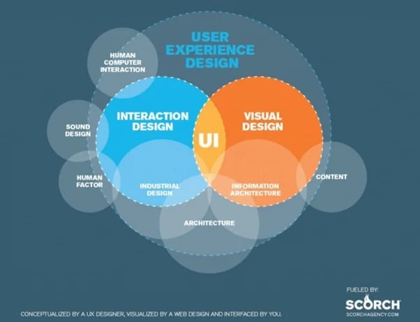
Creating a good information architecture is key to a good user experience — you can’t have one without the other. Even the most stunning websites won’t delight users if the underlying organization is poor.
But UX is a much broader topic than IA. It encompasses everything related to how a user perceives, interacts with, and feels about a product or service.
Building an IA is just one step of the UX design process. Other steps include content inventory, user research and testing, wireframing, and prototyping. Let’s talk about how to create information architecture for your website.
How to Create Information Architecture for Your Website
IA is a crucial step in the creation of any digital product. Whether you're designing your first website or building an app for your business, you need a logical structure.
You may choose to work with a professional information architect or tackle IA on your own. Information architecture is often collaborative. Design, development, and engineering teams often work together on the process. But even a small solo project can improve with an understanding of the basics.
Each information architecture project is unique, so the order of the steps might vary. But these steps can help you do the research, analysis, and organization it takes to create a great structure for your next digital project.
1. Content Inventory and Analysis
Collect all the information in one place to do an inventory of your content.
This usually means creating a catalog of all existing digital content. If you're building a new site, pull together your ideas and in-progress content. This gives you a sense of how the current website works, including:
- Important sections and pages
- Main topics and subtopics
- Quality of content
- The current organization of information
It also helps you decide what to keep, what to discard, and what new content you'll need.
Start by putting all this information into a spreadsheet so it's easier to manage. The information you include in your spreadsheet will depend on the project you're working on.
In the case of a website, you'll want to include:
- Current URLs
- Page title
- Date of last update
- Page type (such as blog posts or product pages)
- Media (such as photos and video files)
- Author
- Focus keywords
This is a good time to update outdated content and remove content that no longer fits your vision for the site. It can also help you see what information you might be missing and repair broken links.
This audit can give you a clear starting point for organizing your site.
2. User Research
Next, you'll focus on learning user habits. This step might include user interviews and creating buyer personas.
If you're working on a solo project, it's important to remember that you are not your user. Because the process of categorizing is somewhat intuitive, it can be easy to default to your personal preferences. Instead, use this step to focus on your unique users and what they want from your website.
First, get a sense of your users' vocabulary. For example, online shopping carts often use the word "item" or "product." If you're in the United States, you probably use the word product more often.
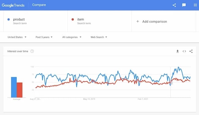
But in France, the word item is more popular.
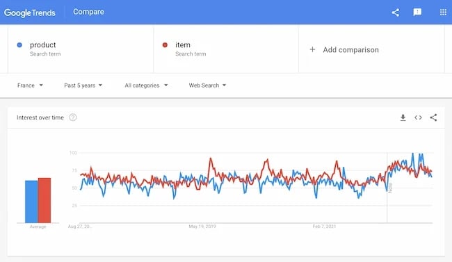
Depending on your target audience, this word choice can have a big impact on the online experience for your shoppers.
Next, try some of the processes that information architects use.
Card sorting can help you understand user behaviors and habits for categorization.
Tree testing can help you see how your users respond to navigation and labels. This process will show you how easily users can find information on your site.
After each round of research, take careful notes on what works and what you need to approach in a different way for future testing.
3. Create Categories
One of the reasons that categorizing is difficult is that there are many ways to approach it. Another challenge is that many people categorize based on personal habits or existing systems. This is a problem if those approaches don't work well for the user.
For example, say you have a corporate website that's organized around acronyms and internal vocabulary. That website will be tough for new employees and clients to understand.
To create categories that work for the largest audience, start with your full list of content. Next, apply your user research to prioritize and group that content.
Start with categories that apply to the largest groups of similar content. For example, if your marketing website has 15 blogs on Facebook, Instagram, and TikTok, you could simplify that grouping to "Social Media."
Next, organize these groups of content into sections. If you have limited time and resources, you can make educated guesses. But it's best to do frequent user testing and to use that research to inform each section.
You can also use competitor research to inform your categorization efforts. Once you learn their approach to site structure you can decide what ideas you want to borrow and which you want to improve on.
As you review your site content you will probably find some content that doesn't quite fit. Sometimes this is content that fits into many categories and sometimes it doesn't align with any existing group.
User research can help with this. It can also help you decide whether an outlier deserves its own sub-category.
4. Labeling
Once you have your high-level categories, it's time to give those categories labels.
While it can be tempting to use the same terms for your labels that you used while you created your categories, this may not be the best strategy.
The way that you label each category has a major impact on how well users can use your website. So, what are the qualities of a good label?
Attracts users' attention.
Labels should either be familiar terms like "Home," "About," or "Privacy," or they should be unique and specific.
For example, The National Endowment for the Arts website has common labels like "News" and "About," but it also has unique labels like "Grants" and "Initiatives" that relate to what the NEA does.

Tells users what to expect.
Labels should give users an idea of what they will see after they click on that label.
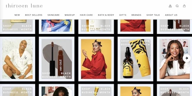
For example, the label "Best Sellers" on the Thirteen Lune home page. This simple phrase lets shoppers know that once they click the link they will see the most popular products on the site.
Use images to add context.
Because you can find just about anything on the internet, users rely on images to contextualize simple text.

For example, the label "Sport" on the H&M website could be confusing for users without the fashion photographs. The images quickly clarify that this is a category of clothing, not a separate line of products.
Make labels easy to scan.
The most effective labels help users quickly see where they can get the answers they want.
So, use terms that most people use and understand. With this in mind, try to avoid words and phrases that are specific to your company or other terms that might be new to your users.
Next, make your label quick to read. Users shouldn't need to read paragraphs of text to get the meaning of your label.
Once you have a list of top-level labels, try a quick round of usability testing. Terms that are easy for you or your team to understand might not resonate as well with users. You may also want to test your labels with specific segments of your audience.
5. Taxonomies and Metadata
Now that you've set up your top-level categories and labels, it's time to look at the content within each of those categories.
Taxonomy is another word for classification. In information architecture, it's the way the IA groups, labels, and categorizes a specific piece of information in a specific place.
Taxonomies help you organize groups within each category and to prioritize the content in each group.
For example, on ecommerce sites, there is a product taxonomy that groups information, and metadata that describes it. So, on the Zappos site, there are taxonomies for different groups of shoes like gender, shoe styles, and shoe size.
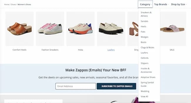
Metadata is a method of labeling that makes it easy to find the different taxonomies you've created to organize your groups.
Using the example above, metadata terms and codes help Zappos website users find and retrieve groups of shoes.
Instead of scanning every single shoe on a single web page, shoppers can limit the number of shoes that appear on the screen. This makes it quicker for shoppers to find the type of shoe they're looking for.
The more content you have on your website, the more complex the taxonomy process will be. But there are a few ways that you can make the process more efficient.
Take it slow.
Don't start on taxonomy until you have clear categories and labels for your top level.
Labeling is fun, and once you start you might just want to keep going. But doing your structure and labeling all at once can make things confusing fast. This is because the more data you run through, the easier it is to make common mistakes like adding too many categories or creating confusing labels.
Keep it consistent.
Consistency is essential for great information architecture. It helps you meet user expectations and create systems that you can seamlessly build on.
As you build your IA, set up frequent consistency checks. This can help to make sure that you haven't accidentally created duplicate or too-similar labels or groups.
Use visual tools.
Sitemaps and IA tools can help you get a clear picture of your site architecture. For visual thinkers, this can make it easier to maintain clear and consistent taxonomies and metadata as your site structure fills out.
6. Search Functionality
At this point in the process, you'll want to decide whether search can improve the user experience on your website.
There are a few things information architects need to think about when developing search functions:
Volume of content: Search is usually only helpful for sites or apps with many pages or options.
Navigation: Search shouldn't be a replacement for a useful navigation system. If users use search functions too frequently it can be difficult to track the effectiveness of your site pages and navigation system.
User habits: Sites with many pages or products might find that visual thumbnails are more effective than search.
If you decide to include search functions, you'll want to figure out what content users can search for and how to design your search bar.
For example, an ecommerce site might want to make it simple for users to search for products. But do those users need to search the entire site? Are there duplicate pages that would pop up instead of the product they're looking for?
Next, you'll want to decide what search results will look like. There are three ways that most search results appear on websites:
Sorting: Results appear chronologically or alphabetically
Ranking: Results appear by relevance to search term, popularity, or rating
Clustering: Results appear in groups created by site admins or machine-learning
Transparency about search results is important if you want to build trust with your users. If you choose to add search, include text that explains:
- What the search function selects from
- Data filters
- Other site settings that can impact results
7. Develop Navigation
Website navigation that feels natural grows out of the research and planning you've done up to this point. So, your next step is to develop navigation that makes your categories and taxonomies easy to find.
As you complete the steps above, you might want to make notes about navigation. Competitive research, your sitemap, and user research are all important.
Because whether you choose to create global navigation menus, sidebars, or breadcrumbs, navigation is key to a great user experience.
As you work through navigation, there are a few concepts that can help you create a system that works for your audience.
Flat vs. Hierarchical vs. Single Page
Single-page models are great for landing pages. It's when all the information and navigation options are on a single page.
Flat models are common on small websites. In this model, every page has equal importance, and they all have the same priority in the navigation.
Hierarchical models show information in a hierarchy from most to least important. Hierarchical models are common in enterprise websites.
Types of Navigation
Primary navigation: Global navigation that appears on all pages. This format lets users access main pages from anywhere on the site.
Secondary navigation: Supporting navigation that appears on relevant pages.
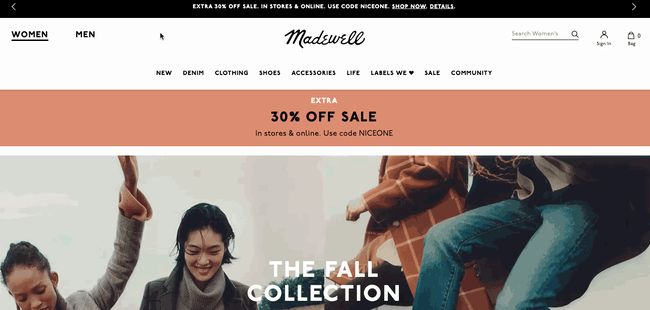
For example, when you click each label on the Madewell homepage, secondary navigation pops up with links to other pages in that category.
Contextual navigation: Extra navigation on specific pages. For example, links at the bottom of blog pages that highlight related posts.
Hidden navigation: Space-saving navigation that can have a negative impact on user experience. For example, hamburger menus on mobile websites.
Design with the user in mind.
While you may have heard buzz about the three-click rule, don't limit ease of use to the number of clicks. At the same time, it's a good idea to create a powerful homepage that links to the main sections of your site.
Make it easy for users to see where they are and to return to the homepage, no matter how many links they click on your site.
And again, be consistent, and make sure that no matter where your user lands on your site they can intuitively find what they're looking for.
The goal of IA for navigation is to give users a clear path to the content they want. This creates a great user experience and gives your business a chance to offer them exciting offers along the way.
8. Wireframing, Data Modeling, and Prototyping
Once your website architecture is complete you’ll build wireframes, prototypes, and data models to communicate the new structure to the team.
To do this, you’ll use wireframes, data models, and prototypes.
Wireframes are the first draft of a digital product's user interface. They are a big-picture view of the total website without all the final details. A wireframe for a website or app makes it easy to see:
- Navigation
- Interface
- Pages and screens
- Headlines, tags, content placeholders, and labels
Prototypes are usually the next step after wireframes. They sometimes include animations, branding, or final content. But the most important thing a prototype does is to show how the digital product will function.
Data modeling is usually the final step before prototypes go to stakeholders and engineers for development. This step outlines how the website will handle new information after the site goes live.
Websites are constantly changing with updates and new information. Data models help visualize how that new data will work within the structure.
9. User Testing
Your final step to ensure your information architecture is useful is testing. There are a few ways you can approach this.
Do more user testing with your initial user group to test your final website labels and categories. You can also grab a new informal group for usability testing.
Another option is to use analytics data for user insights. If you don't have the time or resources for usability testing, you can launch your new IA and then make revisions based on your data. Keep in mind that this approach can impact SEO and user experience while you work out any issues.
This final round of analysis helps you ensure that your new information architecture is sound. It also gives you new insights for future updates.
Featured resources:
Information Architecture Template
Information architecture is complex, and building one requires a lot of time and resources. Fortunately, you don’t have to start from scratch. There are templates available that you can use as the foundation for your next project. Some of these templates are stand-alone, and others are available with an IA mapping tool. Let's take a look at a few below.
UI8’s Information Architecture Kit
-1.webp?width=650&height=491&name=information%20architecture%20(update%20722)-1.webp)
This kit created by web-based company UI8 contains 250 templates and over 500 elements to get you started creating your information architecture for an app. Besides compatibility with Adobe Creative Suite and Sketch, all assets in this kit are vector-based and fully scalable. You can use this kit to show the basic features and flow of an app before you start wireframing.
Keynote Information Architecture & Sitemap Template
-Jul-13-2022-04-24-05-46-PM.webp?width=650&height=461&name=information%20architecture%20(update%20722)-Jul-13-2022-04-24-05-46-PM.webp)
Created by designer Alex Gilev, this file contains an easy-to-use IA template and a Google Doc outlining the content structure of a real project he created. The template contains simple blocks for showcasing the flow of your app or website. You don’t need third-party software to edit this template — you can use the presentation software app Keynote.
Information Architecture Tools
There are many design software tools that you can use to map your information architecture. Let’s briefly look at a few.
Diagrams.net
Diagrams.net is a free software tool for creating user flows and information architecture and flowcharting. It automatically plugs into Google Drive so multiple people can collaborate on the same map in real time. You can also choose to save your final visual site map to One Drive or Dropbox. Here’s an example of a sitemap completed with this tool.
%20(1).webp?width=500&height=577&name=information%20architecture%20(update%20722)%20(1).webp)
OmniGraffle
-Jul-13-2022-04-24-05-20-PM-1.webp?width=650&height=414&name=information%20architecture%20(update%20722)-Jul-13-2022-04-24-05-20-PM-1.webp)
OmniGraffle is a premium tool that offers everything you need to create a visual sitemap. Features include standard options like line, shape, text, and pen tools as well as advanced options like text objects, position snapping, geometric positioning, automatic layout, and default templates.
FlowMapp
-Jul-13-2022-04-24-07-36-PM.webp?width=650&height=389&name=information%20architecture%20(update%20722)-Jul-13-2022-04-24-07-36-PM.webp)
FlowMapp optimizes the process of creating a visual sitemap of your website, app, or mobile project. Besides its drag-and-drop sitemap builder, it has tools for creating user flows, personas, and customer journey maps. FlowMapp offers four pricing plans, including a free option for a single project.
Microsoft Visio
-Jul-13-2022-04-24-04-55-PM.webp?width=650&height=390&name=information%20architecture%20(update%20722)-Jul-13-2022-04-24-04-55-PM.webp)
Microsoft Visio is a premium tool that offers dozens of premade templates, diagrams, and stencils to help you start diagramming your IA. The latest version comes with even more features to help you create professional sitemaps. Team members can also view, comment, and share Visio diagrams to improve collaboration.
The Power of Good Information Architecture
Information architecture is a critical part of the user experience. You want the user to not only be able to understand the structure of your content, but also to predict it. They should be able to find jewelry under the sub-category of accessories, the author’s name on a blog post, and so on.
With a good IA, users can find the information they’re looking for as easily and quickly as possible. Without one, users won’t delight in your product, no matter how beautiful or engaging.
Editor's note: This post was originally published in November 2020 and has been updated for comprehensiveness.
![Blog - Website Redesign Workbook Guide [List-Based]](https://no-cache.hubspot.com/cta/default/53/4b5bb572-5d0e-45b8-8115-f79e2adc966b.png)


![How to Build & Run an Effective Website With a Small Team or Budget [Startup Tips]](https://blog.hubspot.com/hubfs/website-on-a-budget.jpg)


![How to Make a Website With User Accounts and Profiles [With WordPress, Wix, and More]](https://blog.hubspot.com/hubfs/how-to-create-user-accounts-and-profiles.jpeg)