As a blog writer, I see good and bad blog format examples every day.

While I like to think that the content is the only thing that draws people to a blog post and keeps them reading, I know that the layout and blog format also play a huge factor.
![Download Now: How to Start a Successful Blog [Free Guide]](https://no-cache.hubspot.com/cta/default/53/79c9c1d7-e329-46a2-9095-7ebf693a17f9.png)
Images, text, and links need to be optimized just right — otherwise, readers might abandon your blog post if it’s not appealing and easy to follow or doesn’t generate more interest.
That’s why I’ve compiled some of the best blog format examples to help you design the perfect blog for your readers.
.png)
6 Free Blog Post Templates
Save time creating blog posts with these free templates.
- "How-to" Post
- "What is" Post
- Listicle Post
- And More!
Blog Layout Tips
Coming from a blog writer and reader, I know that your blog layout is just as important as the content inside.
Not only is blog layout important for the reader experience, but some elements can also help you optimize your blog for search and make it easier to share.
If you want to improve your blog layout, I have a few tips to make it interesting and easy to read.
1. Create catchy titles.
Your blog title is the first thing people see.
Whether they’re scrolling through the search results or skimming your blog homepage, the headline must be strong enough to pique their interest.
Make sure your blog title is not only interesting but also accurately describes the article’s topic.
In my experience, I usually come up with at least five different title options when I’m drafting a new blog post.
And here’s good news for those who are particularly verbose: Research shows that longer is better when it comes to length.
A study by Backlinko found that blog headlines between 14 and 17 words generated the highest number of social shares.
2. Make it visual.
If you’ve written a long blog post, break up large chunks of text with images, infographics, videos, and charts.
Not only does this keep readers visually engaged, but interactive blog formats drive time on page.
According to benchmark data from Databox, the average time on page for a B2B blog post is one minute and 30 seconds. The average time on page for a B2C blog post is one minute and 26 seconds.
Here’s an example of how that looks on one of HubSpot’s blog posts:

Educational content, like posts that explain why/what and include varied media, can also drive backlinks.
A content study conducted by Backlinko and BuzzSumo found that blog posts with infographics received 25.8% more links than those without.
Data aside, think about what you’d prefer when reading a blog post: 2,000 words of text with no visual breaks or a long blog post that uses educational or interactive graphics to help tell the story.
3. Make it skimmable.
In addition to using strong visuals throughout, you should also ensure your blog post is easy to read.
In my experience, if I can’t digest the main talking points with one quick scroll, then I’m more likely to leave the page.
You can improve your blog format by adding more structure and organization. Start by adding a table of contents or a quick summary at the top of your post.
Then, add plenty of headers and subheads to separate each section or idea.
Quick SEO tip: When formatting your blog post, your title should be in H1, headings should be in H2, and subheadings are in H3 and H4.
You should also be mindful of spacing and readability. To break up large amounts of text, add plenty of line breaks between thoughts and use bullet points when listing things.
4. Write long-form content.
If you want to increase your blog posts’ shareability, try making them longer.
Brian Dean of Backlinko found that blog posts with over 1,000 words received 56% more social media shares than content with less than 1,000 words.

Essentially, the more you write, the more information people will find interesting and want to share on social media. More social media shares can lead to more traffic to your blog post.
As someone who regularly writes 2,000-word blog posts, I can tell you that the key to writing long blog posts is to make sure you’re actually providing value.
Value-packed blog posts are more shareable and engaging than those that don’t teach or provide the reader with anything.
If you can share something original — such as proprietary data, first-hand experience, or unique visuals — you’re giving the reader a reason to stay on your blog or take another action on your site.
That's because you’re providing something they can’t find on another blog.
5. Include strong CTAs.
A common mistake I see on blogs is not including a call-to-action (CTA).
You may write the most interesting and informative article, but if you don’t tell the reader what to do next, they’ll simply move on.
It’s essential to include a CTA on every blog post.
A CTA encourages readers to take another step. This could be checking out more posts, downloading your latest ebook, or subscribing to your newsletter.
Depending on your goals, a blog can sit anywhere in your marketing funnel. Most blogs are set up to be top-of-funnel (TOFU), meaning they generate traffic by covering topics people want to learn about.
However, I’ve seen plenty of blogs that are formatted to be powerful lead-generation tools.
HubSpot, for example, excels at weaving in relevant CTAs throughout every post. Like this one, which encourages readers to download free templates:

Blog Format Examples
1. HubSpot
HubSpot’s blog finds a way to pack a lot of exciting content into the page while still being easy on the eyes.
Notice that, above the fold, it features one blog post with a large image, title, and CTA to read more. The featured image is unique to the brand, with an appealing combination of photography and graphics to draw the eye.
To the right, there’s a list of top posts to engage readers with the wide variety of content on the blog. This makes it easy for readers to connect with HubSpot or learn more.
Plus, there’s consistency. As you scroll down the page, each section is visually consistent, no matter what topic, podcast, video, or blog post you’re looking for. This strategy can help you build brand trust.
6 Free Blog Post Templates
Save time creating blog posts with these free templates.
- "How-to" Post
- "What is" Post
- Listicle Post
- And More!
2. Alloy
When I first landed on Alloy’s blog, it was clear the blog format was built with user experience in mind.
On the homepage, I could easily navigate to certain topics through tags or use the search function to find something specific.
On the individual blog posts, there’s a built-in sidebar that functions as a table of contents. This feature improved my reading experience by allowing me to seamlessly jump around to different topics within the article.

3. Lendio
Lendio, a small business loan marketplace, has an active blog with topics that cover everything small business owners need to know about business loans, finance, and running a business.
One great thing about its blog format is its use of relevant CTAs.
In the blog post example below, Lendio integrated its business loan calculator into a post about getting a business loan.

Not only is the calculator an interactive way to engage readers, but it also provides value and demonstrates what Lendio can offer.
4. Pluralsight

Pluralsight is a great reminder that you don’t have to get super fancy with your blog format.
The clean fonts, for example, match the logo and stay in line with the brand’s clear, informative voice. The grid structure and headers for each section make it easy to understand what is on the blog.
I also like the list of topic filters, which makes it easy to find blog posts you’re interested in reading.
5. Pando

An important aspect of a well-designed blog is a consistent color scheme and style. After all, 80% of consumers say that color boosts a brand’s recognition.
It’s interesting to see how color consistency can unify the more diversified elements of design.
Pando, a blog that explores the startup cycle, incorporates a set palette of colors — orange, green, pale blue, lavender, and deep yellow — in several sections of its site. These colors appear in the background, highlight bars, and certain text areas.
However, it also uses several different fonts — all of which look seamless when tied together by a cohesive color scheme.
6. Creative Circle

If you’re looking for a blog format that drives time on page, it’s the estimated time to read feature.
Anytime I see an estimated time at the top of the post — in this example, it says the article will be a six-minute read — I can make the decision if I want to continue reading.
It also tells me how much content and information I can expect to find; a longer read means the post goes in-depth on a topic.
Adding this to your blog layout can improve your readers’ experience and improve your time on page.
How?
While some people may drop off upon seeing that, the readers who stay will help drive up your average time on page. Plus, you can use this metric as an indicator of people’s interest in the topic.
7. Bit.ly

I’m a fan of Bitly’s blog format for a couple of reasons.
For starters, the orange accent color used in the imagery showcases cohesive branding. This motif ties together every blog post on the home page and shows me that they take their blog seriously.
Second, I like that the company seamlessly integrates a CTA box on the blog homepage. Not only is this a smart way to generate leads right away, but it also helps readers understand what you do.
Often, when I stumble upon a company’s blog after seeing one of their articles in the search results, I leave unsure of what they do.
8. Golde

I love the way Golde uses images to communicate effectively.
Using the brand name as a starting point for its blog, “The Golden Hour,” Golde makes a featured image the focus of each post.
Featuring compelling images that showcase the brand’s product is a great way to improve the click-through rate of your blog.
The gorgeous photography uses yellow and green tones in each photograph. This creates a consistent, warm, and appealing feel that draws you into each blog post.
Once you click on a post, this blog makes perfect use of the space below the text to highlight products, recipes, and other useful resources.
Inspiring Examples of Beautiful Blog Homepage Design
1. Help Scout

Sometimes, the best blog designs are also the simplest. Help Scout, makers of customer service software, uses a unique but minimalist design on its blog that we love — it limits copy and visuals and embraces negative space.
What we particularly like about this blog is its use of featured images for all posts, including the “Most Recent Posts” section that highlights recent or particularly popular entries.
These images catch the reader’s eye and signal what the post is about. And it works — everything about this blog’s design is clean and readable.
2. Microsoft Work & Life

Full disclosure: We’ve totally gushed over Microsoft’s microsites before.
We can’t help it — what better way to revitalize an old-school brand than with a blog that boasts beautiful, interactive, and inspiring branded content?
Microsoft Work & Life is also a prime example of how a business blog can be a major asset for an overall rebrand. In recent years, Microsoft has worked to humanize its brand, largely in response to a rivalry with Apple.
6 Free Blog Post Templates
Save time creating blog posts with these free templates.
- "How-to" Post
- "What is" Post
- Listicle Post
- And More!
The “Work & Life” microsite has a simple tagline — “Learn how we’re helping people stay connected, engaged and productive — at work, at school, at home, and at play.” It’s the softer side of Microsoft, so to speak.
When you're trying to convey a certain brand message, you can use your blog to communicate it — both aesthetically and content-wise.
3. Design Milk

Design Milk, an online contemporary design outlet, uses a simple blog layout to highlight its posts.
If the arrow beside “Read” at the top left points down, you can scroll through featured images and teaser text for a variety of articles.
If the arrow beside “Read” points up, you see a perfect showcase of blog topics and highlighted posts.
That’s an internal link strategy, which helps to encourage readers to stay on the site longer.
The social icons at the top of each post are a pleasant addition to the overall look and feel of the site. They’re easy to spot and make it easy to share Design Milk’s content.
(And to learn more about adding social buttons to your blog, check out this post.)
4. Webdesigner Depot

With a name like “Webdesigner Depot,” it’s no wonder that this design news site is visually appealing.
One thing that we particularly like is the responsive images on each individual post. The subtle motion of the image as readers scroll over a range of articles helps catch visitors’ eyes, which can improve your blog’s click-through rate.
And, check out the effective use of the featured image to highlight the most recent article. This approach immediately draws the viewer into the blog’s most recent content.
What’s more, the color scheme, background, and fonts are all consistent — which keeps this blog looking professional but still distinct from the basic blog templates you might be used to seeing.
5. Mashable

Mashable breaks its content into three noticeable sections on the homepage:
- New posts get attention with a large featured image and three highlighted blocks.
- Posts for each section get attention with a featured image at the top of two to three columns with a short list of headlines underneath.
- Then, “Trending” posts show up to the right, with bold text on top of a shadow box graphic.
This multi-pronged approach to displaying content can help readers decide which kind of news matters to them the most.
They can quickly choose between attention-grabbing top stories, the hottest posts, or stories on the topic they’re most interested in.
The “Related Stories” that end each post are also a great feature to connect readers to more of the content they’re looking for.
6. Brit + Co

Everything about the Brit + Co homepage says clean, warm, and welcoming. It’s free of clutter, making the content more digestible, and the blog layout is extremely organized.
We dig the seasonality of the site, too — from avocado jack-o-lanterns on the first of October to dinner recipes for Valentine’s Day. Adorable and replete with colorful, fun photos to illustrate each story’s content.
The subtle “This Week’s Stories” header also serves as a nice way to promote popular content without being too in-your-face about it.
Plus, with such great visuals, we took note of the nod to Pinterest. That icon is important to include when your blog incorporates so much attractive imagery.
7. Tesco Food Love Stories

We love the colorful, consistent design of the Food Love Stories from British grocery chain Tesco.
Remember how we keep harping away at brand consistency? Check out the way this brand naturally incorporates the logo into its photography and featured video.
What Tesco has achieved is a great balance of simplicity and boldness. The layout is minimal but not dull. Warm and welcoming shades underscore each content highlight and recipe, and the photos add dashes of color throughout the site.
This is a great example of how the right imagery can achieve an appealing “less-is-more” appearance, especially if that fits in with your overall brand concept.
8. 500px

The photography blog, 500px, leads with one featured article and big, bold, high-definition photos to draw the reader in. That makes it pretty clear what the blog is about — it shares valuable content on photography paired with gripping visuals.
Plus, how cool is it that the social links are right there, obviously displayed above the fold?
They keep readers engaged with the content and make it easy to share the photography. Plus, content with images gets more than double the engagement on Facebook as posts without images do.
9. Wired

The more topics you have on your blog, the more chaotic the experience can be for your readers. That’s why we like the refreshing simplicity of Wired’s blog design.
Depending on the size of your screen, there could be eight or more headlines above the fold alone, but this design is still easy to scan and dig in.
Every post includes a featured image to draw you in. Then, striking font choices make it quick to understand the category, author, and headline for each post at a glance.
If your blog started simple and you’re having a hard time making it work as it grows, this blog offers great inspiration for a redesign. You can also use this workbook to redesign your blog website.
10. Crayon

Many blogs want to show readers a little bit of everything they offer.
But depth can be just as enticing to readers as breadth. If you want your visitors to dive into what your blog writers have to say, this blog design gives them an easy choice — just start reading.
With an extended teaser in the header, the Crayon blog’s focus above the fold is the latest post. As you scroll down, they’ll find a grid with more content from the blog.
I also like the color coding by topic, which makes it easy to locate blogs of interest at a glance. You can see more text-forward blog design examples here.
11. Black Travelbox

Black Travelbox makes personal care products for travel. The company has done a great job of connecting its portable balms, conditioners, and more with the joy of travel.
Plus, the folks at this company’s “Travel and Slay” blog know a thing or two about brand consistency across channels.
The blog has a simple color scheme and matching fonts to create a unified user experience from the shop to general content. At the same time, it throws in bold, colorful images to catch readers’ attention.
Visit the website and have a scroll — we think it’s pretty cool how the images vary, but each blog entry highlights a different “travel crush.” Then, it packs each post with bright photographs, smart interviews, and joyful stories.
12. Pixelgrade

Pixelgrade is a design studio that creates stunning WordPress themes for creative people and small businesses.
Their blog format does a great job of highlighting one of their most recent or popular blog posts, alongside a clear CTA and a short excerpt.
What I like best is that the design of the page is 100% in line with their brand. If you like the design of their blog, chances are you’ll also want to try one of their smart and beautifully designed WordPress themes.
For more WordPress blog design ideas, check out this post about WordPress themes for bloggers.
13. BarkPost

We kind of like dogs here at HubSpot. So when a blog dedicated to life as a dog owner came across our radar, it got our attention.
BarkPost, the blog of canine subscription box company BarkBox, is a great example of design for many reasons. First, look at the big, fun font in every header — it’s quick and easy to read, even from a mobile device.
6 Free Blog Post Templates
Save time creating blog posts with these free templates.
- "How-to" Post
- "What is" Post
- Listicle Post
- And More!
Adorable images make the posts for each topic noticeable, too — and, of course, all in the brand-matching, trustworthy blue.
We also like that BarkPost draws attention to its sister companies.
Whether you’re interested in doggie dental care or the best food for your pup, this fun blog design makes it easy for dog parents and lovers alike to find the latest news and resources.
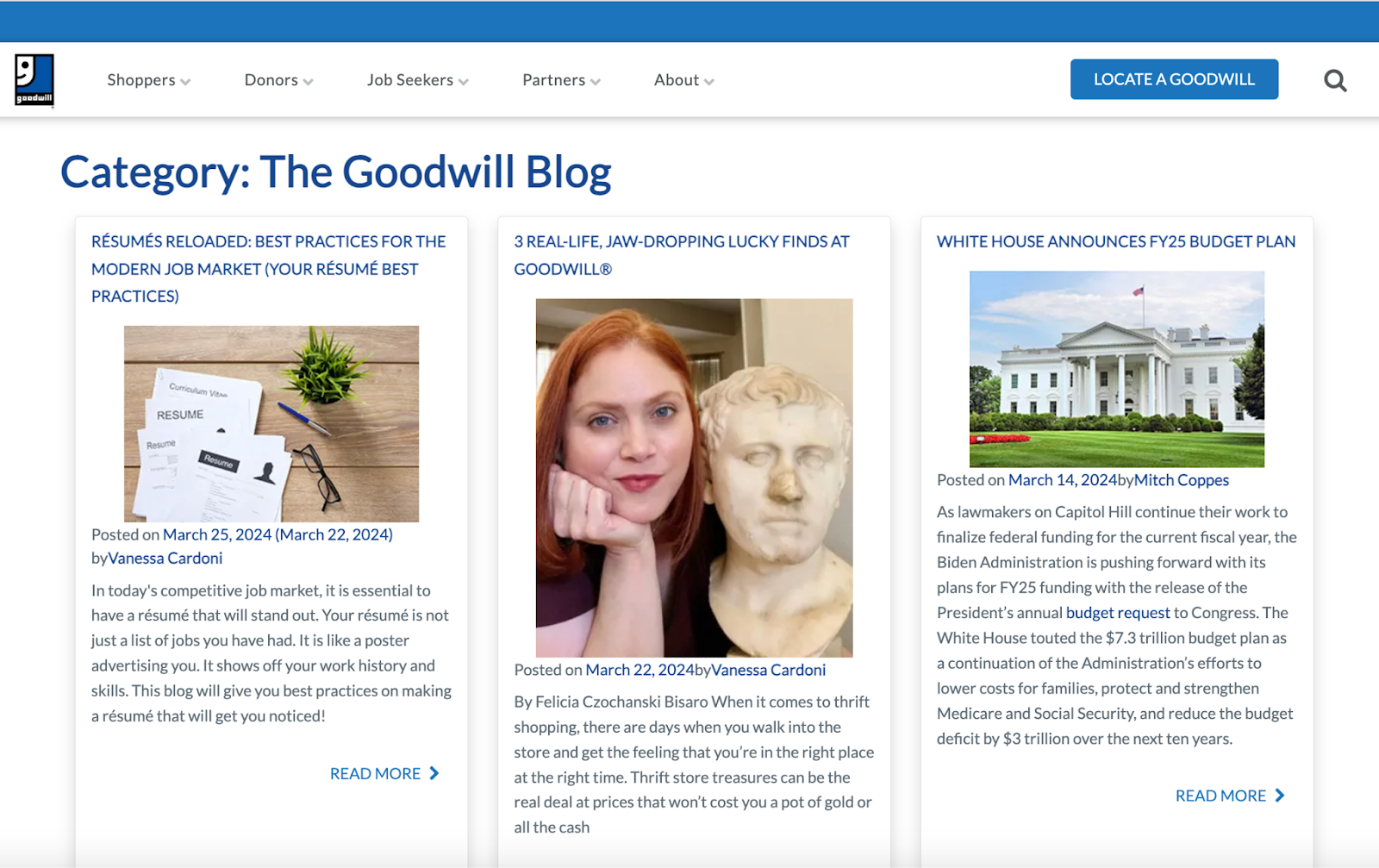
14. Goodwill Industries International
Who says nonprofit organizations can’t blog? Nay, they should. Check out this ultimate nonprofit marketing guide to make yours great.
In this example, Goodwill’s clean, colorful navigation (again — the trustworthy blue) draws the reader to the important elements of this blog.
The posts are also neatly positioned and easily accessible to readers. Visitors can pick the type of information that matters to them the most by choosing a topic using the simple buttons in the graphic above the fold.
Finally, we love the emphasis on personal stories on the Goodwill blog. This design has long-form teasers that lead readers into this organization’s programs. This approach makes it easy to learn why so many people chose to support Goodwill.
15. Springly

Keeping the nonprofit blogging train going is Springly, which makes excellent use of an editorial-style blog format by highlighting popular blog posts and including a sidebar that offers a CTA to subscribe to the company’s email newsletter.
This blog has a simplistic design with concise text and a clear color palette for nonprofits looking for useful resources.
Each article card features the first name and picture of the author, shining the spotlight on its contributors.
Placing time and people at the forefront aligns with what most nonprofits focus on. This approach makes the blog more valuable to those who are most likely to contribute and use it.
Still looking for more inspiration and ideas? Click here to check out over 70 more examples of website blogs, homepages, and landing page designs.
Use These Blog Design Examples to Build Your Best Blog
Creating a beautiful blog isn’t just about looks.
If you want your readers to really fall in love, the design of your blog should match the needs and expectations of your users. What’s most important to them? And what does your blog offer that no one else can?
Don’t just skim through these inspiring blog designs. Use them as a springboard to imagine how your blog can both connect with your audience and improve your blog design. Then, watch your readership grow.
Editor's note: This post was originally published in 2013 and has been updated for comprehensiveness.
![27 Best About Us and About Me Page Examples of 2024 [+Templates]](https://blog.hubspot.com/hubfs/about-us-page_20.webp)