Logo Design Elements and Principles
- Simplicity
- Memorability
- Originality
- Modern Yet Timeless
- Balance
- Complementary
- Versatility
Once you’ve taken the time to understand what you need your logo to “say” and to whom it should mean the most, you can start directing a designer. As you review the options presented to you, evaluate them with these principles in mind:
1. Simplicity
The best logos – the ones that give the viewer an immediate and clear sense of “you” – are clean and uncluttered. In general, less is more and simplicity is more impactful. Like this:
 Remember that logos are used in a variety of ways, on different platforms and in various formats and sizes, so fine details will be lost. A strong logo will have few elements, each of which can be identified easily and integral to what you’re hoping to communicate. If you have elements that don’t contribute to the whole, get rid of them.
The logos below are trying to stuff a whole lot into their logos. No one has the time to spend trying to figure them out:

2. Memorability
A logo should be easily recalled after just a glance. A glance, after all, is typically all your logo is going to get from most people.
Like any symbol, it should stand for something singular, and it should be easily recalled if, after a person looks at it, he or she can immediately describe its basic elements (“It’s three interlocking circles” or “It’s a dog with a bone”). A logo that’s complex, fussy, has multiple parts and pieces or is overly stylized will be difficult for the viewer to “get” and, as a consequence, easily dismissed.

3. Originality
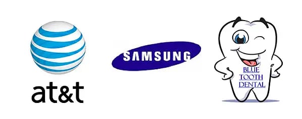
Don’t settle for a me-too logo. Do a quick search of logos in your industry and look for patterns and avoid mimicking them. Telecomm is filled with logos featuring globes, technology and electronics with logos that involve swooshes, and dentistry with logos of teeth or smiles (or both – see below).
These all make sense and communicate what the companies want them to, but if you do the same you lose all hope of getting noticed.

4. Modern Yet Timeless
“Modern” is “today,” but not so “today” that in five years your logo will look silly.
And, modern is different than trendy. A trend is “hot today” and will naturally (sometimes thankfully) run out of steam – probably sooner than later. Modern, on the other hand, is less stylized and more restrained; it captures the relevant characteristics of the times without losing itself in detail.
A logo should be modern in that it should be contemporary, yet not so nuanced with “hot” components that when that trend has run its course you’ll be left with something that feels outdated. Because then your company feels outdated to your prospects.
Your overall approach should be modern as should specific elements, colors and typefaces.
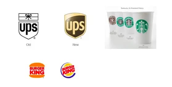
Some logos have changed little over time, only tweaked to make them more modern but keeping essential elements intact, like UPS, Starbucks and Burger King.

5. Balance
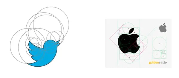
The best logos are designed using principles of proportion and symmetry. Illustrated below, you can see how both the Apple logo and the Twitter logo utilize circles of proportionate values as well as symmetry to create a pleasing, balanced aesthetic quality.

6. Complementary
Your logo’s graphic device and your typeface work together (in what’s typically called a lockup) and enhance one another. Or they should. If your graphic device is clean and linear, don’t select a typeface that’s complex and playful (Fajita comes to mind). The two elements are really one, even if you determine times they can be used separately, and they must be complementary.

7. Versatility
Your logo will be used in a number of ways and in multiple contexts. Here are just a few:
- On t-shirts, baseball caps and, alas, fanny packs
- On pens, keychains and water bottles
- On very horizontal and extremely vertical banners
- On both black and white backgrounds (make sure your designer creates your logo in black and in white to satisfy these needs if necessary)
- Very large and very, very small
- Alongside other company logos, like those for specific products and services
Imagine how these logo would look on pens:

Your logo has to maintain its integrity and serve its purpose no matter what the use. A good designer will understand all this and create a logo that works in all situations. He or she will also take into consideration any other branding elements, like textures or patterns, that are part of your brand and create a logo that complements them.
Logo Design Tips
- Make a statement based on your brand and values.
- Understand your audience.
- Subtract unnecessary elements.
- Create it as a vector file.
- Use Pantone colors.
- Convey your meaning effectively.
- Don't move forward unless it makes an impression.
If all you’re hoping to do with your logo is stand out, your designer’s job is blissfully simple. Doing something outrageous graphically will make you stand out; creating something painfully minimalist will make you stand out, too. But “standoutability” is just one element of good logo design. There’s much more to consider before you get a designer working on your brand’s logo.
1. Make a statement based on your brand and values.
For a logo to function effectively it has to make a strong statement – and the right statement – the first thing you must do is figure out what you’re trying to say. Logos are symbols and as such should tell people what you mean to them (or what you hope to mean to them – logos should be somewhat aspirational).

Evernote, a popular note taking app, uses an elephant with a dog-earred ear as its logo. The app is used to gather and remember lists, images, ideas, etc.
Once you’ve established the attributes that make your company valuable to customers and prospects, use them as communication goals for your logo.
2. Understand your audience.
A logo should not only reflect the company for which it stands; it should reflect its target audience, too. If your audience is middle-aged male gun owners who take part in the annual deer hunting season, your logo should be designed to appeal to them, with elements that suggest things like ruggedness, nature/outdoors, camaraderie, strength, etc.
Understanding your meaning and value to customers and prospects can help you pinpoint what look you want to achieve based on what you stand for (or should stand for). If you’re not sure, ask yourself what makes your company better than competitors; better yet, ask your customers.
Depending on your product or service, your competitive advantage might be speed, authentic old-world craftsmanship, precision, attention to detail, reach, intelligence, variety, coolness, good health, power, innovation, elegance, efficiency or one of a thousand other characteristics.
What you choose should be important to your prospects and customers, not exclusively to you.
3. Subtract unnecessary elements.
Since logos that are too intricate do not scale down well and are more difficult to remember, you'll want to take the "simplicity" principle to heart. Boil your logo down to its most essential elements, removing components or details that aren't absolutely essential to the message. In addition, visual effects like shadows, bevels, outlines, and gradients serve to unnecessarily complicate your logo in many cases.
Removing these things will help to make your logo have a greater visual impact.
4. Create it as a vector file.
Your logo is a versatile thing, and it will likely be used in a variety of contexts from the smallest bit of swag (like a pen) to large format graphic promotions (like billboards and banners). For this reason, a .jpg file that's 500px by 500px just won't cut it because massive sizing changes will reduce it to pixelated mush.
Enter the vector.
Unlike raster images like .jpgs which are made up of pixels, vector images rely on lines, points, and curves to construct your logo in a more mathematical way. Vector files can be sized up or down infinitely while the image proportions stay the same (and without pixelation or distortion).
If you design your logo in a vector environment to start, you'll be saving yourself a lot of heartache later. Using vector graphics software such as Adobe Illustrator or a logo maker like Looka will set you up for success in this regard.
5. Use Pantone colors.
Imagine this: You design your logo on your laptop at your home office. Then, you implement your new logo on your website. Someone in your department complains that the logo has "too many warm tones" even though your laptop is clearly showing a logo with cool tones. You print out the logo as a test and find out there's a third variation of the color altogether. Unfortunately, you already ordered paint for the office that's supposed to match this color that you thought was another color.
Monitors and printers have different calibration settings, so what you see is not always what you get. The way to ensure that your color is consistent thoughout is by using Pantone colors. The Pantone Matching System (PMS) is a way to keep consistency with specific colors regardless of the process used to produce the color.
By using Pantone colors, your team will always be on the same page regardless of what their settings are like or how the color is being produced (digitally, print, etc.).
6. Convey your meaning effectively.
You can uncover great insights by administering "the blink test" to unbiased individuals:
- Print your logo on an 8.5 x 11 sheet of paper (don’t fill up the page – make it about 1 inch high).
- Hand that paper to people who haven’t seen the logo or been a part of conversations about the design project (in other words, pull a guy off the street).
- Ask these people to look at the logo – for just 3 seconds!
- Now ask each to describe it to you.
- If your logo’s intended meaning was immediately clear to them, you’re onto something!
7. Don't move forward unless it makes an impression.
- Put your logo and 8 others on a piece of paper (arranged in 3 rows of 3); make sure they’re about the same size.
- Show this to as many people as will participate; let them view it briefly – no more than 30 seconds but at least 15.
- Take the paper away and ask viewers to recall and describe as many as they can – is yours among them?
This is a poor-man’s research that replicates (somewhat) what your customers and prospects go through every day: they have just seconds to consider a logo and it’s often at a time when other logos are competing for attention.
For your logo to do what it’s expected to, you first must understand what your value and meaning is to your customers and best prospects. Then, by following design principles that are the foundation of some of the world’s best logos, you’ll have a symbol that stands for something. To get started with creating a standout logo, you can use tools like HubSpot's Free Logo Maker.
A logo can never represent everything a company is, offers or wants to be, but a good one will say something distinct that your target will naturally respond to.
Editor's note: This post was originally published in January 2014 and has been updated for comprehensiveness.
Design


![How to Create the Perfect Marketing Timeline [Template + Examples]](https://53.fs1.hubspotusercontent-na1.net/hubfs/53/project-timeline-template-1-20240919-3074583.webp)
![My Tips for Designing Great Website Imagery [With Canva, HubSpot, + 3 More Tools]](https://53.fs1.hubspotusercontent-na1.net/hubfs/53/Untitled%20design%20-%202025-02-14T161951.776.png)
![12 web design best practices & guidelines for usability [+ expert tips]](https://53.fs1.hubspotusercontent-na1.net/hubfs/53/website-design-tips-1-20251229-288711.webp)

![How to design a logo [step by step]](https://53.fs1.hubspotusercontent-na1.net/hubfs/53/Operation-everest-free-advertising-1-20250922-654468.webp)
