.png?width=112&height=112&name=Image%20Hackathon%20%E2%80%93%20Vertical%20(75).png)

The best billboards demand your attention with bold fonts, in-your-face messages, and bright, eye-catching graphics. The best Facebook ads take the exact opposite approach.
If you want to reach and engage with potential customers on Facebook, you need to create ads that blend as seamlessly as possible into the rest of the content on their newsfeeds. This means focusing on simple, high-quality images, straightforward messages, and most importantly: minimal text.
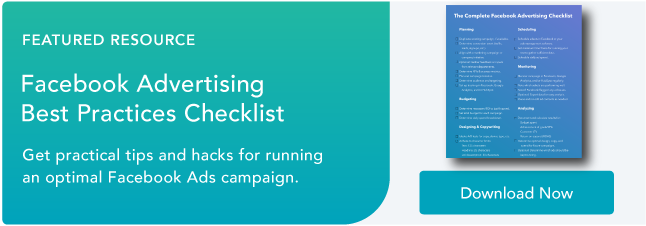
Download Now: Free Facebook Advertising Checklist
Facebook has found that the best performing ads include images with little to no text. Formerly, they had a “20% rule,” which stated that in order to run an image-based ad on Facebook, your image must contain less than 20% text. It even created a text overlay tool to help advertisers determine whether their images had too many words.
The 20% rule is no longer a requirement, and the Facebook overlay tool is inactive. However, it’s still smart to follow the 20% rule and keep text to a minimum in your image-based ads.
Facebook 20% Rule
The Facebook 20% rule was a requirement that rejected Facebook ads with more than 20% of text in its images. While the rule is no longer enforced, Facebook still recommends including a 20% text-to-image ratio. The recommendation applies to both single image and carousel ads run on Facebook and Instagram.
It's important to note that you should use the 20% rule only for the text contained within images in your ad. It does not include text on your ad outside of images, like the description copy or call-to-action button.
There are a few exceptions to the 20% rule, including images of book covers, album covers, event posters, video games, and some product images that contain text (e.g., a cereal box).
Text-based logos are not an exception to the 20% rule. You should count your logo when deciding how much text to include in your image.
So, why exactly did the Facebook 20% rule exist, and why is it still relevant today? It all comes down to what users want to see and engage with in their newsfeeds. Ads with less overlay text perform significantly better than images crowded with text, so sticking to the rule creates a better experience for both users and advertisers.
Facebook Text Overlay Tool
The Facebook text overlay tool is no longer active, but it’s still wise to carefully choose the text you’ll include in your images.
While you're creating an ad, it can be tricky to evaluate the exact percentage of text covering your image. The following examples will show you some of the ways you can add text in a way that will naturally generate engagement.
Before designing your ad, be sure to review specs and sizes for your images and Facebook’s guidelines for image-based ads.
1. Ad With Acceptable Text Overlay
 Your best approach when creating a Facebook ad is to use little to no text.
In this example of an ad image, there's only a small text-based logo and no other copy. This image contains 4% text.
An ad with a simple image like this will blend more easily into users' news feeds and is much more likely to gain exposure and engagement among your target audience.
The best part is that it might strike curiosity because it doesn’t share much; instead, viewers will have to read the description to find out what the ad is about.
2. Ad With Minimal Text Overlay
 In this next example, there are two lines of text, bringing the text percentage to 12%. The logo has been removed from the corner.
It still works because the text doesn’t cover 20% of the image. The text also helps the viewer understand what the ad is about.
Nevertheless, consider adding the copy into the body of your ad instead of your image. Since the image and the description are visible at the same time, you can use the body only to describe your offering.
3. Ad With Excessive Text Overlay
 This final example is exactly what Facebook does not want to see. It contains a whopping 44% text-to-image ratio.
While the copy is well-written and the offering is clear, this ad contains too much text over the image. The information displayed here could easily be incorporated into the body copy of your ad, creating a much cleaner look in users' news feeds.
It might be tempting to throw important information onto your images like this, but you risk alienating users who are turned off by busy copy.
Now that you have an idea of what a good ad looks like, how can you put it into practice in your own ad? Let’s take a look.
Facebook Text Overlay Best Practices
The best way to capture users' attention on Facebook is to use an eye-catching image with no text.
The 20% rule isn't just an arbitrary recommendation — it helps advertisers reach their target audiences more effectively, and prevents users' news feeds from becoming overwhelmed with disruptive advertisements.
If you do want to add text to your image, you should use the following best practices for overlaying text over your Facebook ads.
1. Choose the right font size.
Believe it or not, font size is even more important than the amount of text you overlay over your image.
Smaller font sizes naturally won’t take up as much space, reducing your text-to-image ratio. Bigger font sizes will make you exceed the 20% rule straight away, even if you’re only including two or three words. That said, you don’t want to make the text too small; otherwise, viewers will have to squint to read what it says.
The font size you choose will depend on the size of your image and whether you’re adding a heading or a whole sentence. For headings, try to stay under 42 pixels; for sentences, try to stay around 24 pixels. Play around with font sizes to find what best works for the image.
2. Include only a heading or one line of text.
There’s no reason to include more than one line of text in your Facebook ad. You have the body of the ad to include enough context and information for the viewer to click your link.
If you add text, consider only adding a heading — such as an offer, a call-to-action, or a discount. That’ll maximize the impact of the text and ensure viewers see something that will compel them to click.
For instance, “Buy 1 Get 1 Free,” “Apply Now,” and “30% Off” are all eye-catching phrases that will warrant a second look and don’t take up too much space. That brings us to the next point: Choose only the best and most eye-catching text to add to your image.
3. Choose eye-catching, impactful text.
When adding overlay text to your Facebook ad, be sure to choose a line of text that will 1) Catch your target audience’s attention and 2) Hint at the value they’ll extract if they click through to your offer.
In the body of the ad, you can go into greater detail about your product or offer. But in your image, include only the text that will help someone decide whether they want to read more.
4. Use an alternative text overlay tool to see your text-to-image ratio.
While Facebook’s text overlay tool is no longer available, you can use an alternative that mimics Facebook’s original tool. We recommend trying these:
They’re virtually identical in functionality, so simply choose the one that’s most convenient for you and your browser.
To use them, upload your image and select the squares that have text. On the right-hand column, the tool will tell you whether you’re above or under the 20% text-to-image ratio. That way, you know for sure whether you’ve added too much text to the image.
5. Take advantage of a grid to align the text.
In a free tool such as Canva, you can typically overlay a grid over your design as you’re creating it. Simply go to Elements > Grid and scroll until you find a grid that best works for your design. (Be sure to lower the transparency of the grid so you can see your ad beyond it.)
Use the grid as a guiding tool for aligning your text and ensuring it doesn’t take up too many boxes. If your grid has nine boxes and one line of text takes three boxes horizontally, then you know that the text is too big. If it only takes up one box, it might be too small.
Without a grid, you might lean on gut feeling only — and while your gut feeling can be of great help, it’s best to approach text overlays with as much exactitude as possible.
The 20% Rule Will Help You Create Better Facebook Ads
While Facebook no longer requires advertisers to adhere to the 20% rule, it’s still a valuable guideline for adding text to your Facebook ads. Keep text to a minimum and you’ll ensure your Facebook ad packs as much impact as possible, significantly boosting your ROI and encouraging viewers to engage with your brand.
Editor's note: This post was originally published in June 2019 and has been updated for comprehensiveness.

![How to master the basics of social media advertising [+ 5 examples]](https://53.fs1.hubspotusercontent-na1.net/hubfs/53/Untitled%20(524%20x%20393%20px).png)

![How to Boost a Post on Social Media [Instagram, Facebook, and Twitter]](https://53.fs1.hubspotusercontent-na1.net/hubfs/53/social-media-boosting-1-20250205-921042.webp)
![Anatomy of a Facebook Ad: How to Create Scroll-Stopping Campaigns [+ Examples]](https://53.fs1.hubspotusercontent-na1.net/hubfs/53/anatomy-of-a-fb-ad.png)


.jpg)