Have you ever heard that your website should be your best salesperson?
Think about it. A website should say everything about your business and promote all your current products, services, and pricing. It should attract prospects and answer any and all questions they have about the company.
In other words, your website should convert prospects into leads like any other salesperson.
Just as you need to train and invest in your salespeople year after year, you need to measure your site’s performance over time and make any necessary changes and updates to ensure it continues to successfully convert visitors.
As you analyze your site, you might identify specific problems that prompt you to consider a redesign. Maybe shoppers are increasingly abandoning their carts on your e-commerce site. Maybe your bounce rate is significantly higher on mobile devices than desktops. These are just a few reasons that you may need to redesign your site.
We’ll discuss more reasons below to help you decide whether you need to invest the time, resources, and budget in a redesign.
Why redesign a website?
Reasons for redesigning a website vary, depending on the specific marketing goals of your business. The most common reasons are to rebrand your site, increase your traffic, generate more leads, and add functionality to improve the user experience.
Your business goals will determine the scale of your website redesign. If you’ve changed your branding, then your site might need a simple makeover: change the color palette, swap out some photos, and you’re done. But if you’ve overhauled your marketing strategy, then you might need to migrate to a content management system with the functionality and customization options needed to completely redesign your site.
Learn More About HubSpot's CMS Software
To help you better envision your redesign process, let’s dig deeper into the most common redesign goals and what you'll need to do to achieve them.
1. You want to rebrand your site.
Having a consistent look and feel across your site is important. If a visitor clicks on a link on your homepage and is taken to a page that looks completely different, they may be confused or even worry that they were redirected to a malicious page. Even small differences — like having different navigation menus on pages — can frustrate visitors.
Design inconsistencies like these are common, particularly on sites that have added more authors and merged with other microsites over time. If your site has grown significantly in the past few years, then it may be time to review and implement brand guidelines and styles so your site has a cohesive design. That includes deciding on a color palette, fonts and font hierarchy, button styles, iconography, and more.
For an example of a website with consistent branding, we can look to Mailchimp. In 2018, the email software company completely redesigned its site, unveiling a new logo, a fashionable serif typeface, illustrated images, and more of its eye-catching brand color. Take a look at the before-and-after picture below.
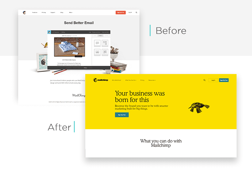
If you’re looking to rebrand your site like Mailchimp did, then you’ll need website building tools that are both easy-to-use and flexible. If your current tools aren’t, then look for a platform that enables you to either start from scratch or customize pre-designed templates with a drag-and-drop editor.
2. You want to drive more traffic to your site.
Your website's great design won't matter if no one sees it. To drive traffic to your site, you need to optimize it for search.
A great way to do this is to make blogging part of your content strategy. Websites that feature a blog have a 434% greater chance of being ranked highly on search engines.
When developing your blog strategy, you’ll need to do keyword research to see what specific words and phrases people are using in their search engine queries and then include them in your titles, headers, body copy, meta descriptions, and URLs.
As you create more blog posts, you can link them to related posts and pages. This will help search engine bots and visitors understand the relevance, value, and relationship between content on your site.
If you first created your site on a publishing platform or with a website builder, then you may need to migrate to a CMS with more advanced content management features. Some platforms like Content Hub, a content management system by HubSpot, will even have built-in SEO tools to help you optimize your content. Otherwise, you’ll have to set up an integration with third-party tools like Google Webmaster Tools or SEMRush.
3. You want to convert more visitors into leads.
If you’re driving lots of traffic to your site and want to convert those visitors into leads, you need to design your site around a clear conversion strategy.
Your site should tell visitors about who you are, what you do, and who your target audience is. Then, it should convince them to take the next step in becoming a customer. Here's a quick video on the purpose of a website:
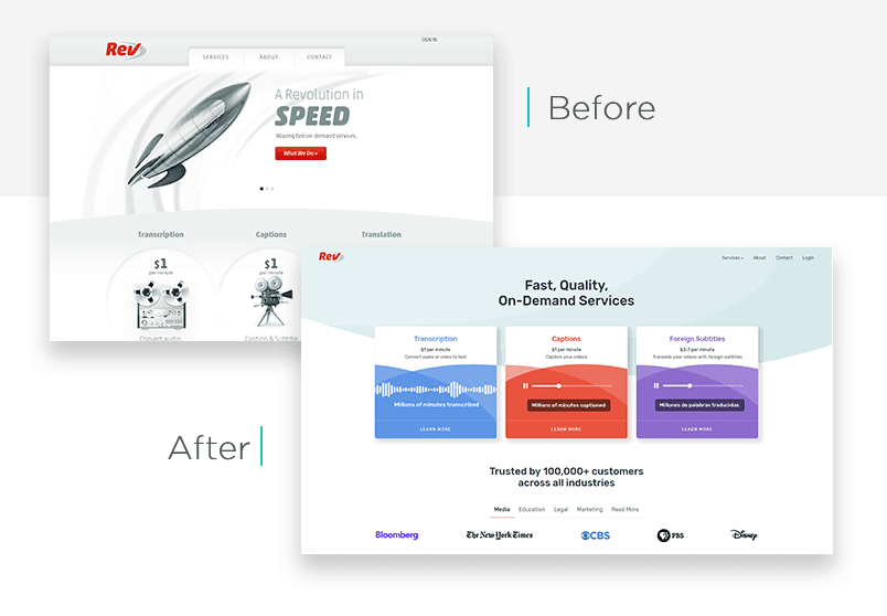
Let’s look at Rev as an example. Before the audio transcription site's redesign, the homepage featured a central carousel with three cards. Each card had a different icon — a rocket ship, a dial, and a telephone — to represent the company’s three value propositions: speed, quality, and service.
Above the carousel was a menu bar featuring a tab labeled “Services.” Visitors had to click on the tab to view a list of the company’s services. Under each service, there was a graphic and some basic pricing info without a clear call-to-action. For a full description of each service, you’d have to either click on the header or scroll below the fold.
When redesigning its site, Rev ditched the carousel and instead featured three cards side by side. Each card represents one of its most popular services and includes a brief explanation, price, and call-to-action button. This new design resulted in an 18% improvement in Rev’s conversion rate.
If you’re looking to see a similar improvement in your conversion rate, check if your current platform supports integrations between your site and a CRM or marketing automation software. Otherwise, you might need to migrate to a CMS with built-in conversion tools. With Content Hub, for example, you can simply drag and drop CTAs and forms onto the page and then track and segment visitors in your connected HubSpot portal.
4. You want to add functionality to your site.
Your website needs to be easy to use, easy to understand, and easy to navigate — for both your visitors on the front end and your marketing team on the backend.
As your traffic and team grow, you’ll likely need to add new functionality to your site to meet the evolving expectations and needs of both visitors and back-end users. For example, you might need to add live chat to your site, add and manage multi-language content, or run A/B tests directly in your dashboard.
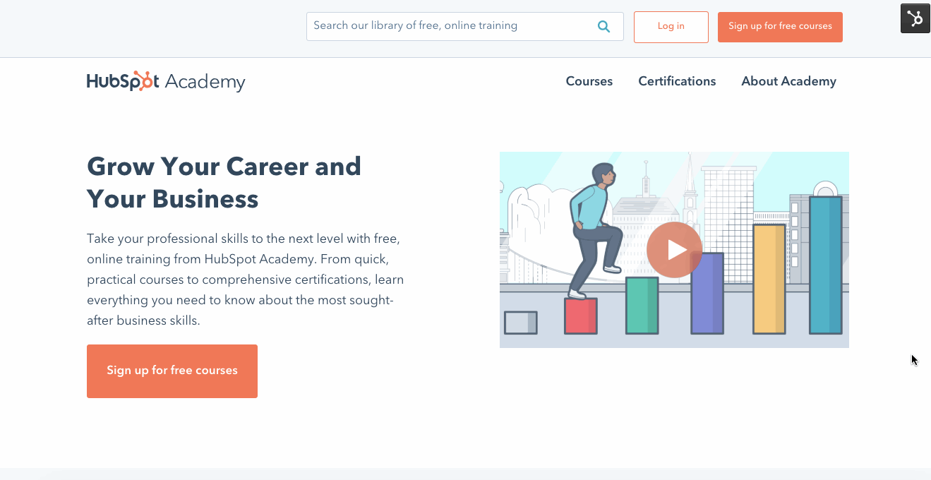
When HubSpot redesigned its Academy site in April 2019, we focused on improving navigability and personalization to ensure visitors could find what they’re looking for as quickly and easily as possible. Among other changes, we simplified the navigation system and added smart content filters to help visitors have a seamless experience on the site.
If you’re looking to add smart content filters or other features to your site, you need a platform that has robust built-in functionality and the flexibility to integrate with external software. Such a platform will be able to support your site’s growth over time.
5. You want to optimize your site for mobile visitors.
Mobile devices accounted for 58% of organic search engine visits in 2019. Because mobile search is so popular, search engines have built their experiences around it. In fact, when you Google something on your phone, you'll see search results for mobile-friendly pages first. That means you need to ensure your site is optimized for both desktop and mobile devices.
Understanding this shift in user behavior, the Art Institute of Chicago redesigned its site in 2018 to make it fully responsive.
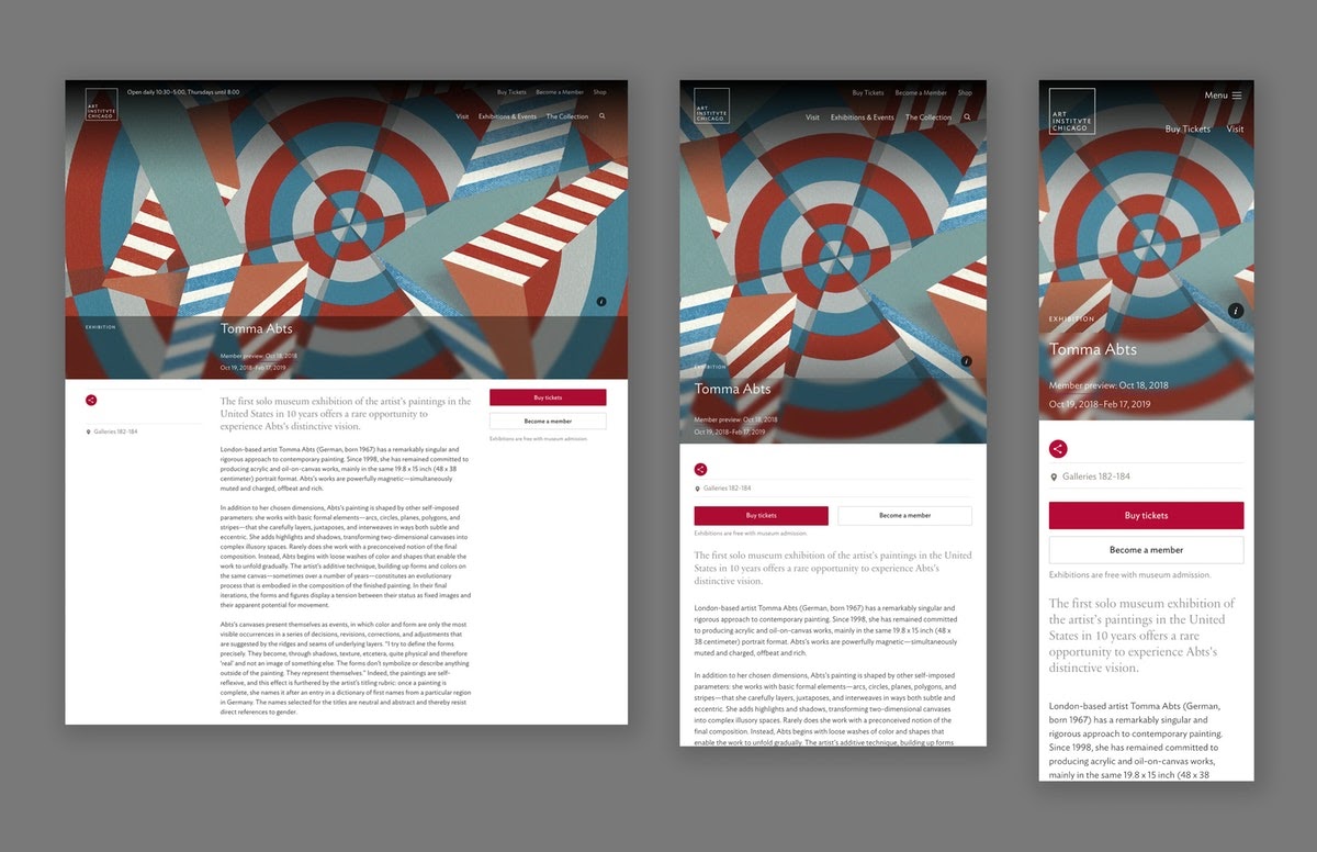
If you’re using a platform that’s responsive out-of-the-box like Content Hub or Squarespace, you don’t need to worry about how your site will look on any device.
However, if you’re using a website builder like Wix, you’ll need to toggle between the desktop and mobile-friendly view of a page to ensure it looks the way you want. You might have to rearrange some elements or delete space to ensure the page is optimized for mobile devices.
Is it time to redesign your site?
A website redesign takes time, effort, and money — but it can be crucial to your success online. When aligned with your overall business strategy, a redesign can help you increase your conversion rate, improve your rankings, and meet the needs of your team and visitors.
Website Redesign