In sales, most professionals say getting prospects 99% of the way towards a purchase is easy, but getting them across the final 1% is the hardest part of the job. Crossing the finish line, just like in a marathon, is extremely challenging.
In marketing, the same principle applies. You can write the most gripping blog post you’ve ever written, persuading an audience that your offer is just as captivating and insightful, but if your landing page or even one of its elements disengages them, their odds of downloading it will plummet.
Fortunately, we’ve tested and iterated our landing pages enough to determine which template converts our website visitors into leads at the highest rate possible, and we want to share it with you.
Check out our analysis of each segment of our Customer Service Metrics Calculator offer's landing page to learn how we convert visitors into leads at a 35% rate.
![Get Inspired: 77 Examples of Exceptional Web Design [Free Download]](https://no-cache.hubspot.com/cta/default/53/c791aced-6180-48a5-916d-b2d76cec1836.png)
The Landing Page Template HubSpot Uses to Convert at a 35% Rate
1. The Hook

We lead off our landing page with a graphic, title, and synopsis of our offer to visually and mentally engage our audience right off the bat. This grabs their attention and generates interest in the rest of the landing page and the offer. We also include a CTA at the beginning of the landing page to enable readers who were already interested in our offer to immediately download it.
2. The Reason Why People Should Care About the Offer

Spotlighting your offer’s insights is crucial for generating conversions. But before you do that, you need to clarify why people should care about you offer in the first place. People buy the “why” behind things, not the “what” or “how”, so when you’re asking for someone’s contact information, which is basically a transaction today, you should be able to give your audience a good reason to do so.
For our Customer Service Metrics Calculator offer, our “why” is that word of marketing one is of the largest business acquisition sources today and certain metrics can track your customers’ happiness and, in turn, their willingness to refer your product or service to their family, friends, and colleagues.
3. The Summary of the Offer

After we clarify why people should care about our offer’s topic, we naturally segue into what our audience will learn by reading our offer. This is a logical transition that answers the question our audience most likely thought of after they grasped the importance of tracking customer service metrics -- “Which customer service metrics are the most important to track?”
4. The Sneak Peek of the Offer

Sneak peeks are just like movie or TV show trailers. They offer you an inside look at what you’re about to experience, which builds suspense and anticipation for its content.
To generate as much hype as possible without giving away too much information, we usually reveal our offer’s most important concepts or the pages that preview the majority of our offer’s insights.
5. The FAQs

Concerns about privacy and personal data collection are at an all-time high now, so it’s easy to understand why people usually ask why they need to enter their contact information to access our offers. To relieve them of any stress or anxiety they might feel about filling out a form, we cleared all the ambiguity out of the way by informing them why we ask people to fill out forms and that it doesn’t cost any money.
With your landing pages, make sure you can field questions from your audience about them and provide the answers to the most frequently asked questions on your landing pages.
6. The Call-To-Action
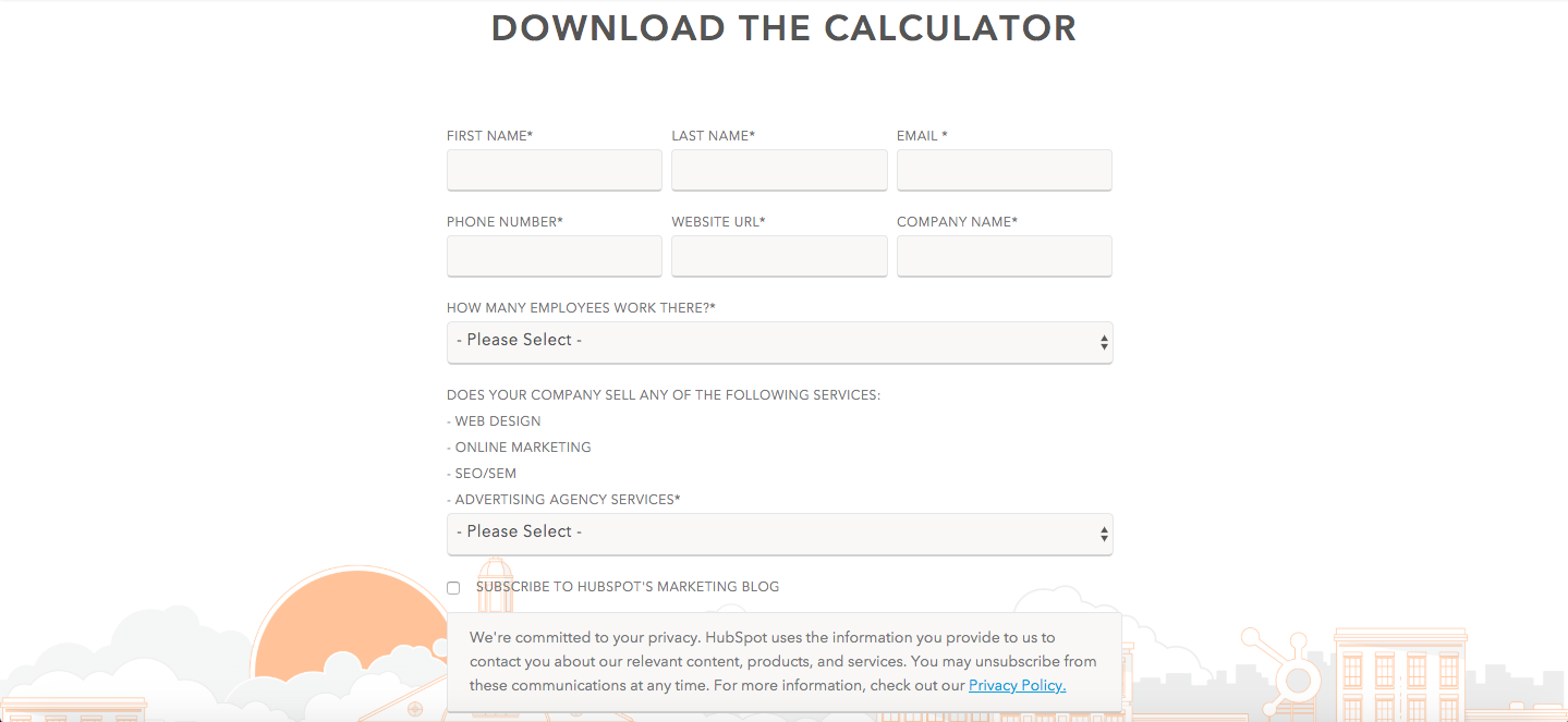
A wise content marketer once said, “If you don't tell your reader what to do next, you might as well have never written your content in the first place.” This principle rings especially true when you create landing pages. Obviously, if you don’t include a call-to-action on your landing pages, no one can actually download the offer. But creating effective call-to-actions hinges more heavily on your CTA’s copy and its ease of use -- and much less on if it exists.
The best CTAs command your audience’s attention with a gripping headline and makes it easy for your audience to actually download the offer by limiting the amount of forms your audience needs to fill out or auto populating their information in your form, if their cookies are turned on.

![How to Create a Landing Page with High ROI [Expert and Data-Backed Tips]](https://blog.hubspot.com/hubfs/Untitled%20design%20%2847%29.jpg)


![Why You Need to Create More Landing Pages [Data + Tips]](https://blog.hubspot.com/hubfs/create%20more%20landing%20pages.png)