
“A simple and affordable way to increase leads and create more conversions through your website.”
Sounds intriguing, right? But what could I possibly be describing?
I’m referring to sign up web forms. In addition to increasing leads and conversions, sign up forms also help businesses grow their mailing lists and learn more about the people interested in their company and products. They only take minutes to make and can be embedded anywhere on your website.
By the end of this blog post, you will know how to create an impactful sign up form for your website and what to include to achieve the greatest impact possible.

13 Tips to Create a High Converting Sign Up Form
The point of your sign up form is to provide a way for website visitors to opt into your communications or gain more information about your business. A good form makes the opt-in process simple and increases the number of conversions. But what makes a good sign up form?
These tips will help you create an impactful sign up form that gets you closer to your desired result: more leads.
Keep It Simple
Keep your form simple and easy to fill out. Exclude the fluff, unnecessary wording and extra fields. When it comes to web forms, the more fields, the less likely a person is to want to complete the form. In fact, one instance, less fields can lead to a 120% increase in conversions.
Use One Column, Not Two
When a lead is completing a sign up form, you want to provide them with an easy end-to-end experience and a single column form is the best way to do that. Two-column sign up forms may disrupt reading or cause leads to misinterpret the fields.
The only time you should place multiple fields on one line is when the questions are so closely related that it makes more sense for your leads to complete them next to one another. For example, first and last name form fields should be placed next to each other.
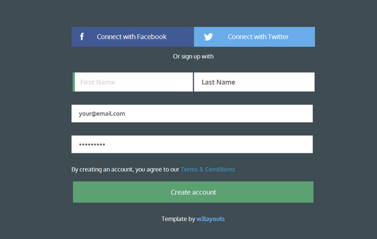
Source: W3layouts
Don’t Ask For Information Twice
Have you ever filled out a form and been asked to enter your password twice? Sure it helps to ensure accuracy and validity on forms, but asking leads for duplicate information is unnecessary, especially since there are alternatives that will make the process less cumbersome.
For example, you can unmask passwords so that users can double check their entry before submitting the form.
Advanced form builders use progressive profiling, which prevents returning users from being asked the same questions when they revisit a website. For example, if a lead signed up for one of your offers and returned to your site at a later date to fill out another form, your form builder would remember the lead and either auto-fill their known information or remove redundant questions from the form altogether. Not only does this keep the form completion process as efficient and easy as possible, but it provides a positive user experience.
Use a CTA Button That Stands Out
You should provide your leads with a clear call-to-action, or “submit” button. The main reason CTA buttons are so important is that they make it clear how a lead should submit the form they just completed. The CTA button itself should be wide and bold so it is easy to see and use — a CTA button should make your leads feel confident that the information they are submitting is going to be seen by the right people.
Eliminate Distractions
Sign up forms should serve one purpose: generate leads. That means eliminating distractions like ads, extra wording, photos or videos. Consider a pop-up, dedicated landing page, or a clean area on your site to keep your users focused on the task at hand — completing your form.
Use Inline Form Validation
Inline form validation stops leads who type incorrect information in the form fields with an error message so they are unable to submit the form until they fix the error.
For instance, maybe someone types a password that doesn’t meet the requirements, enters an invalid phone number or is missing a few digits in their zip code. If your forms were submitted with this misinformation, they wouldn’t be useful for you or your leads. Inline form validation ensures that only accurate information is submitted and, thereby, saves time for everyone.
Consider Text and Form Field Box Alignment
When you create your sign up form, align your text so it’s easy to read and follow. Place text above your form fields (not below or to the side). When your leads see “Name”, they will know they should write their name in the form field directly below. People are traditionally used to reading left to right, and completing forms in a single column format, so maintaining consistency is important.
Make the Value of Signing Up Clear
Whether you’re offering a free trial, first-time purchase discount, weekly newsletter, or important company information on new products and services, you should state the value of signing up on (or around) your form. This will get your leads excited and provide them with an incentive to complete all those form fields.
Show Social Proof
Social proof is a way to show potential leads that other people are taking action by filling out your form and they should too.
70% of online consumers look at a product review before making a decision to buy something. That’s exactly why marketers often use social proof to encourage visitors to complete their sign up forms.
Providing proof works — in fact, studies have shown that product reviews written by real customers are 12x more trusted than product descriptions written by companies and manufacturers. Social proof could be a testimonial quote, a product review or a submission counter.

Source: Instapage
For example, when an eBook author added social proof (in the form testimonials) to his website, he experienced an increase in downloads and email sign ups by over 64%... not bad! When people see social proof, they have a reason to trust you and your business which leads to an increase in conversions.
Make Your Form Look Nice
Did you know that 38% of people will stop engaging with a website if the content and layout are visually unattractive or unpleasant?
People care about your sign up form design. Make your form look professional, visually appealing and ensure it matches the look of your other brand. If you put in the time to create a beautiful form, you will leave a lasting impression on your leads.
Tell Your Leads What Happens After They Sign Up
Once someone completes your sign up form, let them know what to expect next. Whether it’s a weekly email, future product announcements, quarterly company news, or an annual check-in, your new lead should know how and when they will hear from you.
A common way to do this is by sending your new lead to a “thank you” page or providing an inline message once they submit the form. After all, they did just stop whatever it was they were doing to voluntarily provide you with their information.
Don’t Use CAPTCHAs On Forms
CAPTCHAs are the tests that ask you to enter a code or identify images in a photo before submitting a form. Their purpose is to detect bots and decrease SPAM.
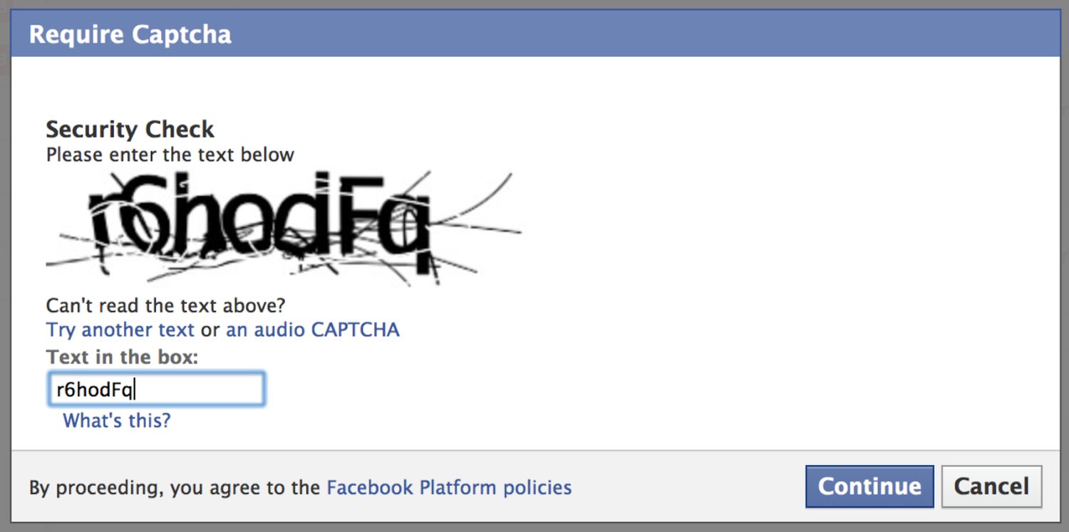
Source: BeSpecular
However, completing a CAPTCHA is sometimes tricky, takes time and often frustrates leads. Not to mention, CAPTCHAs are less helpful than they once were since computers have become better at imitating humans. If you’re worried about SPAM, you can try the reCAPTCHA, which allows leads to simply check a box that says, “I’m not a robot” and carry on with their day.
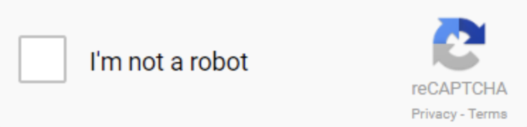
Source: Google
Test Your Sign Up Forms
First, test that your form works. Your leads should have no issue providing their information and submitting it to your server. Then, test which variation of your form is most effective through an A/B test.
Four Great Sign Up Form Examples
A great way to create an impactful sign up form is to look at other successful examples. Although each business has different needs and requirements, there are still common elements shared among successful web forms that you can learn from. Here are four examples to consider:
Netflix
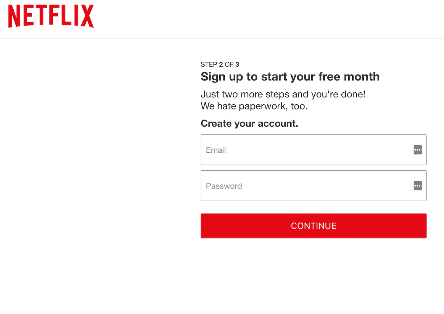
Source: Netflix
Netflix has a quick and easy sign up form with a clear incentive: a free, one-month trial. All new users need to do to get started is create an account with an email address and a password. It’s quick and simple, which is key to increasing conversions. The copy about hating paperwork doesn’t hurt either — it shows how Netflix relates to their customers.
Grubhub
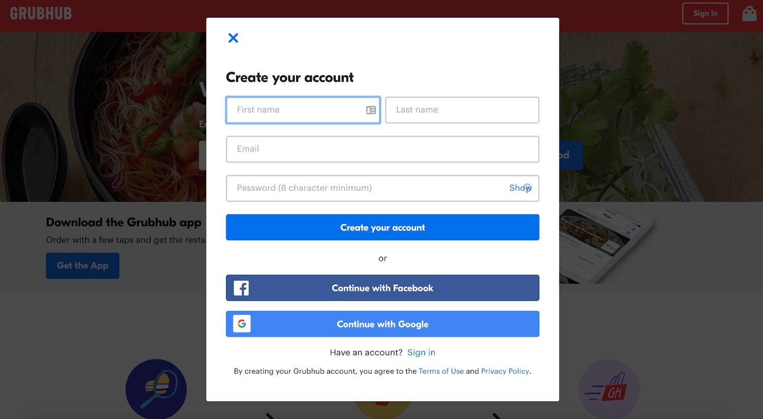
Source: Grubhub
Grubhub uses a pop-up sign up form, which eliminates distractions by darkening the background to bring the form into focus. Leads are asked for just three pieces of information that they can either fill out manually or automatically using their Facebook or Google account. Grubhub knows how to create an efficient and easy experience for their visitors.
Equinox
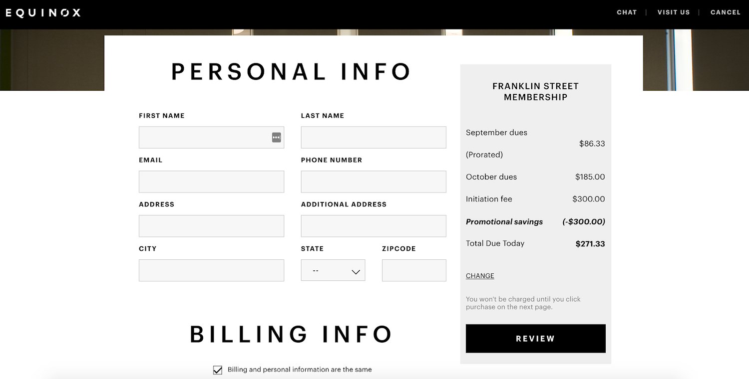
Source: Equinox
Signing up for a gym membership requires a lot of personal information, but Equinox knows how to keep the process simple. The club has separate forms for personal, billing and account information that are displayed as a user progresses. Not only that, but their selections are displayed alongside the form, which allows leads to confidently hit “Submit” at the end of the form.
HubSpot CRM
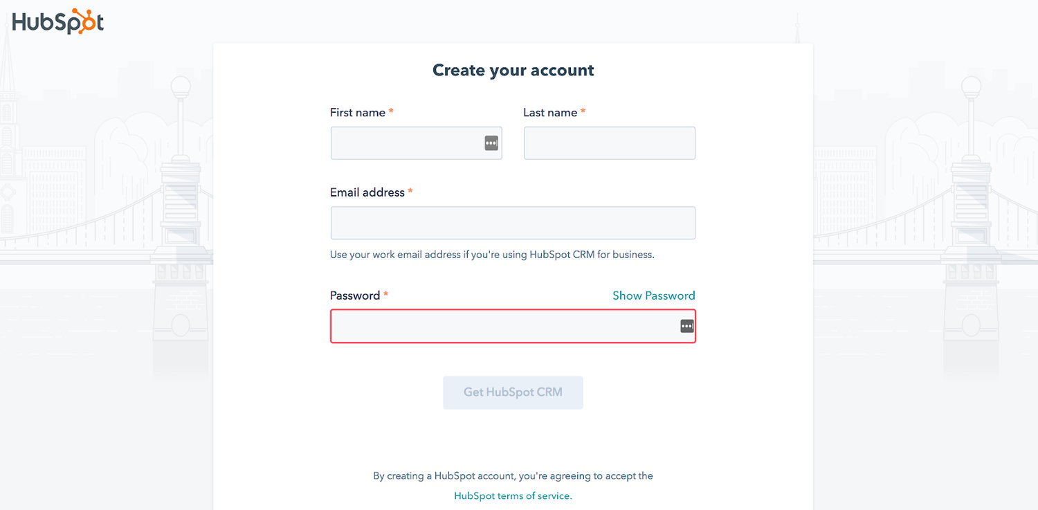
Source: HubSpot
The HubSpot CRM sign up form only requires leads to complete four fields — first name, last name, email and password — before submitting. HubSpot places the first and last name form fields side by side to shorten the form. Lastly, the form is branded, looks nice and matches HubSpot’s aesthetic.
A Google Sign Up Form Template You Can Use Right Away
Now that we’ve reviewed some great sign up form examples, let’s check out a couple of (free) templates you can use to create your own sign up form. All you need is access to the Google Suite (if you already have a Gmail account, you’re good to go).
T-Shirt Sign Up Form: Google Forms
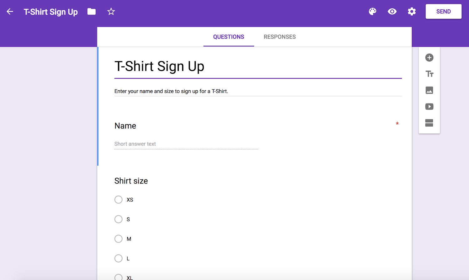
Google Forms is another quick way to create sign up forms. With this free software, you can build a professional-looking form and share it publicly. Google Forms has a large selection of templates to choose from and this T-Shirt sign up form is just one of them. Google Forms allows you to collect information in a variety of ways, such as large and short-entry text fields, multiple choice, checkboxes and more.
Sign Up Sheet Template: Typeform

Source: Typeform
Typeform is a no-code SaaS platform with thoughtfully-designed tools that help companies grow their business by engaging with their audience in a conversational way. Typeform turns digital interactions into human connections with people-friendly forms, quizzes, surveys, and asynchronous video solutions. Register teams and volunteers with an online sign up sheet template from Typeform.
Conclusion
Sign up forms are a way to generate leads and build your mailing lists. They also allow you to learn more about the people most interested in your brand, products and services. With a simple, visually appealing and easy-to-follow sign up form, you will increase your conversions.


Forms