Ever click on a website, take one look, and say, "Hm, that's going to be a no," and look for the exit button? For me, it's usually because of three reasons: the site looks outdated, crowded, or hard to navigate.

This is why visual hierarchy is so important in web design, as a bad website can keep visitors from gaining interest in your brand.

Here's an easy guide for understanding the key design principles of visual hierarchy to draw your audience in, keep them engaged, and generate conversions.
Table of Contents
- What is visual hierarchy?
- What constitutes bad visual hierarchy?
- 7 Web Design Principles for Visual Hierarchy
- Examples of Good Visual Hierarchy
What is visual hierarchy?
Visual hierarchy is the method of arranging graphic elements by order of importance. By relying on principles relating to size, color, contrast, white and more, you can influence how users interact with your designs, from images to websites.
Visual hierarchy affects what you look at and focus on in a design, whether it's an image, graphic design, or web design. It's a key player in information architecture (i.e., how information is organized and displayed for easy understanding and navigation) and can greatly impact the user experience (UX).
When thinking about visual hierarchy, you want to ask yourself a few questions:
- What do we want to draw attention to?
- What actions do we want our users to take?
- Where does the eye naturally go to, and where do they land?
Asking these questions will help you use the principles outlined below to create a clear visual hierarchy.
What constitutes bad visual hierarchy?
When it comes to visual hierarchy, there's a golden rule: If every element appears important, nothing will seem important.
Visual hierarchy serves as a way to rank the information you're consuming. If there is no way to differentiate between the elements, that is considered poor hierarchy.
Take this example:
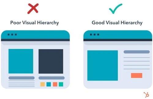
There’s a lot going on on the left. The two main elements are the same size, and multiple colors make it hard to know where to look.
On the right, your eye is automatically drawn to the main blue box on the left, then naturally goes to the elements on the right before landing on the orange call to action (CTA).
A poor visual hierarchy:
- Confuses the user.
- Makes it unclear where to look.
- Creates a bland design.
Instead, create a visual structure that facilitates understanding and guides the user. The right visual hierarchy on a website helps someone understand what a page is about. Below we’ll go over the basics of visual hierarchy in web design.
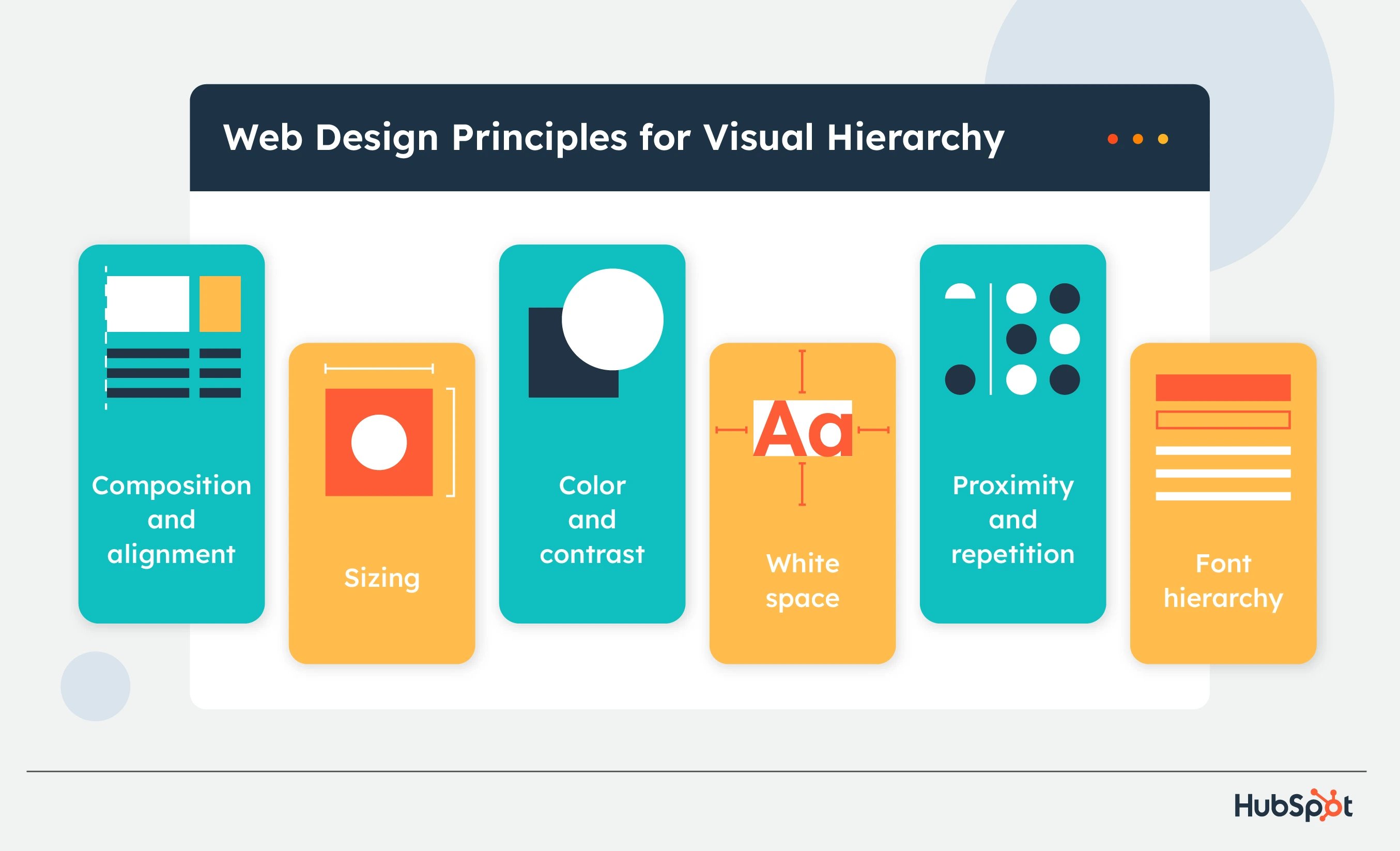
7 Web Design Principles for Visual Hierarchy
- Use alignment and composition to create focal points.
- Consider reading patterns.
- Users notice bigger elements more easily.
- Color and contrast draw the eye.
- White space creates emphasis.
- Proximity and repetition create unity.
1. Use alignment and composition to create focal points.
Alignment and composition help you structure the elements on your site and create focal points for viewers. Two common composition rules are the rule of thirds and the rule of odds.
With the rule of thirds, your page is divided by two horizontal and vertical lines, creating a grid of nine equal-sized squares. The spots where lines intersect are focal points where you’ll place the important elements of your design.
The rule of odds says that an odd number of elements creates more interest and engagement from viewers because each element can be assessed individually rather than in even numbers of groupings.
2. Consider reading patterns.
Reading from top to bottom is a global standard, but there is cultural variation in how people read horizontally. The “Western” standard for languages like English and Spanish is to read from left to right, while Semitic and Indo-Aryan languages, like Arabic, Hebrew, and Urdu, read from right to left.
This variation brings two different reading/scanning styles: F and Z patterns.
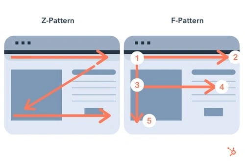
- Z Pattern viewers start at the top left of a page and move across to the top right, then down and backward to the bottom left, then across to the bottom right.
- F Pattern viewers begin on the top left and move to the top right like Z pattern viewers, but they use the left side of a page as a guide and quickly scan to the right in a shorter movement (the shorter line of an F), then back to the left and down to the bottom of the page.
You can either follow traditional reading patterns and design pages that match one's natural processing or disrupt a traditional pattern and provide a main element of focus for them to use for navigation. Remembering this will help you design projects that convert, especially landing pages.
3. Users notice bigger elements more easily.
Size is essential in visual hierarchy because bigger elements get the most attention and are deemed more important.
Take this example from Netflix.
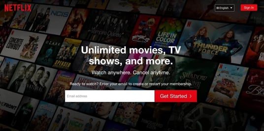
The first thing you'll read when looking at this image is "Unlimited movies, TV shows, and more." Then you'll read the next line, and then the next before you explore the other elements on the page.
The “Unlimited movies, TV shows, and more” is displayed as the most essential part of the message, which makes sense, because that is Netflix’s main selling point.
As you design your webpage, consider what you want your audience to look at first and use that to guide your strategy.
4. Color and contrast draw the eye.
People are drawn to colors, which evoke emotion and have cultural and social connotations. Just look at logos by industry, and you'll notice that food brands gravitate towards yellows, and financial institutions tend to be in blue.
In design, color is great for drawing attention to specific elements. And contrasting colors are great for displaying a difference between the elements of your page or calling attention to one over the other. For example, using a neon green and then an off-white color would draw attention to the elements in neon green.
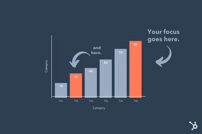
In the image below, the two orange bars in the graph stand out from the gray bars, indicating that the orange is a focal point and the gray is secondary.
On a website, you can use colors to draw focus to your CTAs. In the image below, the standout plan option is draped in purple, while the others are white. The brand likely wants users to choose that plan, so adding color to it draws their attention and interest.
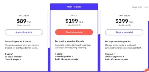
In the example above, the CTA that stands out the most is in the middle. The brand likely wants users to choose this option. The other CTAs are still visible but muted compared to the orange.
To create the most visual impact with color, less is often more.
4. White space creates emphasis.
White space refers to the empty space within a design.

White space in your web design is key for drawing attention and maintaining balance.
Less is more, as filling space with as many elements as possible can confuse and deter viewers if they can’t figure out what they’re looking at.
Apple is also well known for its use of white space.
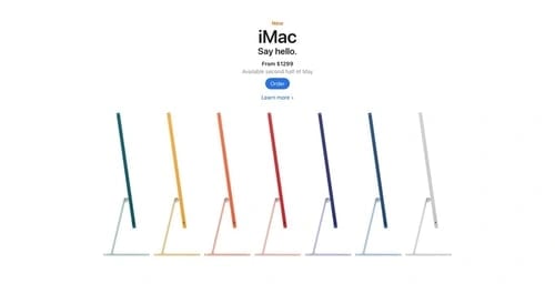
The brand offers a simple user interface, emphasizing elements on the page. Apple's use of white space also reflects a brand's identity.
6. Proximity and repetition create unity.
Putting elements together tells users that the elements are related.
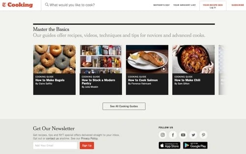
Take the New York Times Cooking website, for example. Its “Master The Basics” header features four closely grouped recipe boxes, letting viewers know they likely share a level of importance.
If you're not sure how to group certain elements, you can use UX research strategies, such as card sorting, to group elements based on your audience's expectations.
7. Font hierarchy helps you organize text.
Fonts add an important visual element to your website and help you organize and classify text (sometimes by level of importance).
A font hierarchy has three parts:
- Primary: Your primary text is the largest on the page, draws initial attention, and contains the most important buzzwords to call people in.
- Secondary: Secondary font is your subheadings or secondary descriptions. It doesn’t stand out as much as primary text but still gives value and helps their gaze travel across your page.
- Tertiary: Tertiary text is the smallest sized text on your page, but it is still readable. It can give more detail about your page and be short (like a caption) or long (like an entire paragraph or description).
Below we’ll go over some visual hierarchy examples for you to use as inspiration.
Examples of Good Visual Hierarchy
1. Visme.co
Visme gives people access to templates and graphics they need to create content.

What we like:
Visme’s striking CTA follows font hierarchy principles to encourage users to sign up for its newsletter. The largest words are the most impactful to know, and the secondary and tertiary text provides more info as readers move down the page.
2. 8AD Studio
8AD Studio is a full-service production agency that specializes in branding.
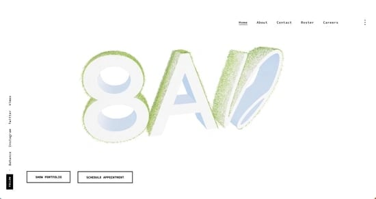
What we like:
By capitalizing on white space, 8AD Studio expertly draws attention to three key elements: its unique logo and two CTAs. It shares three essential elements with site viewers and lets people know it’s good at its job — creating branding that captures attention and builds recognition.
3. Predominantly Black
Predominantly Black is a handmade home and body fragrance company. 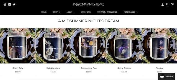
What we like:
Predominantly Black gives a great example of how proximity builds visual hierarchy. By organizing products under the main title and leaving little space in between, visitors quickly understand that these products fall within the same category.
Over to You
Visual hierarchy is all about ranking your elements by order of importance. Once you narrow down what you want to focus on and consider your audience's needs, you can create designs that produce the desired impact.
![How to Create an Ebook From Start to Finish [Free Ebook Templates]](https://blog.hubspot.com/hubfs/ebook-template_0.webp)

![36 Beautiful New Ebook Templates [Free Download]](https://blog.hubspot.com/hubfs/free-ebook-template_7.webp)
![Ultimate Guide to Hero Images [Best Practices + Examples]](https://blog.hubspot.com/hubfs/hero-image_5-1.webp)
![How to Use the Rule of Thirds in Web Design [Quick Tip]](https://blog.hubspot.com/hubfs/bull%20in%20meadow%20rule%20of%20thirds%20example.jpg)

![How To Design An Annual Report [+ Template & Examples]](https://blog.hubspot.com/hubfs/annual-report-design.jpg)