.png?width=112&height=112&name=Image%20Hackathon%20%E2%80%93%20Vertical%20(50).png)

Table of Contents
.png)
Free Website Design Inspiration Guide
77 Brilliant Examples of Homepages, Blogs & Landing Pages to Inspire You
- Agency Pages
- Ecommerce Pages
- Tech Company Pages
- And More!
Download Free
All fields are required.
20 Web Banner Design Ideas
Here are some web banner design ideas that can inspire you to create banners that work for your business.
1. Keep things simple.
You can try to think up fanciful banner designs and be extra creative, but sometimes, the best thing is to keep it simple. A simple banner design will do more than capture your viewer‘s attention. Since there’s not much going on with your banner, they quickly get your message.
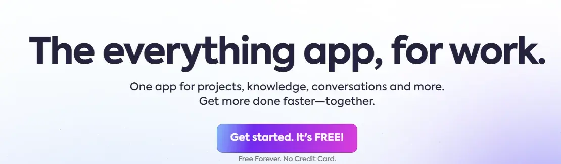
Pro tip: It's best to use a simple banner design when you want your viewer to perform a simple action, like creating an account or signing up for a newsletter.
2. Use images best suited to your niche.
A banner ad aims to advertise your services and increase brand awareness. An image or graphic related to your niche may be the perfect solution for your design problem. It’ll blend well with your website and allow your viewers to understand your content better.
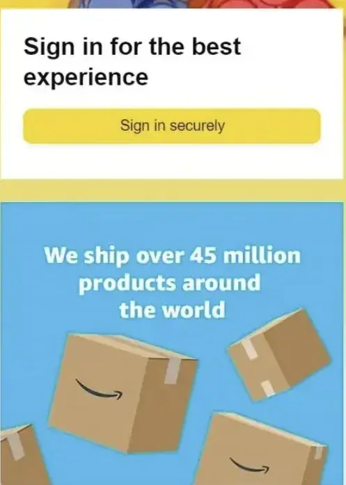
What we like: Amazon uses images directly related to its niche. By using cardboard boxes in its banner, Amazon already gives viewers an idea of what to expect when they click the banner ad.
3. Animate your banner.
Animations add extra movement to your banner — making it easier to grab people’s attention.
While animations can increase your audience’s engagement with your banner, it’s vital to keep the animations simple.

Pro tip: Be creative with your animation. This animated web banner by HubSpot uses creative copy to grab user attention and show the solution to a problem we want to solve.
4. Try a sticky web banner at the top.
Want your shipping policy or special offer to stay visible? A sticky banner at the top of your page might be the perfect solution. These banners remain in view as visitors scroll, ensuring important information stays accessible without disrupting the browsing experience.
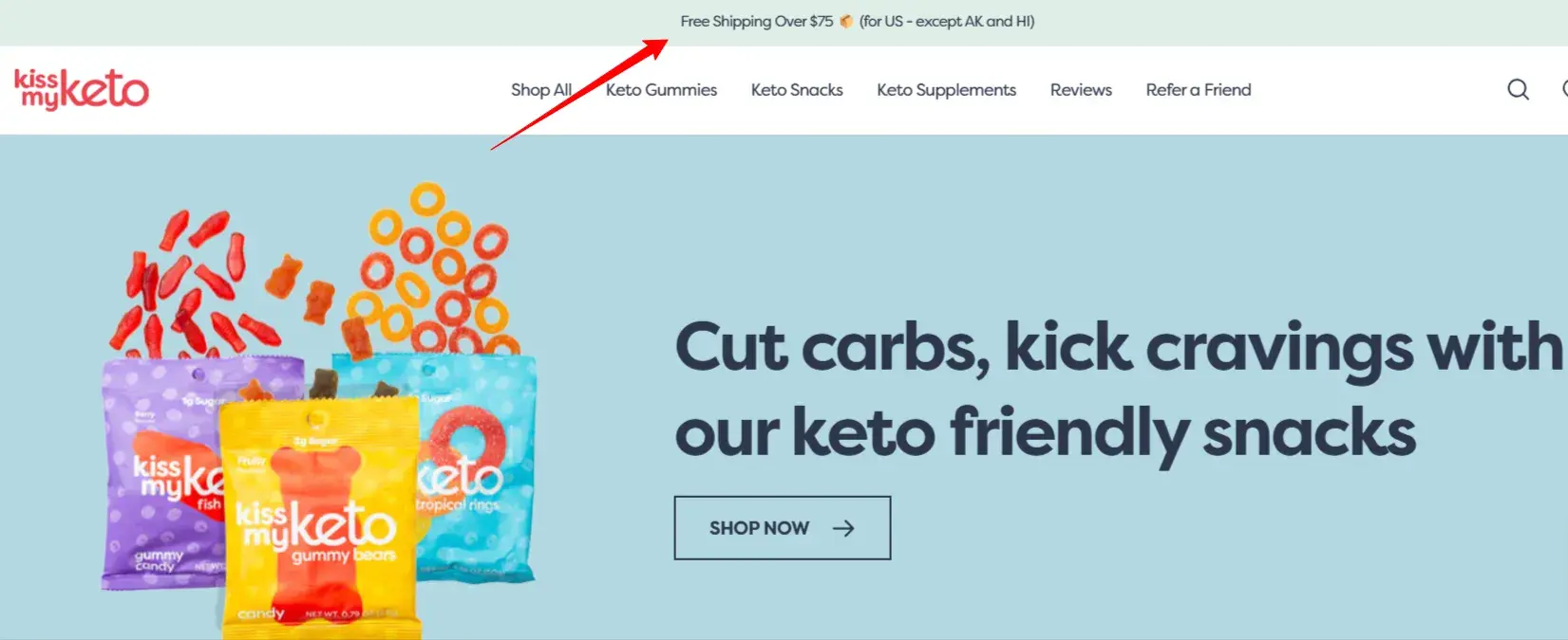
What we like: Kiss My Keto demonstrates this perfectly with its sticky banner. Notice how it clearly and concisely communicates its shipping policy, including the incentives and limitations.
5. Experiment with an artistic reference.
Graphic-style banners are the norm for web banner designs, but you can switch things up by using easy-to-grasp references. You don't need to go over the top — take some art your viewer can relate to, fuse it with your copy, and create an eye-catching artistic design.
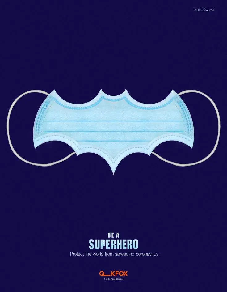
What we like: This banner by Quick Fox is eye-grabbing while simultaneously passing a message. Quick Fox smoothly implements Batman art into its design, making it hard to ignore the message.
6. Make the colors pop.
When used on your website, banners with bright colors stand out and are hard to ignore.
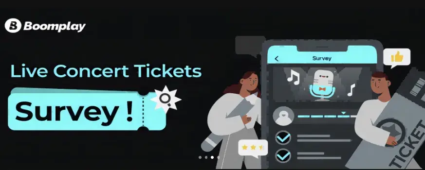
What we like: Contrasting colors work well together. Boomplay has white and light blue colors, so it incorporated them into designing its web banner and created contrast using light and dark colors.
Free Website Design Inspiration Guide
77 Brilliant Examples of Homepages, Blogs & Landing Pages to Inspire You
- Agency Pages
- Ecommerce Pages
- Tech Company Pages
- And More!
Download Free
All fields are required.
7. Showcase popular product collections.
Want to highlight multiple products at once? A grid-style banner might be your answer. I've found that featuring a small collection of related products helps visitors quickly grasp your product range without overwhelming them.
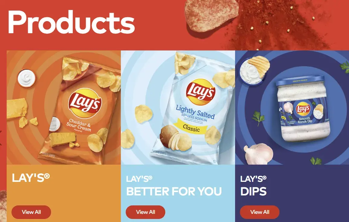
What we like: Lay's nails this approach with its three-product grid banner. By pairing chip varieties with a complementary dip, it creates a cohesive product story. Notice how they keep the CTAs simple and consistent — each product has the same “view all” button, making it easy for visitors to explore what interests them most.
8. Launch new offerings with clear benefits.
When introducing something new, I‘ve found that focusing on the "what’s in it for me?" factor drives the best engagement. A well-structured banner should highlight both the new offering and its immediate value to visitors.
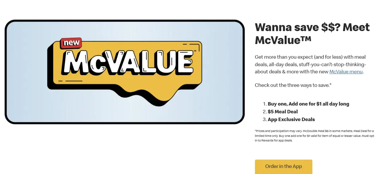
What we like: Look at how McDonald's introduces its new McValue menu. It leads with the benefit (saving money), outlines multiple ways to save, and directs visitors to its app for exclusive deals. Driving traffic to your app can boost engagement and create a direct channel for future promotions.
9. Create depth with gradient backgrounds.
I've found that combining gradients with image collages can create a sophisticated, premium feel. This approach works especially well for subscription-based services where you want to convey both value and quality.
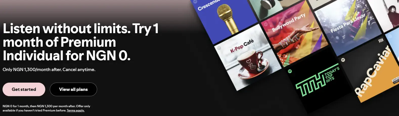
What we like: Notice how Spotify uses a dark gradient background to make its white text pop, while its collage of album covers adds visual interest without overwhelming the offer. Spotify keeps its CTAs clear with contrasting button colors that guide visitors toward different subscription options.
10. Create lifestyle moments.
I've found that showing your product in real-life situations can create powerful emotional connections. When done right, lifestyle imagery helps visitors imagine themselves using your product.
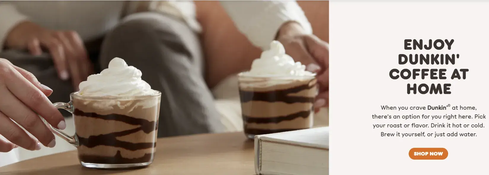
What we like: See how Dunkin' captures an intimate at-home moment with its coffee. It uses carefully styled product shots with lifestyle elements to make its coffee look delicious and accessible. The partial view of people enjoying the product adds relatability without overshadowing its star product.
11. Combine dynamic elements with static offers.
I've found that mixing animated text with static images creates an engaging yet organized banner experience. This approach helps highlight different aspects of your offer while maintaining a clear message.
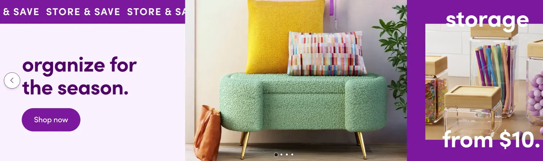
What we like: Look at how Wayfair structures its banner with three distinct sections. Its animated “store & save” text catches the eye, while its central product image showcases functional furniture. The static price point on the right gives visitors a clear entry point to start shopping.
12. Sell, but don’t sell …
I've found that sometimes, the most powerful selling happens when you let your product speak for itself. A minimalist approach with dramatic lighting and clever wordplay can create an air of sophistication that draws visitors in.
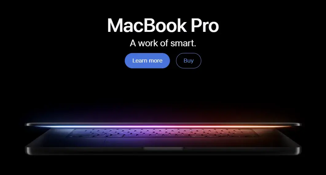
Pro tip: Notice how Apple lets its MacBook Pro's design do the heavy lifting. Its clever wordplay (“A work of smart”) and strategic lighting create intrigue without pushing a hard sell. The dual CTAs give visitors the option to learn more or purchase, respecting different stages of the buying journey.
13. Use the good old CTA.
I‘ve found that combining a strong value proposition with a clear CTA creates banners that convert. The key is telling visitors exactly what they’ll get, then making it easy to take action.
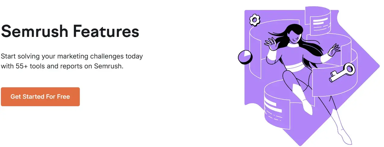
What we like: Semrush keeps its banner clean and focused on value. It leads with a specific benefit (55+ tools and reports), then follows with a clear, action-oriented CTA. The simple design ensures nothing distracts from the main message.
Free Website Design Inspiration Guide
77 Brilliant Examples of Homepages, Blogs & Landing Pages to Inspire You
- Agency Pages
- Ecommerce Pages
- Tech Company Pages
- And More!
Download Free
All fields are required.
14. Tell a story with your design.
If you‘ve paid attention to any designer, you’ll have heard them say countless times, “Art tells a story.” The same applies to web banners — a compelling narrative can turn browsers into bookers.
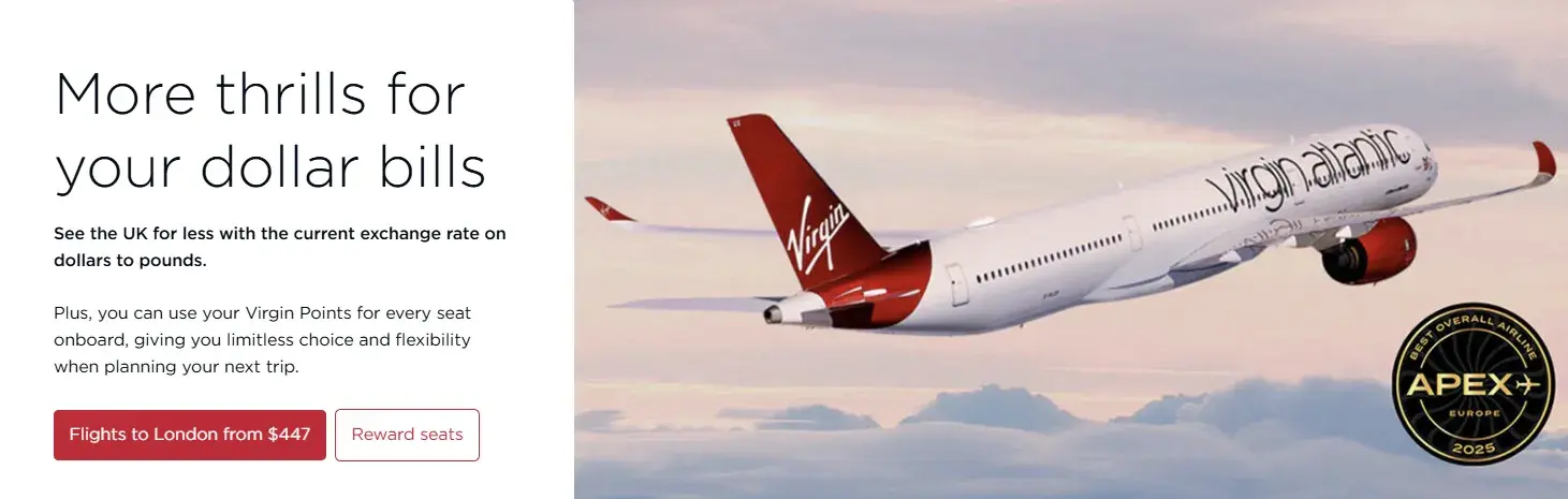
What we like: Virgin Atlantic weaves multiple benefits into a single narrative. It leads with a catchy headline about value, explains the current exchange rate advantage, and highlights its rewards program flexibility. The two CTAs give visitors clear paths: book a flight to London or explore reward options.
15. Get your audience with humor
Humor is a powerful tool in the right hands. You'll be unstoppable if you know how to use humor appropriately and infuse it into your design.
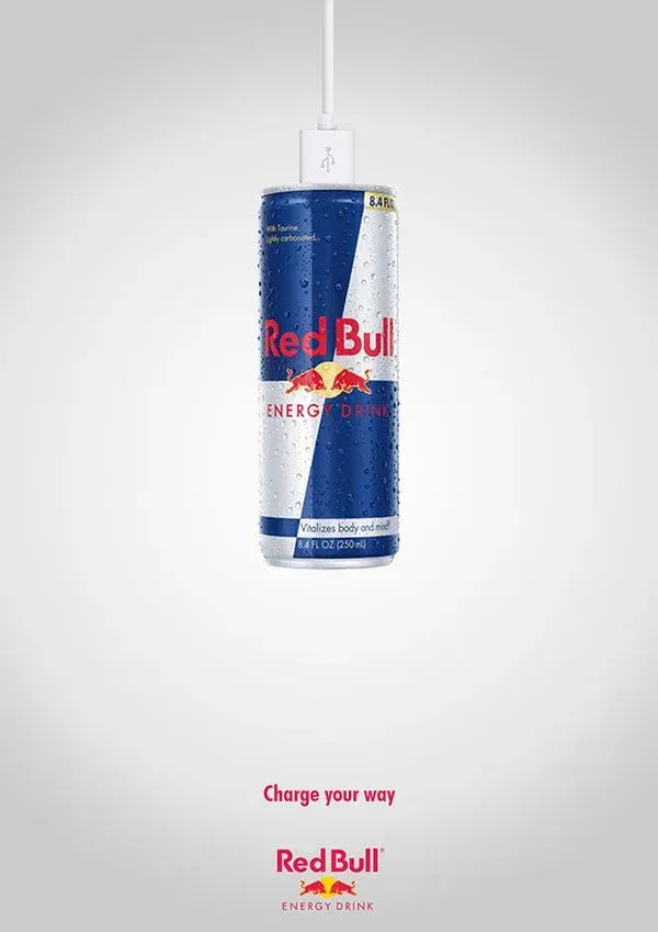
What we like: Red Bull nails the balance between humor and branding. Its clever visual of a plugged-in energy drink can, paired with the witty “Charge your way” tagline, creates a memorable connection without trying too hard. The humor feels natural and on-brand.
16. Use responsive sliding animations to hide and reveal details.
Want to pack more information into your banner without overwhelming visitors? Sliding animations let you reveal details progressively, keeping your design clean while offering depth.
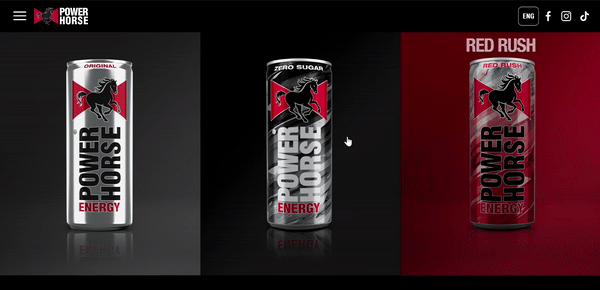
What we like: Power Horse uses sliding animations to transform its simple banner into an interactive product showcase. When visitors click an image, the banner smoothly reveals product details without disrupting the page's flow. This approach keeps the initial design clean while offering easy access to deeper content.
17. Lead with authority.
Sometimes the most powerful banners are the ones that state their value clearly and confidently. A bold statement backed by specific benefits can be more effective than flashy design elements.
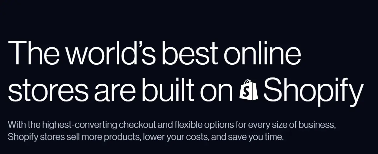
What we like: Shopify makes a bold claim and immediately backs it up with specific benefits. Its minimalist black background with white text keeps the focus on the message, while its logo placement adds credibility. The supporting text efficiently outlines three key benefits: better sales, lower costs, and time savings.
18. Simplify complex concepts.
Technical products don‘t need technical banners. I’ve found that clean design and clear messaging can make complex features feel accessible and appealing.
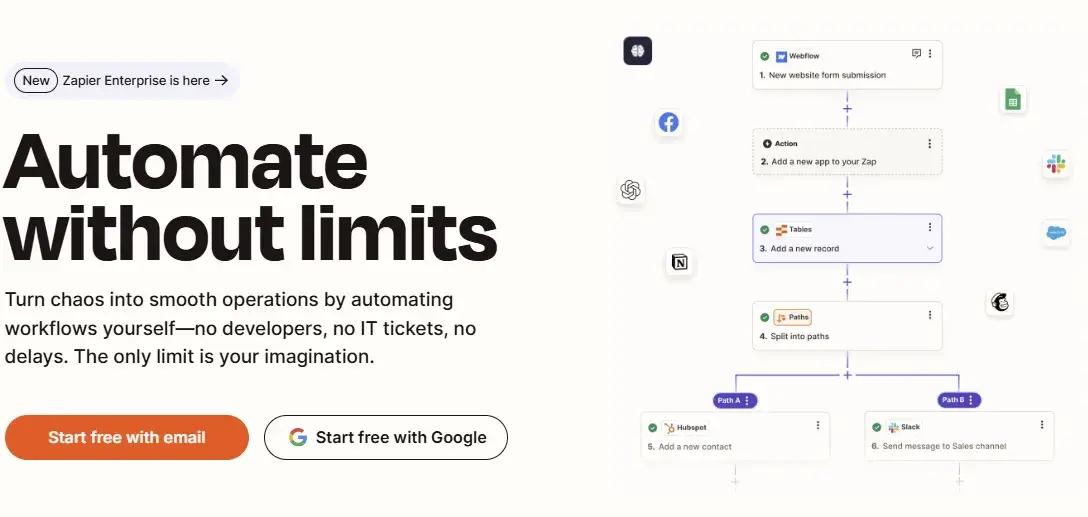
What we like: Zapier transforms complex automation concepts into an inviting message. Its tree-like graphic visualizes how automation branches out across workflows, while the clean layout and empowering copy (“no developers, no IT tickets, no delays”) make self-service automation feel achievable. The dual sign-up options remove barriers to getting started.
19. Pair heritage with emotion.
Sometimes, the most powerful banners combine brand legacy with emotional storytelling. When done right, this approach creates deep connections with visitors.
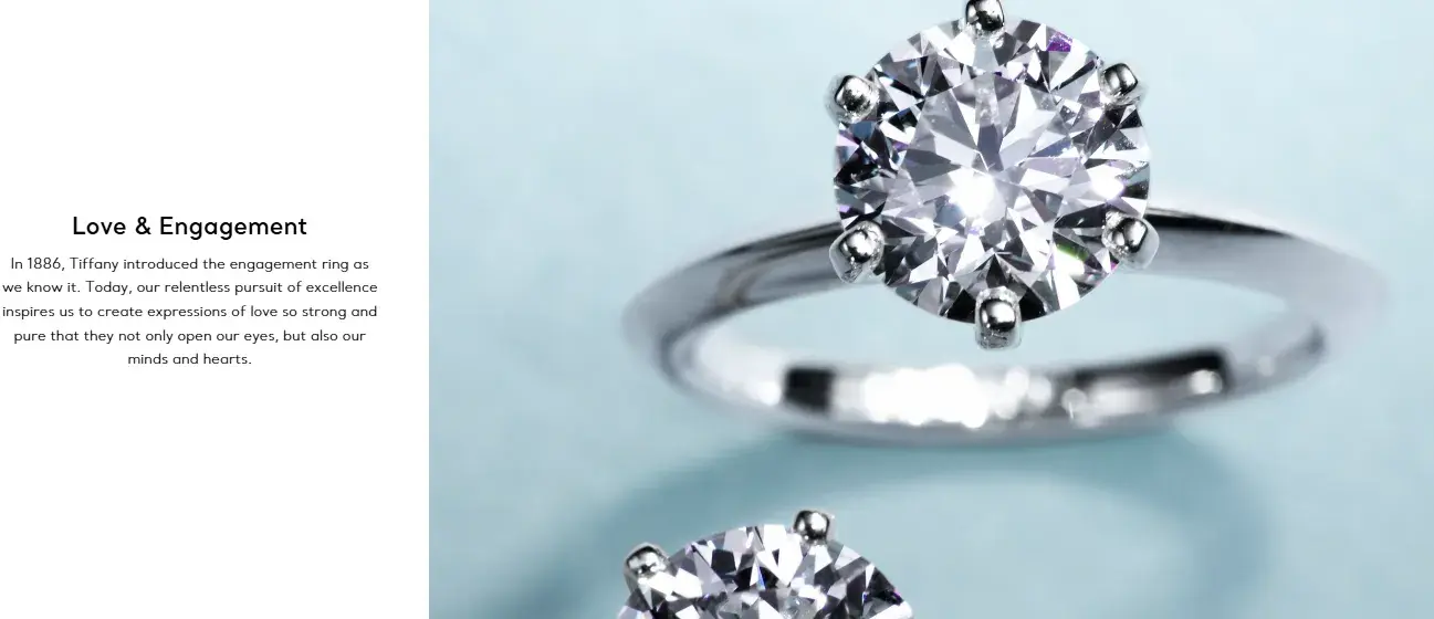
What we like: Tiffany & Co. elegantly weaves its historical significance with modern emotional appeal. Its video backdrop of sparkling rings complements rather than competes with the message. The copy establishes authority (“introduced the engagement ring as we know it”) while connecting to deeper emotional values (“expressions of love so strong and pure”).
20. Showcase brand ambassadors.
I've found that featuring influential personalities can add authenticity to your banner messaging, especially when their story aligns naturally with your brand values.
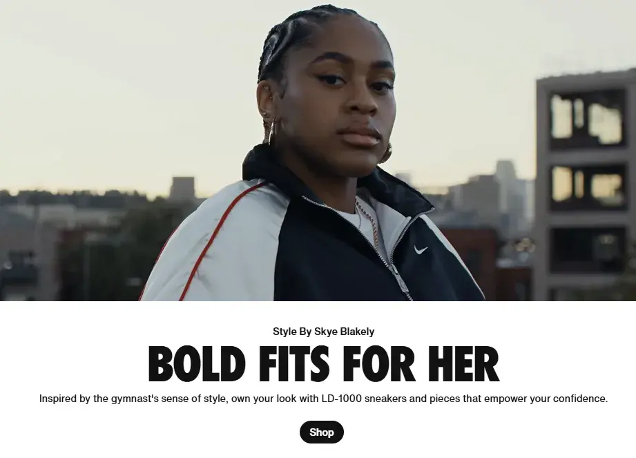
What we like: Nike centers its banner on gymnast Skye Blakely, using dynamic video footage to bring her athletic style to life. The banner connects product features with personal expression (“inspired by the gymnast's sense of style”), while the empowerment message naturally ties to both the athlete and the brand's mission.
What Makes a Web Banner Pop?
Over the years, I‘ve identified several key elements that consistently drive banner engagement. While you don’t need to be a design expert, understanding these fundamentals will help you create more effective banners.
Pro tip: Before diving in, check out our Website Dimensions Guide to ensure your banner will look great on any screen size.
1. Define your banner’s purpose.
Like every part of your website, I've learned that web banners need a clear purpose. While most serve advertising goals, I often design banners for informational purposes, too.
I start each project by identifying the banner‘s specific goal. Through my work, I’ve seen web banners drive results for:
- Product launches and feature updates
- Time-sensitive promotions
- Important announcements
- Resource downloads
The banner‘s purpose determines its design elements and placement on your site. I’ve found that banners with mixed messages often confuse visitors and reduce engagement.
Pro tip: I ask myself, “What's the one action I want visitors to take after seeing this banner?” This clarity helps me create more focused designs.
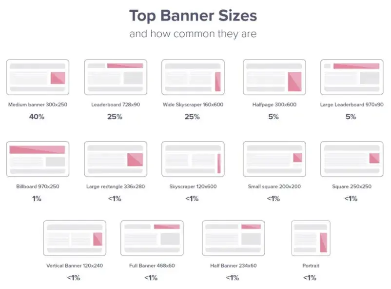
2. Determine your banner size.
I‘ve found that choosing the right banner size helps visibility and user experience. Through testing different formats, I’ve identified the most effective standard dimensions:
- 728 x 90 px (Leaderboard) - I use these for homepage headers
- 336 x 280 px (Large rectangle) - Works well within content
- 300 x 250 px (Medium banner) - Perfect for sidebars
While I use tools like Canva and Adobe Express for creation, I always check how my banners display across different devices. Mobile responsiveness is particularly important — I‘ve seen engagement drop significantly when banners don’t adapt well to smaller screens.
Pro tip: Test your banner on both desktop and mobile views before launching. A leaderboard banner might look great on desktop but could overwhelm mobile users.
Free Website Design Inspiration Guide
77 Brilliant Examples of Homepages, Blogs & Landing Pages to Inspire You
- Agency Pages
- Ecommerce Pages
- Tech Company Pages
- And More!
Download Free
All fields are required.
3. Mix the right colors.
I've learned that banner colors directly impact performance. Understanding color psychology and color theory helps me choose combinations that work.

Through testing, I've found certain color combinations work better for specific goals:
- Grey and white for professional messages.
- Red and yellow for urgent promotions.
- Blue and green for trust-building content.
I avoid combinations like yellow text on white backgrounds — these hurt readability and reduce engagement.
Pro tip: I test my banner colors against the website's existing palette to ensure they complement rather than clash.
4. Use clear and simple texts.
I‘ve found that text can make or break a web banner’s effectiveness. Through testing different approaches, I've learned to focus on three key elements:
- Message clarity: I keep text concise and action-focused. Each word should serve a purpose in moving visitors toward the desired action.
- Font choice: I opt for readable fonts at appropriate sizes. Through testing, I've found that bold sans-serif fonts at 16-24px work best for headlines.
- Formatting: I structure text with a clear hierarchy — headline, supporting text, and call-to-action.
Pro tip: I test my banner text by reading it at arm‘s length. If I can’t scan it in under 3 seconds, it needs simplifying.
5. Choose appropriate images.
You know how they say a picture‘s worth a thousand words? Well, in banner design, I’ve found it‘s only true if you pick the right image. Through lots of testing, I’ve learned that quality makes a huge difference. Sure, professional photos usually work best, but I've gotten great results with well-shot in-house photos, too. The trick is making your images look purposeful, not like last-minute additions.
Here‘s something else I’ve discovered: the type of image really matters. Take product banners, for example. I've seen clean, simple product shots consistently outperform fancy lifestyle images. Why? Because they help visitors focus on what matters — your message and call to action.
Speaking of focus, I always pay attention to how images work with other banner elements. Think of it like arranging furniture in a room — everything needs to flow together. I make sure images guide eyes to the important stuff, not distract from it.
Pro tip: Sometimes, less is more. I often test banners with and without images, and you'd be surprised how often a clean, text-only design wins.
6. Add call-to-actions.
Call-to-actions (CTAs) are the steering wheel of your banner design. Without a clear CTA, even the prettiest banner won‘t drive results. I’ve learned this lesson the hard way through countless A/B tests.
For CTA text, I keep things simple but specific. Instead of generic phrases like “Click here,” I use action-driven text that tells visitors exactly what they'll get. For example, “Start a free trial” or “Get your template” works better because they set clear expectations.
But balancing visibility with subtlety is tricky. Your CTA needs to stand out but not scream at visitors. I've found that strategic button placement and contrasting colors work better than aggressive messaging or oversized buttons.
Pro tip: I keep my CTAs to 2-4 words max. Short, punchy phrases tend to drive more clicks than longer ones.
Why Web Banners Matter
Think of web banners as your website‘s friendly tour guides — they help visitors find exactly what they’re looking for while showcasing your best offers.
Here‘s why they’re so valuable:
They're your 24/7 sales assistant.
I love how banners work around the clock. When helping clients plan their promotional strategies, I always remind them that web banners can spread the word about flash sales or new products even while they sleep. Plus, I've seen firsthand how quick and easy they are to update — definitely easier than training a sales team.
They make your site more user-friendly.
Through my work analyzing website performance, I‘ve learned that nobody likes playing "Where’s Waldo?" with important information. That‘s why I always recommend strategically placed banners to point visitors to key pages or content. I’ve found the guidelines in our Banner Sizes Guide particularly helpful for optimal placement.
You can track real impact.
What I find most exciting about web banners is their measurability. Unlike traditional advertising, I can see exactly how they're performing by tracking:
- Click-through rates on different offers
- Engagement patterns throughout the day
- Conversion rates from banner traffic
- A/B test results for different designs
This data has helped me refine banner strategies over time, leading to consistently better results for the websites I work on.
Create Your Perfect Web Banner
The most effective banners aren‘t necessarily the flashiest or most complex. I’ve found that success comes from thoughtfully combining simple design elements that align with your goals.
So start by picking one or two ideas from this list that resonate with your brand. Maybe the minimalist approach caught your eye, or perhaps you‘re excited to try animation. Whatever you choose, remember that testing different variations is key — I’ve seen small tweaks make big differences in banner performance.
You don‘t need to be a design expert to create effective banners. Focus on clarity, purpose, and your audience’s needs, and you'll be well on your way to creating banners that drive results.
Editor's note: This post was originally published in November 2023 and has been updated for comprehensiveness.
Free Website Design Inspiration Guide
77 Brilliant Examples of Homepages, Blogs & Landing Pages to Inspire You
- Agency Pages
- Ecommerce Pages
- Tech Company Pages
- And More!
Download Free
All fields are required.
Website Design


![Creating a Web Design Contract That Keeps Your Project on Track [+ Expert Tips]](https://53.fs1.hubspotusercontent-na1.net/hubfs/53/web-design-contract-1-20250312-1603286.webp)

![The Podcaster's Guide to Embedding Your Show on Your Website [+Step-by-Step Tutorial]](https://53.fs1.hubspotusercontent-na1.net/hubfs/53/embed-podcast-on-website-1-20250226-2656001.webp)