When CSS property values are set to change over a specified period of time, the element is animated on the page. Therefore, CSS animatable properties are properties that can gradually change from one value to another, such as size, number, color, or percentage.

CSS animations are just like transitions, only with better control and a wider variety of options.
We've compiled an A-Z list of CSS animatable properties along with a demo for each. Let's look at the various animations you can create with CSS on your site.
Table of Contents
- Background Properties
- Border Properties
- Column Properties
- Font Properties
- Grid Properties
- Margin Properties
- Padding Properties
If you aren't familiar with animating CSS properties, here's a 15-minute that can provide a quick crash course:
List of CSS Animatable Properties
Here's a list of all the properties you can animate with CSS, what they do, and an example of each.
Note: Open the animation demos in in the incognito window of your browser.
background
This is shorthand for the property used for setting the page background. It lets you display up to eight properties:
background-image:;
background-position:;
background-size:;
background-repeat:;
background-origin:;
background-clip:;
background-attachment:;
background-color:;
Some of these properties are animatable, which we'll dive into in more detail below.
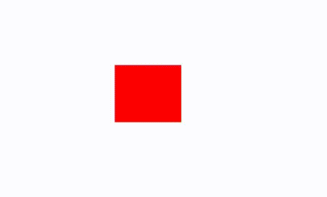
background-color
This property helps you set the background color of an element, meaning the space occupied by an element, including the padding and border but excluding the margin.
Color values can be specified in different ways:
- Hexadecimal in the format of #rrggbb
- RGB in the format of rgb (red, green, blue)
- RGBA in the format of rgba (red, green, blue, alpha)
- HSL in the format of hsl (hue, saturation, lightness)
- HSLA in the format of hsla (hue, saturation, lightness, alpha)
- Predefined. The CSS and HTML specification includes 140 predefined color names you can use.
- The currentcolor keyword can be used to represent the value of a color property. When used, elements that don't have a property value can inherit the color by default.
For this example, we can use the background-color property to change the color from red to purple to blue.
background-position
This is used to set the starting position of a background image. Values include left top, left center, left bottom, right top, right center, right bottom, center top, center center, and center bottom.
In this example, the background position determines where the animation will start and end.
background-size
This is used to set the size of the background image. Values include auto, length, percentage, cover, and contain. In this example, we can split the background into six images by setting the background-size to 50%.
border
This helps you style the borders of an element. It's a shorthand property for: border-width, border-style, and border-color. When the border isn't specified, the text color is applied.
In this example, we can use the border property to change both the color and style of the border throughout the animation.
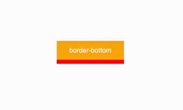
border-bottom
This is used to style the bottom border. It's a shorthand property for: border-bottom-width, border-bottom-style, and border-bottom-color.
In this example, we can use the border-bottom property to only animate the bottom border of the div.
border-bottom-color
This sets the color of the bottom border of an element. Note that you need to have a border before you can apply color to it. Thus, always define the border-style or border-bottom-style before border-bottom-color.
In this example, we can use this property to target only the bottom border color of the div.
border-bottom-left-radius
This adds rounded borders to the corners of the element. It lets you define the radius of the bottom left corner. Values include length and percentage.
In this example, notice how the left bottom corner curls inward toward the end of the animation.
border-bottom-right-radius
This defines the radius of the bottom right corner.
border-bottom-width
This sets the width for the bottom border. It should be defined after the border is created, after border-style or border-bottom-style properties. Values include medium, thin, thick, and length.
Here is one example where the border thickens during the animation.
border-color
This sets the border color. It can be defined by up to four values in the format of border-color: color1 color2 color3 color4;
If it has four values, each side of the border gets the specified color.
If it has three values, the top and bottom borders get the first and last specified color, while the right and left borders are styled with the middle color.
If it has two values, the top and bottom colors take the first, while the right and left borders take the second color.
If it has only one value, all borders have the specified color.
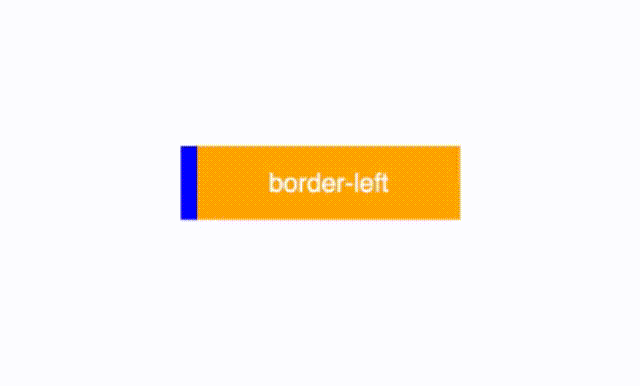
border-left
This styles the left border. It's a shorthand property for: border-left-width, border-left-style, and border-left-color.
In this example, we can use the border-left property to style the color and width of the border.
border-left-color
This sets the color of the left border. Values include color and transparency.
In this example, we use the border-left-color property to change the border from blue to red.
border-left-width
This sets the width for the left border. Values include medium, thin, thick, and length.
In this example, we double the size of the border using the width property.
border-right
This styles the right border. It's a shorthand property for: border-right-width, border-right-style, and border-right-color.
border-right-color
This sets the border for the right color.
border-right-width
This sets the width for the right border.
border-spacing
This defines the distance between borders of cells in a table.
In this example, we can use the border-spacing property to change the distance between the red boxes.
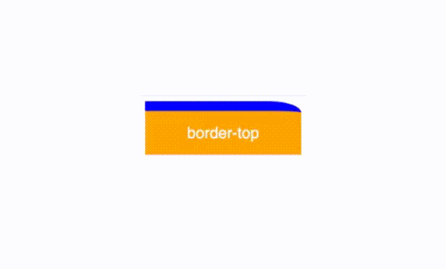
border-top
This styles the top border. It's a shorthand property for: border-top-width, border-top-style, and border-top-color.
border-top-color
This sets the color of the top border.
border-top-left-radius
This defines the top left corner radius.
Notice how in this example the top-left corner of the box changes shape during the animation.
border-top-right-radius
This defines the top right corner radius.
Notice how in this example the top-right corner of the box changes shape during the animation.
border-top-width
This sets the width of the top border.
bottom
This is used to position an element vertically. It only affects positioned elements.
When the position is:
- position: absolute; or position: fixed; the bottom edge of the element is set to a unit above or below the bottom edge of the nearest positioned ancestor.
- position: relative; the bottom edge moves above or below its normal position.
- position: sticky; the bottom property behaves like it's in a relative or fixed position when the element is inside and outside a viewport, respectively.
- position:static; the property has no effect.
box-shadow
This adds shadows to an element. Values include none, horizontal offset, vertical offset, blur, spread, and color.
clip
This lets you clip an image that's larger than its containing element. Values include auto and shape.
color
This defines the color of the text, like in the example below.
column-count
This divides an element into columns. Values include number and auto. In this example, we can split the columns of text into several smaller columns.
column-gap
This sets the gap between columns. Values include length and normal.
column-rule
This defines the width, style, and color of the rule between columns. It's a shorthand property for: column-rule-width, column-rule-style, and column-rule-color.
column-rule-color
This sets the color of the rule between columns. In the example below, we can use it change the colors from red to blue to purple.
column-rule-width
This sets the width of the rule between columns. Values include medium, thin, thick, and length.
column-width
This sets the column width. Values include auto and length.
columns
This sets the column width and count. It's a shorthand property for: column-width and column-count.
filter
This sets visual effects to an element, such as blur and saturation. Values include blur, brightness, contrast, and grayscale.
For this example, if you hover over the box, it will change colors from red to gray.
flex
This sets the flexible length on flexible items. It's a shorthand property for: flex-grow, flex-shrink, and flex-basis.
In this example, when you hover ove the box, it changes size.
flex-basis
This defines the initial length of a flexible item. Values include: number and auto.
flex-grow
This specifies how much an item will grow in comparison to other flexible items in the container.
flex-shrink
This specifies how much an item will shrink compared to the other flexible items in the container.
font
This styles the text font. It's a shorthand property for: font-style, font-variant, font-weight, font-size/line-height, and font-family.
For this example, hover over the text to change its style and weight.
font-size
This sets the size of the font. Values include medium, xx-small, x-small, small, large, x-large, xx-large, smaller, larger, length, and percentage.
font-size-adjust
This lets you control the size of the font displayed by the browser in case the first selected font isn't available.
font-stretch
This lets you make the text narrower or wider. Values include normal, expanded, and condensed.
font-weight
This sets the thinness or thickness of the font. Values include normal, bold, bolder, lighter, and number.
In this example, you can hover over the text to make it bolder.
grid
This styles the grid layout. It's a shorthand property for: grid-template-rows, grid-template-columns, grid-template-areas, grid-auto-rows, grid-auto-columns, and grid-auto-flow.
grid-area
This defines the size and location of an item in a grid layout. It's a shorthand property for: grid-row-start, grid-column-start, grid-row-end, and grid-column-end.
grid-auto-columns
This sets the size for columns in a grid container. It affects columns that don't have a specified size. Values include length, percentage, auto, and fit-content.
grid-auto-flow
This determines how auto-placed items are added into the grid. Values include row, column, dense, row-dense, and column-dense. In this example, if you hover over the boxes, it will stack them on top of each other.
grid-auto-rows
This sets the size of rows. Values include auto, max-content, min-content, and length.
grid-column
This defines the size and location of a grid item. It's a shorthand property for: grid-column-start and grid-column-end.
grid-column-end
This defines the number of columns a grid item will span. Values include auto, span, and column-line. Hover over the box in this example to move it between columns.
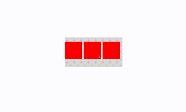
grid-column-gap
This sets the size of the gap between columns. Hover over the boxes in this example to widen the gap between them.
grid-column-start
This specifies the column-line on which the grid item will start.
grid-gap
This specifies the size of the gap between rows and columns. It's a shorthand property for: grid-row-gap and grid-column-gap.
grid-row
This sets the size and location of a grid item. It's a shorthand property for: grid-row-start and grid-row-end.
grid-row-end
This defines the number of rows a grid item will span.
grid-row-gap
This sets the gap between rows.
grid-row-start
This determines which row-line the grid item will start.
grid-template
This sets up the grid template. It's a shorthand property for: grid-template-rows, grid-template-columns, and grid-template-areas.
grid-template-areas
This specifies the areas inside the grid layout.
grid-template-columns
This defines the number and size of columns in a layout. In this example, notice how the box jumps between columns.
grid-template-rows
This defines the number and size of rows in a layout. In this example, notice how the box jumps between rows while changing colors at the same time.
height
This defines the height of an element. This height doesn't include margins, borders, and padding. Values include auto, length, and percentage.
left
This sets the left edge of positioned elements. It affects the horizontal position of an element.
letter-spacing
This sets the distance between characters in text.
line-height
This sets the height of a line.
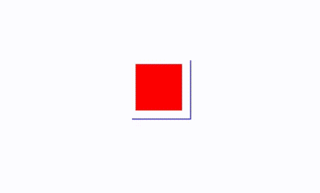
margin
This sets the margins for an element. It's a shorthand property for: margin-top, margin-right, margin-bottom, and margin-left. The margin can be specified by four, three, two, or one value.
margin-bottom
This sets the bottom margin of an element. In this example, bottom margin increases then decreases moving the text below the div element.
margin-left
This sets the left margin of an element.
margin-right
This sets the right margin of an element.
margin-top
This sets the top margin of an element. In this example, the top margin increases pushing the green circle down on the page.
max-height
This defines the maximum height of an element. In this example, the max-height changes causing the element to grow and shrink.
max-width
This defines the maximum width of an element. In this example, the max-width changes causing the element to grow and shrink.
min-height
This defines the minimum height of an element. In this example, the element shrinks and grows vertically as the min-height changes.
min-width
This defines the minimum width of an element. In this example, the element shrinks and grows horizontally as the min-width changes.
object-position
This works in conjunction with object-fit to define the position of an <img> or <video> inside its own content box using x/y coordinates.
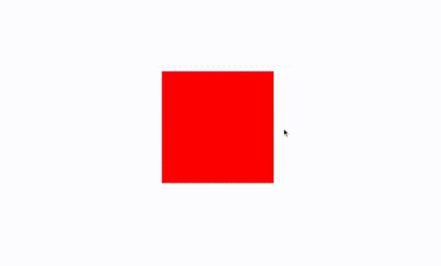
opacity
This sets the degree of opacity for an element. In this example, we can see how the box slowly fades throughout the animation.
order
This defines the order of a flexible item relative to other flexible items in the container.
outline
This sets the outline around an element. It's a shorthand property for: outline-width, outline-style, and outline-color.
outline-color
This defines the color of an outline. In this example, we'll change the outline of the box from blue to green to violet.
outline-offset
This adds a space between an outline and the border of an element. For this example, we can make the outline of the box move in and out with outline-offset.
outline-width
This sets the width of an outline. Notice how the blue outline thickens throughout this animation.
padding
This adds padding to an element. This is the space between the content and the border. It's a shorthand property for: padding-top, padding-right, padding-bottom, and padding-left. It can have one to four values.
padding-bottom
This defines the bottom padding of an element. In this example, notice how the bottom of the box stretches and shrinks during the animation.
padding-left
This defines the left padding of an element.
padding-right
This defines the right padding of an element.
padding-top
This defines the top padding of an element.
perspective
This gives perspective to 3D-positioned elements. In this example, we'll use perspective to make the box appears as if it is spinning on the page.
perspective-origin
This defines the position of the viewer relative to the 3D object.
right
This defines the right edge of a positioned element. It affects the horizontal position and has no effect on non-positioned elements.
text-decoration-color
This specifies the color for overlines, underlines, and linethroughs.
text-indent
This sets the indentation of the first line in a block of text.
text-shadow
This adds a shadow to your text. Values include horizontal shadow, vertical shadow, blur radius, and color.
top
This defines the top edge of a positioned element. It affects the vertical position and has no effect on non-positioned elements.
transform
This applies 2D or 3D effects to an element. You can move, rotate, scale, or skew an element alongside other capabilities.
transform-origin
This lets you change the position of a transformed element. In this example, we changed the position so the box spins on the page.
.gif?width=640&height=386&name=Transform%20Origin%20Live%20Preview%20-%2026%20May%202023%20(1).gif)
vertical-align
This defines the vertical alignment of an element.
visibility
This determines the visibility of an element. You can make elements appear, disappear, and reappear with this property.
width
This sets the width of an element. This doesn't include margins, borders, or padding.
word-spacing
This defines the white space between words. In this example, we increased the space between the words in the sentence.
z-index
This sets an element's stack order. Greater stack order elements appear before lower stack order elements.
CSS Animatable Properties (A - Z)
There you have it! A list of all the animatable properties within CSS. These will help make your website and presentations more lively and interactive.


![How to Create SVG CSS Animations [+ Examples]](https://blog.hubspot.com/hubfs/Google%20Drive%20Integration/svg%20css%20animation_12023.jpeg)