The rising popularity of smartphones and tablets has left web designers with quite a challenge — to create online experiences that not only display in a standard browser window but also on screens a fraction of the size. Fortunately, screens both smaller and larger than normal can be approached with fluid design.

In this post, we’ll explore fluid web design as a solution to this problem. You’ll learn what fluid design is, how it works, and how it sizes up with other designs, so you can decide the best way to scale your web pages and the elements inside them.
Table of Contents
- Fluid Grids in Web Design
- Fixed Design vs. Fluid Design
- Adaptive Design vs. Fluid Design
- Responsive Design vs. Fluid Design
- When Should You Use Fluid Design
- The Benefits of Fluid Design
- Examples of Fluid Design
What is fluid web design?
In fluid web design, the widths of page elements are set proportional to the width of the screen or browser window. A fluid website expands or contracts based on the width of the current viewport. Fluid design helps make websites more usable across device types with varying screen dimensions.
Let’s imagine a website with three adjacent elements, one with a width set to 50% and two smaller elements with widths of 20% (for this demonstration, heights are unimportant). Let’s also put some margins between them.
When displayed in a browser window 1000 pixels wide, the website looks like this:
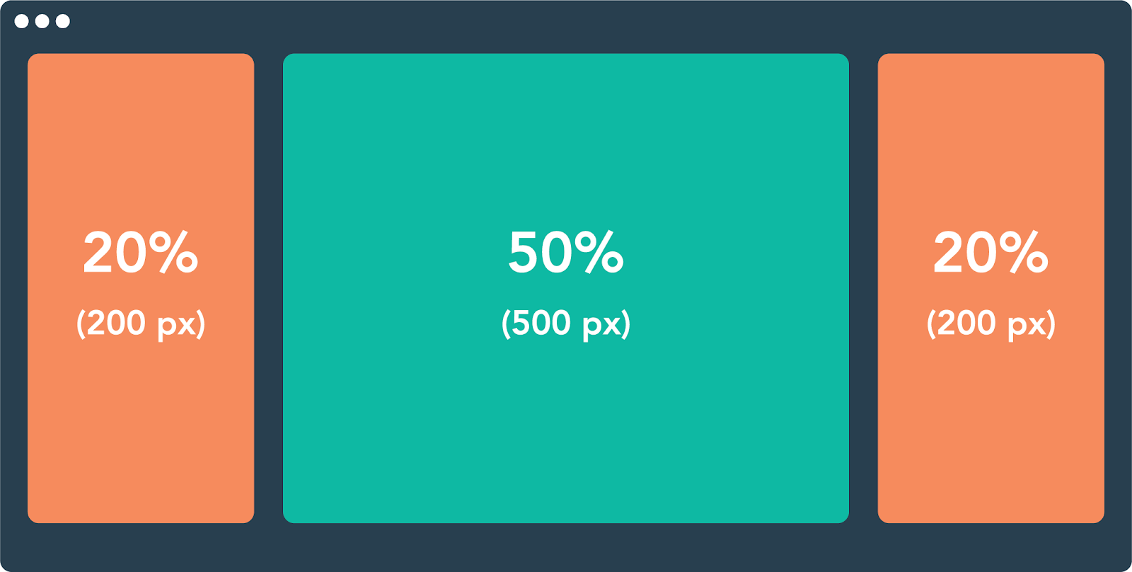
The width of each element in pixels is based on the 1000 px width of the viewport.
When we shrink the browser window to just 600 px, a fluid design scales these elements proportionally:

Fluid design ensures that a website always looks similar in layout regardless of the screen. A consistent layout benefits the user experience while ensuring usability for as many visitors as possible. “Your website must be OK when used by users in devices of their own choosing,” says Brian Dys Sahagun, a Principal UX Designer at Avaloq.
Fluid Grids in Web Design
Fluid grids are a common implementation of the fluid design approach. A fluid grid breaks down the width of the page into several equally sized and spaced columns. Page content is placed according to these columns.
When the viewport expands horizontally, each fluid column expands accordingly, as does the content within the columns:

Grids are a widespread layout for structuring page content in a digestible way, and applying fluid principles to grids is one way of making grids suitable for different screens.
However, fluid design isn’t the only approach — let’s compare it with three other common layout designs: fixed, adaptive, and responsive.
Fixed Design vs. Fluid Design
Layouts that follow a fixed design do not conform to the viewport size. Unlike those in fluid designs and fluid grids, elements in a fixed layout are set to specific pixel widths, and these widths do not change by device or screen size.
Fixed design has lost favor among designers for its lack of flexibility and user-friendliness across devices. It’s rarely, if ever, applied to any professional website — designers now usually opt for fluid, adaptive, and/or responsive sites instead. It’s almost always worth the effort to use fluid instead of fixed designs.
Adaptive Design vs. Fluid Design
Adaptive web design “is about creating interfaces that adapt to the user’s capabilities in terms of both form and function,” according to Aaron Gustafson, the founder of Easy Designs.
Fluid layouts help make websites more usable, but they lack the fine-tuned control of adaptive design. In the adaptive approach, designers create multiple separate website layouts for specific screen widths, the goal being to cater to multiple specific devices. So, a website might have a separate layout design for viewing on desktop, tablet, and smartphone.
Web designers achieve adaptive design with media queries, a feature of CSS that detects properties of the user’s device, including screen dimensions. The media query reads the screen size then selects the best-suited fixed layout from multiple fixed layout options.
Whereas fluid designs might look clunky on very large or very small screens, adaptive design lets us make more precise layouts for specific devices. The tradeoff here is that adaptive designs take much more time to make than fluid ones, which may not be sustainable for individual website owners. This can be a deep topic, so feel free to read more about it in one of our articles.
Responsive Design vs. Fluid Design
You might have heard the term “responsive” to describe any website that adjusts its layout for different devices. In this sense, both fluid and adaptive designs are technically “responsive.”
However, the terminology becomes a bit confusing here — “responsive” can also refer to a particular way of making these adjustments. Here, I’ll be discussing responsive design in the latter sense.
A responsive design layout is a single layout applied to a web page that reformats and resizes elements based on breakpoints. A breakpoint is a specific viewport width value (in pixels) that triggers a change in the website layout. Breakpoints are set in CSS with media queries.
Unlike fluid design, responsive websites use breakpoints to rearrange or eliminate elements on a page, instead of simply resizing them. Therefore, a responsive layout might appear quite different on a desktop versus a tablet versus a smartphone.
Take the responsive website for the clothing brand Kotn, for example. Its breakpoints are set to 960 px and 560 px. Notice the effects of these breakpoints as I shrink the browser window.

There’s more going on here than just shrinking widths of elements, though that is part of the design as well. But also, the content itself is changing.
Responsive designs are the go-to for business websites with content-rich, highly interactive pages. Though they take more work to implement than purely fluid pages, a responsive design ensures that text, media, and interaction elements look great at any viewing width, especially when simply shrinking page elements width-wise doesn’t guarantee good usability or aesthetics.
The Benefits of Fluid Design
Obviously, the main benefit of fluid design is the ability to display a website properly on any screen size, and this is especially important for mobile users. Why is this so important for mobile users? Well, according to Pew Research, 85% of Americans own a smartphone, and even 15% of American adults are “smartphone-only” internet users. This means a lot of mobile internet users are out there, and designing websites with them in mind will only become more important as time goes on.
If thinking from the perspective of Search Engine Optimization (SEO), then you would also benefit from knowing that Google does something called mobile-first indexing. This means that Google makes sure the top search results are mobile-friendly. In order to ensure your site is a top search result, your site needs to be mobile-friendly.
Finally, another benefit is that fluid layouts tend to load fast. The reason is that there’s not many adjustments to make in the positioning and sizing of elements when they’re loaded. Performance is often an extremely important metric, so this benefit is nothing to gloss over if that’s what you care about.
Examples of Fluid Design

One great example of fluid design can be found here. The site in the link is also displayed in the gif above, where I am simply making the window smaller and larger in order to see how it responds. If you are comfortable with development tools, nearly any modern browser will also have a way to preview various viewports from various devices as well.
If you focus on the left side of the gif, you will notice that the vertical bar disappears once the window gets small enough. This is a way to get more screen space out of smaller screens and help the space feel less cramped in an already tiny space. Do be sure that this doesn’t remove important functionality from your site however, and give another way to access it if so (perhaps make the bar horizontal instead of vertical).
Another thing this site does well can be seen while scrolling. While you scroll the site in both large and small windows, the text always remains readable in a linear fashion, and images that were stacked side by side will get stacked on top of each other in order to prevent the images or text from overflowing. Both of these things mean scrolling up and down is a seamless experience in either a mobile window or a desktop one.
Fluid Grid Examples

The previous example used Flexbox in order to achieve its responsive design, but this site uses CSS grid to do it instead. I understand this may not really look much different to you at a glance since the end result is more or less the same, but under the hood something different is going on.
Grid designs work well because they consist of columns and rows, and you can specify exactly how many columns and rows each element is supposed to fit into. For additional specificity, these rows and columns can also be set to specific pixel dimensions or percentages of the available viewport size.
For the above site, this works well since there are a few columns but many rows of content as well. Being able to fine tune the size of each individual row or column can be extremely useful in such a situation.
When should you use fluid design?
Fluid design isn’t a one-size-fits-all solution, nor is responsive or adaptive design. These methods don’t have to be used in isolation, either — principles from any of them can be combined to improve the mobile experience.
When considering a fluid design, you should think about:
- Audience metrics. Tracking tools like Google Analytics can segment your traffic by desktop, tablet, and mobile. Use metrics to inform where you put your design resources.
- Site content. If your site is relatively light on text, media, and interactive features, you can get away with a purely fluid design on some or all pages. Otherwise, it’s better to incorporate adaptive and responsive principles. Mapping your layout with wireframes is helpful in this phase.
- Resources. Because of their relative simplicity, fluid designs generally take less time, money, and effort to incorporate from scratch. However, website builders with out-of-the-box responsive page templates have made complex responsive pages more attainable for those lacking the design chops.
Lastly, if you incorporate fluid elements on your pages, test your site on a range of screen sizes, from smartphone to a large desktop browser window. Without specific instructions for how to accommodate specific dimensions, a purely fluid approach might not perfect your UX. But, it can get you pretty close.
![Blog - Website Redesign Workbook Guide [List-Based]](https://no-cache.hubspot.com/cta/default/53/4b5bb572-5d0e-45b8-8115-f79e2adc966b.png)


![11 Types of Websites to Inspire Your Own [+ Examples]](https://blog.hubspot.com/hubfs/types-of-websites.png)