When building web pages, you have limited real estate to display all your content. To maximize space, you can use dropdown menus.

The ecommerce website Designer Junkie Apparel uses a dropdown menu to display all its product categories, for example. That way, visitors can either shop the whole collection or hover over the menu and click one of the options to narrow down to the products they’re most interested in.
![Download Now: 50 Code Templates [Free Snippets]](https://no-cache.hubspot.com/cta/default/53/34adf7eb-7945-49c4-acb8-f7e177b323e5.png)

In this post, we’ll walk through how to make a dropdown menu using HTML so you can incorporate it into your website designs.
HTML Dropdown Menu
A drop-down menu is a list of options that is revealed only when a user interacts with the menu, either by clicking it or hovering over it with their cursor. The menu options then descend vertically and disappear again once the user disengages from the menu.
Since dropdown menus allow you to place more content and links on a page without cluttering it, they’re commonly used on websites and web applications to hide items that users might not need to see after the initial page load, but still might want to use.

Free Guide: 25 HTML & CSS Coding Hacks
Tangible tips and coding templates from experts to help you code better and faster.
- Coding to Convention
- Being Browser-Friendly
- Minimizing Bugs
- Optimizing Performance
Common use cases for HTML dropdowns include:
- navigation menus that contain links to other pages on a website
- web forms (including mobile-first Bootstrap forms) that list options from which the user may choose one
- site searches for listing sorting or filtering options for a query
- as an alternative to radio buttons that saves page space
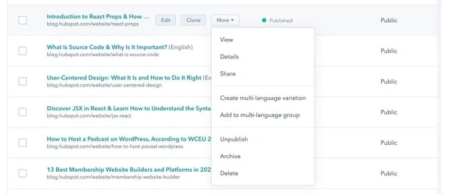
- listing out additional, less common actions a user can take inside an application — here’s an example from the HubSpot blog tool:
Dropdown menus contain several moving parts that all need to work together for a seamless user experience. If your dropdown doesn’t work as expected, users can become easily annoyed. That’s why it’s so important to implement them correctly in HTML.
HTML Dropdown Menu Code
What does a dropdown menu look like in entirety? Here's a quick example of the basic code for an HTML dropdown. Below, we'll cover the syntax in detail.
HTML Dropdown Menu Syntax
To understand how dropdown menus work in HTML, you’ll need to know three elements: label, select, and option. Let’s look at each of these in more detail.
label
The <label> ag creates a label for a menu or other user input on the page. In order to associate the label with a dropdown, the for attribute is used and shares its value with the id attribute of the following <select> tag.
When a <label> is associated with a <select> tag in this way, clicking the label element will automatically place focus on the select element.
select
The <select> element creates the dropdown menu. It contains two attributes, name and id. The id attribute should have the same values as the for attribute in the <label> tag. The name attribute is used to identify the dropdown if the selection is being submitted in a form.
The <select> tag also takes several optional attributes. These are:
- autofocus: Specifies that the dropdown should have input focus (i.e., it’s selected by the browser and can be controlled by the keyboard) when the page loads.
- disabled: Disables the dropdown menu.
- multiple: Allows multiple options to be chosen.
- required: When included in a form, makes the form required in order to submit the form.
- size: sets the number of options that are visible in the dropdown.
option
<select> contains one or more <option> tags nested inside it. Each <option> tag represents one menu item. The opening tag should contain the value attribute, which specifies a value that is submitted when that menu item is selected.
You can also use the optional attributes disabled, which disables the option in the menu, or selected, which automatically selects the option on page load.
How to Make a Dropdown Menu in HTML
- Step 1: Add a <label> element to your HTML document. This will be the name of your dropdown menu.
- Step 2: Add a <select> element. This creates the dropdown menu itself.
- Step 3: Create <option> elements and place them inside the <select> element. These are the list items that will appear in the dropdown menu.
- Step 4: Add a default value from the dropdown list, if desired.
It’s easy to create a basic dropdown menu in HTML with the <select> element. Let’s break the process down step by step below.
Step 1: Create a label element.
To start, add a <label> element to your HTML document. In the opening tag, add a for attribute with a shorthand name for the dropdown list. For example, if the dropdown contains a list of dog names, then you could set the attribute to dog-names. Here’s what your HTML might look like:
Step 2: Create a select element.
Next, add a <select> element after the <label> element. In the opening tag, add a name and an id attribute. Set the id attribute to the same value as the for attribute in the <label> tag, and set the name attribute to a value that identifies the menu when submitted in the form (it can be the same as your id value).
For this example, I’ll set both the name and id attributes to dogs. Here’s the HTML:
Step 3: Create option elements and place them inside the select element.
Finally, you’ll add <option> tags between the opening and closing tags of the select element. Add as many options as you want to provide in the dropdown list. Then, add a value attribute within each opening <option> tag and set it to the option name. Here are four examples:
Here’s the result:
See the Pen HTML-only Dropdown by HubSpot (@hubspot) on CodePen.
Try it yourself! The code module above is editable. Toggle between the HTML and CSS tabs, edit the code, and click rerun in the bottom right-hand corner.
HTML Dropdown Default Value
When you create a dropdown menu this way, the first option listed in the HTML will be the default value of the dropdown, as you can see in the example above.
To change the default value, use the selected boolean attribute. Simply add it to the opening tag of the <option> tag you want to display as the default, after its value attribute.
In the example below, you’ll see a dropdown menu for membership plans. While the options include a free and bronze plan, the boolean attribute is used to set the default value to silver.
See the Pen HTML-only Dropdown with boolean attribute by HubSpot (@hubspot) on CodePen.
Try it yourself! The code module above is editable. Toggle between the HTML and CSS tabs, edit the code, and click rerun in the bottom right-hand corner.
Free Guide: 25 HTML & CSS Coding Hacks
Tangible tips and coding templates from experts to help you code better and faster.
- Coding to Convention
- Being Browser-Friendly
- Minimizing Bugs
- Optimizing Performance
How to Make a Hoverable Dropdown Menu
If you’d like a dropdown menu to appear when a user hovers over an element, you’ll need to use HTML and CSS. Let’s look at the process below.
Step 1: Create and style a div with a class name “dropdown.”
First, create a div and add the class dropdown to it. In CSS, set this div’s display to inline-block and position to relative. This will allow the dropdown content to appear right below the dropdown button.
Here's the HTML:
Here's the CSS:
Step 2: Create the hoverable element.
Next, create an element that will reveal the dropdown list when a user hovers over it. For this example, we’ll create a button. Place the button inside the div.
Here’s the HTML so far:
Step 3: Create and style the dropdown content.
Now it’s time to create the actual dropdown content, which will be hidden until the user hovers over the button. For the example below, we’ll include three links in the dropdown menu. Each of the links will be wrapped in a div with the class name dropdown-content.
Here’s the HTML for the dropdown content:
In CSS, set this div’s display to none, its position to absolute, and its width to 100%. This will ensure the dropdown content appears directly below the dropdown button and is the same width as the button. Also, set the overflow property to auto to enable scroll on small screens. Finally, the box-shadow property is defined to make the dropdown content stand out against the background.
Here’s the CSS:
Step 4: Set the dropdown menu’s hover state.
To ensure the dropdown content actually shows on hover, you need to specify the div’s display property with the pseudo-class :hover. This defines a special state of the element — in this case, how it appears when a user is hovering over it.
Here’s the CSS:
Step 5: Style the links inside the dropdown menu.
Without styling, the links inside the dropdown menu would be bright blue and underlined, with no spacing in between. To make them look better, let’s set the font color to black, the padding to 5px, and the text-decoration property to none.
Here’s the CSS:
Step 6: Change the color of dropdown links on hover.
You can also style the links to appear differently on hover using the pseudo-class :hover. Say you want the text and background color of a link to change when a user hovers over it.
Here’s the CSS:
Here’s the code all together and the result:
See the Pen Hoverable Dropdown Menu with Links by HubSpot (@hubspot) on CodePen.
Try it yourself! The code module above is editable. Toggle between the HTML and CSS tabs, edit the code, and click rerun in the bottom right-hand corner.
Multiselect Dropdown
In the examples above, users could only select one option from the dropdown menu. However, you can also create a menu that allows users to select multiple options. This is called a multiselect dropdown.
To create a multiselect dropdown, you will need HTML, CSS, and Javascript. Here’s an example created by game and app developer Charlie Walter. Notice that he uses a form element.
See the Pen Multiselect (dropdown) by Charlie Walter (@cjonasw) on CodePen.
Try it yourself! The code module above is editable. Toggle between the HTML and CSS tabs, edit the code, and click rerun in the bottom right-hand corner.
HTML Dropdown Menu in Navbar
If you want to add a dropdown menu to your navigation bar, the steps look a little bit different. But luckily, with some basic HTML and CSS, you'll be able to implement it easily.
1. Find or create the <nav> element in your HTML code.
First up, either locate the <nav> tag in your HTML document, or create one. This is your navigation bar and where you'll be adding your dropdown menu.
We recommend adding a CSS class your nav element so that you can style it using CSS. For this example, we'll be using the class "navbar", i.e. <nav class="navbar">.
2. Add an unordered list to your navbar.
In previous tutorials, we used the <select> element to create a drop-down menu. While you could try playing with that in your navbar, it's much easier and quicker to create a dropdown with an unordered list, or an <ul> element.
The unordered list will later become a list of links that your users can click on. Here's the base HTML code, located within the navigation.
See the Pen Dropdown Menu in Navbar Unordered List by HubSpot (@hubspot) on CodePen.
3. Add basic CSS styling to your navbar.
Next, let's style the navbar using CSS. If your website already has an existing navbar, or you're using a pre-existing theme, then this has already been done for you.
If not, let's set the background-color property to #333, set the position property to relative, and set the z-index property to 999, so that our navbar appears above every other element and is not obscured.
Here's what the CSS code looks like:
See the Pen Dropdown Menu Navbar CSS by HubSpot (@hubspot) on CodePen.
4. Add CSS styling to your unordered list.
As a reminder, the unordered list will become your dropdown menu. But we want to style it so that it actually appears properly when users hover.
In the CSS below, we're denoting that we're specifically styling the unordered list in the navbar by citing the class in the selector. That is: .navbar ul (your menu's unordered list), .navbar li (your menu's unordered list items), and .navbar li a (your menu's list item links, denoted by the a selector).

50 Free Coding Templates
Free code snippet templates for HTML, CSS, and JavaScript -- Plus access to GitHub.
- Navigation Menus & Breadcrumbs Templates
- Button Transition Templates
- CSS Effects Templates
- And more!
That way, the styling you place here doesn't apply to all unordered lists or links in your website.
First, for the .navbar ul selector, set the list-style-type property to none. This ensures that there are no bullet points or dash marks preceding your list items. Then, set margin and padding to 0, but you can play with these numbers depending on your preferences.
See the Pen Dropdown Menu Unordered List CSS by HubSpot (@hubspot) on CodePen.
Next, for the .navbar li selector, set the display property to inline-block. This ensures your drop-down menu items appear one below the other, and that they don't interrupt each other or other elements on the page.
See the Pen Dropdown Menu Unordered List CSS - navbar li by HubSpot (@hubspot) on CodePen.
Lastly, style the .navbar li a selector to change the look of your links. You can play with the font color, padding, and text decoration, but ensure that the display property is set to block.
That way, the link takes up the entire width of the drop-down, and not just the text itself.
See the Pen Dropdown Menu Unordered List CSS - navbar li a by HubSpot (@hubspot) on CodePen.
5. Style the dropdown menu with CSS.
Finally, it's time to style your brand new dropdown menu so that it appears when users hover, and doesn't show statically on the page, like a normal unordered list would.
First, we'll be styling the .navbar ul ul selector. Set the position property to absolute, which ensures the menu remains relative to its parent element (the navbar).
Then, set the display property to none, so that the dropdown is hidden by default and it only appears when users hover.
See the Pen Dropdown Menu CSS - navbar ul ul by HubSpot (@hubspot) on CodePen.
Next, we'll be styling the .navbar ul ul li and .navbar li:hover ul selectors, both of which reference the list items within your dropdown menu. For both, set the display property to block, which ensures they appear one on top of the other.
See the Pen Dropdown Menu CSS - navbar ul ul li by HubSpot (@hubspot) on CodePen.
Finally, let's change the background color of the dropdown links on hover. Using the CSS selector .navbar ul ul li a:hover, change the background-color property to the HTML color code of your choosing.
See the Pen Dropdown Menu CSS - navbar ul ul li hover by HubSpot (@hubspot) on CodePen.
Here’s the code all together and the result:
See the Pen HTML Dropdown Menu in Navbar by HubSpot (@hubspot) on CodePen.
Try it yourself! The code module above is editable. Toggle between the HTML and CSS tabs, edit the code, and click rerun in the bottom right-hand corner.
HTML Dropdown Accessibility
There’s another aspect of your dropdowns that we haven’t mentioned yet, but is essential to consider: accessibility. Web accessibility is the principle that all online experiences should be usable by anyone, with special attention paid to users with physical, visual, and cognitive disabilities, impairments, and limitations.
Dropdown menus must be accessible so that these users can browse your site, submit forms, and perform other actions the same as any other user. If not, they may take longer to find what they need or miss parts of your website altogether.
When designing a dropdown menu in HTML, here are a few accessibility best practices to keep in mind:
- Avoid too many levels in your dropdown, as this makes it harder for users with motor issues to navigate the menu. If your menu includes more than one level of submenu (i.e. a menu within a menu within your main menu), there’s probably a better way to structure your menu or your website.
- All menus on your side, including dropdowns, must be navigable via the tab key and the enter key. Tab moves forward through the menu items, and enter opens/closes the menu.
- Be wary of keyboard traps. These occur when the user can tab through the items of a menu, but cannot “tab out” of the menu and is thus stuck in a loop.
- For hover-activated menus, add a time delay (around a second) between when the cursor hovers off the menu and the menu closes. This helps users without fine motor control stay engaged with the menu if they accidentally disengage.
- Using semantic HTML whenever possible not only makes your code easier to understand, but it also makes your menus accessible to screen readers.
To learn about the fundamentals of drop-down menu accessibility, check out our detailed guide: How to Create Drop-Down and Fly-Out Menus That Are Web-Accessible.
Easily create dropdowns in HTML.
With a bit of HTML and CSS, it’s easy to create dropdown menus for your website that are easy, intuitive, and visually appealing.
You can set your dropdown to trigger with a click or mouse hover event — either way, you save valuable page space for very little interaction cost, which is why dropdown menus have been and continue to be a staple of web design.
Editor's note: This post was originally published in June 2021 and has been updated for comprehensiveness.

![How to Create a Landing Page in HTML & CSS [+ 15 Templates]](https://lh7-us.googleusercontent.com/gmIHbJpUHbZTRtyrKrl3gPKd1vx-42KDD7q3zNsm-KeCrF2YypEaYW7J0lQXsog9CXD4UYxUJ-A7VAvPJTjKclV-Rd-bZrAFHvKLE4JFP5UKk84v8M8R5rtubdotpFQxOCZataRdWf_KE0hKe4N06qw)


![How to Embed Google Map in HTML [Step-By-Step Guide]](https://blog.hubspot.com/hubfs/Google%20Drive%20Integration/How%20to%20Embed%20Google%20Map%20in%20HTML%20%5BStep-By-Step%20Guide%5D-2.jpeg)

![How to Create an HTML Tooltip [+ Code Templates]](https://blog.hubspot.com/hubfs/Google%20Drive%20Integration/How%20to%20Create%20an%20HTML%20Tooltip%20%5B+%20Code%20Templates%5D.jpeg)
![How to Make an HTML Text Box [Examples]](https://blog.hubspot.com/hubfs/html%20text%20box.jpg)

![How to Create Radio Buttons in HTML [+ Examples]](https://blog.hubspot.com/hubfs/Google%20Drive%20Integration/How%20to%20Create%20Radio%20Buttons%20in%20HTML%20%5B+%20Examples%5D.jpeg)