.png?width=112&height=112&name=Image%20Hackathon%20%E2%80%93%20Vertical%20(50).png)
But many high-end sellers get this wrong. They try to build a fancy website, but it loads slowly, has poor-quality photos, and lacks the high-value signals that put upscale shoppers at ease. It’s no wonder luxury websites have the highest cart abandonment rate compared to other industries.
To help you master elegant website design, I looked at some of the best luxury websites out there to get an idea of what works best. If fancy web design is eluding you, look no further. This blog post will show you the elements of successful luxury websites, along with real-world examples to solidify the points.
Table of Contents
- Summary: Fancy Websites
- What Makes a Website Fancy: Key Elements of Luxury Web Design
- The 26 Best Luxury Website Designs
- How to Create Your Own Luxury Website
- Frequently Asked Questions: Fancy Websites
Summary: Fancy Websites
Fancy websites are a type of website used by luxury brands, from designer fashion houses to jewelers to high-end real estate. While they vary in product or service type, they all tend to share these characteristics: fast website performance, high-quality photography, and consistent and powerful brand storytelling.
You can get started building a fancy website by choosing a template in Content Hub. Sign up for a free account to start exploring.
.png)
Free Website Design Inspiration Guide
77 Brilliant Examples of Homepages, Blogs & Landing Pages to Inspire You
- Agency Pages
- Ecommerce Pages
- Tech Company Pages
- And More!
Download Free
All fields are required.
Form not available
What Makes a Website Fancy: Key Elements of Luxury Web Design
In my analysis of 20+ fancy websites, here are the most common elements of a luxury website.
Visual Design Principles
Hero Background Video
Hero background videos are very popular in fancy website design. These are full-screen videos that play as soon as you land on a page, usually without sound (though some had sound you could turn on).
High-Quality Product Photography
Elegant websites feature high-quality product photography. These images are professionally done and high resolution, so that when a user zooms in on them, they can see the details without blur.
User Experience Features
Live Chat
As you can imagine, when someone’s about to purchase a $3,000 purse, they’re going to have questions before clicking “buy.” Many of the fancy websites I looked at had live chat boxes in the lower right corner of the screen, allowing visitors to instantly get answers.
Product Configurators
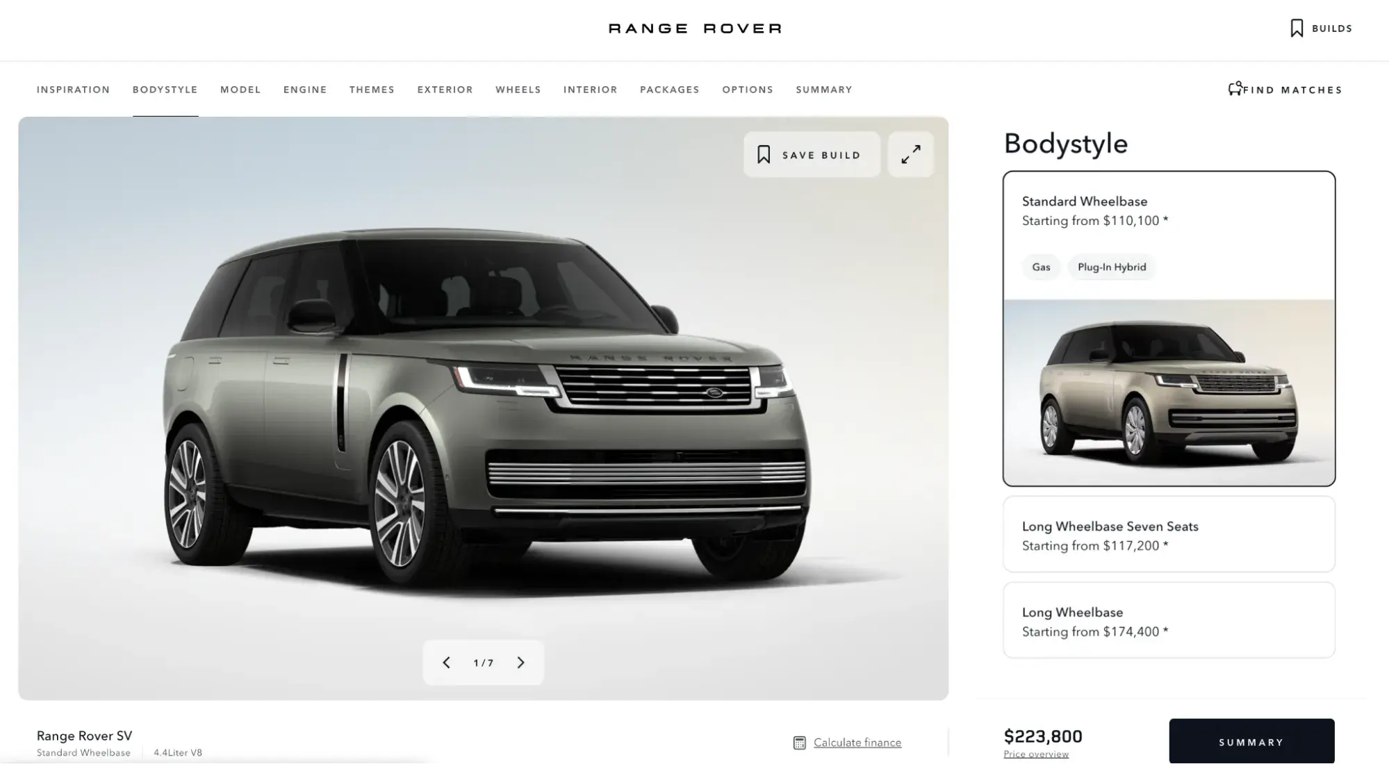
True to the exclusive feel of premium brands, the fancy websites in the list below often had product configurators that let you build and customize one of their products to your liking. For example, Range Rover lets you customize a vehicle, and Rolex allows you to configure its watches.

Animations
From photos that zoomed in, slid in, and faded into view, these fancy web designs had plenty of animations to add visual intrigue and boost engagement. This motion prevents a static site from feeling stale.
Parallax Scrolling
Parallax scrolling, where the background seems to stand still or move more slowly than the foreground, is also a popular way to boost engagement in luxury web design. Some of the fancy websites I looked at use parallax effects to keep my eyes fixed on the page.
Technical Requirements
A premium brand must be premium in its website performance too. That means lightning-fast load times, while balancing the fact that they’re often hosting very large, high-res image files. To accomplish all of this, luxury websites need fast and reliable web hosting, a CDN, an SSL certificate, and the infrastructure and security to handle large online payments.
Brand Storytelling
- Celebrity brand ambassadors. From Ariana Grande for Swarovski to Anya Taylor-Joy for Tiffany, luxury brands tap top talent for their website and marketing campaigns. Not every brand has the budget for A-list celebrities, though, which is why influencers (even microinfluencers) are a great next option.
- Strong brand identity and consistent branding. Think Tiffany Blue and Burberry Check (both trademarked). Luxury brands firmly establish who they are and then protect that identity fervently, using consistent branding across their images, videos, and website design.
- Origin stories. Similarly, luxury brands also tend to dedicate an entire page on their site to their brand’s history. For instance, Bottega Veneta’s website shares images of its workers and its atelier in Italy, while Goyard’s traces its “heritage of excellence” all the way back to 1853.
The 26 Best Luxury Website Designs
- Jimmy Choo
- Porsche
- Manhattan Miami Real Estate
- Goyard
- Prabal Gurung
- The Ritz-Carlton
- The Savoy London
- Romanza Interior Design
- Off-White
- Land Rover
- Avjet Global
- Hermès
- Armani
- Rolex
- Louis Vuitton
- Sims Luxury Builders
- Swarovski
- Cartier
- Burberry
- Tiffany & Co.
- Gucci
- Telfar
- Bottega Veneta
- Prada
- Yves Saint Laurent
- Fendi
Leather goods, high-fashion shoes, luxury hotels, and prestigious car brands — I’ve got plenty of opulent retailers for you. Below, I’ve rounded up 26 of the most visually stunning fancy websites.
1. Jimmy Choo
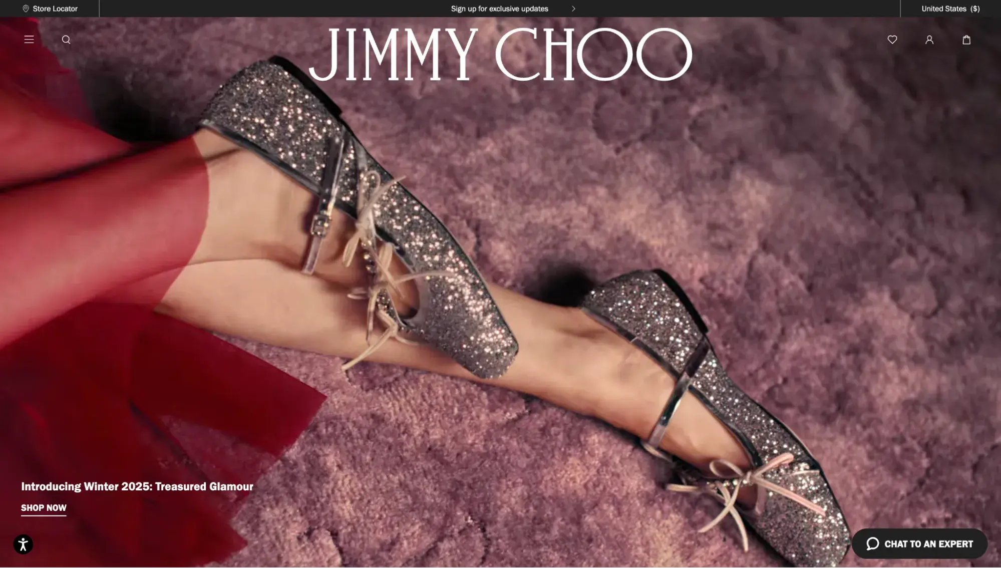
As one of London’s most iconic luxury shoe and accessories brands, it makes sense that Jimmy Choo’s website would be glittery and engaging.
It shines thanks to its visually appealing homepage with a hero background video (featuring celebrity Sydney Sweeney), a delightfully simple hamburger menu, and cohesive branding throughout. As you’ll see in the rest of this list, those full-screen auto-play videos on the homepage are very common in fancy websites.
What I Like
The site is easy to navigate and even features a call to action at the bottom of the homepage, inviting visitors to provide their email in exchange for brand updates.
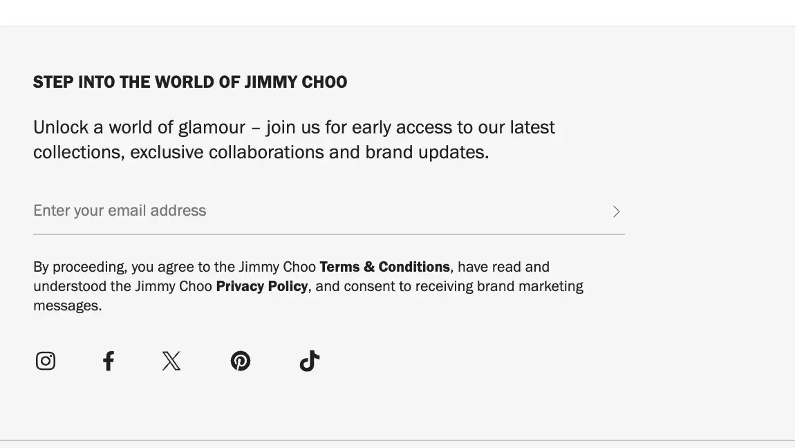
Pro tip: Including a similar form on your website is an excellent way to stay connected with your visitors.
2. Porsche
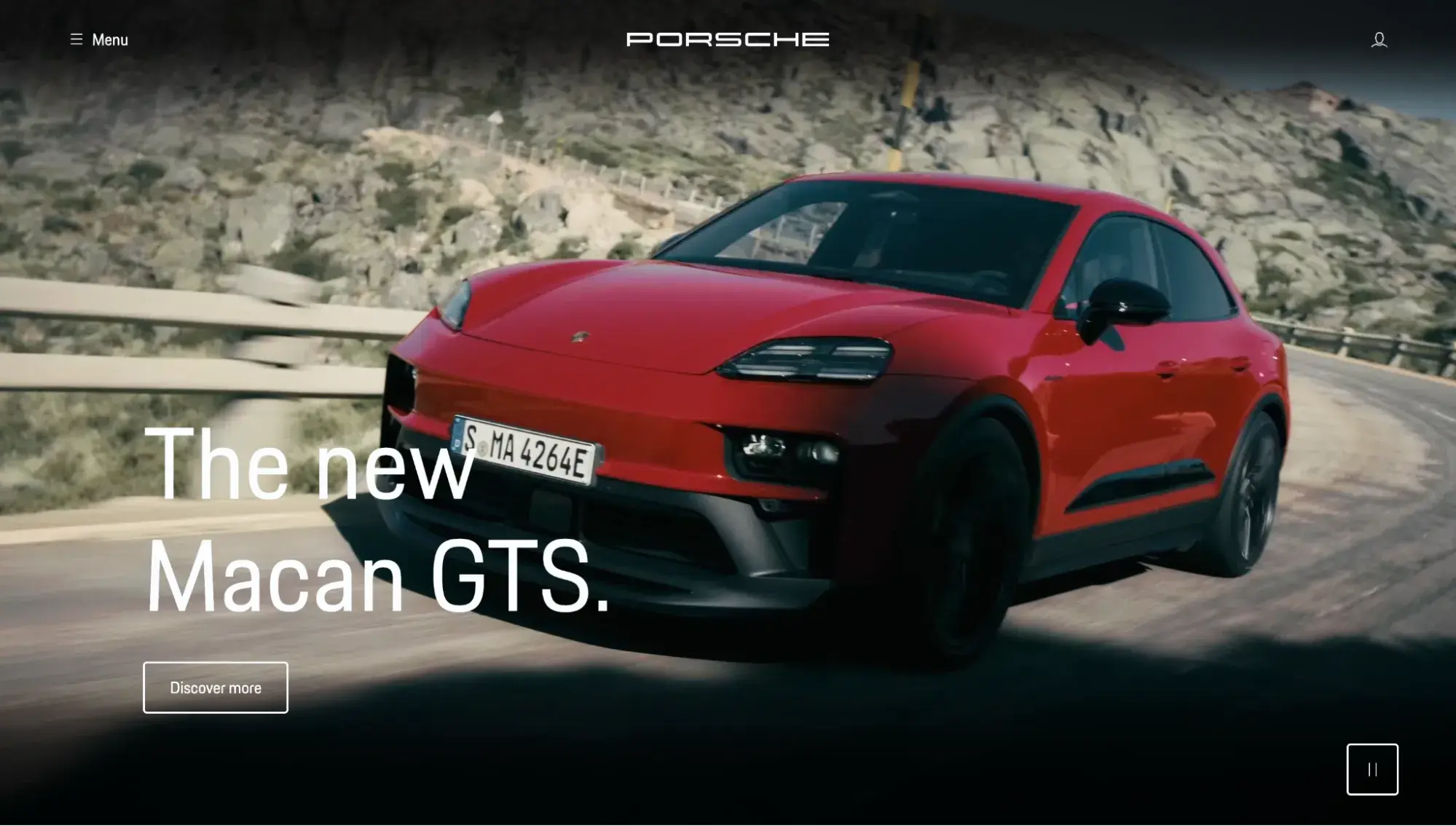
Porsche’s website is just as sleek and luxurious as its opulent vehicles. The German automobile brand’s site gets high marks for its unique menu, which features images of popular Porsche models so visitors can click directly there and skip the hassle of searching the tabs.
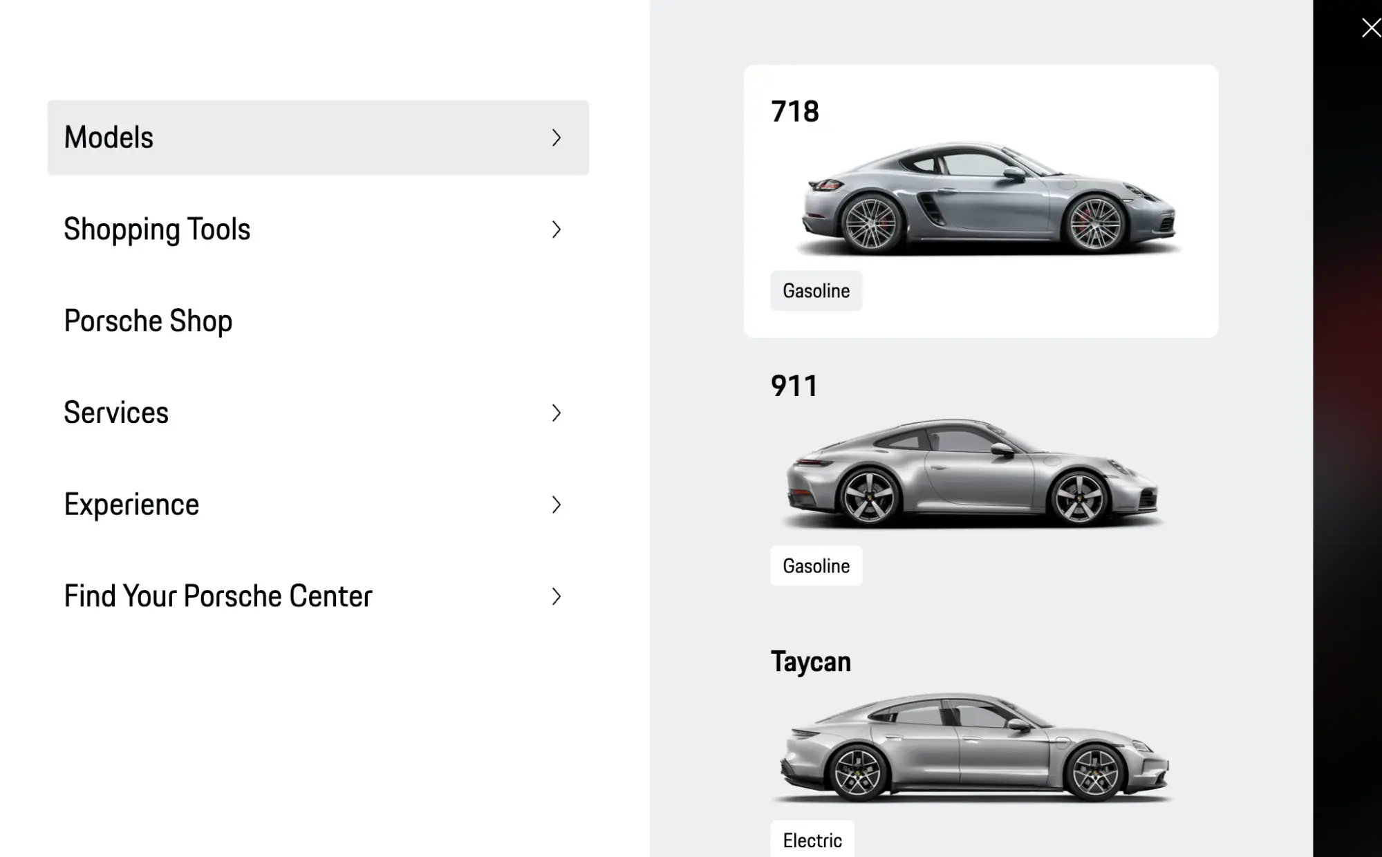
What I Like
Porsche doesn't overcomplicate things. Its menu keeps it simple by allowing you to learn more about fan-favorite vehicles, navigate to your account, learn more about dealers nearby, or shop.
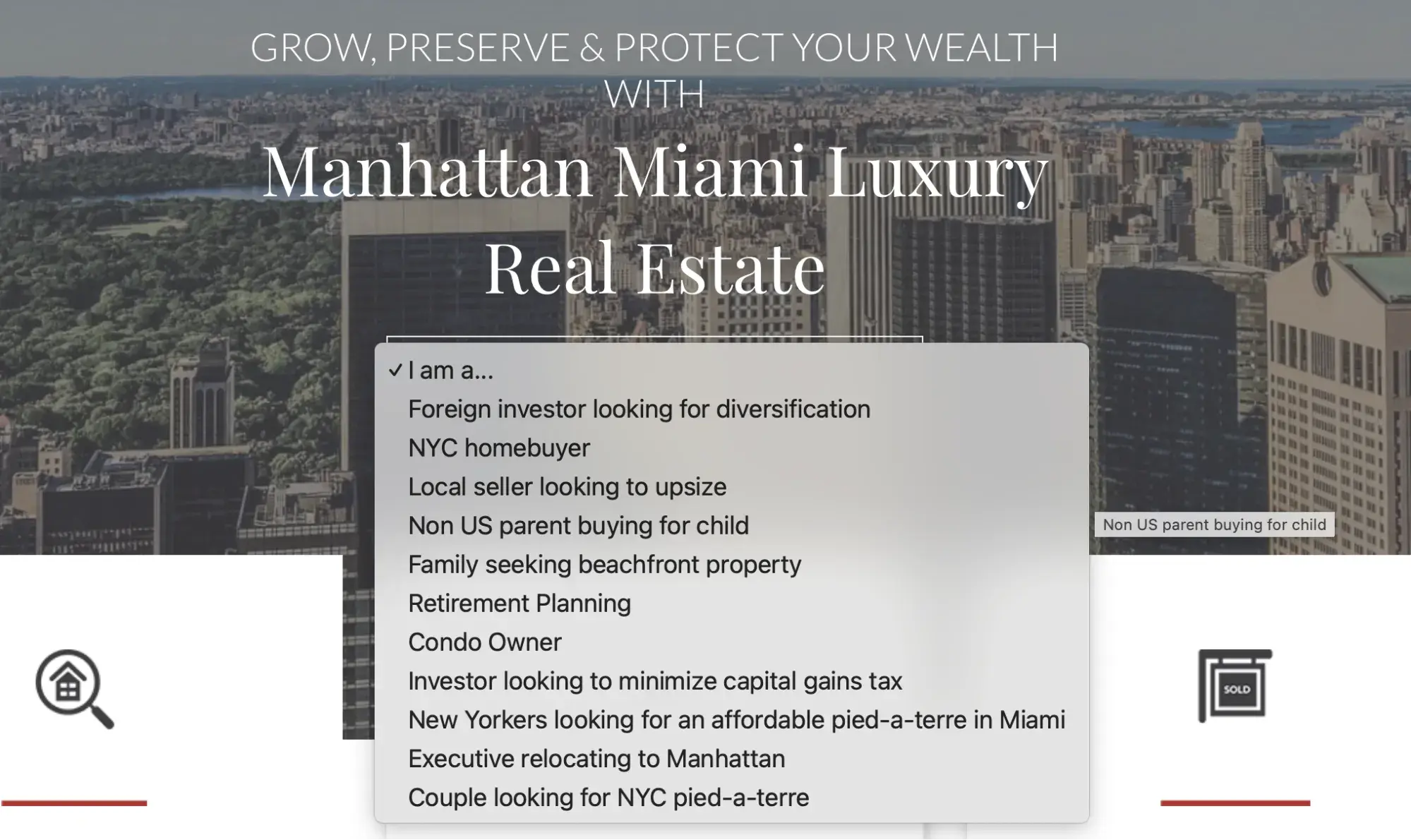
3. Manhattan Miami Real Estate
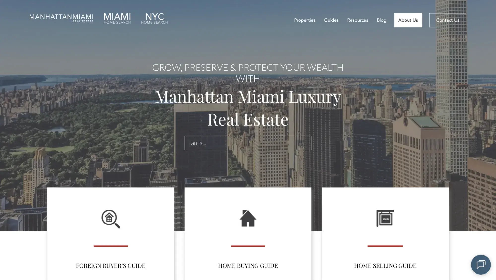
When you’re selling properties in the most prestigious zip codes in the U.S., price tags are in the millions. Manhattan Miami Real Estate chose to build its digital presence using Content Hub, HubSpot’s CMS that is connected to its native CRM. Agency Web Canopy Studio built the real estate company a luxury website that increased visits, leads, and revenue, with a 145% traffic increase thanks to SEO.
What I Like
Right from the top, Manhattan Miami Real Estate shows it knows its customers with a dropdown menu featuring niche case studies. This helps homebuyers feel at ease because they know this real estate company specializes in their specific needs.
4. Goyard
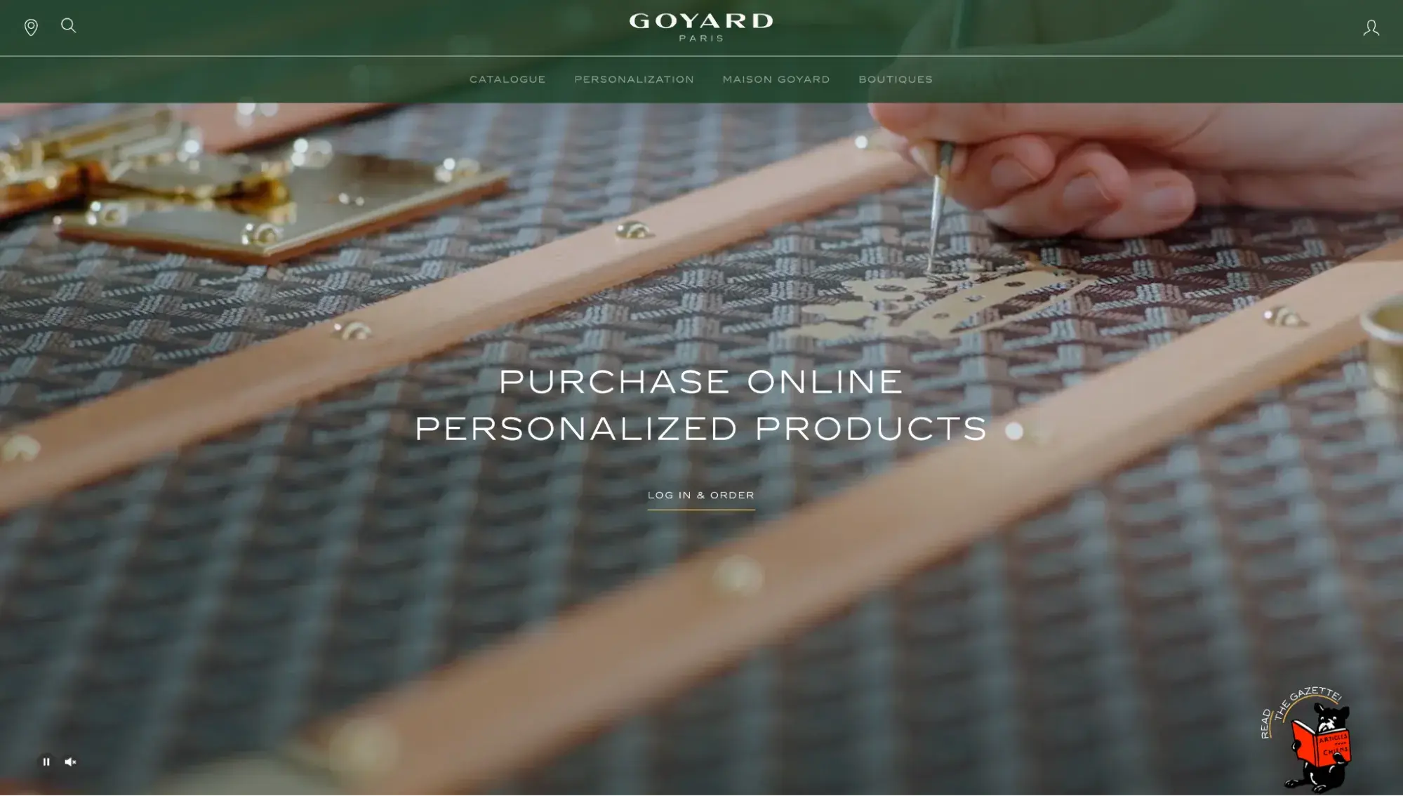
Parisian fashion house Goyard's homepage features a hero background video showing an artisan mixing paint and adding fine details with a brush to the brand’s signature bags. The focus on craftsmanship and attention to detail conveys that this is a premium brand worth spending money on.
Free Website Design Inspiration Guide
77 Brilliant Examples of Homepages, Blogs & Landing Pages to Inspire You
- Agency Pages
- Ecommerce Pages
- Tech Company Pages
- And More!
Download Free
All fields are required.
Form not available
What I Like
Goyard has an entire webpage dedicated to its history as a Parisian trunk-maker since 1853. With a title of “A Heritage of Excellence” and a detail about how Goyard was originally the “official purveyor to kings and presidents,” the brand nails the kind of copywriting that high-end products need in order to signal their value to shoppers.
5. Prabal Gurung
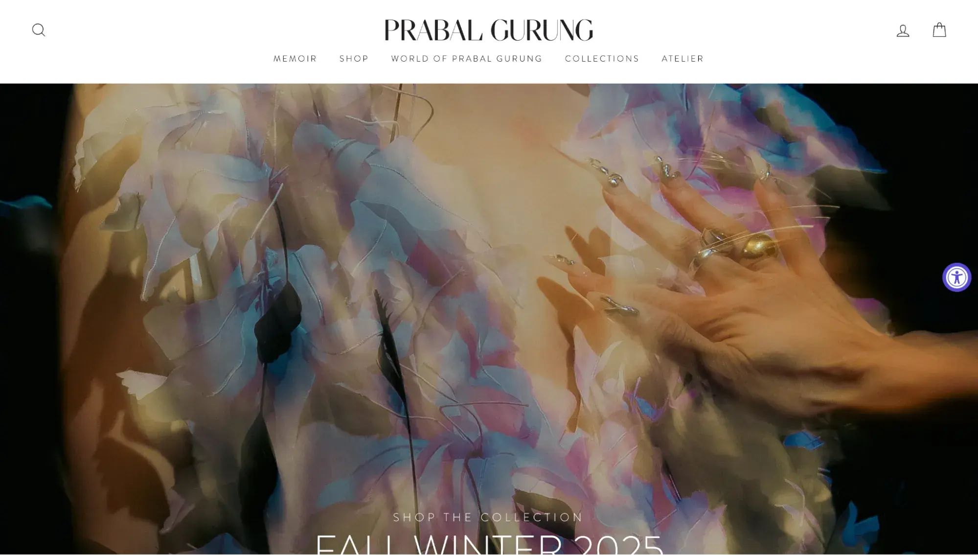
Prabal Gurung, who originally hails from Singapore, is proud to manufacture over 80% of the items in his eponymous luxury fashion brand's collections in New York City.
This premium website tells the story of Gurung himself and the brand through lush imagery and big-name associations (at the bottom is a section titled “The World of Prabal Gurung,” showcasing celebrities wearing his clothing).
What I Like
Prabal Gurung's website is committed to more than showcasing clothes. When you visit the About page, you can read more about his mission and how the brand gives back to the community by supporting education for underprivileged children.
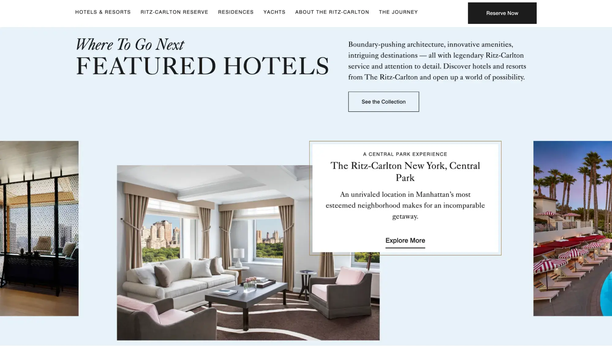
6. The Ritz-Carlton
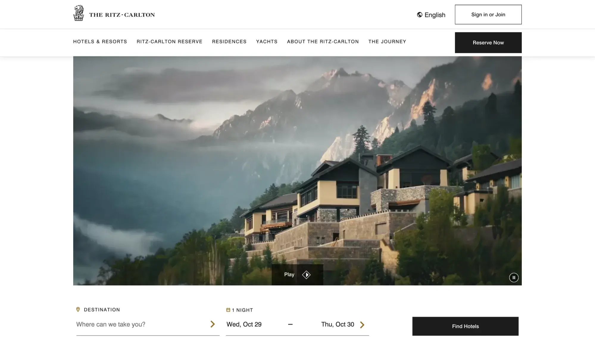
The Ritz-Carlton is a household name and with good reason. This hotel’s homepage provides a healthy dose of fancy website inspiration, but if you need more, check out this website design lookbook.
This luxury resort chain's homepage features a dreamy video and images of Ritz-Carlton hotels across the globe. Instead of the full-screen hero videos we’re used to seeing in this list, The Ritz-Carlton opted for a more subtle choice that doesn’t span the full width of the page. This works well because its videos are so opulent already, offering visitors a glimpse into the Ritz-Carlton vacation experience, without overwhelming.
What I Like
The Ritz-Carlton is a good example of a broken grid layout, whose asymmetry lends instant visual intrigue to a static site that could’ve felt stale without it.
Pro tip: Don’t overlook typography. You can use fonts to convey your brand, just like The Ritz-Carlton does.
“A luxury brand that wants to evoke feelings of trust could favour an elegant serif font,” writes London-based brand and design director Alexandra Lunn, “while a modern tech brand might choose clean sans-serif fonts. Fonts across the board should represent your brand’s values and personality.”
7. The Savoy London
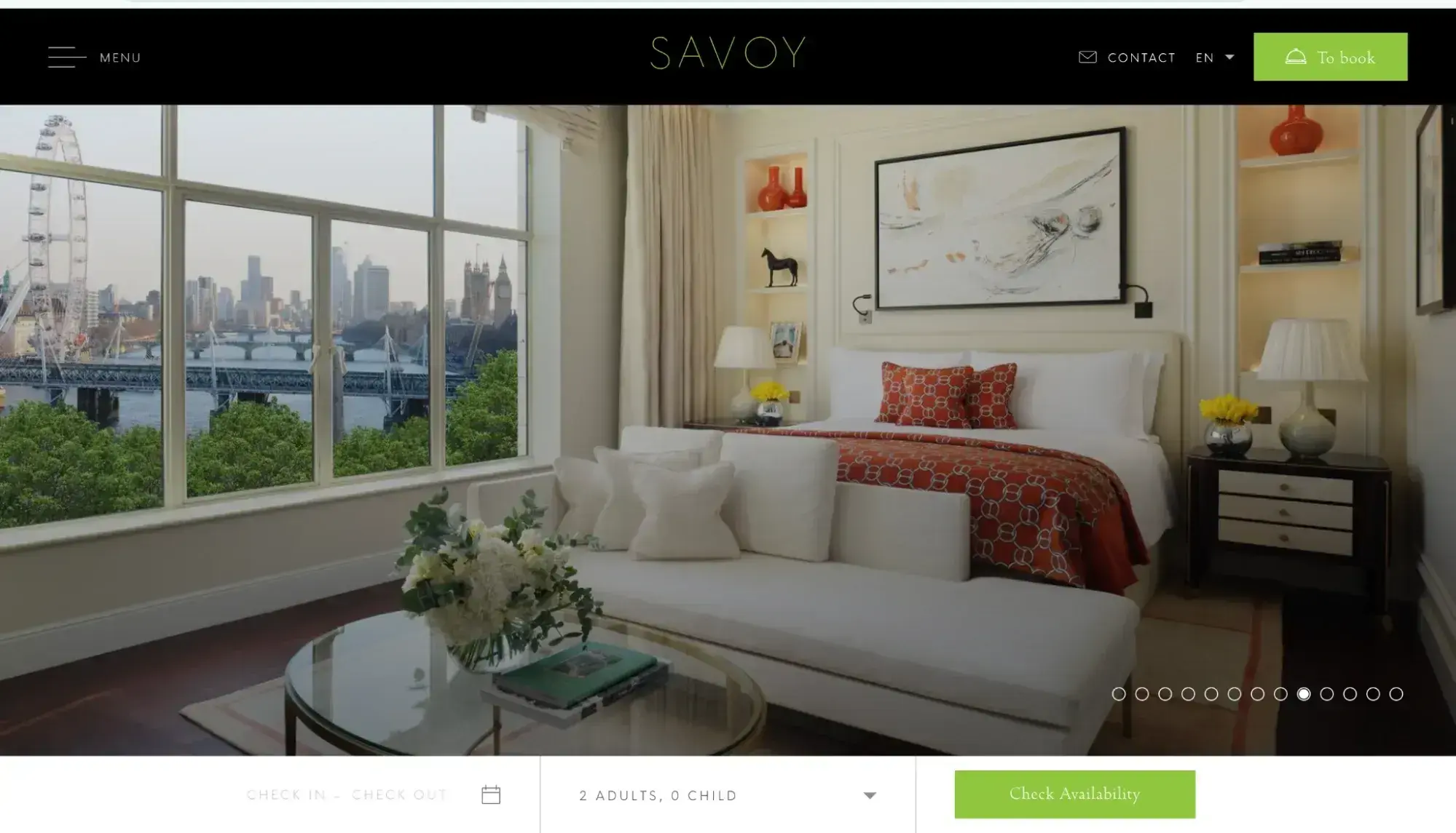
Upon arriving on this luxury hotel's website, The Savoy London ushers you into its glamorous world. The site features a hero image slider that shows the opulent interiors well.
As you scroll down, The Savoy invites you to explore more of this extravagant accommodation with subtle touches of animation thrown in for extra intrigue.
What I Like
The Savoy’s website balances images and text well. As you scroll through the homepage, you’ll notice that on the side of each photo is a block of copy that further illustrates the Savoy experience.

This premium website provides a reminder of the value of pairing visually appealing images with effective copywriting.
8. Romanza Interior Design

Romanza Interior Design wows website visitors with a high-resolution full-screen hero image, showcasing its work. This is a strong reminder to any luxury brand that a fancy website must have high-res professional photos. Without that, even the best web design will flop.
Built by Nextiny, this premium website is hosted on Content Hub and uses HubSpot modules to create its beautiful photo galleries.
What I Like
The tasteful use of gradients on its CTA buttons really adds a feeling of premium branding to the site. It makes the buttons look almost like brushed steel or bronze.
9. Off-White
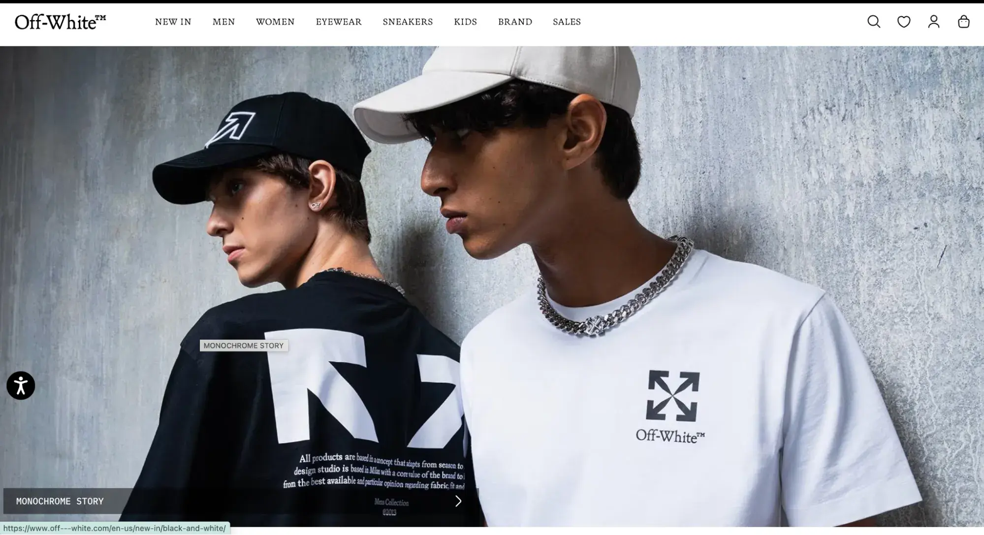
This luxury fashion brand, founded by Virgil Abloh, is known for its one-of-a-kind balance of high-end style with streetwear-ready looks. Off-White's website balances white space with a large central image that attracts the eye.
The site uses a typewriter-style font for its menu navigation, which is unique in the luxury world yet readable. When you scroll down the homepage, you see images in a grid layout that showcase the brand’s understated style.
What I Like
Off-White strikes the right balance of being a premium brand without being showy. With abundant white space, minimal motion, and solid product photography, it lets its products do the talking.
10. Land Rover
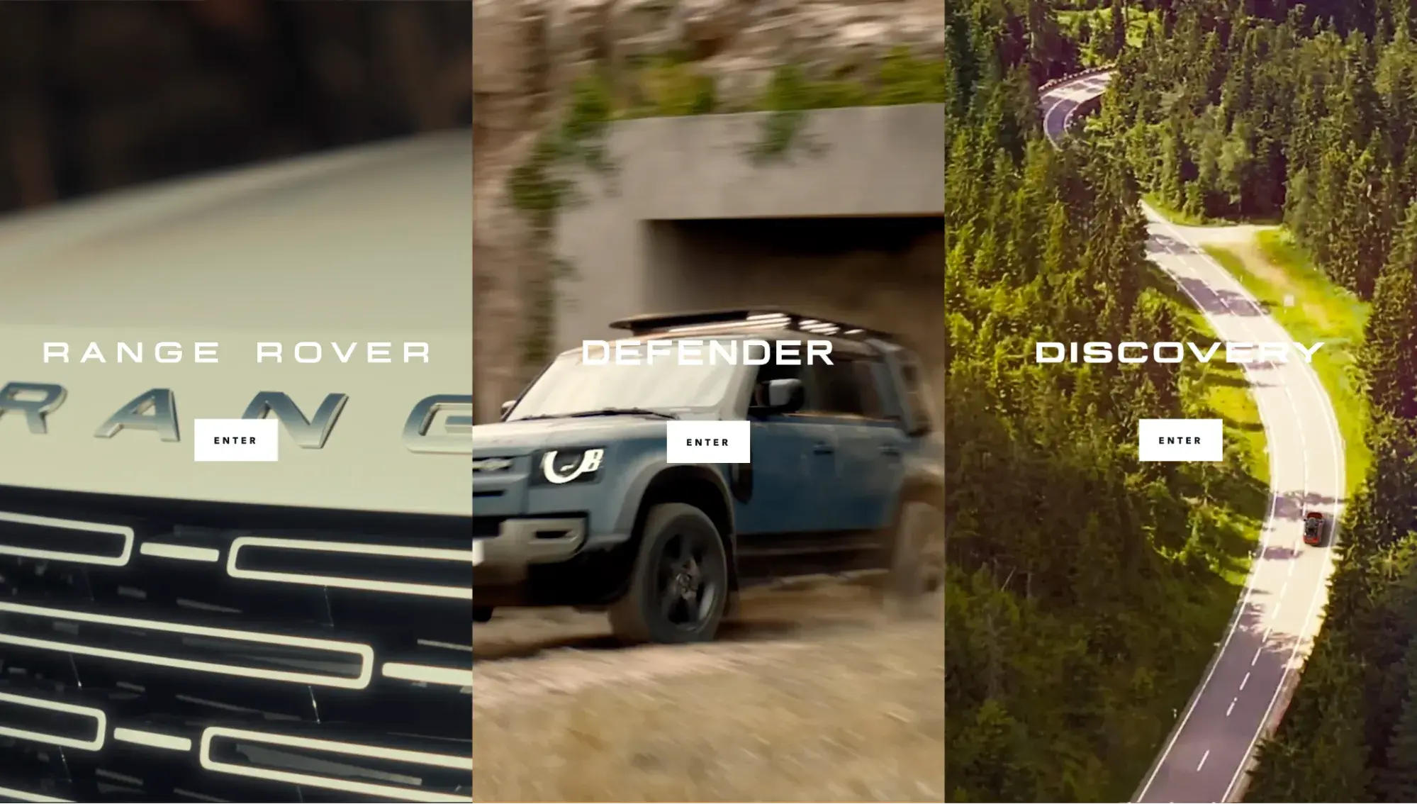
Land Rover, a British luxury automobile manufacturer, presents a visually engaging website that stands out by immediately presenting you with a choice: Which model are you interested in?
The triple columns feature videos with captivating hover effects. When I clicked “Range Rover,” it invited me into the world of this luxury SUV.
What I Like
The build-your-own vehicle part of the website is fun and engaging, allowing the user to get a feel for the car, even if they’re not physically on the lot with it. As a luxury brand, it’s crucial to think of ways you can digitally bridge the gap between the user and your product.
11. Avjet Global

Is there anything more fancy than a private jet? Avjet Global sells both private and business aircraft and sought out SmartBug Media to help with its website redesign. The hero background video captures attention right away, and I love how unique the shape of the hero video is.
Free Website Design Inspiration Guide
77 Brilliant Examples of Homepages, Blogs & Landing Pages to Inspire You
- Agency Pages
- Ecommerce Pages
- Tech Company Pages
- And More!
Download Free
All fields are required.
Form not available
What I Like
Avjet Global instantly builds trust by showing social proof in the headline farther down the homepage that reads, “$10B+ in Exceptional Aircraft Sales.” Then, on its About page, it builds even more credibility with stats like ”43 years of industry leadership“ and ”500+ aircraft transactions."
12. Hermès
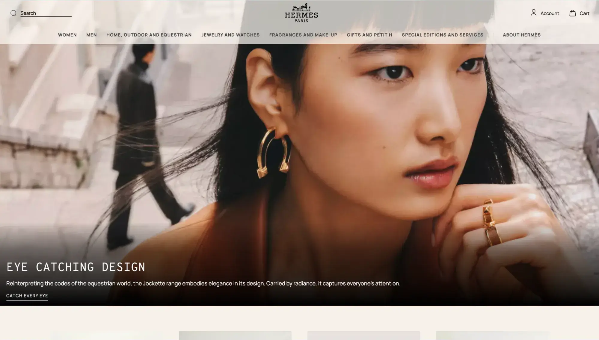
Neutrals dominate the luxury website’s space, but this allows Hermès’ high-end items to truly stand out.
What I Like
Hermès also makes use of a typewriter-esque font throughout the site. It's readable yet chic — and memorable compared to a more lackluster font.
13. Armani
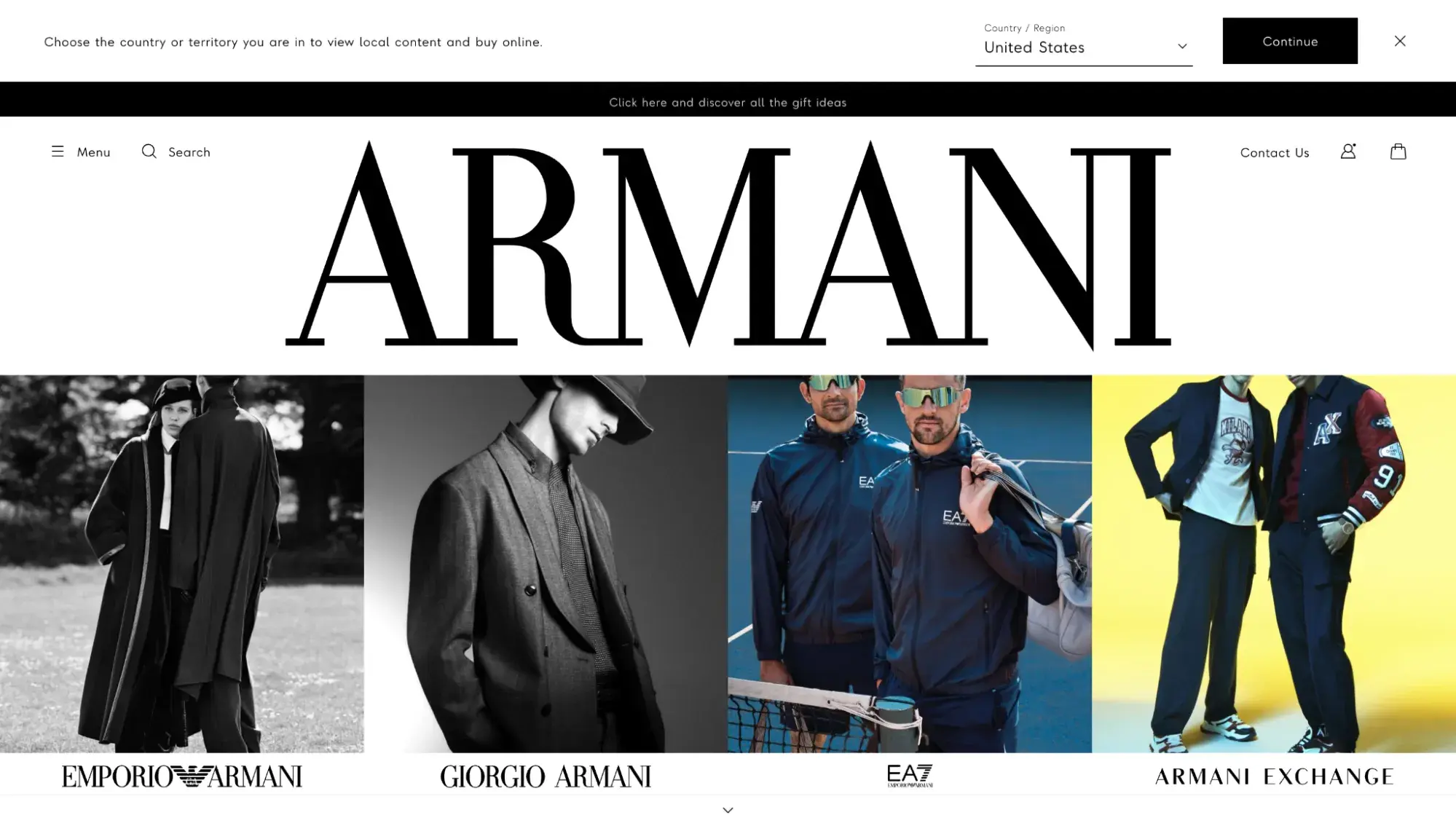
Armani is another Italian luxury fashion house that can teach a masterclass on creating luxury websites that are on-brand. This site features a balance of white space and imagery that creates a stark contrast.
Plus, its oversized logo and brand name really make a statement: This fashion icon is a big deal.
What I Like
Armani features an eye-catching parallax scrolling effect filled with high-res images of its products.
14. Rolex
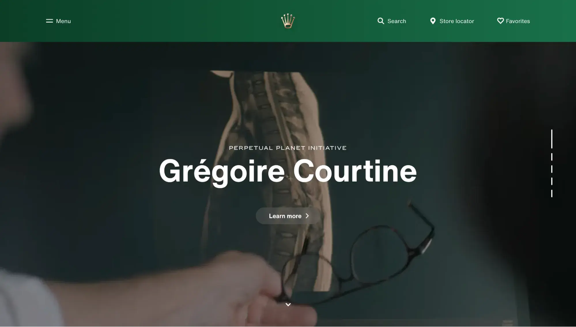
The Rolex website surprised me. It stands out from the rest of the fancy websites in that its homepage doesn’t focus on its product — it focuses on the brand’s impact and lifestyle.
Rolex opens with philanthropy, showcasing a hero background video of neuroscientist and Rolex Awards Laureate Grégoire Courtine, highlighting the brand’s philanthropic initiatives.
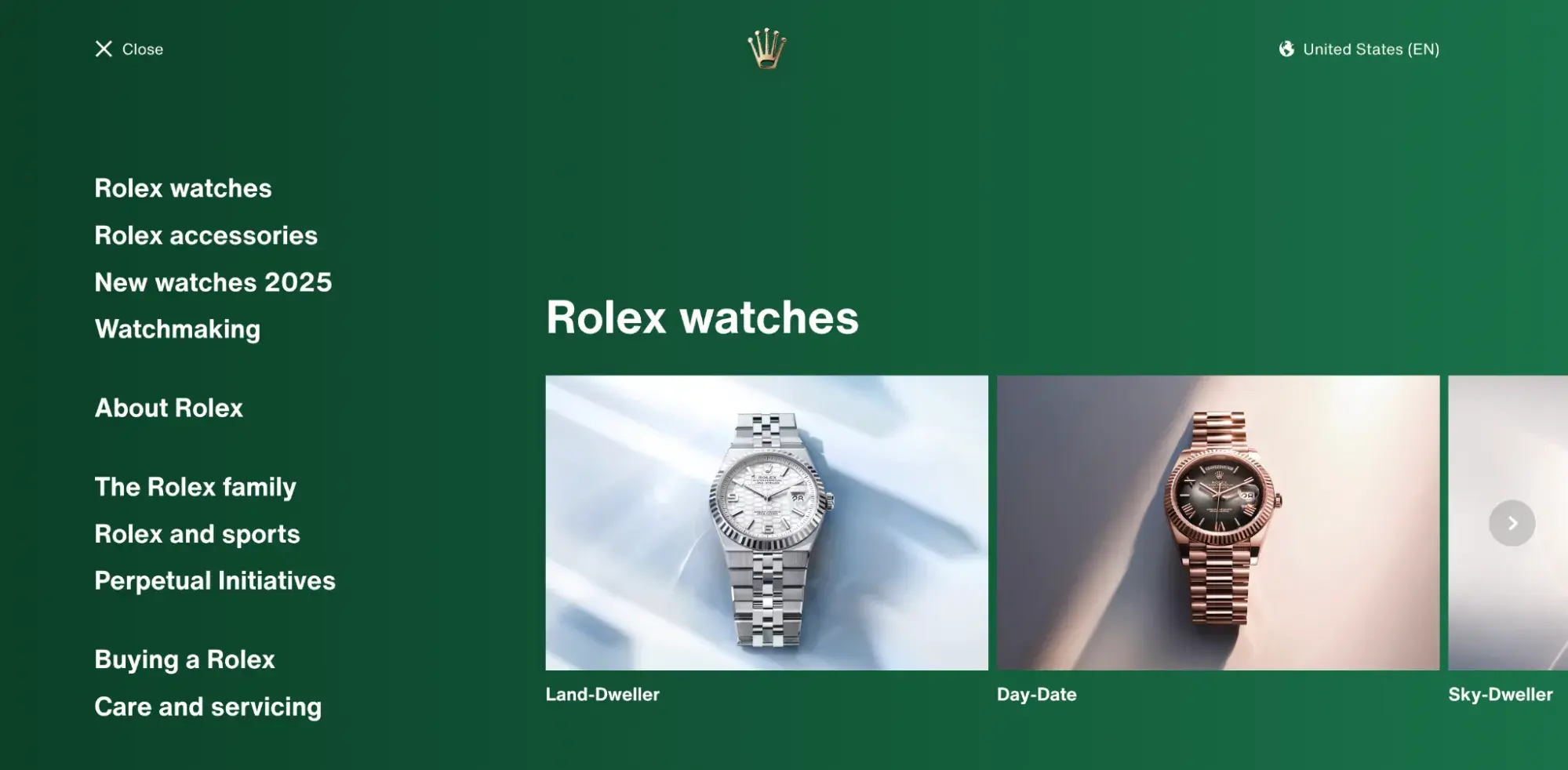
What I Like
Rolex’s website has a unique menu: When I clicked it, it filled my entire screen. It also has images of its iconic watches.
Another unique thing about Rolex: You can’t buy their watches online. You must locate an official store. This just goes to show that not every luxury brand has a luxury ecommerce website. Sometimes, the website is more about getting customers into the physical store.
In fact, this could be a smart move to protect the prestige of the Rolex name. Allowing it to be sold online could dilute the brand. Requiring shoppers to go to an official store only adds to the feeling of exclusivity.
15. Louis Vuitton
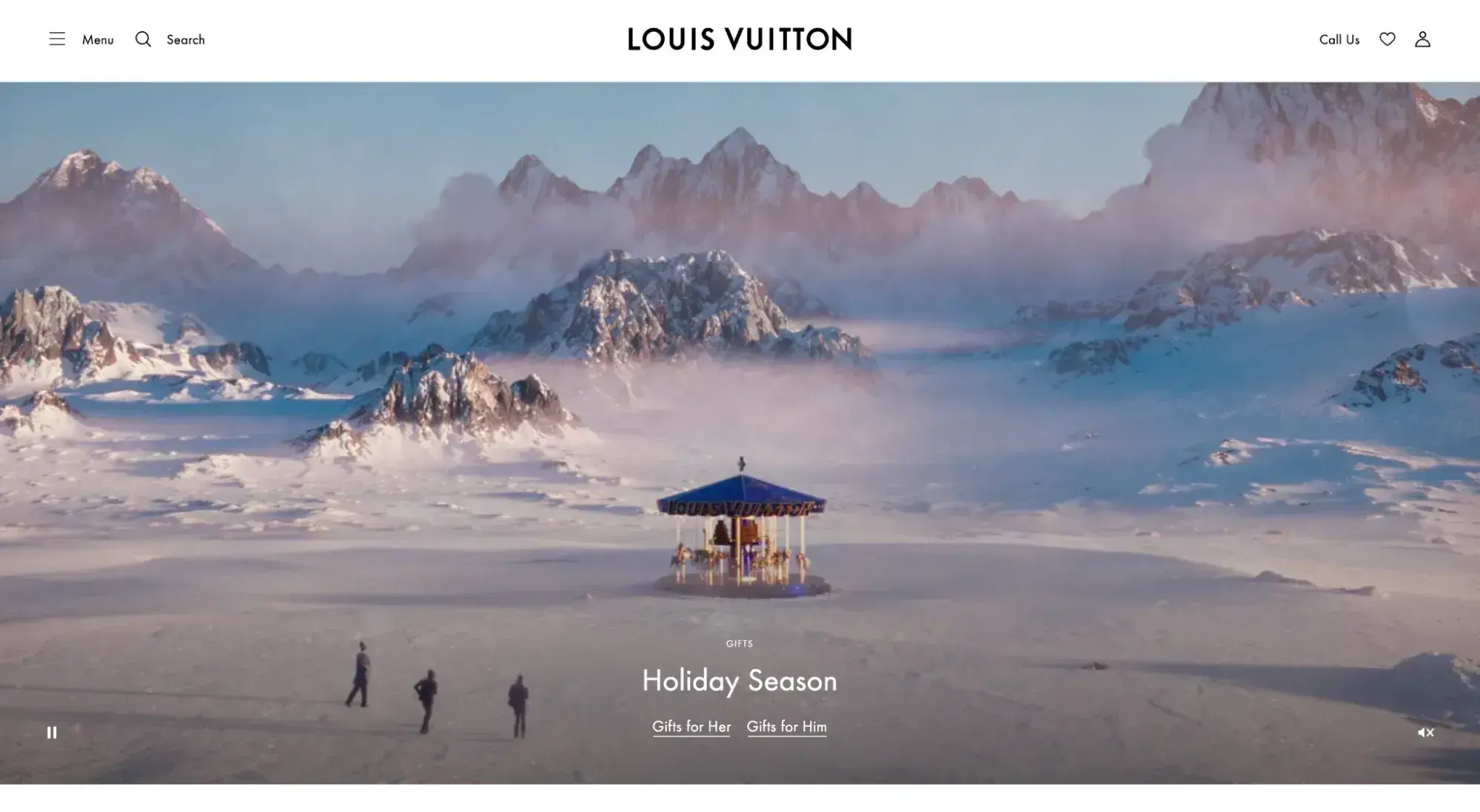
For winter 2024, the French luxury fashion house Louis Vuitton made good use of the brand's visually appealing videos for the holiday season. When I loaded this elegant website, I entered the world of Louis Vuitton with a view of the products in a breathtaking winter wonderland.
The site also features a concise menu and the company's signature, highly readable font.
What I Like
As I continued to scroll down, I noticed the entirety of the Louis Vuitton homepage is a collection of images. All tell a cohesive brand story and follow a similar color palette.
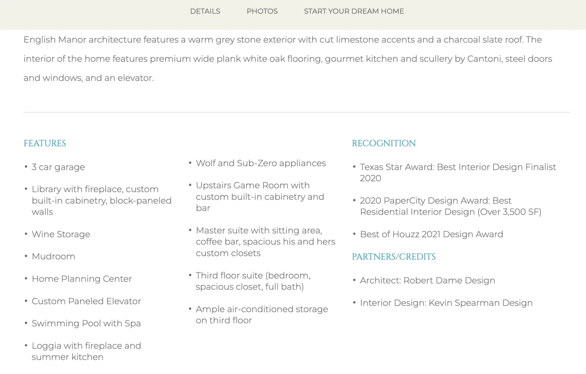
16. Sims Luxury Builders

Sims Luxury Builders finds a nice compromise between a hero background video and a full-screen photo by adding a slow zoom-in effect to its hero image. It also has an entire page dedicated to its multiple awards, building confidence in its prospects. This website is built on the HubSpot CMS (Content Hub) by digital marketing agency Bonafide.
What I Like
Sims implemented a stunning and detailed portfolio section that shows more than just photos of pretty houses. Each property has extensive information about the home's design, including square footage, number of bedrooms and bathrooms, and recognitions and awards it earned.
Elegant Websites
How is an elegant website different from a luxury one? “Luxury” implies high value, which all of the sleek websites on this list convey. But “elegant” is a more specific type of luxury; it implies something stylish and sophisticated. When I think of the word “elegant,” I think of a woman in a beautiful ball gown. Elegant website design is dressed up, without being garish.
Elegant web design features opulent designs, stunning product photography, high-ticket items, and sophisticated typography, often with a feminine touch.
17. Swarovski
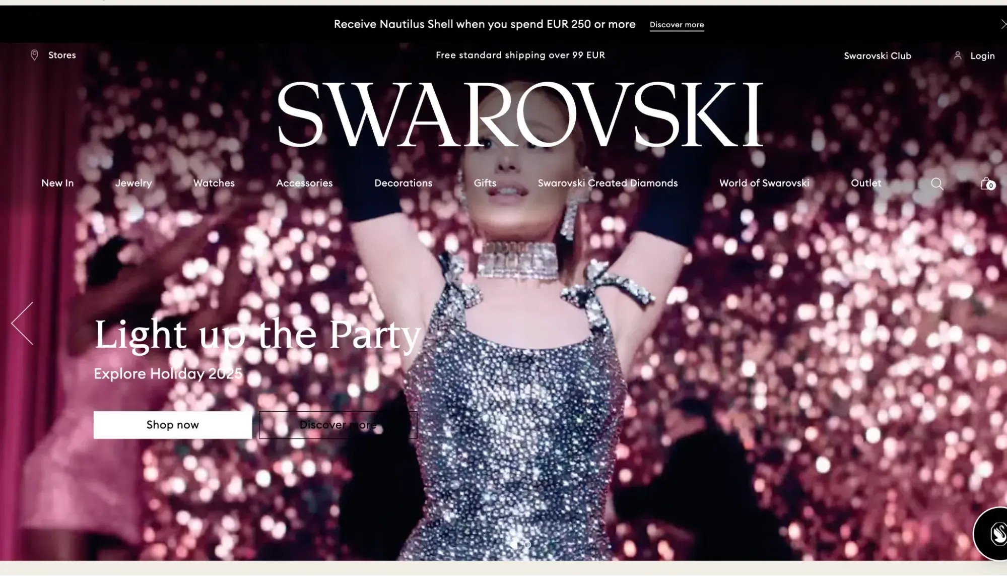
Swarovski has one of the most elegant websites I’ve looked at. The site features the company‘s name in a massive yet easy-to-read font atop a hero background video of a shimmering set of dancers led by Ariana Grande.
What I Like
Swarovski exudes elegance by mixing static imagery with video (motion is a must-have when you’re trying to show sparkle). It also prevents a stagnant feel by adding animation, such as fade and zoom-out effects, to its images as they load on the screen.
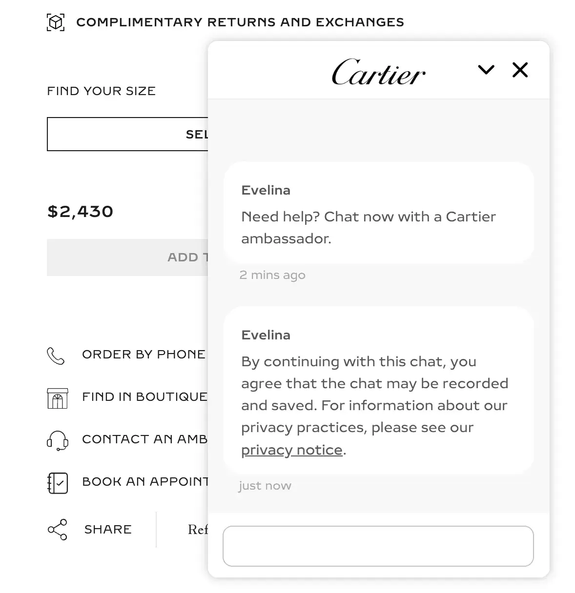
18. Cartier
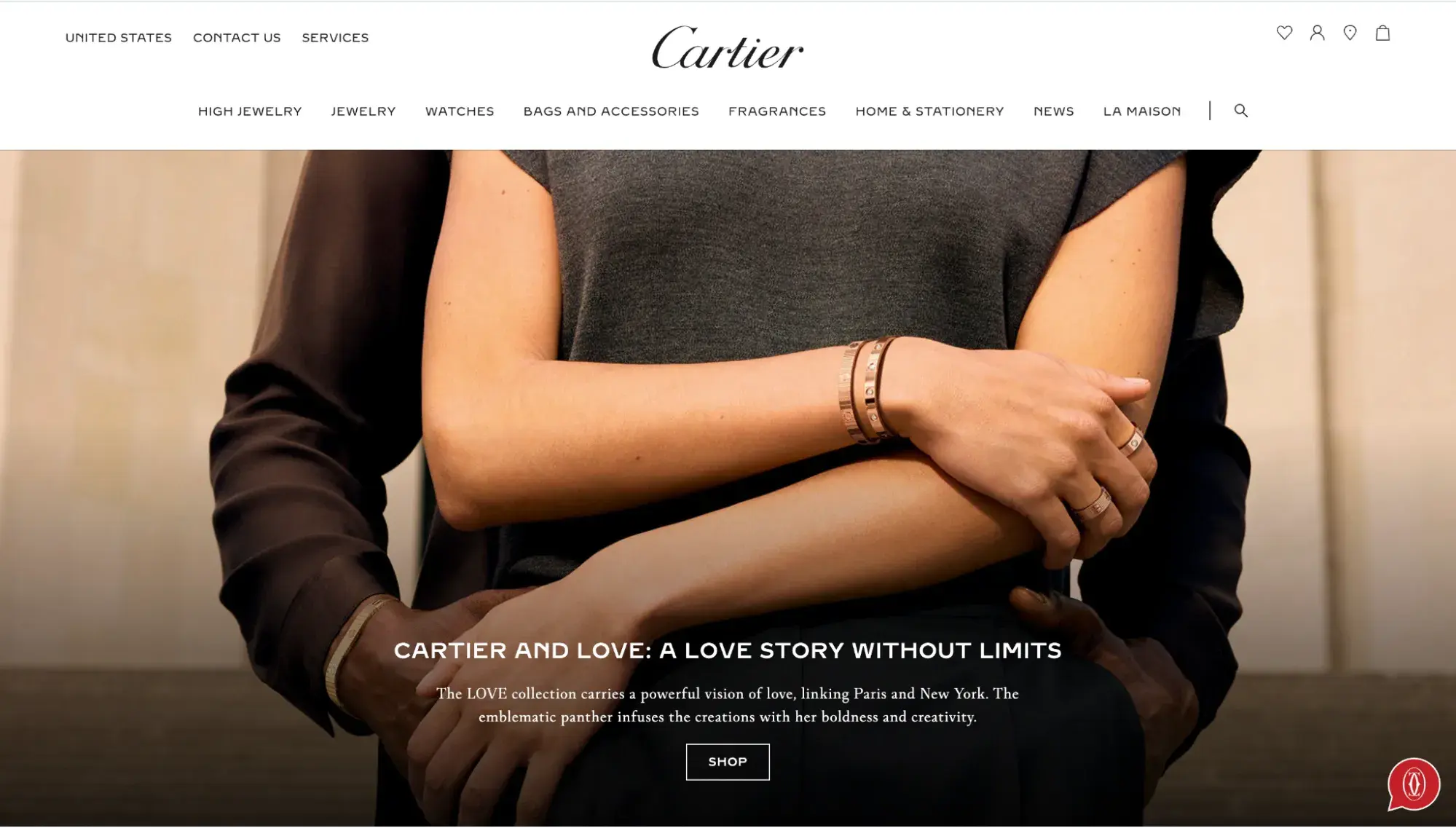
Cartier’s current homepage is refreshingly understated, but it does give us a touch of pizazz with its signature red color in the footer, dialing up the elegance like red lipstick. By toning down the imagery and effects, its sophisticated jewelry pops even more.
What I Like
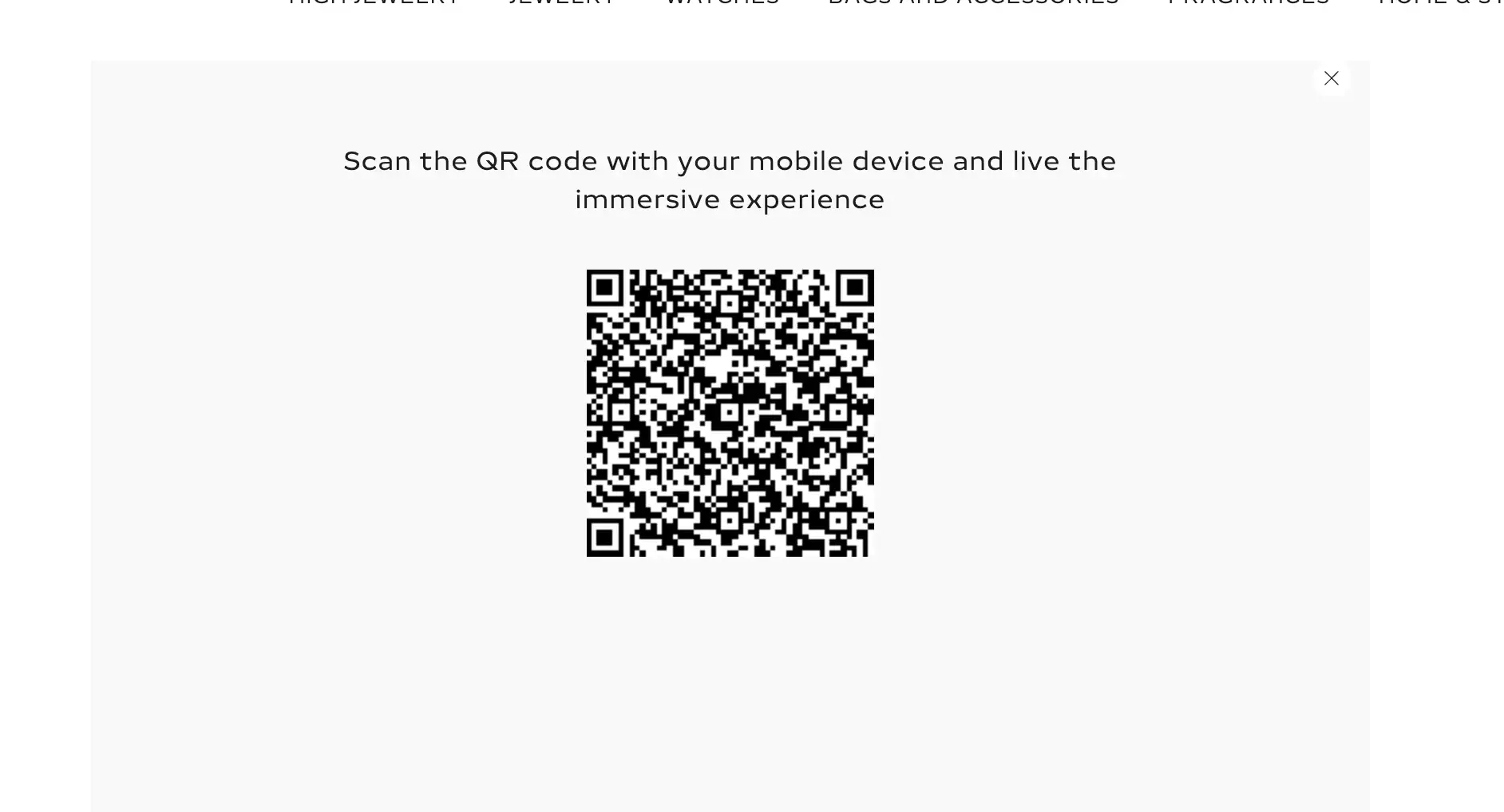
The product pages are a great example of using 3D photography. I could drag, spin, and zoom in on the jewelry. This bridges the gap between online shopping and an in-person experience.
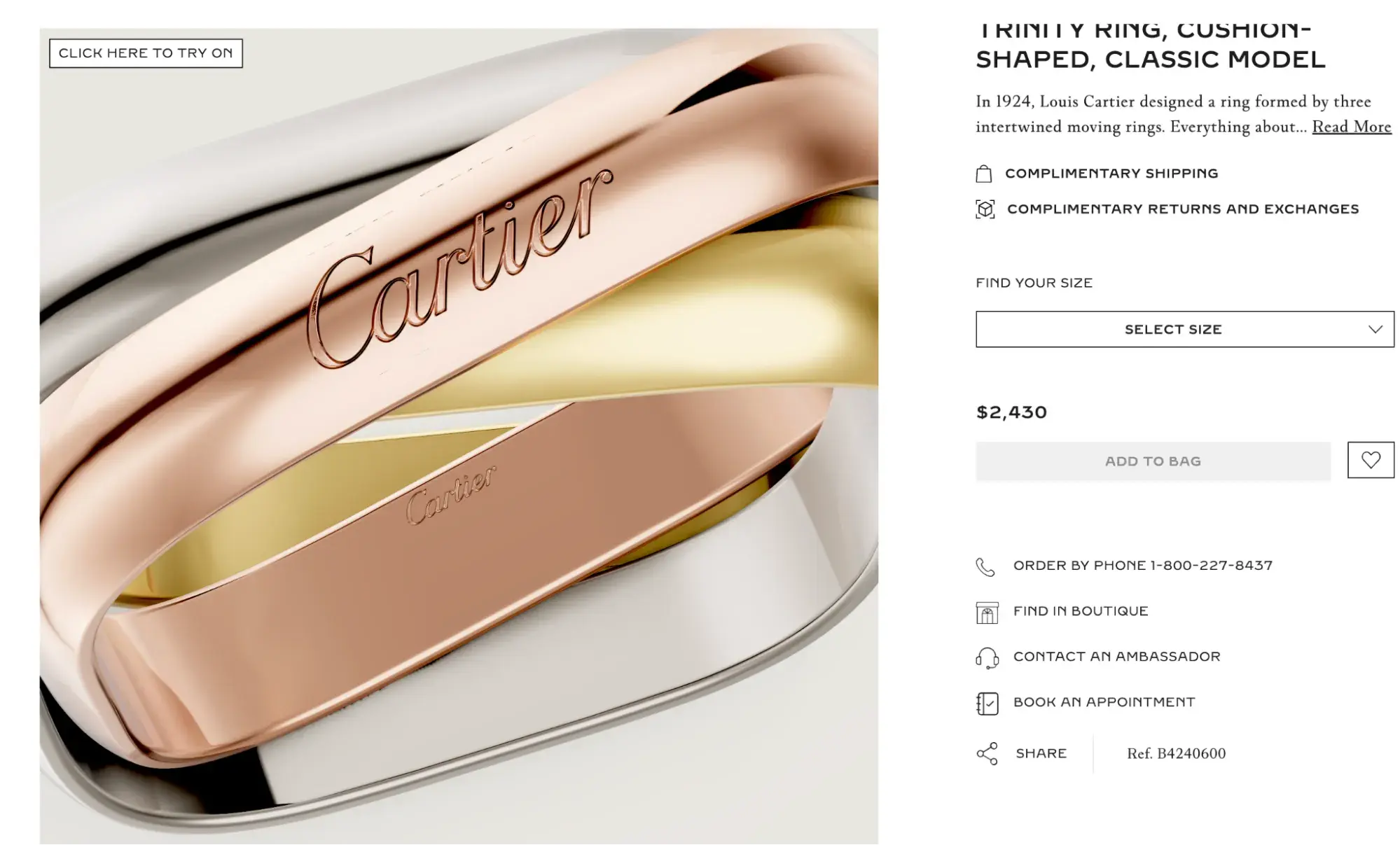
It even let me scan a QR code to “try on” the ring virtually, which was a shockingly cool experience.
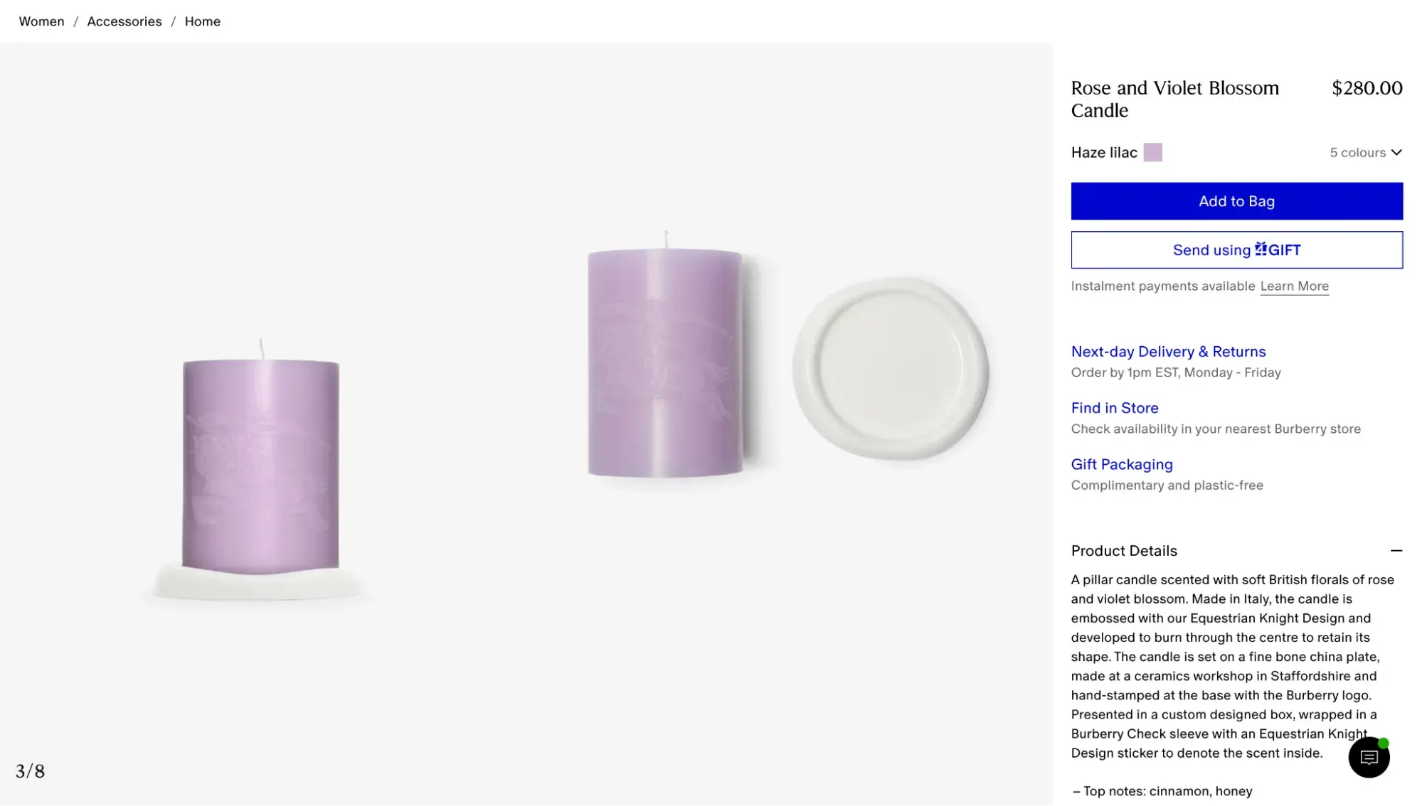
19. Burberry
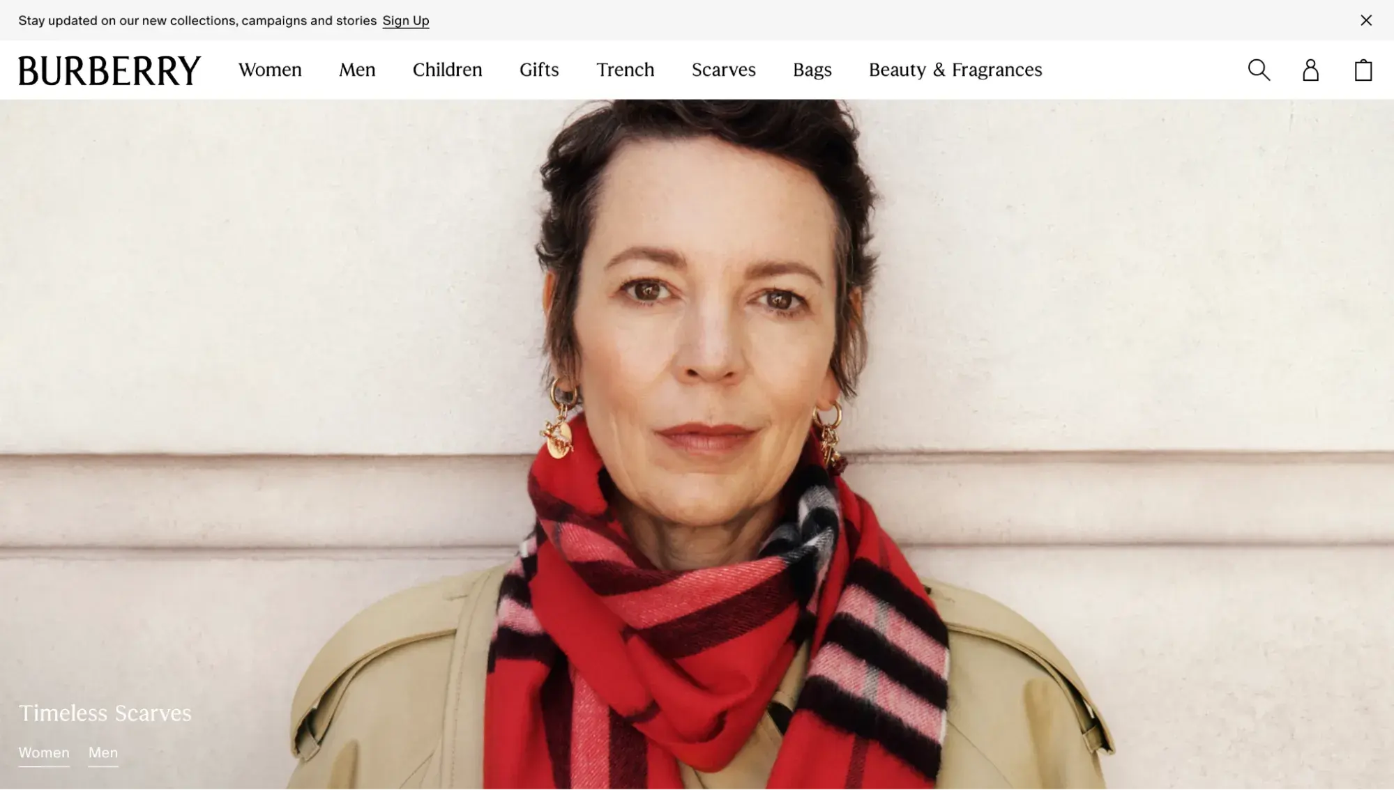
British brand Burberry leads with its strength with a hero image featuring its iconic check-patterned scarf. It continues down the page with a grid of bold images of its products, which gives the same feel as a glossy-paged print catalog.
Pro tip: Luxury brands, pay attention to copywriting. Notice how Burberry takes something as humble as a candle and makes it sound absolutely decadent with phrases like “set on a fine bone china plate” and “presented in a custom designed box.”
20. Tiffany & Co.
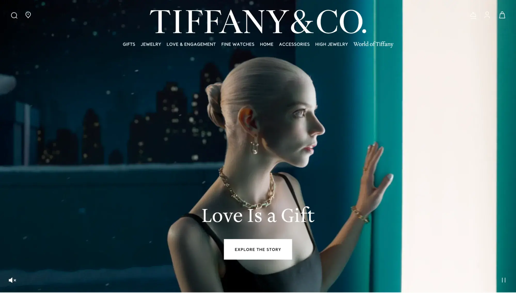
When I think of elegance, I think of Tiffany & Co. — its iconic Tiffany blue gift boxes wrapped with a white satin bow. The jewelry brand plays to its strengths with a hero background video highlighting its gift boxes and sparkling jewelry, with celebrity Anya Taylor-Joy starring. The soft lighting and gentle snowflakes really add to the elegant website feel.
What I Like
Tiffany masters brand storytelling, keeping its trademarked Tiffany Blue color consistent throughout the homepage and website. Parallax scrolling adds visual interest, while stunning product photography does justice to its breathtaking jewelry.
Free Website Design Inspiration Guide
77 Brilliant Examples of Homepages, Blogs & Landing Pages to Inspire You
- Agency Pages
- Ecommerce Pages
- Tech Company Pages
- And More!
Download Free
All fields are required.
Form not available
Luxury Ecommerce Websites
Luxury ecommerce websites are specifically set up to make it easy for website visitors to place an order online rather than having to come into the store. They feature shopping carts and payment options and may even have live chat support.
21. Gucci
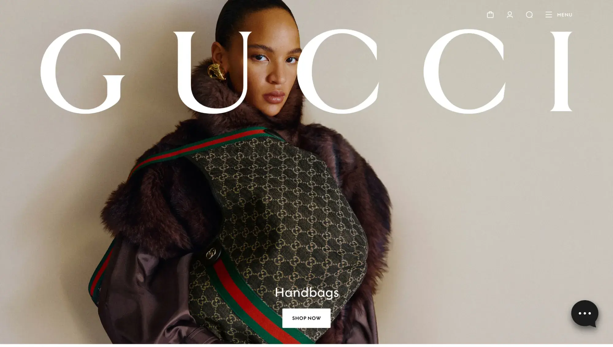
Gucci is a luxury fashion house based in Florence, Italy. As you can tell from its luxury ecommerce website, the company is known for its high-end leather goods.
The easy-to-read font on the homepage is a thread throughout the entire site. The website also displays a non-obtrusive menu that lays out the different sections of the website users can visit.
What I Like
Gucci's website is timeless, and so are the products it sells. Remember: Your website needs to be cohesive with your brand identity and the products available for purchase.
Pro tip: Consider installing a chatbot or live chat option on your sales pages, like Gucci does here:
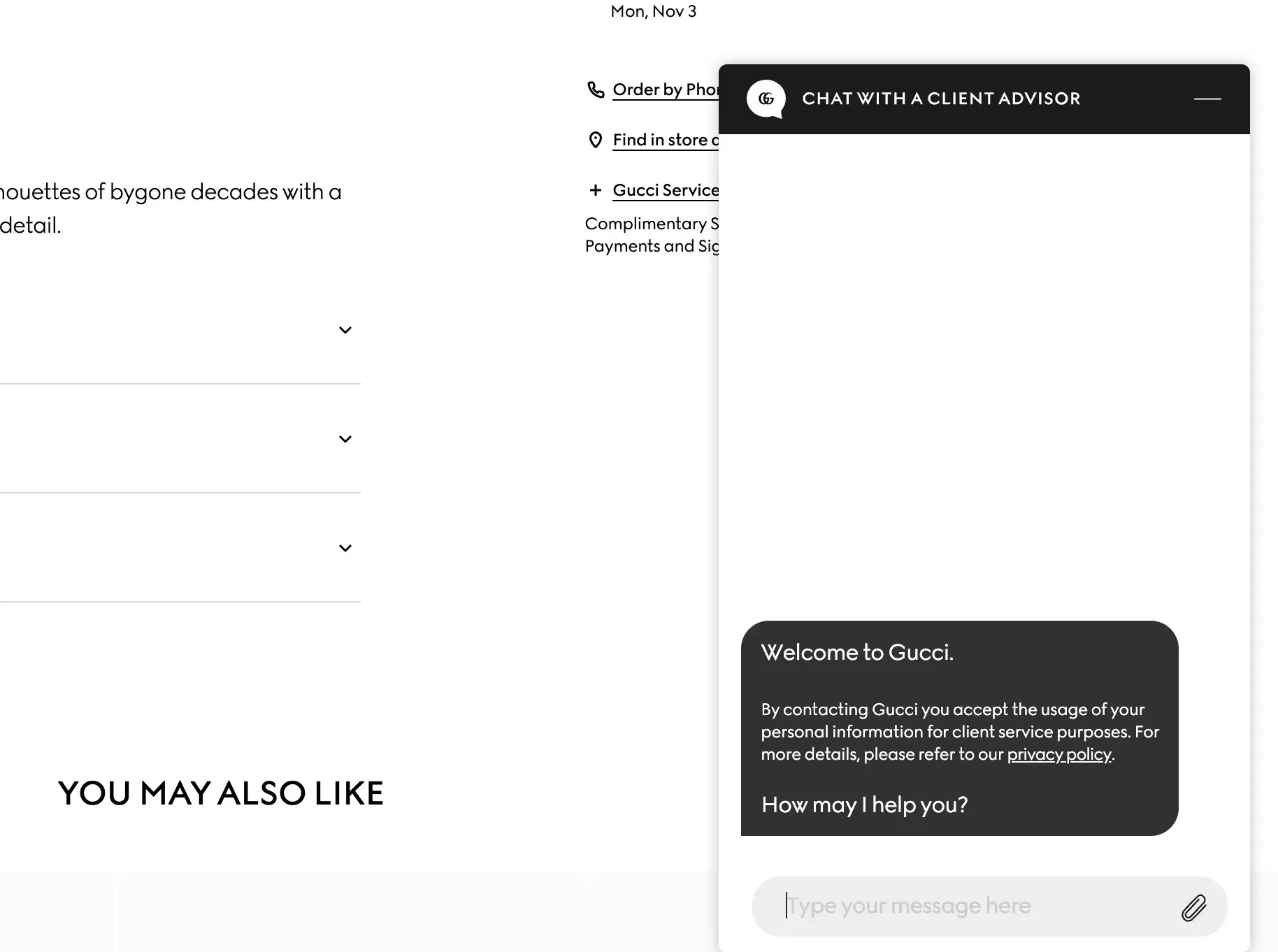
By answering questions immediately as your visitors are shopping, you can decrease consideration time and move them more quickly to checkout.
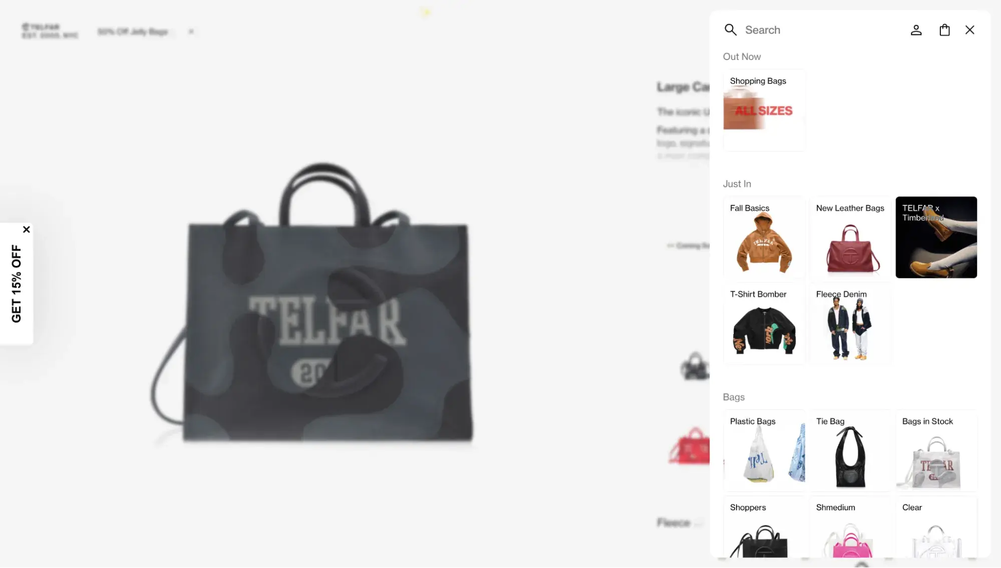
22. Telfar
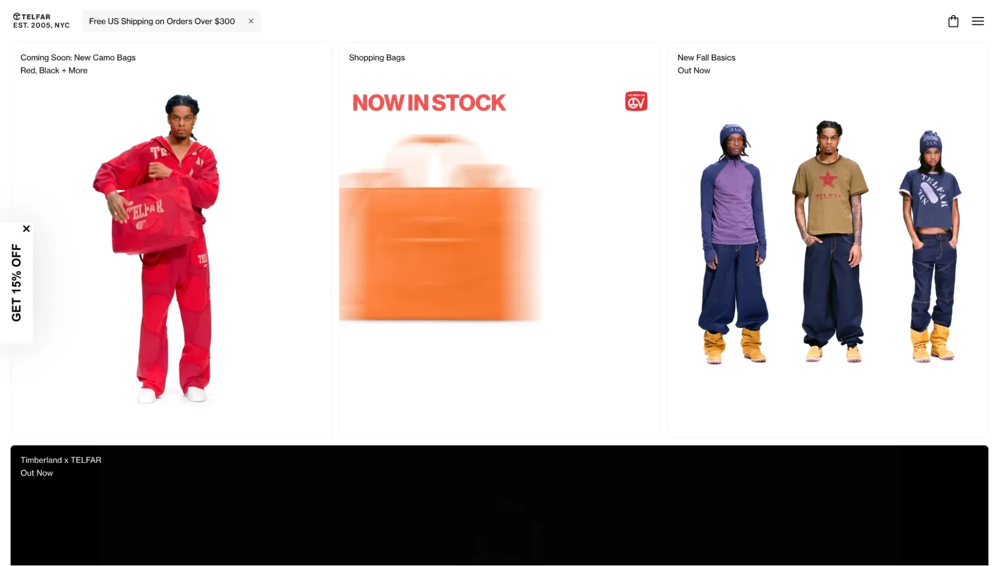
Telfar, a luxury fashion brand created by Liberian-American designer Telfar Clemens, breaks the mold with an unabashedly unique site. Its homepage has a triple-columned hero section, with each column featuring a different video or image. This luxury ecommerce website's design perfectly balances white space, images, and text.
What I Like
Telfar's site features a vertical menu with image icons instead of text links. This makes it fun and unique while also improving the user experience by making it easy to find what you’re looking for.
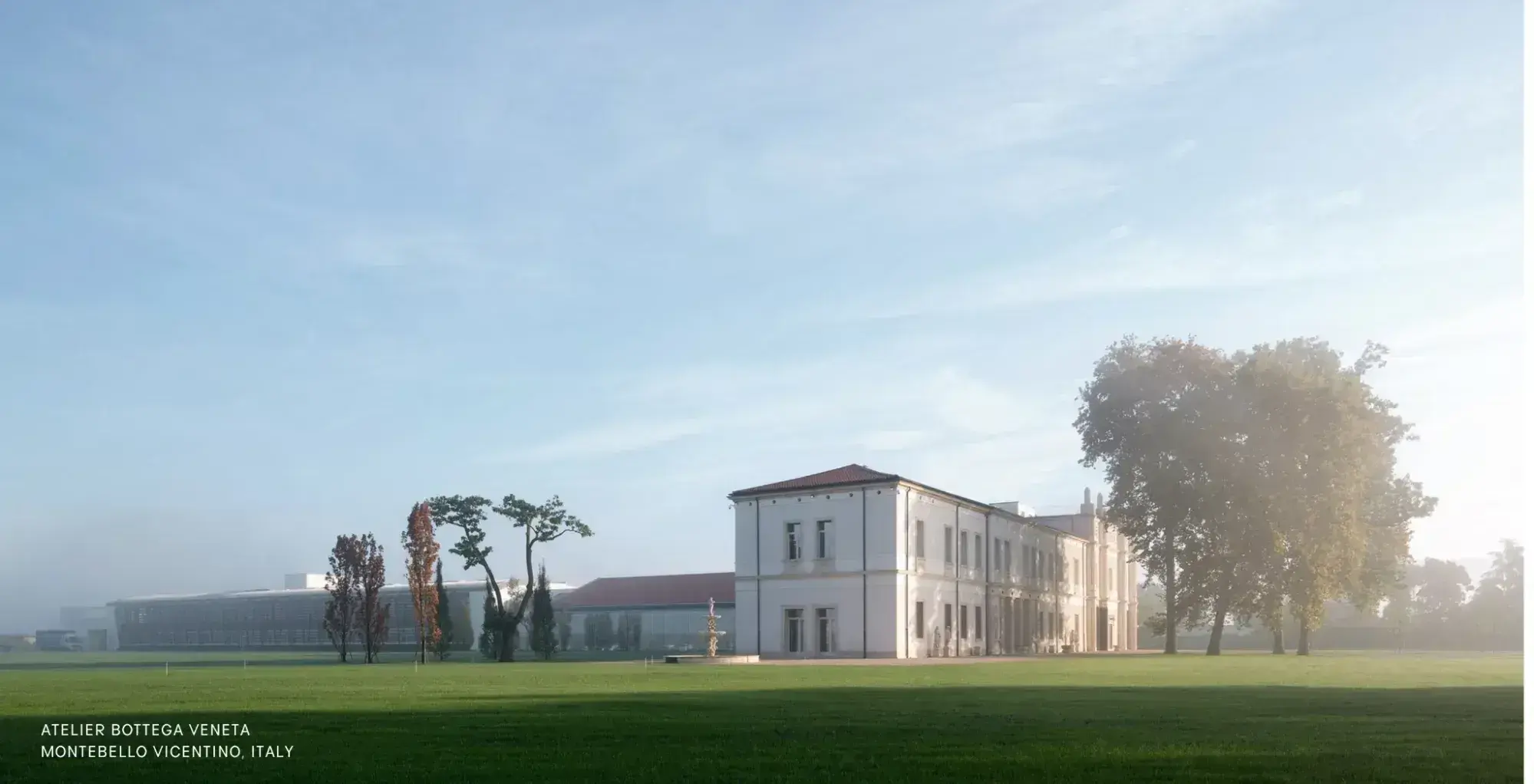
23. Bottega Veneta

Italian fashion house Bottega Veneta’s website leans heavily on photography, with an image grid taking up its entire homepage and hardly any copy. While scrolling, you’re introduced to this season's collection.
Pro tip: Luxury ecommerce websites like Bottega Veneta take advantage of color swatches to show online shoppers what different product variations look like in real life. This can help boost conversions.

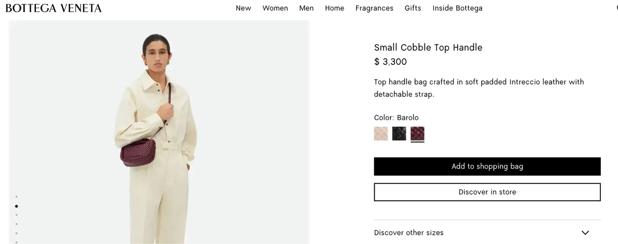
What I Like
Bottega Veneta has an “Our Community” page, which gives you a peek behind the scenes with a large image of its atelier in Italy and more details about the people who work for the company.
24. Prada

Italian fashion house Prada's luxury ecommerce website stands out for its storytelling. As soon as you land on the homepage, you’re greeted by a soundless video depicting sophisticated and stylish city dwellers driving to a snow-covered forest. Once there, they’re met with whimsy as the winter wonderland lights up with white lights.
What I Like
Prada’s hero video is part of a larger holiday campaign, and I liked the creative use of storytelling through video and words. You can follow its throughline on its product pages, where its copy reads: “Prada’s Holiday Women’s Collection redefines the balance between function and fantasy. Mountain-inspired allure meets urban sophistication.”
25. Yves Saint Laurent

Speaking of storytelling, take notes on this masterclass in brand storytelling from Yves Saint Laurent’s November 2024 website. This famous French luxury fashion house featured a vintage-looking hero video that, if clicked, allowed you to watch the video in full with sound.
If you scrolled down, the entire homepage was made up of full-screen images that highlighted the brand’s products.
What I Like
I thoroughly enjoyed being able to watch the full video, which is based on Marcel Proust's book In Search of Lost Time and is reminiscent of an old French film.
It’s a great example of how marketing campaigns don’t have to be blatantly about your brand’s product. Instead, they can be about your brand’s values and feel.
26. Fendi
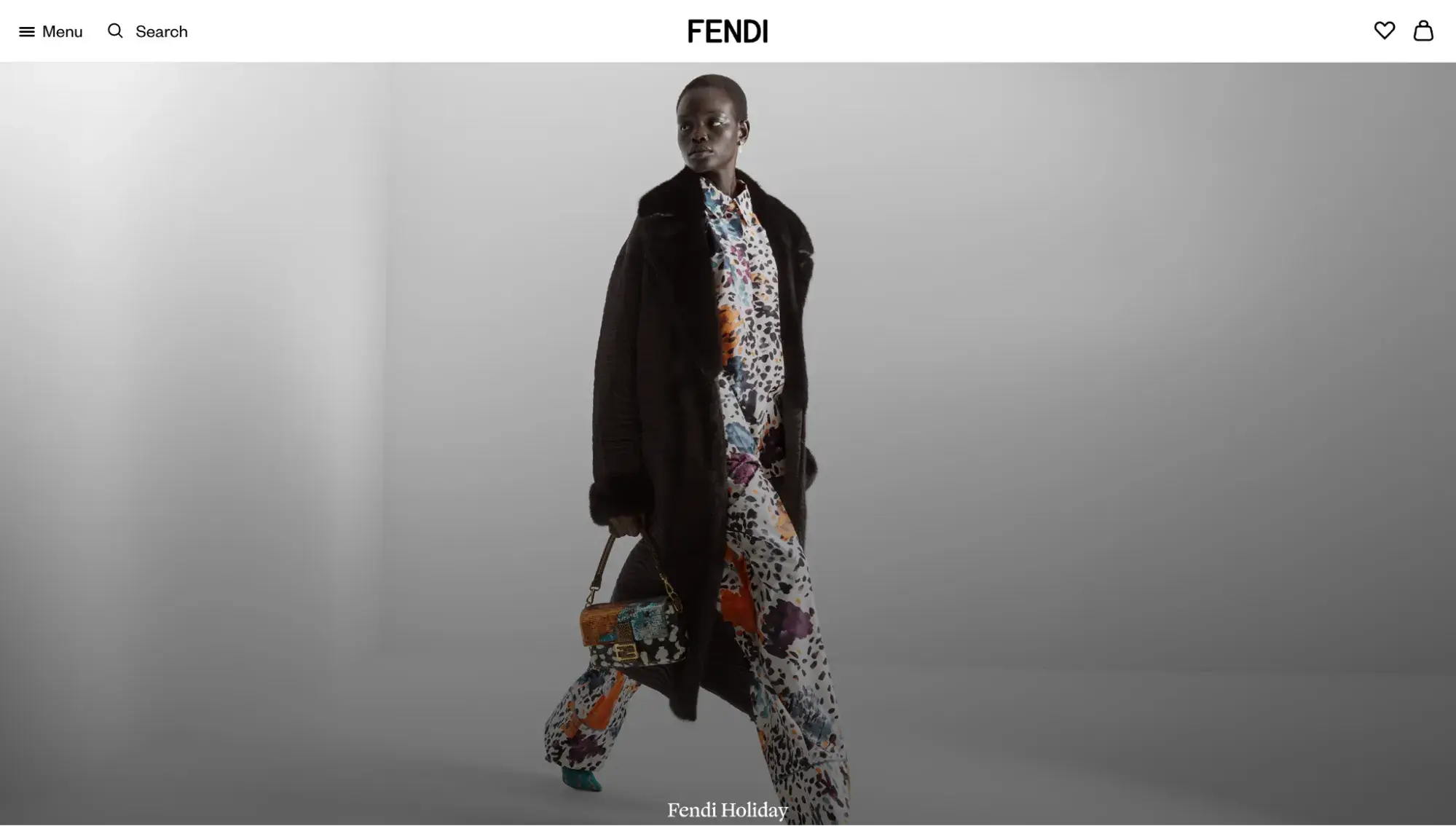
This Italian luxury fashion house initially gained a reputation for its stylish accessories, but I think it deserves credit for its luxury ecommerce website, too. The homepage features a full-screen hero image that oozes with high fashion.
What I Like
At the bottom of the homepage, you're invited to input your location to find a Fendi shop or book an appointment.
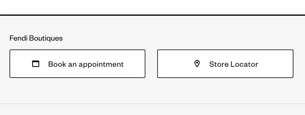
Once again, these interactive features offer a meaningful way for visitors to interact with the brand.
How to Create Your Own Luxury Website
Maybe the above luxury website examples have inspired you to create fancy websites yourself. Here’s how to get started.
Choosing the Right Platform
First, you need to decide how and where to build the site. For this, you have a lot of options, but I’ll give you the main ones.
Custom Development
Luxury brands typically have the money to invest in a custom build from a skilled web design and development agency. This is definitely the most expensive option, as it takes more time and technical skill. But if your website is complex, has ecommerce features, and needs to handle lots of traffic and orders, this is your best bet.
HubSpot CMS + HubSpot Solutions Partner Help
Four of the websites in this list use HubSpot Content Hub as their CMS and worked with HubSpot solutions partners to ensure the platform was customized to their luxury brand’s exact needs. Content Hub works great as a fancy website builder. It natively connects to the Smart CRM, ensuring a more personalized experience for website visitors.
HubSpot CMS + Template
If you’re more of a DIY kind of brand, you can easily use Content Hub without hiring an agency. Simply choose one of our 500+ professionally designed free and paid website templates. Content Hub’s drag-and-drop editor makes it easy for anyone to modify the template, even without technical knowledge.
Shopify + Template
If you’re building a fancy website to sell products online, you can’t beat Shopify, a leading ecommerce website builder. Two of the luxury brands in this list (Prabal Gurung and Telfar) use Shopify. Browse its 800+ premade website templates to find one you love. Then, use its visual editor to customize your site.
Free Website Design Inspiration Guide
77 Brilliant Examples of Homepages, Blogs & Landing Pages to Inspire You
- Agency Pages
- Ecommerce Pages
- Tech Company Pages
- And More!
Download Free
All fields are required.
Form not available
Essential Design Tools
Figma
Figma is a popular tool among designers. It’s useful for creating wireframes and mockups to collaborate with others during the website design process.
Canva
Canva makes graphic design extremely accessible to non-designers. Use it to edit images, find stock photos, or create graphics with text overlay. You can even use it to wireframe or mock up your fancy website. My favorite thing about Canva is that it has thousands of professionally designed templates.
Photoshop
Photoshop is a professional photo editing software. Use it to touch up photos and do much more advanced editing for your luxury brand imagery.
Budget Considerations
How much money do you have to invest in your website? Choose an option depending on your budget. Luxury website design cost varies widely (because websites vary greatly in their number of pages, level of complexity, etc.). But here’s a general idea of cost, with the most affordable being a DIY combo of a CMS website builder and template, and the most expensive being a custom build by a web design agency.
Note that the pricing below does not include maintenance costs, things like domain registration, SSL certificates, and plugins.
- CMS + Template ($): If you bought the lowest paid plan of Content Hub and used a paid template, that would run you $9/mo on the annual Content Hub subscription and then a one-time fee of roughly $200 for the website theme.
- Freelance web developer ($$): Freelance web designers and developers could cost at least $5,000 to build you a website, typically from a template that they then customize.
- Web design and development agency ($$$): Contracting a web design and development agency will cost you anywhere from $7,000 to $70,000+ for an ecommerce website, according to a GoodFirms survey of over 100 web development companies. The more features and customization you ask for, the higher the cost, with a fully custom build being the most premium pricing.
Common Mistakes to Avoid
Getting Too Gaudy
The line between fancy and tacky can be a fine one. How can you avoid going overboard?
- Embrace the white space. Overcrowding a design is a common rookie mistake. By leaving space for the images and text to breathe, you actually do more with less.
- Keep copy minimal. As you’ll notice in the fancy website examples above, many luxury brands lean heavily on high-quality images and use very few words. This prevents their website from overwhelming visitors, keeping things uncluttered and elegant. Check out these modern website designs for more inspiration.
- Hire a professional designer. A web designer or brand designer will have the keen eye that can shape your brand image. When you use templates, AI, or rely on your own taste (assuming you’re not a trained designer), it’s easy to try to do too much.
Neglecting the Brand Story
A brand story helps convey your brand values and build trust with your audience. This is particularly important for luxury brands that are selling high-ticket items. Upscale shoppers want to know about the brand’s origin story, the artisans who craft the products, and the quality of the materials. Be sure to convey your company’s history, your designers, and the people who work behind the scenes.
Poor Website Performance
When trying to design a fancy website, it’s easy to get caught up in how things look. But a good user experience is also about how things feel. If your visitors get frustrated because your website is slow or a button doesn’t work, it can ruin the entire experience.
Pro tip: Content Hub has a site speed dashboard that monitors your site health, including the Core Web Vitals, so you can ensure your fancy website is fast.
Getting Started with HubSpot
By looking at these high-end websites and what makes them successful, you can better understand what it takes to create a site for your high-end brand.
But don’t let this be where your website journey ends. Get started on your fancy website today. Here’s how:
- Sign up for a free Content Hub account.
- Choose a fancy website premade template in the HubSpot Template Marketplace.
- Edit the template (no coding required!) with HubSpot’s easy drag-and-drop editor.
Frequently Asked Questions: Fancy Websites
What makes a website look fancy or expensive?
By far, the number one thing that makes a website look fancy or expensive is the quality of its photography and videography. You can have the fastest, most well-designed website, but if your photos are blurry, you lose the image of being high-end.
How much should I budget for a fancy website design?
For the web design itself, it greatly depends. If you DIY with a CMS and template, you can keep your budget in the hundreds. If you work with a solo freelancer, they might start at $5,000. A web design agency is likely to cost at least tens of thousands of dollars. Luxury brands need to budget not only for the website design and development but also for brand strategy and photography. If you don’t already have a solid brand identity and professional photos, your website won’t turn out right. Not all web design agencies do branding and photography, so be sure to ask. You might have to hire a separate freelancer or agency to do those aspects.
Which platform is best for building a luxury website?
HubSpot Content Hub excels among service-based luxury brands that want a native connection to a CRM and marketing tools for a more personalized luxury website experience. Shopify is a leading platform for B2C ecommerce sites.
How long does it take to create a fancy website?
The amount of time it takes to create a fancy website varies widely, especially depending on the route you take. If you DIY with a CMS and a premade website template, you can get the basic shell of the website ready in a day. It’s the design adjustment, writing copy, and uploading photos that take the longest, but even then, you could have a simple website ready within a week. The timeline that is the longest is if you hire an agency for a custom build. First, the agency has other clients, so it might not get started on your project right away. Second, custom builds take more time. Expect the timeline to be weeks to months.
Do fancy websites convert better than standard designs?
Fancy websites in and of themselves don’t necessarily convert better than standard designs. However, having a fast-loading website with trust signals (such as testimonials, case studies, and reviews) can boost conversions by building trust with your prospects.
What are the most common mistakes to avoid in luxury website design?
Some of the most common mistakes to avoid in luxury website design are a design that’s overcrowded, a slow-loading website, poor-quality photos, and failing to tell your brand story.
Editor's note: This post was originally published in October 2022 and has been updated for comprehensiveness.
Free Website Design Inspiration Guide
77 Brilliant Examples of Homepages, Blogs & Landing Pages to Inspire You
- Agency Pages
- Ecommerce Pages
- Tech Company Pages
- And More!
Download Free
All fields are required.
Form not available
Website Design Examples


![15 black and white website designs to inspire your own [+ pro tips]](https://53.fs1.hubspotusercontent-na1.net/hubfs/53/black-and-white-website-design-1-20250520-1336267.webp)

![Gradient Website Design Examples That Prove This Trend Is Far From Over [+Tutorials]](https://lh7-us.googleusercontent.com/htOWIbyCIoCMxSjC4gJunkGnhCzXpccjTrL8NwoGdRdCsSiEmEAxe_qBFkMrzy2Y8d3cwEr_DMzSGHq9Xi-hQFnMJCo8HDQJ1yQGigcSfFxI2QKXo0s7xXSB2sY-eALG1iUqnHXgomcDsnp7AHRSH1s)
![15 Brochure Website Examples to Inspire You [+ How to Make One]](https://53.fs1.hubspotusercontent-na1.net/hubfs/53/brochure-website-examples-1-20250319-362228.webp)
![28 Types of Websites to Inspire You [+ Real-Life Examples]](https://53.fs1.hubspotusercontent-na1.net/hubfs/53/types-of-websites.png)

