In the early days of the internet, there were a lot of ugly websites. These sites used so many colors, shapes, textures, and elements that they were cluttered and difficult to navigate.

 As a result, a design aesthetic known as minimalism emerged as a sort of counter response. While minimalism can be traced back to early 20th century architecture (and even earlier in Japanese art), it gained prominence once again as modern web designers sought to reduce complexity and improve the user experience (UX).
Let’s take a closer look at what this aesthetic means, how you can recognize it all over the internet today, and how you can incorporate minimalist techniques into your own web design process.
Minimalist Website Design
Minimalism website design is an aesthetic that emphasizes simplicity, balance, alignment, and contrast. Minimalist websites typically use lots of white space, large images, and bold typography.
Below are some key characteristics of minimalist website design:
- White Background: White provides optimal contrast between the background and calls-to-actions, text, and other elements in the foreground. It also doesn’t distract users or make them think about what the color symbolizes.
- Bold Colors: When used as accents or backgrounds, bold colors can ensure optimal contrast, particularly when used with white or black. They also help to convey emotion and meaning.
- Clean Typography: Sans-serif fonts are simpler than serif fonts. When combined with a large font size and bold font weight, this typography will really stand out and ensure maximum impact for your messaging.
- Whitespace: Whitespace — or negative space — is used in minimalist designs to help the viewer understand what they should focus on. This not only helps make your website easier to skim, read, and navigate. It can also persuade users to take a specific action, like click on your CTA.
It's important to understand that minimalism is about functionality as much as it is about aesthetics. Minimalist websites only offer the features and content a user needs to accomplish a specific task, like making a purchase, getting in touch with your team, or learning about your return policy.
Now that we have a better idea of what minimalism is, let’s take a look at some sites that exemplify these characteristics and techniques.
Minimalist Website Examples
Minimalist websites embody the motto “less is more.” That means text, color, shadow effects, textures, and animations are used sparingly. They’ll still be used — but only if users can still easily understand the content, find what they’re looking for, and make decisions. Below are some of the best portfolios, business sites, and blogs that have minimalist designs.
1. Cambridge Park at Orange Blossom
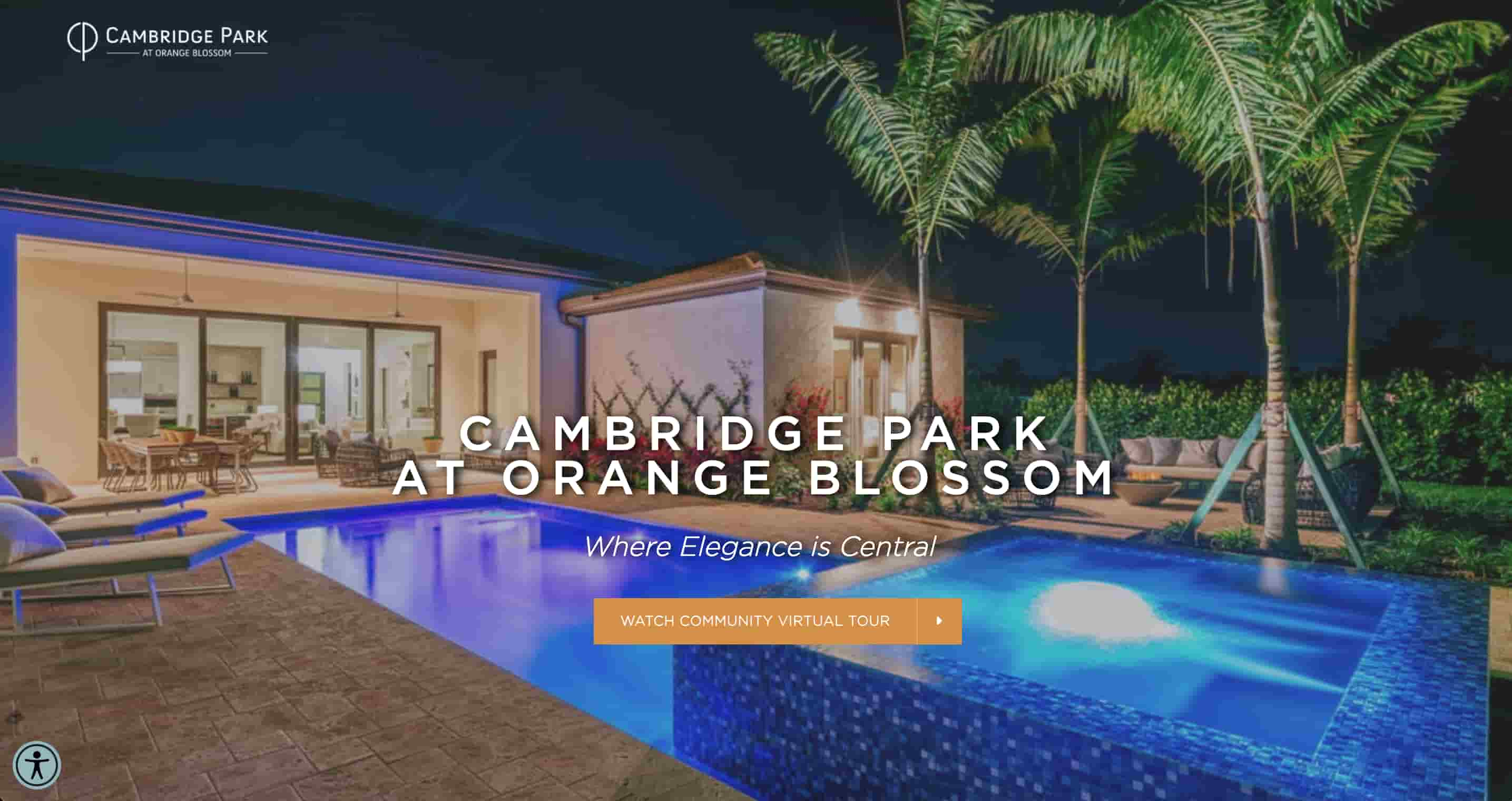
London Bay Homes' website for Cambridge Park uses HubSpot's free CMS to showcase a minimalist design that elegantly enhances its brand. The clean and simple layout, combined with ample white space and crisp typography, reflects the modern and sophisticated aesthetic of their luxury homes, creating a visually enhancing user experience.
2. Visual Artists
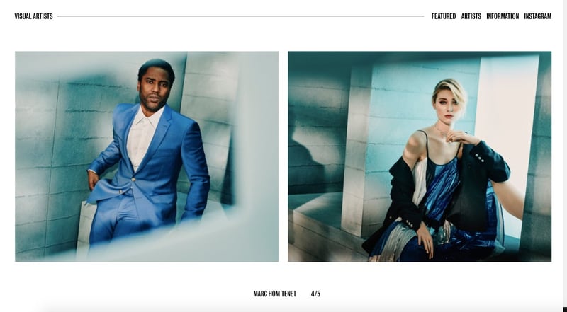
Visual Artists presents only the most necessary information and elements to its visitors. When you first land on the page, all you see is the agency name in big, bold letters against a plain white background. As you scroll, you’ll see the names of the artists, photographers, and creative directors the agency works for, as well as a short carousel of their work. At any time, the only text on the page is the stripped-down navbar at the top and the artist’s name.
3. Mowellens
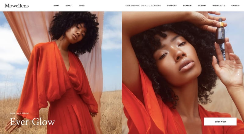
Mowellen’s homepage presents users with simple options. They can click any of the items in the navbar. Below the navbar, there’s an image slider. To the left is the name of the product featured in the image. To the right is the CTA button to take you to that product page. The site pairs a simple black-and-white color scheme with large, colorful images.
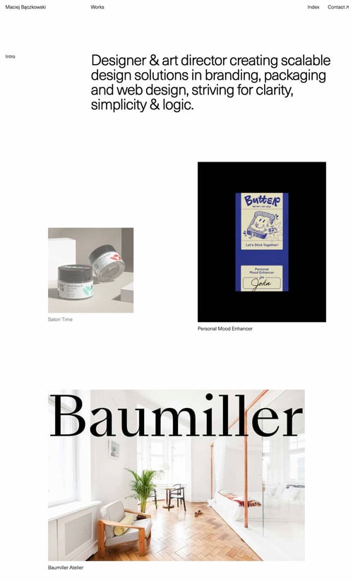
4. Maciej Bączkowski
Maciej Bączkowski’s portfolio site exemplifies his mission statement of “striving for clarity, simplicity & logic.” Using lots of whitespace, he creates an asymmetrical grid layout to display a handful of his recent projects, which pop against the stark off-white background. Below that portfolio section, in bold sans-serif typography, he tells readers the most essential information about him: when he or his work has been featured in the news, where he’s worked, and awards or recognitions he’s earned.
5. Eiktyrne Whisky
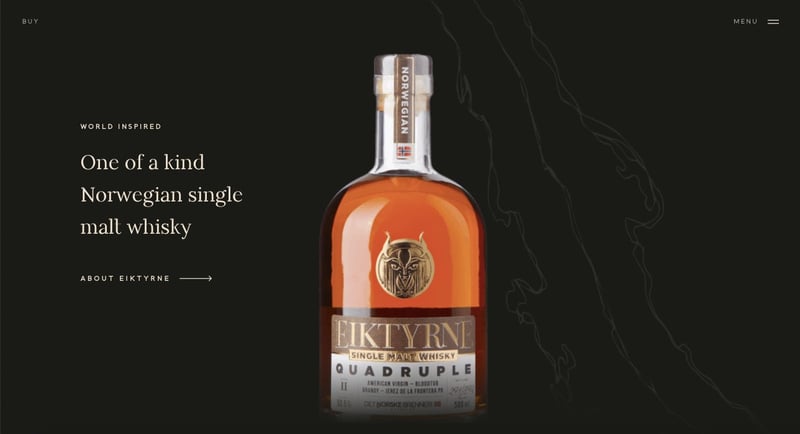
Eiktyrne Whisky is an ideal example of a minimalist ecommerce website. On the homepage, the Norwegian single malt whisky is the main focus because of the image’s position at the center of the page. Plus, its color pops against the dark background color. The text doesn’t compete for its attention but does offer the user a few possible steps forward: learn more about the whisky, buy it, or click the menu for more navigation options.
6. ON
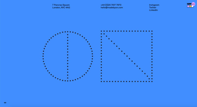
ON offers a stripped-down website with black typography against a solid blue background. When a user lands on the page, they see ON’s logo and the company’s contact information and social media links. They can scroll down to learn more about the company, its process, its clients and what they have to say about working with ON.
7. Pilot
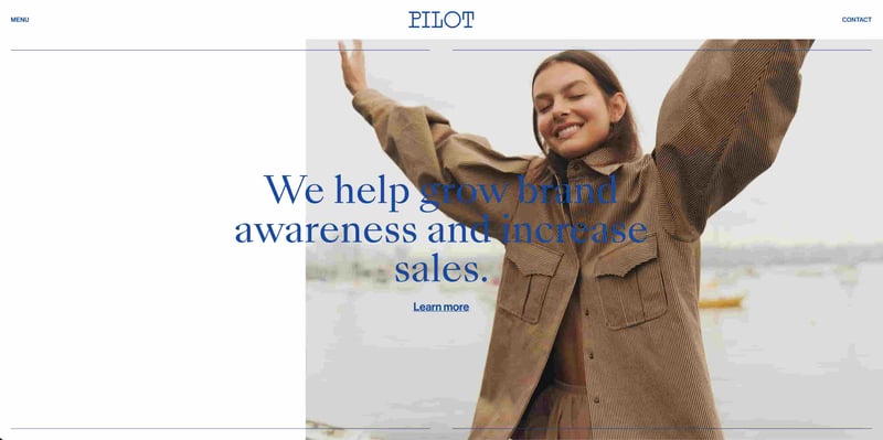
With its use of negative space and bold, blue font against the white background, Pilot’s website is a perfect example of a minimalist website. You see the copyright notice on the left and a back to top button on the right in case the user decides they want to browse more. Or, if the user is ready to work with the agency, they can find all the info they need beneath Pilot’s logo: a telephone number, email address, or a link to Google Maps which will show them exactly how to locate their office.
8. Benji Messmer
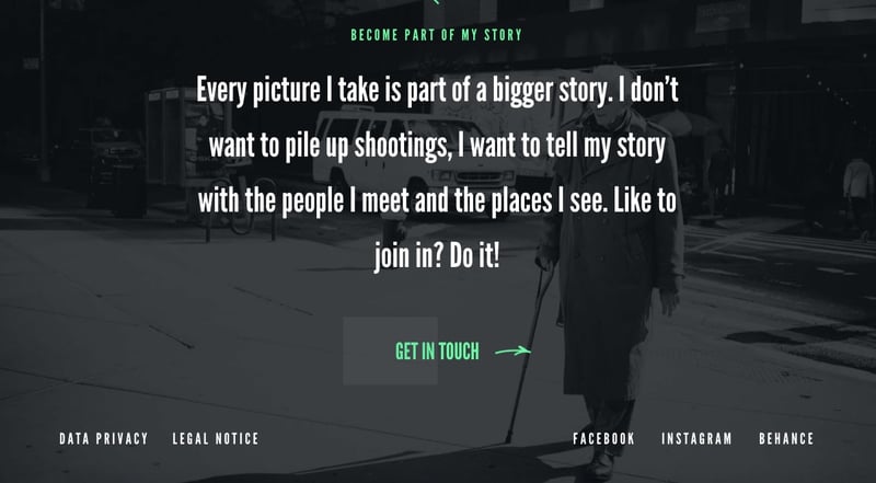
Benji Messmer’s minimalist portfolio site combines bold typography with transparency, a bright green accent color, and hand-drawn icons and animations. His footer features only the bare necessities: links to his data privacy policy, legal notice, and top social media accounts.
9. We Ain’t Plastic
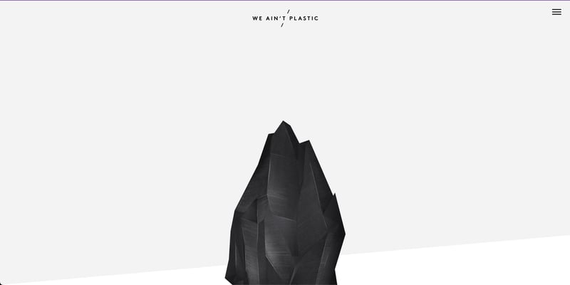
We Ain’t Plastic is the portfolio site of Creative Technologist and User Experience Engineer Roland Lösslein. The website scrolls down to show examples of the company's work, along with contact information, should you need it.
10. Wookmama
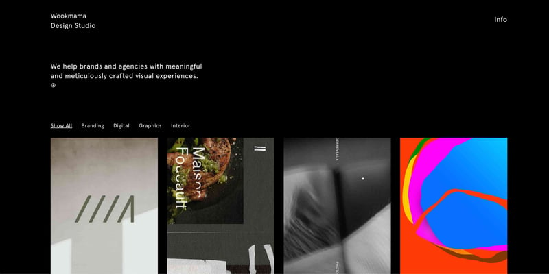
Wookmama has a severly minimalist website footer. To get to it, visitors have to scroll past a short blurb about what the agency does and a grid of their recent projects. Once they get to the bottom, they have only three options. If they were impressed by their portfolio and want to work with the agency, they can shoot them an email. If they want to see more, they can check out their Instagram. Or they can scroll back to the top to browse through the projects again.
11. Dezeynne
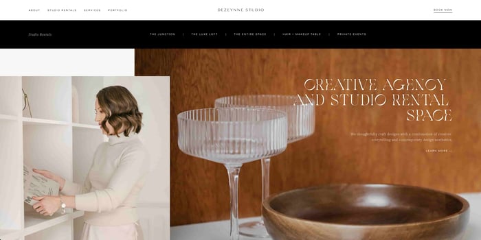
Dezeynne is packed with more info and links than the websites above, but it still takes a minimalist approach. Each section is carefully organized and separated by negative space so the user knows exactly where to click if they want to learn more about the studio, browse private events, and more.
12. Kinfolk
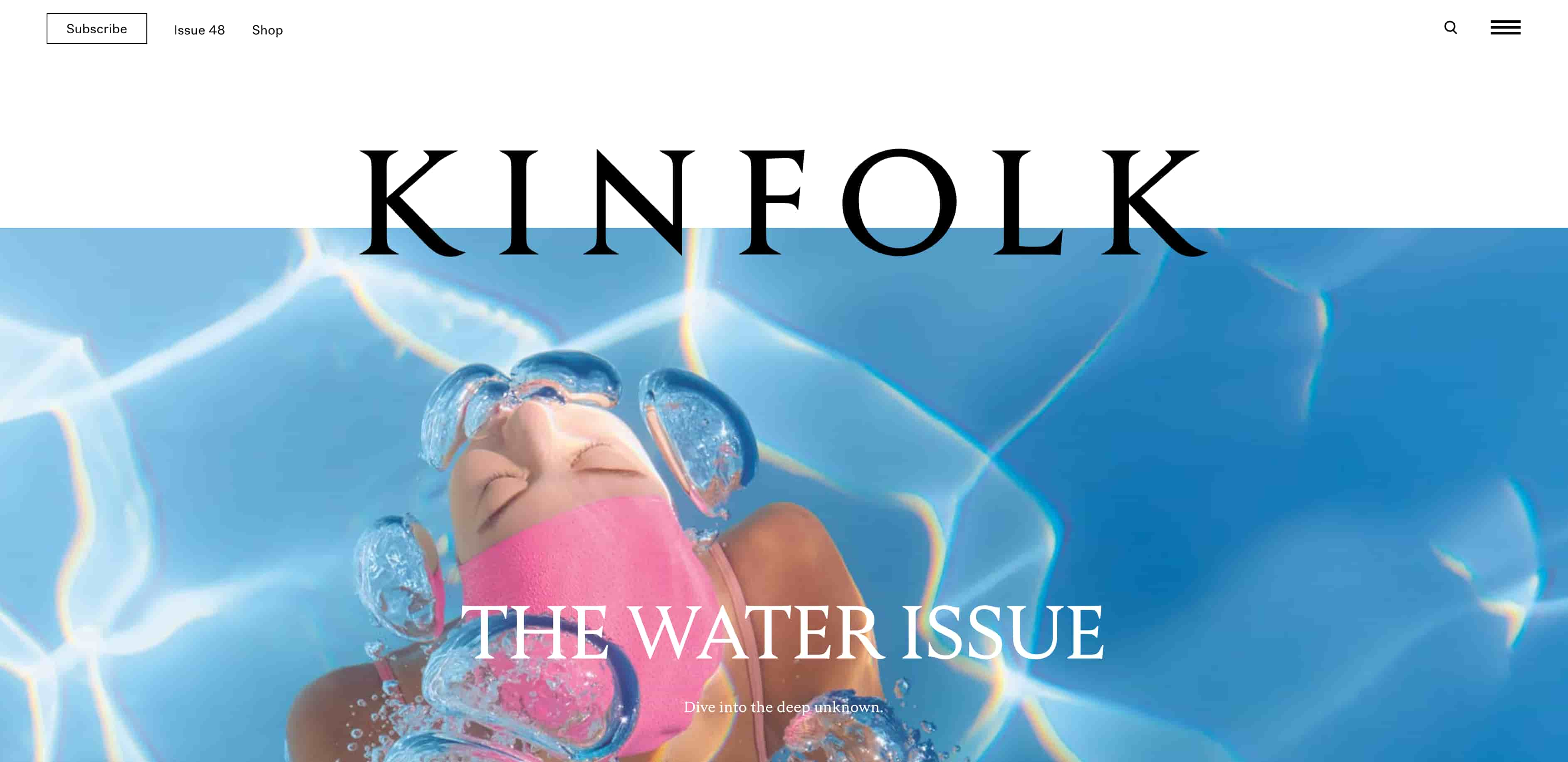 Kinfolk's website utilizes minimalist design to create a visually captivating and immersive brand experience. Through a clean layout, generous white space, and minimalistic typography, the website effectively communicates Kinfolk's aesthetic and lifestyle, creating a sense of simplicity, elegance, and sophistication that aligns with its brand identity.
13. Nendo
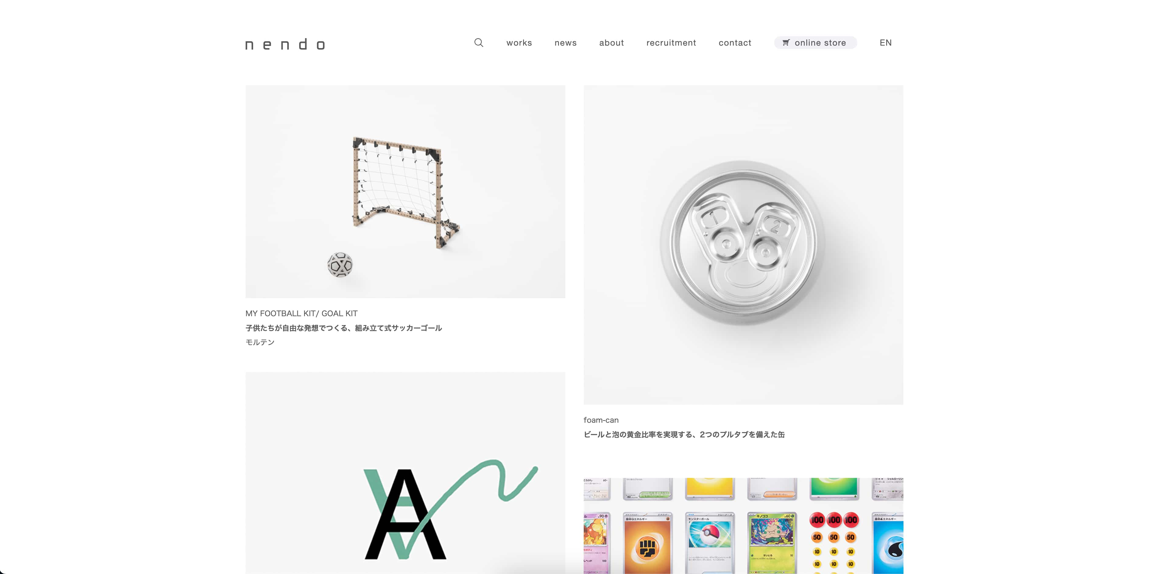 Nendo's website showcases the power of simplistic design to amplify its brand message. With a minimalistic color palette, clean lines, and spacious layout, the website elegantly emphasizes Nendo's products as well as its commitment to simplicity in its design approach, establishing a strong brand identity in the process.
14. Saint Urbain
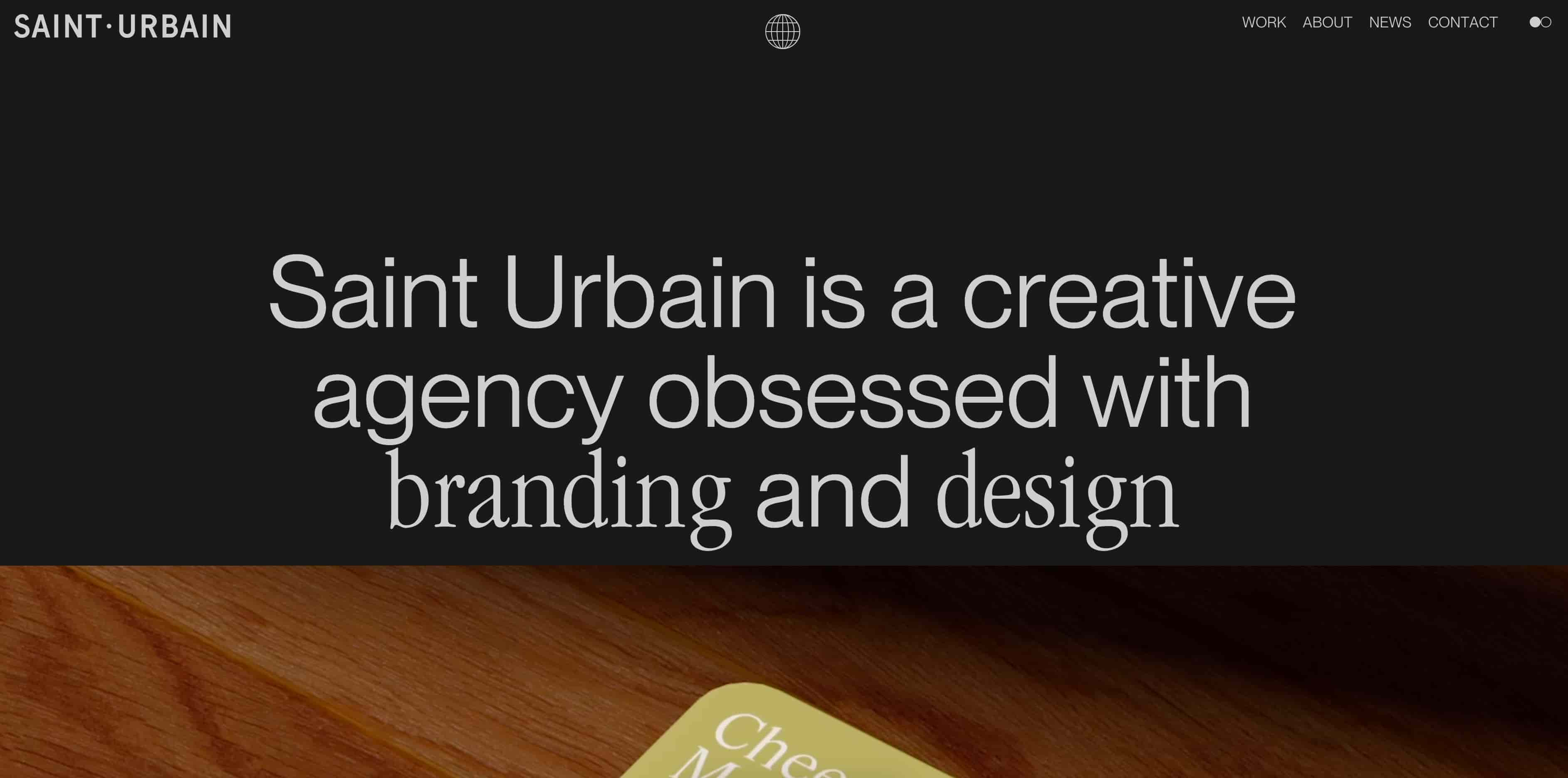
Saint Urbain's website exemplifies minimalist design principles to elevate its brand image. Through a restrained color palette, clean typography, and a spacious layout, the website creates a sense of sophistication and elegance that aligns with the brand's creative vision, proving to prospective customers that this brand practices what it preaches.
15. D1ver2o
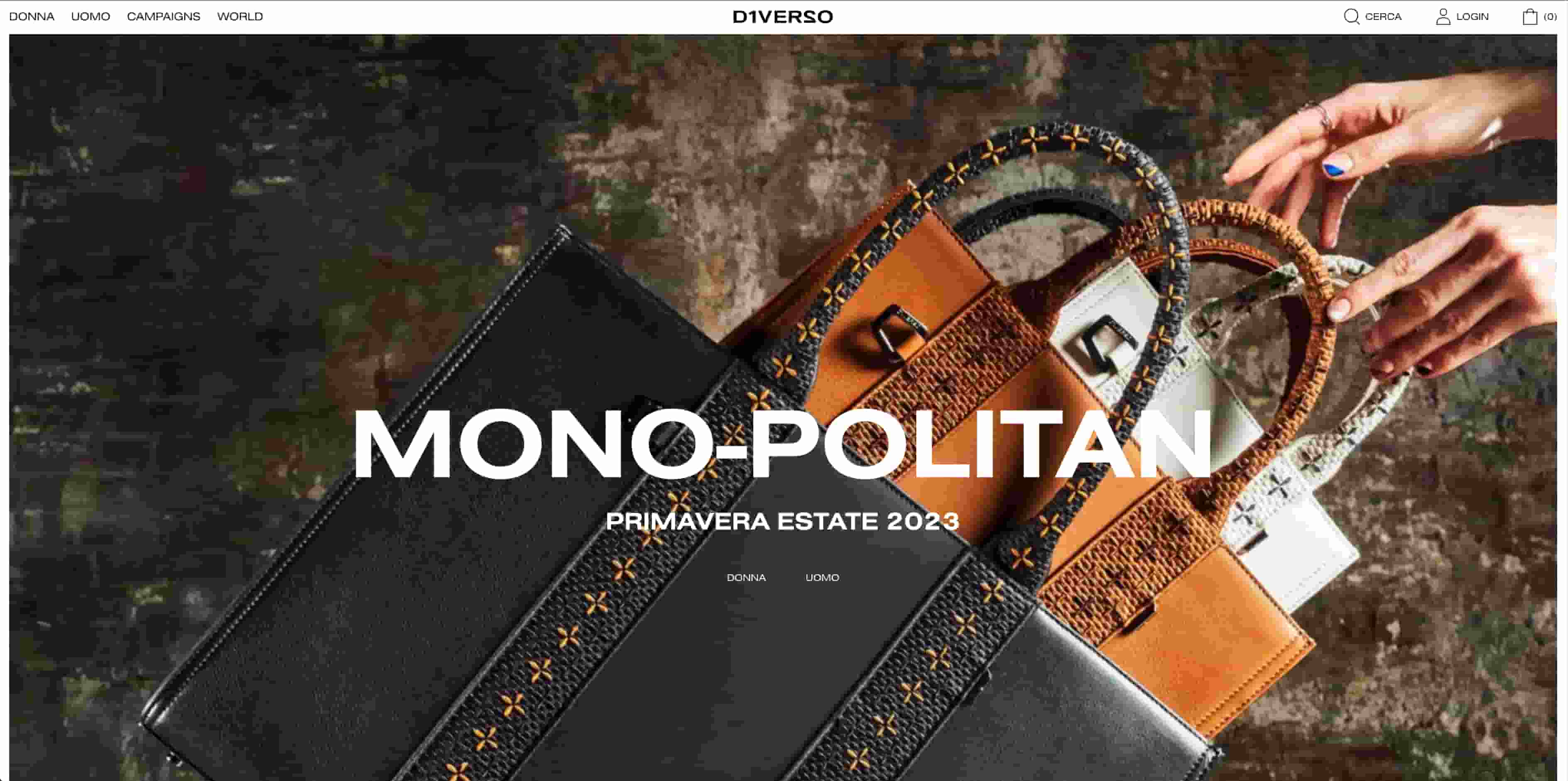 D1ver2o's website leverages minimalist design elements to reinforce its brand identity. With a clean background displaying its products and a simple layout, the website highlights the brand's focus on modernity and innovation, creating a sleek and engaging user experience.
Building a Minimalist Website
You don’t have to be a professional UX designer or developer to create a minimalist website. You just have to try to make it easier and faster for users to understand your content and make decisions on your site. Following the tips below will be a good starting point.
1. Reduce visual clutter.
To reduce visual clutter, hide whatever isn’t useful to the majority of users or to their specific context. A simple example is using an off-canvas menu to hide secondary navigation items. That way, users who don’t need to navigate to those pages don’t have to see them. But users who do can find them with a simple click of their mouse.
2. Maximize whitespace.
Removing any gratuitous elements or information from your site will leave lots of empty space. Use this to your advantage to direct the user's attention to a specific element or task, like signing up for emails.
3. Use visual hierarchy.
Visual hierarchy is the method of using the principles of size, color, contrast, and more to arrange elements by order of importance. While there’s a lot of factors that you can use to establish visual hierarchy, the simplest way to remember this design method is: put what’s most important first.
4. Limit users' options.
You’ve heard of the phrase “less is more” in web design, but have you heard the phrase “less is faster”? According to Hick’s Law, you can speed up a user’s response time by providing only the most essential options. For example, a minimalist email sign-up form might offer users two options only: subscribe or exit out of the form. You can take this minimalist approach to other elements on your site as well.
Why Less Is More in Web Design
When creating a website, you want to do everything you can to attract, engage, and inform visitors about your company. That’s why it might be tempting to cram in as much text, color, images, and animation as possible.
But the key to a good user experience is only providing what’s necessary for them to achieve a specific set of tasks, like navigate to your blog, sign up for your newsletter, or make a purchase. Following the minimalist techniques above can help ensure you’re only providing visitors with what they need — not what you think they might want.


![20 Best Filmmaker Website Examples We Love [+ How To Make Your Own]](https://lh7-us.googleusercontent.com/3pG46rohpxjh8Gc6rCZo_xt0Mp7sSSMdM4_TQO4PTGfSJ3IP2uiCNlHXTD-9GRN2tF4KO22m1mQ9jhcTLQHuP1FHXBLEVVHskrmCfezXym-FWG_Zx6V3gFrHzCMi8oWalZgI3QC9CA3yf2HjV0OAI4w)

![31 Makeup Artist Website Design Examples We Love [+ How To Make Your Own]](https://blog.hubspot.com/hubfs/makeup-artist-websites.png)

![20 Retro Website Design Examples We Love [+ How To Make Your Own]](https://blog.hubspot.com/hubfs/Google%20Drive%20Integration/retro%20websites_32023-Apr-19-2023-07-39-17-5853-PM.png)
![31 Night Club Website Design Examples We Love [+ How To Make Your Own]](https://blog.hubspot.com/hubfs/Google%20Drive%20Integration/Copy%20of%2031%20Night%20Club%20Website%20Design%20Examples%20We%20Love%20%5B+%20How%20To%20Make%20Your%20Own%5D.jpeg)
![25 Actor Website Design Examples We Love [+ How To Make Your Own]](https://blog.hubspot.com/hubfs/Google%20Drive%20Integration/actor%20websites_22023.png)