When we talk about web design, we tend to discuss the things that visitors directly focus on: color palettes, images, typography, and well-placed branding, just to name a few.

However, here I want to discuss a more understated technique for your website design tool belt, one that gives context to your content and personality to your pages without stealing the user’s attention. Let’s talk about texture.
Web textures are a great design choice if you want to elevate your website’s pages beyond plain solid colors while conveying personality and engaging more visitors.
So, in this guide, I’ll explain what web textures are and why they’re effective. I’ll also share tips for adding them to your website and provide you with some of the best web texture resources to get started for free.

What are web textures?
In web design, a web texture is a visual element, typically a background image, that resembles a three-dimensional, tactile surface. Web textures serve to enhance the look and feel of a website by giving web pages personality and depth.
Web textures are a unique web design method because they aim to replicate one of our physical sensations, touch with, another, sight. By presenting a 3D backdrop for your page elements, they induce something of a haptic sensation through the visual medium of our computer screens.
This all has an interesting effect on our brains — it evokes emotions that we associate with the real world. Think of lying in the grass on a summer afternoon, or the tiny craters on a piece of construction paper. Web textures try to replicate that life-like feeling in the digital world.
Types of Textures Used in Web Design
Web textures come in many varieties to evoke a range of feelings and experiences. It’s useful to classify web textures in terms of two factors: realism and prominence.
Realism refers to how closely a texture resembles a real-world texture. This can range from abstract designs, like a color gradient or geometric pattern, to real-world tangibles like grass, carpet, or linen. This is similar to the concept of skeuomorphism — the more realistic a texture appears, the more we associate it with our real-life experiences, which makes the page more immersive.
Prominence refers to how much a texture stands out against its fellow elements. On one end, subtle textures are hardly visible, but still present enough to lend a sense of personality and warmth. On the other end, loud textures immediately bring attention to that region of the page and firmly establish the personality of a website.
I know I’ve talked a lot about textures without examples, so let’s look at some now.
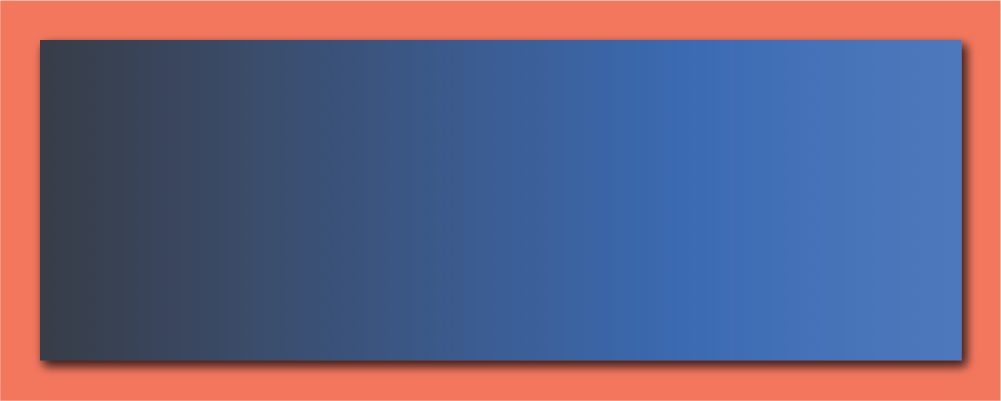
First, here’s an abstract, subtle web texture. You’ve seen gradients like this all over, since they’re a great way to engage visually with minimal distraction.
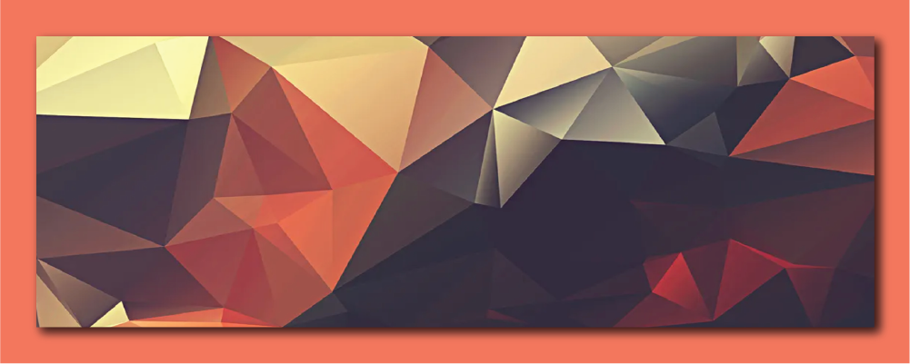
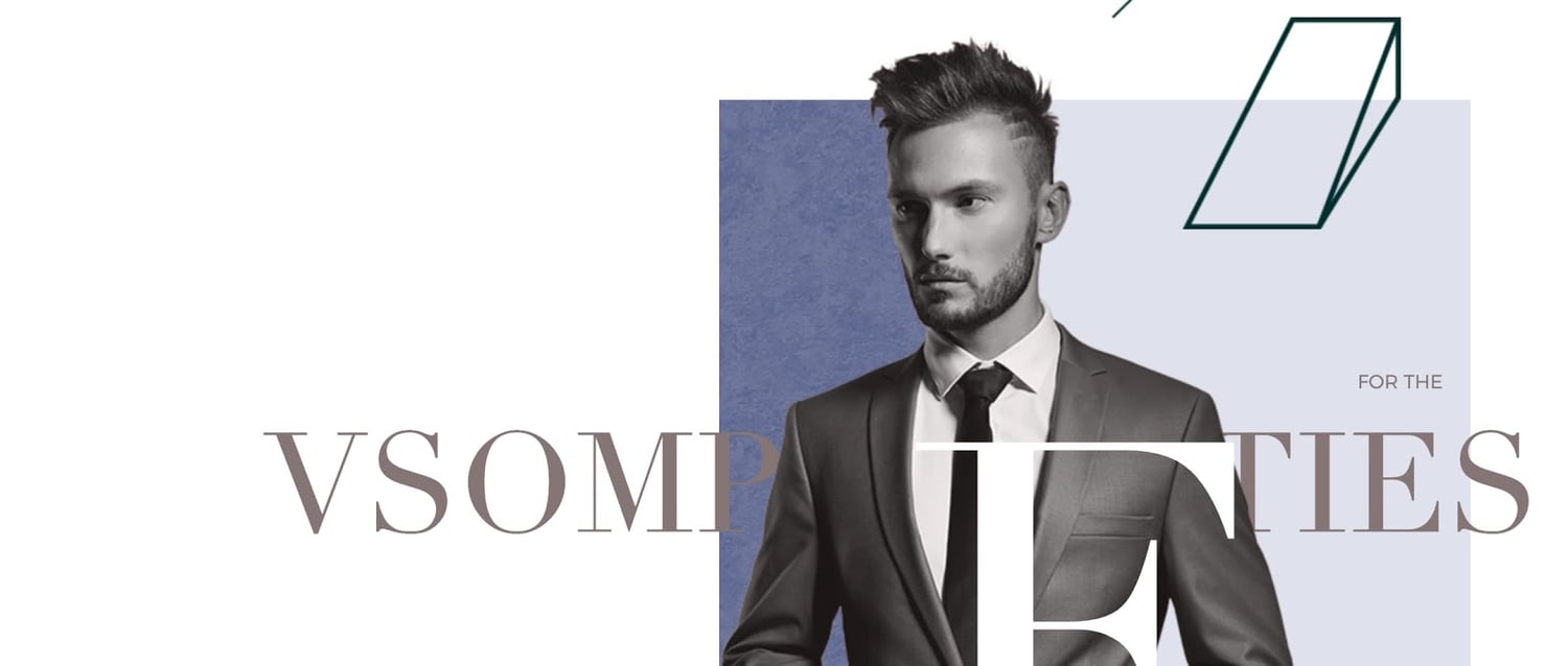
Here’s an abstract and loud web texture. The sharp corners certainly stand out more than a smooth gradient. This polygonal design in particular might be associated with the digital space, making it suitable for, say, a tech startup.
Here’s a realistic and subtle texture. If you look closely, you can make out a linen-like or paper-like surface. When simply browning a website, however, you may not notice this on a conscious level. These types of textures are very common on websites because they can convey emotions related to real-life without users’ realizing.

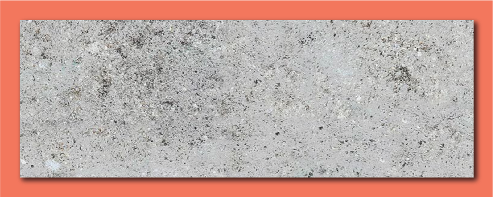
Finally, here’s a loud, realistic texture — you don’t need to squint to know this is concrete. Bold and lifelike designs like this leave no ambiguity as to the purpose of your website. Use these textures with caution, as they have high potential to clash with accompanying two-dimensional elements.
Web Textures vs. Patterns
You might have noticed that I’ve been avoiding using the word “pattern” to describe web textures. That’s because “texture” and “pattern” mean slightly different things in web design, even though you might see these terms used interchangeably in your research.
Patterns are small and repeating images. When you see a pattern on a web page, you can probably make out the “tile” which constitutes the pattern. For example:
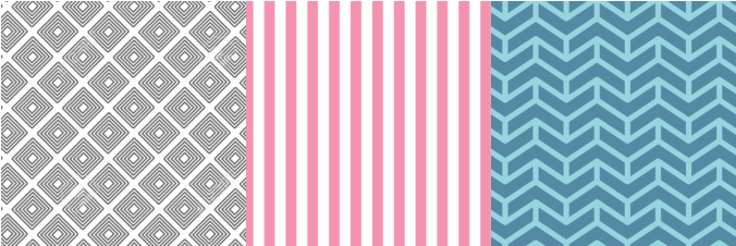
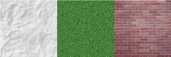
With textures, on the other hand, it’s more difficult to discern a repeating image, often because entire background textures are composed of a single detailed and complex image with no exact repeats. See the difference?
Why Do We Use Textures in Web Design?
As with just about any other design element, effective web textures go beyond making a page look interesting. Web textures can serve two primary functions on your site: conjuring feelings and drawing attention.
Conjure Feelings
Great design accounts not just for what users see, but also for what they don’t see. I’m talking about visual elements that most users don’t consciously register but affect their browsing experience nonetheless.
Web textures are great at doing this — they can make viewers feel positive emotions and associate them with your brand. For example, an outdoors company could implement a grass, night sky, or snowy texture. A tech company can opt for a geometric abstract texture. A bakery texture might add a sprinkle of, well, sprinkles to their texture. It all depends on the personality you want to communicate and the real-world associations you want to make for visitors.
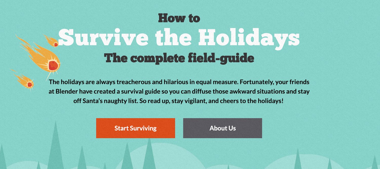
For example, this quirky spin-off site for a Vancouver-based digital agency capitalizes on the power of texture perfectly. The entire site, including its buttons, is overlain with a felt-like texture, invoking a cozy feeling associated with returning home for the holidays.
When used correctly, a web texture helps visitors feel immersed in your website experience, like walking through a store, rather than just peering through a browser window.
Guide the Eye
Web textures can also influence our browsing experience on a subconscious level by directing our gaze to certain areas of a web page. When applied to a page region, element, image, or text, web textures pull our attention toward these things by contrasting with the surrounding page.
This French design agency accents the featured image on their homepage with a basic green marble texture. Many of us associate marble with art displays, museums, luxury, and prestige, making it a fitting texture choice in this instance.
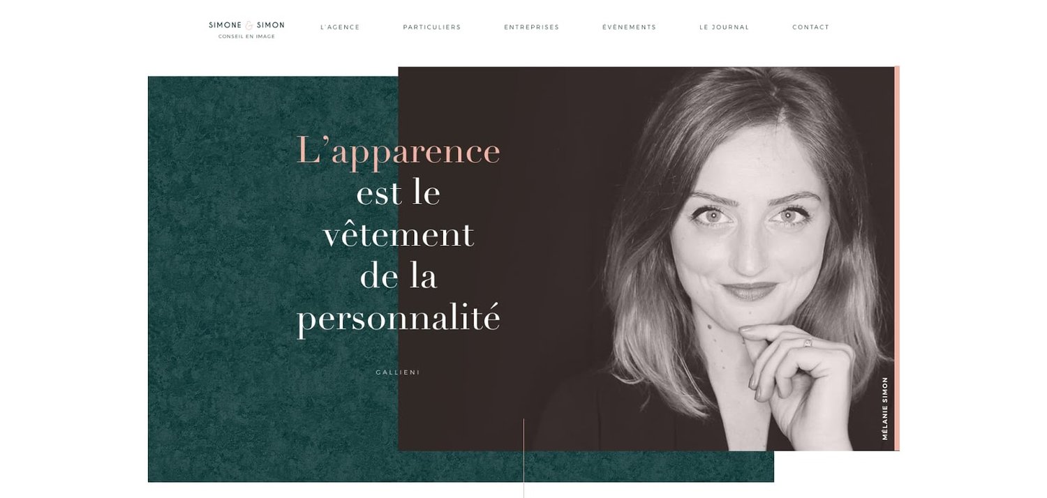
Farther down the page, additional images are set against the same marble texture for a coherent scrolling experience.
Think about what parts of the page you want users to see or click, and if you can apply textures to them. These page sections might be product descriptions, headers, calls to action, or buttons. Strategic placement of certain textures helps to create a path that new visitors will follow while learning about your offers and taking action along the way.
In a similar vein, web textures can also serve to reinforce your page structure. Contrasting textures work well at separating different areas of content, which keeps your info-heavy pages more digestible and engaging.
How to Use Texture in Web Design
- Don’t overdo it.
- Keep text legible.
- Match your intended feeling.
- Balance image quality with load time.
It’s one thing to find a texture that looks good, but implementing it tastefully into your pages takes a bit more thought. To pull off a web texture that draws users in, be sure to follow these four key guidelines:
1. Don’t overdo it.
As with any aspect of website design, limit your use of textures to the essentials. Remember that web textures are there to support your main content, not replace it. Too much texture is bound to distract and even overwhelm users.
Start by thinking about what you want your web texture to accomplish. Should it appear in the background, as a section divider, in your headers, or elsewhere? Understanding the purpose of your textures will help you be more intentional with their use and keep you from going overboard.
Subtle, simple textures are easier to add without diverting users’ attention, so I recommend trying these first and adjusting if you feel in need of something bolder. Also, keep the number of textures on your website to two when starting out, and add more later if you’d like.
Above all, your texture should add some personality and guide attention to what matters most, your content.
2. Keep text legible.
I’m surprised at the number of websites I’ve seen on which text is overshadowed by a textured background. There’s little point in directing attention to text content if the words themselves are illegible, and few things pull visitors out of the experience more quickly. It’s another reason to aim for simplicity in your textures, especially those behind text.
Much of this is common sense — don’t put yellow on a white texture or dark purple on black texture. From an accessibility perspective, though, it’s also a good idea to run your pages through a color-blindness web page filter like this one. That way, you’ll ensure your textures and text work for all readers.
3. Match your intended feeling.
The ability to subconsciously induce feelings is a powerful thing, which is why any web texture option you apply needs to match your brand’s identity closely. You don’t want mixed messaging when it comes to emotion.
If you’re going for a realistic texture, it’s likely apparent which textures best match your company’s image: Grass implies outdoors, sprinkles imply baked goods, etc.
For more abstract designs, however, the most logical texture choice might not be so clear, especially with thousands of options out there.
The solution to this is simple user testing. Run your test site by a diverse audience and see how subjects react to different textures. Be mindful of the emotions your textures bring, and users will feel welcomed. Neglect it, and you could lose their trust.
4. Balance image quality with load time.
Our last tip is more about performance than aesthetics. Web textures most often come in the form of large images, which can affect the loading time of your uncached web pages. Try to find the highest-quality texture(s) you can while minimizing their impact on page load speed.
Again, this will require testing on your part — blurry textures and slow load speeds both detract from the user experience. Still, an engaging web texture is worth a very slightly decreased performance, and incorporating other solutions to reduce load time can make this a non-issue.
Where to Find Free Web Design Textures
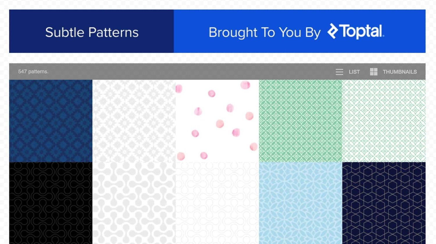
- Subtle Patterns
- Stockvault
- CSS Gradient
- Lost and Taken
- Textures.com
- Vecteezy
- Rawpixel
Free textures are available just about everywhere, as it turns out. Punch in “free web textures” into Google and you’ll get a flood of options.
To make your decision a bit more manageable, here are our seven favorite online sources for free web textures:
1. Subtle Patterns
Though technically a source for patterns, Subtle Patterns offers an excellent variety of free textures from its collection of over 500 tiles. Instantly preview any option in the background of the page and download tiles with a click. Since the image file sizes are small, you can apply them to your pages without taking a hit on performance.
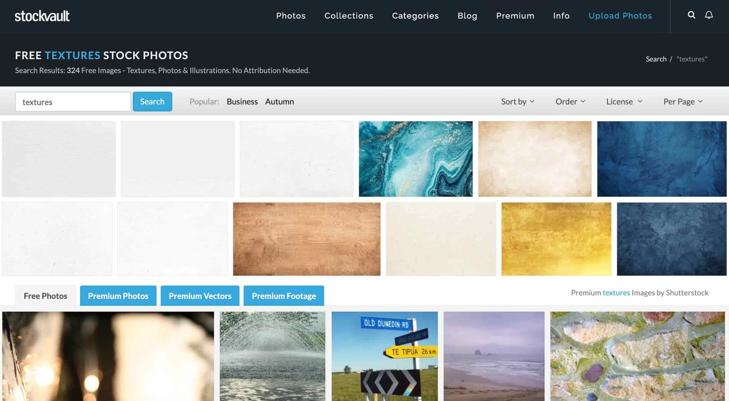
2. Stockvault
Stockvault is a popular stock image source that also hosts a library of free-to-use and high-quality web textures. You can filter your results by license (commercial use, noncommercial use, or creative commons), image size, and number of downloads.
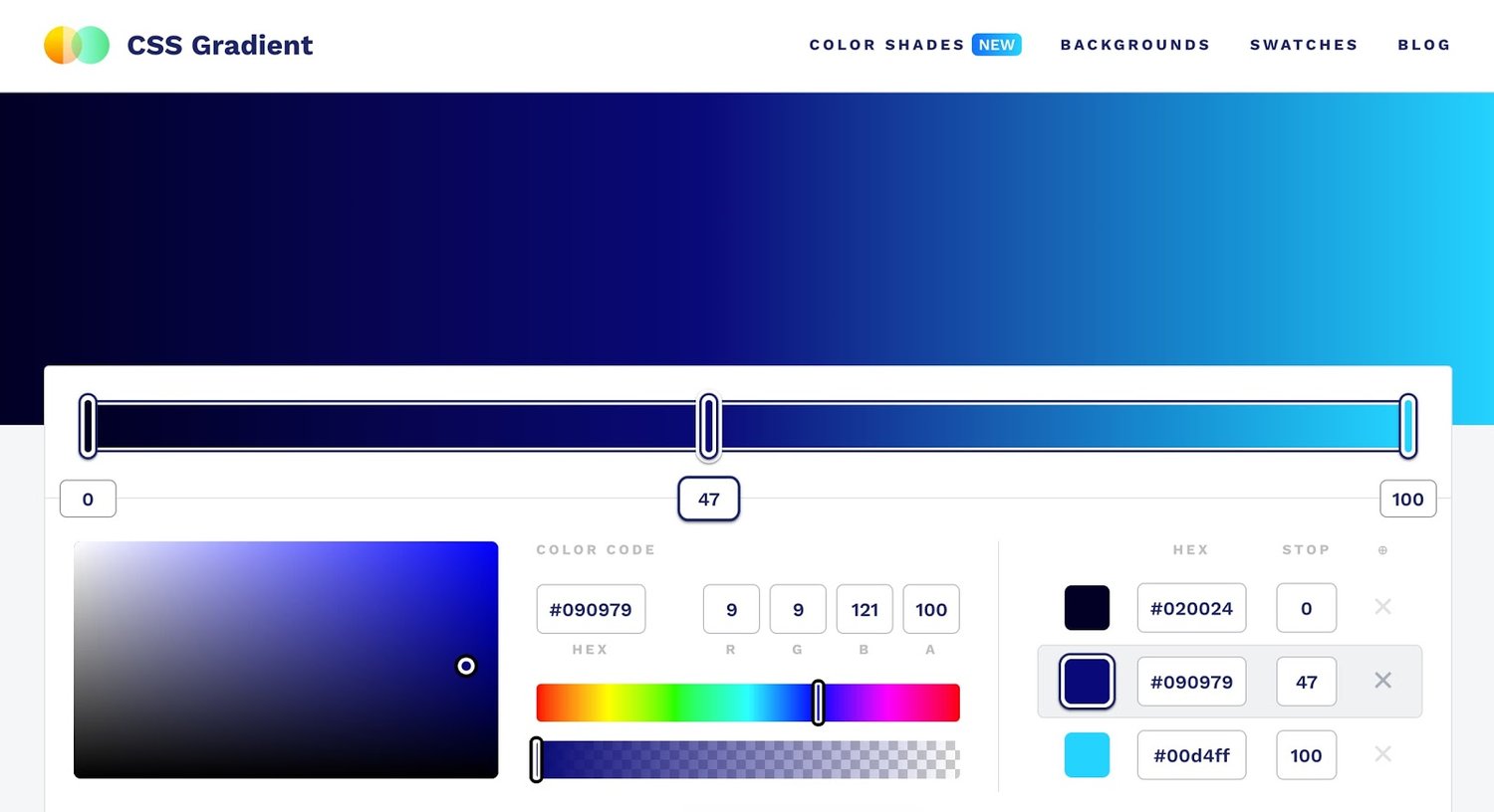
3. CSS Gradient
CSS Gradient is a basic color gradient generator for understated website textures. Plug your colors into the tool to make your own gradient, or choose from a library of premade gradients. To add your texture of choice, just copy the CSS code and add it to your website style sheet.
4. Lost and Taken
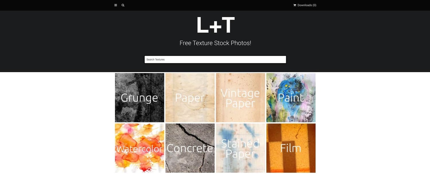
For a solid assortment of realistic textures, head to Lost and Taken, a source for free textured stock photos. The website divides different textures into categories, so you can quickly find a desired collection right from the homepage. All images are from a community of contributors and don’t require attribution on your site.
5. Textures.com
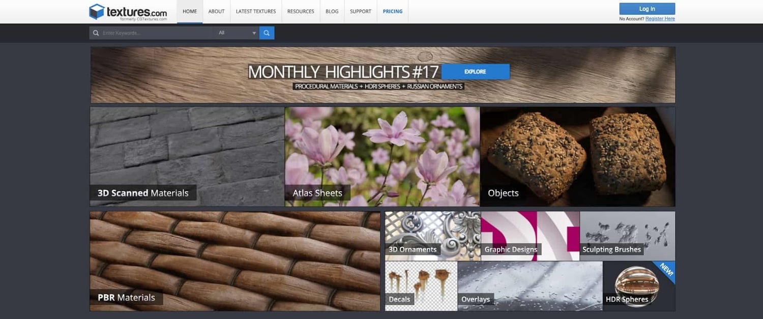
Another reputable source for realistic textures, Textures.com allows you to search for realistic and abstract images among a huge library, spread across over 100 different texture categories.
To download textures, you’ll need to create an account. On a free account, you’re limited to the size of your images and 15 image downloads per day. If you’re set on a free specific texture, you can get it here. Otherwise, you can purchase credits for one-time downloads or a recurring subscription.
6. Vecteezy
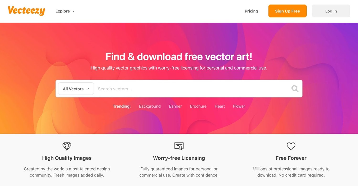
Vecteezy provides a library of scalable vector textures, which you can explore with filtered search. To narrow down to free options, be sure to select “Free License” under the license type field. Even here there are thousands of vector textures which you can further narrow down by keywords.
You can also find an array of abstract and realistic background textures with the “Explore” function. Again, there are enough free choices to keep you occupied.
7. Rawpixel
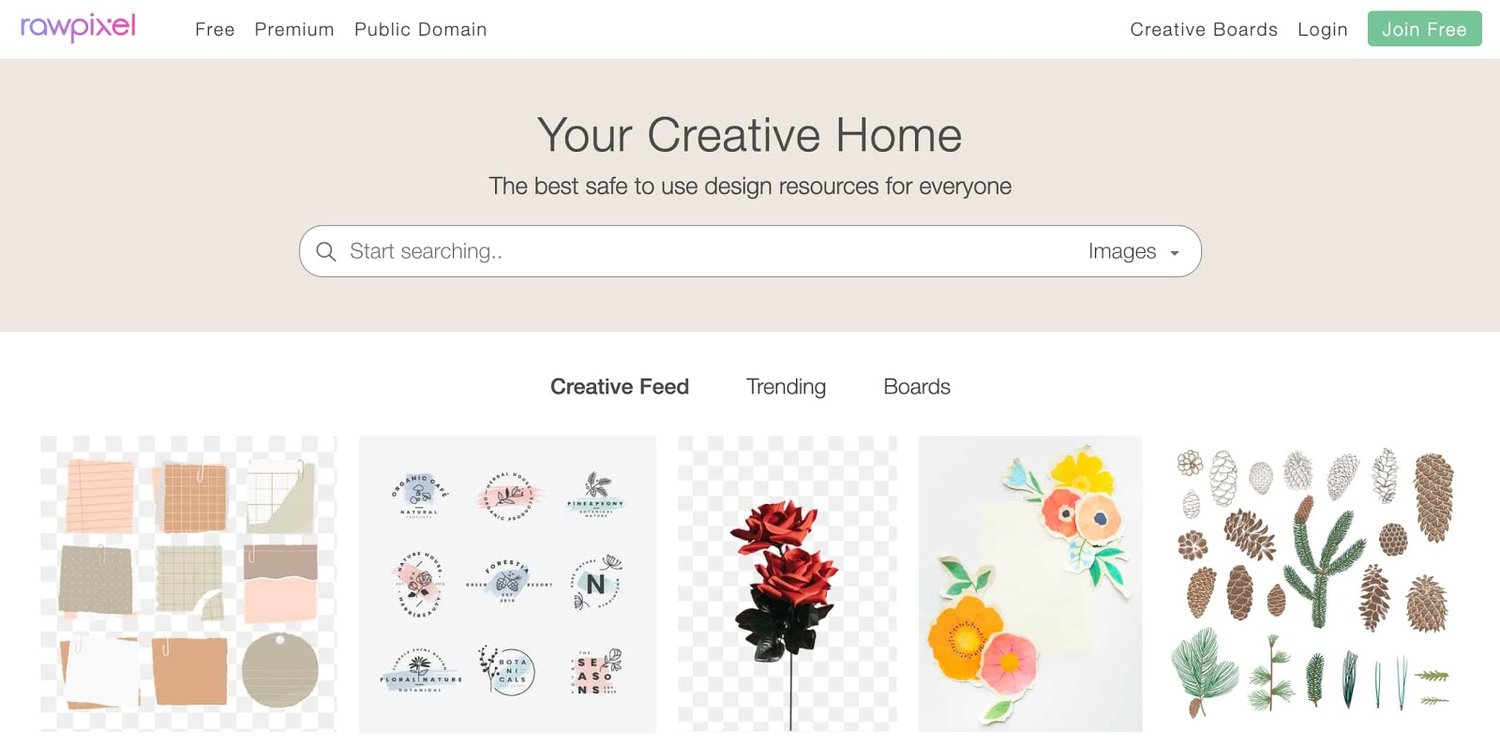
Rawpixel is our final recommended source for free-to-use web textures. Though this membership site specializes in all types of images, a simple search for “textures” reveals plenty of both subtle and bold options. You can filter results by file type, size and dimensions, and cost (free or premium).
Taking On Some Texture
Despite a recent push toward two-dimensional web design in recent years, web textures have held their place thanks to their positive impact on user engagement, experience, and enjoyment.
After understanding the purpose of your textures, I encourage you to plan out how you want them implemented. Then, play around with different texture types and test which performs best on your website, all while adjusting the realism and prominence of the designs. With some trial and error, you can bring a new meaning to the “look and feel” of your site.
![Blog - Website Redesign Workbook Guide [List-Based]](https://no-cache.hubspot.com/cta/default/53/4b5bb572-5d0e-45b8-8115-f79e2adc966b.png)


![11 Types of Websites to Inspire Your Own [+ Examples]](https://blog.hubspot.com/hubfs/types-of-websites.png)