Perhaps no single topic is more underrated in website design than typography, the art and technique of arranging and styling text.

Speaking for myself, I’m an avid website-browser, knowledge-gatherer, and factoid-finder. But, I’ve never come away from, say, a Wikipedia article and thought “Wow, the text on that page was so readable!” I came for some information, I read the information, and I left with the information in my head. This means that, from a typography standpoint, Wikipedia did its job perfectly.

Typography plays a critical role on any website by ensuring we can comfortably read and process all its text-based content. If a website’s typography works, we won’t notice. If it fails, chances are we’ll bounce off the page.
Every website has text, and where there is text there is either good or bad typography. So, as a website owner, you need to invest time into the typography of your own site. By focusing on the look and readability of your words, you ensure your readers won’t be challenged by your text. And for the few who do appreciate good typography, your attention to detail will convey professionalism, empathy, and design smarts.
This guide will tell you everything you'll need to know to get started with website typography. We’ll cover some essential terminology, then review nine widespread guidelines that every legible heading and block of text should follow.
What is website typography?
Speaking generally, typography determines how text looks to the reader, how the words literally appear on a page or screen.
For our purposes, it helps to hone in on just the text that we see on websites. This is because the best practices around web text often differ from those of printed text, and there’s a lot more to account for online.
On top of ease-of-reading, digital text must be designed for:
- shorter attention spans — there are virtually endless website options available, many with better letters.
- skimmability, as users tend to land on web pages looking for something specific and want to find it fast.
- accessibility, because not all internet users perceive or interact with web text in the same way.
- multiple device types and screen sizes — text should be legible across any digital medium.
For all of these considerations, web typography gets its own special category.
Additionally, web typography encompasses both how we design the look of the text itself — fonts, colors, and styling — as well as how we present the text on its respective web page. All of these details matter, since they amount to a comfortable reading experience for as many visitors as possible.
Web Typography Terms
To better understand how to introduce effective type to your website, let’s first cover some fundamental terminology in the field of typography, and how each term applies to web design.
Typefaces and Fonts
A typeface is a specific look and feel applied to a set of alphabetic and numeric characters. Common typefaces include Times New Roman, Arial, Helvetica, Courier, and Calibri.
But hold on, aren’t those fonts? Not exactly. A font is a particular instance of a typeface. Every font within a typeface has a specific weight (i.e., bolder or lighter), size (e.g., 16 px vs. 24 px), and may have other special stylizations applied (e.g., italicized or non-italicized, rounded or unrounded).
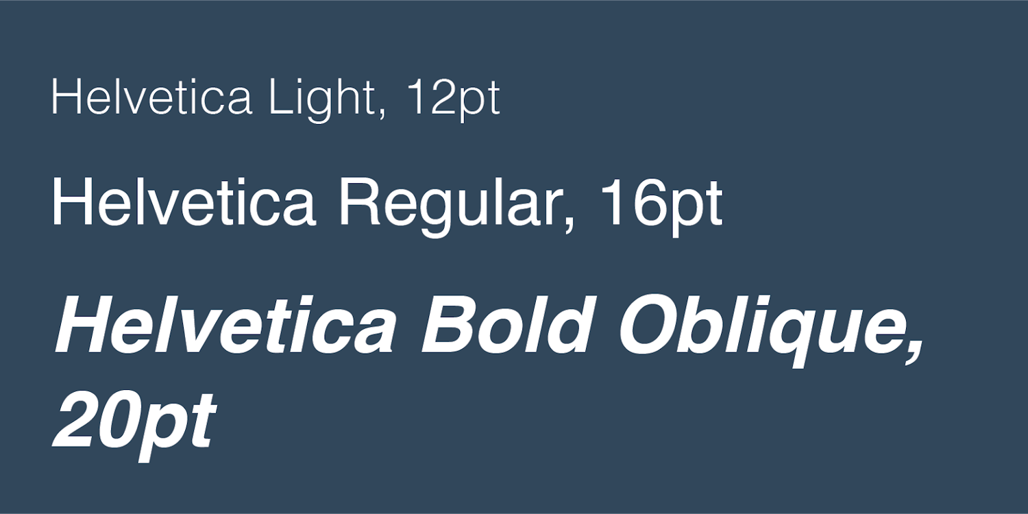
For example, the fonts “Helvetica Light (12pt),” “Helvetica Regular (16pt),” and “Helvetica Bold Oblique (20pt)” are three fonts in the “Helvetica” typeface:
Put another way, a typeface is the broad style category for a set of specific fonts — this is why a typeface is also sometimes called a font family.
The distinction between font and typeface is small, but important as we start to explore web typography practices more in-depth. Now, let’s learn more about the language we use to describe fonts.
Serif and Sans-Serif Fonts
Many fonts conform to two font styles: serif and sans-serif.
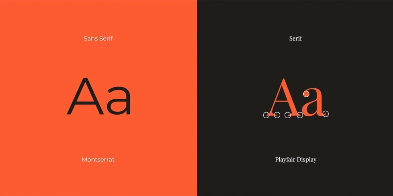
A serif is a small ornamental projection off the main stroke of a letter. Fonts with this styling are called serif fonts. “Sans” is French for “without,” and fonts without these ornaments are labeled as sans serif fonts:
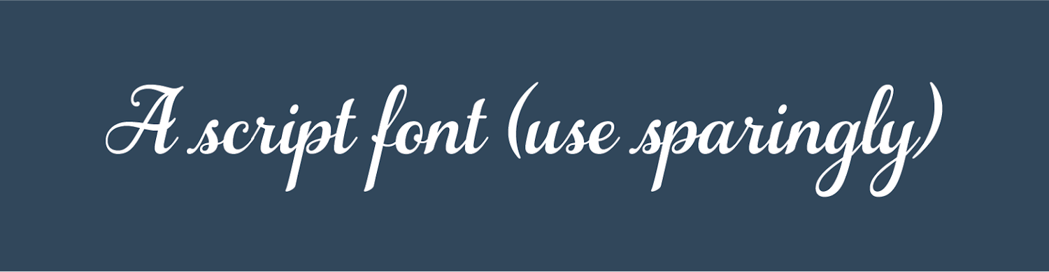
There are other font styles too — script is another style used on the web, though much less common than serif and sans-serif style fonts. Script fonts are designed to replicate the varied and often fluid strokes created by handwriting. Script is a harder style to read than serif and sans serif, and should be used only for special cases, like prominent headings and fancy party invitations.
Kerning
Kerning is the horizontal space between two specific characters. Fonts can have smaller or wider kernings to improve legibility and avoid awkward gaps. Common fonts have specific kernings for every pairing of adjacent characters, so all letters fit together snugly.
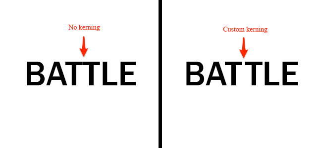
In the above example, kerning separates the two “T”s to improve readability.
Tracking
Like kerning, tracking also describes the spacing between letters. However, tracking denotes the overall spacing between letters of in an entire line or block of text, rather than just two particular letters:
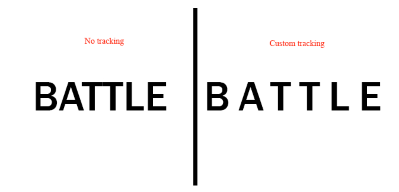
Tracking is another typographical detail to get right for legibility. We can tell if a line of text is spaced too widely or looks a bit too squashed.
Leading
Leading (pronounced like the element “lead”) is the vertical spacing between lines of text. We often use terms like “single-spaced” or “double-spaced” to specify leading, but leading can also be expressed in units of pixels or points.
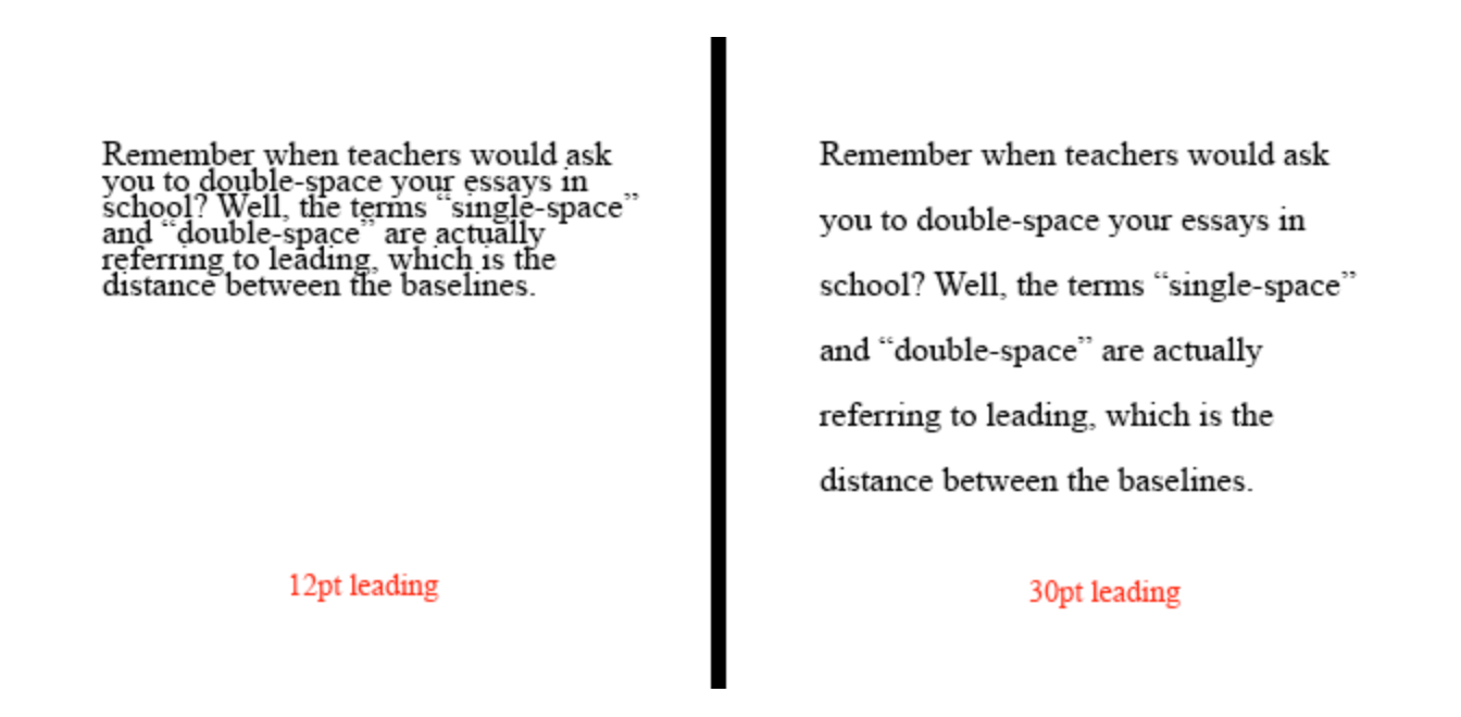 Again, the right amount of leading helps readers navigate text — too much or too little is awkward to read.
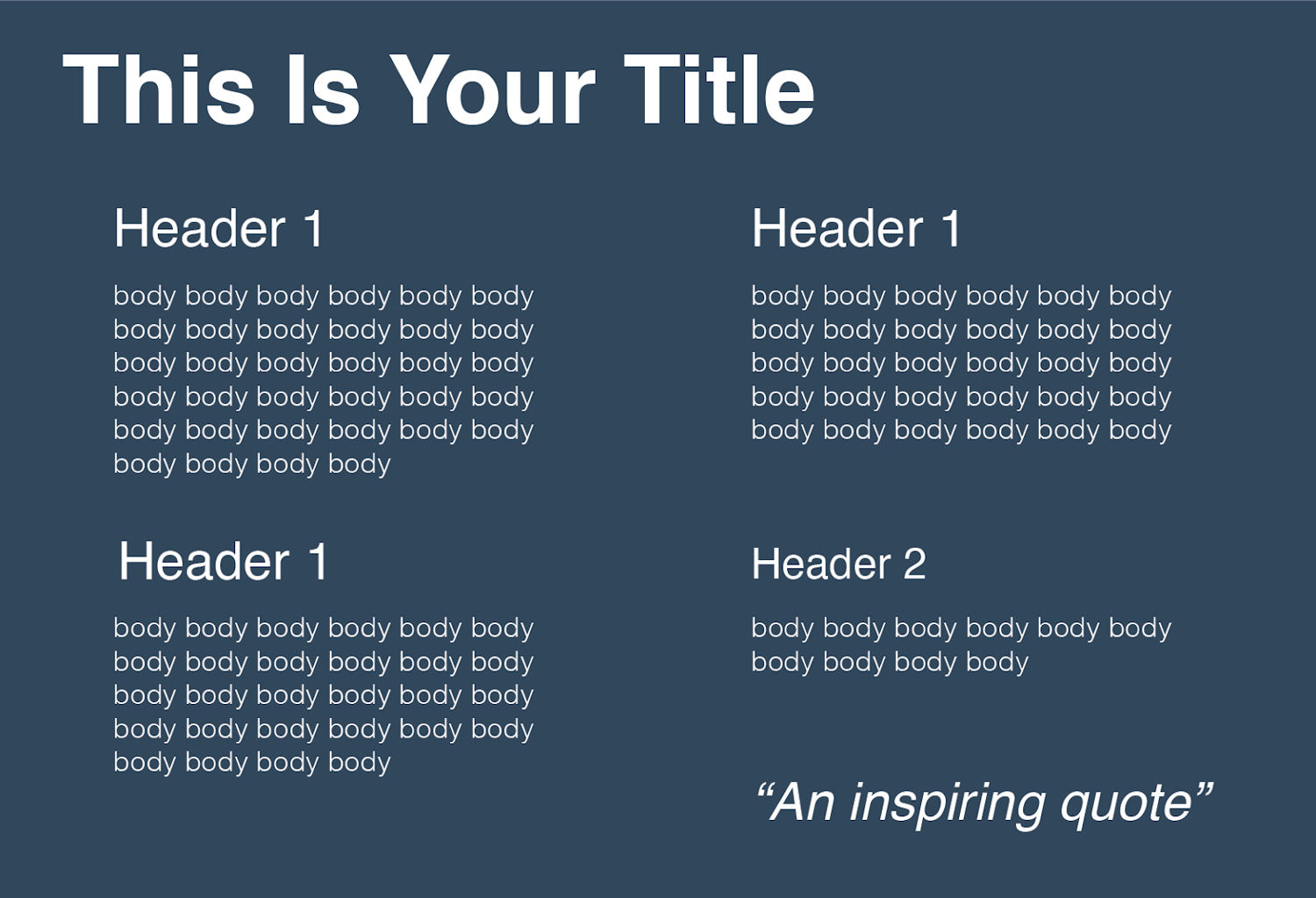
Hierarchy
Most web pages, especially text-heavy ones, break content into sections by topic. These sections are signified and labeled by headings. The order of text from most prominent to least prominent comprises the hierarchy of the page.
Hierarchy is crucial for making pages easily navigable and digestible. Readers should be able to jump to whichever section is relevant to them by looking at headings alone. Typography works to imply hierarchy with different font sizes, font weights, font styles, and perhaps different fonts or typefaces altogether.
For example, a typical blog post hierarchy starts with the title text (a.k.a. “Heading 1” or “H1”), followed by section headings of increasing specificity and decreasing visual prominence (H2s, H3s, etc.). Finally, we reach the body text, which might be the smallest but contains the content readers want.
Here’s an example of a visual hierarchy created with different Helvetica fonts:
Now that we know the basics, let’s learn the nine dos and don’ts of web typography.
Website Typography Guidelines
- Limit the number of typefaces per website.
- Use a sans serif font for body text.
- Stick to standard fonts at first.
- Size your text appropriately.
- Don’t use all caps.
- Use colors carefully and intentionally.
- Stay between around 40 and 80 characters per line.
- Provide sufficient spacing between lines.
- Eliminate text animations.
You probably haven’t had to think much about typography on the web. That’s because popular websites have typography down to a well-styled T. Many years of trial, error, and experimentation have left us with 9 best practices — follow them to ensure your site’s typography meets expectations and keeps users reading (or at least skimming).
1. Limit the number of typefaces per website.
To maintain visual cohesion throughout your content, use no more than two different typefaces across your website. Many websites do just fine with one typeface, especially if they apply different fonts within the typeface for different purposes (like headings, body, button text, etc.). For instance:

If you opt for two different typefaces, select options that are visually compatible but distinguishable from each other.
2. Use a sans serif font for body text.
While serif fonts are common in printed text, typography experts generally agree that sans serif fonts are actually more readable in digital contexts. Our eyes follow web text better without the decorations.
This doesn’t mean you can’t use serif fonts on your website at all — a serif text in a title, heading, pull quote, or decorative section can draw attention and provide nice contrast. However, for blocks of text that require more effort to read and understand, your text is better “sans.”
3. Stick to standard fonts at first.
By “standard,” I don’t mean “plain” or “boring,” but “compatible.” By choosing a web-safe font, you’ll ensure your text is easily readable for everyone through any digital means.
There are a few advantages to standard fonts. First, all web-safe fonts will render on every web browser and device, be it desktop and mobile. If a font isn’t recognized, the system will default to a font that might look worse.
Second, readers are accustomed to seeing standard fonts online. They won’t be distracted by the appearance of the text, and will be able to scan it more quickly. Ultimately, your typography should help the reader, not distract them from the content they want.
Third, web-safe fonts tend to lack some inconvenient design flaws seen in other fonts. A standard font, for example, won't contain any strange kernings that make two letters look stuck together. They also minimize instances in which two different characters are hard to distinguish, like “I” form “L” or “r” from “n”.
If you’d prefer a non-standard typeface or font, there’s always a chance some browsers won't recognize the style and instead display something like plain Times New Roman. There’s nothing wrong with good old Times, but again, sans serif fonts are better for body text.
To solve this, consider implementing a font stack, a list of backup fonts in your CSS file that the browser will render if your first font choice fails to do so. Put a couple of standard fonts in your font stack to ensure visitors will always see the most suitable style of text.
4. Size your text appropriately.
Web designers specify font size with pixels (px) rather than points (pt). This is because a pixel is a standardized unit online, whereas a font point is not — two people reading 12pt text on the same website might see different things depending on their devices or web browsers.
A common practice is to set all website text to a minimum size of 16px. This is roughly the size of body text in printed media, and is the smallest font that most people can read without needing to zoom in. Of course, you can and should increase and vary the size of your text to further assist readers and establish hierarchy, but don’t go overboard with massive fonts either.
On the subject of hierarchy, headings should always be larger than body text and decrease in size by H1, H2, H3, etc. This helps readers scan your pages for the target content. You might also elect to add varying weights to your headings for a greater contrast with body text.
5. Don’t use all caps.
This is more of a straightforward rule — ”all caps” is unnecessary in nearly all contexts outside of decorative text, branding, and the occasional set of headings.
If you want to emphasize body or heading text, bold it. This lends the same effect while being more readable and visually pleasing.
6. Use colors carefully and intentionally.
A common pain point for web users is a bad pairing of text color and background color, in which the two do not contrast enough to maintain legibility. Refrain from layering text over a background with similar colors, and be very cautious when placing text atop images.
More precisely, the Web Content Accessibility Guidelines (WCAG) recommend a contrast ratio of at least 4.5:1 for most text, and 3:1 for large, bolded text. Use a free tool like this one to check the contrast between your font and background color. Alternatively, you can’t go wrong with black or dark text on a white background, at least in terms of legibility.
Aside from contrast, be mindful of your choice of text color as well. It’s best to keep your body text one uniform color with the exception of hyperlinks, which should contrast with the rest of the text. Avoid using blue as the default color in your text, since it implies a hyperlink.
Also, refrain from using red and green as a visual cue in your text, as this won’t be apparent to individuals with red-green color blindness. In fact, color alone should not be used to distinguish one piece of text from the rest. Combine color with other styling (like bolding, italics, or underline) to emphasize a text snippet.
7. Stay between around 40 and 80 characters per line.
Humans are picky readers — we favor lines of text that fall between 40 and 80 characters. Anything less forces our eyes to move to the next line too frequently, which distracts us. On the other end, any line length greater will bore readers, cause discomfort, and require more effort to find the start of a new line as the eye travels back to the left side of the text block.
These parameters provide some wiggle room for different page layouts and mobile-responsive designs. But, if you can, aim for the sweet spot of 60-70 characters per line. Your eyes will thank you.
8. Provide sufficient spacing between lines.
Proper whitespace ensures that readers can easily follow single lines of text and return the next line after a line break. Accessibility frameworks tend to allot vertical space based on the font size of the respective text.
For body text, start with a spacing of 1.5, which means that the leading is 50% the height of the text line. For headings, this distance should be slightly greater. For between paragraphs, start with a spacing of 2.5 and adjust up or down from there.
9. Eliminate text animations.
Yes, animations do grab the reader’s attention, but few things are worse for readability than flashing or moving text. If you’ve ever tried to read a note that someone held up to you, you’ll understand why — it takes work to stabilize it in our brains.
What’s worse, many visitors will think of this text as an unnecessary inconvenience, a gimmick, and/or an ad. Flashing images may also trigger photosensitive seizures.
The sole exception to this final rule is entrance or exit effects. These can be a fun way to build an experience for a visitor as they scroll. But, once the text appears, it should stay static.
Testing Your Text
Armed with these guidelines and typography know-how, you’re ready to start experimenting with typefaces, fonts, and styles in search of the perfect reading experience.
However, there’s one last catch: You could follow all of the guidelines above, and still neglect some aspect of typography that an average visitor will notice instantly. That’s why the final phase of any text design iteration is thorough user testing.
Find a diverse group of internet users who can offer insight into the readability of your text content. It doesn’t matter if you’re publishing basic product descriptions or romance novels — by factoring in human feedback into your typography, you'll be confident that your website is a comfortable and satisfying read.


![11 Types of Websites to Inspire Your Own [+ Examples]](https://blog.hubspot.com/hubfs/types-of-websites.png)