Sidebars are a staple of website navigation — they’re convenient to users and ensure that certain page elements are always in view. Inside them, you can place links, menus, widgets, CTAs, display ads, or just about anything else you want.

If you’re DIY-ing your website, it’s easy to add sidebars with just a bit of HTML and CSS know-how. You could use a CSS framework like Bootstrap CSS for your sidebar — this template from Start Bootstrap provides a simple, mobile-friendly sidebar interface you can try. Or, you might want a pure CSS implementation.
In this article, you'll learn several ways to make a sidebar with CSS along with some sidebar examples. We’ll make static sidebars, fixed and sticky sidebars, full-page sidebars, sidebars in CSS grids, and collapsible sidebars. That’s a lot to cover, so let’s dive in.
![Download Now: 50 Code Templates [Free Snippets]](https://no-cache.hubspot.com/cta/default/53/34adf7eb-7945-49c4-acb8-f7e177b323e5.png)
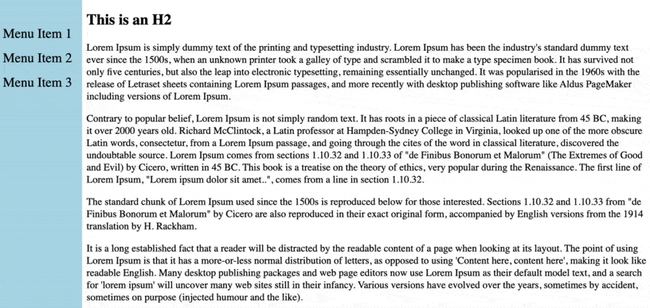
How to Create a Sidebar in CSS
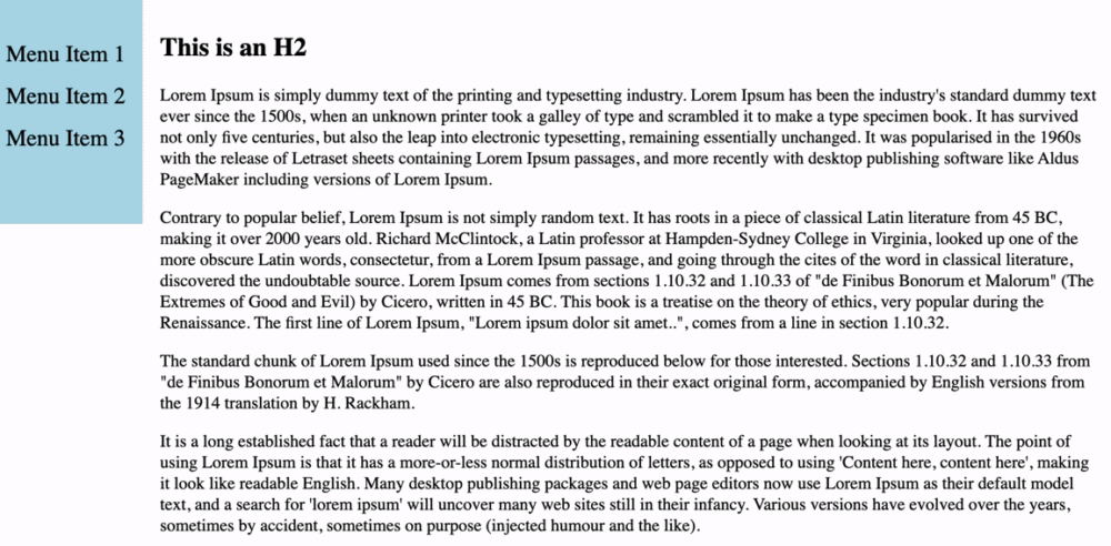
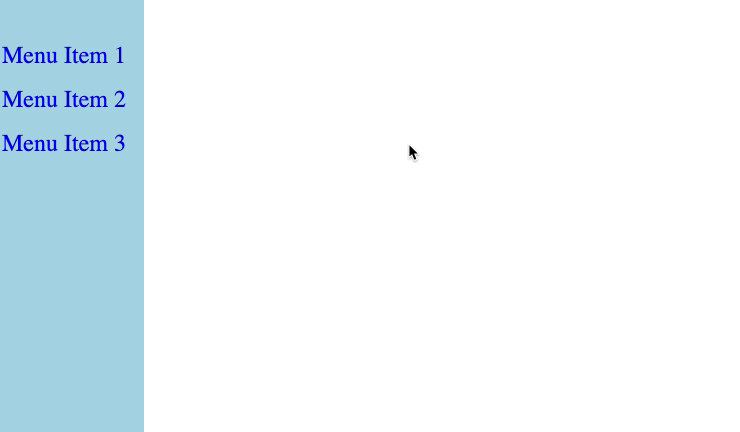
The simplest way to implement a sidebar is with a static sidebar element (colored blue below) that spans the height of the page and is positioned on the side of the screen.
.webp?width=650&height=321&name=css-sidebar-simple-example%20(1).webp)
To make this, use the following HTML and CSS:
This works well, but what if you want the same sidebar elements to be in view at all times? In this case, you can make a fixed sidebar or a sticky sidebar. Let's do a fixed sidebar first.
How to Create a Fixed Sidebar in CSS
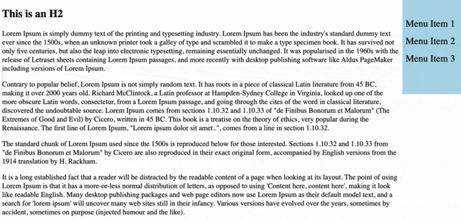
A fixed sidebar remains in the same place relative to the viewport (i.e. the visible browser window) when the user scrolls. For example, this sidebar stays pinned to the top left corner of the screen:
To make this, use the following code:
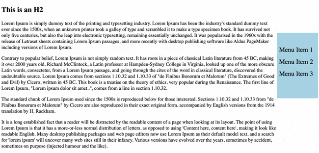
To pin the sidebar to the right side of the viewport, apply the following CSS instead:
This flips the sidebar placement:
How to Create a Sticky Sidebar in CSS
Sticky sidebars are similar to fixed sidebars in that they follow you as you scroll down the page.
However, a sticky sidebar element maintains a relative position until it crosses a threshold in the viewport (i.e. the user scrolls past a certain point on the page). At that point, the element stays in place, like a fixed element. This makes the sidebar appear to “stick” to the top of the screen, like so:
To achieve a sticky sidebar effect, use the following HTML and CSS:
In this code, the position: sticky declaration tells the sidebar div to “stick” to the top border of its parent container, which here is the viewport.
How to Create a Full Height Sidebar in CSS
To extend the sidebar to the bottom of the viewport, set the height property to 100% in your CSS:
As you can see below, the sidebar is fixed and extends to the full height of the browser window, no matter the height dimension of the viewport.
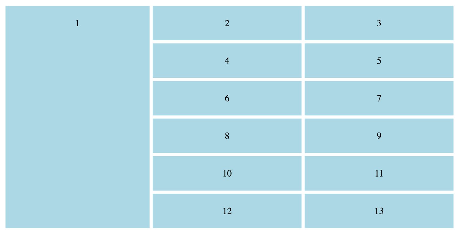
How to Create a Grid Sidebar in CSS
You can use the CSS grid layout to create a sidebar element. Set your leftmost or rightmost grid item to extend to the bottom of the grid (or as far down as you want it to go), and you’ll end up with something like this:
Here’s the HTML and CSS code for the example above:
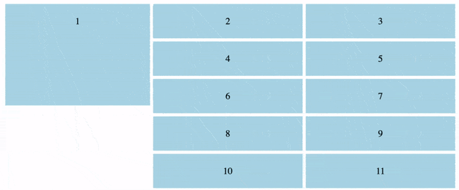
This sidebar element will be positioned relative by default, meaning it will move upwards as the user scrolls downward. You can turn this sidebar element into a sticky element by adding the sticky CSS declarations to the first box element:
And voila, the sidebar sticks:
How to Create a Collapsible Sidebar in CSS
Next, let’s cover how to create a collapsible sidebar. This can be handy for secondary navigation because it saves page space by hiding nonessential items.
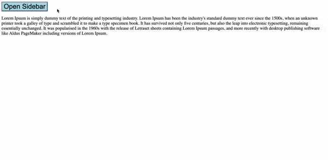
The easiest way to add a smooth collapsible sidebar involves a bit of JavaScript coding, so brush up on that if you need to. Here’s a simplified version of W3School’s implementation:
This code produces a collapsible menu. When the “Open Sidebar” and “X” buttons are clicked, the JavaScript code changes the width of the sidebar element. The transition declarations in the CSS animate the growing and shrinking of the menu when the width is changed, so we get the following effect:
How to Create a Sidebar Navigation Menu in CSS
A sidebar makes a great home for a navigation menu. a CSS sidebar navigation menu isn't too difficult once we have the sidebar built. To do it, we’ll turn our menu item divs into links (using the <a> tag) and add some additional styling for a cleaner look and a more comfortable user experience.
To aid screen readers and provide better accessibility, we’ll also wrap out menu item links in a <nav> tag to denote a navigation menu. Use the following HTML and CSS:
CSS Sidebars: Some Testing Required
Sidebars are one of those components that visitors have come to expect, and they’re usually a safe bet for enhancing navigation or adding extra display elements without distracting from the main page content.
It goes without saying, but the methods I’ve described in this post are pretty bare-bones. It’s up to you to apply CSS to personalize your sidebar feature exactly to your liking, so expect a lot of trial and error here (and when working with CSS in general). Still, any of these HTML/CSS templates are a great starting point for a sidebar that improves your navigation and user experience.
Editor's note: This post was originally published in October 2020 and has been updated for comprehensiveness.


![How to Import Bootstrap in React [The Beginner's Guide]](https://blog.hubspot.com/hubfs/import-bootstrap-in-react.jpg)
![How to Create Scrolling Text With CSS [+ Code Examples]](https://blog.hubspot.com/hubfs/Google%20Drive%20Integration/scrolling%20text%20css.jpeg)