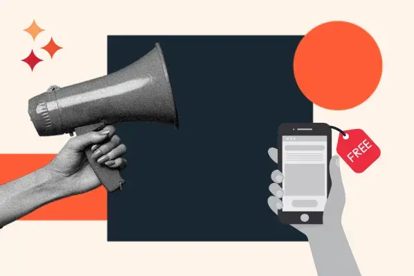
How to Improve Lead Generation
- Improve your landing page CTA's through design, copy, and targeting best practices.
- Improve your landing pages by keeping things clear, simple, and compelling with your headlines, forms, and imagery.
- Improve your offers by making sure there is one for each phase of the buying cycle.
- Improve your entire campaign by testing against best practices. Look for statistically significant conversion rate changes.
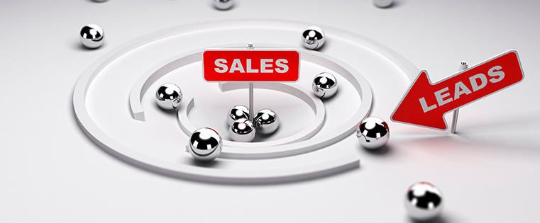
Want to increase your company’s profitability from your website? Generating traffic is only half the battle. You can spend months focusing on doubling traffic to your website, but if you don’t have compelling offers, effective calls-to-action, and convincing lead nurturing campaigns, you won’t have a way to turn that traffic into leads and ultimately profits.
Here are 25 ways you can increase website conversions, not only to the point of becoming a lead, but to the point of becoming a qualified lead.
Download Now: 28 Free CTA Templates
How to Improve your Calls-to-Action
1. Improve Positioning of Your Calls-to-Action (CTA)
Calls-to-action do best “above the fold” - the space of your webpage viewable to the user without having to scroll down. According to heat map analysis, anything “below the fold” will only be viewed by 50% of people who view your page. Doubling impressions on your CTAs can significantly increase your website leads.
2. Be More Clear About What You’re Offering
Be crystal clear about what the offer is in your CTA. And be specific. If you’re giving away a free guide, say “Download our FREE guide to X”. If you’re hosting a free webinar, say “Register for our FREE webinar on X.” X should clearly convey a compelling benefit of receiving the offer. This is much more effective than “Download Now” or “Get a Free Article.” These simply aren’t specific enough.
3. Use Images Rather Than Only Text so it Stands Out
Images stand out on a webpage more than text does, and get a lot more attention, as proven by the heat map study. Additionally, using an image will allow you to show off the offer in a way you can’t necessarily convey using text alone.
4. Use Colors that Contrast with Your Site Color Scheme
Your web designer might kick and scream about this, but if your call-to-action blends in too much with your site design, it won’t stand out as much. You want as many eyeballs to land on that call-to-action as possible, so use contrasting colors to make the CTA stand out.
5. Make your CTA a Hyperlink to the Corresponding Landing Page
You’d be surprised by how many times I’ve seen calls-to-action that aren’t links. Whether intentional or a matter of forgetfulness, the lack of a link will make it much harder for visitors to find out how to get the offer, and they’ll likely give up. So double, triple, and quadruple check to make sure all of your CTAs link to their corresponding landing pages.
6. Place CTAs on the Most Relevant Pages
CTAs shouldn’t be one size fits all. If your company offers various products or services, you may want to consider creating a different offer for each. Then you can place CTAs linking to each offer on the website pages that are most relevant to that offer.
7. Add CTAs to Each Blog Post
Whenever you create a new blog content, choose an offer that’s the most relevant to that blog post. Then add a call-to-action to the bottom of that blog post linking to the landing page for that offer. Informational offers such as ebooks, guides, and webinars do very well in this space, because people reading your blog would likely be eager to get more free information from you.
How to Improve Landing Pages
8. Match the Headline of the Landing Page to the Corresponding CTA
Keep your messaging consistent on both your CTA and the headline of the landing page. If people click a link for a free offer and then find out there’s a catch on the landing page, you’ll instantly lose their trust. Similarly, if the headline reads differently than the CTA, it might lead to confusion, and the user might wonder if the CTA is linked to the wrong page.
9. Be More Clear About What You’re Offering
This is the biggest mistake I see in landing pages. People often try to be too clever or witty in the headline, and it’s not clear what the offer actually is. Again, if you’re giving away a free guide, say “Download our FREE Guide to Improving X”. Plain and simple.
10. Improve the Positioning of the Form
Just like you want to have your call-to-action above the fold, it’s ideal for the form to be above the fold as well. This way, there can’t be any confusion as to what’s expected from the viewer on this page: they need to fill out the form to get what you’re offering.
11. Keep the Form as Simple as Possible
“Simple” does not always mean “short.” What you ask for on a form should match the information your sales team needs from your leads to make the sale. For top of the buying cycle folks at the beginning of their research process, name and email address might suffice. For more committed prospects at the bottom of the buying cycle, you might want to ask for some qualifiers like job title or city/state, and perhaps ask for a phone number. Just try not to ask for more than what’s necessary.
12. Use Images to Show Off What You’re Offering
Your landing page doesn’t have a visual masterpiece, but it should show what your offer is all about. If your business is something a bit more abstract, just take a screenshot of your guide/whitepaper/eBook/etc. and add the image to your landing page. You can use freeware like Jing to easily capture and save screenshots.
13. Keep the Text Concise and Easy to Scan
Be brief and to the point; it’s the offer where you give the prospect more information. In addition to your headline, have a brief paragraph explaining what the offer is, followed by a few bullet points outlining what the offer consists of and what the benefits are.
14. Emphasize the Benefits of the Offer
Make it clear in your brief paragraph and/or bullet points what the benefits of the offer are. It’s more than just listing what the offer is comprised of; it takes a bit of spin. Instead of “Includes specifications of product XYZ,” say something like “Find out how XYZ can increase productivity 50%.”
15. Remove Links and Navigation to Maintain Focus
When a prospect reaches your landing page, you’re just a few keystrokes away from getting their contact information. So don’t distract them with links that will take them further away from your goal of getting a lead. The thank you page, shown after a prospect fills out a form and becomes a lead, will give you the opportunity to return the navigation and links.
16. Create a Thank You Page that Keeps New Leads on the Site
When creating a thank you page, not only can you give back the navigation, but you can provide other links to keep the lead engaged. You can provide call to actions to the next step in the buying cycle, link them to your blog, encourage them to follow you on Twitter, ask them to subscribe to your newsletter, and more. You can do more with your thank you pages than just adding tracking code!
How to Improve Offers
17. Make Sure Your Offers are Compelling
Your offer should answer the question: “What’s in it for me?” Things like pricing brochures, specs, and self-promotional videos are not compelling offers, because they do not answer that question. Informational items like whitepapers, guides, and webinars are compelling offers because they do. See the difference?
18. Link Back to Your Site in Your Offer
Although lead nurturing is a very powerful tool, provide a way for your leads to find you again besides through email; especially if they are more inclined to ignore email from people they don’t know. If they enjoyed your whitepaper (which is remarkable, so of course they did!), make it easy for them to remember where they got the whitepaper from by linking to your site on your cover page.
19. Create Offers for Each Phase of the Buying Cycle
Just like your forms might vary for each phase of the buying cycle, your offers should as well. Someone at the top of the buying cycle may be more interested in an informational piece like a guide or ebook, whereas someone more committed at the bottom of the cycle might be more interested in a free trial or demo. You don’t need to pick and choose; create offers for each phase, and include a primary and secondary CTA to these offers on various pages throughout your site.
How to Improve Lead Nurturing Campaigns
20. Be More Clear About What You’re Offering
I’m being repetitive about this for a reason: I’ve seen this mistake made too many times, and it’s such an easy fix. Always be crystal clear about what you are offering. Keep your email short and sweet. Instead of prefacing your offer with two paragraphs about your company’s background, get to the point. What are the tips you want to share with your prospects? How can they benefit from subscribing to your blog? Why should they care what new offer you have on your site?
21. Include Links Back to Your Site
It’s awfully hard to measure the success of your lead nurturing emails by the unsubscribe rate alone. Include links back to your site so that you can test variations, and measure what works and what doesn’t. These links don’t have to be CTAs leading to landing pages. You can link to more free information on your blog, encourage people to follow you on Twitter, etc.
22. Keep the Text Concise and Easy to Scan
People don’t want to read dense paragraphs of text in their email. Just like your landing pages, have a brief paragraph with a free bit of information, a few bullet points of tips or guide steps, and a link back to your site to find out more information. Save the actual bottom-of-the-cycle-offer CTA for one of your later lead nurturing emails, so it doesn’t seem like you’re trying to sell sell sell right out of the gate.
23. Create an Attention-Grabbing Subject Line
The subject line is arguably the most important part of a lead nurturing campaign. Without an attention-grabbing title, people won’t open your email to read everything else you have to say. Clearly state how the recipient will benefit from reading your email.
24. Limit the Amount of Images in Your Emails
Text-only lead nurturing emails are successful for a number of reasons. Not only do they reduce the risk of your email being sent directly to the SPAM folder, but emails seem more personal if they are written as though they could have been written for the individual reader, rather than a newsletter template that’s been sent to thousands of people.
How to Improve Your Entire Campaign
25. Measure, and TEST TEST TEST!
Everything on your site can be tweaked and tested in order to improve conversion rates. After a CTA has been on your homepage for a month, vary the messaging or swap out an entirely new CTA and after another month, and measure which has performed best. If your offer CTA is in your 2nd lead nurturing email, move it to the 3rd and see if click-through rates increase. If landing page conversions are low, move the form above the fold and measure the results. Don’t be afraid to test different variations; you can always switch back if the old version worked better. It will be worth it when you’ve found a combination that increases your site conversions.
What are some of the tweaks you've made to your website to increase conversions and sales? Share your tips in the comments below!

Lead Generation
![What is a lead magnet? 20 lead magnet ideas and examples [+ step-by-step]](https://53.fs1.hubspotusercontent-na1.net/hubfs/53/lead%20magnet%20represented%20by%20a%20magnet.webp)


![Gated Content: What Marketers Need to Know [+ Examples]](https://53.fs1.hubspotusercontent-na1.net/hubfs/53/UNGated%20Content.png)

![What Is Demand Generation? Here’s How You Can Create Buzz for Your Offering [FAQs]](https://53.fs1.hubspotusercontent-na1.net/hubfs/53/demand-generation-1-20250321-225687.webp)