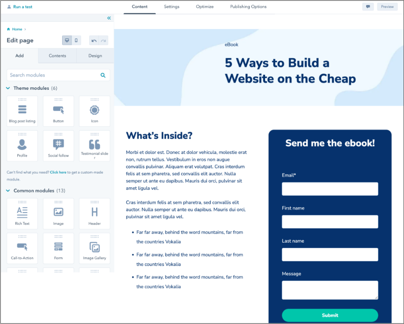
Often, your landing pages can make or break how many leads you attract. So, your team needs to know what makes a great landing page and the mistakes you need to avoid. That’s especially true if you’re building these landing pages with code yourself.
In this guide, I’ll explain how to create a landing page in HTML and CSS that gets visitors to actually convert.
Table of Contents
- Why do landing pages matter?
- Why build an HTML landing page?
- HTML Landing Page Best Practices
- How to Create a Landing Page in HTML
- How to Create a CSS Landing Page
- CSS & HTML Landing Page Templates
- HTML Landing Page Tools
- Build Your Perfect HTML Landing Page
Why do landing pages matter?
The goal of any landing page is to drive action. It's usually the first page visitors see on your website after they click on an offer, and it’s where they’ll develop a first impression of your site. Your landing page then asks visitors to provide details, including their name, email address, or phone number, in exchange for an offer.
What you offer is up to you — whitepapers, ebooks, and newsletters are all common. Whatever you create should be genuinely helpful for your audience. I've learned that visitors are more likely to share their contact info and move up your sales funnel if your offer is relevant to their needs.
The offer is the most important aspect of your landing page, but it is not the only important part. When building landing pages, I focus on customer-focused, personalized design. Customized landing pages can increase conversion by up to 202%.
Why build an HTML landing page?
So, you know you need a landing page. But why should you consider coding it yourself?
Well, as a developer, I’d caution against building a landing page from scratch if you’re completely new to coding. There are plenty of CMS options (including HubSpot’s) that allow you to create landing pages from a template. You can even customize what you create to match your branding.
However, if you’re looking for a greater level of creativity and you have coding experience, building a landing page with HTML and CSS may be the best option. These languages let you customize designs beyond what website builders offer.
You can also guarantee that your page is responsive and aligns perfectly with your marketing goals. Beyond that, lightweight HTML and CSS-only pages can help you when performance is critical. Builders that use a lot of JavaScript can slow down page speed. Your custom page can prioritize speed and a quick loading time.
But before you start typing, you’ll need to brainstorm. Having a framework for your landing page can help you when it’s time to code. To help you get started, I’ll review a few best practices to guide the way.
HTML Landing Page Best Practices
Landing pages are designed to capture specific streams of traffic — a subset of your website visitors targeted by your marketing campaign. For example, if I’ve made a mobile fitness app that charges a fee, my landing page might offer a free trial.
With the right SEO, my website can bring in fitness-focused visitors. Then, my landing page captures potential customers who sign up for the offer so I can market to them in the future.
While your specific landing page layout will vary, here are a few recommendations to improve your impact:
- Make it clear, not complicated. Your unique selling position and call-to-action (CTA) should be front and center. You’ll want to keep copy direct, making it clear what users get in exchange for their information.
- Make it clean, not cluttered. White space is your friend. Keep your landing page simple. Limit text and curate images for maximum impact.
- Test, don’t guess. Your landing pages shouldn’t be static. You should test different text, colors, images, and more to see what maximizes impact. Design your page, publish it, and then record the results. If it’s not working, make changes.
- Optimize for speed and mobile. Of netizens, 92.3% access the online world on a mobile device. Make sure your landing pages are lightweight, mobile optimized, and load within 3 seconds. Be sure to optimize your code for mobile users.
How to Create a Landing Page in HTML
Now, it’s time to build your landing page. Below, I’ll use HTML to create the structure for a sample page.
First, it’s important to note that HTML is a markup language that gives you control over the text, images, and links that appear on your webpage. CSS, a different type of code, will bring these structural elements to life through design.
If you’re new to coding, you can see popular tags and learn more in our essential guide to HTML.
With the basics under your belt, you’re almost ready to go. You just need a text editor where you’ll actually code your page. If you don’t have one yet, check out our HTML and CSS editor recommendations before moving on.
If you’re using WordPress, you can also click on a specific block in the editor and click on the three dots. Then, select Edit as HTML. If you want complete control over your HTML elements, start by editing a page or post, then click on the three dots in the top-right corner of the editor and select Code Editor.
Now, let’s dive into the process of creating a landing page in HTML.
1. Create the basic structure.
To build an HTML landing page from the ground up, I'd prefer to use a basic HTML framework, such as Material Design for Bootstrap (MDB), which is available in free and paid versions.
A framework is a collection of pre-written code that makes it easier to create in HTML. Rather than creating every element from scratch, you can use a framework's built-in components to create landing pages quickly.
Once I‘ve downloaded and unzipped the MBD package, I’m ready to create my first landing page. Here, I need five key things:
- A basic structure.
- A navigation bar,
- A navbar class.
- A full-page background
- CSS styling.
Additionally, I need to include some basic page elements:
- A heading using the <h1> tag at the top of my page.
- Some text using the <p> to define paragraphs and CSS styles for color and font.
- The <input> tag to create form fields where visitors can enter their name and contact information.
- Links using the <a> tag that lets visitors download or access content once they’ve provided their contact details.
I start by opening the index.html file (the HTML file for my homepage) in my project folder. This is typically where I’ve unzipped the MDB or other HTML editor package. I can then paste this code underneath the opening <body> and closing </body> tags:
This HTML provides the structure for your landing page. In it, I have:
- A <header> element for my page header and primary navigation.
- A <main> element to indicate the most important part of the page that contains its unique content (i.e., things that aren’t repeated across pages, like the header and footer).
- A <footer> element for my page footer.
These are all placed inside the <body> tags. <body> contains all things on my page that are directly visible to visitors.
2. Create a navigation bar.
Next, I paste the following code between the opening <header> tags:
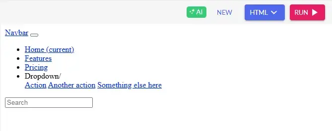
There’s much more code here, so let’s break down what this means. Everything is contained by the <nav> (navigation) element, indicating that the contents inside these tags guide the user through the website.
First, I have a place for the brand text in the navbar, followed by a button to collapse the navbar from view. Inside this collapsible section of the navbar, I have a list of navigation links to Home, Features, and Pricing pages, then a template for a dropdown menu.
Lastly, this code places a search bar in my navigation, allowing users to enter queries and quickly find their desired page.
Pro tip: Use ARIA attributes such as aria-label and aria-expanded to improve accessibility for screen readers.
3. Stick the navbar to the top of the screen.
A sticky navbar stays visible to the user even when they scroll down the page. To make my navbar sticky, I replace the first <nav> tag (directly under “<!--Navbar-->”) with the following code:
4. Create a great background.
After my content is set, a great background will help my landing page stand out. I put this code underneath the navbar, just before the closing </header> tag:
This code adds a mask over my background, which partially obscures the background image so content in the forefront is more visible.
Pro tip: Avoid background images larger than 200KB. Instead, use WebP format for better compression and faster load times.
5. Add some style.
Finally, it’s time to spruce up your page with styling. To do that, I’ll make use of the language CSS. Like HTML, CSS isn’t a programming language, and it’s also not too difficult to wrap your head around.
In the next section, I’ll show you how to change your simple HTML landing page codes to beautiful landing pages with the magic touch of CSS.
How to Create a CSS Landing Page
HTML works with CSS to change the style of the elements on your landing page. With CSS, you can change the background color, text color, and font type. These changes then “cascade” across all elements, allowing you to make changes that apply to your entire simple landing page HTML code at once.
CSS can either be written in the HTML file it applies to or in a separate file called an external stylesheet. For this tutorial, I'll use the latter method.
Create an empty text file called “style.css” in the same folder as index.html, and then paste the following HTML code in between the <head> tags inside index.html:
This HTML instructs the document to reference your style.css file for styling instructions.
Next, I open style.css, paste in this CSS code, and save the file:
This will provide a placeholder background image for my landing page. Setting the height at 100% ensures that background elements cover the entire screen.
Even after this CSS, my landing page will still look pretty generic. At this point, it’s up to me to decide how to populate the page with my content and style it to match my business’ branding.
Then, I can use CSS to change the look of your page. Here are the key styles I focus on when adding CSS:
- Colors. With CSS, I can change the colors of my text, as well as the background colors of block elements and my entire page. See our guide to CSS colors to learn how it works.
- Fonts. Fonts are another crucial detail of a landing page. A font can make my text both professional-looking and more readable. I can choose a font family according to my branding guidelines and adjust the font size to establish hierarchy.
- Margins and padding. CSS provides ways to space out my elements with margins and padding. As mentioned, white space is my friend — it makes my pages appear clean and digestible, which are both essential when optimizing any landing page.
1. Make the HTML structure.
Likewise, I have mentioned before that we can‘t make a CSS web page without using HTML. Thus, you need to have an HTML structure first and then add a layer of CSS to it to get a colorful and dynamic landing page. Without CSS, it’s just some simple landing page HTML code that works without any appeal.
So, I’ll add some CSS code to our navbar HTML and see how it turns out.
Let me break down the implementation of some of the important CSS here:
- .navbar { background-color: #007bff !important; } Sets the navbar's blue background.
- .navbar-brand, .nav-link { color: #fff !important; } Makes text white for contrast.
- .dropdown-menu { background-color: #007bff; } Keeps the dropdown matching the navbar.
- .form-control { width: 250px; } Ensures consistent search bar width.
If you run this code through your code editor or builder, you can see that your previous HTML code now has a fulfilled structure, an appealing look, and a nice background color.
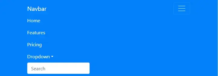
It works well and looks like a web browser. Clicking the dropdown button takes you to different buttons.

2. Adjust the color palette.
I have used a blue-and-white theme color code here to create a clean and professional look. But say you want to change it and give it the look you want.
The existing color palette:
- Primary Blue (#007bff) Navbar background & dropdown menu.
- Darker Blue (#0056b3) Dropdown item hover effect.
- White (#ffffff) Navbar text and links.
- Light Gray (#dfe6e9) Link hover effect.
Say you want to change the color palette and create something like the HubSpot color palette. Let me show you the changes in the color palette so that you can understand how they affect the color of your landing page.
Here is the HubSpot color palette. So you can make the changes to your landing page color palette.
- Primary Orange (#ff7a59) Navbar background & dropdown menu.
- Dark Blue (#2e475d) Dropdown background.
- Light Blue (#00a4bd) Dropdown item hover effect & search bar border.
- White (#ffffff) Navbar text and links.
- Light Gray (#f5f8fa) Link hover effect & background shade.
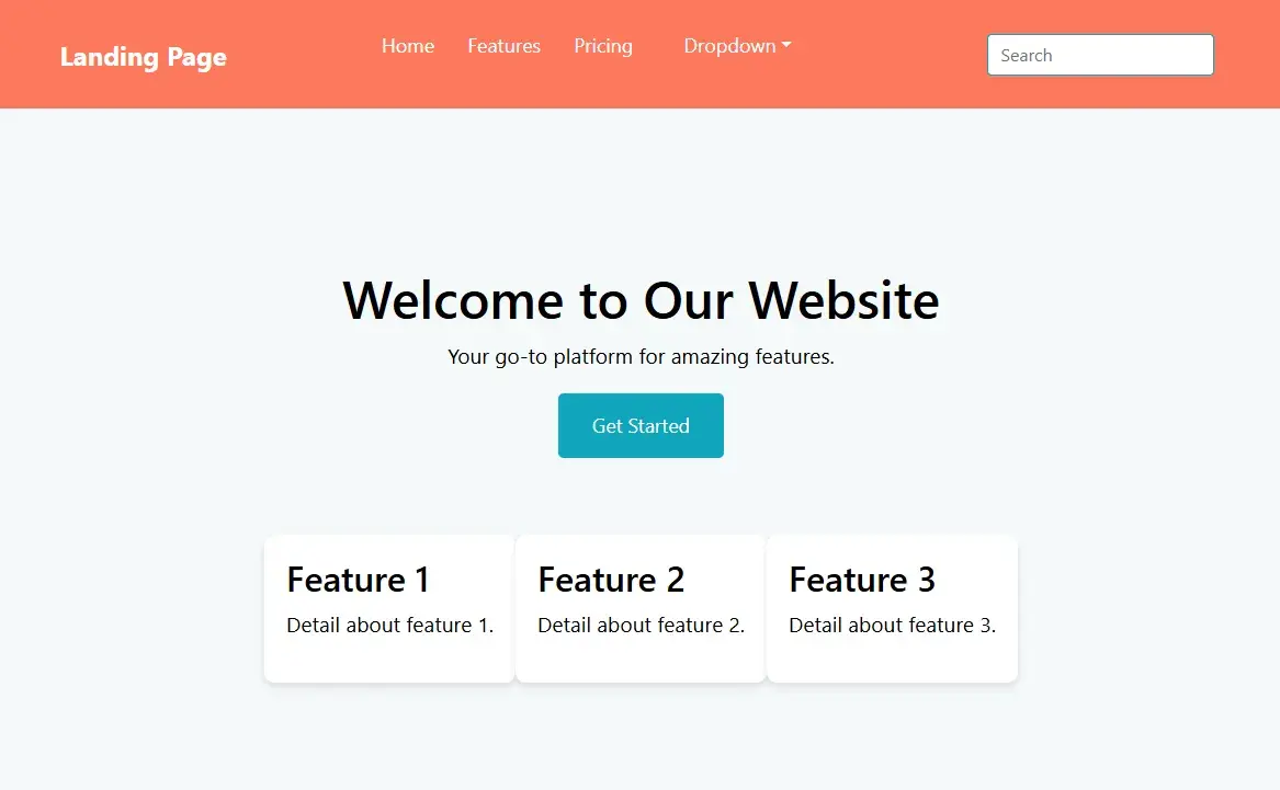
After adjusting your CSS color palettes and running the code, you should see a website navigation bar similar to the HubSpot branding color type.
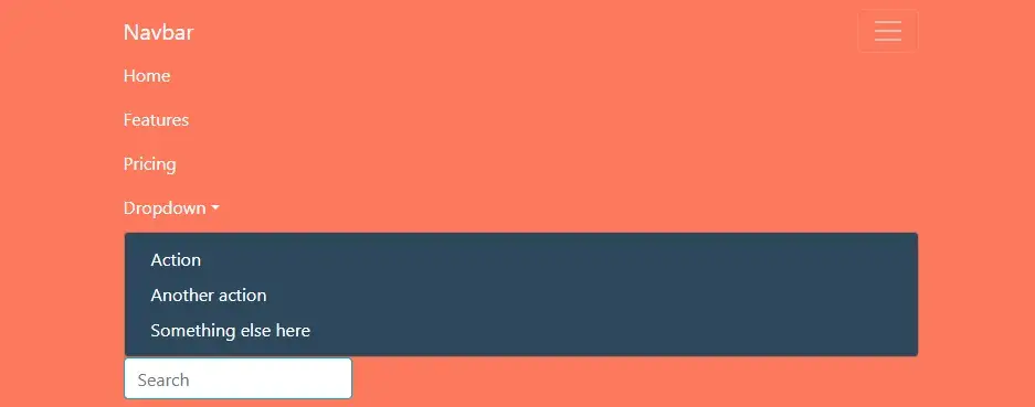
Doesn’t it feel good? I also felt the same way when I started building landing pages a decade ago.
In the next part, I will show you how to add some of the most crucial sections of a landing page. Different sections like the Header, Hero, and Features structure a landing page. Each section has a specific purpose:
- Header section — helps with navigation.
- Hero section — captures attention and engages users.
- Features section — highlights key offerings.
3. Add a header section.
The header is the first interactive element that users encounter. It provides brand identity and navigation, allowing users to move around the website easily. A well-structured header enhances user experience (UX) and accessibility.

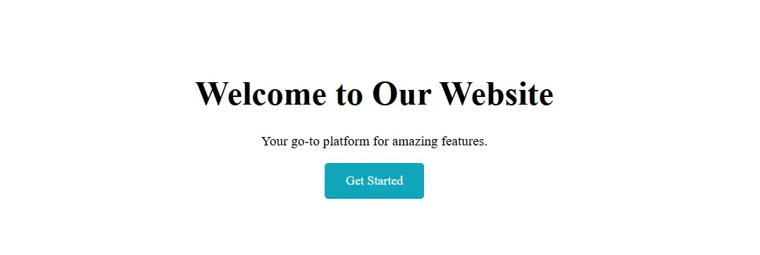
4. Build the hero section.
The hero section is one of the most important parts of a landing page. It’s usually a full-width section with a large background image, a title, a short description, and a call-to-action button. This section grabs attention and encourages users to take action.
5. Add the features section.
The features section breaks down the key benefits of the product/service in a structured format. It allows users to scan the most important features, uses a grid layout to improve readability, and increases conversion rates by highlighting unique selling points.

So far, this should be the complete structure of your landing page:
6. Add hover effects and transitions.
Hover effects and transitions improve the user experience by making the website feel interactive. They provide visual feedback when users interact with elements like buttons, links, or cards.
A hover effect is a visual change when a user moves the cursor over an element. You can apply hover effects in CSS using the “:hover pseudo-class”. Let's add some hover effects and transitions to make the landing page look cooler and more dynamic.
Simply look at the parameters below if you want to change the hover and transitions to your personal preference:
- Links (.nav-links a:hover) Changes color to orange (#ff4500) when hovered.
- Buttons (.btn:hover) Changes background to darker orange (#e63e00) and slightly grows in size.
- Feature Boxes (.feature:hover) Move slightly upward (-5px) and get a stronger shadow effect.
- Smooth Transitions (.btn, .feature) Makes these changes happen smoothly over 0.3 seconds instead of instantly.
Pro tip: Run Lighthouse audits in Chrome DevTools to check for performance bottlenecks, accessibility issues, and SEO improvements.
7. Make the landing page responsive
A responsive website automatically adjusts to different screen sizes, ensuring an optimal viewing experience on desktops, tablets, and mobile devices. Responsiveness is crucial because 92.3% of web traffic comes from mobile devices.
Besides, a site that looks great on all screen sizes improves user experience and engagement. Most importantly, Google favors mobile-friendly websites in search rankings.
Media queries, like the ones I used in the code below, can help you specify how you want elements to appear based on the user’s screen size. You can only assess the usability of this code after testing your landing page on various device sizes.
Pro tip: Instead of fixed pixels (px), use relative units (%, em, rem) to make sure that your code works better on all screen sizes.
You might be surprised at how far you can get with just these alone. But, if you need some help with your design vision, we have some landing page examples you can use for inspiration.
New to this process? To get started with CSS, check out our Ultimate CSS Tutorial for Beginners.
CSS & HTML Landing Page Templates
Coding from scratch offers you the most flexibility when building a landing page. However, starting completely from square one can be time-intensive. These landing page templates have code you can customize, all while saving the time it takes to build a page.
1. One Page
At a Glance
- Free options are available
- Prices go up to $49
- Uses the latest version of Bootstrap
- SEO optimized
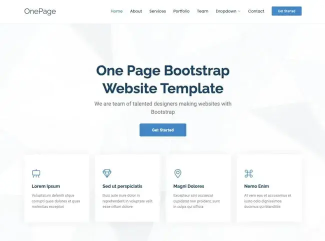
The OnePage landing page template is perfect for businesses of any kind, featuring a versatile design with a neutral color scheme and well-structured sections. I love the responsiveness of this template across both desktop and mobile devices.
Additionally, OnePage is built with user-friendliness in mind. There are easy-to-follow comments in the code. You can easily find which parts can be customized, making it beginner-friendly. For businesses wanting to build a landing page fast, this template is a must.
Best for: Small businesses, startups, creative agencies, and freelancers.
What I like: OnePage stands out for its user-friendly design and flexibility. I also love how lightweight and fast-loading this template ensures a great user experience.
2. Simple Conversion
At a Glance
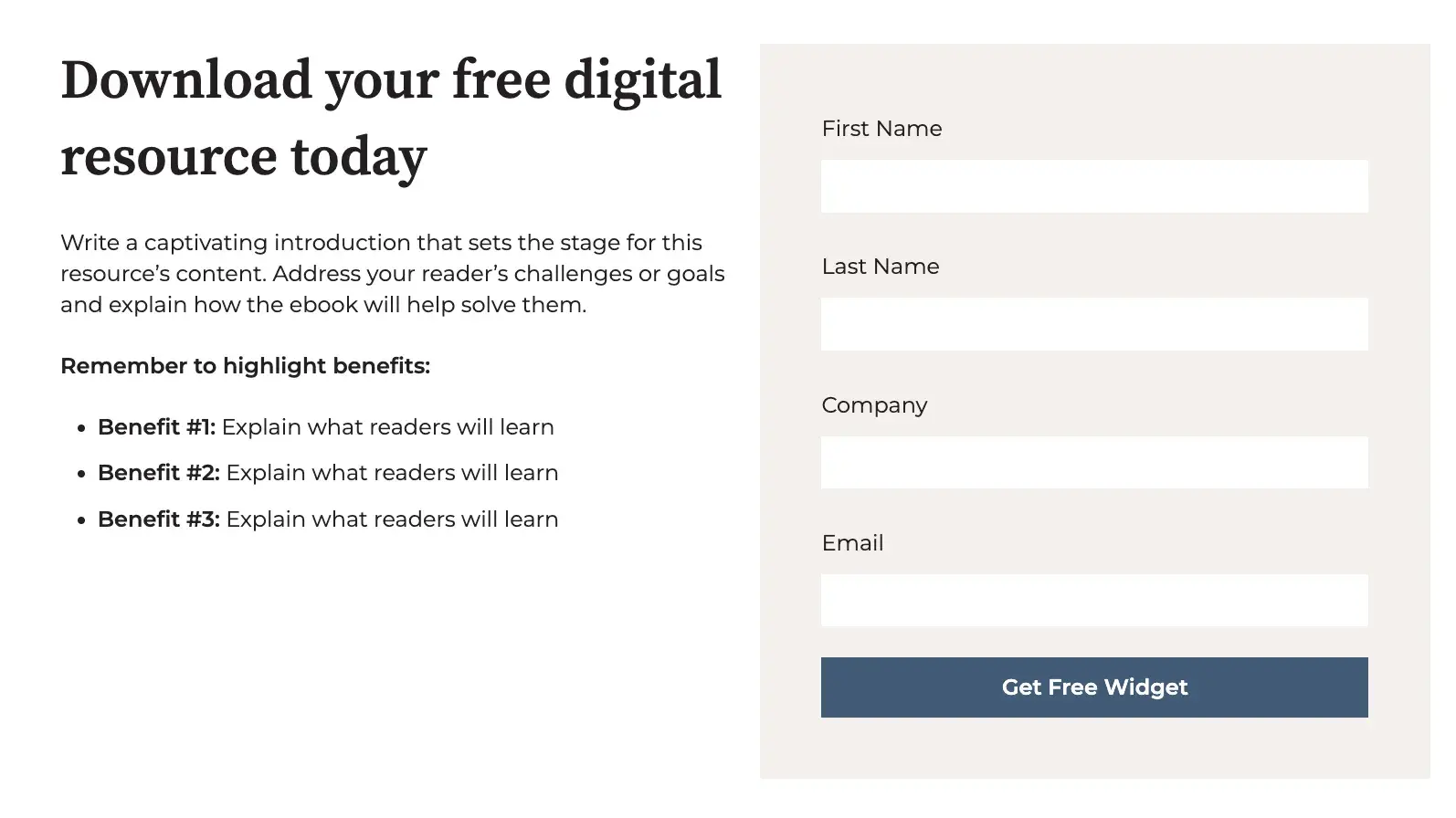
- Includes a photo, customizable text, and a short form
- Below the fold, you can also add more information about your offering
Bloated landing pages can distract from your goal, pulling attention away from forms and CTAs for your offer. I like the simplicity of this design. You can avoid clutter and minimize the number of distractions on your page.
You can customize and add other elements to your page, including icons below the form. This template is a great option if you want to build a simple landing page fast.
Best for: Marketers, freelancers, sales teams, startups, and small businesses
What I like: Simple Conversion is an effortless landing page. I love how easy it is to customize pages and shift to any dimension I want them to change.
3. Open Pro

At a Glance
- Built with Tailwind CSS
- One time $49 payment
- Compatible with desktops, tablets, and mobile devices
- Available in HTML, VUE, Figma, Next.js, Sketch
With Open Pro, SAAS companies can quickly build landing pages that showcase their offerings. Plus, there are multiple ways you can edit this template. You can make changes in Figma, Vue, and HTML, making customization a breeze. You can also add a banner and MP4-compatible background.
I love this template's testimonial feature. You can showcase real customers who have benefited from your offering, making your audience more likely to engage. This template serves as a great starting point, streamlining the process of building a landing page.
Best for: Web3 companies, SaaS startups, tech, and IT Websites
What I Like: Open PRO has a bold and modern design. The dark layout adds a sleek, premium feel.
4. Focus
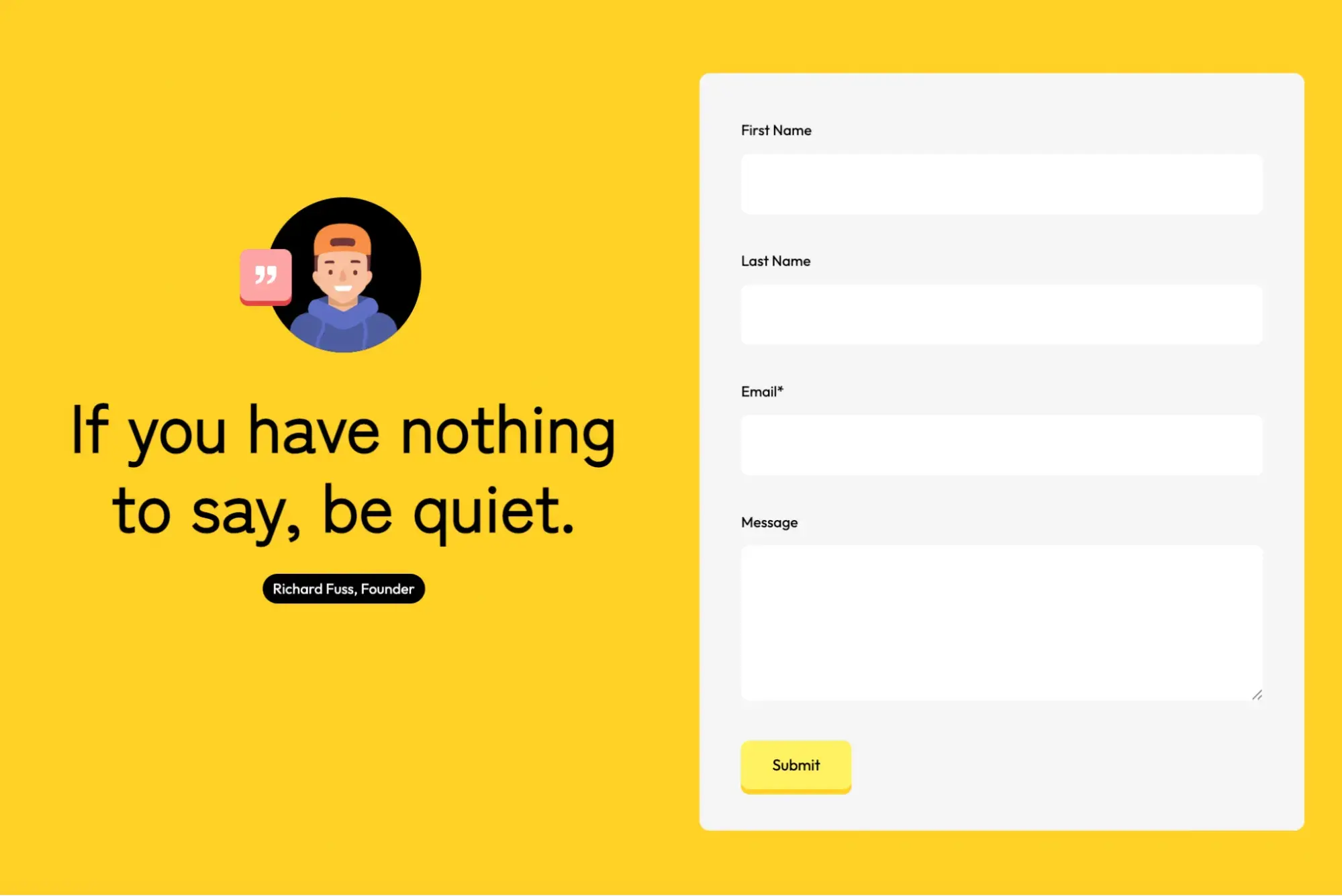
At a Glance
- Bright colors that are sure to catch attention
- Simple, easy-to-customize design
If you’re looking for a modern, vibrant design for your pages, Focus is the way to go. This page has a simple layout that’s quick to customize. You just need to decide your form fields, your headline, the text for your offer, and a photo. You can easily upload your assets — a task made even simpler if you’re already using HubSpot.
Best for: Startups, Small Businesses, Creative Agencies, Personal Brands
What I Like: The bright colors grab attention. The layout is simple and quick to customize.
5. Session
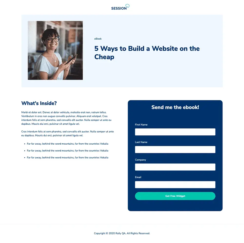
At a Glance
- Free with HubSpot
- Prominent CTAs for conversion
- Easy to customize
Your landing pages don’t need to be filled with graphics to be well-designed. Sometimes, you just want a prominent headline, basic information, and a CTA for people to click on. If your style is more minimalist, Session may be the best choice for you.
This is one of my favorite options for a straightforward offer strategy. Your newsletter, ebook, or gated content can shine.
Best for: Professional services, consultants, B2B companies, and nonprofits
What I like: I like how the minimalist design keeps things clean. The CTA stands out, making it great for conversions and perfect for simple offers.
6. Delivery
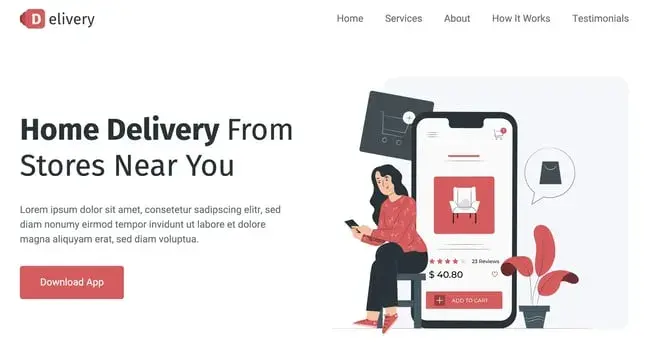
At a Glance
- Free options are available
- Prices go up to $29
- Fully Responsive across all browsers and devices
- Built with Bootstrap 5 and HTML5
This responsive template is perfect if you’re offering special coupons or deals. Businesses can offer free delivery or free add-ons in exchange for leads. I love the fun design of this page. Subtle yet impactful animations capture my attention effectively.
Beyond that, the template's minimalist approach ensures that only relevant information is shared, avoiding overwhelming customers.
Best for: Ecommerce platforms, retail businesses, subscription services, food delivery services
What I like: The fun design feels modern. The animations add a nice touch without being distracting.
7. Applayer
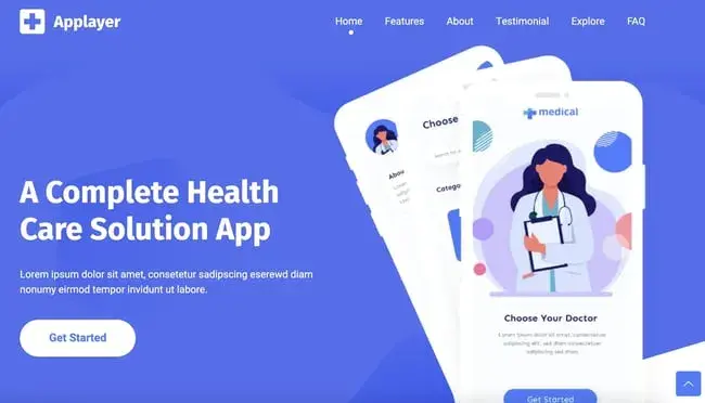
At a Glance
- Free options are available
- Prices go up to $14
- Fast Loading Times
- Built with the latest Bootstrap 5 version
This trendy template is an excellent choice for new businesses looking to establish a modern digital presentation. Applayer’s landing page has attention-catching CTAs with plenty of text modules where you can describe your offerings.
I also love the explore and FAQ sections. You can easily address common questions without the need for direct contact.
Best for: Tech startups, app developers, software companies, digital product creators
What I like: The CTAs stand out and drive action. Plus, there’s plenty of space to describe the product.
8. Treact
At a Glance
- Free for personal and commercial use
- Designed with Tailwind CSS
- Customizable components
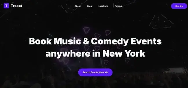
Treact is a great choice for marketers who want enhanced customization options. This template’s collection features prebuilt landing pages with an extensive library of customizable UI components. If you find a near-perfect template with one module you want to fine-tune, you can easily shift these UI components.
Best for: Marketing agencies, design studios, freelancers, corporate websites
What I like: The UI components are easy to tweak. The design feels modern and flexible. This theme is great for building something custom without extra effort.
9. Activello
At a Glance
- Supports most free Wordpress Plugins
- Free Wordpress Template
- Includes Documentation
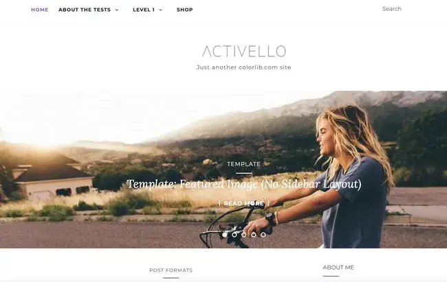
Activello is a free Wordpress landing page. Plus, it’s built on Bootstrap, making it fully responsive across multiple devices. Beyond that, SEO is essential, allowing customers to find their web page. Luckily, this template prides itself on being Google-friendly. No matter the type of content or business, this highly versatile template can suit your needs.
Best for: Bloggers, content creators, lifestyle brands, photographers
What I like: It’s clean, SEO-friendly, and responsive. This theme works well for content-heavy websites.
10. Click Through
At a Glance
- Free with HubSpot
- Includes modules for hero images and text
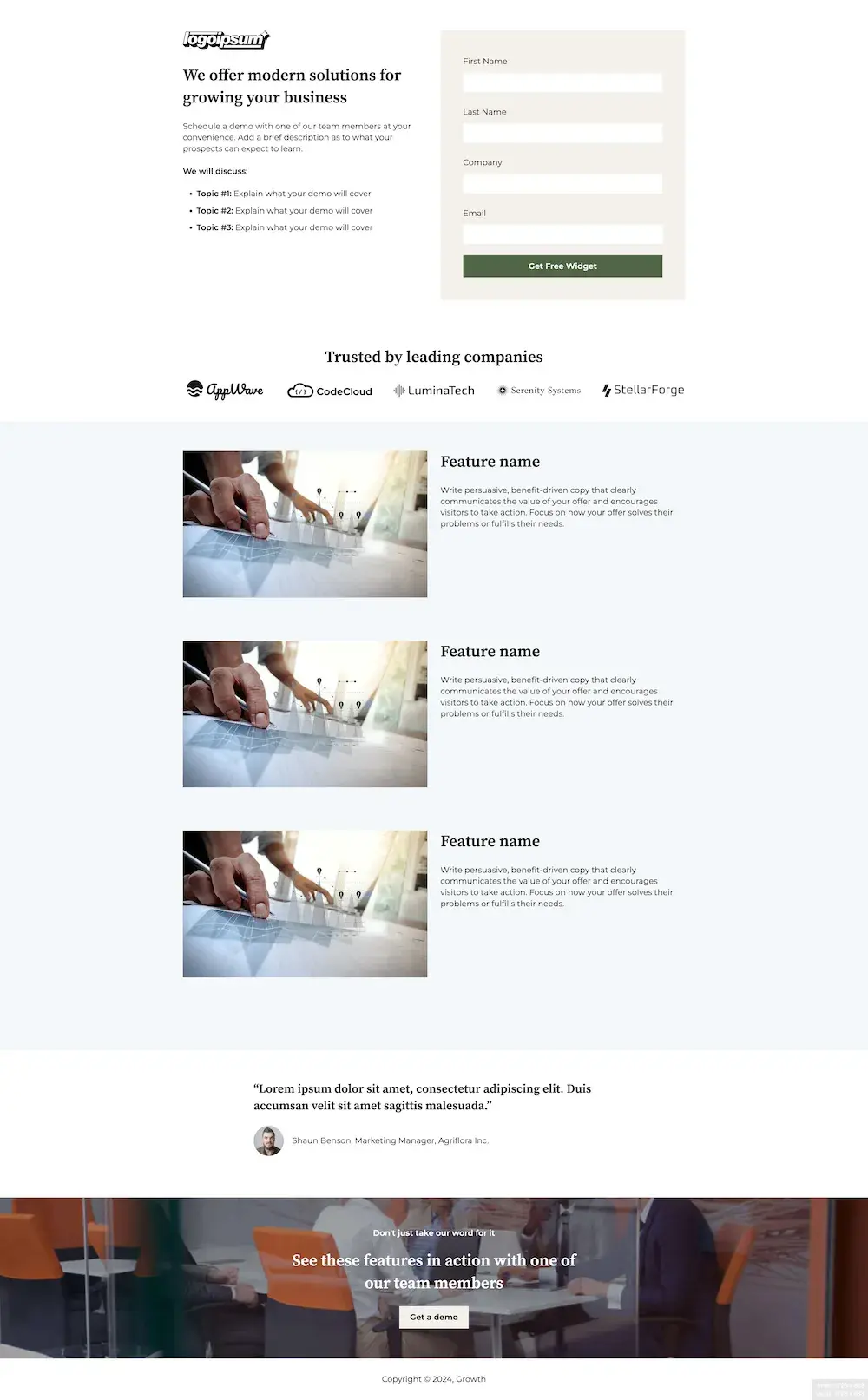
HubSpot’s Click Through landing page template offers a great way to capture blog subscribers. You can add your own hero image. Then, you can add any context visitors may need before downloading your offer. This template can also be edited with HubSpot’s drag-and-drop interface for a no-fuss experience.
Best for: Content marketers, educational platforms, online communities, newsletters
What I like: The hero section makes a great first impression. Plus, it’s easy to edit with HubSpot’s drag-and-drop tool.
11. EventGrids
At a Glance:
- Prices go up to $39
- Built with Bootstrap 5
- Multipurpose Design
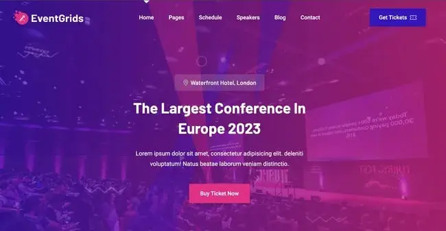
The EventGrids template boasts an eye-catching design that‘s hard to miss. With its vibrant colors and tastefully integrated animations, it’s sure to captivate your visitors and draw them into your content.
Purposefully crafted for event pages, the color palette is well-suited to the theme, enticing your audience to join in on the excitement. Simply incorporate your unique content, and you'll be on your way to generating ticket sales and bookings in no time.
Best for: Event planners, conference organizers, festivals, workshops
What I like: The colors and animations make it stand out. It feels lively and exciting, which helps drive engagement and increase ticket sales.
12. Consultant Landing Page
At a Glance
- Available with Wix
- Customizable
- CSS Animation on scroll
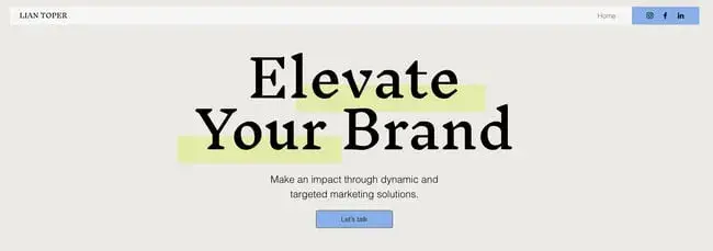
If you work in consulting, this landing page template makes promoting your services easy. All you need to do is fill out a chart that describes your services and share your store. I love how this template has a smooth scrolling animation, making your site feel extra professional.
Best for: Business consultants, financial advisors, legal services, coaches
What I like: The scrolling animations feel smooth. The layout is structured and easy to follow.
13. Boutique

At a Glance
- Free options are available
- Prices go up to $190
- Multiple variances available
- SEO optimized
The Boutique template is its neutral design. As an ecommerce business, you need a distinct brand identity. Boutique landing pages allow you to quickly showcase your products on the web without confusing your customers with designs outside your brand vision.
With seven color variances, over 70 icons, and SEO friendliness, the Boutique template is the perfect start.
Best for: Online retailers, fashion brands, handmade goods sellers, boutique stores
What I like: The neutral design fits any brand. The page feels premium and professional.
14. App Landing Page
At a Glance
- Available with Wix
- Buttons to download for iOS and Android
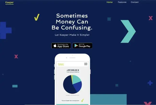
If you’re promoting an app, simple is better. You want to describe how your app benefits users, showcase images of the app interface, and include buttons so visitors can download your offer. This template from Wix has everything you need, so you can create your page quickly.
Best for: App developers, tech startups, mobile game creators, software companies
What I like: This page is simple and straight to the point. You can focus on the app’s benefits and feature direct download buttons for easy access.
15. Video
At a Glance
- Free with HubSpot
- Responsive design
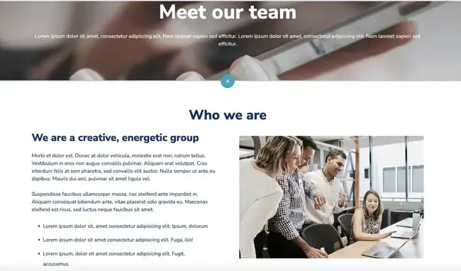
Video can be an effective way to capture customers. You can describe your offer in your own words and even show a video demo. If you want to showcase video on your page, this HubSpot template makes it easy. You can include your video, images, and a description of how users will benefit.
Best for: Content creators, online courses, product demos, webinars
What I like: This theme is great for showcasing videos. You can also explain your product engagingly.
HTML Landing Page Tools
Need some help with your landing page? Here are my favorite options that make building web pages a breeze.
- HubSpot — HubSpot offers a free landing page builder to help you create and test beautiful landing pages that look great on any device.
- Elementor — A WordPress plugin with 300+ templates, making it easy to create pages without coding. Starts at $49 per year for one site.
- Ucraft — Offers free landing page templates to help generate leads and collect visitor data.
- Leadpages — A WordPress plugin that allows you to build landing pages or upload custom HTML, giving you control over your design.
- Startup — A no-code website builder with pre-designed blocks based on Bootstrap to help you create responsive pages quickly.
Build Your Perfect HTML Landing Page
Converting visitors into valued customers starts with clear, clean, content-rich landing pages. It's smart to use HTML and CSS basics to design and deploy the best-fit page for your business and take full control over its functionality and visuals. AI is great, but AI is yet to give you the personalized experience you can get with your brain-to-finger prompts.
Editor's note: This post was originally published in February 2020 and has been updated for comprehensiveness.
Landing Page Design

