Web accessibility transforms websites from visual experiences into universal platforms. The difference between an accessible and inaccessible site determines whether users can complete tasks, access information, or engage with content regardless of their abilities.
So grab your free web accessibility checklist that breaks down the Web Content Accessibility Guidelines (WCAG) into actionable steps. I’ve tested these practices on multiple client sites and my own platforms, so I know what works in real-world scenarios.
Table of Contents
- Web Content Accessibility Guidelines (WCAG)
- Website Accessibility Checklist
- How I Made My Website Accessible
Web Content Accessiblity Guidelines
The Web Content Accessibility Guidelines (WCAG) are a set of guidelines for making web content more accessible to people with disabilities. Published by the Web Accessibility Initiative (WAI), WCAG is an international standard for web content accessibility.
HubSpot CMS Hub provides built-in accessibility tools that support WCAG compliance efforts. The platform includes alt text fields for images, keyboard navigation support, form field labels, and ARIA attributes that help businesses maintain accessibility standards across their sites.
Website Accessibility Checklist
- Provide alternatives for non-text content.
- Provide different options for viewing media content.
- Create content that can be viewed on different platforms.
- Make content easy to hear and see.
- Make all functions keyboard accessible.
- Allow users to adjust timing.
- Avoid content that blinks or flashes a lot.
- Provide tools to help navigate your website.
- Accommodate various input options.
- Ensure text content is grammatically correct.
- Design predictable website features.
- Offer assistance when users make mistakes.
- Write code that works.
Web accessibility can feel pretty daunting at first. Between WCAG guidelines, compliance levels, and technical requirements, there’s a lot to wrap your head around. But, accessibility matters.
, Logan Mallory, VP of revenue and marketing at Plooto, sums it up best: “It’s the difference between someone actually being able to use our site and product, not to mention it’s just the right thing to do.”
So, whether you’re just starting out or looking to improve your site’s accessibility, this checklist will help you tackle the essentials. And if you want to dive deeper? Download our free accessibility guide with detailed how-tos and examples.
Now, here’s what to do to make your website accessible.
.png)
Website Accessibility Checklist
This checklist will help you make the following more accessible on your website:
- Web Pages
- Navigation
- Video & Media
- And More!
Download Free
All fields are required.
1. Provide alternatives for non-text content.
WCAG Guideline 1.1: “Provide text alternatives for any non-text content so that it can be changed into other forms people need, such as large print, braille, speech, symbols, or simpler language.”
Alternative text (alt text) describes images and non-text content for screen reader users. Screen readers convert alt text into synthesized speech, allowing users to understand visual content through audio descriptions.
Alt text requirements apply to images, charts, infographics, CAPTCHAs, icons, ASCII art, emoticons, and linked images. Each element needs a text description that conveys its meaning and purpose.
HubSpot’s content management system includes alt text fields directly in the image upload interface. The platform prompts content creators to add alt text during the upload process, making it easy to maintain accessibility standards across all visual content.

Writing Effective Alt Text
Alt text describes images as if explaining them to someone over the phone. The description focuses on the image’s purpose and context rather than purely visual details.
Effective alt text includes these characteristics:
- Concise descriptions that convey essential information.
- Context-appropriate details based on the image’s purpose.
- Natural keyword integration without keyword stuffing.
- Exclusion of phrases like “image of” or “graphic of” that screen readers already announce.
Here’s What Needs Alt Text
These content types require alt text descriptions:
- Informational images that convey data or concepts.
- Charts and graphs displaying statistics.
- Infographics combining text and visuals.
- CAPTCHAS with audio alternatives.
- Icons that represent functions or ideas.
- Linked images describing the destination URL.
- ASCII art and decorative emoticons.
Pro Tips From Our Accessibility Experts
- Use empty alt text (alt=“”) for decorative images.
- Test your alt text with a screen reader.
- For complex images like charts, provide detailed descriptions in the surrounding text.
- Remember that good alt text helps with SEO, too.
Note: Linked images are a bit different. They need alt text that details their URL destination, not a description of the image.

For example, if this image of a house was linked to a homepage, it would need alt=“Home,” not descriptive alt text like alt=“a yellow house with a red roof and a large window.”
If you’re unsure of what alt text to write, consult this handy Alt Decision Tree, or Hubspot’s guide to image alt text.
2. Provide different options for viewing media content.
WCAG Guideline 1.2: “Provide alternatives for time-based media.”
Audio and video content requires alternative formats that make information accessible regardless of user abilities. Transcripts and captions transform time-based media into text formats that screen readers can process.
HubSpot Video supports caption uploads and automatic transcript generation. Developers implementing custom video players need to ensure proper caption support through WebVTT files and player controls.
Audio Content Requirements Checklist
Audio transcripts must include:
- Complete spoken content with accurate wording.
- Speaker identification when multiple people speak.
- Sound effects that contribute to meaning.
- Background sounds relevant to understanding.
- Timestamps for navigation.
Volume controls allow independent audio level adjustment. Playback controls must include pause, stop, and speed adjustment. Autoplay requires user controls to prevent unwanted audio.
Here’s a good example of a transcript from the Founders Unfound podcast:

Video Requirements Checklist
Synchronized closed captions match dialogue with precise timing. Open captions remain always visible, while closed captions toggle on or off.
Video Requirements Checklist
- Add synchronized closed captions that match the dialogue.
- Include both open captions (always visible) and closed captions (can be toggled).
- Create accurate transcripts with:
- Full dialogue.
- Speaker identification.
- Important visual information.
- Relevant sound effects.
- Provide audio descriptions for important visual content.
- Ensure media players have keyboard-accessible controls.
Audio descriptions narrate important visual content that dialogue doesn’t explain. Silent videos require descriptive narration.
HubSpot’s video content includes closed captions on tutorial and product demonstration videos. The platform accepts .SRT files containing dialogue and timing information.
Here’s an example of a closed caption video from HubSpot:
Best Practices for Media Players
Media player controls must be keyboard accessible. Clear labels identify all functions. Progress bars show playback position and enable timestamp navigation.
Caption customization lets users adjust text size, font, color, and background. Screen reader compatibility ensures assistive technologies announce player states and controls. When building custom players, implement proper ARIA labels and keyboard event handlers. Spacebar toggles play/pause, arrow keys control volume and seeking, and focus indicators must remain visible.
Pro tip: Captions and transcripts improve SEO by making content indexable by search engines.
3. Create content that can be viewed on different platforms.
WCAG Guideline 1.3: “Create content that can be presented in different ways (for example, simpler layout) without losing information or structure.”
Content structure determines how well information adapts across devices, screen sizes, and assistive technologies. Proper HTML markup creates logical relationships between page elements that screen readers can interpret correctly.
Platform builders use semantic HTML throughout template structures. WYSIWYG editors can generate proper HTML tags when content creators use formatting tools. Developers need to ensure custom components and modules maintain semantic structure even when adding interactive features or complex layouts.
Content Structure Checklist
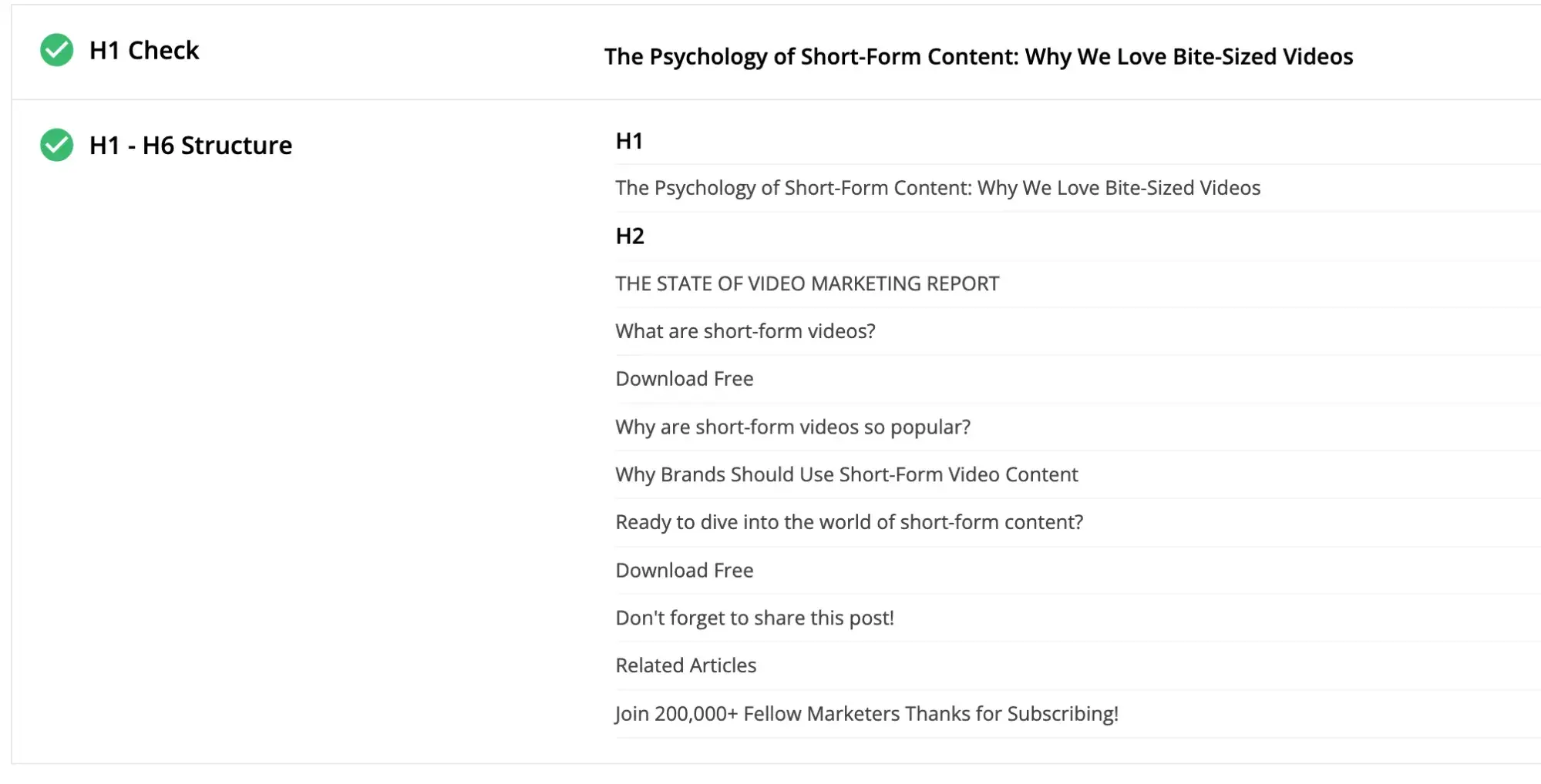
Heading hierarchy creates the organizational structure for page content:
- H1 tags contain the main page title (one per page).
- H2 tags mark primary section headings.
- H3 tags nest under related H2 sections.
- Subsequent heading levels follow numerical order without skipping.
Screen readers use heading structure to help users navigate content. Users can jump between headings to find relevant sections quickly, making heading hierarchy essential for content accessibility.
HubSpot’s blog post about short-form video demonstrates proper heading structure. The article uses a single heading 1 tag for the page title, H2 tags for main sections, and numbered H3 tags for sequential subsections.
Semantic HTML elements include:
- Proper list markup (ul, ol, li) for grouped items.
- Emphasis tags (strong, em) for important text.
- Table markup with thead, tbody, and th elements.
- Navigation tags (nav, header, footer, main) for page structure.
- Article and section tags for content organization.
List markup tells screen readers how many items exist in a group and which item is currently being read. Bulleted or numbered lists also help content appear in Google’s featured snippets, creating SEO benefits alongside accessibility improvements.
Text emphasis uses bold or italic formatting to highlight important information. Bold formatting provides stronger emphasis than italics and works better for accessibility purposes. Use strong and em tags rather than b and i for semantic meaning.
Content adaptation across platforms requires:
- Mobile-responsive layouts that reflow at different widths.
- Readable content at zoom levels up to 200%.
- Responsive tables that adapt to narrow screens.
- Proper spacing that is maintained at different sizes.
Pro tip: When building custom components, start with semantic HTML elements before adding JavaScript interactivity. The semantic foundation ensures baseline accessibility even if scripts fail to load.
4. Make content easy to hear and see.
WCAG Guideline 1.4: “Make it easier for users to see and hear content, including separating foreground from background.”
Visual and audio clarity determine whether users can perceive content effectively. Color contrast, text sizing, and audio controls make content accessible to users with vision or hearing differences.
Color and Contrast Checklist
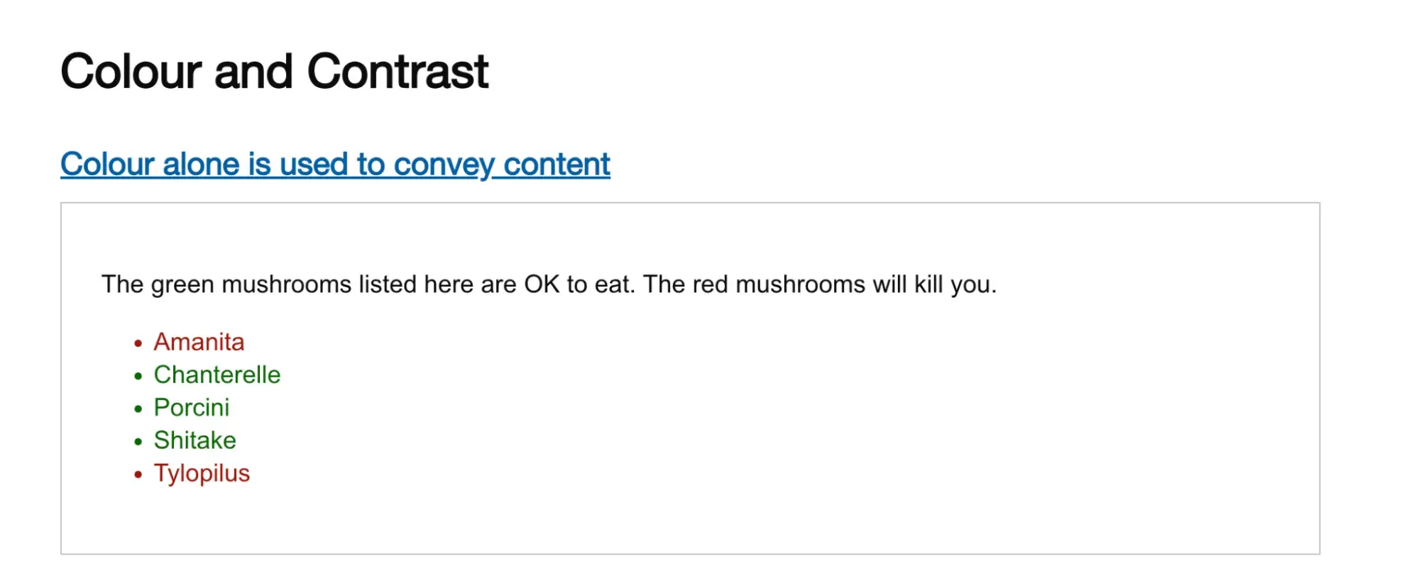
Color usage must include additional indicators beyond color alone:
- Pattern variations that distinguish elements.
- Icon symbols that reinforce meaning.
- Text labels that clarify color-coded information.
- Underlines on links for visibility.
The U.K. Government Digital Service created an intentionally inaccessible website showing how color-only indicators fail for colorblind users. The example demonstrates that relying solely on red and green creates confusion for people with deuteranopia.
Contrast ratios define the luminosity difference between text and backgrounds:
- Normal text requires a 4.5:1 contrast ratio.
- Large text (18pt or 14pt bold) requires a 3:1 contrast ratio.
- Link text needs 3:1 contrast with surrounding text.
- Interactive elements require 3:1 contrast for boundaries.
WebAIM’s Contrast Checker calculates contrast ratios and identifies WCAG conformance levels. The tool accepts color values in hex, RGB, or HSL formats and provides pass/fail results for different WCAG levels.
Developers should implement contrast checking during the design phase. CSS custom properties make it easier to maintain consistent, accessible color schemes across an entire site. I validate all color combinations before deployment to catch contrast issues early.
Links must display a non-color indicator on mouse hover and keyboard focus. Underlines provide the standard indicator that works for all users regardless of color perception abilities.
Audio Control Requirements
Audio content requires:
- Volume adjustment separate from system settings.
- Pause and stop functionality for all audio.
- Mute options that silence background sounds.
- Audio that doesn’t interfere with screen reader output.
Background audio that plays automatically must provide controls to pause, stop, or mute the sound within three seconds of page load.
Visual Adaptation
Text resizing maintains readability when users increase font sizes. Layouts must support text size increases up to 200% without breaking the page structure or cutting off content.
Browser zoom functionality must work up to 200% without loss of content or functionality. Content should reflow to fit the viewport at different zoom levels rather than requiring horizontal scrolling.
CSS media queries enable responsive text sizing. Use relative units (rem, em) rather than fixed pixels to ensure text scales properly when users adjust browser settings.
Chrome DevTools includes an “Emulate vision deficiencies” feature that simulates how content appears to users with different vision conditions. The tool helps identify contrast issues during development.
Pro tip: I use Chrome DevTools’ vision deficiency emulation regularly when reviewing client sites. Seeing content through different vision conditions builds empathy and reveals contrast issues that aren’t obvious at first glance.
Website Accessibility Checklist
This checklist will help you make the following more accessible on your website:
- Web Pages
- Navigation
- Video & Media
- And More!
Download Free
All fields are required.
5. Make all functions keyboard accessible.
WCAG Guideline 2.1: “Make all functionality available from a keyboard.”
Keyboard accessibility enables users who cannot operate a mouse to access all website functions. Motor control conditions, muscle spasms, and repetitive strain injuries prevent some users from using mouse-based navigation.
Platform templates often include keyboard navigation by default when using standard HTML elements. Developers building custom interactive components need to implement keyboard event handlers and ensure proper focus management.
Keyboard Navigation Checklist
Interactive elements must respond to keyboard input:
- Buttons activate with Enter or Space keys.
- Links activate with the Enter key.
- Forms submit with keyboard commands.
- Common actions include keyboard shortcuts.
Focus management determines how keyboard navigation flows through page content:
- Visible focus indicators show the current position.
- Logical tab order follows content hierarchy.
- Keyboard traps are eliminated.
- Skip links allow users to bypass repeated content.
Focus indicators appear as outlines or highlights around interactive elements. A dotted outline with a yellow highlight creates obvious visual feedback showing users where they are on the page. High contrast ensures focus indicators remain visible against any background color.
Tab order should follow the logical reading order of content. Left-to-right, top-to-bottom flow matches user expectations and makes navigation predictable. Use tabindex=“0” to include elements in natural tab order; avoid positive tabindex values that disrupt flow.
Skip links let keyboard users bypass repeated navigation menus and jump directly to the main content. Implement skip links using anchor links to the main content area: `<a href=“#main-content” class=“skip-link”>Skip to main content</a>`.
Custom interactive components need keyboard event listeners. JavaScript frameworks may require additional work to maintain keyboard accessibility when building single-page applications or dynamic interfaces.
Quick Test: Keyboard Navigation
Put the mouse away and test site navigation using only the keyboard:
1. Press Tab to move forward through interactive elements.
2. Press Shift+Tab to move backward.
3. Press Enter or Space to activate buttons and links.
4. Verify all functions work without mouse input.
5. Check that focus indicators are visible on all elements.
Pro tip: Screen reader testing reveals keyboard accessibility issues quickly. If a screen reader cannot access an element, keyboard users face the same barrier. I test with NVDA and VoiceOver during development.
6. Allow users to adjust timing.
WCAG Guideline 2.2: “Provide users enough time to read and use content.”
Time limits on interactive content create barriers for users who need extra time to read, process information, or complete tasks. Elderly users, people with motor impairments, and users with cognitive processing differences require flexible timing controls.
Examples of critical timing situations:
- Booking systems with reservation timers.
- Shopping carts with session timeouts.
- Forms with automatic submission.
- Login sessions.
- Interactive questionnaires.
- Handle timeouts appropriately:
- Save form data automatically.
- Warn users before the session expires.
- Provide clear extension options.
- Allow at least 20 seconds to extend.
- Maintain user data after re-authentication.
- Manage moving or auto-updating content:
- Allow users to pause carousels.
- Provide controls for auto-updating info.
- Make alert messages adjustable.
- Enable control of scrolling content.
Time Limits Checklist
Timing controls must include these options:
- Time limit extensions before expiration.
- Options to disable timers completely.
- Warnings before time expires.
- Save user input when sessions timeout.
- Recovery options after a timeout occurs.
Timeout warnings should appear with enough time for users to respond. WCAG requires at least 20 seconds for users to request an extension.
Form data should be saved automatically to prevent information loss when sessions expire. Implement session storage or local storage to preserve form values, allowing users to continue where they left off after re-authentication.
When building carousels or sliders, include pause buttons that stop automatic rotation. The prefers-reduced-motion media query can disable auto-rotation by default for users who have enabled motion reduction settings.
Exception: Security-related timeouts and essential real-time events represent exceptions to these requirements. Financial transactions and auction bidding may require fixed timing for legitimate security or business purposes.
7. Avoid content that blinks or flashes a lot.
WCAG Guideline 2.3: “Don’t design content in a way that is known to cause seizures or physical reactions.”
Flashing or quickly moving content triggers seizures, disorientation, or motion sickness in some users. Photosensitive epilepsy affects approximately 1 in 4,000 people, making flash safety essential for accessible design.
Motion Safety Checklist
Flashing content must follow these limits:
- No more than three flashes per second.
- Flashing areas smaller than 341 x 256 pixels.
- Flash frequency testing with timing tools.
- Warnings for any flashing content.
Moving content requires user controls:
- Pause buttons for all animations.
- Controls for video autoplay.
- Respect for users’ reduced motion preferences.
- Limited parallax scrolling effects.
Interactive animations should remain subtle:
- Hover animations under three seconds.
- Transitions that complete quickly.
- Alternative static views for motion-sensitive users.
- Options to disable motion effects completely.
The prefers-reduced-motion CSS media query detects user operating system settings for motion preferences. Implement alternative styles that remove or reduce animations:
@media (prefers-reduced-motion: reduce) {
* {
animation-duration: 0.01ms !important;
animation-iteration-count: 1 !important;
transition-duration: 0.01ms !important;
}
}
Pro tip: Many users enable “reduced motion” in their operating system accessibility settings. Respecting this preference creates better experiences for motion-sensitive users. I implement reduced motion alternatives for all animations during development. Learn more about motion sensitivity here.
8. Provide tools to help navigate your website.
WCAG Guideline 2.4: “Provide ways to help users navigate, find content, and determine where they are.”
Make it easy for visitors to find their way around web pages by implementing the navigation requirements below.
Page Titles and Structure Checklist
Create descriptive page titles:
- Write unique titles for each page.
- Include primary keywords.
- Keep titles clear and concise.
- Match titles with H1 headings.
A well-written title tag makes it clear to users and search engines what the page is about, can help the page rank higher in search, and assists visitors in finding it when there are multiple tabs open. You can check the title tag of your page by hovering your mouse over the browser tab.
You can check the title tag of your page by hovering your mouse over the browser tab. Usually, a page title will be the same as the first heading on the page.
Navigation Methods
Provide multiple ways to find content:
- Add site search functionality.
- Create a site map listing all pages.
- Include breadcrumb navigation.
- Use a consistent menu structure.
- Add skip navigation links.
For websites bigger than a few pages, it helps if users have different methods to reach their destination. Some people, such as those with visual impairments or cognitive disabilities, find it easier to use a search facility rather than a complex navigation menu.
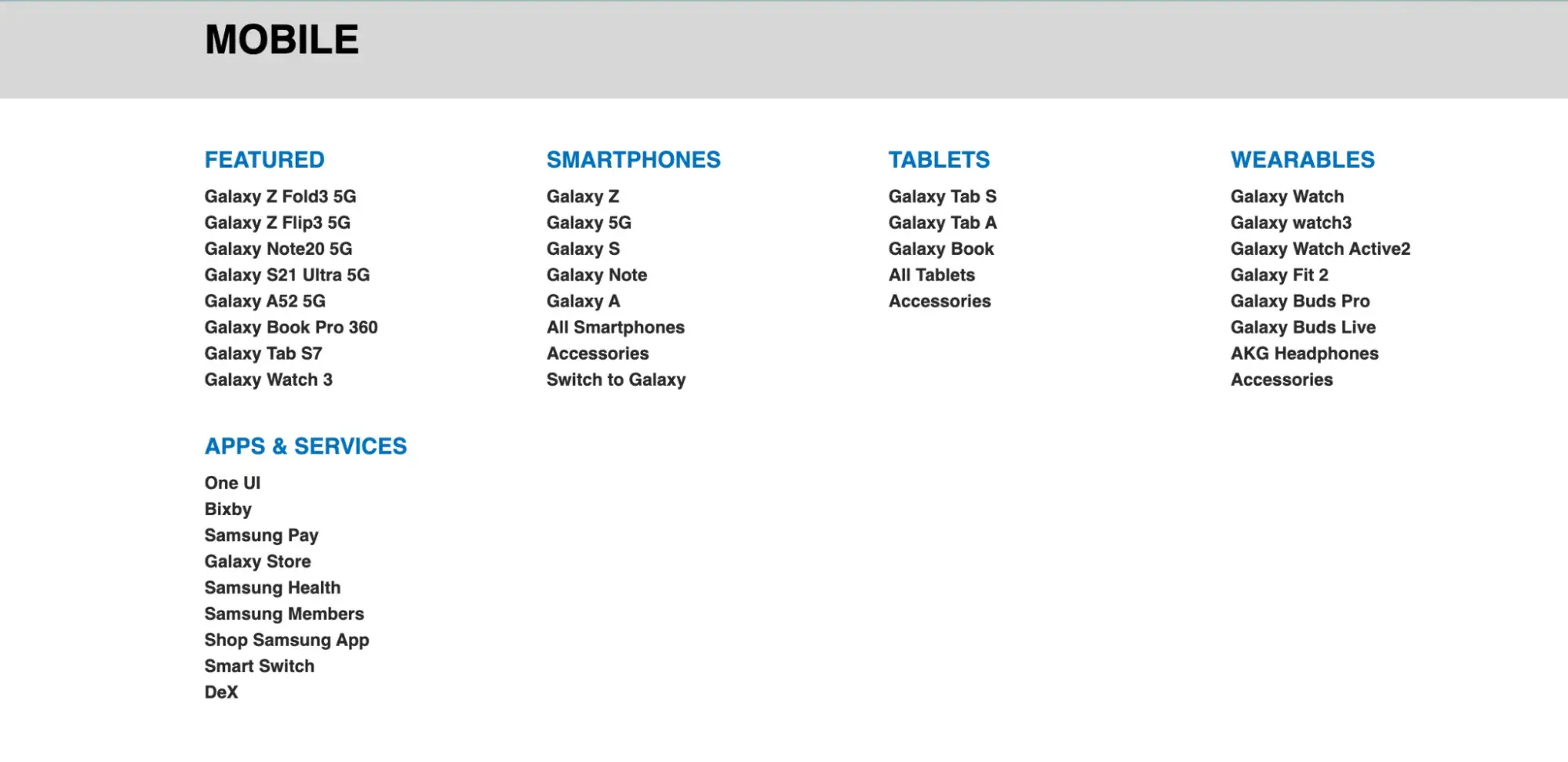
A site map lists all the website’s pages in one place, grouped by section. Using one makes it easy for users to find what they need fast.
Here’s an example from Samsung’s website:
Breadcrumb navigation is like a “You are here” sign, with links letting a visitor know where they’ve been and how to return home.
Link Text
Write descriptive links:
- Avoid generic text like “click here.”
- Make link purpose clear out of context.
- Add aria-labels for icon-only links.
- Use unique and meaningful descriptions.
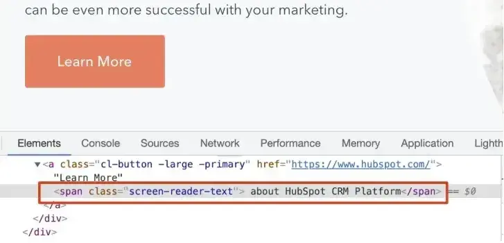
Former HubSpot tech lead Sang-Min Yoon provides this example: “Let’s say there is a button that just says ‘Learn More.’ This is not accessible because users don’t know what they are learning more about. So screen reader text is needed to let users know what they are learning more about.”
In the screenshot below, you can see the screen reader text “about HubSpot CRM Platform” is highlighted.
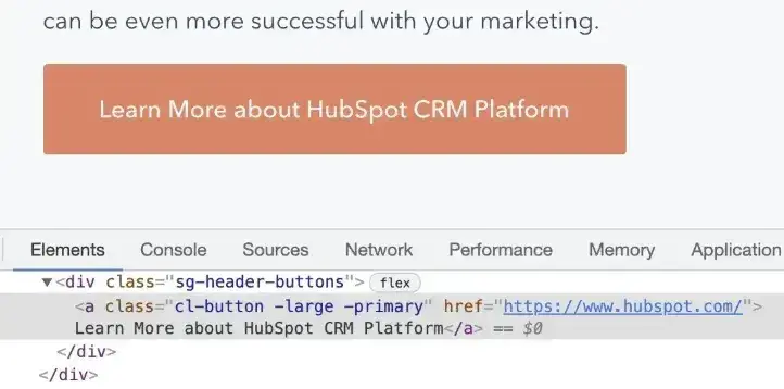
Another solution is to simply be more descriptive for the text provided for the link, Yoon said. In the screenshot below, the button text reads “Learn More about HubSpot’s CRM Platform” on the front end and in the source code:
Focus Indicators
Focus indicators usually show as an outline or a highlight on links, buttons, and form fields. In the example below, a dotted outline and a yellow highlight make up the focus indicator on the link. It’s an obvious way for the user to see where they are on the page.
Implement proper focus indicators:
- Make focus visible on all interactive elements.
- Ensure logical tab order.
- Maintain focus visibility.
- Add focus management for modals.
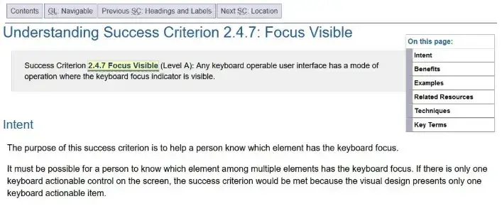
Focus indicators must have a high contrast level, like the one above. Otherwise, they aren’t helpful for sighted keyboard users.
Pro tip: Test your navigation with a keyboard only. If you can’t tell where you are on the page when using the tab key, you’ve found an accessibility issue that needs fixing.
9. Accommodate various input options.
WCAG Guideline 2.5: “Make it easier for users to operate functionality through various inputs beyond the keyboard.”
Users interact with websites through touchscreens, voice commands, specialized input devices, and other methods beyond keyboard and mouse. Accommodating different input methods ensures all users can complete tasks effectively.
Website Accessibility Checklist
This checklist will help you make the following more accessible on your website:
- Web Pages
- Navigation
- Video & Media
- And More!
Download Free
All fields are required.
Input Methods Checklist
Touch interactions require:
- Touch targets at least 44x44 pixels.
- Sufficient spacing between touchable elements (at least 8 pixels).
- Support for pinch zoom gestures.
- Multipoint gesture alternatives.
Small touch targets create frustration for users with motor control differences and anyone using mobile devices. Adequate spacing prevents accidental activation of adjacent controls.
CSS can enforce minimum touch target sizes:
button, a {
min-height: 44px;
min-width: 44px;
padding: 8px;
}
Alternative input support includes:
- Voice command compatibility.
- Gesture-based navigation.
- Pointer device alternatives.
- Assistive technology compatibility.
Motion input requires careful handling:
- Optional motion-activated features.
- Alternative methods for motion-based actions.
- Support for device orientation changes.
- Options to disable motion sensitivity.
Motion-activated features should include alternative activation methods for users who cannot or prefer not to use motion controls. Shaking to undo, tilting to scroll, or rotating to zoom need button-based alternatives.
Pro tip: I test sites with different input methods, including touch only, voice commands, different mobile devices, tablet interfaces, and stylus input. Each method reveals different usability issues.
10. Ensure text content is grammatically correct.
WCAG Guideline 3.1: “Make text content readable and understandable.”
Clear, readable content is essential for all users, especially those with cognitive disabilities or who use assistive technologies. Here’s how to make your content accessible.
Language Settings Checklist
Set proper language attributes:
- Define main page language.
- Mark language changes within content.
- Use correct language codes.
Michele Herzog, a former HubSpot developer on the Web Accessibility team, said, “The TLDR I always tell folks is that it tells the screen reader what language to read the page in. If those don't match, you might get a screen reader trying to read Spanish content as if it’s in English, and it’s very difficult to understand.”
If you use WordPress, you can define this in your Settings. The language will be applied to all your website’s pages.
Content Readability Checklist
Write in plain language:
- Use clear, simple sentences.
- Avoid complex jargon.
- Define technical terms.
- Explain abbreviations.
- Break up long paragraphs.
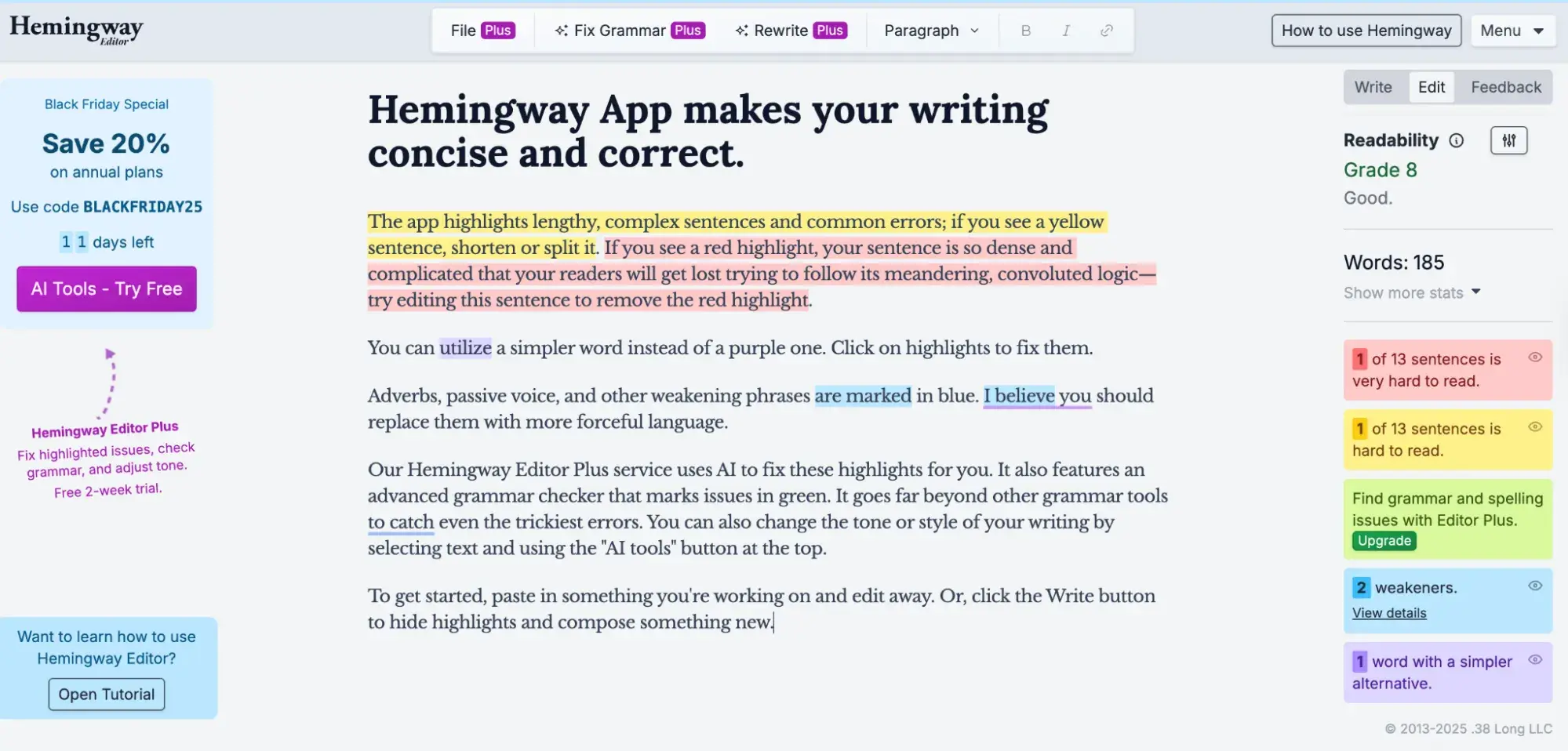
The Hemingway App can help with this. It warns you when your sentences are too complex or when you could use simpler words by highlighting the text in color.
If you need to use abbreviations or unusual words, they may not be universally understood, so define them for your readers’ benefit. You could:
- Include definitions in the text.
- Link to definitions in a glossary.
- Provide context clues.
- Use tooltips for technical terms.
Pro tip: Test your content‘s readability with tools like Hemingway Editor or Microsoft Word’s readability statistics to ensure it’s accessible to users with different reading levels.
11. Design predictable website features.
WCAG Guideline 3.2: “Make web pages appear and operate in predictable ways.”
Predictable behavior helps all users understand and navigate websites, especially users with cognitive disabilities or visual impairments. Consistency in navigation, layout, and interactive elements reduces cognitive load.
Navigation that changes order or position on every page confuses users. This effect intensifies for people with low vision, blindness, or cognitive processing differences who rely on predictable patterns to navigate.
Links that open in new windows or tabs without warning baffle users, particularly those with cognitive issues. These users cannot use the browser Back button to return to their previous location, disrupting their navigation flow.
Navigation and Layout Checklist
Consistent navigation requires:
- Menu order stays the same across pages.
- Header and footer layouts remain consistent.
- Important elements appear in predictable locations.
- Spacing and alignment are maintained across pages.
Navigation changes need proper handling:
- Warnings before new windows or tabs open (use target=“_blank” with aria-label=“opens in new tab”).
- Alerts about automatic page redirects.
- Clear navigation paths between pages.
- Functional browser Back button.
Interactive Elements Checklist
Predictable interface behavior includes:
- Consistent button behaviors across the site.
- Standard form layouts on all pages.
- Common interface patterns users recognize.
- Platform conventions that match user expectations.
ARIA roles standardize interactive component behavior. Herzog explains, “The main benefit of them is that common website features, like tabbers or toggles, have predefined keyboard interactions and roles you can use on your website to make your content — and how a user interacts with it — predictable and standardized.”
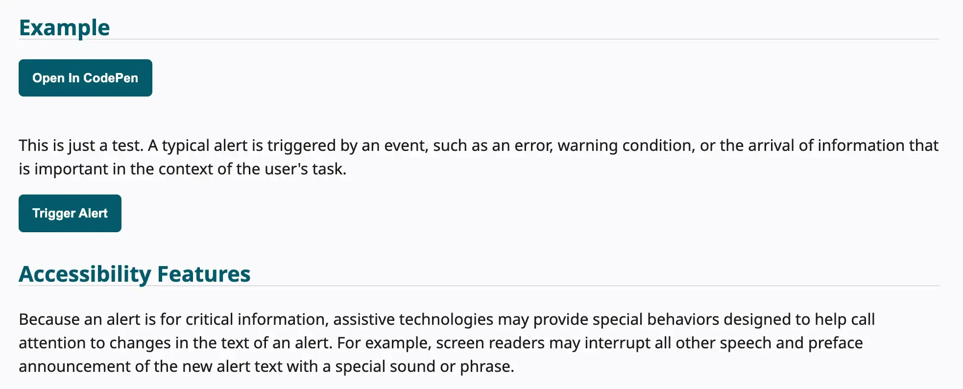
ARIA roles identify element types for assistive technologies. Common roles include:
- role=“navigation” for navigation landmarks.
- role=“main” for main content area.
- role=“complementary” for sidebars.
- role=“alert” for important messages.
- role=“dialog” for modal dialogs.
When building custom components, implement proper ARIA roles and states. Tabs need role=“tablist”, role=“tab”, and role=“tabpanel” with aria-selected attributes. Accordions use role=“region” with aria-expanded to communicate state.
12. Offer assistance when users make mistakes.
WCAG Guideline 3.3: “Help users avoid and correct mistakes.”
Most of us have to fill in forms on websites sometimes, and often we make mistakes. Tips on completing forms and descriptive error messages help prevent or correct mistakes.
Form Design Checklist
Provide clear form labels:
- Use descriptive labels above or beside fields.
- Mark required fields clearly with an asterisk and “required.”
- Group related fields with fieldsets.
- Include format examples where needed.
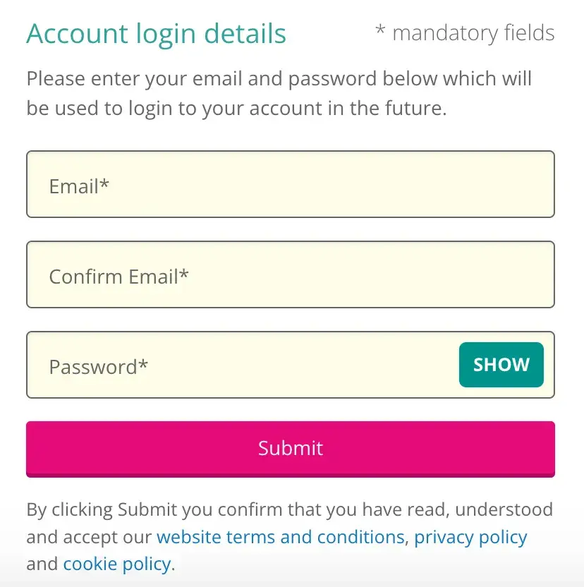
Avoid: Relying on placeholders instead of form labels. Placeholder text disappears when someone starts typing. Anyone with memory issues may forget what information they were supposed to complete, and may type in the wrong data or abandon the form completely.
Show requirements upfront:
- Display password criteria before submission.
- Indicate character limits.
- Show accepted file types.
- List required information.
Avoid: Withholding key information until after the form is submitted. An example is what characters to use when creating a password. If information is quite complex to fill in, people need to know the format first. Otherwise, they can get frustrated with having to repeat their input through no fault of their own.

Handle errors effectively by:
- Showing specific error messages.
- Explaining how to fix issues.
- Maintaining form data after errors.
- Allowing easy correction.
Avoid:
- Failing to mark required form fields as required. It‘s very frustrating for someone to complete a form and find it fails on submission because it wasn’t obvious which form fields were required and which were optional.
- Giving unhelpful error messages that don’t tell users how to fix their mistakes. “Email address is invalid” tells someone what the error is, but not what to do to correct it. “Your email address is missing the @ symbol” is better, as it gives specific feedback on how to fix the error.
Pro tip: Test your forms with keyboard navigation and screen readers to ensure all users can complete them successfully.
13. Write code that works.
WCAG Guideline 4.1: “Maximize compatibility with current and future user agents, including assistive technologies.”
Technical code quality determines whether assistive technologies can interpret and present web content correctly. Valid, semantic HTML creates the foundation for accessibility.
Code Quality Checklist
Code validation ensures:
- Valid, properly formatted markup.
- Screen reader recognition of all controls.
- Browser compatibility across platforms.
- Proper error handling.
Browsers compensate for HTML errors automatically, but screen readers may fail to recognize improperly coded controls. Validation catches these errors before they affect users.
The W3C Markup Validation Service checks HTML validity. I run validation checks during development to catch issues early. Build tools can automate validation as part of the deployment process.
Semantic HTML elements include:
- Appropriate HTML tags for content types (button vs. div with click handler).
- Logical content structure with landmarks.
- Elements used for intended purposes.
- Standard semantic markup.
Software developer David Ding emphasizes, “Often developers can over-engineer components, which then need a lot of manual intervention to make them accessible, when using boring, standard HTML buttons or input elements would have done the trick and supplied most of the accessibility out of the box.”
Semantic HTML describes element purpose rather than just appearance. Using heading tags for actual headings rather than styling divs to look like headings maintains semantic meaning that assistive technologies can interpret.
Use button elements for interactive controls, not divs with click handlers. Buttons provide keyboard interaction, focus management, and semantic meaning automatically.
Accessible custom controls require:
- Screen reader testing during development.
- Keyboard functionality for all interactions.
- Proper ARIA labels and roles.
- Standard behavior patterns users expect.
Poorly coded accordions may be unusable for screen reader users. Testing with assistive technologies during development catches these issues before launch.
Custom components need proper ARIA attributes:
<button aria-expanded=“false” aria-controls=“panel-1”>
Toggle Panel
</button>
<div id=“panel-1” role=“region” hidden>
Panel content
</div>
Status messages notify users of changes:
- Form submission results (success or error).
- Shopping cart item additions.
- Content updates and changes.
- Action feedback and confirmations.
Shopping cart additions need visible confirmation that items were added successfully. Screen reader users need announcement of these confirmations through proper ARIA live regions:
<div role=“status” aria-live=“polite” aria-atomic=“true”>
Item added to cart
</div>
Use aria-live=“polite” for non-critical updates and aria-live=“assertive” for urgent messages that require immediate attention.
Website Accessibility Checklist
This checklist will help you make the following more accessible on your website:
- Web Pages
- Navigation
- Video & Media
- And More!
Download Free
All fields are required.
How I Made My Website Accessible
The A11Y project offers a nice checklist for checking your WCAG compliance. Although I prioritize accessibility daily as a software developer, I never blindly assume that I have implemented all best practices. I validate my code using testing tools and the compliance checklist above. I recently redid my personal brand site. I tested it on the website and found some valuable areas of improvement that I missed.
I’ll walk you through my process so you can see the checklist live in action. (Note: this is a condensed version of the checklist — check out the A11Y website for more detailed instructions. Some specific checks, like audio and video, weren’t applicable to my website, which is text-only.)
Content
Content accessibility starts with clear, simple language. I reviewed all website copy for plain language, eliminating jargon and complicated metaphors that might confuse users with cognitive disabilities. Button and link elements needed descriptive text that explained their purpose clearly.
Pro tip: HubSpot’s Content Hub includes helpful resources for evaluating website content accessibility.
Testing It Out
As a professional writer and software developer, I hope that I’ve gotten this covered on my own website — but it’s always good to give it a closer look from another perspective. Testing revealed areas for improvement I had initially missed.
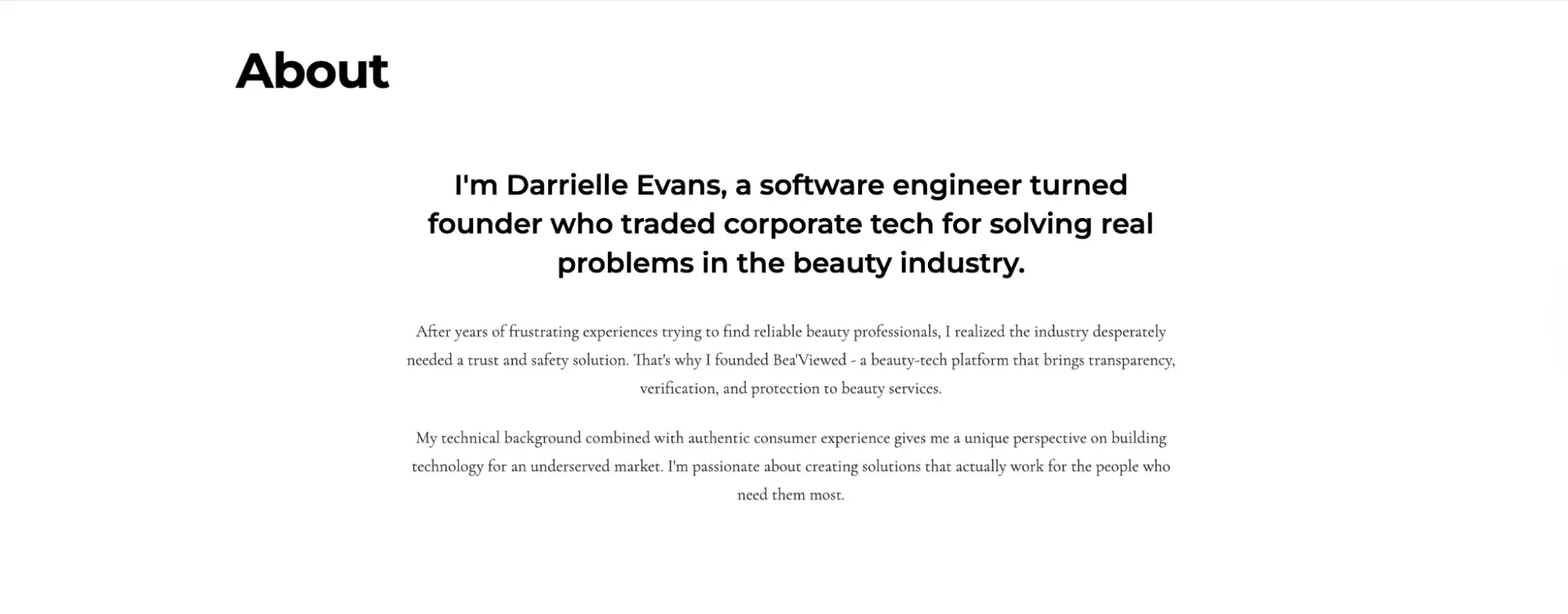
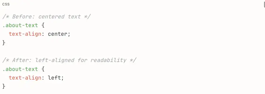
For example, text alignment affected readability in ways I hadn’t thought about. I originally centered the About section text for visual appeal, thinking it created a polished, magazine-style look. However, A11Y Project documentation explained that center-aligned or justified text creates reading difficulties for many users, particularly those with dyslexia or other cognitive processing differences.
Before:
I had to make a simple change to my CSS to add this improvement:
After:
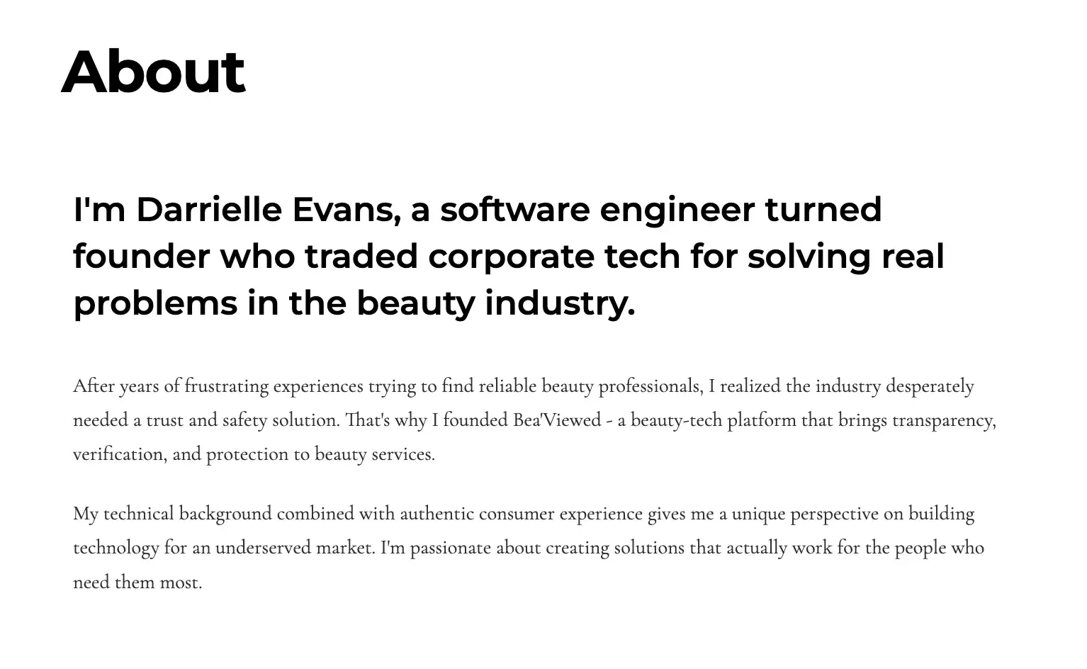
The change seemed minor but made a noticeable difference. Left-aligned text creates consistent starting positions for each line, helping users track their position while reading. This adjustment improved readability across the site without sacrificing the professional aesthetic I wanted.
Global Code
Global code affects the entire website rather than individual components. My Next.js site needed several code-level improvements:
- HTML validation to catch markup errors.
- Lang attribute on the HTML element.
- Unique meta titles for each page.
- Enabled viewport zoom through proper meta tags.
Testing It Out
As a software engineer, I felt confident about my HTML structure. However, systematic testing revealed areas I had overlooked.
I ran the site through the W3C Markup Validation Service and found several issues that browsers rendered correctly but could cause problems for assistive technologies.
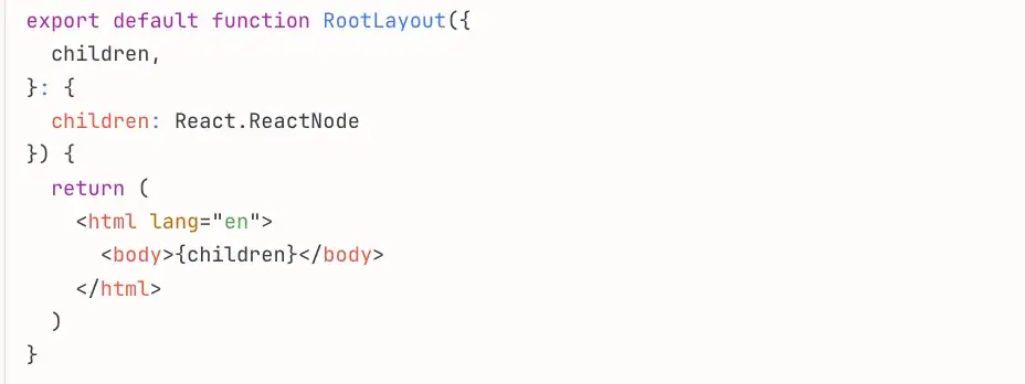
The lang attribute tells screen readers which language pronunciation rules to use. In Next.js, this lives in the root layout:
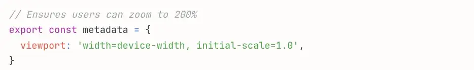
The viewport meta tag needed verification to ensure zoom wasn’t disabled. Next.js handles this through metadata configuration, but I confirmed it allowed user scaling:
Page titles needed to be descriptive and unique for each section. Since my site is a single-page application, I ensured the main title clearly described the content: “Darrielle Evans - Software Engineer & Beauty-Tech Founder.”
Keyboard
Keyboard navigation allows users who cannot use a mouse to operate websites. Some users have motor control limitations, while others use assistive technologies that don’t work with cursor-based navigation.
All website functionality must be operable through keyboard alone. This includes navigation menus, interactive components, buttons, and links.
Testing It Out
I tested keyboard navigation by disconnecting my mouse and using only Tab, Shift+Tab, Enter, and arrow keys to navigate. This revealed areas where my interactive components needed improvement.
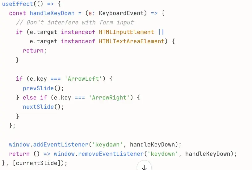
The carousel needed arrow key support beyond the button controls, so I added keyboard event handling:
Testing confirmed all navigation buttons, carousel controls, and interactive elements were reachable and operable with the keyboard alone.
Images
Image accessibility requires descriptive alt text for all meaningful images. Decorative images that don’t convey information need empty alt text to signal screen readers to skip them.
Testing It Out
My portfolio site uses Next.js Image components for optimization and accessibility. I knew to include a descriptive alt text beyond my name for the hero image of myself.
Alt text I used: “Professional portrait of Darrielle Evans, software engineer and beauty-tech founder.”
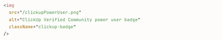
I am a Clickup Power User and missed adding alt text to my badge displayed on the website.
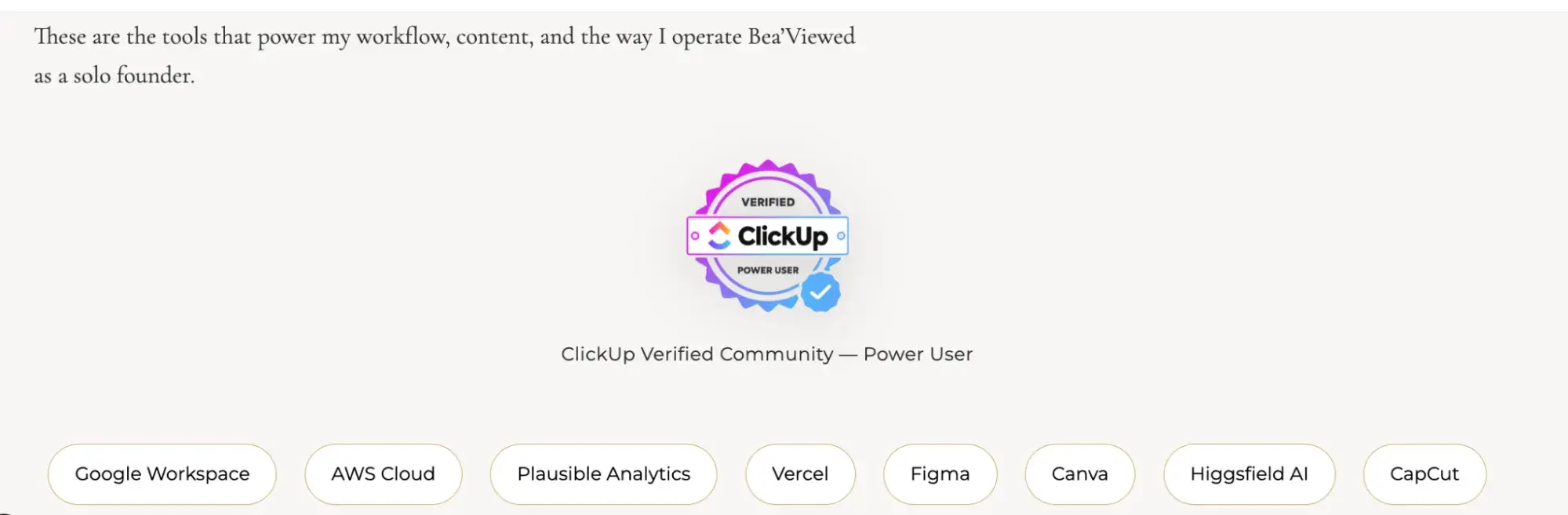
I added the following:
Descriptive alt text benefits both accessibility and SEO — search engines index image alt text, improving discoverability while making content accessible to screen reader users.
Headings
The headings on your site break up the content of the page into related “chunks” of information: H1, H2, H3, etc. These are an important component for anyone who uses assistive technology to understand the meaning of a website page.
Here are some steps to follow:
- Use heading elements to introduce content.
- Use only one H1 per page.
- Heading elements should follow a logical order.
Testing It Out
My site’s heading structure was already strong — a single H1 in the hero section with H2 tags for each major section.
But here is how you can validate your heading structure.
Best Practice for Testing Your Headings
- Install WAVE Extension (Chrome/Firefox): Visualizes heading structure instantly.
- Use VoiceOver Rotor (Mac): Control+Option+U, select “Headings.”
- Use NVDA (Windows): Insert+F7 to view Elements List > Headings.
- Check for:
- Single H1 per page.
- No skipped levels (H2 → H4 without H3).
- Logical reading order.
- Descriptive heading text.
For more inspiration, check out these 14 examples of accessible websites that get it right.
Make your site accessible.
Following Web Content Accessibility Guidelines takes effort, but the impact makes it worthwhile. After systematically improving my own site, I’ve made accessibility a non-negotiable part of every project I work on.
Making your website accessible delivers tangible benefits:
- Reach more users. Accessible sites work for people with disabilities, keyboard-only users, screen reader users, and anyone with slow Internet or older devices. That’s 15%+ more potential visitors who can actually use your content.
- Improve usability for everyone. Clear navigation, descriptive labels, and logical structure help all users — not just those using assistive technologies. What helps a screen reader user also helps someone multitasking or scanning quickly.
- Boost SEO performance. Semantic HTML, descriptive alt text, and proper heading structure help search engines understand your content. Accessibility and SEO share the same foundation: clear, well-structured information.
- Reduce legal risk. Web accessibility lawsuits have increased significantly. Building accessible sites from the start protects you from potential liability.
The techniques I’ve covered — semantic HTML, keyboard navigation, ARIA labels, proper contrast, responsive design — aren’t just checkboxes. They’re fundamental building blocks of quality web development that make your work better for everyone.
Editor's note: This post was originally published in March 2020 and has been updated for comprehensiveness.
Website Accessibility Checklist
This checklist will help you make the following more accessible on your website:
- Web Pages
- Navigation
- Video & Media
- And More!
Download Free
All fields are required.
Web Accessibility