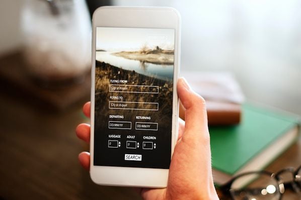


It's official: In certain parts of the world, there are now more Google search queries on smartphones than on desktop computers and tablets.
This week, Google's Jerry Dischler wrote in a post on the official AdWords blog that "more Google searches take place on mobile devices than on computers in 10 countries, including the U.S. and Japan." Google declined to name the other eight countries. We also know that their definition of "mobile devices"doesn't include tablets -- instead, Google groups tablets with desktops. It's also worth noting that mobile queries include mobile browser-based searches in addition to those coming from Google's mobile search apps.
How recently did this change take place? Google didn't say -- although we've been expecting this for a while now. In March 2014, Matt Cutts said he "wouldn't be surprised" if mobile search exceeded desktop queries within the year.
This major turning point comes just weeks after Google's major algorithm update, which expanded Google's use of mobile-friendliness as a ranking signal. The update rewards mobile-friendly websites and penalizes those that aren't fully optimized for mobile in mobile search results.
Now that mobile search queries have surpassed desktop queries, the business implication of the mobile algorithm update has become that much clearer: If you're still thinking of mobile as a secondary priority, your business' online presence will start to suffer. As Dischler says, "The future of mobile is now."
To marketers like us, these changes may seem scary. But Dischler reminds us that they present a "tremendous opportunity" to reach our audience through all the new touchpoints of a consumer's path to purchase. It's our job to make sure our mobile search strategies are reaching people in these different search contexts.
Have some ground to make up? We're here to help. Below are the main things you need to think about when optimizing your website for mobile visitors.
HubSpot Customers: If your website, landing pages, and blog are on the Content Hub then your site is ready from a technical point of view. HubSpot's Content Hub uses responsive design to adapt to any mobile device and fully passes the sniff test on Google's new algorithm. But we'd still recommend checking out the last two tips below for some extra optimization tips.
4 Things to Think About When Optimizing Your Website for Mobile
1) Implementing responsive design.
Google recognizes three different configurations as mobile-friendly: responsive design, dynamic serving, and a separate mobile website. It's that first one, though -- responsive design -- that Google recommends as the #1 design pattern. Here are some of the benfits of responsive design:
- A Single URL. Responsive design lets you serve the same content to users from a single URL regardless of device. This means Google only has to crawl one version of your website, making it easier for them to find and rank your content. You'll also avoid giving users the disruptive experience of accidentally clicking on the mobile link (possibly shared through social or email) while on a desktop computer.
- Less maintenance and overhead. Instead of maintaining two websites, you can keep one set of resources.
- Reduces load time. Load time matters, especially on mobile. Because responsive design uses a single URL for all your pages on any device, you do not have to implement a redirect for any page elements or create a mobile-specific view, which helps speed up the experience for the visitor. (Click here to learn more from Google about speed and load times.)
Plus, if you're using responsive design, you can ignore the next tip -- it's taken care of when your site is already responsive.
2) If you aren't using responsive design, setting a mobile viewport.
Have you ever visited a website on your mobile phone where the content loads wider than the screen, requiring you to scroll back and forth and zoom in and in to read text? It doesn't make for a very good user experience.
That's exactly how you tell whether the mobile viewport is set on a website. Check your company's website on your smartphone. If you find yourself needing to double-tap or pinch-to-zoom in order to see and interact with the content, then your mobile viewport is not set. Setting a mobile viewport allows the page to reflect content to match different screen sizes. Learn more about configuring viewports here.

Image Credit: Google Developers
3) Making sure you don't block the crawling of any page assets, especially if you have a separate mobile site.
In order to get found in search, it's super important that Google's spiders can crawl your JavaScript, CSS, and image files. Make sure you're not accidentally blocking any page assets (CSS, JavaScript, and images) for using robots.txt or any other methods -- otherwise Google's algorithms won't be able to index your content.
To test how Google "sees" your content, enter your site's URL into Google's "Fetch as Google" tool. It'll tell you whether you having any indexing issues on your site. If you use separate URLs for your mobile and desktop pages, don't forget to test both of those URLs. (Keep in mind, though, that Google's new mobile algorithm recognizes the benefits of using a single URL for indexing and sharing content across devices.)
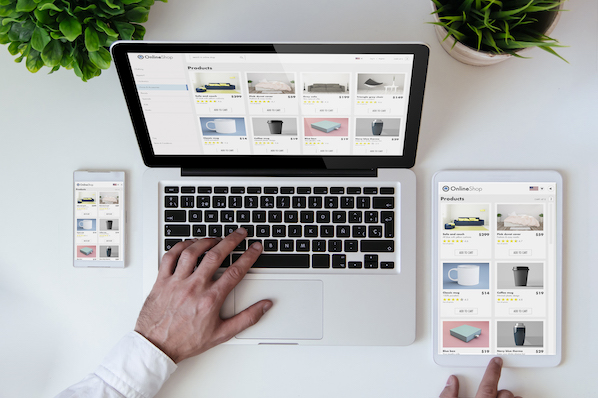
4) Making your text, images, and overall design work for mobile.
As the number of people searching the web on mobile increases, so will the number of people browsing your website on mobile. If the design of your website doesn't work well on a smartphone or tablet, they might give up and leave your page.
Here are a few tips to ensure your designs are legible and easy to interact with on mobile devices, tablets, and desktop:
Enlarge your fonts.
Small fonts mean some of your website visitors will have to pinch-to-zoom to read and interact with the content on your site. (Chances are, a lot of them won't bother, and they'll leave your page.) Larger fonts allow visitors for a much better experience, no matter which device they're using. Here are the font sizes we recommend:
- Headlines: 22 px minimum
- Body copy: 14 px minimum
(Note: iOS automatically resizes fonts under 13 px, making them larger on your behalf.)
Make calls-to-action touch-friendly.
In my experience, there's nothing more frustrating than having to zoom in and fiddle around to click a call-to-action (CTA) on my smartphone. This includes buttons on your homepage, CTAs on blog posts, social sharing icons, and so on.
If you're using a button, make it a minimum size of 44 px by 44 px so it's big enough for people to press with their finger. We also recommend putting CTAs front-and-center so they're easy to see and reach. Finally, consider spacing around your CTA when you design your web pages so that people can easily touch it without accidentally clicking on something they didn't mean to.
Use high-quality images that have a compressed file size.
Large file sizes take far longer to load on mobile than desktop because of the phone's technical parts and internet connection. To optimize images, marketers should use high-quality photos that have a compressed file size. Try to keep images under 1 MB when possible, and if they are larger, try to resize the image so the file size can be as small as possible.
How do you reduce the file size of your images? HubSpot customers don't need to worry about it -- images uploaded to HubSpot's software are automatically compressed. Otherwise, tools like TinyPNG will help you reduce file size.
Depending on your connection (3G, LTE, Wifi), websites can load at much different speeds -- and this can affect a users experience. It can really pay off to couple small image file size with other speed enhancements like CDN, minimizing the amount of video on mobile-specific pages, and so on.
Use alt text on images.
Like on tablets and desktops, there are mobile apps out there that block images by default. Google and other search engines also sometimes have trouble "seeing" images. Help your website visitors have a better experience on your website by using alt text (short for "alternative text"), which often renders in place of images when those images are turned off -- it gives those readers with blocked images some context.
Alt text is just a text field describing an image in a way people and computers can read. For example, for an image of HubSpot's Facebook Page, you might choose the alt text hubspot facebook page.
To add alt text to an image, all you have to do is add an attribute to the image tag, usually by clicking into your CMS' image editor. (HubSpot customers: To add alt text, click "Edit image..." and enter your description into the "Alt Text (description)" field.)
Make videos mobile-friendly.
There are license-constrained media out there like Flash that aren't supported on mobile devices. If you've ever been unable to watch a video or piece of content that isn't playable on your smartphone, you already know how frustrating and poor of an experience it can be.
To give a good experience to mobile users, use HTML5 for all of your videos and animations instead of media players like Flash. You might also consider including a summary of the video, notes, or even a whole transcript -- it doesn't hurt for SEO, either.
Balance text and imagery.
Keep your mobile visitors top-of-mind when designing the overall look of your website by using a proper balance of live text and imagery. Like with the CTAs, consider the spacing around your text boxes and images to make sure your webpage is legible and easy to interact with, regardless of which device your visitors are using to access your page.
Want to learn more about optimizing your website for mobile? Read this blog post.
Mobile Optimization


![10 Best Mobile Friendliness Tests [+ What Does it Mean to be Mobile Friendly?]](https://53.fs1.hubspotusercontent-na1.net/hubfs/53/mobile-friendliness-test.jpg)