When you're knee-deep into the design of your website, it's hard to admit this fact: Some of the pages on your website are more important than others.
Okay, many of you probably find that fairly obvious — but I'm surprised how rarely content managers and web designers actually apply this knowledge to their websites to improve conversions.
I’m all about low-hanging fruit and taking on the easiest tasks that will have the biggest results. What I’m about to describe in this article has the potential to improve your site dramatically with just a few, critical changes.
Free Resource: Website Optimization Checklist [Download Now]
In this post, I'll explain how to optimize each one of these pages. And if your most-visited pages are different from the ones listed above, you'll still learn a framework for optimizing any of the important pages on your website.
What is website optimization?
You've probably heard the word “optimize” most commonly used in phrases like “search engine optimization” (SEO) and “conversion rate optimization” (CRO). I’m actually referring to something broader here, but the advice that I’m delivering will help to enhance both of those.
The optimization I’m going to explain will create user optimized pages. In the pursuit of SEO and CRO, it’s easy to overlook the broader, big-picture idea. First and foremost, a site must be optimized for the user. The best place to see big results quickly is to start optimizing the most visited pages of your site.
Most Important Web Pages to Optimize for Conversions
- Home Page
- About Page
- Blog
- Contact Us Page
Let's get right into it. Every website is different, but generally speaking, here are the four most important (and often most-visited) pages on a website:
Home Page
The home page is the first impression of your business to potential customers. And although your time limit on making an amazing impression is several times longer online than it is in real life (62 seconds on average is spent by people viewing a website) you’ll want to make every second count.
It’s tempting to put every remotely relevant fact about the business on the home page, but resist the urge. Remember, your home page is the first step of the journey — not the final destination. The copy, design, and visuals should guide the visitor to their next step, or the call-to-action.
About Page
Customers, investors, candidates for hire, and even competitors might all use your about page to learn more information about your company. An about page typically includes a brief company history, mission or vision statement, executive leadership bios, and a few impactful client testimonials.
Blog Page
It’s no secret that blogging is a tried-and-true method to optimize a website for keywords related to a business. Rather than loading up several product pages for each individual keyword you want to rank for, a blog can serve as a more efficient way to weave storytelling, product mentions, and sign up links together in order to answer potential customer inquiries, solve problems, and pose your product or service as the preferred solution.
Contact Us Page
For many small businesses and freelancers, the contact us page serves as the lead-driver of a website. This is usually their bread-and-butter and how these businesses make money. Whether your business includes a contact form, a calendar scheduler, an appointment booking app, a phone number, or an email address, this is where future customers make the decision to get a hold of a representative of the business to learn more about the products and services.
How to Optimize A Web Page
The broad framework for optimizing your site for conversions is the same across your home page, About page, blog, and Contact Us page. There are two simple goals for every page, and the specifics of optimizing those pages will flow from these goals.
The first goal is all about the user, and the second is all about you. Here we go:
Provide information the user is looking for.
Remember, we’re focusing on the user. Why are they on the page to begin with? To answer this question effectively, let’s dive deeper into some facts we’ll want to know first:
- Where did they come from? The idea here is to understand how the user got to your site, so you can deliver relevant content.
- Did they come from a search engine? (If so, what did they search to find you?)
- An email? (What kind of email? Who sent it?)
- A referral on another website? (What site was it? How long has it been referring to your URL?)
- What do they need to know? A single page can deliver a limited amount of information, so you need to determine what that information is going to be. You want them to know something so that they will do something (which is addressed in the next question). Remember: Less is more on a web page. The more information you load up on your main pages, the less likely the user is to remember any of it. Give them less, and they're more likely to remember — and do — what you want them to.
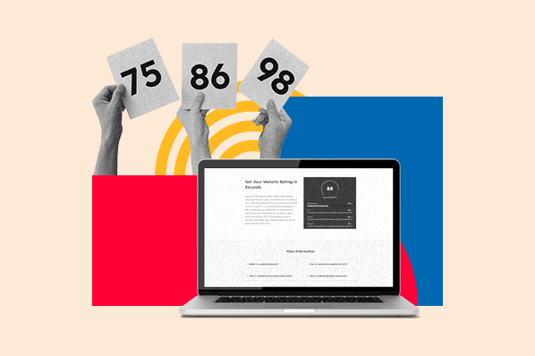
Pro Tip: Use visuals such as explainer videos, diagrams, hero shots, and so on to help condense a lot of information to a single page. To get the most out of your visuals, make sure you correctly optimize your images and videos.
Once you answer the question of what the user's looking for, you're halfway there. That brings us to question two.
Identify a goal for the user once they find the information.
Now, you need to ask the user to do something. This is where most pages fall short. One of the critical components of a web page is its call-to-action (CTA), and many website owners don't realize that every single page of a website should contain at least one CTA.
The point of a home page or product page isn’t for the user to visit and leave. The point of content marketing isn’t for user intake, but rather, for user marketing. If you retain only one thing from this article, let it be that every web page needs a CTA.
Why am I so insistent on this? Because every bit of knowledge you share on your website demands some response. So, what is it that you want the user to do? Visit another page on your site? Watch a video? Complete a form? Sign up for a free trial? Any or all of these can become your goal for the user, just make sure to give them one or two options per page that are clearly and starkly defined.
Web Page Optimization Examples
Example of an Optimized Website Home Page
HubSpot's home page is well laid out and hosts a clear CTA, front and center. A user is on the HubSpot home page for a reason, and perhaps that reason is to grow their business. The headline speaks to the question “what am I looking for?” and the CTA buttons tell me, the user, what I’m supposed to do next.

Now, let's see what HubSpot has going on on the About page.
Example of an Optimized Website About Page
A user might click on the About page for a variety of reasons. A few might be:
- They want to figure out what exactly the business does.
- They want to work for the business.
- They want to make sure the business is legitimate.
- They want to see if the business serves a specific niche or location.
- They want to analyze the business’s success.
I could go on and on. There are a ton of reasons that could bring a user here, but they all boil down to the desire for information. Let’s see what HubSpot does. Here is the company’s About page:
-1.gif?width=650&name=The%204%20Most%20Important%20Pages%20on%20Your%20Website%20(%26%20How%20to%20Optimize%20Them)-1.gif)
The user likely wants to know the information about the company, and in response, they can scroll the page to learn more about the mission, history, and products.
Along the way, the user will want more detailed information which means the CTAs will need to become more specific to help guide them to that info. The more granular and detailed the information, the more correspondingly detailed the CTA becomes. Halfway down the page, I see a video about the HubSpot story featuring CEO Brian Halligan.
There’s more. There’s a block of content about each HubSpot product including the CRM, each Hub, and integrations. I can click any of these to learn more about the ones that can help grow my business.

Finally, no matter how far I scroll down the page, the sticky header menu includes an orange CTA for me to Get HubSpot for free.

This is an example of an About page optimized to drive engagement, increase conversions, and enhance the brand. The page is as much about the user as it is about the company itself because along the way, the user is receiving value.
Example of an Optimized Website Blog Page
Even though the HubSpot blog is one of the most popular digital publications, there are still some practical applications you can use to optimize your own blog page if you have a smaller following. Although there are several articles a visitor can choose from across a variety of topics, you’ll notice specific CTAs that invite users to sign up for the blog newsletter, download a report, explore more topics, and finally, subscribe to their blog of interest.
.gif?width=650&name=The%204%20Most%20Important%20Pages%20on%20Your%20Website%20(%26%20How%20to%20Optimize%20Them).gif)
Sprinkle the CTAs throughout your blog home page for a more natural approach. As readers scroll, you don’t want them to be bombarded with next steps, but you don’t want to leave them wondering what they should do next. Balance the user experience on your blog with a sticky header CTA and one or two primary CTAs.
Example of an Optimized Website Contact Us Page
Granted, HubSpot uses its contact page a bit differently than you might use yours. Whereas a contact page might be the end goal you want for your visitors, HubSpot optimizes product and landing pages to draw in leads and sign-ups for specific products it offers.
There’s still an opportunity for a potential customer to get into the sales pipeline from the contact page though. HubSpot includes a sales line, customer support, and a chatbot to get users to the best point of contact.
-2.png?width=650&name=The%204%20Most%20Important%20Pages%20on%20Your%20Website%20(%26%20How%20to%20Optimize%20Them)-2.png)
For customers, new employees, or candidates interviewing with the company, they can find the addresses and phone numbers of the global offices. Similar to the other three pages, the stick header menu includes a CTA to sign up for HubSpot for free.
Tips for Optimizing Each Page
Now that you have a framework for optimizing your pages and a couple of examples, here are a few, more specific tips to help you optimize each of the four most important pages.
1. Home Page
- Use a big headline and place the most important information front and center. A home page may allow for several different CTAs — make it easy for the user to choose by making CTA buttons large and easy to click.
- Provide flow. Make it obvious where the user is supposed to go and what they are supposed to do next.
- Make the Navigation Menu Clear. Oftentimes, a visitor uses the home page as a way of finding where on the site she wants to go. For this reason, you should make the navigation menu very clear.
2. About Page
- Deliver the most important and relevant information above the fold. The user is on your About page for a reason — answer their question(s) without making them scroll.
- Include at least one CTA. Remember, most people aren’t just looking for more information, they're seeking a deeper level of engagement.
3. Blog
- Organize information on your blog clearly, and make sure that information satisfies the reasons users might be on your blog. Most users will want to read the most recent articles, so provide these. You may also want to organize categories on the blog home page, such as “most recent,” “most popular,” or other forms of categorization.
- Include CTAs that make it easy for the user to subscribe to the blog, download a free resource, and so on. Even though the user came to get information, you want them to get engaged and connected. (Click here for 8 types of CTAs you can try on your blog.)
- Provide CTAs in the core design of your blog so they appear on each individual blog post. In my experience, most blog visitors land on individual blog articles through organic search, instead of landing on your blog's "home" page. To get these users engaged, put CTAs on the sidebars, in the footer, and in other places. (Learn how to pick the perfect CTA for each blog post here.)
4. Contact Us Page
- Put the information the user is looking for above the fold — an email address, phone number, contact form, map, mailing address, and so on. Of all four of these web pages, the Contact Us page implies the most detailed level of intent on the part of the user.
- Use CTAs that allow the user to contact you easily (since, presumably, that's why they came to your Contact Us page). Make the CTA really obvious, and engage them by gratifying their intent instantly, using CTA copy like ”Chat now” or “Email now”.
Ask the User to Act On Your Content
As a website owner, you’re in the business of not just disseminating information, but soliciting a response, too. To engage your visitors and boost conversions on your site, here's how to optimize pages like a pro: Look at your most visited pages, understand the reason users are there, provide valuable information, and ask them for an action in return. Regardless of your most-visited pages or even the nature of your website, you can create more engaged users with this optimization framework. Try it out — use the checklist below to get started.
Editor's note: This post was originally published in December 2014 and has been updated for comprehensiveness.

Website Design

![What makes a good website? Here are 16 things I look at [new data]](https://53.fs1.hubspotusercontent-na1.net/hubfs/53/what-makes-a-good-website-1-20250527-1287063.webp)