.png?width=112&height=112&name=Image%20Hackathon%20%E2%80%93%20Vertical%20(69).png)
It's an exciting time to be a content marketer. But it's also a challenging time.
As more companies continue to jump on the inbound marketing bandwagon, the influx of content seems to be turning into a bit of a traffic jam. And few things have the power to cut through this noise like data storytelling.
Combining the visual appeal of images with the trust engendered by raw data, data storytelling is a force to be reckoned with. Marketers are using data storytelling to support every part of the buyer’s journey, from attraction and consideration to conversion and delight. What better content to offer a consideration-stage buyer than a comparison chart between your services and your competition’s?
Not a data analyst? No worries. Check out the list of tools below. From data collection to design, this roundup of resources is designed to make it easy for anyone to get started with data storytelling.
Download Now: An Introduction to Data Visualization for Marketers [Free Guide]
Tools for Generating Ideas
Not sure what data story your audience would want to read (and share)? These tools may spark an inspired topic.
- Portent’s Content Idea Generator: If you need an eye-catching headline, try this. When we entered the word “data,” this happened: “6 Insane (But True) Things About Data.” Compelling, right?
- HubSpot's Blog Topic Generator: Have an idea of what your audience might be interested in, but don't know how to frame it? Plug a few relevant nouns into this tool to generate a ton of topic ideas that can be used for any project, not just blog articles.
- Cubeyou: Which story topics will interest your target audience most? Cubeyou’s social-data-driven platform makes it easy to collect insights on your specific segment.
Tools for Gathering Data
Whether you leverage your own data (like OKCupid ’s fascinating dating trends blog) or tell stories using data collected by others, finding the right numbers can be a treasure hunt. These tools will help you dig.
Tools for Collecting Your Own Data:
- Google Analytics: Web analytics and reporting.
- Crazy Egg: Find out how people are clicking and scrolling through your website.
- Qualaroo: Behavior insight surveys for better A/B testing.
- App Annie: Mobile app ranking, analytics, market intelligence.
- SurveyMonkey: Ask a broad range of people any question you want.
- Import.io: Web data platform and free web-scraping tool that turns web pages into data.
Tools for Finding Public Data:
- UNData: The United Nation’s statistical database covering issues like crime, education, energy, finance, health, industry, and technology all over the world.
- Pew Research: Public opinion polls, demographic research, media studies, social and political trends. Their “Fact Tank” has great inspiration for data visualization and infographics.
- The Data Hub: Currently listing more than 9,673 open datasets on everything from British Music to the ontology of beef, this site has everything.
- Google Scholar: Books, studies, whitepapers, theses, abstracts and court cases are all easily searchable.
- Google Finance: Real-time stock market data.
- Google Public Data Explorer: Datasets on worldwide economic development, human development, and global competitiveness.
- The World Factbook: Information on people, places, history, government, economy, geography, communications, transportation, and military. Still confused about Greece? This will tell you everything.
- Data.gov: “The home of the U.S. Government’s open data” has information like housing price indexes, student loan data, health care provider charges and more in its more than 157,302 datasets. Of course, there’s also Healthdata.gov, and CDC.gov.
- Amazon Public Data Sets: A repository of public data sets that can be integrated with AWS cloud-based applications.
- r/datasets: A subreddit of datasets for data mining and analytics.
The important thing to remember when using other people’s data is – other people’s biases. Numbers don’t change according to social or government agendas, but how they are presented does. Be a good journalist and never trust your source 100% until you have thoroughly checked out the data and its origins.
Tools for Design
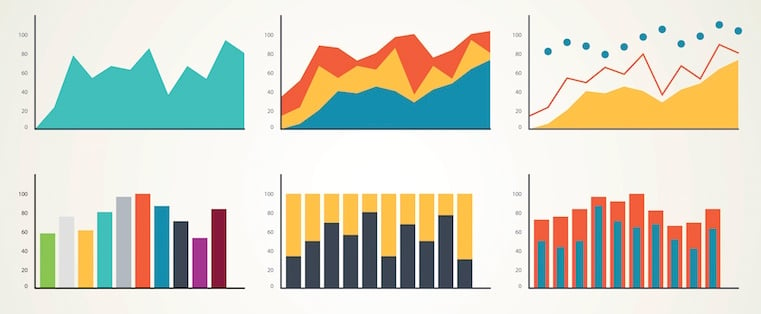
The design of your data visualization is nearly as important as the data you show. While you may choose a simple bar graph or line chart, you’ll still have to think of color schemes, supporting graphics, background images, and typography to create a visually compelling data story.
Tools for Color Schemes:
- Coolors.co: Fast color scheme generator that is very hip.
- Kuler by Adobe: Create color schemes with the color wheel or browse thousands of color combinations.
- Pictaculous: Upload a photo to turn up recommendations for colors to use, including their HEX codes.
Tools for Supporting Graphics:
- The Noun Project: Thousands of glyph icons from different artists. Some icons are free and require attribution and some are available for a fee.
- Graphicstock: More than 300,000 graphics, photos and illustrations, royalty-free.
- Picmonkey: Freemium and premium accounts come with access to fun, current graphics.
Tools for Background Images:
- TheStocks.im: Royalty-free stock photos in one place.
- Unsplash: Royalty-free high-resolution photos that are absolutely beautiful and thought-provoking.
- Free Range Stock: “Good photos, totally free” says it all.
- IM Free: Curated collections of free photos available for commercial use.
- Negative Space: 20 new free stock photos every week.
- Death to the Stock Photo: Submit your email to receive a fresh serving of photos to your inbox, monthly.
(Want more options? Check out 17 of the best free stock photo sites here. Or, download 160 free business-themed photos here.)
Tools for Typography:
- Typogui.de: A fun version of “Typography 101” for non-designers.
- Dafont: Downloadable fonts, some of which are free, though most require fees for commercial use.
- Google Fonts: A directory of downloadable, open source web fonts.
- Font Squirrel: Hand-selected typefaces presented in an easy-to-use format.
- Tiff: Can't decide between two fonts? Compare and contrast different fonts using this tool.
- WhatFont: Quickly identify fonts on a specific web page in just one click so you can use them for your own project.
All-in-One Tools:
- Visage.co: Allows you to create high quality visual data stories efficiently, and at scale. When you need to create a lot of visual content, it’s an excellent option.
- Silk.co: A place to publish data and create interactive visualizations with their tools.
- Alteryx: A tool that does data preparation, analytics, reporting, and spatial design for you.
With these tools, you’ll be able to find compelling, accurate data. You’ll be able to design an eye-catching visualization. And, you’ll be able to craft your story to speak specifically to your target audience – and be heard above the noise.
What are your favorite data storytelling tools? Share the ones we missed below.
![Blog - Data Visualization [List-Based]](/hs-fs/hub/53/hub_generated/resized/4268a670-43f2-448f-9acf-036fb4a99a84.png)
Data Visualization


![18 best types of charts and graphs for data visualization [+ how to choose]](https://53.fs1.hubspotusercontent-na1.net/hubfs/53/Operation-Everest-data-visualization-1-20250919-5958715.webp)