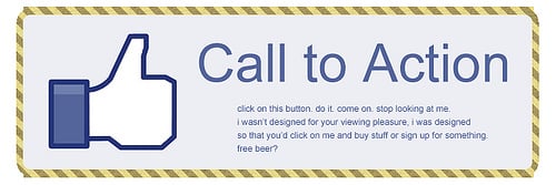
Think about all the times you‘ve signed up for things in your life. Did you once download Evernote? Dropbox? Spotify? Maybe you’ve even taken a class on General Assembly.
Each one of these signups is likely a result of an effective call-to-action (CTA).

Think about it: If you hadn't been drawn in by the copy or design of the CTA or been guided so eloquently through your sign-up process, you would probably use a lot fewer apps and websites than you do now.
In this post, we'll explain how using strategic CTAs can guide your visitors through the buying journey and highlight our favorite examples.
What is a call-to-action (CTA)?
CTA stands for call-to-action, and it's the part of a webpage, advertisement, or piece of content that encourages the audience to do something. In marketing, CTAs help a business convert a visitor or reader into a lead for the sales team. CTAs can drive a variety of different actions depending on the content's goal.
28 Free Call-to-Action Templates
Increase website conversions with these free templates.
- Bottom-of-Post CTAs
- Form Button CTAs
- Sidebar CTAs
- And More!
What is a CTA in Marketing?
As a marketer, CTAs are relevant because they encourage your audience to take action on a marketing campaign.
Ultimately, the goal of any marketing campaign is to guide your audience in the buyer's journey so they eventually make a purchase.
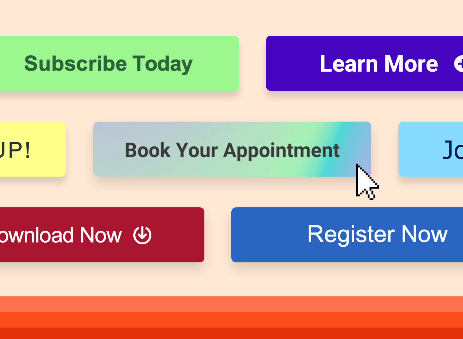
Types of CTAs
Not all marketing campaigns use the same types of CTAs since there are several tactics you can use to guide your audience in their journey. For instance, a marketing campaign with the goal of gaining more newsletter subscribers might utilize a form submission while a campaign enticing users to “learn more” may include a button.
Below are common types of CTAs that are used in marketing. Keep in mind that every brand and audience is different so it may be beneficial to A/B test CTA types and designs in order to figure out which ones work best for you.
Buttons
By far the most common type of CTA, buttons are icons with an actionable phrase written in them that entices users to click and take further action. Button designs can vary based on the brand style and goal of the campaign, but generally, your button should have a high-contrast color so it can stand out on the page.
Forms
Form submission CTAs convert site visitors into leads by offering visitors something in exchange for their contact information. Offers can include downloadable content, product quotes, service sign ups, subscriptions, and more.
Banners
A CTA banner can be located along the top, bottom, or side of a webpage. Banners typically include some type of captivating copy and design that encourages visitors to click on them to take action.
Contextual Links
Usually located within the body copy of a blog post, contextual links contain clickable text that directs users to a related landing page.
Pop-Ups
A pop-up is a CTA in a small window that suddenly appears on the page. Since users often tune out static CTA buttons and forms, pop-ups can be a great way to communicate an offer or entice users to sign up for your service. Many websites also use exit intent pop-ups, which are triggered when users are about to leave the site.
Slide-Ins
Similar to pop-ups, slide-in CTAs are meant to capture the user's attention by “sliding in” from the bottom or the sidebar. Slide-ins are a good alternative to pop-ups since they are less disruptive to the user experience.
How to Write a CTA
- Keep it simple
- Use action verbs.
- Create a sense of urgency.
- Be creative.
-Aug-12-2023-07-23-19-6678-PM.png)
1. Keep it simple.
Sometimes the most effective CTAs are also the most simple. For instance, a CTA that says “download now” tells the user that they can download related materials just by clicking on your button.
When writing your CTAs, use understandable and direct language that clearly communicates what action you want your audience to take. The more jargon or complex sentences you use, the more likely you are to confuse your readers and miss out on a conversion.
2. Use action verbs.
The most effective CTAs start with a strong action verb to encourage readers to take immediate action. Action verbs inject energy and momentum into your CTAs, making them more vibrant and engaging.
For example, active CTAs like “Buy now” and “Get started” are more motivating than passive CTAs like “Continue” and “Next.”
Keep in mind that some action verbs are better suited for specific purposes. For instance, CTAs like “Get started” and “Sign up” are good for SaaS conversions, while CTAs like “Buy now” and “Add to cart” are better for ecommerce conversions.
3. Create a sense of urgency.
Add a time element to your CTA to create a sense of urgency. This encourages your audience to act promptly instead of procrastinating. It can also foster a fear of missing out (FOMO), driving people to take action to avoid losing out on valuable opportunities or limited-time offers.
Creating a sense of urgency can be done by using phrases like “limited time offer,” “today only,” or “while supplies last.”
Keep in mind that the urgency you convey should always be genuine. Overusing urgency tactics or creating false scarcity can erode trust and credibility with your audience.
4. Be creative.
CTAs don’t have to be so rigid and formulaic. When writing your CTA, incorporate your personality and humor to stand out and make an impact — just make sure that it aligns with your brand voice and drives action.
For instance, instead of writing something generic like “Sign up,” you could go with something more exciting like “Take the leap.” While both examples encourage you to take action, the latter taps into the idea of taking chances and embracing new opportunities, making it more compelling.
Remember, the ultimate goal is to make your CTA compelling and irresistible enough for your audience to take action. And if your CTAs aren’t getting the most engagement, consider testing out different versions to help you strengthen and refine them over time.
28 Free Call-to-Action Templates
Increase website conversions with these free templates.
- Bottom-of-Post CTAs
- Form Button CTAs
- Sidebar CTAs
- And More!
CTA Copy Examples
CTAs all serve a designated purpose, but keep in mind the language they use can vary. And today, marketers everywhere have put some creative spins on their calls to action to generate the leads their businesses depend on.
Below are a few examples of the types of CTA button copy you might use in marketing:
.jpeg)
To help you identify what‘s effective and what’s not, we've listed out examples of CTAs that totally rock. These call-to-action examples are broken out into three categories:
- Simple and effective CTAs
- CTAs with great call-to-action phrases
- CTAs that balance multiple buttons on one page
Best Call-to-Action Examples
- HubSpot CTAs
- The Budgetnista
- Glossier
- 310 Creative
- Heyday
- VRBO
- Hulu
- Hija De Tu Madre
- Wool and the Gang
- Tweak It Studio
- Evernote
- Dropbox
- OfficeVibe
- Netflix
- Square
- Prezi
- Full Bundle
- Panthera
- EPIC
- Aquaspresso
- QuickSprout
- Grey Goose
- Treehouse
- OKCupid
- Blogging.org
- IMPACT Branding and Design
- Huemor
- Brooks Running
- Humboldt County
- Uber
- Spotify
- Ugmonk
- Madewell
- Barkbox
- t.c. pharma
- General Assembly
- charity: water
- Hipmunk
- MakeMyPersona
- TeuxDeux
- Betabrand
- Fabletics
- Ashley Stewart
- Amazon
- Barnes and Noble
- Slack
- Nintendo
1. HubSpot
CTA: Download Now
-Aug-12-2023-07-23-22-5117-PM.jpeg)
One of the perks of using HubSpot is the wealth of free resources they offer. This slide-in CTA found in an article discussing marketing intelligence, demonstrates how a well-placed CTA can improve user experience.
It's unobtrusive and comes in midway through the article, not only prompting readers to “download now” but offering a useful and free resource. The marketing kit offers an out-of-the-box solution for those who may not know where to start.
How to Replicate this CTA
Offer a free resource that is directly related to the topic of the article it appears on. On HubSpot's CTA, readers can finish the article and then download the guide with templates to get started making a marketing kit of their own. (Click here to learn how to add slide-in CTAs to your blog posts.)
2. The Budgetnista
CTA: Sign Up for Weekly Goodies!
-Aug-12-2023-07-23-23-2799-PM.jpeg)
Run by personal financial educator and author Tiffany Aliche, The Budgetnista is a one stop shop for personal finance. In addition to providing content that delights her audience, she's also a pro at creating inviting CTAs.
Instead of simply putting a sign up CTA to promote her newsletter, she uses language that entices the reader to click. “Sign Up For Weekly Goodies” sounds a whole lot more interesting than “sign up for my newsletter.” Who doesn't want weekly goodies?
How to Replicate this CTA
The Budgetnista‘s CTA mirrors Aliche’s personality, which is a nice touch and helps personalize the interaction. Encourage visitors to take the desired action by using friendly and creative language.
3. Glossier
CTA: I'm in
-Aug-12-2023-07-23-18-4684-PM.jpeg)
Beauty brand Glossier has its marketing image down, showcasing realistic images of women with a variety of skin types. Who can forget their boy brow campaign? Their website is clean with lots of white space that makes the photos of the models and makeup pop.
Their CTA is an overlay that appears when you start scrolling down their site. While many would quickly click out of the pop up, the language Glossier chooses makes you want to stick around. “Let's take this to your inbox” is a clever way to ask folks to sign up for your newsletter. If you‘re down to join simply click "i’m in" and you're done.
How to Replicate this CTA
Use clever phrasing and imagery that makes your brand more relatable and entices people to take action. Glossier‘s CTA, for example, includes an image of a model wearing the brand’s makeup which makes it even more appealing.
4. 310 Creative
CTA: Book Free Assessment
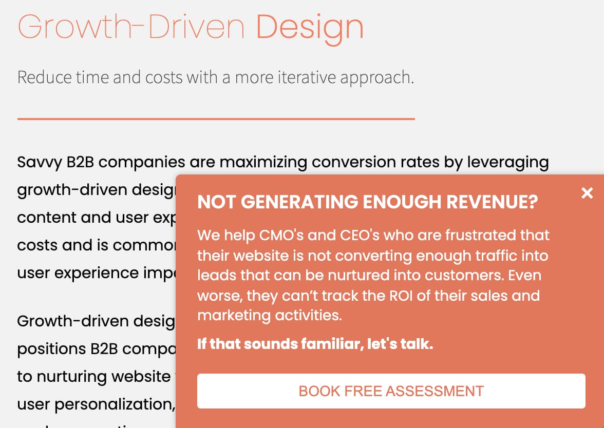
Growth agency and HubSpot partner 310 Creative aims to help B2B companies scale and refine the buyer's journey to increase sales. Knowing that visitors to the site may not quite know what specific services they need, 310 Creative makes use of a CTA that removes confusion.
The slide-in CTA solicits visitors to book a free assessment to get some clarity on where their business may be falling short and discover why these outcomes are happening.
How to Replicate this CTA
Demonstrate empathy for the visitor and remove barriers by stating the service is free. By describing an issue followed by “If this sounds familiar, let's talk” it demonstrates that 310 Creative is here to help and understands the user's frustration.
5. Heyday
CTA: Sign Up And Save
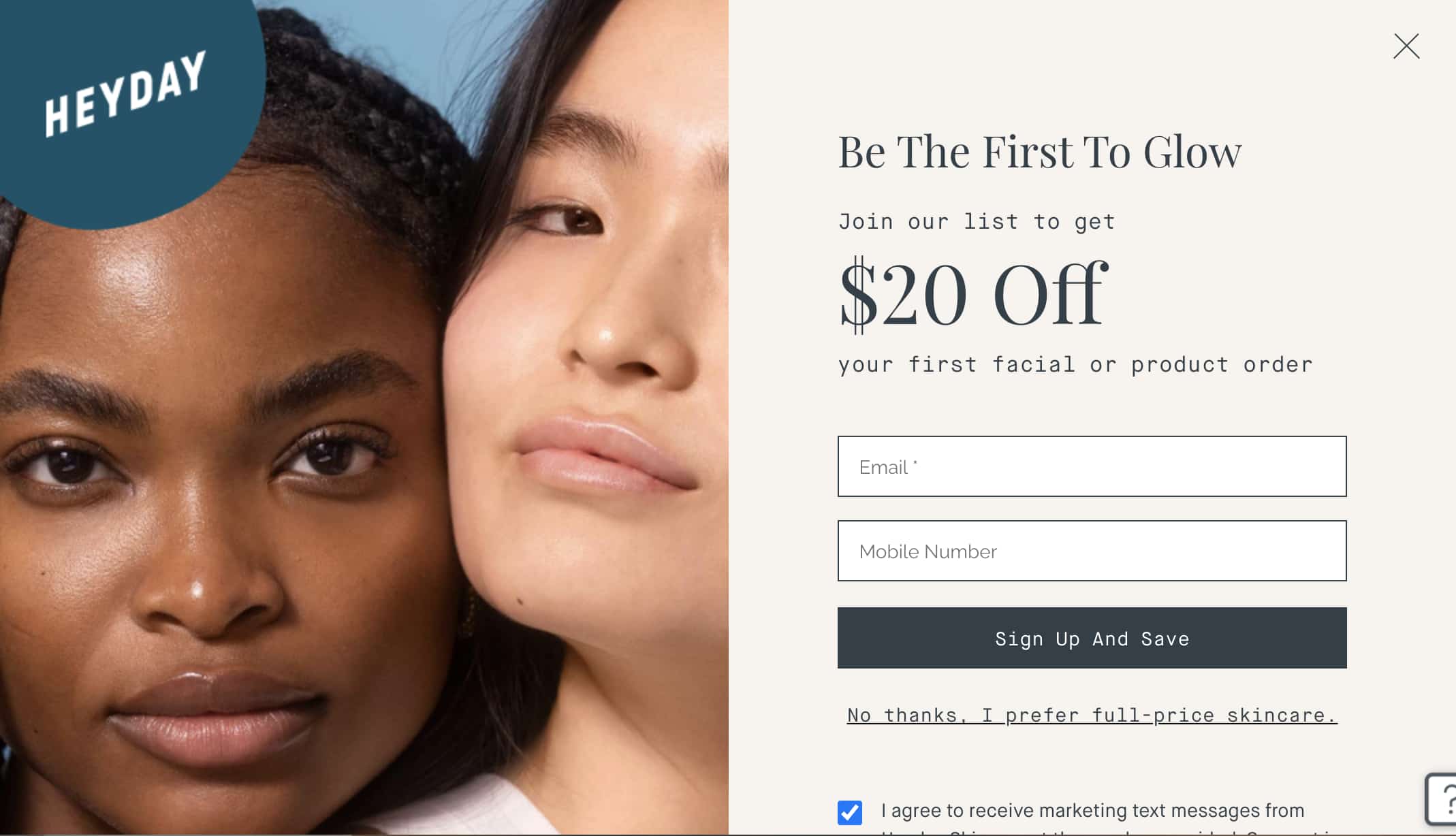
Heyday is a bit of a rebel in the facial industry. Its minimalist, no-frills approach has made it a favorite among those who just want to see an aesthetician without the fuss and upselling.
That minimalist, but friendly approach shows up in their CTA too. Making great use of some models with glowing skin, this CTA entices viewers to sign up for their newsletter with a discount. The “sign up and save” button is persuasive, along with the humorous “No thanks, I prefer full-price skincare” hyperlink to opt out.
How to Replicate this CTA
Employ beautiful aesthetics, a discount, and humor to encourage visitors to take the desired action.
28 Free Call-to-Action Templates
Increase website conversions with these free templates.
- Bottom-of-Post CTAs
- Form Button CTAs
- Sidebar CTAs
- And More!
6. VRBO
CTA: Discover your escape
-Aug-12-2023-07-23-20-0443-PM.jpeg)
If you love browsing beautiful vacation homes in your spare time, VRBO is a great place to do it. The brand makes great use of aspirational aesthetics and gorgeous locales.
The dark blue CTA pops against VRBO's white background, drawing the reader in. Then the “discover your escape” button adds a touch of adventure for those who may be interested in renting a vacation home.
How to Replicate this CTA
Make great use of color and phrasing. VRBO‘s CTA communicates that you’re not booking a regular vacation, but rather an adventure where they can serve as your trusted guide.
7. Hulu
CTA: Get The Disney Bundle
-Aug-12-2023-07-23-17-2169-PM.jpeg)
Streaming giant Hulu went for a dramatic approach with this CTA. The dimmed background shows off all its television and movie offerings, while the green and white text of the CTA draws your attention to the promotion.
It's a sign-up and upsell in one, informing users that they can get a discount add-on with Disney+ and ESPN+.
How to Replicate this CTA
Entice visitors with the impression they‘re getting a deal by offering a bundle and put emphasis on providing value to get visitors to take action. Here, Hulu’s CTA button says “get the disney bundle” instead of having a generic button that says “sign up.”
8. Hija De Tu Madre
CTA: Subscribe
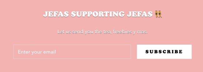
Apparel company Hija De Tu Madre, keeps it fresh with a clean, pink and white color scheme that exudes youthfulness and freshness. Most of what makes their CTAs so appealing is the clever play on words, mixing both Spanish and English, an ode to their target audience.

Because they‘re so dialed into their audience, Hija De Tu Madre can extract more information from their visitors. Instead of just having a CTA that requests an email (first image), they’ve introduced a mobile phone request in a second CTA. How do they persuade folks to hand over their digits? By offering them a chance to win merch — specifically their popular denim jackets.
How to Replicate this CTA
Offer something visitors consider valuable in return for their personal information — in this instance a coveted denim jacket will make people more likely to share more information. The key is to know your audience and tap into their interests.
9. Wool and the Gang
CTA: Share Your Knits #woolandthegang
-Aug-12-2023-07-23-18-7251-PM.jpeg)
This CTA from Wool and the Gang will make you feel all fuzzy on the inside. The collage background of customers donning their Wool and the Gang garments plus a cute pup really draws the reader in and fits with the brand's audience.
The CTA button states “share your knits #woolandthegang” which encourages customers to share what they've made using Wool and the Gang products, working as both brand promotion and customer engagement.
How to Replicate this CTA
Grab the visitor's attention by creating a sense of community and enticing visitors to join. This particular CTA also doubles as brand promotion as more customers share their kits across social media.
10. Tweak It Studio
CTA: Personalized Wood Names
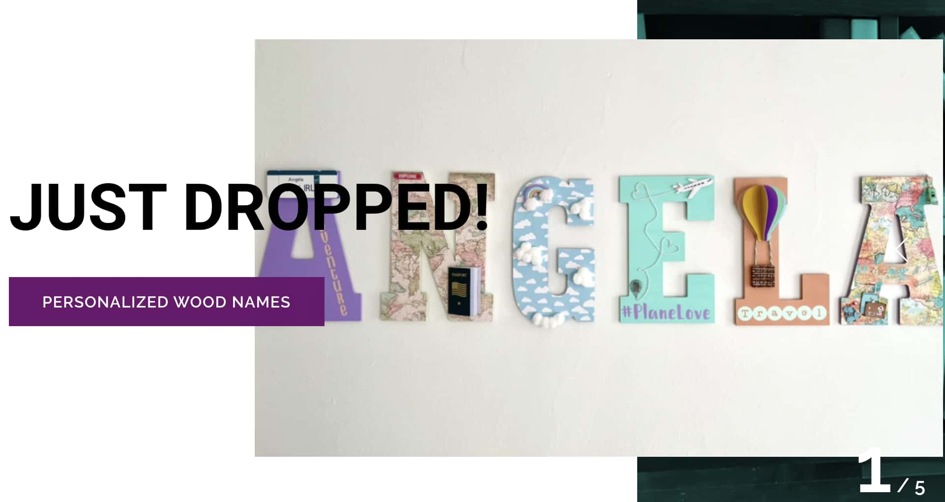
Home decor and design company Tweak It Studio showcases the importance of having fun, but clear CTAs.
They get the visitor‘s attention with "Just Dropped" in big bold letters to inform readers on new products on offer, then combine it with a CTA button that states exactly what the item is — in this case "personalized wood names." It’s much more effective than just having a button that simply states “buy now.”
How to Replicate this CTA
Use urgency to get visitors to check items in your online store and clearly communicate where the visitor is heading when they click the CTA button.
11. Evernote
CTA: Sign Up
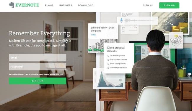
“Remember Everything.” Visitors can immediately understand that message the moment they land on this page. The design on Evernote's website makes it super simple for users to see quick benefits of using the app and how to actually sign up to use it. Plus, the green color of the main and secondary CTA buttons is the same green as the headline and the Evernote logo, all of which jump off the page.
How to Replicate this CTA
Consider using a bright color that contrasts well with the elements on your web page to make your CTA stand out.
12. Dropbox
CTA: Sign up for free
-3.png)
Dropbox has always embraced simple design with a lot of negative space. Even the graphics on their homepage are subtle and simple.
Thanks to that simple design and negative space, the blue “Sign up for free” call-to-action button stands out from everything else on the page. Since the CTA and the Dropbox logo are the same color, it‘s easy for the visitor to interpret this CTA as "Sign up for Dropbox." That’s one effective call-to-action.
How to Replicate this CTA
Negative space can work in your favor if used correctly. Use it to your advantage by allowing your CTA to stand out using your bold, brand colors
13. OfficeVibe
CTA: Subscribe
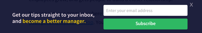
Here‘s a slide-in call-to-action that caught my attention from OfficeVibe. While scrolling through a post on their blog, a banner slides in from the bottom of the page with a call-to-action to subscribe to their blog. The best part? The copy on the slide-in told me I’d be getting tips about how to become a better manager — and the post it appeared on was a post about how to become a better manager. In other words, the offer was something I was already interested in.
Plus, I like how unobtrusive slide-in CTAs are — as opposed to what my colleague Rachel Sprung calls the “stop-everything-and-click-here-pop-up-CTA.” I find these CTAs offer a more lovable experience because they provide more information while still allowing me to continue reading the blog post.
28 Free Call-to-Action Templates
Increase website conversions with these free templates.
- Bottom-of-Post CTAs
- Form Button CTAs
- Sidebar CTAs
- And More!
How to Replicate this CTA
You can create your own slide-in CTA using HubSpot's marketing tools. After designing your CTA using our templates, create a HubSpot account. Go to Marketing > Lead Capture > CTAs in your HubSpot account and follow the CTA instructions here.
14. Netflix
CTA: Join Free for a Month
-Aug-12-2023-07-23-19-1334-PM.jpeg)
One big fear users have before committing to sign up for something? That it‘ll be a pain to cancel their subscription if they end up not liking it. Netflix nips that fear in the bud with the "Cancel anytime" copy right above the "Join Free for a Month" CTA. I’d venture a guess that reassurance alone has boosted signups. Also, you‘ll notice again that the red color of the primary and secondary CTAs here match Netflix’s logo color.
How to Replicate this CTA
Not only can you get a visitor's attention with a stark contrast in color, but you can use language in your CTA that entices them to click. Consider using “Try for Free,” or something similar in your CTA that removes the risk for potential customers.
15. Square
CTA: Get Started
-Aug-12-2023-07-23-20-9143-PM.png)
To achieve effective CTA design, you need to consider more than just the button itself. It's also super important to consider elements like background color, surrounding images, and surrounding text.
Mindful of these additional design components, the folks at Square used a single image to showcase the simplicity of using their product, where the hovering “Get Started” CTA awaits your click. If you look closely, the color of the credit card in the image and the color of the CTA button match, which helps the viewer connect the dots of what to expect if/when they click.
How to Replicate this CTA
You can use color to help visitors connect the dots whether it's coordinating similar tones like in this image, or by using brand colors like the Dropbox example.
16. Prezi
CTA: Give Prezi a try
-4.jpeg)
The folks at Prezi are also into the minimalist design look on their website. Other than the green dinosaur and the dark brown coffee, the only other color accompanying the predominantly black-and-white design is a bright blue — the same blue from their main logo. That bright blue is strategically placed on the homepage: the main “Give Prezi a try” CTA, and the secondary “Get Started” CTA, both of which take users to the same pricing page.
How to Replicate this CTA
This page took a minimalist color scheme, but incorporated two CTAs with the same color button that direct visitors to the same landing page. If your page has a clean, minimalist design consider trying two CTAs with different text to draw visitors in.
17. Full Bundle
CTA: Our Work
-Aug-12-2023-07-23-23-0866-PM.png)
Full Bundle is another company that uses negative space to make their primary CTA pop. The white “Our Work” call-to-action stands out against the dark grays of the background. Their choice of CTA is strategic, too. Given that they primarily exist to build out clients‘ online presences, it’s important for them to showcase their work — and that's what most folks are going to their website for.
How to Replicate this CTA
Make creative use of negative space like Full Bundle's gray tones. As you can see, the different shades of gray make triangles, adding a subtle design element that makes their white CTA pop out at the bottom.
18. Panthera
CTA: Join
-Aug-12-2023-07-23-17-7873-PM.jpeg)
The folks at Panthera are looking for users who really care about wild cats around the world and want to join a group of people who feel the same way. To target those people in particular, we love how they use language that would speak to big cat-lovers: “Join the pride today.” The page itself is super simple: an on-page form with two, simple fields, and a button asking folks to (again) “Join.”
How to Replicate this CTA
Establish a connection with your target audience by using vernacular related to your brand that would appeal to them in your CTA.
19. EPIC
CTA: Let's start a new project together
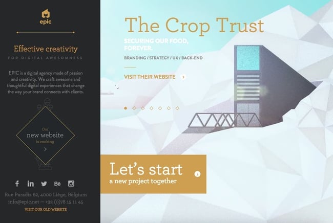
The folks at the agency EPIC use their homepage primarily to showcase their work. When you arrive on the page, you‘re greeted with animated videos showing some of the work they’ve done for clients, which rotate on a carousel. While there are plenty of other places users might click on their site — including their clients‘ websites — the main call-to-action stands out and always contrasts with the video that’s playing in the background.
I love that it features friendly, inclusive language —“Let's start a new project together” — which gives a hint to users looking for a creative partner that they're an especially great team to work for.
How to Replicate this CTA
Use inviting language. It‘s easy to make a button that just says "join us," but that’s not very convincing. Consider something friendlier like “let's work together” or something specific to the service you offer.
20. Aquaspresso
CTA: Send Me Specials Now!
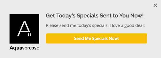
The whole point of a call-to-action is to direct your site visitors to a desired course of action — and the best CTAs do so in a way that's helpful to their visitors. The folks at coffee company Aquaspresso really nailed that balance here with the pop-up CTA on their main blog page.
Here, the desired course of action is for their blog readers to check out what they‘re actually selling (and hopefully buy from them). There are many ways they could have done this, including putting out a CTA that urges people to "Check out our most popular products!" or something very direct. But we love what they’ve done instead: Their CTA offers blog readers something much more helpful and subtle — an offer for “today's specials” in exchange for the reader's email address.
Adding that the specials are for today only is a great example of a psychological tactic called scarcity, which causes us to assign more value to things we think are scarce. The fear that today‘s specials are better than tomorrow’s might make people want to fill it out and claim their offer while they can.
28 Free Call-to-Action Templates
Increase website conversions with these free templates.
- Bottom-of-Post CTAs
- Form Button CTAs
- Sidebar CTAs
- And More!
How to Replicate this CTA
The call-to-action above was created using HubSpot's templates. Consider introducing a sense of urgency for website visitors by using scarcity in your CTA. You can use phrases like “limited time offer” or “get today's deals” to motivate visitors to take the desired action.
21. QuickSprout
CTA: Are you doing your SEO wrong? Enter your URL to find out
-Aug-12-2023-07-23-19-9049-PM.png?width=450&height=495&name=DRAFT%20call%20to%20action%20(723)-Aug-12-2023-07-23-19-9049-PM.png)
No one wants to be wrong. That‘s why a call-to-action button like QuickSprout’s slide-in CTA on their blog is so clickworthy. It asks the reader, “Are you doing your SEO wrong?” Well, am I? All I have to do is enter my URL to find out — seems easy enough. It's language like that that can really entice visitors to click through.
Plus, having the CTA slide in mid-blog post is a great tactic for catching readers before they bounce off the page. Traditionally, many blogs have CTAs at the very bottom of each blog post, but research shows most readers only get 60% of the way through an article.
How to Replicate this CTA
Use language in your CTA that grabs the visitor's attention or speaks to a pain point they may be having. The case above uses SEO, but you could use something like “Having trouble converting leads?” and then position your service as the remedy. (Click here to learn how to add slide-in CTAs to your blog posts.)
22. Grey Goose
CTA: Discover a cocktail tailored to your taste
-Aug-12-2023-07-23-24-0335-PM.jpeg)
Here's a fun, unique call-to-action that can get people clicking. Whereas site visitors might have expected to be directed to product pages or press releases from the homepage, a CTA to “Discover a Cocktail Tailored to Your Taste” is a pleasantly surprising ask. People love personalization, and this CTA kind of feels like an enticing game. The play button icon next to the copy gives a hint that visitors will be taken to a video so they have a better idea of what to expect when they click.
How to Replicate this CTA
Personalization works wonders for establishing a connection with visitors. Consider implementing a CTA that suggests a personalized experience for visitors based on the product or service you offer. For example, you could say “Explore plans that fit your budget,” or “choose a design tailored to your brand.”
23. Treehouse
CTA: Claim Your Free Trial
.png)
A lot of company websites out there offer users the opportunity to start a free trial. But the CTA on Treehouse‘s website doesn’t just say “Start a Free Trial”; it says “Claim Your Free Trial.”
The difference in wording may seem subtle, but think about how much more personal “Claim Your Free Trial” is. Plus, the word “claim” suggests it may not be available for long, giving users a sense of urgency to get that free trial while they can.
How to Replicate this CTA
If you offer a free trial for your service, instead of just using a button that says “free trial,” personalize the experience by using “start your free trial.”
24. OKCupid
CTA: Continue
-Aug-12-2023-07-23-22-9203-PM.png)
OKCupid‘s CTA doesn’t seem that impressive at first glance, but its brilliance is in the small details.
The call-to-action button, which is bright green and stands out well on a dark blue background, says, “Continue.” The simplicity of this term gives hope that the signup process is short and casual. To me, this CTA feels more like I‘m playing a fun game than filling out a boring form or committing to something that might make me nervous. And it’s all due to the copy.
How to Replicate this CTA
People enjoy games so if it works for your product or service, try to gamify your CTA to spark interest.
25. Blogging.org
CTA: Countdown Clock
-4.png)
Nothing like a ticking timer to make someone want to take action. After spending a short amount of time on blogging.org's homepage, new visitors are greeted with a pop-up CTA with a “limited time offer,” accompanied by a timer that counts down from two minutes.
As with Aquaspresso's example in #10, this is a classic use of the psychological tactic called scarcity, which causes us to assign more value to things we think are scarce. Limiting the time someone has to fill out a form makes people want to fill it out and claim their offer while they can.
Curious, what happens when time runs out? So was I. Hilariously, nothing happens. The pop-up CTA remains on the page when the timer gets to zero.
How to Replicate this CTA
Similar to Aquaespresso, consider using scarcity to give visitors to your site a sense of urgency to take action.
26. IMPACT Branding & Design
CTA: What We Do

CTAs can feel really pushy and salesy (yes, that's a word...) if the wrong language is used. I like IMPACT‘s educational approach, where they challenge visitors to learn what the company does before pushing them to take any further action. This call-to-action is especially intriguing to me because they don’t even use an action verb, yet they still manage to entice people to click.
How to Replicate this CTA
Entice visitors to learn more about your business by using language in your CTA that persuades them to see what you do. Use something like “see our past projects,” “what we do,” or “view our work.”
27. Huemor
CTA: Launch (Do Not Press)
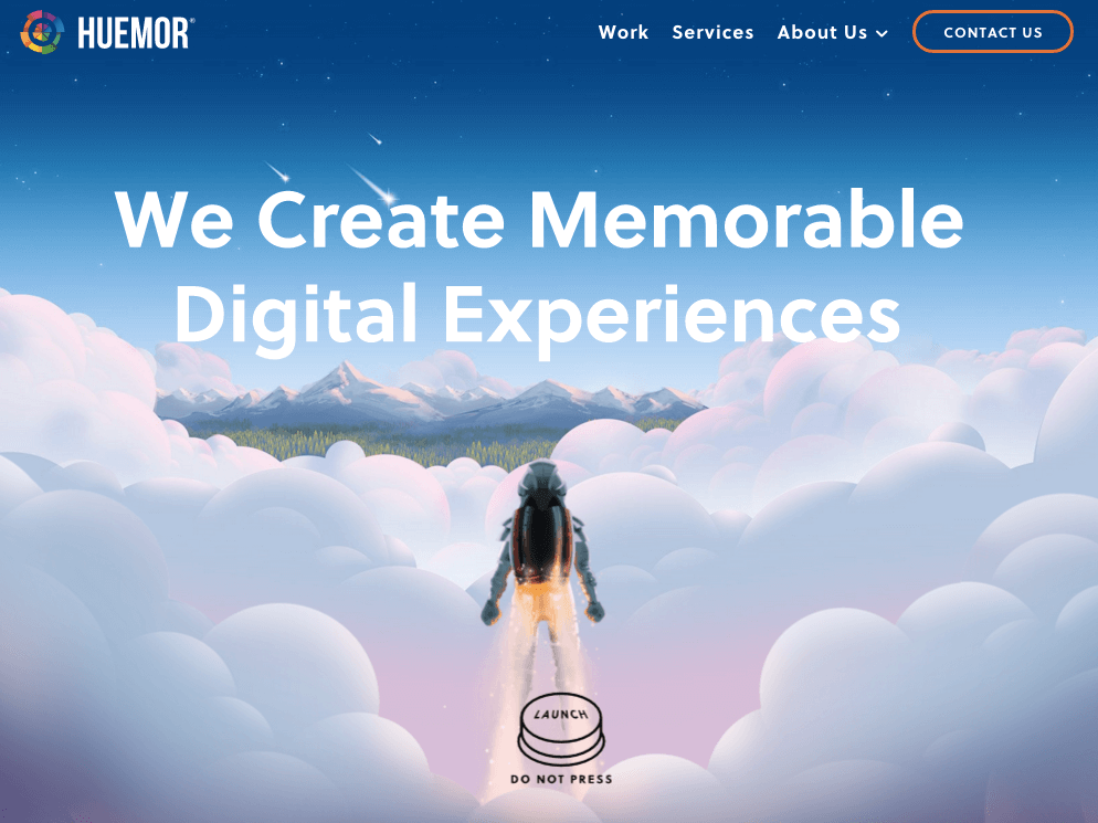
If you went to a website and saw a “Launch” CTA accompanied by the copy “Do Not Press” ... what would you do? Let‘s be honest: You’d be dying to press it. The use of harmless reverse psychology here is playful, which is very much in keeping with Huemor's brand voice.
How to Replicate this CTA
If your brand is more playful or in the creative industry, you can use that to your advantage in a CTA using gamification or reverse psychology like Huemor's example.
28. Brooks Running
CTA: Find out when we have more
-Aug-12-2023-07-23-21-7108-PM.png)
How many times have you hotly pursued a product you love, only to discover it‘s sold out? Well, as you might know, it’s no picnic for the seller either. But just because you‘ve run out of an item doesn’t mean you should stop promoting it.
Brooks Running uses a clever call to action to ensure their customers don‘t bounce from their website just because their favorite shoe is out of stock. In the screenshot above, you can see Brooks touting an awesome-looking shoe with the CTA, "Find out when we have more." I love how this button turns bad news into an opportunity to retain customers. Without it, Brooks’ customers would likely forget about the shoe and look elsewhere.
When you click on the blue CTA button depicted below, Brooks directs you to a page with a simple code you can text the company. This code prompts Brooks to automatically alert the visitor when the shoe they want is available again.
How to Replicate this CTA
For ecommerce businesses, sending customers to a page that states the item is out of stock can be a turn off for customers and cause them to bounce. Consider adding a CTA that says “notify me when restocked,” or “find out when we have more” to keep them engaged and gain their email information.
29. Humboldt County
CTA: Follow the Magic
-Aug-12-2023-07-23-17-5525-PM.png)
Humboldt County's website is gorgeous on its own: It greets you with a full-screen video of shockingly beautiful footage. But what I really love is the unconventional call-to-action button placed in the bottom center, which features a bunny icon and the words “Follow the Magic.”
It enhances the sort of fantastical feel of the footage, making you feel like you're about to step into a fairytale.
What's more, once you click into that CTA, the website turns into a sort of choose-your-own-adventure game, which is a fun call-to-action path for users and encourages them to spend more time on the site.
-Aug-12-2023-07-23-18-9544-PM.png)
How to Replicate this CTA
Great for travel companies and creative firms, CTAs like Humboldt County's lure readers in. If your brand has some creative leeway, use it. You could try a phrase like “find your next adventure,” or “plan your trip.”
30. Uber
CTA: Sign up to drive | Start riding with Uber
-Aug-12-2023-07-23-20-1931-PM.jpeg)
Uber's looking for two, very distinct types of people to sign up on their website: riders and drivers. Both personas are looking for totally different things, and yet, the website ties them together really well with the large video playing in the background showing Uber riders and drivers having a good time in locations all over the world.
I love the copy of the driver CTA at the top, too: It doesn‘t get much more straightforward than, "Make money driving your car." Now that’s speaking people's language.
How to Replicate this CTA
Targeting two types of customers? You can create CTAs for each of their personas similarly to Uber.
31. Spotify
CTA: Go Premium | Play Free
-Aug-12-2023-07-23-21-1447-PM.jpeg)
As soon as you reach Spotify‘s homepage, it’s pretty clear that their main goal is to attract customers who are willing to pay for a premium account, while the CTA for users to sign up for free is very much secondary.
It‘s not just the headline that gives this away; it’s also the coloring of their CTA buttons. The “Go Premium” CTA is lime green, making it pop off the page, while the “Play Free” CTA is plain white and blends in with the rest of the copy on the page. This contrast ensures that visitors are drawn to the premium CTA.
How to Replicate this CTA
If you offer both a paid and free version of a service, consider using two separate CTAs, choosing a color that pops for the paid option versus something more understated for the free version.
32. Ugmonk
CTA: Send me the coupons | I'm not interested
-Aug-12-2023-07-23-21-5461-PM.png)
Exit CTAs, also known as exit intent pop-ups, are different from normal pop-ups. They detect your users‘ behavior and only appear when it seems as though they’re about to leave your site. By intervening in a timely way, these pop-ups serve as a fantastic way of getting your reader's attention while offering them a reason to stay.
Ugmonk has a great exit CTA, offering two options for users as a final plea before they leave the site. First, they offer a 15% discount on their products, followed by two options: “Yes Please: Send me the coupon” and “No Thanks: I'm not interested.” It‘s super helpful that each CTA clarifies what "Yes" and "No" actually mean, and I also like that they didn’t use guilt-tripping language like “No Thanks: I hate nature” like I've seen on other websites. Finally, notice that the “Yes Please” button is much brighter and inviting in color than the other option.
How to Replicate this CTA
Exit intent CTAs are extremely useful for ecommerce. You can offer a discount on services or something else of value to entice visitors to convert.
33. Pinterest
CTA: Continue with Facebook | Sign Up
-2.png)
Want to sign up for Pinterest? You have a couple of options: sign up via Facebook or via email. If you have a Facebook account, Pinterest wants you to do that first. How do I know? Aesthetically, I know because the blue Facebook CTA comes first and is much more prominent, colorful, and recognizable due to the branded logo and color. Logically, I know because if you log in through Facebook, Pinterest can pull in Facebook's API data and get more information about you than if you log in through your email address.
Although this homepage is optimized to bring in new members, you'll notice a very subtle CTA for folks with Pinterest accounts to log in on the top right.
How to Replicate this CTA
Allow users to sign up with Facebook or Google in your CTA. This saves visitors time signing up and you'll be able to gain more information about them.
34. Madewell
CTA: Take me there | What's next?
-Aug-12-2023-07-23-20-7274-PM.jpeg)
Madewell (owned by J.Crew) has always had standout website design, taking what could be a typical ecommerce website to the next level. Their use of CTAs on their homepage is no exception.
When you first arrive on the page, you‘re greeted with the headline "I’m Looking For ...“ followed by a category, like ”Clothes That‘ll Travel Anywhere." Below this copy are two options: "Yes, Take Me There" or "Hmm... What’s Next?" The user can choose between the two CTAs to either browse clothes that are good for travel, or be taken to the next type of clothing, where they can play again.
This gamification is a great way to make your site more interesting for users who come across it without having a specific idea of where they want to look.
How to Replicate this CTA
Use gamification in your CTA to persuade visitors to explore your site further. They may not know specifically what they are looking for or how your company can help. Creating fun prompts can help visitors find what they are looking for.
35. Instagram
CTA: Download on the App Store | Get it on Google Play
-1.jpeg)
Since Instagram is a mainly mobile app, you‘ll see two black CTAs of equal size: one to download Instagram in Apple’s App Store, and another to download it on Google Play. The reason these CTAs are of equal caliber is because it doesn‘t matter if someone downloads the app in the App Store or on Google Play ... a download is a download, which is exactly what Instagram is optimizing for. If you already have Instagram, you can also click the CTA to "Log In" if you’d prefer that option, too.
How to Replicate this CTA
If you have an app, consider adding a CTA for each platform visitors can download it from. This removes friction and makes it easier for visitors to download your app without having to search.
36. Barkbox
CTA: Get Started | Give a Gift
-3.jpeg)
The two CTAs on Barkbox's homepage show that the team there knows their customers: While many people visiting their site are signing up for themselves, there are a lot of people out there who want to give Barkbox as a gift. To give those people an easy path to purchase, there are two, equally sized CTAs on the page: “Get Started” and “Give a Gift.”
As an added bonus, there‘s an adorable, pop-up call-to-action on the right-hand side of the screen prompting users to leave a message if they’d like. Click into it, and a small dialogue box pops up that reads, “Woof! I'm afraid our pack is not online. Please leave us a message and we'll bark at you as soon as pawsible.” Talk about delightful copy.
How to Replicate this CTA
Similar to Uber, you can use multiple CTAs to serve different audiences. Play with language and come up with phrases that work best for your brand voice.
37. t.c. pharma
CTA: Find out more | View products
-Aug-12-2023-07-23-19-5226-PM.png)
Turns out Red Bull isn‘t its own parent company: It’s owned by Thailand-based t.c. pharma, a company that makes popular energy drinks, electrolyte beverages, and functional drinks and snacks.
Its homepage features two call-to-action buttons of equal size: “Find out more” and “View products” — but it‘s clear by the bright yellow color of the first button that they’d rather direct folks to “Find out more.”
How to Replicate this CTA
Use color to persuade visitors to take a desired action. If you have a preferred button that you'd like people to click, make it the more prominent of the two.
38. General Assembly
CTA: View Full-Time Courses | Subscribe
-Aug-12-2023-07-23-23-4440-PM.png)
As you scroll through the General Assembly website, you‘ll see CTAs for various courses you may or may not want to sign up for. I’d like to point your attention to the CTA that slides in from the bottom of the page as you're scrolling, though, which suggests that you subscribe to email updates.
Although this feels like a secondary CTA due to its location and manner, I actually think they try to sneak this in to become more of a primary CTA because it's so much more colorful and noticeable than the CTAs for individual classes.
How to Replicate this CTA
When you create your own CTAs, try using bolder colors — even ones that clash with your regular stylings — to see if it‘s effective at getting people’s attention. (Click here for a tutorial on how to add slide-in CTAs to your webpages.)
39. charity: water
CTA: Give by Credit Card | Give by PayPal
-Aug-12-2023-07-23-20-5664-PM.jpeg)
Charity: water‘s main goal is to get people to donate money for clean water — but they can’t assume that everyone wants to pay the same way.
The CTAs featured on their homepage take a really unique approach to offering up different payment methods by pre-filling $60 into a single line form and including two equally important CTAs to pay via credit card or PayPal. Notice how both CTAs are the same size and design — this is because charity: water likely doesn‘t care how you donate, as long as you’re donating.
How to Replicate this CTA
For payment CTAs, consider giving visitors options for how to pay. What matters most is that they make the purchase.
40. Hipmunk
CTA: Flights | Hotels | Cars | Packages
-Aug-12-2023-07-23-20-3999-PM.png)
When you land on the Hipmunk site, your main option is to search flights. But notice there are four tabs you can flip through: flights, hotels, cars, and packages.
When you click into one of these options, the form changes so you can fill out more information. To be 100% sure you know what you‘re searching for, Hipmunk placed a bright orange CTA at the far right-hand side of the form. On this CTA, you’ll see a recognizable icon of a plane next to the word “Search,” so you know for sure that you‘re searching for flights, not hotels. When you’re on the hotels tab, that icon changes to a hotel icon. Same goes with cars and packages.
How to Replicate this CTA
Use icons to provide further explanation of your CTA to users.
41. MakeMyPersona
CTA: Grab the template! | No thanks
-Aug-12-2023-07-23-19-3395-PM.png?width=450&height=352&name=DRAFT%20call%20to%20action%20(723)-Aug-12-2023-07-23-19-3395-PM.png)
Here‘s another example of a great pop-up with multiple calls-to-action — except in this case, you’ll notice the size, color, and design of the users‘ two options are very different from one another. In this case, the folks at MakeMyPersona are making the "Grab the template!" CTA is much more attractive and clickable than the "No, I’m OK for now, thanks" CTA — which doesn't even look like a clickable button.
I also like how the “no” option uses polite language. I find brands that don‘t guilt-trip users who don’t want to take action to be much, much more lovable.
How to Replicate this CTA
Being friendly shouldn‘t just be for getting visitors to take the desired action. Using friendly language is just as important in CTAs for those who would like to opt out. Consider using a phrase like "no thanks" or something similar to what MakeMyPersona used to keep it cordial even if customers aren’t ready to make a purchase yet.
42. TeuxDeux
CTA: Get Started for Free | Try for Free
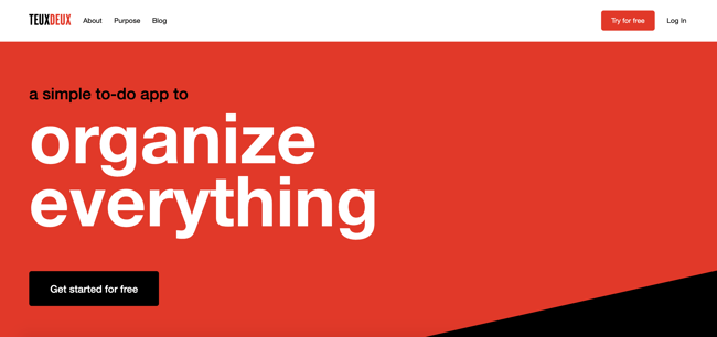
Another example of simplistic design, TeuxDeux's main website features one phrase and two CTA buttons.
That's it.
Using the company's colors, the background is just a splash of red and some black.
The CTA buttons stand out against the color and emphasize that you can try the product for free.
I like these CTAs because they show that the company understands its audience. Whenever I‘m researching to-do list apps, I always want to try it before I buy it. It’s something that people are very particular about and want to test-drive. TeuxDeux's CTAs show that they understand this about their audience.
How to Replicate this CTA
Know your audience and allow them to test drive your service. Tap into their needs and interests and include them in a CTA to help them navigate to what they need faster, risk-free. It could be something like “get started for free,” “download templates for free,” or “try for free.”
43. Betabrand
CTA: Get involved
-Aug-12-2023-07-23-18-2137-PM.png)
Betabrand is a clothing company that sells yoga/dress pants for women. Usually, clothing brands tend to use similar CTAs such as “Shop Now.”
However, Betabrand's homepage CTA is unique in that it involves the audience. Here, users can vote and impact the design of new products.
This is a fun way to get the audience involved and do something different.
How to Replicate this CTA
Encourage visitor participation by using a voting or survey type CTA when appropriate. It helps customers develop a personal relationship to the brand because they are contributing to the decision making process.
44. Fabletics
CTA: Limited Edition

This Fabletics CTA uses several marketing tactics: scarcity and a holiday.
On the homepage, the brand announces a limited edition collection that‘s tied to a holiday (Mother’s Day).
Additionally, the CTA uses a bright color so the CTA stands out on the simple homepage.
How to Replicate this CTA
Combine CTA types when it makes sense. For example you could use scarcity with a limited time only promotion for a grand opening, holiday, or to celebrate a new product launch.
36. Ashley Stewart
CTA: Shop the Lookbook

Ashley Stewart is a clothing brand catered to plus-sized women. In this CTA, the company uses a fun design to entice website visitors. The entire collage of images looks like a behind-the-scenes camera roll, which is interesting to look at.
Additionally, the CTA copy is straight to the point, which is helpful for visitors who are looking to browse.
How to Replicate this CTA
Sometimes short and sweet is the best approach. Use your CTAs to get to the point and get visitors what they want. You could use something like “shop this look,” or “download the guide now.”
45. Amazon Music
CTA: 3 months free
-Aug-12-2023-07-23-22-7461-PM.jpeg)
This is a great example of several of the elements we've talked about in one CTA.
Amazon uses two strategically placed CTAs, colorful, yet simple design, and offers the product for free.
With this CTA, Amazon is promoting one of its own products and services on its homepage instead of other products listed for sale on the site.
The only message they want to get across? That you can try their product, Amazon Music, for free for three whole months. This CTA accomplishes that goal with a simple design.
How to Replicate this CTA
Offering a free trial? Make it known by using a prominent CTA that pops and eliminating unnecessary features that clutter the landing page.
46. Barnes and Noble
CTA: Shop Now
-Aug-12-2023-07-23-18-0295-PM.jpeg)
Barnes and Noble uses a simple CTA to entice visitors to shop a limited collection during the Mother's Day holiday.
I like this CTA because the landing page design is so cohesive with the branding of the overall company.
Additionally, the graphics and the fonts are all interesting and match the brand's messaging.
How to Replicate this CTA
Create a cohesive look that appeals to your audience and aligns with your brand voice. Play with fonts and colors that compliment each other and are pleasing to the eye. Keep the CTA simple with a “shop now,” or “download now” button.
47. Slack
CTA: Learn More | Contact Us
-2.jpeg)
Slack uses beautiful, simple design on its homepage to entice visitors to click on one of the two CTA buttons.
I like this example because Slack has two CTA buttons for two different audiences. If you‘re just getting started in your research, you can click "Learn More." However, if you’re a repeat visitor and know that you want to talk to a sales person, you can click “Contact Us.”
This is a great example of serving two audiences with your CTAs on your homepage.
How to Replicate this CTA
Serve two audiences with separate CTAs on the same landing page. You can make them distinct using color to contrast the two buttons or draw more attention to the desired choice.
48. Nintendo
CTA: Compare Features
-Aug-12-2023-07-23-24-3223-PM.png)
On Nintendo's website, the company is focused on answering any questions a visitor might have.
In fact, one of the main CTAs is “Compare Features.” With this CTA, Nintendo answers one of their most popular questions because they understand that many visitors are still doing their research before purchasing a product.
How to Replicate this CTA
Have multiple pricing or feature options? Consider using a CTA that helps users compare their choices so they can make a more informed decision.
Create Your Own CTAs
There you have it. Now you can see just how important a few small CTA tweaks can be. Take inspiration from the examples above and create CTAs that convert.
Full Disclosure: We don't have data to know if these are all scientifically successful, but these examples all follow our best practices. If you decide to recreate these CTAs on your site, please remember to test to see if they work for your audience.
Editor's note: This post was originally published in June 2014 and has been updated for comprehensiveness.


![UPDATED 50 Free Call-to-Action Templates to Design Clickable CTAs in PowerPoint [Free Download]](https://blog.hubspot.com/hubfs/contextualized-CTA-template-568830-edited.png)