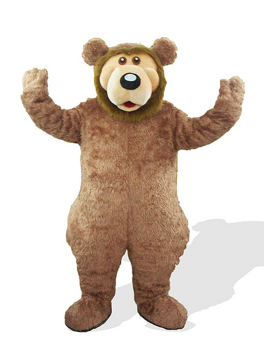
Tony the Tiger. Count Chocula. The Keebler Elves. Brand mascots have been a part of our lives since we were little kids looking for the next sugar-packed treat to enjoy.
But they extend beyond the hyper little kid target market. You know the Michelin Man? That half tire, half ghost-looking giant that represents, well, Michelin? He's been around since the late 1800s! And though his look has changed since then (and now we have animation to bring him to life) there are many brand mascots that have been going strong for years.
At the same time, there are other mascots that brands seem to hold on to for years despite an overwhelming distaste among the general public for their wily ways. This post will examine both extremes -- the brand mascots we all love, and the ones we all love to hate. Let's take a look, shall we?
1) Old Spice Guy
You might know him as Isaiah Mustafa, but it's more likely you know him as "The Old Spice Guy." He took the world by storm with his ridiculously over the top manliness in the video campaign, "The Man Your Man Could Smell Like." Don't remember? Here, watch it again real quick:
The campaign took off! Since then, the video has seen well over 41,000,000 views on YouTube, and the campaign has yielded countless more commercials, YouTube videos, and social media campaigns. In fact, when Mustafa gave real-time video responses to social media questions directed at him, it was the fastest-growing video campaign of all time, beating out Obama's victory speech when he won the presidential election. And the thing is, it's Mustafa that made the campaign successful -- he's hilarious, he's good looking, he's over the top, he's the stereotype of what every man wants to be like, and the stereotype of what every man thinks his woman wants him to be like.
2) London 2012 Olympic Games Mascots
What the ... what are these things?
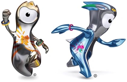
Apparently they're named Wenlock and Mandeville, and according to The Atlantic Cities, they are modeled after, "droplets of steel fallen from the stadium." Cuddly.
The problem with these mascots -- aside from having confusing names and being completely unidentifiable as an object, animal, or person of any sort -- is that they don't clearly identify with the city of London, or the Olympic Games in any way. As one blogger put it, "the logo looks like it was dropped on the floor and I think the mascots look like rejects from a kids television show." In short, these things are super weird, the names aren't memorable, and most people just plain don't get it.
3) Pillsbury Doughboy
Did you know that the Pillsbury Doughboy actually has a real name? It's Poppin' Fresh, but come on, he's the Pillsbury Doughboy to all of us. He was created by Leo Burnett in the 1960s, and that chubby little guy is pretty darn adorable.
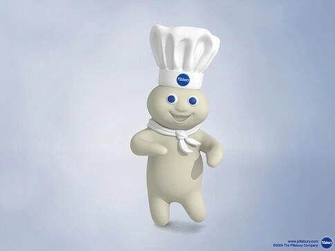
He's soft, fluffy, ticklish, and has a cute little laugh. What's more, he aligns with the Pillsbury product in a way that makes sense -- he's essentially a ball of dough -- but he's also a pristinely white baker, so it doesn't weird people out that he's messing around with their food. The Pillsbury Doughboy is non-offensive, non-obnoxious, relevant to the product, charming, and has withstood the test of time.
4) Mucinex's Mr. Mucus
On the other end of the spectrum, we have the offensive, obnoxious, and charmless Mr. Mucus. A representation of, well, mucus, this dirty little guy takes on an aggressive persona that tries to prevent you from getting better. The premise is that while he's tough and stubborn, Mucinex is so strong that it can combat Mr. Mucus.
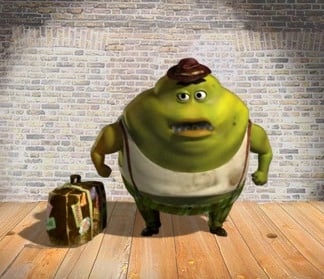
The problem is ... this thing is gross. Giving the side effects of an ailment a quippy name doesn't make it cute, and his appearance certainly doesn't do anything to help their cause. Business Insider published a study from E-Poll Market Research in which they ranked character awareness, appeal, and other attributes of 1600 brand mascots. How did Mr. Mucus fare in the results? 50% disliked Mr. Mucus, the second most reviled brand mascot in their survey.
5) Dos Equis' Most Interesting Man in the World
He's kind of like the Chuck Norris of the beer industry. And like the Old Spice Guy, the Most Interesting Man in the World is one of those guys every man wants to be. He's suave, intelligent, worldly, and wildly popular with men and women alike. If it's out there, this guy's seen it! Not only that, but he's helping Dos Equis redefine their brand to be associated with all of those things. And isn't that the point of a brand mascot?
Plus, he has his own meme, which means the public has found him so captivating and humorous they want to riff off of him. This guy has gone viral! What more could a brand ask for from their mascot?
6) Mr. Six
Not as captivating, however, is Mr. Six, the mascot for amusement park Six Flags. An elderly gentleman like The Most Interesting Man in the World, Mr. Six hasn't had the same positive effect on audiences.
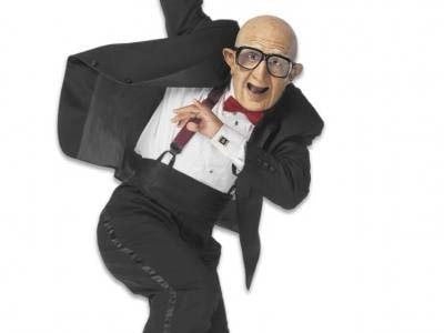
The same study that found Mr. Mucus to be extremely disagreeable also had respondents railing against Mr. Six, with 45% disliking him and calling him "creepy." It probably doesn't help that he's always found dancing erratically to the Vengaboys' "We Like to Party." The combination of what some consider to be an annoying song and the disturbing image of what seems to be a young dancer dressed up in geriatric garb has understandably left a bad taste in people's mouths. And as TIME Magazine put it, why use a creepy old guy to target kids?
7) Geico Gecko
Geico has had multiple sponsors, but the gecko has consistently risen to the top. Anyone remember the Geico Caveman? He still pops up from time to time, but certainly suffered from some overexposure. Then there was the inexplicable pile of dollar bills with two googly eyes on top. He didn't do quite as well. The gecko, however, has managed to maintain his popularity since 1999 when he first debuted.
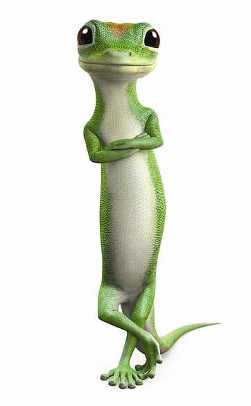
Perhaps it's the British Cockney accent, perhaps it's that he's kind of a cute little guy, but I believe his success is mostly tied to the fact that he can convey Geico's message without being distracting. The Geico Caveman was creative and entertaining, sure, but so much so that people ran with the entertainment value and started offering him a sitcom. On the other end of the spectrum, the pile of dollar bills was a little too confusing to be an effective mascot -- people spent more time trying to understand it and less time listening to Geico's message. The Geico Gecko lets audiences actually listen to the Geico's message.
8) Offensive Sports Teams
I'm not going to call out any cities or team names specifically here, or show any team mascots that give a visual explanation of what I'm talking about. We've all heard it before, though. There are some teams that carry historical names that were at the time, or have since become, offensive to certain groups of people. While some say it's historical and as such the names shouldn't be changed, the bottom line is it offends people. Lots of them. And most marketers strive not to offend hundreds of thousands of people. Enough said.
9) Twitter's Blue Bird and Fail Whale
Never since the Viagra pill has a "little blue anything" been so in demand. But people love that little, blue Twitter bird ...
... and they love it's counterpart, the big blue fail whale, just as much!
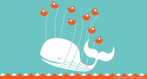
What's so great about these two mascots is not only that they're cute (hey, cute goes a long way in marketing, especially when you're trying to explain why your product is broken!), but that they have a very clean design. They are whimsical, fun, and easy to riff off of for both users and Twitter's brand managers. That means they can be easily repurposed for plenty of different campaigns. You could see the little blue bird with a pumpkin pail on Halloween, the fail whale at a pool party in July, or you can just let the users create their own designs and scenarios which thousands of people have already done -- just do a quick Google of these brand mascots to see what I mean!
10) Burger King King
Does that guy scare the bejeezus out of anyone else? The Burger King King acted as the fast food chain's mascot for seven whole years. That's right, it took seven years of scaring kids and adults alike for Burger King to realize their extremely literal mascot wasn't the best fit for the burger joint. As TIME eloquently put it, this frightening mascot has been, "stalking people outside their homes and scaring young women" since 2004. Just take a look at this video -- how would you feel if you saw that glassy plastic face outside of your window?
What brand mascots do you love, and which ones make you cringe?
Image credit: HalloweenFashion

Branding

