This is part two of a two-part series by HubSpot Partner, Smartbug Media. You can read part one to learn how smart content fits into your website redesign process.

We know that HubSpot is a very powerful tool that helps us identify the right prospects, gather analytical insight about these prospects, and begin to discover the best ways to market to them and turn them into customers.
One of the more important, yet very underutilized, pieces of HubSpot is smart content. With the opportunity to change the visitor experience based on multiple data points, we can help identify and uncover quick-win opportunities for our organization.As we look to future website updates and experiments to tackle with our internal teams, let’s take a look at four quick-win examples with which you could use smart content on your HubSpot website.
Examples of Using Smart Content
1. Smart Navigation Call-to-Action (CTA)
A great place to start with smart content and to get your feet wet is creating smart CTAs. These can be set up in a matter of clicks and can help begin the process of presenting the right type of offer to your prospects.
Most of us have some sort of CTA in our main navigation (commonly placed on the right-hand side) that stays across all of our pages to help entice visitors to click. Most of these, however, are usually set up as bottom-of-the-funnel offers (Request/Schedule a Demo/Consultation, etc.) that for most of our visitors may not be the right or appropriate time to be showing that type of offer. Some new visitors entering your website may be too early in the buying cycle and may need to learn more about you or still need to identify their problem or pain point.
As a next step, adda CTA module to your navigation at the end of the menu. By adding this to your header, you can set smart criteria and a more top-of-the-funnel offer by default, and once you identify additional information from your prospect, you can showcase additional offers to help lead them down the funnel.
Here’s an example of how we’ve set it up for one of our clients.
Default CTA
![]()
SMART Criteria: Has downloaded an awareness or consideration stage piece of content
![]()
Pro Tip: While you are adding a CTA in place of a navigation item, it will remove it from your hamburger menu for mobile. This is due to it not being listed as an item in the navigation. While thinking this through (and making sure we are offering the same experience to our mobile visitors), we were able to write some code to make sure that this shows up in your mobile navigation.

This can also be done with referencing CSS classes to those CTA modules instead of the menu wrapper module number as well.
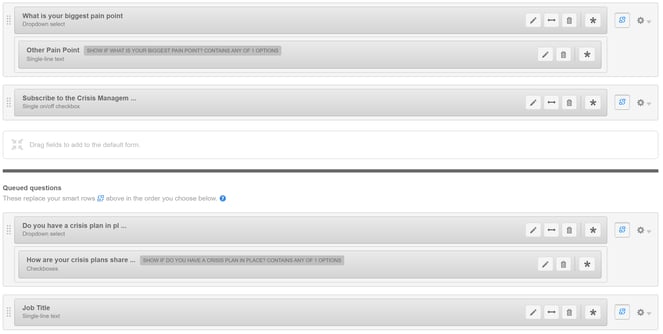
2. Smart Forms – Adding/Removing Fields
While often overlooked, creating smart forms across your website is a quick and easy way to begin the segmentation process.
These can help accomplish the following two things:
- Ask other form questions to help further qualify visitors.
- Show them a completely different form to measure results/success by adding or removing fields to each.
In regard to these points, HubSpot forms have functionality built in where you can swap out form fields based on if they are known or not. Based on your setup, these can be useful to gather additional items for qualification purposes or to help improve your submission rates across all of your offers. For all of your awareness offers (if you use the same form), if a prospect revisits another awareness offer, they’ll have fewer fields to fill out.
Pro Tip: For all offers on each piece of the buyer’s journey, set up one form exclusively for each, if possible, instead of setting up a form for each offer. By doing this, you can simplify your form updates going forward and keeping items consistent across your website. This is also very helpful for workflow and list segmentation rules as well!
3. Mobile-Specific Smart Forms
It seems that more and more each year we are seeing more pressure from both search engines and prospects to have a rock-solid mobile experience that matches what we provide desktop users and from recent reports, this doesn’t look to be changing anytime soon.
In November 2016, StatCounter noted that mobile and tablet traffic has overtaken desktop traffic for the first time ever worldwide (51.3 percent versus 48.7 percent, respectively). If there isn’t already a reason for organizations to begin to think mobile first, now’s the time to begin.
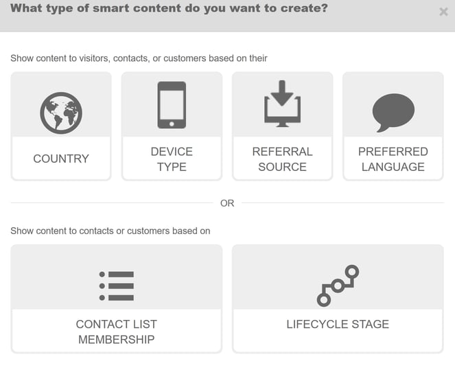
With smart content, you can set a smart rule to have mobile visitors see a completely different form from that of your desktop counterparts.
You can do this by clicking on “device type” when you add a new smart rule, then clicking mobile on the next screen.
Pro Tip: For mobile-specific forms, focus on fields that don’t require as much work on mobile as they do on desktop. Set up your form fields to drop-downs or checkboxes instead of multi-line text boxes to save both time and effort for prospects putting in form information on mobile.
A client example of what we’ve done is below.
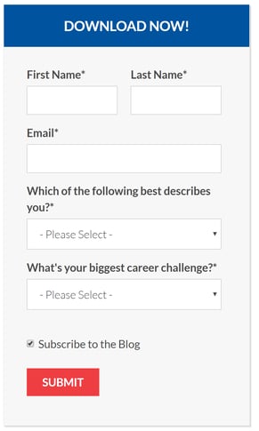
Desktop Form
 Mobile Form
From this type of change, we’ve not only seen a much higher submission rate on mobile (in some instances 5-10% higher than our desktop counterparts), we’re now able to view this data separately in HubSpot under the forms tool, since each form only shows on each version of the website the visitor is accessing.
4. Smart Footer CTA
One item that we’ve implemented on multiple client websites is placing a footer CTA at the bottom of all pages. This is a great way to show an additional conversion opportunity for visitors who scroll through the entire page.
By setting up these footer CTAs, you can place some context behind these, like the following items:
- Header text explaining the CTA
- Subheader text explaining the expectations of the offer
- An image or screenshot, providing imagery or context to the CTA text
- Button text that helps push the visitor to the landing page
Some recent client examples that we’ve put together are:
Default Footer CTA
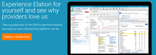
SMART Criteria: Explored a Sample Chart
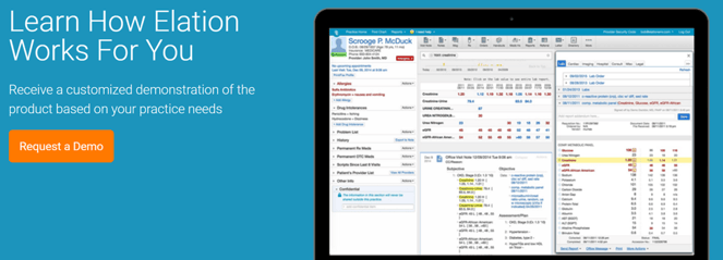
As you can see, there’s some imagery providing context to the offer, header, and subheader text explaining what the next step is, as well as button text created separately for each offer to help influence the visitor to click.
Pro Tip: Make your smart footer CTA a global group in the design manager. This will help keep all of your smart rules in one place and easier to update instead of having to update them at the page level whenever your criteria changes.
In Closing
These aren’t the only opportunities for you in terms of smart content, which is what makes growth-driven design an exciting form of ongoing Web improvement for marketers. You can try one of these examples one month, measure results and success, and, from there, tweak and redefine your rules and logic in order to constantly improve your results. While smart content has an almost infinite number of possibilities, these four quick-win examples can help get you and your organization off on the right path.
For any of you out there who are already using it, what are some interesting ways that you’re using smart content across your website?