
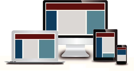
 Responsive web design began as way of ensuring your website was delivered in a readable size that worked well on cell phones and tablets. It eliminates the frustration of tiny cluttered pages, navigation that can barely be read and calls-to-action that are too small to click. Simply put, responsive design is a technology that makes websites easy to use on a variety of devices.
Despite the benign roots, responsive design has moved into an unexpected and much more important corporate identity role. It's changing brand perception by heavily influencing online design and user experience. This change is not limited to mobile devices-- it can be seen on all laptops and desktop computers as well as in print and banner advertising. The trends in website look and feel illustrate the tremendous influence of mobile technologies and Content Management Systems on design, and show once again that the process for creating a website is far closer to architecture than it is to painting on the Bauhaus scale.
Mobile Optimization: A Marketer's Blueprint for Responsive Design
Form follows function and mobile requires consideration be weighted towards ease of use and concise messaging. The same minimalist design approach that’s desirable for responsive design improves marketing results on every screen and frankly, is easier to execute then complex design or big production web development. Add to this the ease of current generation content managements systems and marketers now have design tools that make building intentional, goal driven websites easy. When developed correctly, these website are smart, effective, and get results (no matter what device the website is being seen on).
We’ve known for years that clear, concise information that’s obvious, clickable, and formatted as a structured narrative, results in better website conversions.The best news to come out of this new technology? Development can be done without the need for Photoshop page templates, writing HTML or speaking to an IT person about updating your website. Score one for marketers.
With Responsive Design, Less is More
We’ve known for years that clear, concise information that’s obvious, clickable, and formatted as a structured narrative, results in better website conversions. Responsive design demands marketing professionals follow these best practices because small screens require obvious design elements.
By cutting website design down to the very basics, messaging can be easily conveyed, call to action’s pop off the page and access to further information is one obvious button click away. Or to put it another way, #TLDR (To Long Didn’t Read) combined with “bulls-eye formalism” light content and minimal CTA options are what’s now driving web page design.
Example 1: Evernote's Minimalistic Approach to Drive Conversion
This design shift is evident in big clean home pages that have lots of space and a single call to action. More websites are using photographic images and graphic design that spans the width of the screen with a single button or email sign up as the only next step:

When it comes to your home page and primary content areas, less is more. Good design is about results. Daniel Pink, the author of Drive, The Surprising Truth About What Motivates Us, said “It's easy to dismiss design - to relegate it to mere ornament, the prettifying of places and objects to disguise their banality. But that is a serious misunderstanding of what design is and why it matters - especially now.” The new, “stacked, scrollable information” approach to websites provides easily viewed written information that can be digested in less than a second.
Example 2: HubSpot's Clear "Next Steps" to Drive Conversion
Accessing more information means scrolling down the page until your next visual block of content. Home and main pages appear as an index that’s structured in a narrative format. Screens often have a call to action that allows the visitor to drill further into the website from each content block through obvious next steps that drive them to the information they seek:

Example 3: Harvest's Use of Imagery to Drive Conversion
Attracting a viewer’s eye to important areas on a page is nothing new. Back in art school, the mantra for simple eye catching design was, “If you can’t make it big, make it red.” The difference now is that a minimal, formalist approach to color, shape, negative space and the use of images is driving commercial goals that include click through rate, increased conversions and sales:

The Bottom Line
Responsive design and Content Management Systems have caused a shift where control over online branding and websites has finally moved out of the hands of the IT department. Technology has made it possible to concentrate on design attributes, key messaging and concise content so that we can consider the more important goals of conversions and sales.
This is a guest post by Michael Conway, Founder & Member, of the marketing agency Means-of-Production. Visit Means-of-Production.com for more content from Michael and the agency.
Originally published Oct 18, 2013 10:00:00 AM, updated January 18 2023
Topics:
Inbound Marketing