.png?width=112&height=112&name=Image%20Hackathon%20%E2%80%93%20Square%20(10).png)
After years of designing websites along with studying, researching, and testing different web design strategies, I can confidently consider myself a design expert. I’m here to help you on your journey by sharing important lessons I’ve learned throughout my career.
In this blog, I will be sharing website design best practices (what you should do to create a modern, user-friendly site), website design guidelines (the design principles that shape your decisions), and website design requirements (the technical must-haves your website can’t afford to skip). This blog aims to give you well-rounded knowledge and improve your design skills.
Table of Contents
12 Website Design Best Practices
- Prioritize functionality over aesthetics.
- Use a mobile-first approach.
- Prioritize fast loading speeds.
- Keep the design clean and uncluttered.
- Apply visual hierarchy strategically.
- Limit the options presented to users.
- Keep SEO in mind from day one.
- Choose the content your users understand.
- Add images to engage and inform readers.
- Use consistent branding.
- Simplify your navigation.
- Test, iterate, and improve.
1. Prioritize functionality over aesthetics.
From all my years designing websites, this is my top piece of advice to other web designers: prioritize functionality over aesthetics. If a site doesn’t work, it doesn’t matter how good it looks.
“Design should support content and functionality, not the other way around. The vast majority of users are going to your site for the information that’s there, not for the way it looks,” says Claire Escobedo, creative director at Online Optimism.
“As a designer, I know how great it is for a website to look nice, but it can never come at the expense of making sure that your website is functional and understandable for all users.”
Concentrate on functionality instead of just aesthetics. Create solutions that are easy to use, dependable, and practical, putting the needs of users front and center.
HubSpot's Free Website Builder
Create and customize your own business website with an easy drag-and-drop website builder.
- Build a website without any coding skills.
- Pre-built themes and templates.
- Built-in marketing tools and features.
- And more!
2. Use a mobile-first approach.
I’ve lost count of how many times I’ve seen a beautifully designed desktop website completely fall apart on mobile. And honestly, with mobile traffic dominating almost every analytics report I look at, mobile optimization isn’t just a “best practice” anymore — it’s the baseline.
When I’m designing a website, I always start by asking myself a simple question: “How will this look and feel on a 6-inch screen?”
Because the truth is, some things that feel natural on desktop become frustrating, cluttered, or downright unusable on mobile.
A perfect example is Amazon. On desktop, Amazon’s homepage is famously dense with multiple navigation layers, category menus, mega dropdowns, and hover-triggered interactions. It works because desktop users have a mouse, a wide screen, and the patience to navigate more detailed structures.

But open the same site on mobile, and the experience transforms:
- The top navigation collapses behind a clean hamburger menu.
- Hover menus become expandable, tap-friendly sections.
- Product images get significantly larger for easy tapping.
- Content blocks stack vertically with generous spacing.
The entire layout simplifies into a smooth scroll experience.
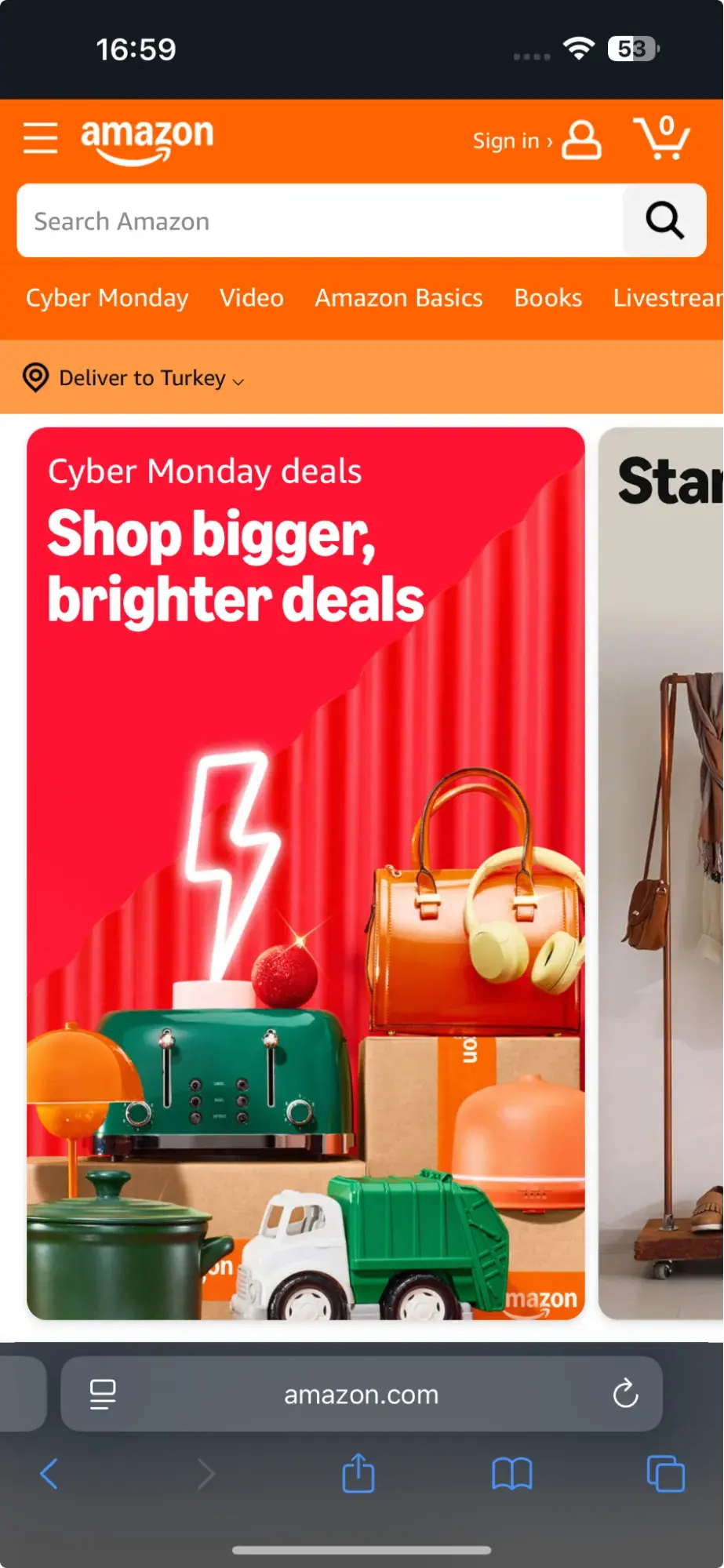
Amazon isn’t simplifying because it “prefers minimalism.” They’re simplifying because mobile users interact differently, and they’ve tested their interface at a level most of us will never even see behind the scenes.
One major mistake I still see in mobile design is forgetting that you can’t hover on a phone. It sounds obvious, but I still encounter live sites using hover-dependent dropdowns — even on mobile. When that happens, navigation breaks, interactions freeze, and users back out immediately.
Here’s my personal checklist for mobile optimization:
- Remove or simplify desktop-heavy UI elements.
- Replace hover interactions with tap or focus states.
- Collapse complex menus into expandable accordions.
- Use larger, responsive images for touch interaction.
- Reduce heavy scripts to avoid lag on weaker mobile CPUs.
3. Prioritize fast loading speeds.
The attention span of Internet users keeps decreasing by the day; you have just a few moments to grab your site visitors’ attention, or else they may leave in search of an alternative solution. As a result, speed is super important.
A slow website, I’ve discovered, kills conversions more quickly than anything else. In modern web design, performance is not an afterthought but a design objective thanks to solutions like Next.js, Vite, Cloudflare Pages, and optimized images (WebP or AVIF).
My speed checklist:
- Compress images.
- Use lazy loading.
- Avoid heavy JS bundles.
- Cache aggressively.
- Use a CDN.
Fast websites don’t just load quickly; they feel modern, trustworthy, and more enjoyable to use. And in 2026, that experience is the difference between a new customer and a lost one.
4. Keep the design clean and uncluttered.
In modern web design, keeping a clean and uncluttered design is super important. Beginners always try to implement as much functionality as they have learned, adding different components that do not increase the overall value of the element.
I have been there, too. I also used to overdesign everything. I would add extra animation, too much color variety, and icons all over my website. But now, I design with restraint. Because users aren’t looking for an overcomplicated website that ends up reducing the cognitive load speed. Rather, they look for simplicity.
I recently came across a great piece by Greg Merrilees, CEO and Founder of Studio1 Design, highlighting the importance of finding the right balance in website color schemes.
He suggests considering color harmonies — when picking a color palette, start with your dominant color and then layer it. Darker colors grab attention first and carry more visual weight, so you’ll want to move back to lighter colors from there.

Every website visitor has a reason to be on a website, so the design should always aim to facilitate a great experience and provide value.
A clean layout should include:
- Clear spacing.
- Limited color palette.
- Minimal distractions.
- Consistent visual hierarchy.
Modern users skim. They don’t read, so I try to make every visual element earn its place.
5. Apply visual hierarchy strategically.
Website visitors never completely view a web page from top to bottom. They usually scan it, and they follow predictable patterns. These patterns are created by visual hierarchy. This is how we, as designers, guide them to the right information we want them to see without making them think much of it.
Personally, I treat hierarchy like storytelling. I start with the most important and then gradually lead users through supporting details and finally toward the action I want them to take.
Here are a few techniques I use almost every time:
- Larger font sizes for key messages and section headers.
- Bold, contrasting colors for calls-to-action (CTAs) so they stand out instantly.
- Varying font weights to highlight what matters and mute what’s secondary.
- Spacing to create natural breaks between ideas.
- Directional cues (like icons or image placement) to guide the eye.
Good hierarchy makes a design feel effortless. Users don’t need to guess where to look — the layout literally points them in the right direction.
6. Limit the options presented to users.
According to Hick’s Law, increasing the number and complexity of choices will increase the time it takes for a person to make a decision. This is bad news in website design.
If a website visitor is presented with too many options, they might get frustrated and bounce — or they might pick an option you don’t want, like abandoning their cart. That’s why it’s important to limit the number of options presented to a user.
For example, when a visitor lands on Shawn Michelle's Ice Cream homepage, they have three clear options: learn about the company, explore the flavors, or check out the catering menu.
It‘s clean, with all the key info easy to find. Does a site like this need anything more? Absolutely not. Everything’s right there, making it easy for customers to get what they need, reducing the chance they’ll leave frustrated.
This is a perfect example of Hick’s Law in UX design.

Pro tip: Don’t have the time to follow the rules? You can always download a pre-built website template that will provide a sound foundation for your site.
7. Keep SEO in mind from day one.
One thing I’ve learned after working on dozens of websites is that great design means nothing if no one can find the site. I’ve seen beautiful interfaces with perfect color palettes and pixel-perfect spacing, but because the SEO foundation was weak, the site barely showed up on Google.
Good design creates a strong first impression, but SEO is what brings people through the door in the first place.
As regards SEO, here’s what I always plan for from day one:
- Fast load times and strong Core Web Vitals. I optimize images (AVIF/WebP), lazy-load media, and keep scripts lightweight. Speed is both a UX and SEO win.
- Mobile responsiveness. Google indexes mobile-first now, so if your mobile design breaks, your rankings take a hit.
- Structured data when relevant.
- Clean HTML structure.
- Proper heading hierarchy.
8. Choose the content your users understand.
Website content should be straightforward and not require all your brainpower to get it and deliver value at the same time.
Good website content should feel effortless to read while still delivering value. And trust me, that’s not easy.
“In order for people to spend time and energy doing something, like sit and read through all the features of a new product or service, you have to create a compulsion within them to do so,” Damon Culbert, digital PR manager at Add People, says.
B2B services are a great example. They’re often complex, and non-experts don’t understand them. A non-expert might need an hour of reading to grasp the basics — or they could look at a visual that explains it in five seconds.
This is why I always push clients to pair their messaging with strong visuals. Screenshots, diagrams, product images, short videos — anything that makes the “aha moment” instant.

A good example is BuzzSumo’s homepage. It delivers a clear, concise message with visuals like magazine excerpts and social media screenshots, making it obvious what they do — even for first-time visitors.
9. Add images to engage and inform readers.
Striking a balance between text and images is essential in website design. Incorporating visuals can make your content more informative, engaging, and memorable. It’s easier for some people to learn and process information visually.
Here’s a unique example of breaking up text with images from a cosmetic company’s website. This shows how endless the possibilities of incorporating imagery into your website design are.

Images should be part of your entire website, not just the homepage, but must be used carefully and in balance.
The design team at Dgtl Infra, for example, creates blog posts with images every 200–300 words and sees 40% more shares than text-heavy articles. They aim for a 60/40 text-to-image ratio. This balance keeps readers engaged without sacrificing substance. The team uses a mix of infographics, product shots, and relevant stock images.
Every image should serve a purpose. Randomly inserted visuals can do more harm than good. Each should either illustrate a point or provide a visual break at a natural pause in content.
10. Use consistent branding.
One of those things that people may not notice right away is brand consistency, but it has a psychological impact on how they view your website. This is more akin to a user experience (UX) tool that helps consumers feel grounded when navigating your website, sets expectations, and steers emotions.
There are several branding components, like logo, typography, voice, tone, and imagery style. All these components should be used consistently across your website design to achieve brand positioning.
Slack is a great example of consistent branding. They discovered that their original 11-color palette was nearly impossible to keep consistent across platforms. The colors looked different on iOS, Android, desktop, web, and even marketing materials. Developers and designers struggled to apply the brand correctly, and users sometimes felt the product looked slightly “off” depending on where they accessed it.

The new system fixed all of that:
- A reduced, harmonized palette.
- Clear rules for when and how to use each color.
- Accessibility-friendly contrast ratios.
- A unified look across product screens and marketing visuals.
From a developer’s perspective, this made UI work so much easier. Instead of guessing which shade to use, they had a reliable system that kept everything consistent, from buttons to banners to onboarding screens.
And that’s what consistent branding really does: It removes friction. It helps users instantly recognize where they are and what to do next. It creates emotional continuity.
HubSpot's Free Website Builder
Create and customize your own business website with an easy drag-and-drop website builder.
- Build a website without any coding skills.
- Pre-built themes and templates.
- Built-in marketing tools and features.
- And more!
11. Simplify your navigation.
Navigation is one of the most important design elements on a website. It impacts whether visitors arrive on your homepage and browse or click the “Back” button. That’s why it’s important to keep it as simple as possible.
Many websites opt for a horizontal navigation bar. This navigation style lists the major pages side by side and is placed in the website header.
Take the navigation bar on Blavity as an example. The main navigation categories (Briefing, Entertainment, Culture, Health, Blavity U, 21Ninety, and Blavity Brands) are clearly labeled, easy to notice, and stay in place while you scroll.

The use of a dropdown menu for the “Blavity Brands” category adds a layer of organization without overwhelming the user with too many options at once. This is a subtle visual cue that helps to guide the user’s navigation.
12. Test, iterate, and improve.
Something I always keep in mind is that the first version of my web design is never the final version. I almost never publish a design and walk away. Instead, I treat every website like a living system that needs feedback and refinement.
After launch, I run a series of tests to understand how real users interact with the layout — not how I think they’ll interact:
- Heatmaps to see where users actually focus their attention.
- Click maps to spot unexpected behaviors or dead areas.
- Scroll-depth tracking to find out where users drop off.
- Page speed and Core Web Vitals to measure performance in the wild.
These insights almost always reveal something the design didn’t show. Sometimes users ignore a CTA I thought was obvious. Other times, they scroll right past a section I assumed was important. When that happens, I refine, retest, and keep improving.
9 Website Design Guidelines
- Simplicity
- Visual Hierarchy
- Navigation
- Consistency
- Responsivity
- Accessibility
- Conventionality
- Credibility
- User-Centricity
1. Simplicity
Rarely does anyone visit a website just to look at it. Websites are often visited for certain reasons. Why complicate design and make it difficult for users to obtain what they want? Sure, looks matter, but a website’s main objective should be to help users.
Simple structure loads faster, feels cleaner, and naturally guides the user where they need to go.
Here’s how I typically apply this principle:
Use a minimal color palette.
I like sticking to a small set of colors — usually 3–5 — because it keeps the interface visually calm and consistent. It also reduces cognitive load. Bright accent colors and subtle neutrals tend to work best for static designs.
Choose readable, consistent typefaces.
As much as I love experimenting with typography, I’ve learned to keep it practical:
- Clean, legible fonts.
- High contrast between text and background.
- No more than three typefaces.
- Limit font sizes to maintain hierarchy.
Use graphics with intention.
Websites don’t need every corner filled with illustrations or icons. I only add graphics when they help explain information, guide a user, or highlight something important. Decorative elements that don’t support functionality often end up slowing the experience down.
2. Visual Hierarchy
Visual hierarchy is the way you guide the users’ eyes through your website towards the most important information you want them to get to. Visual hierarchy is done with the right layout, color, contrast, and spacing decisions. With this, you can nudge visitors toward the actions you want them to take, without ever needing to spell it out.
Personally, I use a few tricks all the time:
- Larger elements get more attention.
- High-contrast colors act like magnets.
- Strategic placement, especially near the top or center, naturally pulls the eye.
- Whitespace helps isolate key actions and makes them feel important.
A great example of visual hierarchy done right is the Figma homepage. The primary “Get started” button immediately stands out thanks to its bold color and generous spacing. The headline supports it by giving context, and the subtext sits just close enough to add clarity without overwhelming the page. Everything else — the illustrations, navigation, and secondary CTAs — quietly sits in the background.

When visual hierarchy is done right, the experience feels easy and intentional. Users don’t have to wonder what to do next; the design gently leads them there. And as someone who’s spent a lot of time designing sites, I can tell you that natural flow is one of the biggest indicators of thoughtful design.
3. Navigation
Planning out intuitive navigation helps visitors find what they're looking for.
Ideally, a visitor should land on your site and not have to think extensively about where to click next. Moving from point A to point B should be as frictionless as possible.
Here are a few tips for optimizing your site’s navigation:
- Keep the structure of your primary navigation simple (and near the top of your page).
- Include navigation in the footer of your site.
- Consider using breadcrumbs on every page (except your homepage), so users remember their navigation trail.
- Include a search bar near the top of your site so visitors can search by keywords.
- Don’t offer too many navigation options per page.
- Include links within your page copy, and make it clear where those links go.
- Don’t make users dig too deep. Try making a basic wireframe map of all your site pages arranged like a pyramid: Your homepage is at the top, and each linked page from the previous forms the next layer. In most cases, it’s best to keep your map no more than three levels deep.
One more pointer: Once you’ve settled on what your site’s main (top) navigation will be, keep it consistent. The labels and location of your navigation should remain the same on every page.
This leads us nicely to our next principle below.
4. Consistency
Consistency in design is one of those things that users may not notice when present, but when absent, the web design seems a bit off.
When your pages suddenly switch color palettes, typography styles, button shapes, or writing tone, the whole experience becomes disjointed. Users start wondering, “Wait… did I click on the wrong thing?” And once confusion sets in, you’ve already lost a bit of trust.
That’s why I try to keep the core elements consistent across every page:
- Backgrounds and colors.
- Typefaces and text sizes.
- Button styles and spacing.
- Tone of voice in the content.
Now, consistency doesn’t mean cloning the same layout everywhere. I actually build page templates, one for landing pages, one for blog posts, one for product pages, etc. By reusing those patterns, users instantly recognize what type of content they’re viewing, and they know where to find key info without relearning the interface.
A great example of consistency done right is the Notion website. Whether you’re on a feature page, a template gallery, or the help docs, the visual system stays the same: same grid, same typography, same minimal design language. Notion could radically change its layout on every page, but keeping things uniform makes the whole experience feel calm and intuitive.

Because at the end of the day, consistency isn’t just about aesthetics, but also about helping users feel at home as they move through your site.
5. Responsivity
The value of responsivity cannot be overstated. Your web design must display perfectly across different devices and screen sizes. Earlier, I mentioned how Google now uses mobile-first indexing — and this is one of the biggest advantages of having a responsive website: better visibility in search results.
Another important reason is representation. We can only predict which devices users will rely on, but we can never know for sure. To ensure we create web designs that are accessible to all, we must apply responsivity to our design plan.
An issue I see too often? Exhausting mobile pages. Users must scroll endlessly through poorly structured information, which increases bounce rates. Use collapsible parts, accordions, or links to auxiliary sites to reduce swipes for mobile users.
Also, double-check these details:
- External links should open in new tabs, so users don’t lose their place.
- Text must be big enough to read without zooming.
- Touch targets (like buttons) should be large enough for thumbs, not cursors.
6. Accessibility
The goal of web accessibility is to make a website that anyone can use, including people with disabilities or limitations that affect their browsing experience. As a website designer, it’s your job to think of these users in your UX plan.
Just like responsiveness, accessibility applies to your entire site: structure, page format, visuals, and both written and visual content.
The Web Content Accessibility Guidelines (WCAG), developed by the Web Accessibility Initiative and the World Wide Web Consortium, set the guidelines for web accessibility. In a broad sense, these guidelines state that websites must be:
- Perceivable. Visitors are aware of the content on your site.
- Operable. The functionality of your website should be possible in different ways.
- Understandable. All content and alerts can be easily understood.
- Robust. Your website is usable across different assistive technologies, devices, and browsers.
“At Online Optimism, we adhere to a minimum of WCAG Level A for all website builds, with most of our sites adhering to Level AA and some to AAA,” says Claire Escobedo.
Escobedo shares a few easy accessibility tips, including:
- Add alt text for all non-decorative images.
- Use descriptive link text.
- Use visual cues like underlines for links.
- Enable focus states.
- Don’t hide information or functionality in hover states or in images without alt text or descriptions.
- Use form field labels.
For a deeper dive into this topic, see our guide to web accessibility.
7. Conventionality
It’s tempting to believe that breaking every rule will make your website feel “innovative.” But the truth? Most people don’t want to relearn how the Internet works every time they visit a new site. Whether we admit it or not, we’ve all been trained by years of using familiar patterns — and those patterns quietly guide our expectations.
Here are some conventional standards in web design:
- The menu should be at the top.
- The logo should be somewhere obvious, usually top-left.
- Buttons should look like buttons.
- Links should react when you hover.
- A cart icon should behave like a cart, not like a mystery box.
8. Credibility
Credibility is one of those things users can sense almost instantly, even if they can’t explain why. When a website feels trustworthy, visitors relax. When it doesn’t, they bounce, no matter how nice the UI looks.
Being honest is an easy way to develop credibility. Tell folks what you do when they visit your homepage. Don’t hide your worth behind ambiguous slogans or make users search for basics. People navigate your site more confidently if you’re open.
Transparency with pricing is another powerful trust signal. Nobody wants to send an email or jump on a call just to find out whether a service is within their budget. A clear, visible pricing page shows that you’re not trying to trick anyone, and it immediately separates you from sites that feel evasive.
HubSpot's Free Website Builder
Create and customize your own business website with an easy drag-and-drop website builder.
- Build a website without any coding skills.
- Pre-built themes and templates.
- Built-in marketing tools and features.
- And more!
9. User-Centricity
At the end of the day, usability and user experience hinge on the preferences of the end-users. After all, if you’re not designing for them, who are you designing for?
So, while the principles detailed in this list are a great starting point, the final key to improving the design of your site is to conduct user testing, gather feedback, and implement changes based on what you’ve learned.
And don’t bother testing usability by yourself. You’ve already invested a lot of time into your design, which brings your own biases into the equation. Get testers who have never seen your site before, the same as any first-time visitor.
Here are a few user testing tools to get you started:
- Website Grader. HubSpot’s free tool evaluates your website based on several factors: mobile, design, performance, SEO, and security. It then offers tailored suggestions for improvement. You can learn more about Website Grader in our dedicated blog post.
- Crazy Egg. Track multiple domains under one account and uncover insights about your site’s performance using four different intelligence tools: heat map, scroll map, overlay, and confetti.
- Loop11. Use this tool to easily create usability tests, even if you don’t have any HTML experience.
- The User Is Drunk. Pay Richard Littauer to get drunk and review your site. Don’t believe me? We tried it.
Now we understand the principles and best practices that should guide you throughout the design process. In the next section, let’s run down the essential page elements that you should strongly consider including in your design plan.
Website Design Requirements
- Header and Footer
- Menu Navigation
- Search Bar
- Branding
- Color Palette
- Headers
- Clear Labels
- Visuals and Media
- Calls-to-Action
- Whitespace
1. Header and Footer
The header and footer are staples of just about every modern website. Try to include them on most of your pages, from your homepage to your blog posts and even your “No results found” page.
Your header should contain your branding in the form of a logo and organization name, menu navigation, and maybe a CTA and/or a search bar if well-spaced and minimal.
On the other end, your footer is where many users will instinctively scroll for essential information. In your footer, place contact information, a signup form, links to your common pages, legal and privacy policies, links to translated versions of your site, and social media links.
2. Menu Navigation
Whether it’s a list of links across the header or a tidy and compact hamburger button in the corner, every website needs a guide for navigation positioned at the top of at least your homepage and other important pages. A good menu limits the number of clicks to reach any part of your website to just a few.
To reduce clutter, you might consider making some or all menu options a dropdown menu with links within it, as can be seen on HubSpot’s homepage.

3. Search Bar
A search bar plays a huge role in delivering a great user experience. It is often found at the top of a page, and its purpose is to help users who have an idea of what they are looking for quickly route to their desired result. For instance, in an ecommerce website, it can be used as a quick filter to get to a desired product without having to search through an entire category.
I get the best result from my search bar by:
- Placing it where users expect it.
- Keeping it visible on all key pages.
- Using clear visual cues, such as a magnifying glass icon.
- Ensuring the results page is clean and relevant.
4. Branding
Branding is the psychological impact you create on your website visitors when they visit your website. It controls the way they perceive your website.
The basic website branding should include:
- Clear, visible logo in the top-left or center of your header.
- A uniform color scheme and font across pages.
- Recognition of a warm, professional, playful, or authoritative tone.
- Brand-appropriate graphics and illustrations.
Good branding feels deliberate. Everything from button styles to copy tone should reflect the same identity. When done effectively, users will remember you, not just your website.
Branding also requires trust. A site with clean, consistent branding appears more genuine, trusted, and professional, which can affect client conversion.
That’s why I recommend establishing brand guidelines if you haven’t already. Check out our style guide for a reference.
Pro tip: Create a unique online presence with the HubSpot Brand Kit Generator, which allows you to easily customize logos, icons, and color palettes by entering your business name, industry, and slogan.
5. Color Palette
Color choice plays a major role in your site’s usability and UX as well. This decision tends to be more subjective than other requirements in this list.
But, like everything else we’ve discussed, try to simplify — limit your color selection to 3–4 prominent colors at most.
Starting a color palette from scratch can be surprisingly difficult the first time. We seem to intuitively pick up on which colors work well together and which don’t, but we stumble when trying to pick from the infinite combinations available.
The solution? Try a color palette that’s been shown to work on other websites. Take inspiration from your favorite sites, and see our list of our favorite website color schemes to get started.
Pro tip: There are many free website design tools that can suggest color palettes and do a lot of the heavy lifting for you, so be sure to check them out for inspo if you’re feeling stuck.
6. Headings
Headings are key to establishing the visual hierarchy we discussed earlier, especially on text-heavy pages.
As readers skim your pages, you need a clear and to-the-point heading to alert them to stop scrolling after finding what they want.
Use only as many headings as there are distinct sections of your page, as too much blown-up and bolded text will dampen this effect.
7. Clear Labels
Website users need clear labeling to know where they are and can go. Every button, link, menu item, and form field should display its function immediately. Poor usability occurs when visitors must pause to interpret a label.
Avoid ambiguous terms like “Learn More” and “Click Here” without context. Instead, use simple labels like “View Pricing,” “Download Guide,” “See Portfolio,” or “Contact Support.”
Same with navigation menus. Each label should match page content. Simple labels eliminate confusion, speed navigation, and boost user confidence in their choices.
Pro tip: Test your menu items with a non-site visitor after naming them. You’ve succeeded if they can guess what each page contains.
8. Visuals and Media
Images, videos, pictures, symbols, and animations affect how users view and engage with your website. Visuals go beyond adornment. When used properly, they direct attention, reinforce messaging, and speed up learning.
Quality, purposeful graphics boost credibility, storytelling, and engagement. Product photographs help purchasers evaluate an item, explainer movies simplify complicated ideas, and icons simplify language.
Intentionally using pictures is crucial. Media-heavy pages slow down performance, especially on mobile devices. Media should assist user goals, not detract from them.
Here is my take on visuals and media:
- Maintain quick loading times with compressed, optimized pictures.
- All visuals should fit your brand and color scheme.
- To increase SEO and accessibility, include informative alt text.
- Make animations functional but not overbearing.
Here’s just one example of effective media on a homepage. Notice how every image complements the page aesthetic and supports the offer of personalized fitness training with results.

Also, all images and videos should be optimized for search engines and include descriptive alt text for accessibility.
Pro tip: Media should guide attention, not replace information. A good visual should complement the website, not compete with it.
9. Calls-to-Action
Having a pleasing website is great, but how do you know whether your visitors are actually doing what you want? Are they engaging with your content? This is where CTAs come into play.
A CTA is any page element that prompts user action. The action could be adding a product to a cart, downloading a content offer, or signing up for an email list.
Make your CTA elements prominent in the visual hierarchy, but not intrusive or distracting like many click-through ads tend to be.
While the design of a button is important, we can’t overlook its content: the text it contains. Yevhenii Tymoshenko, CMO at Skylum, touched on this, saying, “We recently redesigned the layout of our website by placing CTAs at the top and the bottom of the page. We also reworded them to be more actionable. Now they say ‘View Plans’ and ‘Explore App,’ speaking to the customer directly without using pushy language like ‘Buy Now.’ As a result, our conversion rates increased by 12%.”
If you need ideas for sleek CTAs that drive more conversions, see our CTA examples list.
10. Whitespace
Design elements are separated by whitespace, often known as negative space. It’s not “wasted space.” It is one of the most powerful web design tools today. Whitespace is like conversation pauses. Without it, everything feels rushed and overwhelming.
Whitespace matters because it increases reading comprehension and decreases cognitive burden. It looks modern, clean, and luxurious. It creates visual hierarchy by keeping the key pieces highlighted.
One of the best insights I’ve come across on this topic comes from Sean Lee-Amies, CEO and founder at Square One Digital, who explained it perfectly.
“Take Google for example. They’re massive. There’s no end of things they could talk about, and yet the only thing on their homepage is a logo, a search bar, and two buttons,” Lee-Amies says. “Whitespace is always the first casualty of a web design created by people who haven’t yet learned to use a less is more approach to content and communication.”
Here are my best practices for whitespace:
- Avoid congested layouts by cushioning parts generously.
- Consistent spacing creates rhythm and equilibrium.
- Don’t overload the screen — let the design breathe.
- Whitespace and clear typeface improve readability.
Focus on design that puts users first.
All of our discussion above points to one basic truth: The visitor is number one, and you are number two.
That may seem harsh, like stifling your creativity or vision. However, website design is not about personal preference.
Visitors want simplicity. They expect a straightforward, predictable experience without labyrinths, complicated roads, or superfluous options. Your website should seamlessly direct users to the information or activity they are seeking. Study these best practices and guidelines carefully to improve your web design skills.
Editor's note: This post was originally published in May 2021 and has been updated for comprehensiveness.
HubSpot's Free Website Builder
Create and customize your own business website with an easy drag-and-drop website builder.
- Build a website without any coding skills.
- Pre-built themes and templates.
- Built-in marketing tools and features.
- And more!
.webp)
![How to create a landing page with high ROI [+ expert and data-backed tips]](https://53.fs1.hubspotusercontent-na1.net/hubfs/53/%5BUse-2.webp)
![Signs it's time to redesign your website [+ 15 steps to follow]](https://53.fs1.hubspotusercontent-na1.net/hubfs/53/phaseswebsiteredesign%20copy.png)
%20(7).webp)

![How to start a blog (the right way) and write posts people actually want to read [+ free templates]](https://53.fs1.hubspotusercontent-na1.net/hubfs/53/how-to-start-a-blog-2.webp)
![What is a lead magnet? 20 lead magnet ideas and examples [+ step-by-step]](https://53.fs1.hubspotusercontent-na1.net/hubfs/53/lead%20magnet%20represented%20by%20a%20magnet.webp)