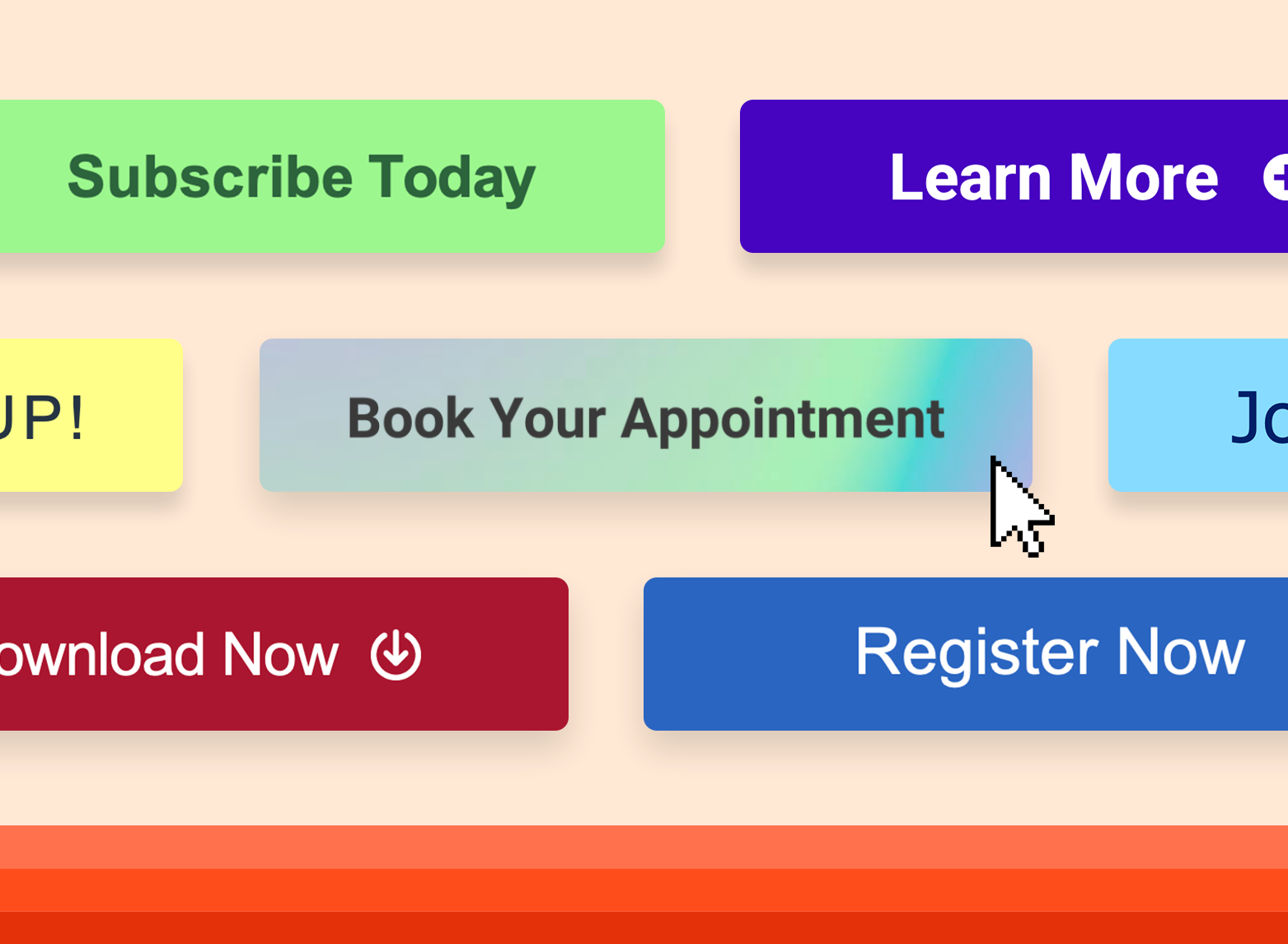
If there’s one thing I’ve learned, it’s that not all CTAs are created equal. The type of CTA you choose can quietly make or break your marketing results. The right one guides people forward naturally. The wrong one stops them in their tracks.
To help you figure out which CTA to use in different scenarios, I’ve put together 10 types that every marketer should know — along with what I’ve learned from testing and optimizing them throughout my career. But first, let’s start with what a CTA actually is.
Table of Contents
What is a CTA?
A call-to-action (CTA) is an image or line of text that prompts your visitors, leads, and customers to take action. It is, quite literally, a 'call' to take an 'action.' An example of a CTA is 'click here.'
You’ve probably seen hundreds, maybe thousands, of CTAs today alone without realizing it. You’re probably even looking at a few right now. They’re the buttons, links, and pop-ups that quietly guide you through every site you visit. And while they help businesses generate leads or drive sales, they also make it easier for users to move to the next step without friction.
With that in mind, let’s take a look at some of the most common types of CTAs every marketer should know.
28 Free Call-to-Action Templates
Increase website conversions with these free templates.
- Bottom-of-Post CTAs
- Form Button CTAs
- Sidebar CTAs
- And More!
Download Free
All fields are required.
Form not available
10 Types of CTAs Marketers Should Know
The CTAs below can be made with our free PowerPoint Template, so download it here if you want to use them on your own website. You can also create a CTA with HubSpot’s CTA tool.
1. Lead Generation
Lead generation CTAs are designed to turn visitors into leads. They prompt someone to exchange their information (like an email address) for something valuable in return, such as a free template, guide, or report.
These CTAs work best in high-traffic areas of your website where new visitors are most likely to land, like blog posts or your homepage. I’ve found that adding a clear, benefit-driven CTA at the end of or throughout a blog post often performs well. When readers finish a post they enjoyed, they’re already primed to take the next step.
Here’s an example of a lead generation CTA as it appears within a blog article (this one, to be exact):

It’s a great example of how a simple, well-placed CTA can drive engagement. The button stands out visually, the copy focuses on value, and you get exactly what’s promised without surprises.
Pro tip: Notice how this offer fits naturally within the context of the article? If your blog post is about content strategy, don’t offer a sales demo. Offer a content calendar template instead. Keep your offer tightly aligned with the topic. Relevance is what turns curiosity into conversion.
2. Form Submission
Once someone clicks a CTA and lands on your offer page, there’s still one more step before they become a lead: filling out the form and hitting submit.
It sounds simple, but this final moment can be the difference between a conversion and another bounce. I’ve seen plenty of strong offers lose momentum because the button copy wasn’t specific enough. The supporting text is also a big deal. It’s what builds trust and convinces people to share their information.
This page from Gong is one of my favorite examples of how to do it right:

Instead of a bland “Submit,” Gong uses “Grab the list.” It’s specific, friendly, on-brand, and keeps the momentum of the offer going. The microcopy above the form and throughout the page also builds trust. It explains exactly what you’re getting and gives a quick credibility cue.
Pro tip: Keep your forms as short as possible. Every extra field adds friction, and the less you ask for, the more likely people are to complete it. Start with just what you need, like a name and email address, and build from there only if it’s absolutely necessary.
If you’re looking for a way to create forms for your own site without complicated code, this free online form builder makes it easy to customize submission buttons, automate follow-ups, and track conversions on your own.
3. “Read More” Button
When you’re publishing a lot of content, it’s easy to overwhelm your homepage or blog feed. That’s where “Read More” CTAs come in. They give visitors a quick preview of your content and invite them to keep exploring without cluttering the page.
You’ve probably seen these CTAs in blog feeds, resource hubs, or news sites — even in social media captions. They might seem small, but they can make a real difference in how long someone stays on your site.
I’ve seen this firsthand when working on content-heavy blogs. Cutting the bulk of the text and replacing it with CTAs not only made pages easier to scan but also increased average session duration. People were more likely to click into individual posts instead of scrolling past long walls of text.
Here’s what that looks like in practice:

As you can see, the article gets a short snippet of text with a “Read More” button underneath. It’s clean, predictable, and easy to scan. Plus, it keeps readers curious enough to click through to the full story.
Pro tip: Don’t overthink the copy. In this case, the goal is to make it obvious, not clever. If you want to boost engagement even further, pair each button with a short teaser or preview image to give readers a reason to keep going.
4. Product or Service Discovery
When someone visits your website for the first time, they’re often there to figure out what you actually do and whether it can help them. That’s where product or service discovery CTAs come in. They help visitors explore your offerings in a way that feels natural, not salesy.
I’ve found these CTAs work best on homepages, product overview pages, or pricing pages where people are still deciding what to learn about next. The goal isn’t to close a sale right away; it’s to make discovery effortless.
Apple does this better than almost anyone:

Apple always features its newest product front and center on the homepage, but what stands out is how well it supports discovery for everything else, too. Right below the hero section, you’ll find CTAs to learn more about other models, compare products, or explore accessories. It’s a masterclass in keeping the spotlight on what’s new while still making it easy for visitors to find what they came for.
I’ve seen the same approach work for SaaS brands. Giving users multiple entry points to explore, compare, and convert meets them wherever they are in their journey. It turns what could be a single “Buy now” moment into a guided experience.
Pro tip: Pair your product CTAs with short, benefit-driven copy that focuses on outcomes, not features. “See how it works” or “Get started free” feels more approachable and helpful than “Request information” or “Submit inquiry.”
5. Social Sharing
Not every CTA needs to sell something. Some of the most effective ones simply make it easier for people to share what they love.
Social sharing CTAs turn your readers into promoters. With just one click, they can share your content across their own networks, helping you reach audiences you might not get to otherwise. I’ve seen this work especially well for blog posts, quizzes, and any content that feels fun or personal enough for someone to say, “You’ve got to see this.”
BuzzFeed has this down to a science — which makes sense, since shareable content is their whole thing.

They place share buttons at the top of every quiz or article and again at the bottom, right after you’ve finished reading or taken a quiz. It’s perfectly timed. You’re most likely to share something right when you’ve just enjoyed it.

I’ve tested similar placements on blog posts and newsletters, and it really does make a difference. Putting share CTAs where readers naturally pause, instead of tucking them away at the bottom of the page, almost always leads to more engagement.
Pro tip: Keep your social CTAs simple and easy to spot. A few recognizable icons in consistent colors do the job. The less effort it takes to share, the more likely people will actually do it.
6. Lead Nurturing
Not every lead is ready to buy right away, and that’s okay. Lead nurturing CTAs help you stay connected in the meantime, offering something valuable while keeping your brand top of mind.
I’ve found these CTAs are the bridge between interest and intent. When someone’s not quite ready to buy, a helpful, low-commitment next step can keep the relationship moving forward. Think of them as a conversation versus a pitch.
Mailchimp’s homepage does this really well:

Instead of relying on one big CTA like “Start Free Trial" (though they have that too), they offer multiple options that align with different levels of readiness, like “Download our report,” “Watch on-demand,” “Connect your store.” Each one gives visitors a way to keep learning or exploring without pressure. It’s subtle, but it builds a sense of trust and progress.
In my experience, this approach works best when you match the CTA to the mindset of your audience. For example, when I ran a campaign for a SaaS client last year, we swapped a single “Book a demo” button for a mix of options: one to “Explore features,” another to “See real customer results,” and one to “Try it free.” Engagement jumped by more than 40% because people could choose the level of commitment that felt right for them.
That’s the beauty of nurturing CTAs — they create momentum. Instead of asking for a big decision right away that could scare away prospects, you’re guiding someone closer to a “yes” with every small click.
Pro tip: Use nurturing CTAs to guide, not pressure. Offer something genuinely useful like a webinar, checklist, or industry report. Anything that helps people solve a problem before they even become a customer. When you focus on adding value first, conversions follow naturally.
7. Closing the Sale
After you’ve built awareness and nurtured trust, it’s time for the CTA to seal the deal. Closing-the-sale CTAs are designed for that final step — when someone’s ready to buy, start a trial, or talk to sales.
The key here is confidence and clarity. You want people to feel good about clicking, not hesitant. That means reinforcing trust and making the next step obvious.
Here’s a good example from Snowflake:

They don’t just drop a “Buy now” button and call it a day. Instead, they give visitors two clear options: “Start for free” or “Watch a demo.” It’s simple, direct, and meets people where they are. What I really love, though, is the supporting copy: “30-day free trial,” “No credit card required,” “Cancel anytime.” It instantly removes the friction that can make someone second-guess the click.
I’ve seen the same thing play out in my own campaigns. When we added a few short trust cues next to a CTA, like “Cancel anytime” or “No credit card required," conversions increased without changing anything else about the page. Sometimes, it’s not about making your button bigger or brighter. It’s about making it feel safer.
Pro tip: Don’t just focus on the button. Think about the words around it. Small phrases that build trust or clarify what happens next can be the thing that finally gets someone to click.
8. Event Promotion
Whether it’s a webinar, a conference, a community meetup, or any other event, a strong CTA can make the difference between someone just reading about it and actually signing up for it.
Event promotion CTAs are all about making it as easy and as appealing as possible for people to sign up or register.
Eventbrite sets the bar high here (no surprise, since their entire platform revolves around events):

Their CTAs (like “Get tickets”) are short, direct, and consistent across every page. From the homepage to individual event listings, it’s never confusing what you’re supposed to do next.
I’ve taken a similar approach for virtual event campaigns in the past, and the results speak for themselves. Replacing soft CTAs like “Learn more” with clear, action-driven ones like “Save your spot” or “Join us live” consistently boosted sign-ups. When the action feels immediate and simple, people are far more likely to commit.
That’s the key to great event CTAs. Make them obvious, make them sound exciting, and meet your audience right in that moment of interest.
Pro tip: Use action verbs that build momentum like “Reserve,” “Join,” or “Get your ticket.” If you’re running a recurring event or webinar, layer in social proof too. A line like “Join 2,000+ marketers” instantly adds credibility and makes the event feel can’t-miss.
9. Related Content
The longer a visitor stays on your website, the more likely they’ll convert to a lead. Related content CTAs help you keep readers on your site longer by pointing them toward what they’ll want to explore next. You’re not forcing them down a path; you’re just making it easy to stay curious.
Forbes does this really well:

At the end of each article, they include a “See Also” section filled with visual links to related stories. It’s clean, consistent, and easy to navigate. Each image gives a quick snapshot of what’s next, so readers can keep clicking without losing interest.
I’ve used this approach with clients before, and it works almost every time. Adding a simple “You’ll also like” section or surfacing related posts midway through long pieces keeps people exploring. It’s one of the easiest ways to reduce bounce rates and quietly build authority at the same time.
Pro tip: Don’t leave readers at a dead end. Add 2–3 genuinely relevant content CTAs that connect naturally to the post they just finished. Bonus points for visuals. People are far more likely to click when they can see what’s next.
10. Quiz CTA
Quizzes are one of those underrated tools that can do it all. They engage visitors, collect insights, and drive conversions — all without feeling like marketing. When done right, they make people want to interact with your brand just for the fun of it.
Zenni Optical does this brilliantly with their “Find Your Frame Personality” quiz:

They pair a standard “Shop all” button with a playful “Take quiz” CTA that instantly catches attention, especially for someone who’s not sure what they’re looking for yet. The follow-up section keeps the energy going with a friendly tagline: “A few quick questions. One big reveal. See which frames fit your vibe.”

I’ve seen this kind of CTA work wonders for brands that want to make discovery feel personal. Quizzes lower the barrier to entry and turn curiosity into clicks. And because the experience feels tailored, visitors are much more likely to convert after getting their results.
Pro tip: If you’re using a quiz as a lead magnet, keep it light and fast. Three to five questions are plenty. Make the results useful enough that people feel like they got something valuable, and they’ll have no problem sharing their email to see more.
Guide your visitors to conversion with CTAs.
After testing hundreds of CTAs over the years, I’ve learned that the best ones don’t just drive clicks, they guide people. I’ve seen how the right CTA, placed in the right spot, can completely change how someone experiences a page.
I try to think of every CTA as part of a conversation. What’s the most natural next step for the reader? What’s going to make them feel confident, not pressured? When I approach it that way, performance almost always improves, and the user experience does too.
I’ve also learned that small changes matter more than you’d think. A single word swap, a clearer value statement, or just moving a button higher on the page can make all the difference.
At the end of the day, the best marketers don’t guess — they test. So use these examples as a starting point, experiment with your own CTAs, see what clicks (literally), and let the data lead the way.
Editor's note: This post was originally published in September 2013 and has been updated for comprehensiveness.
28 Free Call-to-Action Templates
Increase website conversions with these free templates.
- Bottom-of-Post CTAs
- Form Button CTAs
- Sidebar CTAs
- And More!
Download Free
All fields are required.
Form not available
.webp)
![How to create a landing page with high ROI [+ expert and data-backed tips]](https://53.fs1.hubspotusercontent-na1.net/hubfs/53/%5BUse-2.webp)

![Signs it's time to redesign your website [+ 15 steps to follow]](https://53.fs1.hubspotusercontent-na1.net/hubfs/53/phaseswebsiteredesign%20copy.png)


![How to start a blog (the right way) and write posts people actually want to read [+ free templates]](https://53.fs1.hubspotusercontent-na1.net/hubfs/53/how-to-start-a-blog-2.webp)
![What is a lead magnet? 20 lead magnet ideas and examples [+ step-by-step]](https://53.fs1.hubspotusercontent-na1.net/hubfs/53/lead%20magnet%20represented%20by%20a%20magnet.webp)