Wouldn’t it be nice to know which buttons, with which colors, on which location on your website earn the most clicks? You don’t have to be a tech savvy marketer to find out because you can run A/B tests -- all without an expensive, sophisticated redesign of your website.
If you’re a newbie to website optimization, check out HubSpot’s A/B test FAQs to get started. But if you're already in the know, let's get started with one of the most important pages on your website -- your homepage. Here are a few A/B tests you can start running right now on your company’s homepage that could result in much better conversion rates, with relatively little effort on your part.
1) Test Your Call-to-Action Buttons
One of the most obvious ways to impact conversion rates is to run some tests on your call-to-action buttons. You can make tons of iterative changes -- color, copy, font, shape, placement -- all which seem minor but could actually impact visitors' behaviors.
If it seems too minor to make a difference, consider this: we actually conducted an A/B test on button color and found that changing the CTA button from green to red increased clicks by 21%. In the world of website optimization, that’s huge!
2) Test Your Navigation Bar
Determine which pages of your website bring in the most customers. Those are the pages to optimize and try to drive more traffic to. Switch the order of your site navigation bar and measure which order brings in the highest number of clicks for the pages that are most important for converting leads to customers. Or, if you don't want to do a navigation bar reorder, you could work on optimizing the copy on your nav items to compare which version gets more clicks.
As an example, a customer of Optimizely ran a test comparing the phrases they use on the navigation bar. They discovered that “How It Works” earned 47.7% more clicks than “Why Use Us.”

3) Test Your Login and Signup Buttons
If your company offers a product that allows users to sign up and/or log in, decide which action is more valuable to your company. Is it more important to get new users to sign up, or to get people logging into their pre-existing account? When you know which is a priority, try swapping the order or color of these buttons to learn which order earns you the most clicks for that option.
4) Test Your Content Offers
If your company runs an inbound marketing playbook, you may highlight the most popular content offers on your homepage. As you can see in the screenshot below, HubSpot lists our most popular offers on the homepage.

However, it's hard to determine which offers will be the most popular for your homepage -- after all, the traffic you get to your homepage is different than the traffic to, say, a blog post. To determine which offer(s) brings in the most leads or even the most customers, try swapping out the offers you feature to see which ones perform best. And once you've determined which offers are the best to highlight, you can even test shifting the order of these resources to determine how you can get the highest clickthrough rate for those assets that convert best.
5) Test Your Images
Does your homepage feature beautiful imagery? Have you tried different images to determine if some encourage more engagement than others? It may be worth it to learn if certain types of images -- images of people, images of your products, illustrations versus photographs, sliders versus static images -- draw visitors deeper into your site.
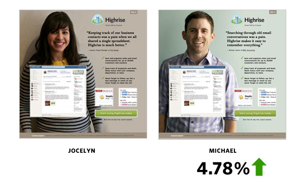
Highrise, a small business CRM, A/B tested their website's imagery by featuring two different people -- Jocelyn on the left, and Michael on the right. They found Michael helped improve conversions by almost 5%.

6) Test Your Headlines
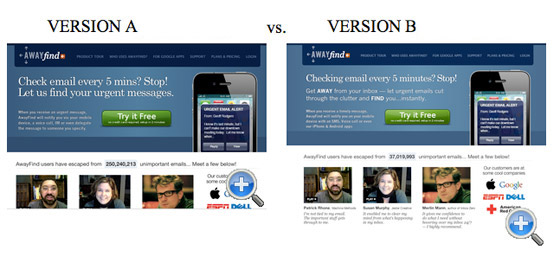
Headlines are the main text featured on your homepage, so it makes sense to invest some time testing what the best copy or styling is for that prime real estate. You can measure visitor engagement, or like the example below, measure clicks on the CTA.

In the example above, WhichTestWon ran an A/B test on AwayFind’s homepage and found that Version B increased signups by 38%. This could be because the headline is more concise and the subheader includes bolded words to clearly communicate the product's value -- but hey, you never know what'll work for your headlines. Which is why we do A/B tests. Right? Right.
7) Test Your Hyperlinks
Hyperlinks follow the same principles as the text in CTAs. Specific words resonate better with certain audiences -- and since your hyperlinked words typically stand out visually, your anchor text matters. Revist the words on your homepage that link to other pages of your website. Brainstorm other phrases and test which earn more clicks. Another option is to change the color of the hyperlinks and determine if using a different color brings in more clicks.
Of course, this wouldn't be an A/B test post if we didn't include the A/B test caveat: what works for one company may not work another. Several factors come into play including a company's industry, target demographic, and product or service offering that all impact why one variation works better than others. The bottom line is that data should drive every decision regarding changes to your website. If you think there might be a better way to present information on your homepage, it’s worth testing.
A/b Testing


![How I Use Landing Page Split Testing to Find Untapped Marketing Potential [+ 12 Places to Start]](https://53.fs1.hubspotusercontent-na1.net/hubfs/53/landing-page-split-testing-1-20250121-3573417.webp)
![How to Understand & Calculate Statistical Significance [+ Example]](https://53.fs1.hubspotusercontent-na1.net/hubfs/53/how-to-calculate-statistical-significance-1-20250106-7754856.webp)


.png)