The Definition of Symmetrical Balance
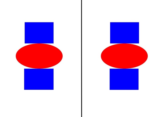
Symmetrical balance occurs when you have two identical sides of a design with a central point of axis -- so if you cut the design in half, the left and right are mirror images of each other. To be considered perfectly symmetrical, a design needs to have equally weighted visuals on either side.
Symmetrical design allows you to draw attention to all areas of an image equally. Since this form of design is usually very structured and rigid in nature, it’s referred to as formal balance. For marketers, symmetrical design is ideal for projects like event invitations or discount offers, but can seem boring if used on more creative pieces.
Let’s take a look at an (admittedly very basic) example of symmetrical balance:

Not quite the Taj Mahal, but it’ll do.
The Definition of Asymmetrical Balance
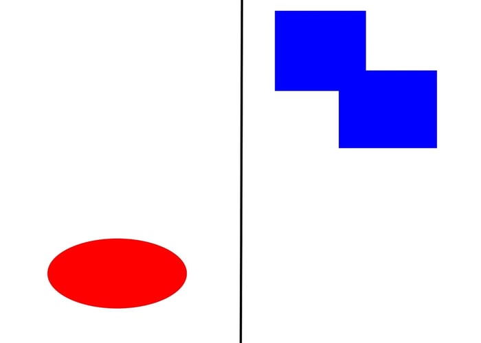
Asymmetrical balance occurs when you have different visual images on either side of a design, and yet the image still seems balanced. To be considered asymmetrical, a design needs to have unequal visual weight on either side, but those unequal visuals need to balance each other.
Asymmetrical designs can evoke feelings of movement and seem more modern than symmetrical designs, but it can be more difficult and less straightforward to create relationships between the design’s individual elements.
Let’s take a look at an example of asymmetrical balance:

It’s important to note asymmetrical balance is still strategic -- placing shapes haphazardly around a page won’t create a compelling composition. To create a successful asymmetrical design, you still need to figure out how to balance out the image.
Vincent van Gogh’s The Starry Night, for instance, uses a notable visual, the sun, in the top right, and balances it out with a dark cypress tree in the bottom left. It would not be a successfully asymmetrical balance if van Gogh put both the sun and tree on the right side of the page.
Asymmetrical vs. symmetrical balance
Asymmetrical balance is when you have two dissimilar sides of a design and have positioned visual weight unequally, and yet you’ve still achieved a sense of balance. It evokes a sense of modernism and movement. Symmetrical balance, on the other hand, is when you have two identical sides of a design with equal weight on either side of a central point of axis. It evokes a sense of formality and structure.
Design


![How to Create the Perfect Marketing Timeline [Template + Examples]](https://53.fs1.hubspotusercontent-na1.net/hubfs/53/project-timeline-template-1-20240919-3074583.webp)
![My Tips for Designing Great Website Imagery [With Canva, HubSpot, + 3 More Tools]](https://53.fs1.hubspotusercontent-na1.net/hubfs/53/Untitled%20design%20-%202025-02-14T161951.776.png)
![12 web design best practices & guidelines for usability [+ expert tips]](https://53.fs1.hubspotusercontent-na1.net/hubfs/53/website-design-tips-1-20251229-288711.webp)

![How to design a logo [step by step]](https://53.fs1.hubspotusercontent-na1.net/hubfs/53/Operation-everest-free-advertising-1-20250922-654468.webp)
