There's good news here: It’s only partly gift. The rest is just technique — technique that you can learn and master. You — yes, you! — can unleash the same wizard-like conversion copy powers, as long as you understand the techniques at play.
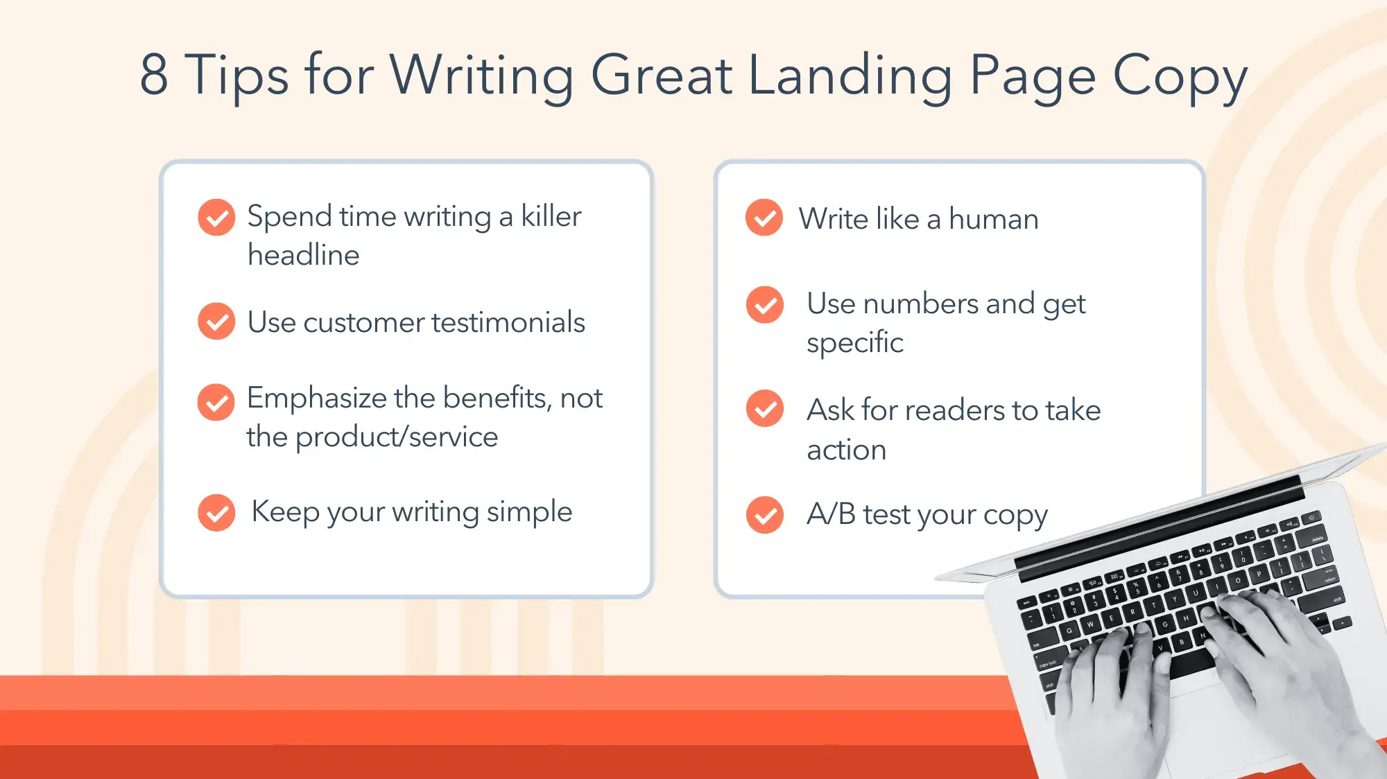
8 Tips for Writing Great Landing Page Copy
You see, conversion is very much a science of the mind — how your prospect‘s mind processes information, makes decisions, and decides to convert. In this post, I’ll describe eight writing techniques that are proven to work.
After putting your time and resources into generating traffic, here’s how you can turn traffic into revenue by creating copy like a conversion pro.
Here are the landing page copy best practices we'll cover:
1. Spend time writing a killer headline.
This isn’t the best news you’re going to read all day, but someone needs to say it: People don’t meticulously read your landing page copy. They scan, they skim, and they allow their eyes to flitter across the page, but they don’t (usually) read every word.
So, what's a copywriter to do? Go find a job where someone appreciates our hard work?
No. We adapt to the customer and produce copy that will compel them to convert despite their skimming habits. Here’s what customers do pay attention to:
- The headline.
- The subheading (usually).
- Pictures.
- CTA buttons.
After that, customers may or may not read the following:
- Major section headings.
- Bullet points.
- Short paragraphs.
- Image captions.
That should give you an idea of what to focus on as you write your conversion copy.
The most important piece of content is the 10 or 15 words in the headline. Nail that, and you’ll have come a long way.
To help convert the non-readers, you should:
- Make your headline big, strong, and clear.
- Use a compelling subheading that pushes your product’s benefits.
- Show large pictures that demonstrate the benefits of your products and explain your message.
- Use strong copy in your CTA.
- Break your copy up into major sections, led by a headline in large type.
- Use bullet points to discuss the benefits of your product. Short bullet points. Not long ones.
- Use short paragraphs rather than long blocks of text. Any paragraph over five lines long can be hard to digest.
- Use captions on your images.
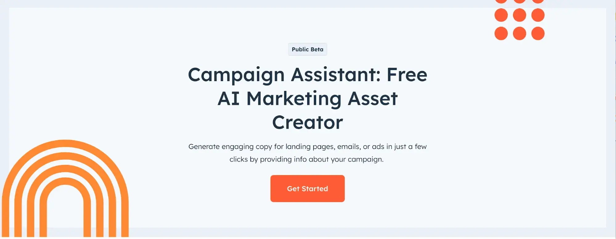
Stuck? HubSpot’s Campaign Assistant can help you generate copy, and it’s free to use.
2. Use customer testimonials.
One of the most powerful conversion copywriting techniques isn’t about writing at all; it’s about letting happy customers write your copy for you.
Testimonials produce conversions like nothing else can. It’s impossible to write copy as good as your customer. Why? Because good copy isn’t just style and substance — the source matters, too.
Testimonials are compelling because they show the customer what they will experience if they use your product or service.
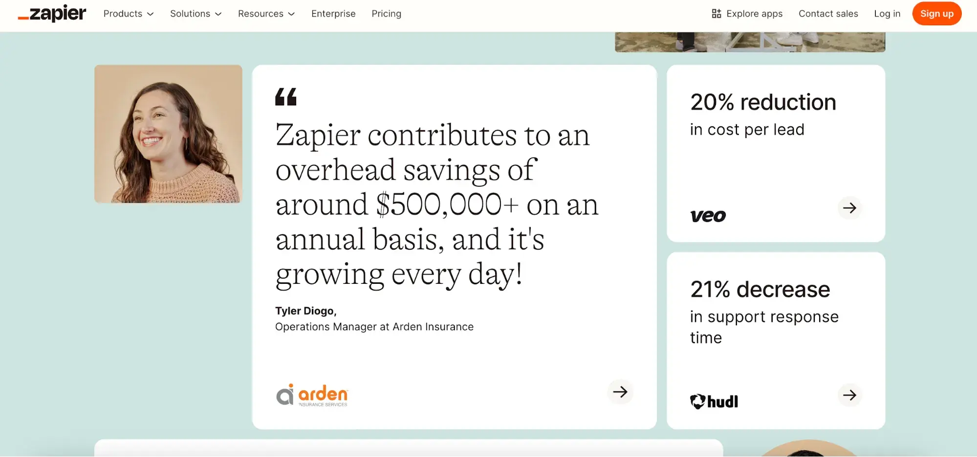
Zapier’s landing page is a great use case for these customer testimonials. A key to its successful, high-converting landing pages is that it places testimonials front and center, featuring a picture of the customer alongside a quote. It also uses the customer’s full job title and company along with a company logo, which really bolster the testimonial’s credibility.
Remember, your best conversion writers are your customers, so let them speak for themselves. Social proof is a powerful addition to your copywriting and marketing strategy.
3. Emphasize the benefits — not the product/service.
One of the most important lessons I've learned in online marketing is that customers don’t really care about your products or services.
In other words, they don‘t care about the "solution" you’re trying to sell to them. A group of Harvard researchers conducted a study of 1,400 B2B customers in a variety of fields and concluded that we’d reached “the end of solution sales.”
That study was from 2012, but its findings have been supported more recently — McKinsey & Company’s 2024 study confirms yet again that B2B customers are acting more and more like individual consumers, completing a significant part of the buyer’s journey before ever interacting with a sales rep.
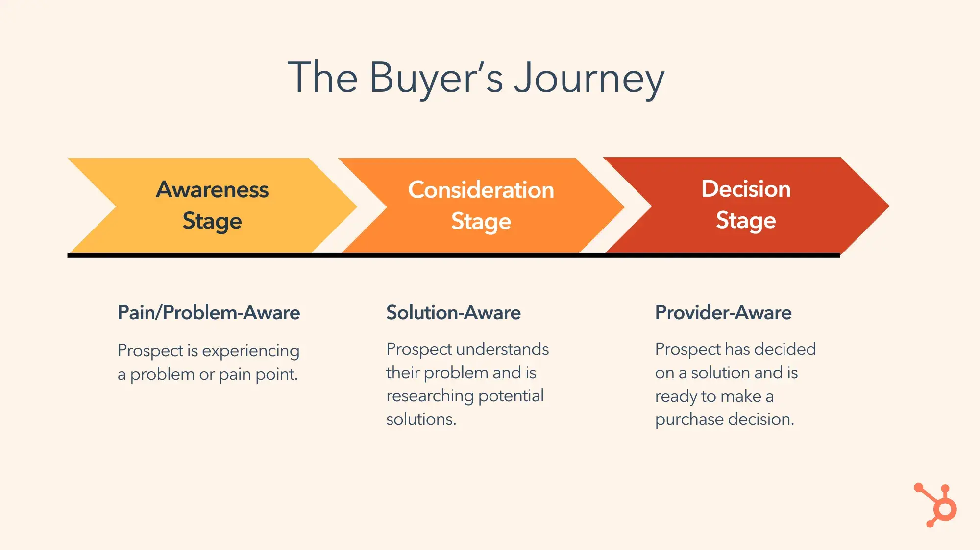
Traditionally, sales was predicated on the “solution-selling method.” Aja Frost, HubSpot’s senior director of global growth, says that solution selling “rests on a pretty simple premise: Prospects want to be solved for, and salespeople are uniquely equipped to be the ones who solve for them."
That approach has declined in popularity for one very simple reason: Customers already know what solution they’re looking for. They are capable of learning virtually anything thanks to the internet and search engines.
In fact, not only do customers know the solution, they also know the features they are looking for, the requirements the product must meet, and even benchmark pricing.
If you are only pitching your solution, you’re not giving your customers what they need and want. You need to pitch benefits.
It’s okay to mention your solution, because that signals to the customer that they’re in the right place — but don’t push that solution. Instead, push the benefits.
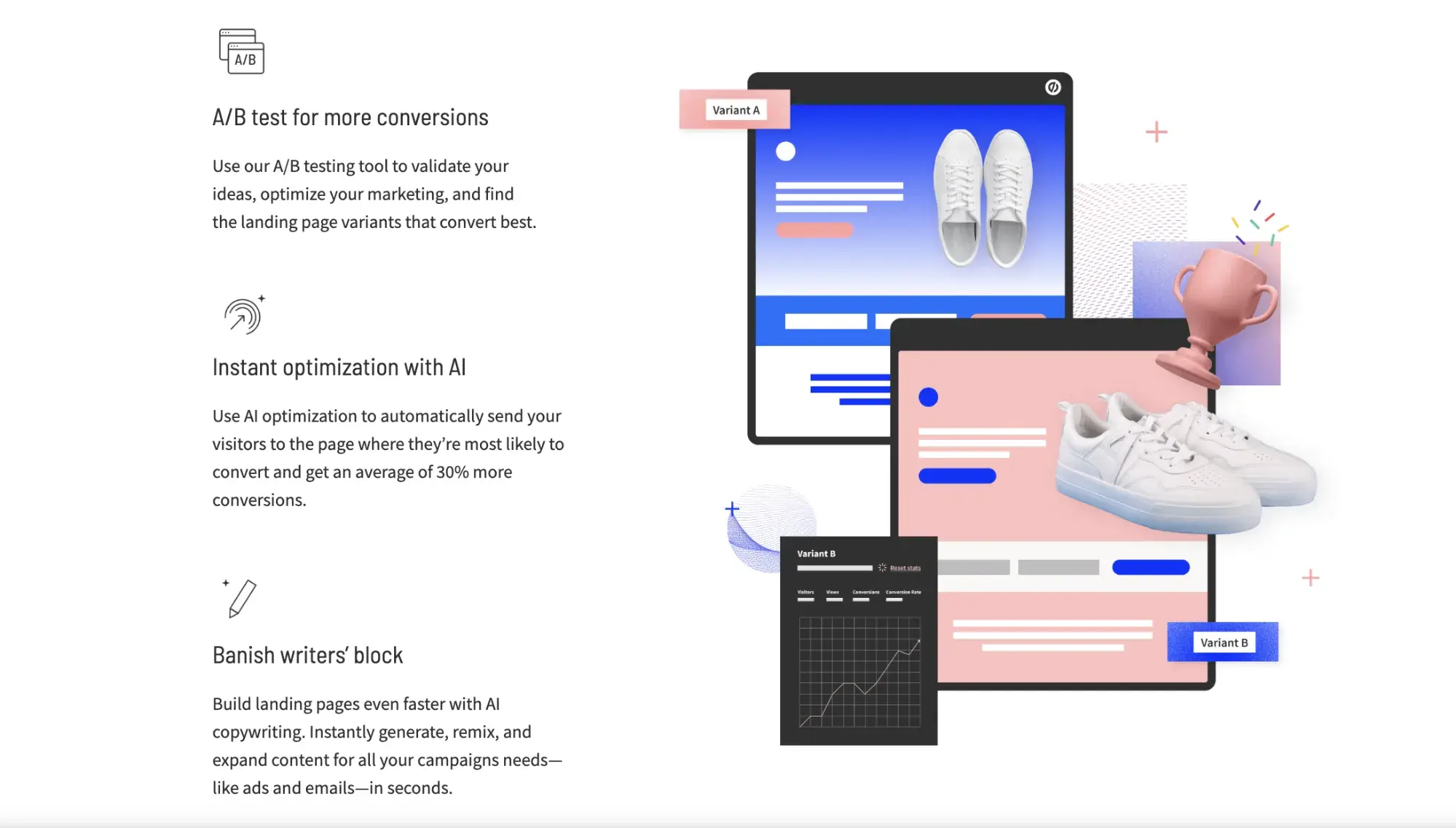
Let's look at an example from Unbounce, which successfully emphasizes the benefits of its product on this landing page: “more conversions,” “instant optimization,” and “banish writers’ block.”
GetACopywriter.com leads with benefits on its landing page, pictured below. Its ideal customer is looking for copywriters, so it simply pitches the benefits of using its service to find one — like human (not AI) writers and SEO optimization.

Benefits trump solutions every time. If you want to take your landing page copywriting to the next level and increase conversion rates, put customer benefits at the forefront of your marketing efforts.
4. Keep your writing simple.
The best conversion copy you’re going to read will come in the next two words: Be simple.
You may be as good of a writer as Stephen King or Joan Didion, but that doesn't matter so much because literary prowess is useless in conversion copy. Your most powerful writing skill is simplicity. Simplicity sells.
Take Optimizely, for example. It produces brilliant landing pages for its clients, but take a look at its own landing page:
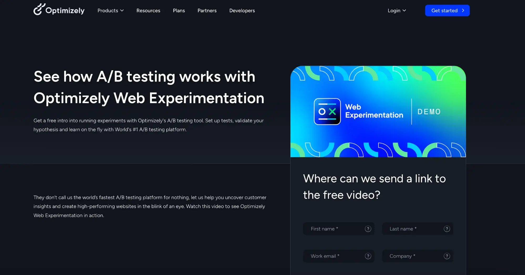
Is that it? Yes, yes it is. And it's very effective. Why? Because it’s so incredibly simple.
Let’s visit another landing page service — Get Response. Its landing page has a little more to it, but not much:
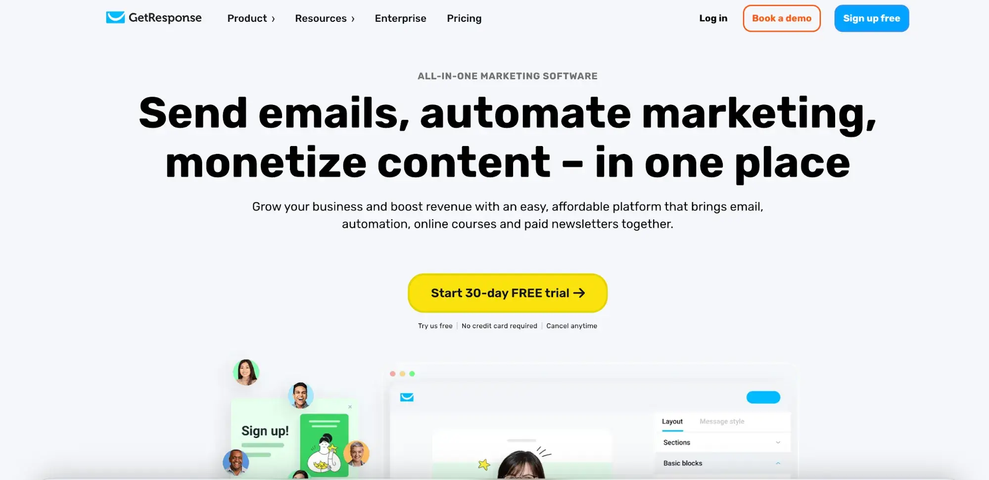
Simplicity again. Did whoever wrote those landing pages sit around for hours brainstorming, testing, tweaking, standing in front of a whiteboard with a fistful of colored markers, thumbing through a thesaurus, taking long walks in nature, and meditating on the meaning of life in order to produce such brilliant simplicity?
Nope. They just wrote the simplest, clearest statements they could.
But simplicity doesn't mean replacing creativity with meaningless buzzwords. ConversionXL created a list of words that marketers should do their best to avoid:
- “On-demand marketing software”
- “Integrated solutions”
- “Flexible platform”
- “World leader”
- “Once-in-a-lifetime opportunity”
- "Changing the way X is done"
- “Paradigm shifting”
- “Exceeding customer expectations”
Those clichés don’t work anymore — you need to keep it simple. (And if you need inspo on how to do it right, we’ve got 31 great marketing tagline examples.)
Here are a few tips for keeping your landing page copy simple:
- Use a simple sentence structure.
- Keep sentences short. Only one idea per sentence.
- Use short words. Short words are easy to understand and skim.
- Don’t get fancy with your wording — don’t use a $5 word when a 50¢ one will do.
- Be clear and succinct. Use the most basic words to describe what you’re trying to say.
If you can be simple, you can write great conversion copy.
5. Write like a human.
There’s another technique that will help you crush your competition: Sound like a human being.
At some point, a bunch of copywriters decided it would be great to produce copy that sounded strained and robotic. Who’s writing this stuff? And who’s reading this stuff? I don’t know, but I do know that no one is converting on it.
Now that AI is a common step in marketing workflows, including writing content, the human touch is more important than ever. That doesn’t mean you have to avoid AI, it just means you need to edit it and make sure it sounds human.
People prefer to connect with other people, not with robots. That’s why your copy needs to sound like a human wrote it. Here are some specific things you can do to make your writing more personal:
- Write the way you speak.
- Use normal words, like the ones you’d use if you were talking to a 10-year-old. For example, why use “convivial” if you can use “friendly?”
- Use short sentences.
- Break grammar rules if the writing still sounds good and natural.
- Be funny.
- Use first person.
- Use contractions. “You’ll be amazed” sounds far more natural than “You will be amazed.”
- Use expressions you’d use in a normal conversation. “Seriously.” “I’m thinking…,” “Wait a second.” “It was crazy.” “Wow.” “It was pretty awesome.” “It’s like…”
Ramit Sethi, a personal finance advisor, entrepreneur, and author of the blog I Will Teach You To Be Rich, has sky-high conversion rates and a powerful personal style. His blogs read like a personal email to a best friend. He doesn’t even mind tossing in a word or two that he would use if he was hanging with his buddies.
Check out this excerpt from one of his blog posts about whether you earn enough money:
![how to avoid the “more, more, more” trap. most people assume that more money equals more happiness, but in reality, the pursuit of more is often a never-ending cycle. if you’ve ever thought, “once i hit [$x], i’ll finally be secure,” only to move the goalpost every time you get close, you’re stuck in the more trap—constantly chasing a number that doesn’t exist. the problem? more money alone doesn’t create financial freedom. without an intentional plan, you can always feel like you’re behind, no matter how much you earn.](https://53.fs1.hubspotusercontent-na1.net/hubfs/53/landing-page-copy-11-20250415-7888363.webp)
Sethi is conversational but still authoritative. Try to get yourself away from the idea that you’re writing “copy,” and think of it more as a conversation. If you do that, you’ll write better. You’ll sound like a human. Your conversion rates will go up.
6. Use numbers and get specific.
The more specific you are, the more believable and persuasive you will be. Which one of these claims is more persuasive to you?
- “Your conversion rates will explode!”
- “In the last 90 days, customer conversions have increased by an average of 78.2%.”
The second one is far more specific, and therefore more believable. Anyone can make blanket claims about awesomeness, but not everyone can cite statistics and detailed metrics.
Let's take a look at an example. Check out this landing page from Calendly, which combines customer testimonials and specific numbers that promote Calendly’s benefits:
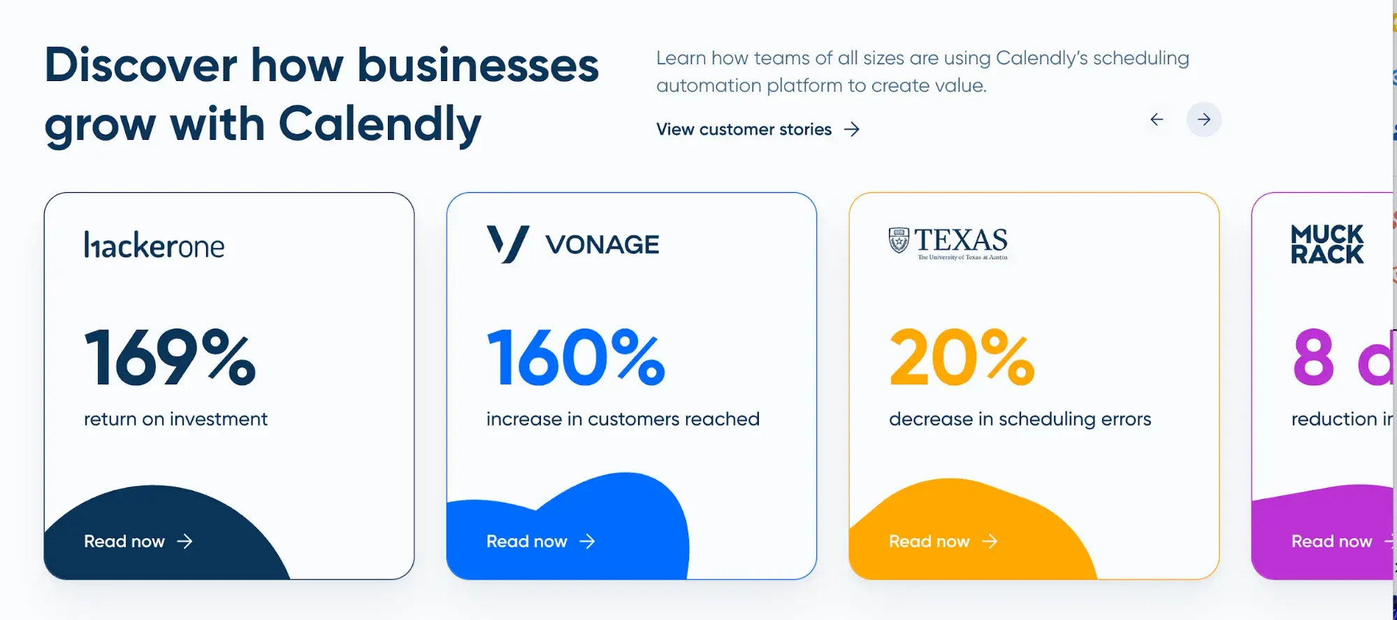
How effective would it be if Calendly claimed to have “millions of appointments scheduled?” It’s certainly much less compelling than something as specific as “a 160% increase in customers reached” or “a 20% decrease in scheduling errors.” Attaching each of those numbers to a particular client makes this even more specific.
The number makes a big difference. Customers want specific information about benefits other customers are seeing, and they want specific examples of what they will experience. Specificity is a powerful tool.
7. Ask for readers to take action.
The final killer technique of a conversion pro is the call-to-action. If you don‘t ask for conversions, you won’t get them. That’s why I suggest that you start with the end goal in mind — and the whole point of your landing page is that conversion. All of your copy should be building up to that conversion. Don't be shy!
Similarly, writing CTA button copy is just as important, if not more so, than the rest of the copy on your page. Remember how I mentioned that CTA buttons are copy that people actually read? It matters. Simple changes in wording can create huge conversion increases — just remember to conduct A/B tests.
For more ideas on CTA copy that drives clicks, check out these 14 real-life examples of great CTA copy.
8. A/B test your copy.
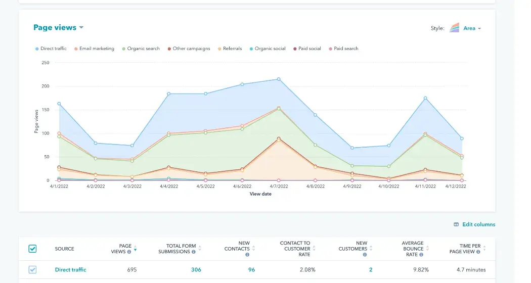
A good conversion copywriter isn’t just writing — you’ve got to be testing, too. How else will you know what kind of writing converts higher or lower for your audience?
There are all kinds of A/B tests you can do on a landing page — images, placement, flow, layout, etc. Rebecca Hinton, a CRO strategist at HubSpot, ran an A/B test in 2024 that tested a tiny layout tweak — and it led to 20% more conversions on one of our landing pages.
Usually, however, the biggest gains come from changes in the copy. If you want to gain higher and higher conversion rates, you’ll need to test your copy along with the other elements of your landing pages.
Don’t expect to hit a home run on your first at-bat. You will succeed by carefully, methodically, and intentionally testing every variation. Here are some of the things you can test:
- Headline variations
- Subheading variations
- CTA copy
- Lists of benefits
Test small things, too. Changing a single word in the headline could make a huge impact on your conversion rates. You won’t know unless you test it out. (Don't know how to run an A/B test? We’ve got tips.)
In 2024, HubSpot tested different copy on CTA buttons for some of our free downloads. We tested three variants against a control, and found that "Download for Free" got more clicks than "Download Now" or "Download the Free Template."

You can use HubSpot's free landing page builder to test page variations against each other.
Get Started With Writing Landing Page Copy
All in all, boosting conversion rates starts with killer copy. A whole lot depends on the words that you type with your keyboard. Thankfully, it’s not some insurmountable task — anyone can learn how to do it. With the right copywriting techniques firmly in place, you can achieve higher conversion rates.
What techniques do you use to write your conversion copy?
Editor's note: This post was originally published in October 2014 and has been updated for comprehensiveness.
Free Landing Page Builder


![How to create a landing page with high ROI [+ expert and data-backed tips]](https://53.fs1.hubspotusercontent-na1.net/hubfs/53/%5BUse-2.webp)



![Why You Need to Create More Landing Pages [Data + Tips]](https://53.fs1.hubspotusercontent-na1.net/hubfs/53/create%20more%20landing%20pages.png)
.png)


.jpg)