That's why we’ve rounded up 21 of our favorite lead generation forms and included key takeaways from each to help you create a great user experience and increase your own conversions.
22 Lead Generation Form Examples
- HubSpot Marketing Grader
- Slack
- Dropbox
- Optimizely
- Sentient Ascend
- Oracle
- eHarmony
- Microsoft Small Business Academy
- Lyft
- AirBnB
- Bizness Apps
- SoulCycle
- Unico Nutrition
- Zillow
- Crazy Egg
- Hulu
- Broadcast2World
- DIRECTV
- Bounce Exchange
- My Simple Show
- MakeForms
22 Lead Generation Form Examples
While reviewing the following examples, be sure to keep an eye out for themes — many of these forms employ common, effective tactics that you can apply to your own.
1. HubSpot Marketing Grader
Source: HubSpot
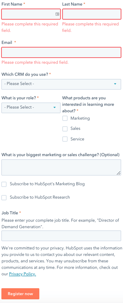
The HubSpot Marketing Grader homepage has a unique CTA — it’s a jump link that, when clicked, scrolls down to the bottom of the page where the lead generation form is located. This prevents you from having to search around the website for the form. The form is clean, contains no distractions, includes form field titles that are easy to understand, and tells you what information is required.
Key takeaways:
- Jump link to the form
- Form has a clean and sleek appearance with no distractions
- Straightforward form field titles
2. Slack
Source: Slack
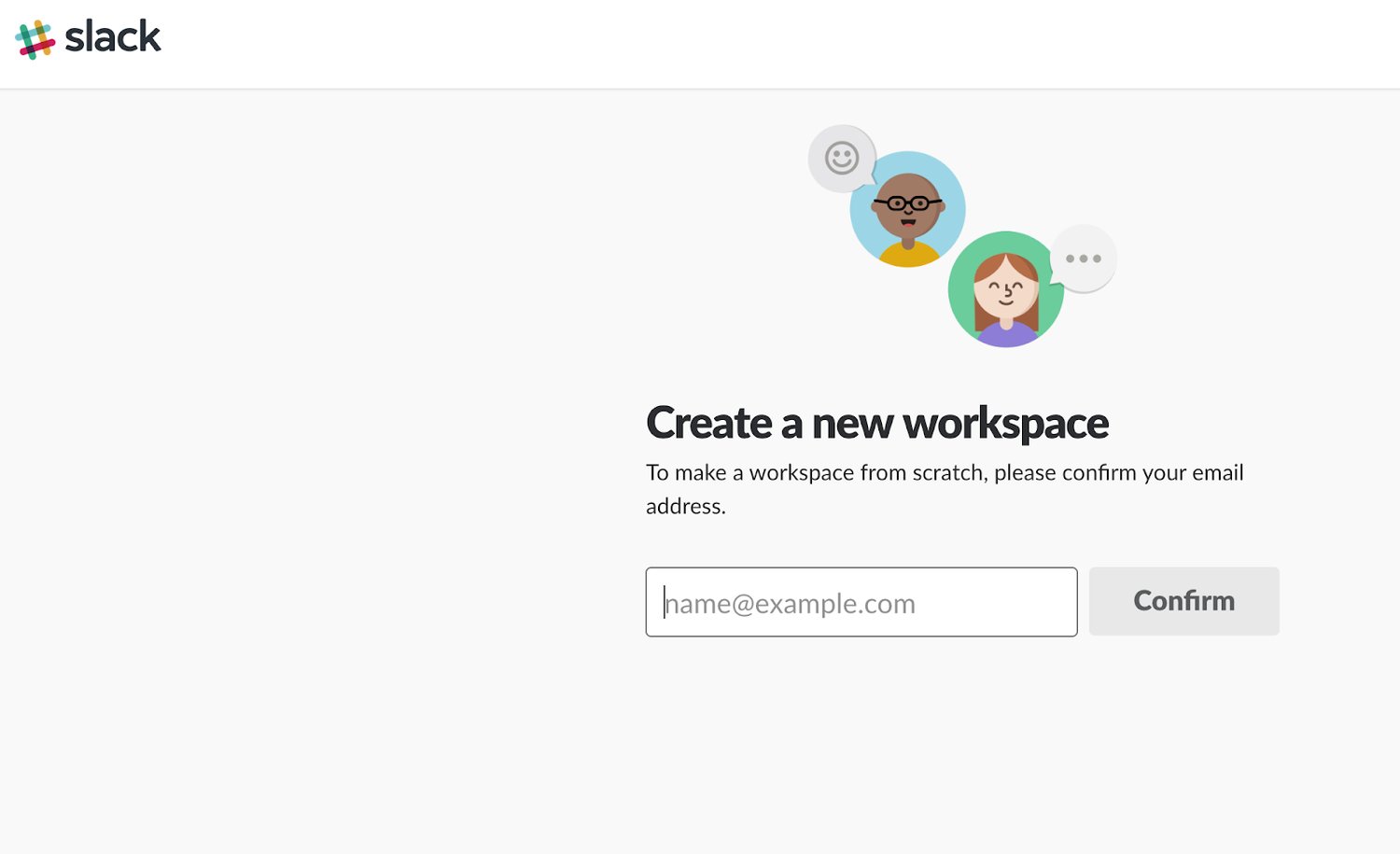
Slack keeps things simple with their multi-step lead generation form. The form asks for an email address before taking you to another landing page to complete a few more necessary fields. Slack’s lead generation form also matches their brand’s aesthetic and includes fun animations that don’t distract you from completing the form.
Key takeaways:
- Simple and straightforward
- Split up into multiple steps (and pages) due to the number of necessary fields
- Branded appropriately with unique animations
3. Dropbox
Source: Dropbox
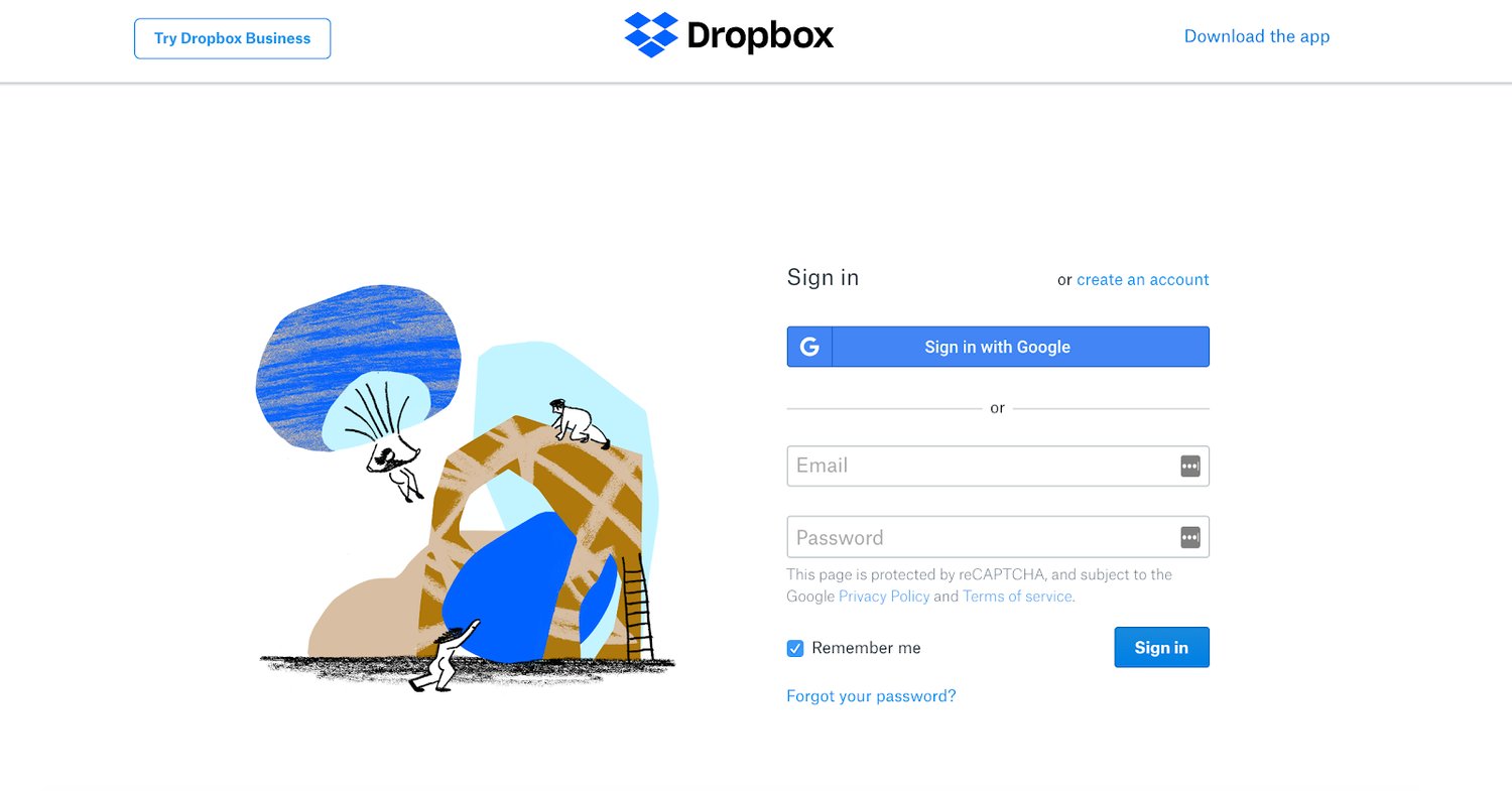
Dropbox’s lead generation form appears when you click on the CTA button located on the company’s landing page. There are only four required fields and the form allows you to speed up the completion process by giving you the option to sign in using your Google account.
Key takeaways:
- Clear CTA button leads you to the form’s landing page
- Only four required fields on the form
- Optional sign in using Google account
4. Optimizely
Source: Optimizely
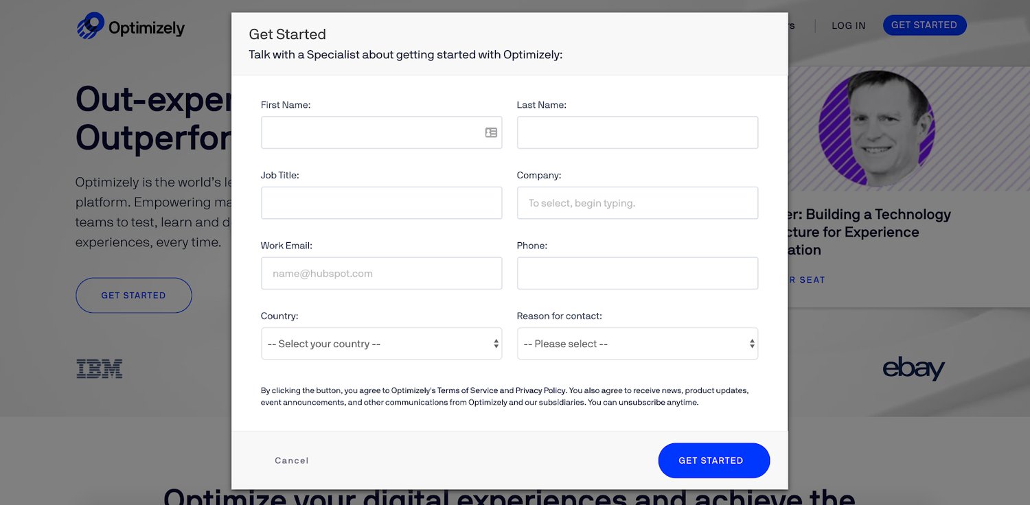
There’s a bright and bold “Get Started” CTA button in the top right corner of Optimizely’s landing page. When you click it, their lead generation form appears in a popup box (along with a dimmed background, making the form easy to read and complete). The two-column format also makes the form appear shorter.
Key takeaways:
- Bright and bold CTA button on the company’s landing page
- Form appears in a popup box and the entire background dims
- Form’s two-column format tricks the eye and makes it appear shorter in length
5. Sentient Ascend
Source: Sentient Ascend
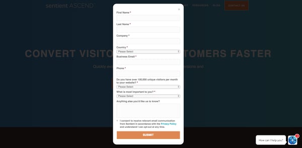
Sentient Ascend’s CTA button is pretty much the first thing you see when you go to the company’s website — it’s bright orange and located in the hero section of the page. The form clearly marks which fields are and are not required for you to complete, and there is an optional long-text entry field where you can leave a longer response.
Key takeaways:
- CTA button is very visible
- Form clearly tells you which fields are and aren’t required
- Long-text entry field allows you to comment freely
6. Oracle
Source: Oracle
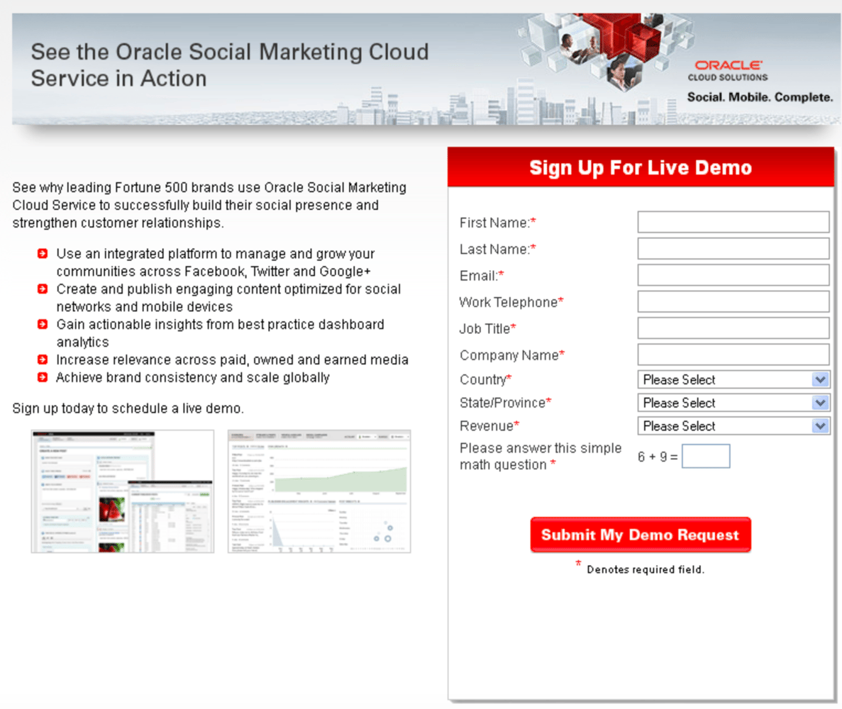
Oracle’s lead generation form is unique because it includes a description about the reasons why so many impressive companies already use their product. They use social proof as a way to entice you to sign up.
The form fields are to the side of the product description, which clearly separates the two sections of the page. There is also an asterisk next to each required field to avoid confusion about what information needs to be submitted. Oracle also added a simple math question at the end of the form to ensure only humans are signing up (which works in a similar way to a CAPTCHA).
Key takeaways:
- Form uses social proof and product benefits to encourage submissions
- Asterisks show you which fields are necessary
- Simple test at the end of the form serves as a CAPTCHA workaround
7. eHarmony
 Source: eHarmony
eHarmony’s lead generation form is the first thing you see when you enter the site. The form states that signup is free, which is an added incentive considering eHarmony is a paid dating service. The unique form design — which includes colorful circles that act as checkboxes — is visually pleasing and fits the company’s branding. With only five form fields, sign up is a quick and painless process for visitors.
Key takeaways:
- Form is front and center when you enter the site
- Unique form design matches the company’s branding
- Signup incentive
8. Microsoft Small Business Academy
Source: Microsoft Small Business Academy
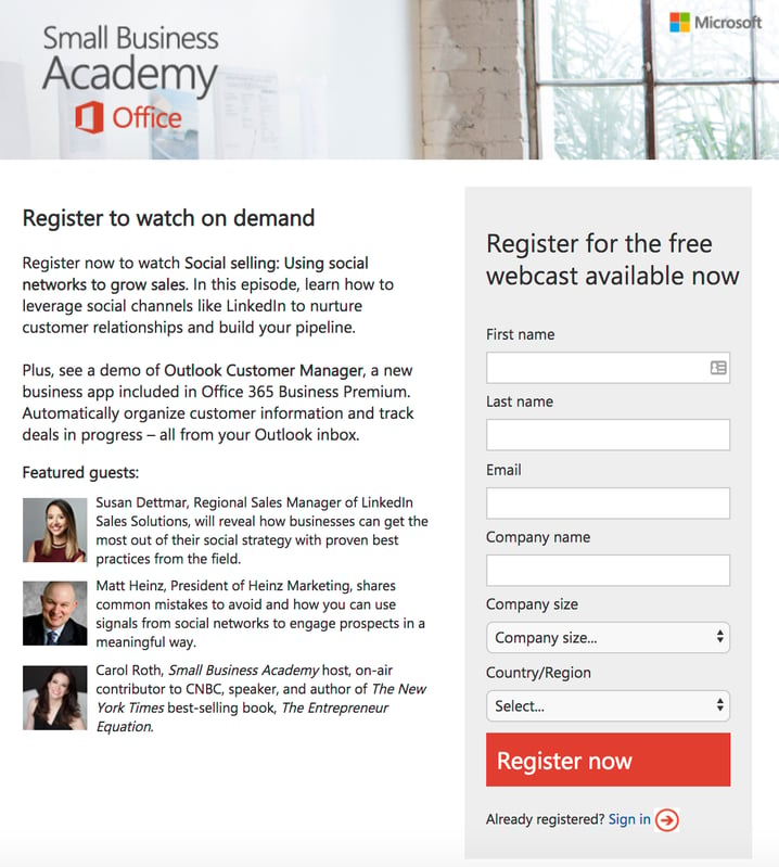
The Microsoft Small Business Academy lead generation form lists multiple reasons why you should register for their webcast — located right next to their lead generation form. Not only do they mention what registration includes, but they also add to the excitement with short bios about the webcast’s featured guests.
The form is set apart from the other content on the page as it is located in a separate box, making everything on the page easy to read and the form easy to complete.
Key takeaways:
- Descriptions are included about the reasons you should sign up
- Details about the webcast’s features and guest speakers are listed
- Form is set apart from the other content on the page
9. Lyft
Source: Lyft
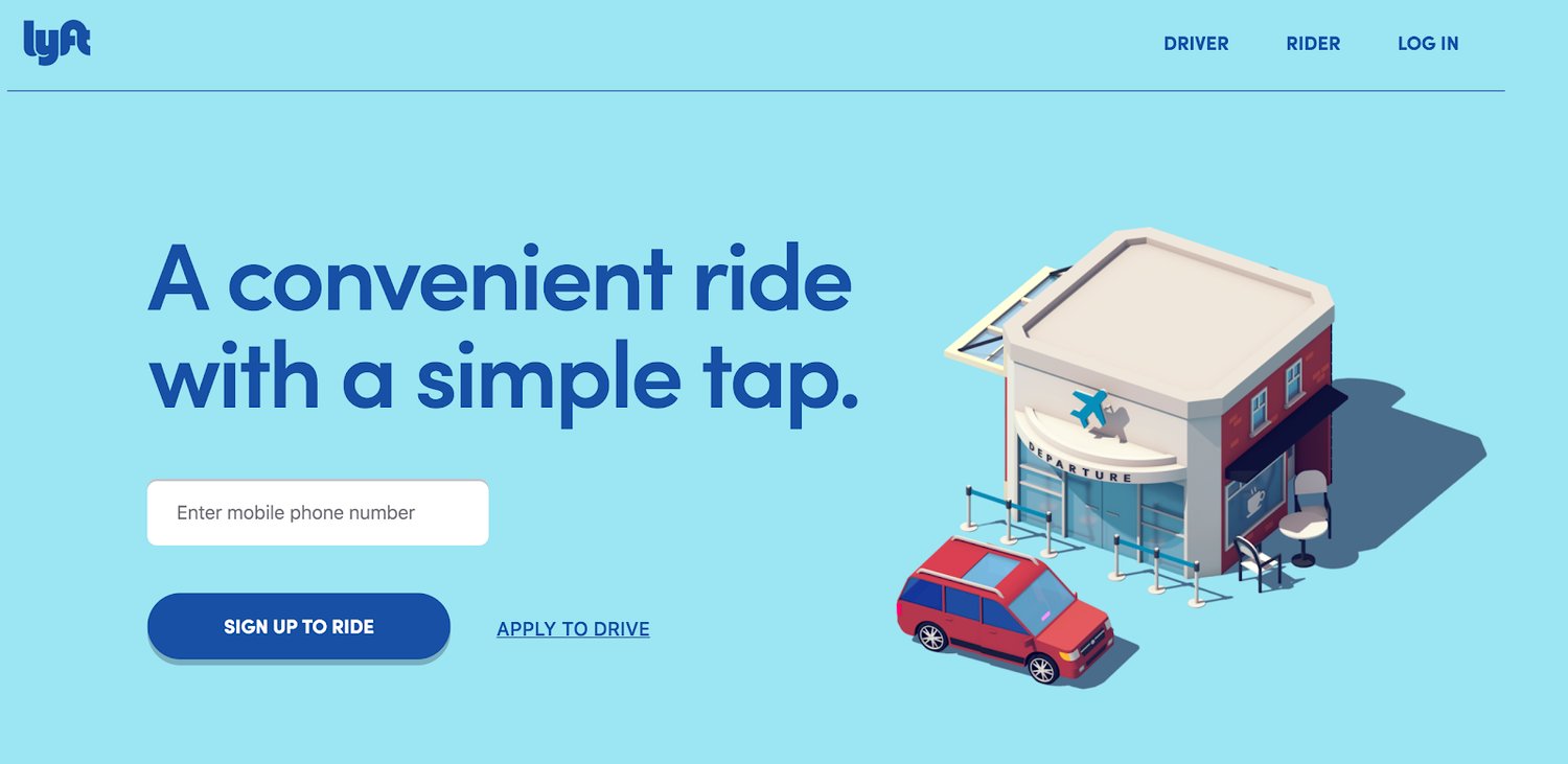
The Lyft lead generation form is just about the only thing you see (along with some fun animations) when you enter the company’s website. The form serves two purposes — you can either sign up for a ride or apply to become a driver. With the click of a button, the form changes back and forth between these two options. Lyft also makes signing up appear simple by only requiring one piece of information to get started.
Key takeaways:
- Visuals don’t detract from the form
- Form has a dual purpose that saves you time
- Multi-step form looks less daunting to complete
10. Airbnb
Source: Airbnb
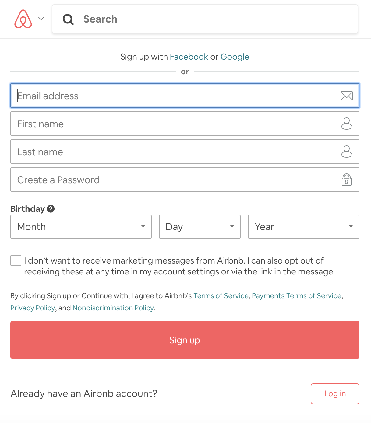
When you open Airbnb’s website and click on their sign up CTA, you are brought to the form pictured above. The form allows you to sign up using your Facebook or Google account to speed up the process.
When they created their form, Airbnb assumed you may have questions come up during the signup process. Located next to specific form fields, there are buttons with question marks that explain why Airbnb requires certain information. Airbnb also confirms whether or not you want to receive their marketing messages via email before simply signing you up.
Key takeaways:
- Option to connect to your Facebook or Google account
- Explanations included about why specific information is required
- Opt into marketing messages
11. Bizness Apps
Source: Bizness Apps
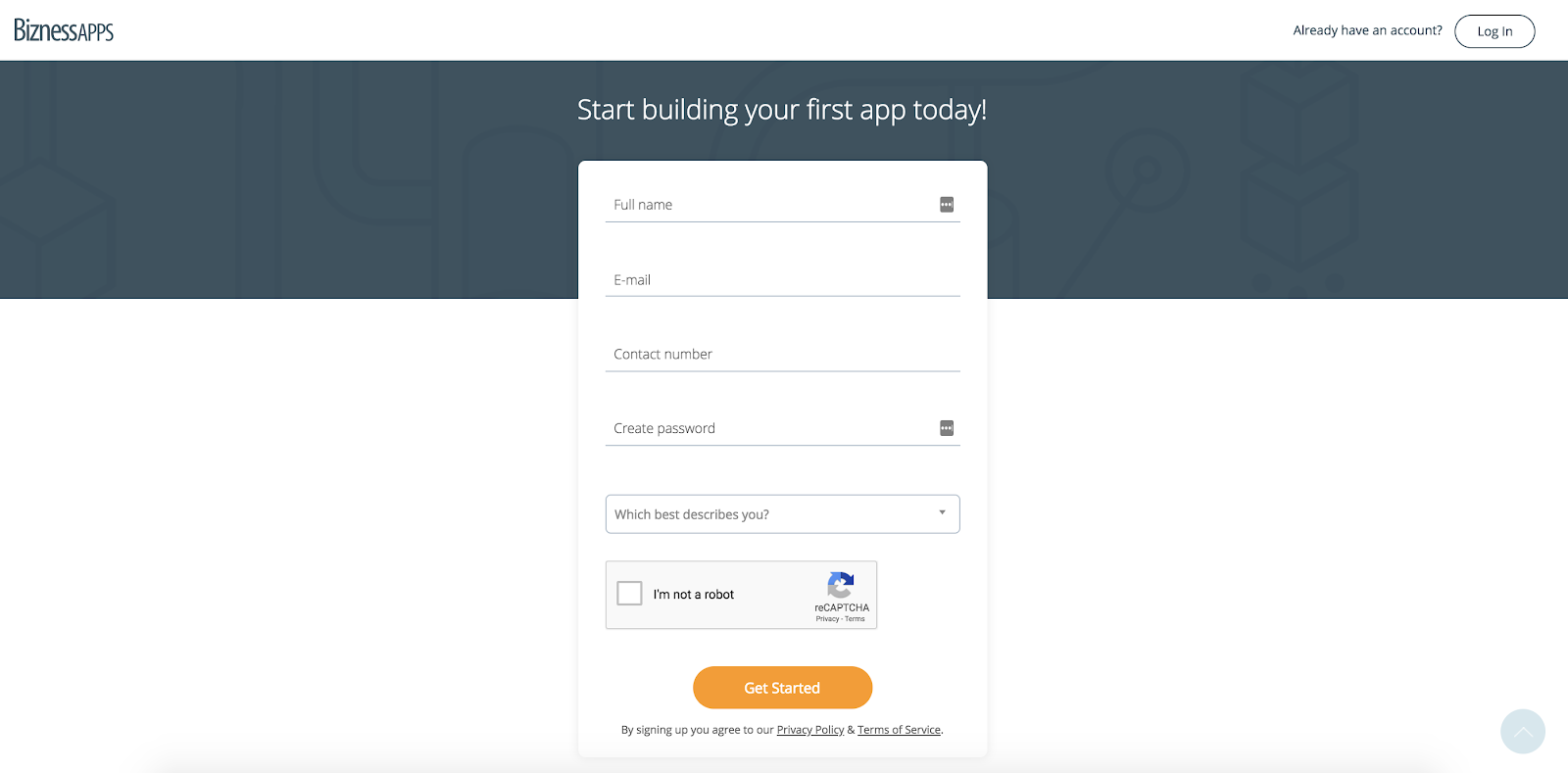
Bizness Apps’ lead generation form is very plain in terms of design, which works because it matches the rest of their branding. The title of the form clearly states its purpose and there is also a reCAPTCHA at the bottom of the form which allows only quality leads (not spammers) to submit for processing.
Key takeaways:
- Plain and simple design
- The form’s title clearly states purpose
- reCAPTCHA allows only quality leads to submit forms
12. SoulCycle
Source: SoulCycle
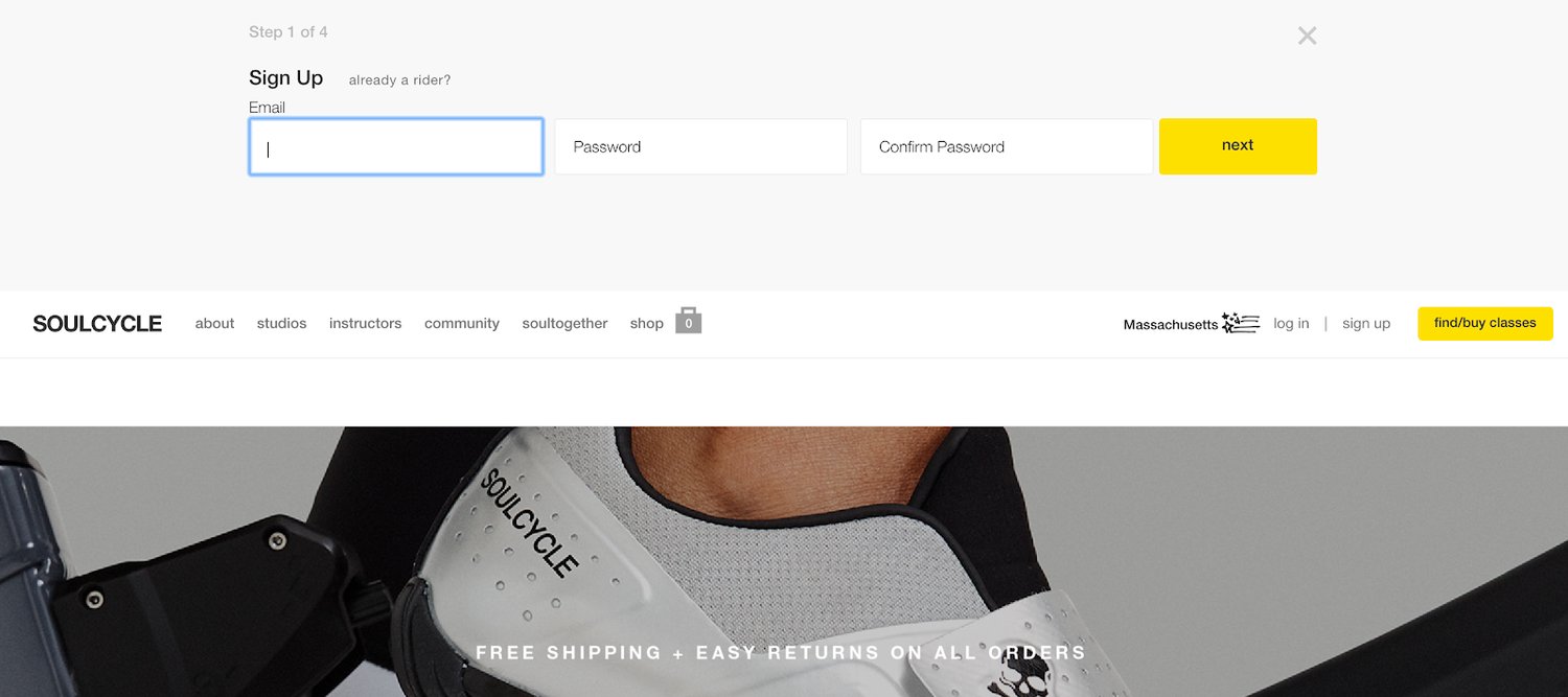
SoulCycle’s lead generation form is located at the top of their landing page in a drop-down menu. The form only requires an email, username, and password, making the entire sign up process take only seconds to complete. In addition to having just a few fields, the form’s sleek look matches SoulCycle’s entire website design and branding.
Key takeaways:
- Form is located in a drop-down menu
- Form only has a few fields
- Form matches SoulCycle’s branding and style
13. Unico Nutrition
Source: Unico Nutrition
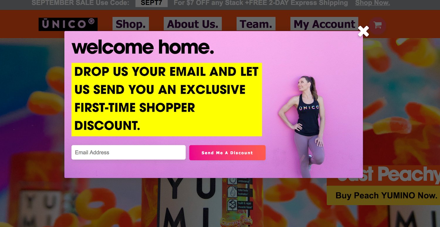
Unico Nutrition has two lead generation forms on their website that appear at different times throughout the buyer’s journey. The first form appears in a popup box the second you open their website. The form offers an incentive for providing your email addresses — an exclusive first-time shopper discount. Who doesn’t love a discount code?
Source: Unico Nutrition
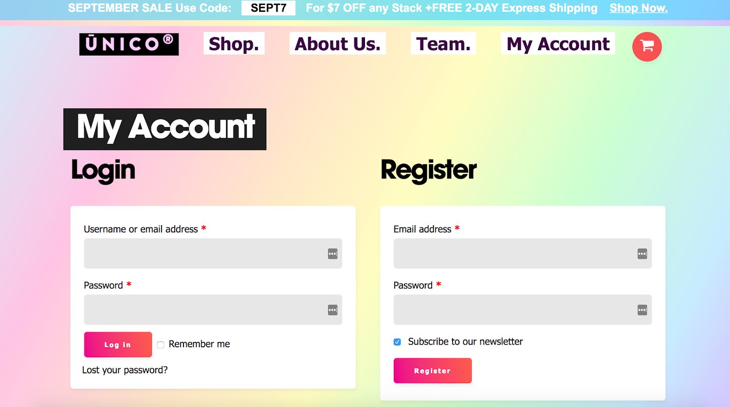
Unico’s second lead generation form appears after visitors click a “Sign Up” CTA button. The landing page has a dual purpose and includes two forms — a new customer sign up form and a current customer login form. Whether it’s your first time trying to login or your hundredth, all of your interactions with your Unico account will originate from the same landing page.
Lastly, the appearance of both forms matches Unico’s fun and colorful website and branding.
Key takeaways:
- Having multiple lead generation forms works for Unico’s buyer personas
- Landing page has a dual purpose with sign in and sign up forms
- Bright and colorful appearance
14. Zillow
Source: Zillow
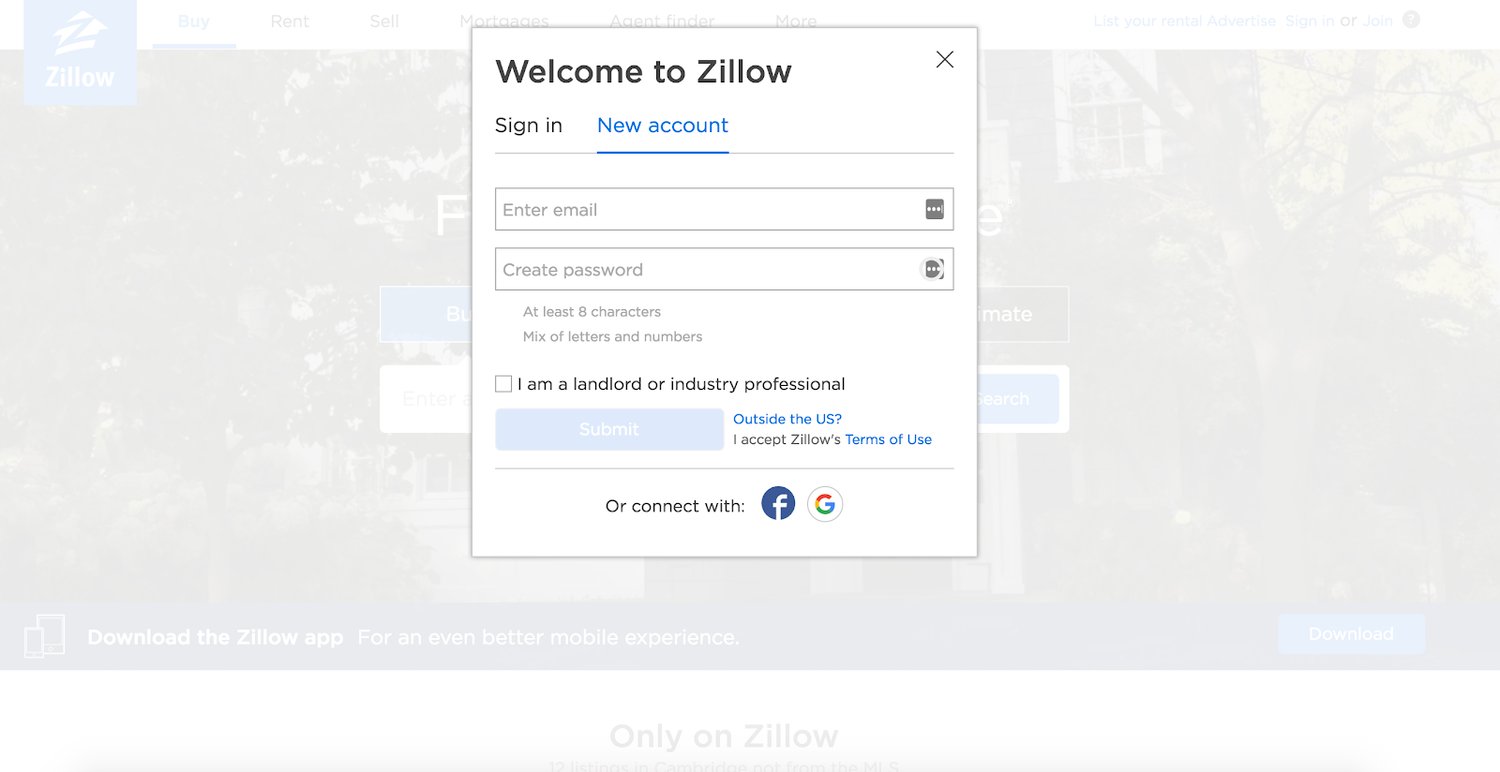
Zillow has a CTA button at the top of their main landing page that opens a sign up form in a popup box. When the popup box appears, the background fades so you can easily focus on the form. Zillow also makes, sign up easy with the ability to connect to your Facebook or Google account to speed up the process.
Key takeaways:
- Form appears in a popup box
- Background dims around popup box
- Option to connect to your Facebook or Google account
15. Crazy Egg
Source Crazy Egg
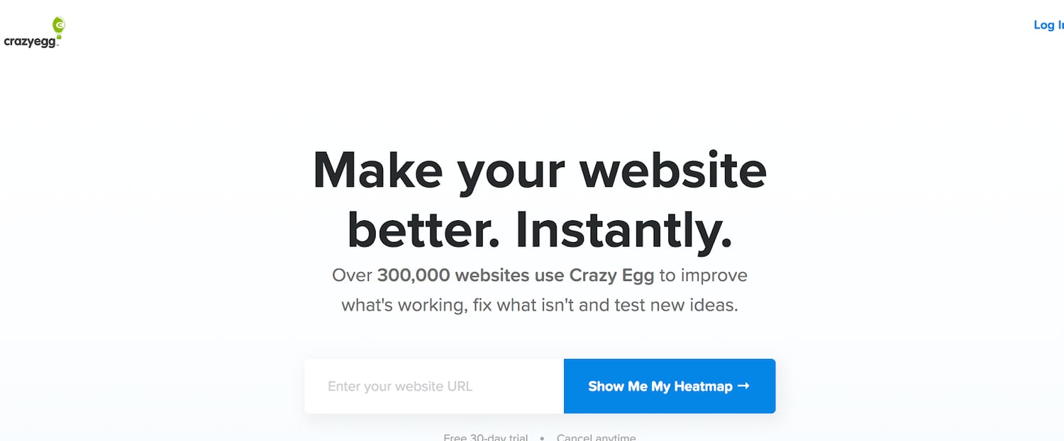
When you open Crazy Egg’s website, you immediately see a large, bold CTA button that says, “Show Me My Heatmap” — right away, there is an incentive for you to sign up. To receive your heatmap, all you have to do is complete one form field. And to further convince you that providing your information is a good idea, the form includes social proof at the top of the page reminding you that over 300,000 (and counting) other websites use Crazy Egg.
Key takeaways:
- Sign up CTA and incentive are the first two things you see
- Only one form field visible on the landing page
- Social proof is convincing
16. Hulu
Source: Hulu
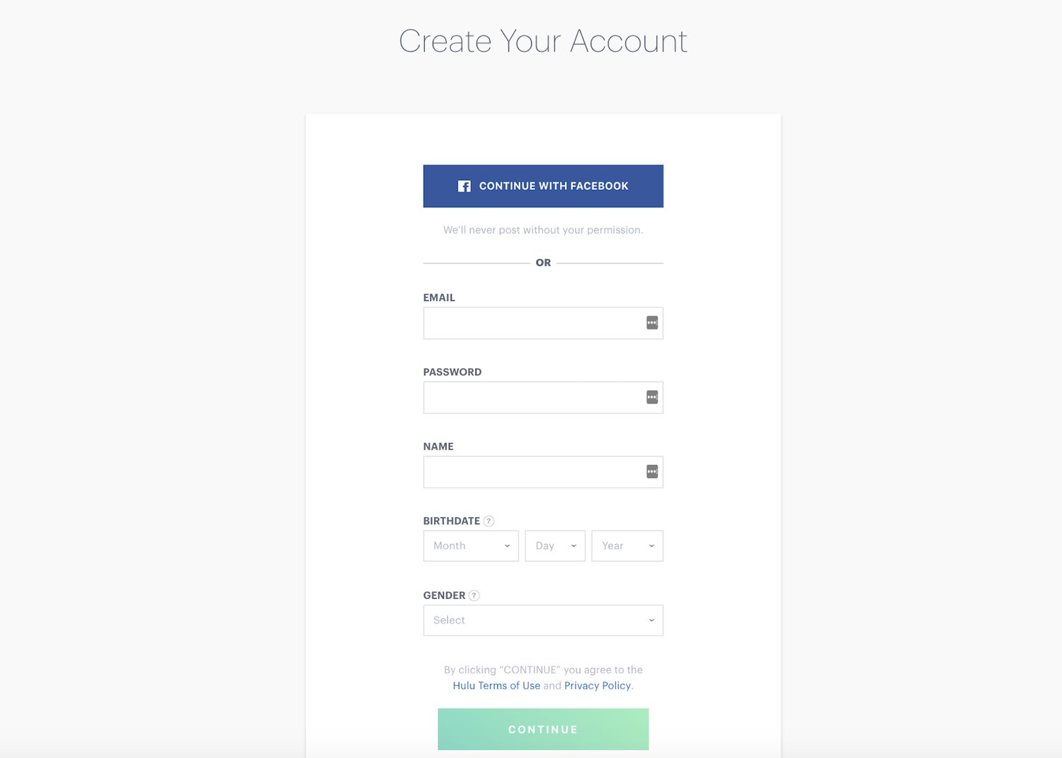
Hulu’s lead generation form is minimalist in terms of design. With one of the only pops of color being the CTA, followed by some very straightforward form fields, the form is easy to follow and understand. This is important because it’s a multi-step form, meaning once you hit “Continue”, you are directed to another landing page with more form fields to complete. Hulu breaks up the form into multiple steps due to its length to make it appear less daunting.
Key takeaways:
- Simplistic look that makes the form easy to complete
- Visible and attention-grabbing CTA button
- Form appears less daunting because it is broken up into multiple steps
17. Broadcast2world
Source: Broadcast2world
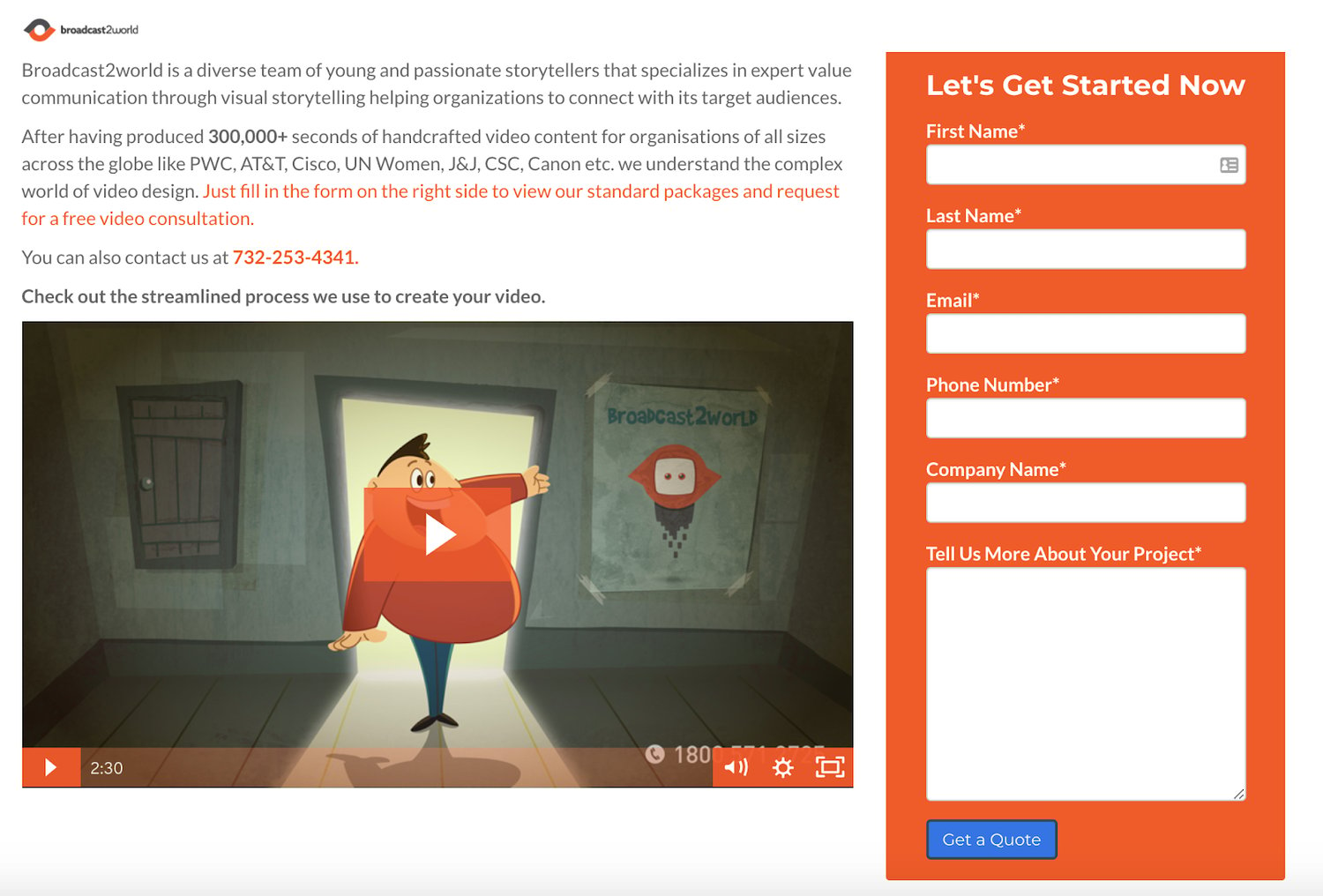
Broadcast2world’s lead generation form is located on a landing page that contains a video, a description about the reasons why you should sign up, and social proof. Located next to the form, there is even contact information so you can get in touch with someone at the company to discuss any of your questions or concerns prior to signing up. And if that’s not enough, Broadcast2world added a long-text entry field to the form where you can describe any questions or concerns.
Key takeaways:
- Form is on its own landing page
- Form is nicely organized alongside several other pieces of content
- A long-text entry field is included for questions and concerns
18. LinkedIn
Source: LinkedIn
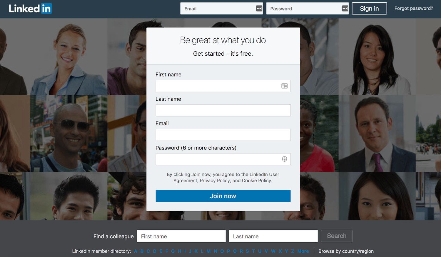
When you open LinkedIn’s website, you immediately see their lead generation form. In addition to sign up being free (as stated at the top of the form), registration only requires you to complete four fields. Lastly, LinkedIn makes sure you understand that you will be agreeing to all of their terms and conditions upon form submission.
Key takeaways:
- Form is the first thing you see when you open LinkedIn’s site
- Sign up is free and easy
- Requirement to agree to the company’s terms and conditions
19. DIRECTV
Source: DIRECTV
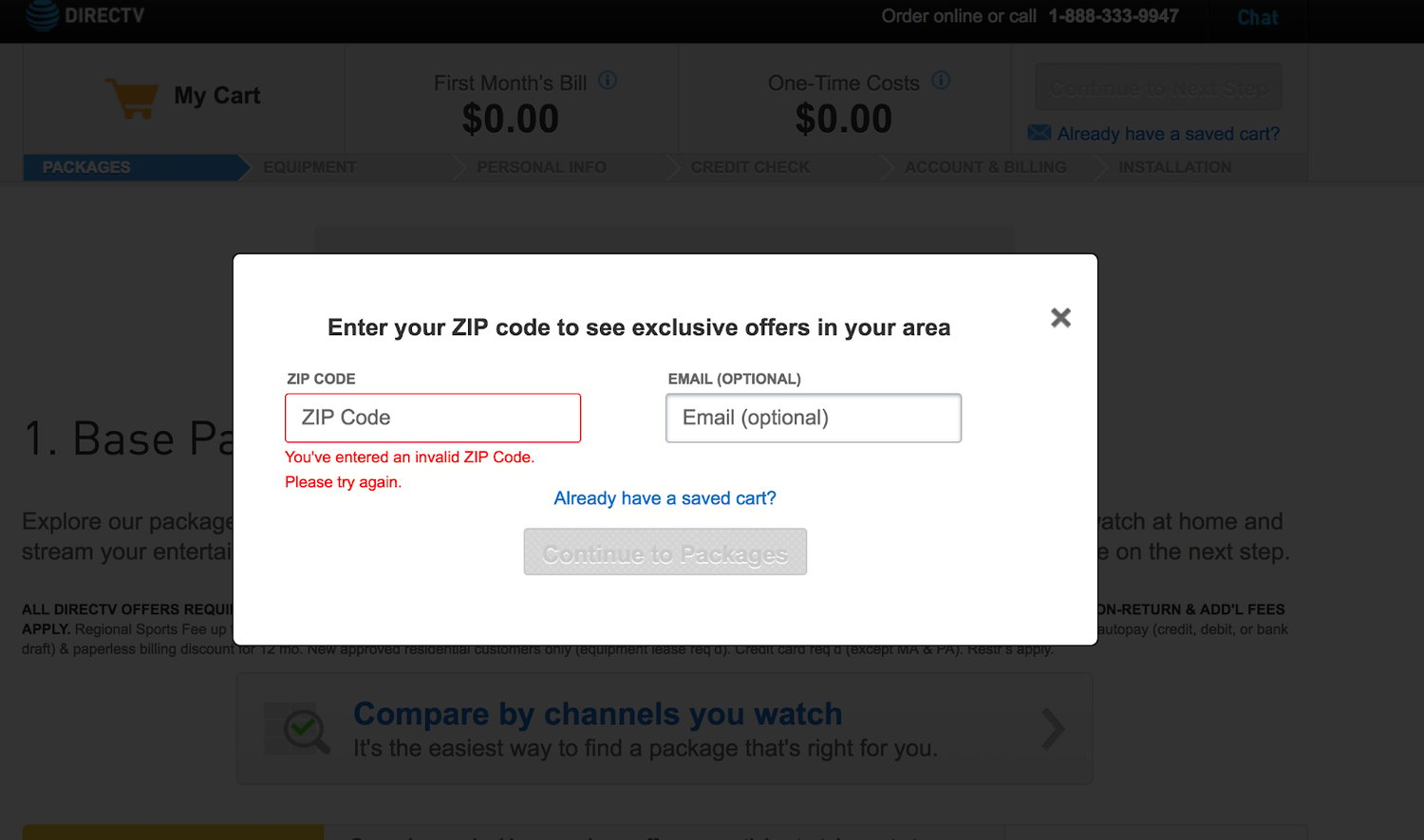
When you open the DIRECTV website and click on their “Get Started” CTA button, a lead generation form appears in a popup box, causing the background to dim. The form stops you from continuing onto the next field if you don’t provide accurate information or if you try skipping required fields. Since the form is on the longer side, DIRECTV chose to implement a multi-step form so the it looks shorter in length and easier to complete.
Key takeaways:
- Form is located in a popup box
- Form stops you from continuing if you provide incorrect information or skip a step
- Multi-step form splits up all of the information
20. Bounce Exchange
Source: Bounce Exchange
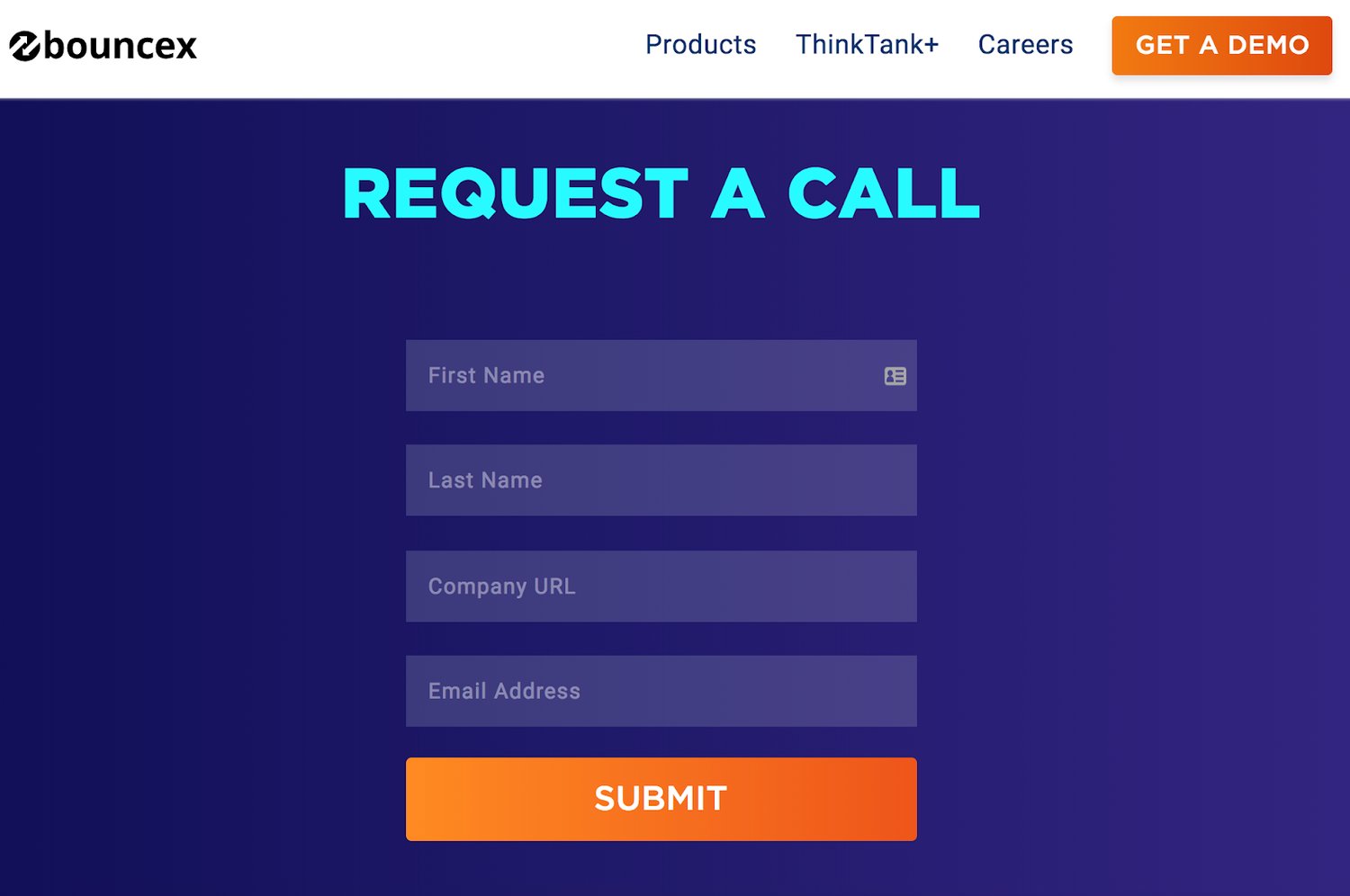
When leads click on the Bounce Exchange “Get A Demo” CTA button on the company’s landing page, they are brought to another page dedicated to signing up. Both the form’s title and the CTA “Submit” button are bright, bold, and large. The titles of the form fields are placed in a unique location, inside of the fields instead of above or around them, which creates a clean and streamlined appearance.
Key takeaways:
- Dedicated landing page
- Form’s title and CTA are attention-grabbing and easy to spot
- Form field titles are inside of the fields
21. My Simple Show
Source: My Simple Show
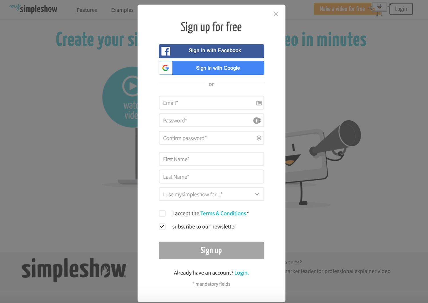
My Simple Show’s lead generation form appears in a popup window that dims the background and everything else around it. Sign up, which is free according to the form, is also made quick and easy because you can connect through your Facebook or Google account. Another way the form saves you time is by providing you with their password creation requirements in the form ... because nobody likes sitting there trying password combination after combination.
Key takeaways:
- Form appears in a popup window that dims the background
- Form states sign up is free
- Password requirements are clearly explained
22. MakeForms

Source: MakeForms
MakeForms focuses on creating secure, conversion-optimized lead generation forms that are easy to deploy across websites, landing pages, and apps. The platform allows businesses to design visually appealing forms while also incorporating advanced logic, validation, and workflow automation.
A typical MakeForms lead generation form keeps the experience simple for users while giving businesses powerful tools in the background. Features like multi-step forms, conditional logic, auto-validation, and branded design customization help reduce friction during the signup process and increase completion rates.
MakeForms also allows teams to embed forms anywhere, including websites, popups, or standalone landing pages, making it easy to capture leads across different touchpoints. Built-in integrations and webhook support ensure the collected data flows directly into CRM or marketing tools for immediate follow-up.
For businesses that prioritize security and compliance, MakeForms also supports encrypted submissions and compliance-friendly data handling, making it suitable for industries that handle sensitive information.
Key takeaways:
- Multi-step forms reduce friction and improve completion rates
- Conditional logic personalizes the form experience for each visitor
- Flexible embedding options (website, popup, standalone page)
Conclusion
Lead generation forms have the potential to increase your conversions and create a great user experience on your website. With the key takeaways and tips mentioned above, and the help of a great form builder, you can craft an impactful lead generation form that works for your brand, business, and buyer personas in just minutes.
Get started by picking a few tactics from these examples and try implementing them in your own forms to see what works and boosts your number of conversions!
Editor's note: This post was originally published in October 201 and has been updated for comprehensiveness.
Forms


