Ask any professional athlete or business executive how they became successful, and they’ll tell you they mastered a process. By figuring out which habits led to success and which didn’t, they improved their efficiency and productivity.

But implementing a process into a business, department, or even a team is a completely different animal than honing your personal process. With so many moving parts, how do you track and refine each aspect of your business process?
![Download Now: An Introduction to Data Visualization for Marketers [Free Guide]](https://no-cache.hubspot.com/cta/default/53/6ecf26a9-faff-4c16-a2d4-b70751ce8b65.png)
Data flow diagrams provide a straightforward, efficient way for organizations to understand, perfect, and implement new processes or systems. They’re visual representations of your system, making it easy to understand and prune.
Before we dive into how data flow diagrams can help refine any of your business systems or processes, let’s go over what exactly it is.
What is a data flow diagram (DFD)?
A data flow diagram (DFD) is a visual representation of the information flow through a process or system. DFDs help you better understand process or system operations to discover potential problems, improve efficiency, and develop better processes. They range from simple overviews to complex, granular displays of a process or system.
DFDs became popular in the 1970s and have maintained their widespread use by being easy to understand.
There are two types of DFDs — logical and physical. Logical diagrams display the theoretical process of moving information through a system, like where the data comes from, where it goes, how it changes, and where it ends up.
Physical diagrams show you the practical process of moving information through a system. It can show how your system’s specific software, hardware, files, employees, and customers influence the flow of information.
You can either use logical or physical diagrams to describe that flow of information. You can also use them in conjunction to understand a process or system on a more granular level.
.png)
An Introduction to Data Visualization
Learn how to design compelling charts & graphs that are easy to understand, including:
- Tools and Software for Data Visualization
- Data Types, Relationships, and Formats
- How to Effectively Visualize Data
- A History of Data Visualization
The Benefits of Data Flow Diagrams
DFDs are visual representations that can help almost anyone grasp a system‘s or process’ logic and functions. Aside from being accessible, they provide much-needed clarity and improve productivity. Here's how.
Accessibility
Because visual information is easier to digest, DFDs typically explain complex concepts better than blocks of text can.
Visual presentations of how a process works can also hold people's attention longer — making it easier to retain the information.
Clarity
DFDs clarify the systems and processes necessary for your team to do their best work. Whether implementing a new company-wide system or refining a department's existing process, a DFD gets you and your team on the same page.
Creating DFDs will give you clarity about business operations, too. A clearer understanding enables you to refine and track your business processes with less friction.
Productivity
The accessibility and clarity created with DFDs will leave less room for error. Your team will better master systems and processes because they understand them.
Greater understanding — paired with a repeatable process — will likely boost team effectiveness and productivity.
On a broader level, DFDs can help you streamline your business operations. When mapping out your processes, you‘ll gain insights into what does and doesn’t work.
These insights help boost you and your team's productivity. As a bonus, you can share any best practices across departments.
Data Flow Diagram Symbols
Before using a DFD, you need to know the symbols used to describe it.
Data flow diagram symbols are standardized notations, like rectangles, circles, arrows, and short-text labels. These symbols represent a system’s data flow direction, inputs, outputs, storage points, and sub-processes.
Four common methods of notation are used in DFDs: Yourdon & De Marco, Gene & Sarson, SSADM, and Unified.
All use the same labels and similar shapes to represent the four main elements of a DFD — external entity, process, data store, and data flow.
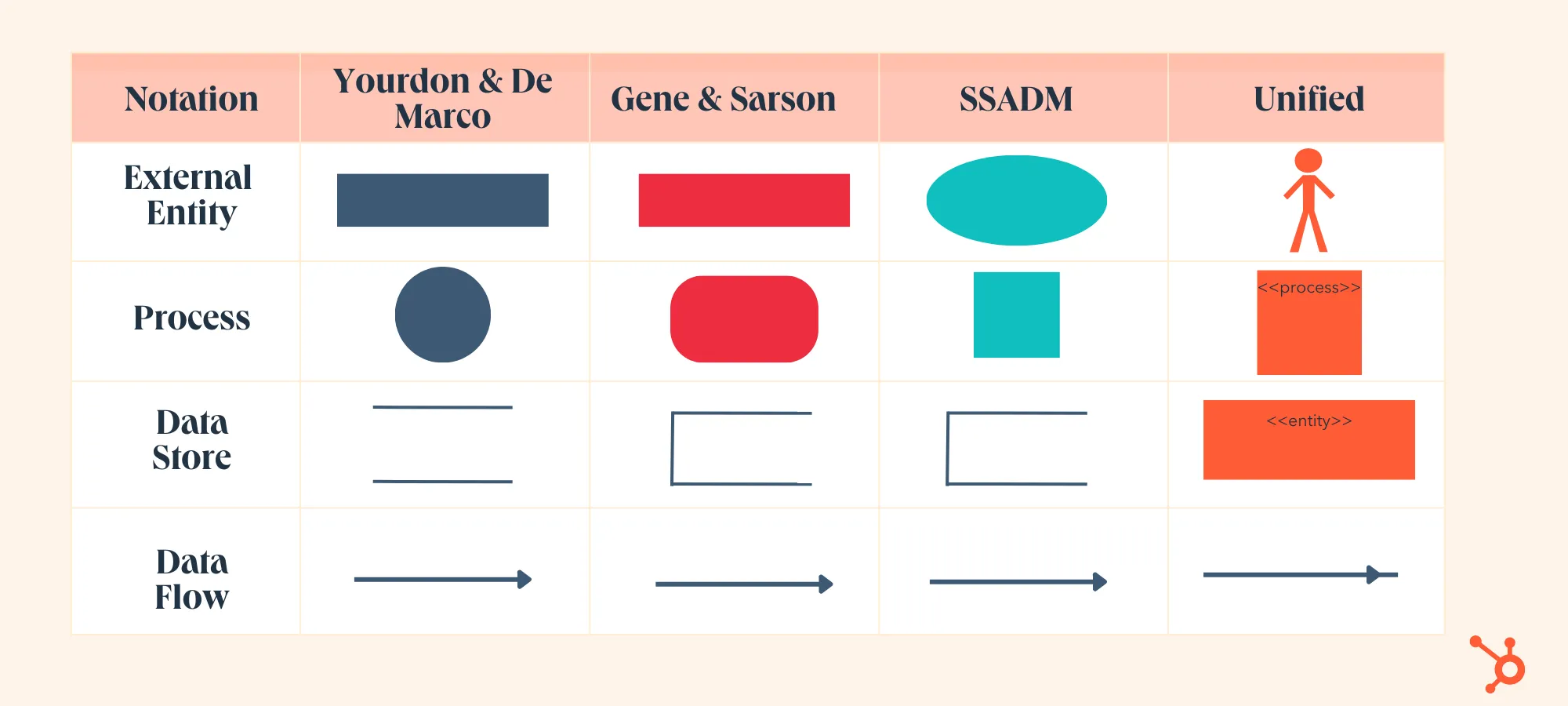
1. External Entity
External entities — which are also known as terminators, sources, sinks, or actors — are outside systems that send or receive data to and from the diagrammed system.
They’re either the sources or destinations of information, so they’re usually placed on the diagram’s edges.
External entity symbols are similar across models except for Unified, which uses a stick-figure drawing instead of a rectangle, circle, or square.
2. Process
Process is a procedure that manipulates the data and its flow by taking incoming data, changing it, and producing an output. A process can do this by performing computations and using logic to sort the data or change its flow of direction.
Processes usually start from the top left of the DFD and finish on the bottom right of the diagram.
3. Data Store
Data stores hold information for later use, like a file of documents that’s waiting to be processed. Data inputs flow through a process and then through a data store, while data outputs flow out of a data store and then through a process.
4. Data Flow
Data flow is the path the system’s information takes from external entities through processes and data stores. With arrows and succinct labels, the DFD can show you the direction of the data flow.
DFD Levels
DFDs can range from simple overviews to complex, granular representations of a system or process with multiple levels, starting with level 0.
The most common and intuitive DFDs are level 0 DFDs, also called context diagrams. They’re digestible, high-level overviews of the flow of information through a system or process, so almost anyone can understand it.
Level 0: Context Diagram
This DFD level focuses on high-level system processes or functions and the data sources that flow to or from them. Level 0 diagrams are designed to be simple, straightforward overviews of a process or system.
Level 1: Process Decomposition
While level 1 DFDs are still broad overviews of a system or process, they’re also more detailed — they break down the system’s single process node into subprocesses.
Level 2: Deeper Dives
The next level of DFDs dives even deeper into detail by breaking down each level 1 process into granular subprocesses.
Level 3: Increasing Complexity
Level 3 and higher-numbered DFDs are uncommon. This is largely due to the amount of detail required, which defeats its original purpose of being easy to understand.
An Introduction to Data Visualization
Learn how to design compelling charts & graphs that are easy to understand, including:
- Tools and Software for Data Visualization
- Data Types, Relationships, and Formats
- How to Effectively Visualize Data
- A History of Data Visualization
Data Flow Diagram Examples
Professionals in various industries, like software engineering, IT, ecommerce, and product management & design, can use DFDs to better understand, refine, or implement a new system or process.
But what does a data flow diagram look like in practice — and how does it help your business? Here are three examples to help you contextualize DFDs' impact.
1. Level 0 DFD
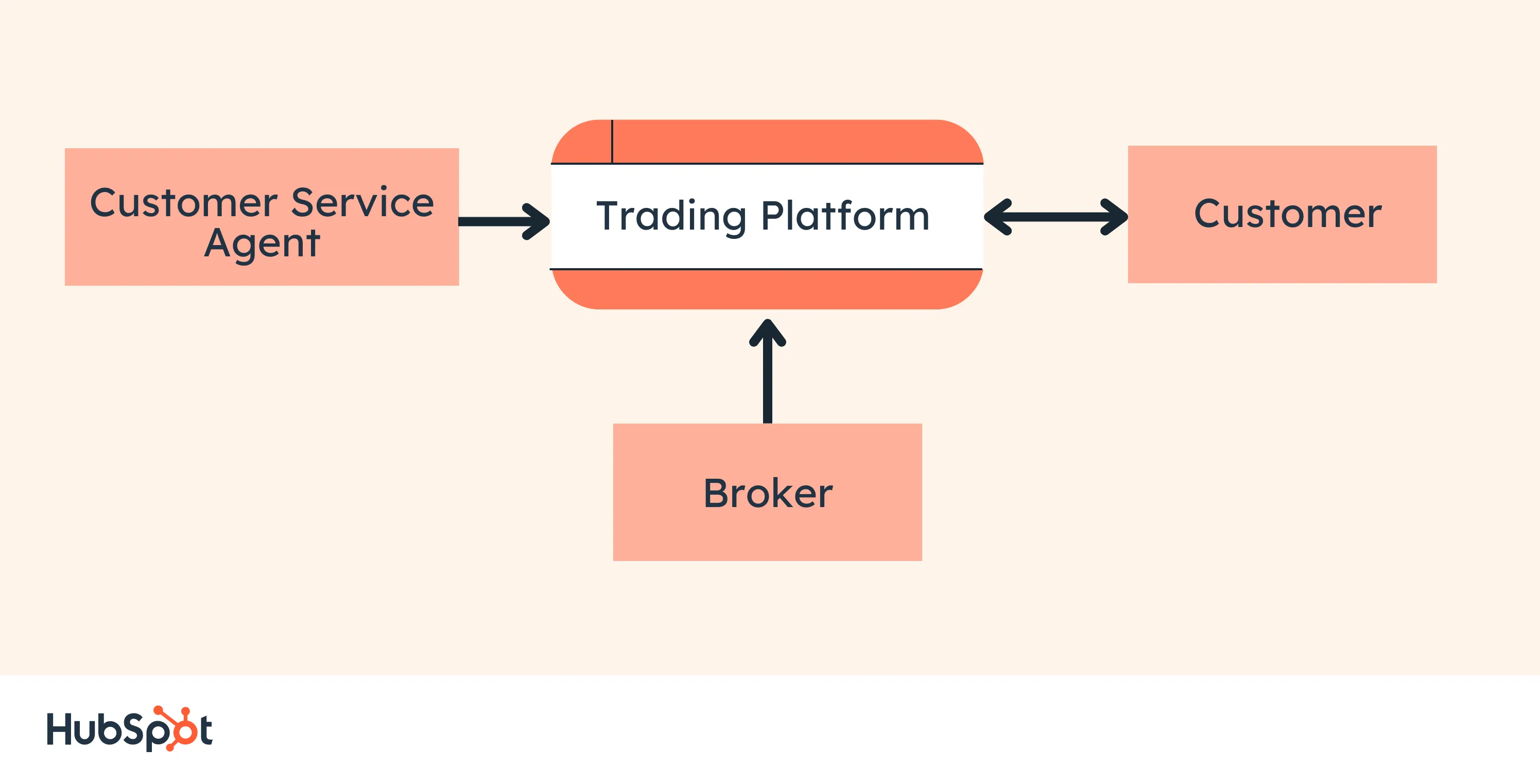
This Level 0 DFD provides a contextual map of a securities trading platform.
Data flows in one direction from the customer service assistant and the broker to the platform. It also flows in two directions from customers to the platform and back again.
2. Level 1 DFD
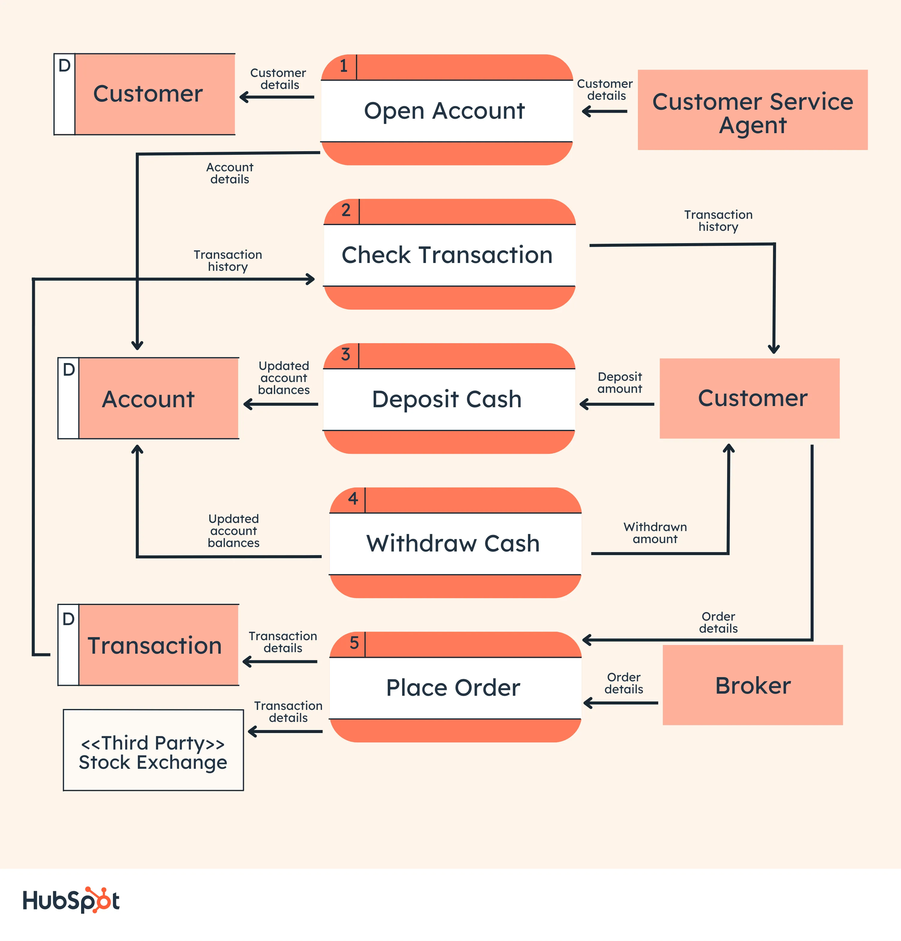
This Level 1 DFD breaks down the customer process in more detail, expanding it to include account creation, cash withdrawals, and eventual securities transactions.
3. Level 2 DFD
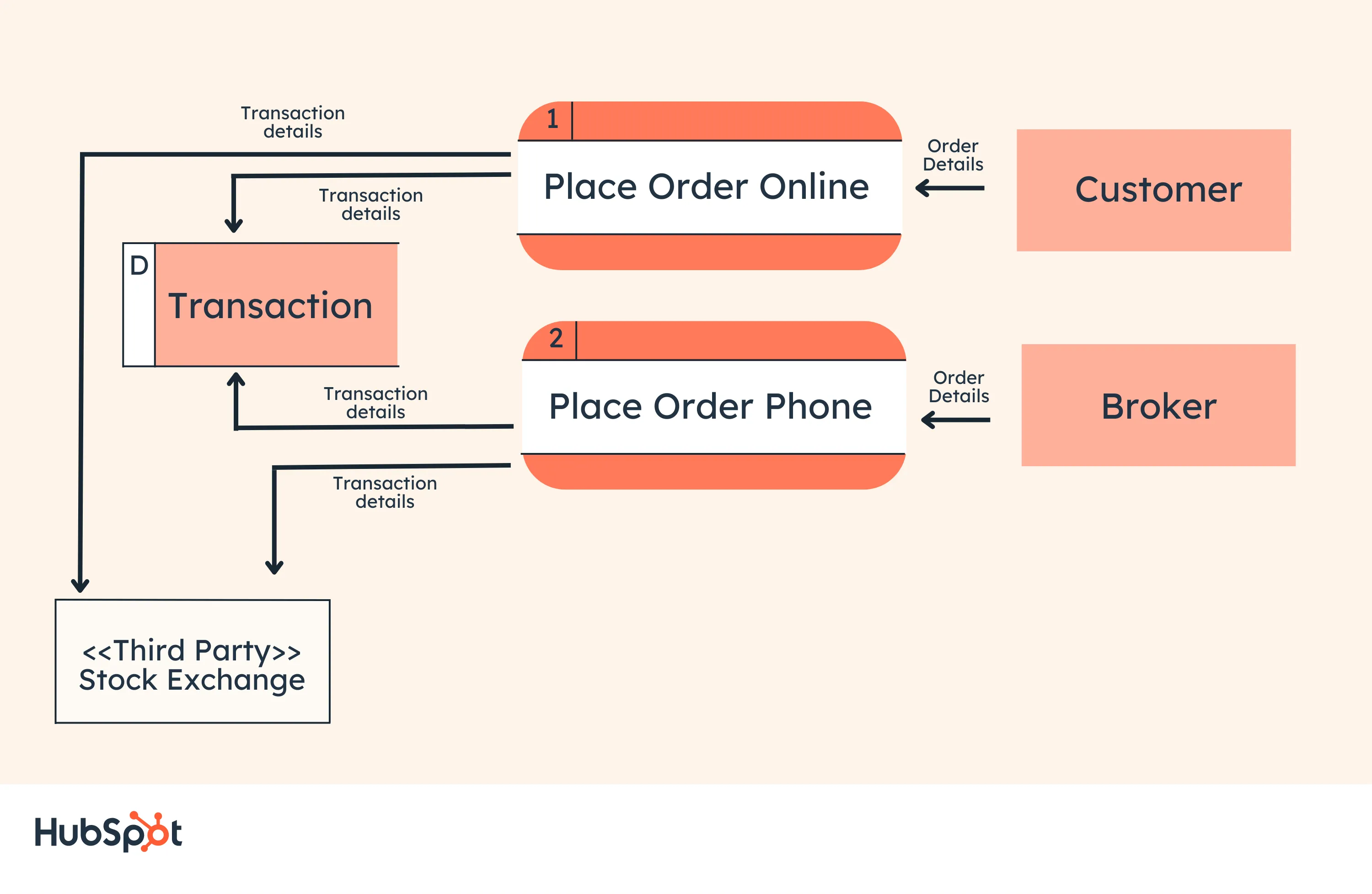
This Level 2 DFD decomposes the “Place Order” process to contextualize the steps required to place an order — either by a customer or by a broker.
It even accounts for a third-party stock exchange center where transaction details are forwarded after an order is placed.
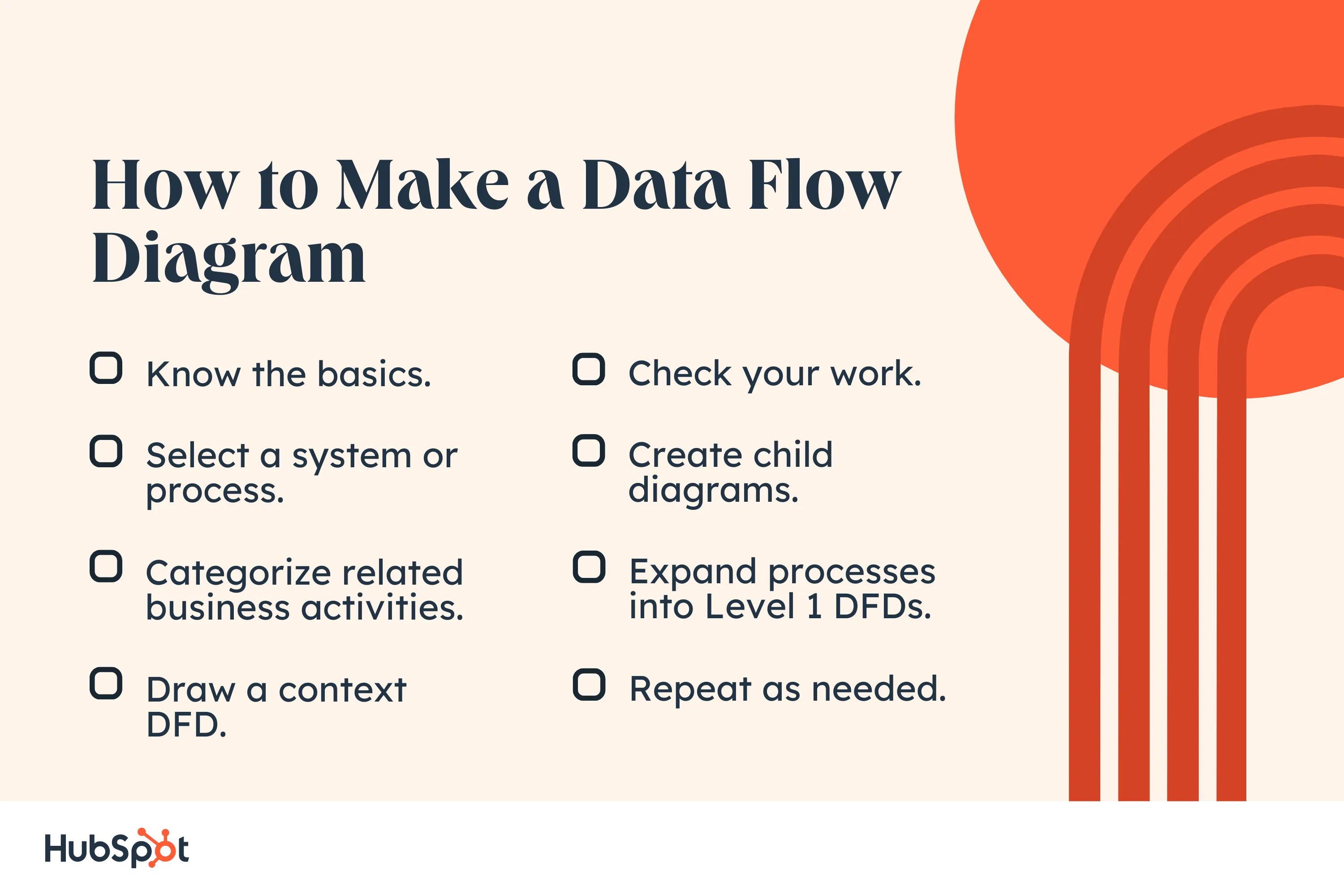
How to Make a Data Flow Diagram
- Know the basics.
- Select a system or process.
- Categorize related business activities.
- Draw a context DFD.
- Check your work.
- Create child diagrams.
- Expand processes into Level 1 DFDs.
- Repeat as needed.
1. Know the basics.
Before you start mapping out data flow diagrams, you need to follow four best practices to create a valid DFD.
- Each process should have at least one input and one output.
- Each data store should have at least one data flow in and data flow out.
- A system’s stored data must go through a process.
- All processes in a DFD must link to another process or data store.
2. Select a system or process.
Begin by selecting a specific system or process you want to analyze. While any system or process can be turned into a DFD, the larger the process, the more complicated the diagram and the more difficult it will be to contextualize.
Wherever possible, start with a small function or process you’re looking to improve.
3. Categorize related business activities.
Next, categorize all activities related to this process into external entities, data flows, processes, and data stores.
Consider a restaurant food ordering system. Customers are external entities, the food ordering system is a process, and the interaction between customers and the system (which goes in both directions) is the flow.
Also worth noting? The ordering system doubles as a data store, so for an SSADA model, this means drawing it as a rectangle with rounded corners with two horizontal lines inside to represent its dual function.
4. Draw a context DFD.
Now it’s time to start drawing. DFDs can be created by hand, using free templates available online, or via browser extensions.
Begin with a simple, Level 0 DFD: Start with your process or system, then map all basic connections and flows.
5. Check your work.
Before diving into more complex DFDs, check the work you’ve already done to make sure it’s accurate and complete.
If you’ve missed (or added) a process, entity, or flow, your next-level DFDs may not make sense, and you may be forced to start over.
6. Create child diagrams.
For each process or system described in your Level 0 DFD, create a new child diagram with its own entities and flows. Eventually, you can use these child diagrams to connect processes together.
7. Expand processes into Level 1 DFDs.
Using your child diagrams, you should map more in-depth connections between each process.
In the case of our restaurant example, this could mean digging deeper into the food ordering system and its connection to suppliers, managers, customers, and kitchen staff.
8. Repeat as needed.
Each process — no matter how large or small — can be reimagined as a Level 0 context diagram, and the cycle can begin again.
Repeat these steps as needed to create as many DFDs as required, or break processes down further to develop Level 2, 3, etc. DFDs.
Perfecting Your Process
While there’s no such thing as a “perfect” data flow diagram, continued practice can help streamline the process and offer critical insight into what’s working, what isn’t, and where your business can make impactful improvements.
Your best bet? Remember the rule: Keep it simple. Start with context, build out connected processes, and repeat as needed to map key connections, flows, and entities across your organization.
![Blog - Data Visualization [List-Based]](https://no-cache.hubspot.com/cta/default/53/2f02d8fe-c9b0-4078-a3ae-5831c892fbd0.png)