.png?width=112&height=112&name=Image%20Hackathon%20%E2%80%93%20Vertical%20(50).png)

You don’t have to use every single web design trend. In fact, you shouldn’t. However, it’s important to be aware of some of the options out there.
Why does it matter? Well, your website houses the information your customers need to learn about your product and make a purchase. So, making sure your site takes advantage of the right web design trends for your industry is one of the most important ways you can build trust with your audience.
Experimental navigation, scrolling effects, and kinetic typography are just a few ways you can level up your website. Check out the full list of trends that will dominate websites this year.
.png)
Free Website Design Inspiration Guide
77 Brilliant Examples of Homepages, Blogs & Landing Pages to Inspire You
- Agency Pages
- Ecommerce Pages
- Tech Company Pages
- And More!
Download Free
All fields are required.
Form not available
What are the most important web design trends?
- Experimental Navigation
- Kinetic Typography
- Drag Interaction
- Structured Typography
- Cinemagraphs
- Brutalism
- Layering
- Text-Only
- Animated Illustrations
- Ultra-minimalism
- Mixing Horizontal and Vertical Text
- Geometric Shapes and Patterns
- 3D Design
- Broken Grids
- Organic Shapes
- Grid Lines
- Y2K Inspired Design
- Scrapbook Aesthetic
- Gamified Design
- Emphasis on Product Photography
- Minimal Vintage
- Goofy Sans Serif Typography
- Sci-Fi Inspired Design
- Natural and Organic Textures
- User Experience
- Conversion Strategy
- Dynamic Cursor
- Custom Illustrations and Animations
- Chatbots
One major theme amongst these website design trends is motion, from scrolling effects to micro-animation. Check out this video, which details some popular website design trends for this year.
1. Experimental Navigation
When we discuss experimental navigation, we’re talking about the navigation patterns that subvert the traditional, which is all-caps navigation on the top of the screen in a sans serif font.) Instead, experimental patterns move in a more creative direction, generating visual interest and guiding users to navigate the site in a specific manner.
Take What is Missing, for example. In addition to having an all-black intro that creates a huge impact, the main page has a dynamic circular menu so you can explore their site.
What I like: This year, you’re invited to turn your navigation into an extension of your website’s unique branding. That’s all thanks to experimental navigation.

2. Kinetic Typography
Kinetic typography — or moving text — is an animation technique that gained momentum in the 60s when feature films began using animated opening titles. You can use it for a similar purpose in website design to immediately grab the visitor's attention once they land on the homepage.
You can also harness the power of kinetic typography to highlight important sections, guide the visitor as they scroll, and gradually reveal information, like on Gravity Global.
What I like: Kinetic typography can delight visitors and help them digest your content. Plus, it’s visually attractive and engaging.

3. Drag Interaction
Gone are the days when users don’t have control over their experience on your website.
Drag interactions are designed to mimic an actual, physical action. They essentially allow visitors to pick up and move objects on the screen. This type of gesture interaction is gaining momentum with more websites. It’s an especially popular option if you have an ecommerce or portfolio site.
Take Robin Mastromarino's portfolio site as an example. In addition to clicking on the controls of the homepage slider, you can drag and drop the different slides to browse his featured projects. The page transitions and animations are based on drag speed to give users a sense of control over these effects.
What I like: Drag interaction offers visitors a sense of customization and control over their experience on your site.

4. Structured Typography
More and more companies are using structured typography to headline their home pages. In a post-pandemic world, consumers crave structure and stability — both of which structured typography is reminiscent of. (Think: All capital letters and strong, solid shapes.)
Here’s an excellent example of how structured typography could look on your website. The Awwwards homepage reveals how much of an impression structured fonts can make.
What I like: Structured typography tells the visitors’ eyes precisely what they should be looking at.

5. Cinemagraphs
Motion is the name of the game in web design trends this year. Cinemagraphs are no exception. Cinemagraphs are high-quality videos or GIFs that run on a smooth, continuous loop. They have become popular to add movement and visual interest to otherwise static pages.
While full-screen loops were more popular in the past, this year, you’ll see smaller animations sprinkled throughout complex layouts. The addition of these cinemagraphs draws the eye and helps your readers keep scrolling, like in this example from the design and technology studio Grafik.
What I like: Cinemagraphs can help draw the visitor’s eye around the page, even in the most complex layouts.

6. Brutalism
Some designers opt for more eclectic, convention-defying structures to stand out in a sea of tidy, organized websites. While it can seem jarring at first, many popular brands are now incorporating brutalist elements.
Brutalism emerged as a reaction to the increasing standardization of web designand is often characterized by stark, asymmetrical, nonconformist visuals, and a distinct lack of hierarchy and order. In other words, it's hard to describe, but you know it when you see it — like the below example from Chrissie Abbott.
What I like: Brutalism prioritizes simplicity and functionality — pillars of the user experience.

Image Source
7. Layering
Layering images, colors, shapes, animations, and other elements add depth and texture to a site that doesn’t have a lot of text. Below is a stylish example from the singer-songwriter SIRUP.
What I like: Layering can help add depth to a site and tell the brand’s story.

Free Website Design Inspiration Guide
77 Brilliant Examples of Homepages, Blogs & Landing Pages to Inspire You
- Agency Pages
- Ecommerce Pages
- Tech Company Pages
- And More!
Download Free
All fields are required.
Form not available
8. Text-Only
In 2024, we’ll see more web design agencies embracing minimalist design. Some are experimenting with cutting out images and prominent navigation sections altogether, relying on a few choice lines of straightforward text to inform visitors about their company.
Danish agency B14 uses the hero section of its homepage to describe its mission statement simply.
It’s a modern, uncluttered approach to presenting information that provides a stark contrast to its portfolio section, which uses cinemagraphs, hover animations, and an animated cursor effect.
What I like: This minimalist approach ensures visitors only get the most essential information.

Image Source
9. Animated Illustrations
More companies are turning to illustrators and graphic artists to create bespoke illustrations for their websites because it's one of the latest web design trends.
"Illustration works well to convey more complex ideas that lifestyle photos aren't always able to capture,"Kendra Pembroke, a Visual Designer at Red Ventures said.
These illustrations are often animated to add interactivity. For example, if you hover over one of the illustrations on the NewActon site (designed by Australian digital agency ED), the illustration and those in the surrounding area will wiggle.
Then, only the illustration you're hovering over will continue to move in a small circle. This design is also functional: each illustration represents one of the categories from the navigation menu on the right.
What I like: Animated illustrations help convey complex ideas and add some personality to a site.

10. Ultra-Minimalism
Taking classic minimalism to the extreme, some designers and agencies defy conventions of what a website needs to look like, displaying just the bare necessities. This trend of web design, known as “ultra-minimalism,” can be great for the user experience and load times.
The site from We Ain’t Plastic is simple in color and design, making it hyper-clear what they offer. And with the image of the iceberg, it slows people’s minds down and draws interest.
What I like: Ultra-minimalism can positively impact the user experience and website performance. The only reason we’re moving it to previous website design trends is that we’re seeing it a lot more often on sites around the world.

11. Mixing Horizontal and Vertical Text
Freeing text from its usual horizontal alignment and placing it vertically on a page adds some refreshing dimension. Take this example from action sports video producersPrime Park Sessions, which combines horizontal and vertical text alignments on a minimal page.
What we like: Mixing horizontal and vertical text defies convention and can therefore delight and intrigue some users.

12. Geometric Shapes and Patterns
Whimsical patterns and shapes are popping up more frequently on websites, adding some flair to a landscape otherwise ruled by flat and material design. Canadian design studio MSDS uses daring, patterned letters on their homepage. They offer a more artistic aesthetic that is eye-catching and visually interesting.
What I like: Geometric shapes and patterns can direct visitors' attention to certain products or CTAs.
-1%20copy.jpg?width=650&height=445&name=Update%20website%20design%20trends%20(heavy)-1%20copy.jpg)
13. 3D Design
This year, website design is huge on creating an immersive experience for the site visitor. That’s why 3D artwork is gaining momentum.
Adobe’s 3D Modeler makes it easy for anyone to explore 3D design. The most industry-popular 3D modeler is Maya, but this takes some more expertise. Blender is also a great option as it is a free 3D design software tool.
If you want to include a 3D design on your website but are overwhelmed by the scope of the project, there are lots of freelance 3D modelers on Fiverr and UpWork. Just check out some of the examples on Dribbble.
This style has hints of Japanese Kawaii, a culture of cuteness that focuses on childlike objects and pastel coloring.
What I like: Cute and playful, this design is both interesting to look at and will keep your customers on your page longer as their eyes explore all the elements.
.jpg?width=650&height=437&name=web-design-trends-3d%20(1).jpg)
14. Broken Grids
While grids are arguably the most efficient way to display text and images, broken grids continue to make their way into mainstream sites and offer a change-up from the norm.
Check out the website for HealHaus, for example. Its homepage features images and text blocks that overlap. It’s visually pleasing and easy on the eyes. Plus, it adds a sense of motion to pages without slow-loading animations.
What I like: This convention-defying technique can make standard website pages or sections more interesting.
-Oct-06-2021-08-53-34-65-PM.jpg?width=650&height=385&name=Update%20website%20design%20trends%20(heavy)-Oct-06-2021-08-53-34-65-PM.jpg)
15. Organic Shapes
Sharp edges are out, and curved lines are in. Organic shapes are set to dominate web design in 2024. "Organic shapes can help add some playfulness without affecting the way the information is displayed," Pembroke said.
In the example below fromOrigin 63, the organic shapes in the hero section are decorative and help reinforce the brand's identity and promise.
What I like: Organic shapes add personality and movement without distracting from the content.

16. Grid Lines
Grid lines began cropping up in the last few years, and with good reason — they give site visitors a feeling of order and simplicity. Adding grid lines makes your website easier to digest while adding a modern, visually interesting aesthetic. On the Foundations for a Better Oregon website, grid lines are used to create a clear layout that looks futuristic.
What I like: This trend isn’t just visually engaging — it also gives your site a valuable sense of organization.

17. Y2K Inspired Design
The resurgence of the Y2K aesthetic that started in 2020 is here to stay for at least a bit longer. In 2024, you will see websites adding nods to the coveted Y2K style to evoke a sense of nostalgia. Even celebrities channel the aesthetic on their artist websites — look at singer and actress Olivia Rodrigo’s site for a healthy dose of inspiration.
What I like: This playful aesthetic doesn’t take itself too seriously.

18. Scrapbook Aesthetic
If you need more proof that website visitors are leaning into nostalgia, consider that the scrapbook aesthetic is coming back. But this isn't the same scrapbook aesthetic we saw popular in the early 2010s when this web design trend emerged.
Today's scrapbook aesthetic is an updated, buzzy version. In some cases, like this Gucci website, it's interactive.
What I like: You can now bring your scrapbook-style site to life.

19. Gamified Design
Gamified design is everywhere these days, making it one of the most prevalent website design trends this year. Gamification is an excellent idea because it adds an element of human emotion for visitors.
For instance, when they arrive on your site, they have the experience of engaging with your content in a unique, memorable manner. This example by PrettyDamnQuick demonstrates exactly what we mean.
What I like: This playful trend is more than fun — it’s genius from a user engagement standpoint.

20. Emphasis on Product Photography
2024 is the year of product photography reigning supreme for ecommerce websites. From beauty companies to clothing brands and beyond, product photography will be front and center in 2024. This example from skincare brand BYOMA shows how impactful keeping your brand’s products centerstage can be.
What I like: Visitors don’t have to hunt down images of what you’re selling — they’re immersed in it from the moment they arrive on your website.

21. Minimal Vintage
In their report, InDesign Skills claims that minimal vintage will be an important graphic design element in 2024. Similar to minimalist styling in print design, minimal vintage focuses on a retro color palette and type style.
Minimal vintage might not instantly look old-school. Rather, it subtly nods to different decades of yesteryear, such as this design from Deco Hause.
What I like: This trend invokes the nostalgic feeling of past advertisements.

22. Goofy Sans Serif Typography
Goofy sans serif typography is ideal for brands that want to show they are fun-loving and not too serious. This optimistic typeface is cartoon-inspired with a touch of retro fun.
When including Goofy sans serif typography in your content or on your website, be sure to let it be front and center, so it doesn’t have to compete with other elements. Gumroad’s font is bold and fun.
What I like: This font is a whimsical approach to clean lines and simplicity.

23. Sci-Fi Inspired Design
Sci-fi is having a moment right now with lots of new sci-fi movies coming out, so I think it’s going to continue to rise this year. Why? Brands that use this web design trend position themselves as futuristic, which makes it a strong choice for tech brands.
Bright colors and metal tones can help you achieve this look, but don’t be afraid to add a hint of 80s retro to really seal the deal. Matt Romo’s design for the MROM bot hits the nail on the head.
What I like: Sci-fi-inspired web and brand designs are not afraid of color and tech-related elements.
-jpg.jpeg?width=650&height=493&name=web-design-trends-mrom%20(1)-jpg.jpeg)
24. Natural and Organic Textures
Natural textures make a great background for a fun but simple font. Choose natural textures that relate to your industry and help your viewer envision your products. Just take Horizontal Design as an example.
Natural textures can also position your company as eco-friendly or a business that cares about natural resources.
What I like: Organic textures infuse your design with vivid tactile-ness and new life.
.jpg?width=650&height=412&name=web-design-trends-nature%20(1).jpg)
25. User Experience
Although mobile usability is a trend that’s everywhere now, in 2024, I expect we’ll see a further shift toward user experience (UX) as a critical website design trend.
Ryan VonBergen, vice president of design at Media Junction, had some great insights here, saying, “Design trends are a great starting point to guide direction, but cutting edge doesn’t always mean good. You also want to make sure your aesthetic choices enhance usability and accessibility to create a great experience for all.”
Taking this trend even further, more companies will prioritize a self-help section that makes it easy for their users to get self-service, whether they use generative AI, user-generated content, or mini-articles that answer the most frequently asked questions.
And, Media Junction’s site does a great job of reinforcing this — it’s easy for people to understand what they do and to find the information they’re looking for.
What I like: Simple messaging, high-contrast text and graphics, and streamlined navigation provide a great user experience. And there’s some flash, with the right half of the home page featuring rotating images and graphics.

Image Source <26. Conversion Strategy
As marketing departments everywhere get laser-focused on profitability and the bottom line, I expect we’ll continue to see a higher emphasis on conversion strategy as a web design trend. Yes, it's always going to be about attracting your audience, but in 2024 and beyond, we’ll see more effort placed into converting them as well.
Angela Pointon, president of 11outof11 agrees, saying, “ Despite how visually appealing or interactive a website's design may be, considering conversion strategy for the website is still critical. The question shouldn't be: do we like the design? The question should be: will the design enable more conversions?"
So, what will this look like as a trend? You’ll likely see more data-driven copy and design decisions, more copy-led design, and more efforts to understand your target audience and what they want so you can speak to them with words and aesthetics. You may also see this show up with sticky contacts and progressive lead nurturing, or it could simply be a focus on more intuitive design.
One great example of a conversion-focused website is Cognism. By focusing on a clear message and value proposition, backing up their statements with stats and social proof, and offering specific CTAs, it’s a true sales tool.
What I like: Leaning into conversion strategy helps ensure that your site can support your business with clear ROI.

Image Source <27. Dynamic Cursor
Dynamic cursors are FUN. They’re a great way to differentiate your website from your competitors and can lead to a better user experience. Some sites do this with in-your-face bold changes like the Pest Stop Boys, where the cursor acts like a magnifying glass where you “find” pests.
What I like: Dynamic cursors create a fun, playful, and interactive element that makes users want to engage more with your site.

To share another example that’s slightly less bold, check out Spring Invest’swebsite, where the cursor is slightly bigger than a normal site’s and has an animation that follows your mouse around and grows when you click.

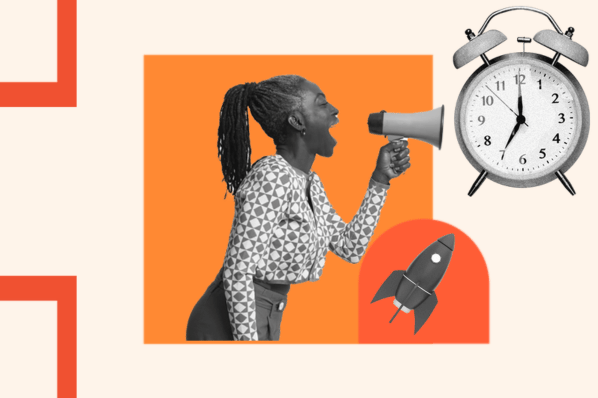
Image Source <28. Custom Illustrations and Animations
Custom illustrations and animations can add to the playful aesthetic of a website without taking away from the functionality. They add movement that adds to the brand story and messaging while contributing to how users interact with the site.
SmartBug uses a custom illustration and animation on their site where the rocket image contributes to the message “All Systems, Grow.” It also uses moving molecules to illustrate their serious, granular approach.
What I like: Custom animations can make your site come to life, enhancing the way people interact without distracting them from the usability.

Image Source <29. Chatbots
Chatbots have been around for a while, so if you’re wondering why I’m including them as a 2024 design trend, I get it. But here’s the thing — as generative AI becomes easier to incorporate with your CRM and data, I expect we’ll see more businesses using them. And okay, so it’s not technically a web design trend, but it is something that more companies will be using this year and beyond, including your competitors.
Not to toot our own horn, but you don’t have to look further than HubSpot’s site to meet our very own chatbot that we’ve named HubBot.
What we like: Generative AI makes chatbots more human, more intuitive, and easier to use than ever before. What’s more, it allows you to reinforce your brand message and user experience, and that means it’s not a trend that’s going away anytime soon.
 Previous Website Design Trends That Are Common Now
Let’s be clear, I’m not advocating that any of the trends on this list are passé. On the contrary, most of them remain quite popular. However, because they’re more commonplace, we’re shifting them to a new section of this list.
1. Scrolling Effects
Scrolling effects — animations triggered by scroll action — create more dynamic web experiences, which is why they’re arguably one of the most popular trending web design elements this year.
These are increasingly used on interactive websites to intrigue readers to keep scrolling, signify a break in content, and create a three-dimensional experience.
Engineered Floors does just that, combining horizontal and vertical scrolling.
For example, when the user lands on the homepage, they see an image of what appears to be a chair on the right. As the user scrolls, this image zooms out to reveal a living room, which is gradually covered in carpet. This 3D experience is delightful and informative.
What I like: Scrolling effects can stimulate visitors and encourage them to continue scrolling even below the fold.

2. Colorful Gradients
From Instagram to websites to advertisements and beyond, chances are you’ve seen your fair share of gradients in the last few years. Gradients have been all the rage lately, and we’re seeing this more commonly today.
Can't decide what colors to use for your website? Use HubSpot's Color Palette Generator to find a color scheme that suits your brand. The Color Palette Generator is easy to use: first, select your brand's primary color.
Then, choose complementary colors. The software will provide several full-color palette options that add neutral tones to your primary and complementary colors. You can customize your color palette to your liking.
Check out this gorgeous and visually appealing example by ROSE Wrapped for gradient design inspiration. It pairs a colorful gradient with kinetic typography for the ultimate visual impact.
What I like:Gradients are visually exciting and, when used properly, not distracting.

3. Overlapping Text and Images
Text that slightly overlaps accompanying images has become a popular effect for blogs and portfolios. Freelance art director and front-end developer Thibault Pailloux demonstrates how by placing overlapping text with a colorful underline beneath each title.
What I like: Overlapping text and images maximize space on the page.

4. Web Textures
Web textures are background images that visually resemble a three-dimensional surface. When you use them right, you can use web textures to immerse visitors in your website by engaging the tactile sense.
Need proof? Just check out this example from the Color Of Change website — the background evokes a duct-tape-like texture.
What I like: Web textures draw attention to a particular section on a website.

5. Pastel Colors
Pastel colors have been popular in website design. Pastels are bright, warm, and whimsical — a powerful reprieve from the bleakness of the early 2020s. This portfolio created by Cédric Pereira reveals exactly how visually impactful pastel colors can be.
What I like: Pastels add an element of levity to your website.

Design Trends You Can Use on Your Website
As VonBergen says, “Design trends come and go but creating a human connection with your visitors will make a lasting impression. Make sure your aesthetic choices match the experience you want to provide to that ideal visitor.”
Of course, you don’t need to incorporate all of these trends to build one of the best website designs in 2024 — we doubt that’s even possible.
Even adding a couple of these website design trends as prominent components or subtler details can improve your site’s UX significantly, leading to higher engagement, more CTA clicks, and a better outcome for your business.
Editor's note: This post was originally published in January 2018 and has been updated for comprehensiveness.
Website Design Examples