Luckily, I was in for a surprise. Working with our company's SEO team over the past year has led me to realize that the goals of SEO and design don't have to be at odds with each other -- in fact, they're intertwined around anticipating and delivering value to your customers.
Designing with SEO in mind ultimately creates an excellent customer experience.
Here, I'm going to explore how you can use SEO-minded design to increase traffic while still maintaining an engaging user experience -- but first, why is it even important?
The Impact of SEO-Minded Design
At its core, our team is looking to deliver traffic to our website, which impacts our ability to acquire leads and product sign-ups.
I see design as an integral part of being able to deliver these KPIs, because we directly influence what visitors -- and search engines -- see on a given page.
Ultimately, designing pages to provide a thoughtful and valuable experience for visitors affects whether our content appears in a SERP (Search Engine Results Page) or not.
For instance, if users find our navigation confusing, they might exit our page quickly -- which will indicate to the SERPs that our pages are outdated or don't match the keywords at hand.
There are plenty of other design-related factors that could influence SEO -- take a look at our Ultimate Guide to Google Ranking Factors in 2019 to learn more.
Next, let's explore how your team can practice SEO-minded design.
How to Practice SEO-Minded Design
There are a few concepts that tie SEO and design together that are helpful in balancing the best practices of both areas, and I want to cover four in particular today. Let's dive in.
1. Don't neglect the mobile experience.
Google has shifted to mobile-first indexing, which means that it uses the mobile version of your website for indexing and ranking.
The crazy reality is that Google may never see a desktop version of your website.
This change makes it imperative to ensure content quality isn't compromised when designing for smaller screen sizes. Hiding content on mobile but showing it on desktop is like clipping a bird's wings -- crawlers (the bots that scour the web for new content) won't be able to explore the breadth of your website and gain enough context regarding the value your content provides.
In practice, this means that your site navigation should be fully available to mobile users.
Additionally, you'll want to ensure the link structure on mobile isn't dramatically different from navigation options offered on desktop. Plus, text content and images should remain available to ensure crawlers have enough context to understand what your website is about.
I'll be the first to admit that reducing content for mobile is a bad habit I developed earlier in my career, and it's really tough to break.
To better embrace responsive design, I've shifted my mindset from trying to replicate the experience across all touchpoints, to delivering the best experience possible on each platform.
This gives you the freedom to optimize conversion flows on a per-platform basis, leveraging what you know about the needs of your users when they visit your site through different devices.
In support of mobile-first indexing practices, search engines also heavily weigh the mobile friendliness of your website. As a result, you should pay close attention to the following things when designing your site for mobile devices:
- Size of tappable areas: Ensure there's enough space for a person to tap on a link with their fingers. Tap targets of at least 48 pixels in size are considered standard by search engines like Google.
- Using legible font sizes: Text sizes should scale to ensure legibility on each device. Using fonts that are too small will result in penalties from search engines.
- Image asset file sizes: When exporting images and other media content, try to optimize the file size for web so it doesn't take forever to load. User attention span is short and if pages take too long to load, potential visitors will abandon your site.
We used this approach when building HubSpot's Business Templates directory, which launched in March 2019. The content we offer is in the form of editable document templates, which users can download and use. Since the templates are offered for Microsoft Word, Excel, and PDF -- typically desktop applications -- we realized users probably wouldn't find much value in downloading the templates to their mobile devices.
On mobile, I decided to prioritize the option to email a link to themselves to download the template later, enabling users to achieve their goals regardless of the platform they were on.
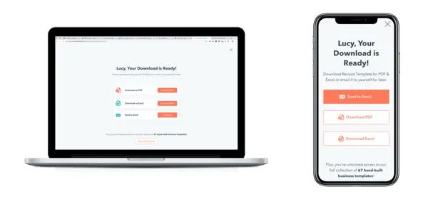
Slight modifications in the download experience between desktop and mobile create an optimized experience for each platform. These screens show how email to self is the primary option on mobile, while downloading is prioritized on desktop.
I also made a very simple change to my workflow to ensure I'm considering responsive design at every stage of the design process. When I set up a new file in Sketch (the main software our team uses for interface design), I always create two "artboards" next to each other -- one for desktop, and one for mobile.
As I'm designing a screen for desktop, I concurrently arrange the same content to the mobile screen size without deleting anything, then make adjustments needed based on the mobile context. It's not quite a mobile-first approach, but it's a step in the right direction.
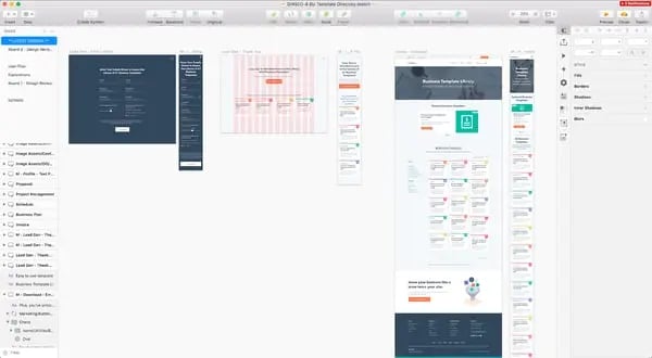
An example of a file set up for a responsive design approach
2. Make navigation meaningful.
The better your navigation is at surfacing the way your website is structured, the better crawlers will be able to discover content and understand what your website is about.
But clear navigation isn't just for bots -- it also helps visitors navigate your website and find interesting, relevant content. Think about your own experience visiting a website for the first time. Perhaps you've found an article on Google that you enjoyed reading and want to see more articles by that author. A well-organized website makes that content readily available to you.
You're probably familiar with several modules that are commonly used to organize content: "Related" feeds, "People also search for", "People also bought …" -- these features are commonly employed on ecommerce and directory websites. Although they might seem gimmicky, they can be valuable to customers for the following reasons:
- Reinforces content categorization. Visitors will learn about how you define categories on your website and the type of content that belongs in each. This empowers them to find specific content without aid.
- Promotes discovery of relevant content. This allows websites to deliver value for customers beyond their original query, encouraging customers to perceive us as knowledgeable, helpful sources for information. When they see content from us in the future, they may be more likely to trust us.
- Helps with decision making. These components reduce the cognitive load of having to recognize versus recall data, and customers feel reassured that they are not alone. However, it's important to use this data wisely to be helpful -- and to not abuse it.
Other UI components like breadcrumb navigation and table of contents may have a bad reputation in the design world, but they're useful for leveraging complex information architectures.
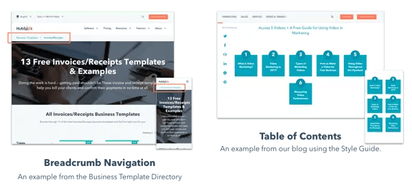
These components help manifest how your website is organized -- and let crawlers and visitors more easily find their way around your website.
From a user perspective, clear navigation acts like road signs, telling you more about where you are, where you've been, and where you're going. There's nothing worse than having to resort to the Back button on your browser because you don't know where else to click.
3. Give people what they want.
How many times have you searched Google for answers and clicked on a link that gave you different content than what you were expecting? We can probably agree that getting content that doesn't answer our question is a frustrating experience, and can result in a loss of trust.
Search engines want to serve quality content that answers the queries they receive -- which makes designing pages with relevant content one of the most important parts of enabling strong SEO. After all, when search engines don't deliver quality content, they lose customers and revenue as a result.
Understanding what will be valuable to visitors comes from understanding theirintentbehind a query. Being familiar with user goals lays the foundation for you to create content that will deliver value.
There are a few simple ways to learn more about user goals (short of being able to read their minds) that I like to practice on a regular basis:
1) Keyword Research
Keyword research examines the terms that people are typing into search engines, the number of times it's being searched in a given time period (usually monthly), and a few other metrics that help you determine the value and difficulty of pursuing a search engine ranking for that term.
Examining the full queries people are searching allows you to uncover more about the user's knowledge of the keyword and intent behind their search. Matching the specificity of your content to the user's expectations is critical for ensuring you deliver value.
For instance, here's an example to consider:
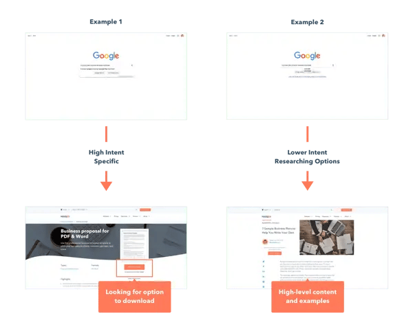
In the first example, someone searching for "business plan proposal template download" might expect a page that enables them to directly download a business plan template, and connotes a high level of specificity and intent -- this customer is likely in the consideration phase of their search, and probably already knows what a business plan proposal is and how to use it.
On the other hand, someone typing a query like "business plan proposal template examples" might not know what goes into a good business plan, and might be interested in a high-level article that gives them more context, as well as a few different options.
Keyword research also serves as a good litmus test for how well your copy resonates with customers. You can use metrics like monthly search volume (MSV) to see which keywords are commonly typed into search engines. This can help you understand how customers are referring to relevant concepts in the real world. You might consider this when weighing the cost and benefits of leveraging a commonly known term versus teaching a new one.
However, it's important to understand the limitations of using keyword research when incorporating it into your process. Keyword research shows you what users are searching for, but doesn't tell you what they're actually looking for.
People searching for the same term might be looking for very different things, and that depends greatly on the context that prompted them to enter a query. You can use keyword research to help you form a hypothesis about user intent, but you can't draw any conclusions about causality from it. Using keyword research can be a powerful tool, but only if you take its findings at face value and use it properly.
2) Empathy Exercise
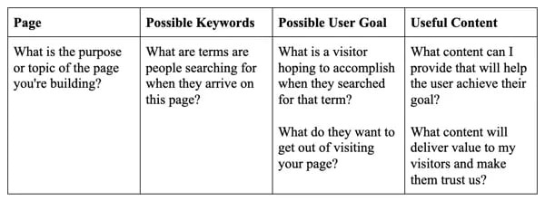
Once I've looked at the words people are searching for, I start to analyze the possible intent behind their query. For each page or asset I'm creating, I'll create a brief list of the keywords, goals, and content a visitor might find valuable to accomplish their goals.
This simple empathy exercise helps me consider the context in which people are visiting, and map out the modules that would create value to users.
Here's a template to help you get started with your own empathy exercise:
For the Business Template directory, I made a list that looked something like this:
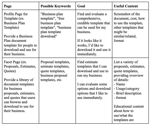
The context behind a user's search query can have a huge impact on their expectations for your content -- so while performing the empathy exercise, it's important to know that you might not capture every use case or scenario.
I use this empathy exercise to form a hypothesis about a user's goals, and then determine what content might be most valuable on that page. This sets a benchmark of the content that must be included, which allows me to wireframe modules that will showcase essential content.
We can build off this foundation and add content that oru marketing team or stakeholders may require, as long as it doesn't prevent customers from reaping the most value.
3) User Research and Testing
User testing or research is another helpful tool in evaluating the assumptions you bring into a project. It's incredible how often your assumptions could be off-base from the actual values your customers hold, so it's critical to get their direct insights whenever possible.
On our team, we've incorporated both moderated and unmoderated user testing into our arsenal using programs like Validately and Respondent, both of which allow you to recruit and screen users to test your designs.
When used together, these three methods can give you a stronger understanding of the context behind people's search terms, as well as the goals they might expect your content to help them meet.
4. Apply accessibility best practices.
Making your content accessible for all visitors is an important but often overlooked step in the design process. There are a lot of common explanations for why accessibility hasn't been prioritized -- unfortunately, some of these might sound familiar:
"Accessible design isn't as visually interesting and looks boring."
"It takes extra time to make something accessible for all."
"It only impacts a small subset of our customers."
The truth is that accessibility isn't that hard, and it's unacceptable to make excuses about why we can't do it. Making content accessible impacts SEO because it creates a better user experience and helps search engines understand what your content is about.
If it sounds daunting, these are a few simple things you can do to improve the overall customer experience and positively impact your SEO:
1) Add descriptive alt text.
Alt text helps people who have visual impairments understand what non-text content on your website is about. Technology like screen readers are used to help people with visual impairments interact with websites, and these tools read the alt text you provide when it encounters an image, video, or other non-text content.
Additionally, in cases where images aren't able to load (like slow or unstable internet connections), alt text appears in place of the image so users can still understand the content they're unable to see.
People aren't the only ones who use alt text -- search engines do, too. Crawlers use alt text for two things:
- Understand what an image is about. Capturing the topic and purpose of your image in the alt text description helps search engines rank your image in image searches and drive additional traffic to your website.
- Understand what your website is about. This helps search engines better understand what your website is about and the value it delivers to users, which impacts what SERPs your page is seen on.
Designers, developers, and marketers can work together to ensure that descriptive alt text is implemented on all content. Collaborating and keeping each other accountable for this practice can drive traffic to your site, and help us create an inclusive experience for all.
2) Create a clear content hierarchy.
Using headers to establish a consistent visual hierarchy makes content more digestible for both people and crawlers alike. It's difficult for people to read long bodies of text, so headers play an important role in providing users a way to quickly scan and find their way through long pieces of content.
Headers should be visually distinguished, clear, and descriptive, and tell readers (and crawlers) exactly what lies ahead.
3) Write descriptive anchor text.
It's relatively common to see buttons and CTAs that say "Read More" or "Learn More". Unfortunately, this isn't very helpful for visitors or bots in understanding what they should expect to see next.
When effectively used, CTAs and hyperlink copy should help set the visitor's expectation about what a linked page is about, allowing them to evaluate whether or not it would be valuable for them to visit the page.
Anchor text is also read by screen readers for visitors with visual impairments, and using links that aren't descriptive can be especially confusing for users who don't have the visual context of where your CTA lives.
Designing with SEO in mind will help you create a stronger, better customer experience. Ultimately, the best thing you can do in any situation is put the customer first.
By using a collaborative, intentional approach to design and SEO, we can drive measurable impact for our businesses -- and create more inclusive experiences for all.
Mobile Optimization





![10 Best Mobile Friendliness Tests [+ What Does it Mean to be Mobile Friendly?]](https://53.fs1.hubspotusercontent-na1.net/hubfs/53/mobile-friendliness-test.jpg)

