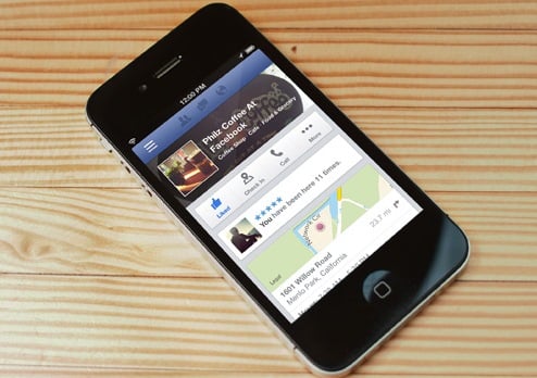
 If you're the proud owner of a Facebook business page, your page's mobile presence is about to get a makeover. Today, Facebook announced some design and layout improvements to the mobile version of Facebook Pages in response to the fact that half of Facebook Page visitors access those pages from their mobile devices. These updates are accessible starting today via mobile browsers and on the Facebook iOS app, with the changes coming soon to the Facebook Android app.
The best thing about it? Facebook Page admins don't have to do anything to optimize for it besides keeping the web version of their page complete and up to date. How's that for easy optimization? Let's review the changes to the Facebook Page mobile layout so you know what to expect both for yourself as a page admin, and for your mobile Facebook Page visitors.
What's New for Mobile Users?
As you can see via the screenshots below from TechCrunch, there are a few noteworthy changes to the mobile version of Facebook Pages from the user perspective.
- Cleaner Look and Feel: The simplified layout is designed to give page visitors a much more mobile-friendly user experience.
- Easy Ways to Interact With the Page Overall: The new design features buttons for users to Like the page, check in, call the business, or click for more, which includes actions like sharing, sending a message, copying the page's link, or reporting the page -- right below the page's cover photo and thumbnail.
- Most Useful, Relevant Information Featured Up Top: The new design aims to surface the important information closer to the top of the page so users don't have to scroll to find critical info. This information includes a close-up map so users can quickly determine the business' location in addition to the business' address, distance from the user's mobile location, hours of operation, price range, and a prominently featured average star rating.
Below the fold, the layout includes reviews left by the user's friends, and an option for users to add their own recommendations. Next, users see a large, slideshow-like album of photos from the page before finally viewing the page's feed of Timeline posts.


What's New for Facebook Page Admins?
In addition to design enhancements from the user's perspective, Facebook's updated mobile page layout also comes with some notable changes on the admin side of things ...
- Pinned Posts Appear Higher Up: Ever since Facebook's Timeline changes went into effect back in 2012, Facebook page admins have been able to pin important posts (including offers or videos) to the top of their Timeline using Facebook's desktop version. With Facebook's mobile update, this pinned content will now appear front and center when pages are accessed via mobile devices.
- Better Mobile Management: Facebook's changes give page admins the ability to easily swap between public and admin views of their page directly through their mobile devices, enabling them to comment on posts with either their personal or business account. In addition, Facebook has also released a new layout for corporate pages that have both a central brand page as well as other local business pages. The parent page shows links to its child/local pages below the map so users can find the nearest location. These features are noticeable in Facebook's images below:

Big Wins for Local Business Marketers
Although Facebook Page admins don't have to do anything in order to activate the new layout for their mobile visitors, Facebook's changes do have some implications for marketers -- particularly local businesses.
Aside from any possible motives of competing with more mobile-friendly local business-oriented apps like Yelp, Facebook's changes all seem reactive to the need for making the mobile experience on brand pages much more utilitarian rather than social. It makes perfect sense, considering that mobile users accessing Facebook Pages are likely more interested in getting information about nearby local businesses than actually interacting with the content on the page -- a behavior that makes much more sense for the desktop user.
Given that the mobile design is much more focused on providing users with local business information, recommendations, and ratings than encouraging Timeline engagement, Facebook's updates appear to be much more beneficial for the local business brand page than any other type. And because it's possible that mobile users may start gravitating toward Facebook over other apps like Yelp (at least I'm sure that's Facebook's hope) for information about local businesses, it's critical for local business marketers to make sure the information on their Facebook Page is accurate and up to date. It also wouldn't hurt to start collecting positive reviews/recommendations and star ratings, either ;-)
What do you think of Facebook's new mobile page layout? How do you think it will affect Facebook mobile marketing?

