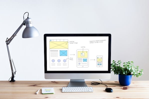
What is Fitts’s law?
Fitts’s law is a predictive model for the speed of human movement, commonly used in human-computer interaction. It states that the time it takes someone to select an object depends on how far they are from the object and the size of the object. Small objects that are far from your starting position or related objects that are far away from each other take the longest time to select. Large objects that are close to your starting position or related objects that are close together take the shortest time to select.
In the physical world, this law seems pretty straightforward. The biggest button on a microwave is the door button because opening the microwave door is the most important action. In human-computer interaction, it’s just as simple.
When your cursor is far away from a small call-to-action, you need to be more precise to accuracy click on it, increasing the time and energy you spend moving your mouse toward the CTA. But when your cursor is close to a large CTA, you don’t need to be as precise to accurately click on it. You can spend less time and energy moving your mouse toward the CTA and still get the same result.
Fitts’s law is widely applied in UX and UI design, or any interface that involves pointing with a mouse or finger. It’s the reason why call-to-actions on websites are large. Think about it: if you want users to take specific actions on your site, placing large call-to-actions where users expect them to be makes them easy to find and click on.
That said, these guidelines should be taken with a grain of salt. Logic alone can’t design a stellar user experience. Emotions drive human behavior, attracting us to visually appealing objects that are easy to use. And designing a user-centered experience requires a solid understanding of human psychology. Below, we’ll cover how to balance the logic of Fitts’s law with psychology by examining three examples from some of the top user experiences out there.
3 Examples of Fitts’s Law in Web Design
1. Size | VeryGoodCopy
When an entire button or image is large, clickable, and has clear boundaries, they're easy to select. Users can intuitively understand where to click and where not to click. But forcing users to point their cursor directly over a specific part of a button, like the text, requires more precision, and, in turn, time and effort.
Bigger isn’t always better, though. Increasing your button’s size can produce diminishing returns of usability. A button that’s too big can shatter your page’s balance and hog valuable real estate that’s better suited for white space or another call-to-action. Buttons that are large enough to demand attention without disrupting the visual balance of your page are what maximize usability.
Ultimately, pixels are scarce. But the relationship of usability and size lets you salvage valuable real estate to clean up your page with white space or boost its conversion rate by adding another call-to-action, like VeryGoodCopy’s website below.

2. Distance | HubSpot
When users land on your website, and you want them to take a specific action, you need to estimate where the starting point of their cursor will be. This is called the prime pixel.
Brands don’t actually know their website visitors’ prime pixel location, but this is surprisingly a good thing. If they knew where this point was, then they could adapt their website design to your cursor location and create the shortest path to a desired CTA from it. Your user experience would be different every time you entered the site. And that would make it much harder to find things -- you’d essentially be looking at a new website design every time you enter it.
Estimating the location of your prime pixel is a better alternative because it allows you to build a consistent and easy-to-navigate site. For instance, Google’s search box is always in the center of the screen because when users enter the site, they’re most likely looking at the middle of the screen. Most of the time, the prime pixel should influence the location of the target object. And the shorter the path to desired action, the better the user experience.
On mobile devices, the primary pixel is the area where your thumbs are, which are called the thumb zones. Fitts’s law applies to our thumbs’ range of motion in terms of mobile user experience. That’s why iPhone menus are at the bottom of the screen. Your thumbs naturally hover over that area, so you don’t need to stretch them or move your hands to reach those important buttons.
But since mobile phones don’t have much space on their screens, it’s challenging not to cluster buttons together on your website. This could make it easy for someone’s thumb to aim for one button and mistakenly hit another. Putting enough space between your buttons will prevent these mishaps from happening.
Placing buttons around the prime pixel isn’t a hard rule, though. In theory, pie menus should be easier to use because you barely have to move your cursor to select an option. The buttons are all centered around the prime pixel. But using submenus inside of a pie menu branches them off of circles, which can clutter your page.

Dropdown menus are the more user-friendly option. Even though they technically take longer to select an option -- users have to do a longer cursor movement to find their buttons -- drop-down menus are more visually pleasing and hog less space than pie menus. They also unclutter your interface and organize its content into hierarchies and different groups. This allows you to have multiple dropdown menus right next to each other with submenus in all of them, without having to sacrifice the aesthetic of your page or a ton of whitespace, like HubSpot’s homepage below.

Fitts’s law also suggests that you should decrease the distance between objects that users use in a logical order. For instance, the login button is always right next to the username and password form fields.
When certain buttons are related, you should organize them in a way that’s easy to remember and find. Grouping similar buttons creates a familiar mental map on your website that users can basically memorize.
But placing every comparable button right next to each other could clutter your page and lead to a lot of user mistakes, especially if you put a high risk button, like a delete email button, right next to a frequently used button, like a send email button. To reduce these accidental actions, there should either be a two-step method to verify the action, an undo option, or ample space between the buttons.
3. Effort | Google and Apple
A lot of vital commands like 'exit', 'start', and 'shut down' are located in the corners of your computer screen. Placing buttons there makes it easier for users to select them because the buttons are pinned by two sides. And the cursor stops at each side, so you can’t go beyond them. This means you don’t have be as precise when you want to click a button in a corner or edge. You just have to move your cursor to its general vicinity.

Placing buttons in corners and edges isn’t as user friendly on mobile devices, though. If you place them there, users need to stretch their fingers or move their hands just to reach them.
Less effort isn’t always better either. Crucial commands that are easy to do like turning off your phone doesn’t allow users to minimize the costs of their mistakes. Once they trigger them, users can’t undo them. There’s no forgiveness in the design at all.
To prevent frequent accidental shutdowns on their phones, Apple makes users swipe a slider to turn off their phone. And to rescind a power off, all users have to do is press the cancel button. The cancel button’s consequence doesn’t compare to turning the phone off, so Apple makes it easier to accidentally press it.

Fitts’s law is incredibly useful, but it isn’t foolproof. Data always trumps theory, especially when testing user experience, so consider tracking the way users use your website and optimize its design for usability and conversions. Remember, Fitts’s law should never be a hard rule in user experience design. But it should always be an essential guideline.

User Experience
![The Usability Testing Playbook [Expert Tips & Sample Questions]](https://53.fs1.hubspotusercontent-na1.net/hubfs/53/usability-testing-1-20250305-3357250.webp)
![9 Breadcrumb Tips to Make Your Site Easier to Navigate [+ Examples]](https://53.fs1.hubspotusercontent-na1.net/hubfs/53/breadcrumb-navigation-tips.jpg)