When you simmer it down, data visualization is pretty much storytelling with visuals. That's why I love data visualization; it transforms complex figures into clear, intuitive charts that help me quickly spot trends and understand the story behind the numbers. As I alluded to above, it also helps me communicate that story meaningfully to others.
In this article, I’ll explain what data visualization is and share some data visualization best practices to help you get started.
Table of Contents
- What is data visualization?
- How to Visualize Data: 10 Approaches
- Examples of Data Visualization
- Bad Data Visualization Examples
- Data Visualization Tools
.png)
An Introduction to Data Visualization
Learn how to design compelling charts & graphs that are easy to understand, including:
- Tools and Software for Data Visualization
- Data Types, Relationships, and Formats
- How to Effectively Visualize Data
- A History of Data Visualization
Download Free
All fields are required.
Form not available
What is data visualization?
Data visualization allows you to organize data in a way that’s both compelling and easy to digest. It’s about representing data in a visual context, such as a chart or a map, to help anyone viewing it better understand the significance of that data.
How does data visualization work?
Whereas data shared via text can be confusing (not to mention bland), data represented in a visual format can help people extract meaning from that information more quickly and easily.
Data visualization allows you to expose patterns, trends, and correlations that may otherwise go undetected.
Static vs. Interactive Data Visualization
Data visualization can be static or interactive. For centuries, people have been using static data visualization like charts and maps.
Interactive data visualization is a little bit newer: It lets people drill down into the dirty details of these charts and graphs using their computers and mobile devices, and then change which data they see and how it’s processed.
Time Series Visualization
In addition to static and interactive data visualization, you may also hear the term time series visualization. Time series visualization is what it sounds like — visuals that track data, or performance, over a period of time.
This is important because a major reason why people want to focus on data visualization is to show changes in variables over time.
Time Series Data Visualization Examples
There are many ways to use time-series data visualization — you’ll learn more about these below, but here’s a quick list to give you a better understanding of which visuals are considered time-series visuals:
- Line chart.
- Bar chart.
- Area chart.
- Bullet graph.
How to Visualize Data: 10 Approaches
1. Line Chart

A line chart is a straightforward tool for visualizing data trends over time. It works by connecting individual data points with a line, which makes it easy for you to see patterns and changes across different time intervals.
You can use a line chart to track a single data series or compare multiple series simultaneously. It’s beneficial for highlighting trends, spotting fluctuations, and understanding overall progress in your data.
I personally use line charts to gauge a new client’s website performance. As part of an initial audit, I will likely use Google Search Console’s (GSC) performance chart to set benchmarks for metrics like impressions and clicks. I can then spot trends that help me understand what works and what needs improvement. These insights form part of my strategy. I will also use line charts for content monitoring throughout the project.
2. Bar Chart

A bar chart uses rectangular bars to represent values, with the length or height of each bar corresponding to the quantity it represents. This type of chart is very helpful for highlighting differences across groups or items at a glance.
Whether the bars are displayed vertically or horizontally, a bar chart makes it easy to see which categories stand out, helping you to analyze and communicate your data quickly.
When I first started my blog, I knew nothing about SEO. (I started my own site purely to build a writing portfolio.) I also didn’t know about GSC. So I used to use Jetpack stats through WordPress to check website traffic month on month.
The bar chart was the default traffic analytics setting. I didn’t get too into data details at this point, so I just went with the first option. But it did give me an excellent first glance at which months were top performers for my blog. I could then dig into what I did differently that month, and try more of the same. I still love bar charts as a quick way of spotting prominent trends.
3. Scatter Chart
A scatter chart is a valuable tool for examining the relationship between two variables by plotting individual data points on a coordinate plane. Each point represents an observation, allowing you to see patterns, correlations, or outliers in your data.
This type of visualization is ideal for exploring how changes in one variable might relate to changes in another. It gives you insights into trends and relationships that might not be immediately apparent.
Admittedly, I don’t use scatter charts that often. But I do find them handy for specific use cases like tracking marketing campaigns against revenue generated.
4. Area Chart
An area chart is similar to a line chart but fills in the space beneath the line, which helps emphasize the volume of change over time. This visual representation is helpful for showing cumulative totals or highlighting how different parts contribute to the whole.
By filling in the area below the trend line, an area chart can make it easier to spot patterns, compare magnitudes, and understand the overall impact of the data.
I like using area charts on ecommerce websites. For example, I use them to visualize which product categories or collections are most popular. I like to use an area chart for this because it clearly shows the significance of the differences between products. In my experience, it makes these differences very apparent to clients, too. Once I know which categories or collections are working well, we can double down on the success.
5. Map Chart

A map chart displays data on a geographic map, which makes it easy to see how values differ across regions or locations. It uses colors, symbols, or shading to represent data points across countries, states, or cities.
This type of chart is useful for highlighting regional trends or comparing data geographically. With a map chart, you can quickly identify patterns, clusters, or outliers that are tied to specific areas of the world.
I really like the “Views by Location” map chart in Jetpack Stats. I think this is one area of Jetpack that actually has the edge over Google Search Console. Through this feature, you can clearly see which countries are visiting your website. You can do something similar with GSC, but you need to export the data to a spreadsheet and create a map in a separate program.
6. Indicator Chart

An indicator chart usually shows one or more large numerical values, often accompanied by visual cues such as colors or icons (e.g., gauges or tickers), to quickly communicate whether a metric is meeting its target or requires attention.
You can use an indicator chart to monitor performance over time, compare current values against goals, or highlight important data points on a dashboard. Its clear and direct presentation makes it easy for you to immediately understand the status of a critical measurement without digging into more detailed data.
I’d be a big liar if I said I used indicator charts often, or at all. But researching this chart type has given me food for thought. I’d really love to know if folks find this chart impactful for marketing.
7. Pivot Table

A pivot table is a versatile tool that helps you quickly summarize and analyze large data sets. It allows you to reorganize raw data into a structured format by grouping and aggregating key values, such as sums, averages, or counts.
With a pivot table, you can easily compare different categories or time periods and uncover patterns that might not be visible in the original data.
Again, I’m not a big user of pivot tables. I think I’ve always been put off exploring them because they’re “complex.” That said, I like the examples in How to Create a Pivot Table in Excel: A Step-by-Step Tutorial. I can see the third example, “Combining Duplicate Data,” working well for large ecommerce sites with thousands and thousands of URLs.
In the future, I’d like to test this method to analyze duplicate content. I’ve worked on sites with thousands of product collections, and it’s hard to avoid duplicates at this scale. I’m thinking a pivot table could provide a quick summary of all duplicate collections, along with performance metrics.
8. Bullet Graph

A bullet graph is designed to show progress toward a target in a clear and space-efficient manner. It typically features a horizontal bar representing the main measure, along with markers indicating target values or performance ranges.
This type of chart is useful on dashboards, where it provides a quick snapshot of how well a metric is performing against set goals. By comparing the length of the bar to the reference markers, you can easily assess whether a value is within an acceptable range or if it needs attention.
As a social media manager, I’ve used bullet graphs to compare and contrast social media usage by platform. This graph type makes it easy to see which platforms are yielding the best results for a specific metric, such as clicks or shares.
9. Box Plot

A box plot is a statistical visualization that summarizes a dataset using its quartiles and highlights any outliers. It displays a box representing the interquartile range, with a line inside indicating the median and “whiskers” extending to show the data’s range.
This chart is helpful for quickly understanding the central tendency, spread, and symmetry of your data, as well as identifying any unusual observations.
As with an indicator chart, I’ve never used a box plot for marketing, unfortunately. But I like the “Daily Downloads,” example shared by Atlassian. I can see this working well to track downloads of online resources.
10. Pie Chart

A pie chart is a circular graph divided into slices, where each slice represents a part of the whole. This type of chart is helpful for showing how individual categories contribute to an overall total. By displaying data in proportional segments, a pie chart allows you to grasp the relative size of each category quickly.
However, it’s most effective when used with a limited number of categories to keep the visualization clear and easy to understand.
I like to use a pie chart to get a breakdown of where a website’s traffic is coming from. I typically break these charts down into different areas like “Organic,” “Social,” “Referral,” etc. I use the visual to see the top sources of website traffic. I can then capitalize on what’s working and try to improve what isn’t, or redirect energy away from channels that aren’t working for the project.
Ready to feel inspired? Let’s take a look at some great examples to inspire your data visualization ideas.
An Introduction to Data Visualization
Learn how to design compelling charts & graphs that are easy to understand, including:
- Tools and Software for Data Visualization
- Data Types, Relationships, and Formats
- How to Effectively Visualize Data
- A History of Data Visualization
Download Free
All fields are required.
Form not available
Examples of Data Visualization
Below are 20 examples of data visualization, split into two major sections: static and interactive data visualization.
Examples of Static Data Visualization
1. United States Urban Population

This chart aims to show the growth of the rural population versus the urban population in the United States between 1955 and 2024. On the graph, the rural population is green, while the urban population is blue.
What I like: Like any good stacked bar chart, you shouldn’t have to work too hard to get a clear picture of what’s happening with the data. And this chart? It delivers. Because of the color differentiation (green and blue), it’s very clear which areas are rural or urban. You also don’t have to do any calculations. Instead, when you hover over a bar, you can see the exact figures and percentages for both populations in that year.
2. Global Warming

In this chart, the World Meteorological Organization aims to show the increase in global mean temperature over the last two centuries. The chart displays data from six global surface temperature datasets used to track and analyze the average temperature of the Earth’s surface over time.
According to all six datasets, 2024 was the warmest year on record, with a global mean surface air temperature of 1.54°C.
What I like: A line chart can either plot a single data point (i.e., website traffic) over time or compare multiple datasets. On the latter, each dataset should be clearly differentiated. The graph above achieves this by using a different color for each dataset. That means you can easily see when and how they converge.
I like how this helps to build a bird’s-eye picture of what’s going on. For example, there may be some slight differences between at least three datasets for the years 1860 through 1880. But all six agree that the global surface temperature has been rising steadily since 1970 at a consistent rate.
3. The Advent of Generative AI

This pie chart aims to show the software categories that will be affected by the rise of generative artificial intelligence (AI). It also indicates the degree to which each category will be disrupted. For example, content creation will likely be affected the most by generative AI, while system infrastructure will be affected the least.
What I like: I like how easy it is to read the data on this pie chart. The names of the industries are clearly listed, along with their individual monetary values. There’s also a color scheme that indicates the level of disruption/reimagination each category will undergo. So, at first glance, you know what you’re looking at and what it means.
4. The Lunch Hour Premium Mystery
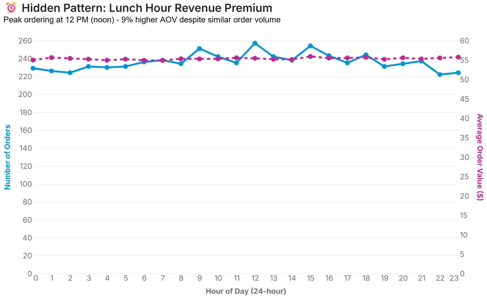
The next two examples have been created using Secoda, an AI platform for data and analytics. Secoda makes data accessible to all stakeholders, regardless of technical ability, by letting users simply ask questions of the data.
The prompt used to create this and the following graph was: “Can you give me some more hidden insights on these trends in Static Data Visualization and Interactive Data Visualization?” (More on the interactive data example later.)
The example graph above reveals the following hidden insight: “While orders remain flat throughout the day (~230-260 per hour), 12 PM shows a 9% higher average order value ($55.40 versus $54.95 average). This suggests lunch-hour customers are less price-sensitive or making impulse additions.”
What I like: The chart plots both “Number of Orders” and “Average Order Value(s)” over 24 hours. The way it is laid out, alongside the separate colors for each, clearly differentiates the data sets.
I also appreciate that the platform provides an action based on the hidden insight. In this case, Secoda recommends that you “Test premium product placement and ‘lunch combo’ bundles during the 11 AM–1 PM window.”
5. The Patience Paradox
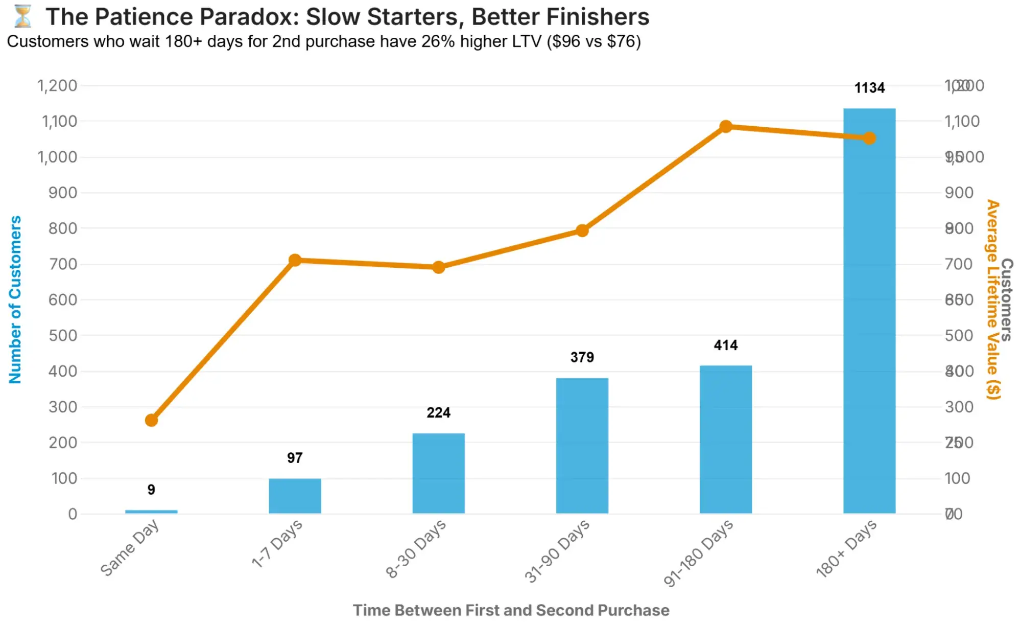
Secoda visualized the next hidden insight using a column + line graph (also known as a dual-axis).
The insight itself is: “Counterintuitively, customers who wait 180+ days before their second purchase have 26% higher lifetime value ($96.27) than those who repurchase within a week ($87.73). The ‘slow burners’ represent 50% of repeat customers.”
What I like: There is a lot of data on this chart, and despite that, the data is easy to understand. As with the “The Lunch Hour Premium Mystery” graph, the layout of this chart, particularly the use of dual axes and colors, helps make the complex information easy to interpret at a glance.
Once again, I really like the action set by Secoda: “Don’t write off dormant customers. Create ‘we miss you’ campaigns at 90-120 days targeting this high-value segment.”
6. Popular Opinion of China Over Time in Select Indo-Pacific Nations

This chart depicts the results of five surveys in which 1,000–1,700 respondents were asked, “If the Association of Southeast Asian Nations (ASEAN) were forced to align itself with one of the strategic rivals, which one should it choose?” The rivals in question are China and the United States, and the surveys were done yearly from 2020 to 2024.
What I like: At the top of the chart, there’s an aggregated graph compiling the answers of all the member countries of ASEAN, which determined that, as of 2024, they’d rather side with China than with the United States.
However, I love that the charts below break down how respondents from each member country responded over the years. When you hover over the red or blue bars, you see the percentages of people who picked either option.
7. Target Candlestick Chart
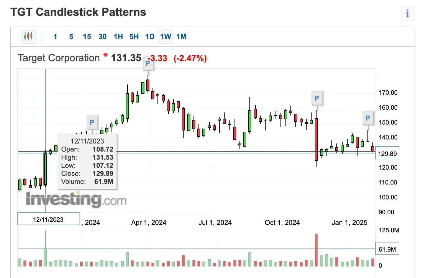
This boxplot chart follows the movement of Target’s stock throughout 2024. Each candlestick represents certain values that show traders/investors when it’s okay to enter or exit the market to maximize profits and minimize losses.
What I like: First of all, as someone who hasn’t used a boxplot chart since school, I really love that this example is applicable to the real world.
Aside from that, I can imagine beginner traders/investors might look at the candlestick patterns and struggle to gauge what they mean. So I like the added interactive element — when you hover over each candlestick, it reveals key values like Open, High, Low, Close, and Volume, which can inform trading decisions.
8. Popularity of Basketball and Football in the United States

In 2024, Statista surveyed 17,639 American adults who followed sports and asked them which one they followed: American football, basketball, or both. These adults ranged in age from 18 to 64, so Statista divided them into five age categories and plotted their responses in this bar chart.
What I like: I like how each variable is represented with two highly contrasting colors, and how the percentages are displayed above each bar. This means that, at first glance, you can understand the information visualized on the chart. For example, I immediately know that Americans aged 25-34 follow American football more than basketball. However, there is only a 6% difference between the two.
Examples of Interactive Data Visualization
9. Global PE-/VC-backed investments in metals and mining
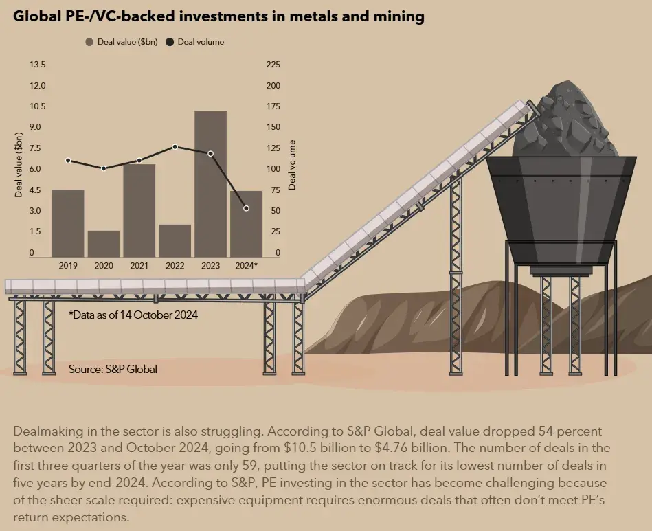
This infographic-like chart shows the history of private equity’s interest in mining. It starts with a breakdown of the 10 largest mining-focused funds to have closed historically, with the colors of the tree stumps signifying the locations (e.g., North America, Asia-Pacific, and multi-regional).
It’s a really long graph, and as you scroll, the information, graphics, numbers, etc., slide onto/appear on the page. The section highlighted above shows Global PE-/VC-backed investments in metals and mining. The chart uses data from 2023 and 2024 to visualize how dealmaking in the sector is struggling.
What I like: The chart’s aesthetic appeal is impressive. As someone who isn’t a metals and mining aficionado, I’m still interested in the data because the chart is so visually pleasing. For example, the interactive chart consists of different types of graphs, including pictograms and bar graphs. This keeps the data visually interesting.
The layout is very reader-friendly, making it easy to follow the timeline from 2017 to 2024. I think the animated elements are a nice touch as well. As you scroll down, these eye-catching elements move, which keeps me engaged.
10. How Different Nations Approach Governance
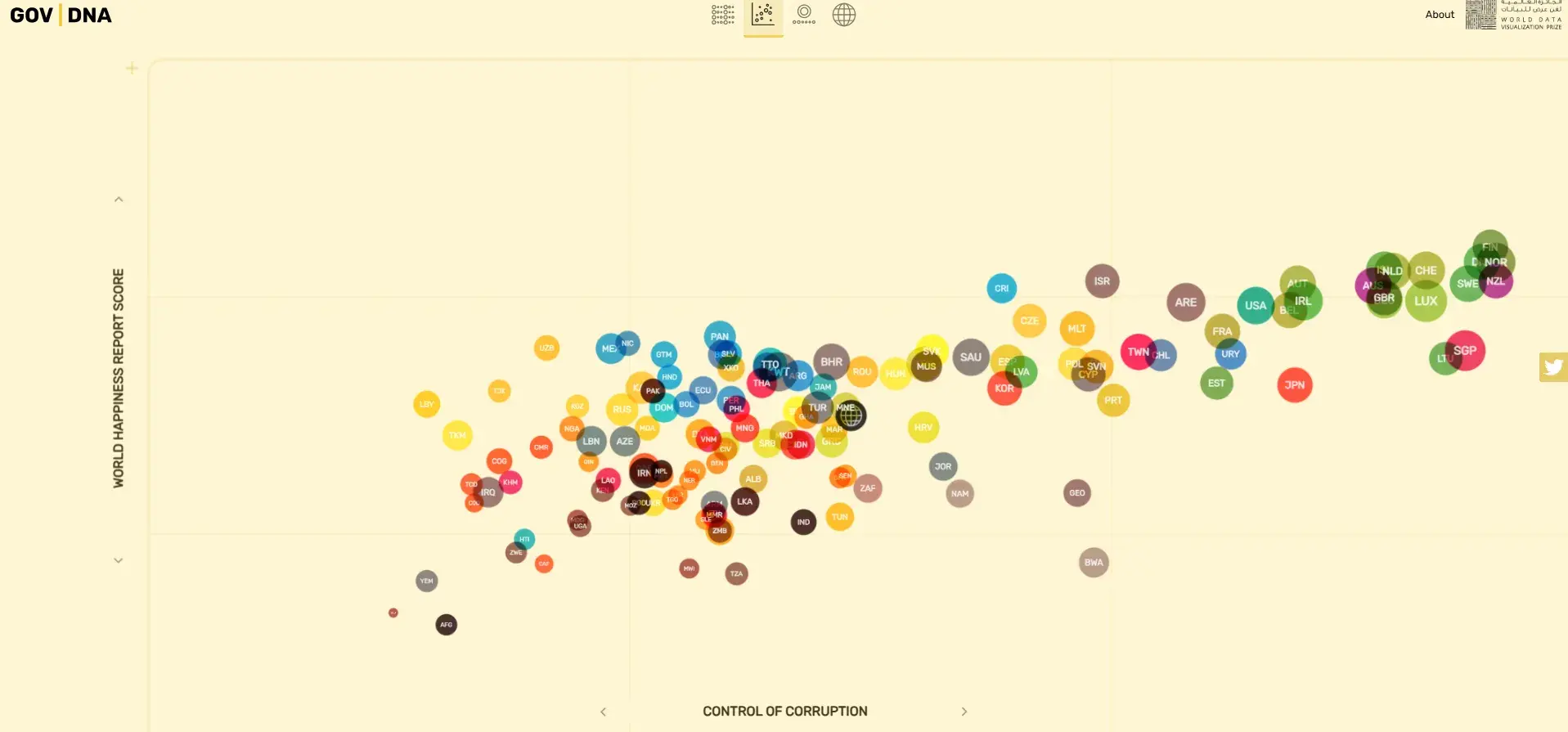
There’s no definite answer to the question of what role the government should play in everyday people’s lives. However, this interactive visualization lets you explore how different nations approach governance today.
It measures several indicators, including the rule of law, control of corruption, judicial effectiveness score, government integrity score, property rights score, tax burden score, overall economic freedom score, financial freedom, and life expectancy, among others.
What I like: I love how in-depth this interactive visualization is. Not only does it show you the scores of different countries based on one of the several indicators it measures, but it also offers various chart types to help you discover trends and better interpret the mountain of information.
For example, if I want to see the details of Finland’s control of corruption, I could click it to get information on Finland’s Gross Domestic Product (GDP), GDP growth, health expenditure rate, employment rate, government spending score, school life expectancy, and more.
I think, overall, this chart has done an incredible job of presenting a ton of information in an easy-to-digest way. In particular, the color choices help create an interesting visual without being too overwhelming or “noisy.”
11. NASA’s Eclipse Explorer

NASA created this interactive map to help people who’d like to witness a solar eclipse know when one will happen in their location. On the map, you can look up your city, zoom in and out of the map, and get information on when the next eclipse is estimated to happen.
What I like: I like that the information is spelled out for people, but they’re still able to dictate what they’re looking for. For example, I searched for Delaware, Ohio, on the map. It immediately provided information about the next eclipse in the city, including the time it will occur, the duration of total coverage, and even the estimated temperature for that day. I learned when it was happening, how long it would last, and whether to bring a jacket. Pretty cool!
12. North Korea’s Trash Balloons Explained
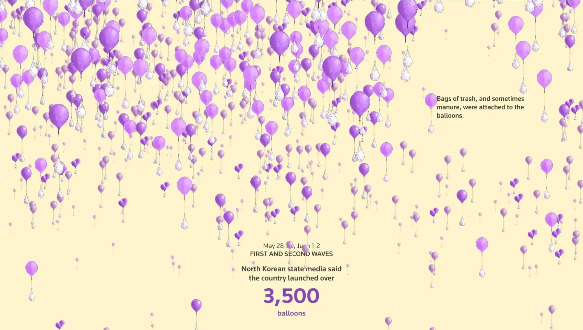
For this interactive visualization, Reuters takes the storytelling route to explain the balloons North Korea launched into South Korea last year. The visualization consists mainly of purple balloons with other bags attached to the ends. They symbolize the bags of trash/manure that North Korea attached to the ends of the balloons it launched into South Korea.
What I like: First, I really appreciate the color choice. Even though the chart shows the same balloon illustrations multiple times, it can get quite cluttered depending on the month. The pale yellow, purple, and purpley-gray make this complex information easy on the eye.
I also love that the visualization takes you on a journey. When you first scroll, there are tons of balloons to give you an idea of the scale of the balloon launches. Then, the number of balloons will be reduced relative to the batches that North Korea sent.
I love how Reuters accompanies each wave of balloons with information on the dates North Korea sent them and the total number of balloons.
13. Parallel Lives

This Parallel Lives interactive visualization is a database of prominent historical figures. These figures are grouped into three categories based on their professions and impact: Culture, Discovery/Science, and Leadership.
This graph starts at 3,345 BC, and as you scroll down (and through the years), you see the names of prominent people who existed at the same time across these categories. For example, in 486 BC, Euripides, Socrates, and Pericles were all alive, although they were 12, 2, and 26 years old, respectively.
What I like: I am such a history buff. But I’ve always struggled to pinpoint how a global historical event and its key figures fit alongside other significant events. I love how this visualization takes the guesswork out of this.
Scrolling through the page allows you to contextualize the lives of these figures in relation to one another. It provides their names, professions, and ages, offering a broad look at what life might’ve been like at that time, especially if these figures existed in different parts of the world.
I also really love how each figure is separated by category. That means if you’re interested in “Culture,” you can focus on those noteworthy historical figures. The same goes for “Discovery/Science” and “Leadership.”
An Introduction to Data Visualization
Learn how to design compelling charts & graphs that are easy to understand, including:
- Tools and Software for Data Visualization
- Data Types, Relationships, and Formats
- How to Effectively Visualize Data
- A History of Data Visualization
Download Free
All fields are required.
Form not available
14. Private Law (Children Act) Comparisons
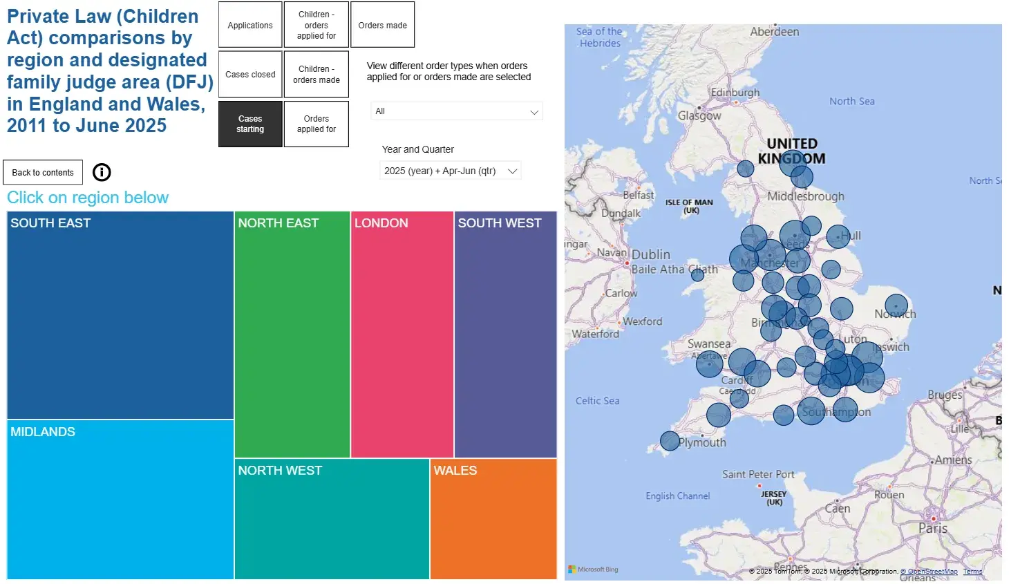
The data visualization above was built using Microsoft Power BI. The broader report contains interactive sub-reports/dashboards. In terms of use cases, a company like Child and Family Solutions uses it to forecast demand for independent social work services — both by region and by the services they’re most likely to provide.
The data represent real family law statistics updated quarterly. In short, the visualization helps these companies to spot trends and adjust work capacity and forecasts based on real data.
What I like: I like that you can filter the data and that it’s visualised nicely, either on a map of the U.K. or in charts like bar and line graphs. I also like that you can select one of the blue circles on the U.K. map to view details about that region.
15. Status Correlation Explorer
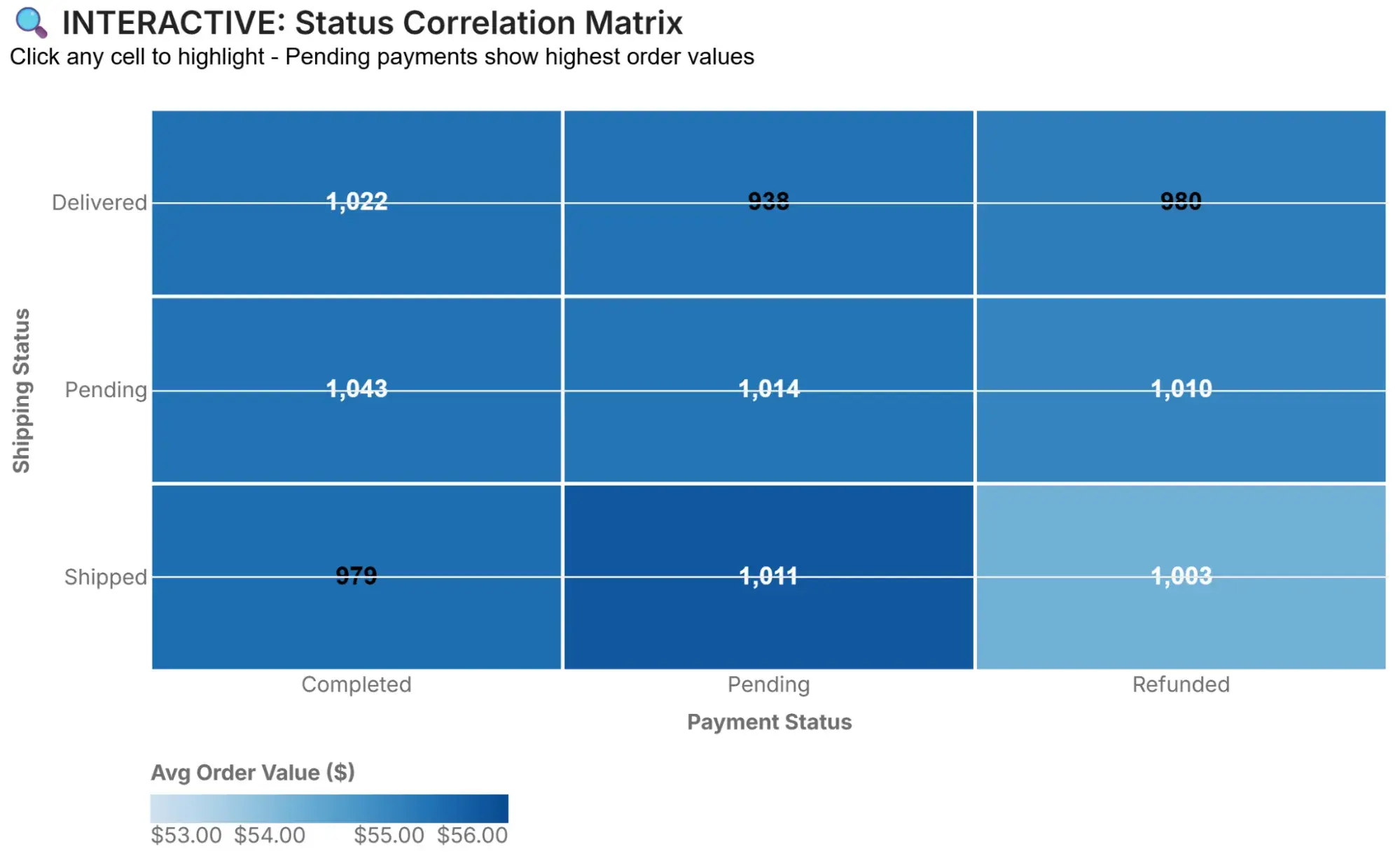
Once again, I’m returning to Secoda, but this time with an example of hidden data insights visualized in an interactive format. The visualization shows that “Orders with ‘Pending’ payment status show highest AOV ($56.60 avg) across all shipping statuses — 2.4% higher than completed payments. This suggests larger orders trigger more payment review/delays, not cart abandonment.”
Based on this, the following action is recommended: “Don’t panic about pending payments. They represent higher-value orders in processing, not lost sales.”
What I like: You can click any cell in the visualization to highlight that shipping/payment status combination and compare order values. This makes it easy to spot trends and quickly gather information from each cell.
16. Most Popular Thanksgiving Pies Across the U.S.
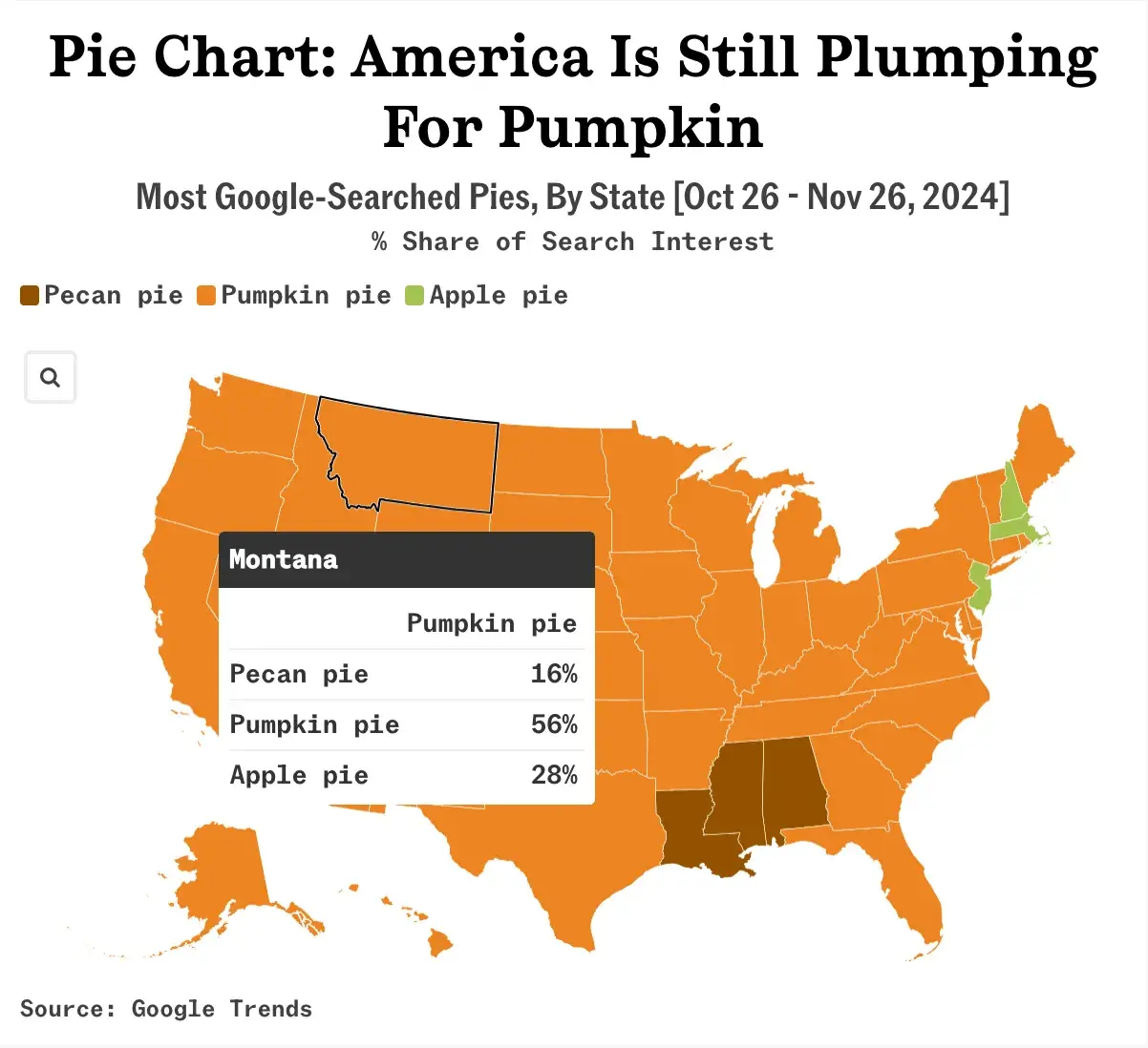
Many American families enjoy pie on Thanksgiving, but the flavors they choose vary significantly from state to state. Using the Google Trends data from October 26 to November 26, 2024, Sherwood News created an interactive choropleth map showing the most googled pie types by state.
What I like: Because of the colors, I can immediately tell that pumpkin pie dominated the Google searches in most American States. However, the map provides more information when I click a specific state.
So, while pumpkin pie was the most popular in Montana (56%), the map also shows that 28% of families searched “apple pie” and 16% searched “pecan pie.”
17. NASA’s Eyes on Asteroids

This interactive data visualization from NASA allows users to see where asteroids sit in relation to our solar system. The visualization is based on real-time data, so if an asteroid is about to hit Earth, you can be the first to know. Got to love 21st-century living, right?
What I like: I love the design’s layout and aesthetic. It looks “space age” and automatically makes me want to explore the asteroid belt. The interactive features are interesting, too. For example, you can click on or “follow” different parts of the diagram. I tried this with Mars, and it brought up a more focused view. When I clicked on the Red Planet, I could scroll around and see it in relation to other celestial bodies.
18. Iran and South China Sea Oil Trade

The world’s largest gathering point for dark fleet tankers is forty miles east of the Malaysian peninsula. Here, these tankers, which operate without insurance, transfer millions of barrels of sanctioned Iranian oil to China.
The charts above are a result of Bloomberg analyzing five years of satellite imagery of this region to reveal the rapid growth of this shadowy oil trade.
What I like: I love how these charts clearly show the increase in side-by-side ships in the region from 2020 to 2024, especially with the exact percentages written underneath each chart.
Rather than plot this information on a line or bar chart, Bloomberg used a scatter plot to help viewers visualize the areas where these ships appeared each year. This way, you can see that between 2020 and 2024, the ships grew by over 100% and became more concentrated.
19. Tracing Microplastics

About 170 trillion microplastics are floating in the world’s oceans, posing serious threats to marine life, aquatic ecosystems, and our food chain.
To give readers an idea of how dangerous these microplastics are, The Straits Times uses an interactive storytelling experience to explore the Indian Ocean Garbage Patch, where microplastic concentrations can reach over one million particles per sq km.
What I like: I love how methodically this “scrollytelling” experience breaks down the effects of microplastics in the ocean and why people should care more about them. It takes you on a journey from South Asia to East Africa, illustrating how textile microfibers from washing machines enter these garbage patches and the consequences of this environmental hazard.
I also love how when you scroll through the Earth element of the visualization, specifically, the animation guides you through different parts of the planet in relation to microplastics. The Earth diagram starts as a bird’s-eye view, and the camera zooms into other parts of the Earth as the data story progresses.
20. PIN Code Popularity

Many people rely on four-digit PINS to unlock their phones, access their bank accounts, and verify their digital identities. Yet, many people subconsciously choose highly predictable codes that scammers can guess.
ABC News analyzed millions of PINs exposed in data breaches and created this interactive heatmap chart to show how common and vulnerable certain PIN combinations are. The brighter the square (bright green), the more vulnerable that number is.
For example, the combination 1234 makes up nearly 1 in 10 of the millions of PINs ABC News analyzed.
What I like: When you scroll down the page, it highlights different PINs on the data visualization. And if you’re not sure what the data implies, a clear description of what it means appears on the right-hand side of the page. I think this is a nice touch that makes the data accessible to everyone.
I like how this heatmap isn’t just a chart; it’s a mindreader of sorts. Beyond exposing vulnerable PIN combinations, it goes into why people are likely to choose these numbers. When you’re aware of how high your chances are of being hacked when you use these numbers, you’re more likely to avoid them.
The examples of data visualization above are excellent references as you develop your approach. However, it‘s also important to consider the less effective ways to go about data visualization, so you know what to avoid. Join me as I cover some bad examples next.
Bad Data Visualization Examples
There are many ways in which data visualization can go wrong.
For instance, consider this data visualization of MLS salaries in 2013: If you’re thinking “Ouch, my eyes hurt,” you’re not the only one. There is a lot of information on this chart. Honestly, the sheer amount of information on this chart makes it difficult to read.

I don’t think information volume is a problem in and of itself. However, unlike some of the examples of static and interactive data visualizations above, this chart does a poor job of presenting the data in a user-friendly way. For example, the color choices and layout are chaotic, and I have no idea where to look first.
Additionally, the scale of the variables requires audience members to zoom in significantly to read the data. Some of the boxes used to depict data appear to be vertical, while most are horizontal — this also makes the information confusing to read.
When you include several completely different variables in a single visual, it becomes complicated for audience members to understand — the following chart is an example.

Don’t get me wrong, I think column + line graphs are effective static data visualizations. Secoda’s “The Patience Paradox” data visualization (#5 on the list above) is a prime example of how to make it work. I think the issue with the above example is that it’s trying to do too much with a single graph. Speaking of which…
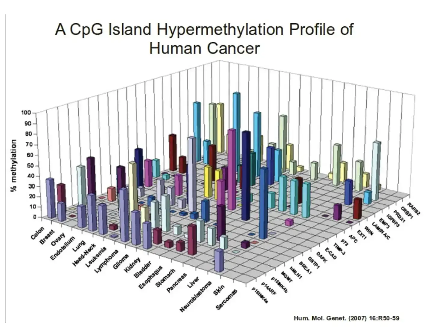
Something else you’ll want to do is make sure you’re not making your visual more complicated than it needs to be. For example, this chart shows several variables as 3D bars. This graph doesn’t need to be 3D — in fact, it makes the information harder to understand and view.
In short, I think a good rule of thumb to follow for data visualization is one I’m borrowing from copywriting: It’s more important to be clear than clever. If you want to take your skills even further, consider enrolling in a Power BI training course. These courses provide hands-on training to help you transform raw data into dynamic reports and interactive dashboards, making data analysis more efficient and impactful.
Lastly, let’s review some data visualization tools to simplify this process.
Data Visualization Tools
There are a number of data visualization resources available today but the following list is here to help get you started. Don’t be afraid to test out a few options to determine which suits your needs (and data) best.
1. HubSpot
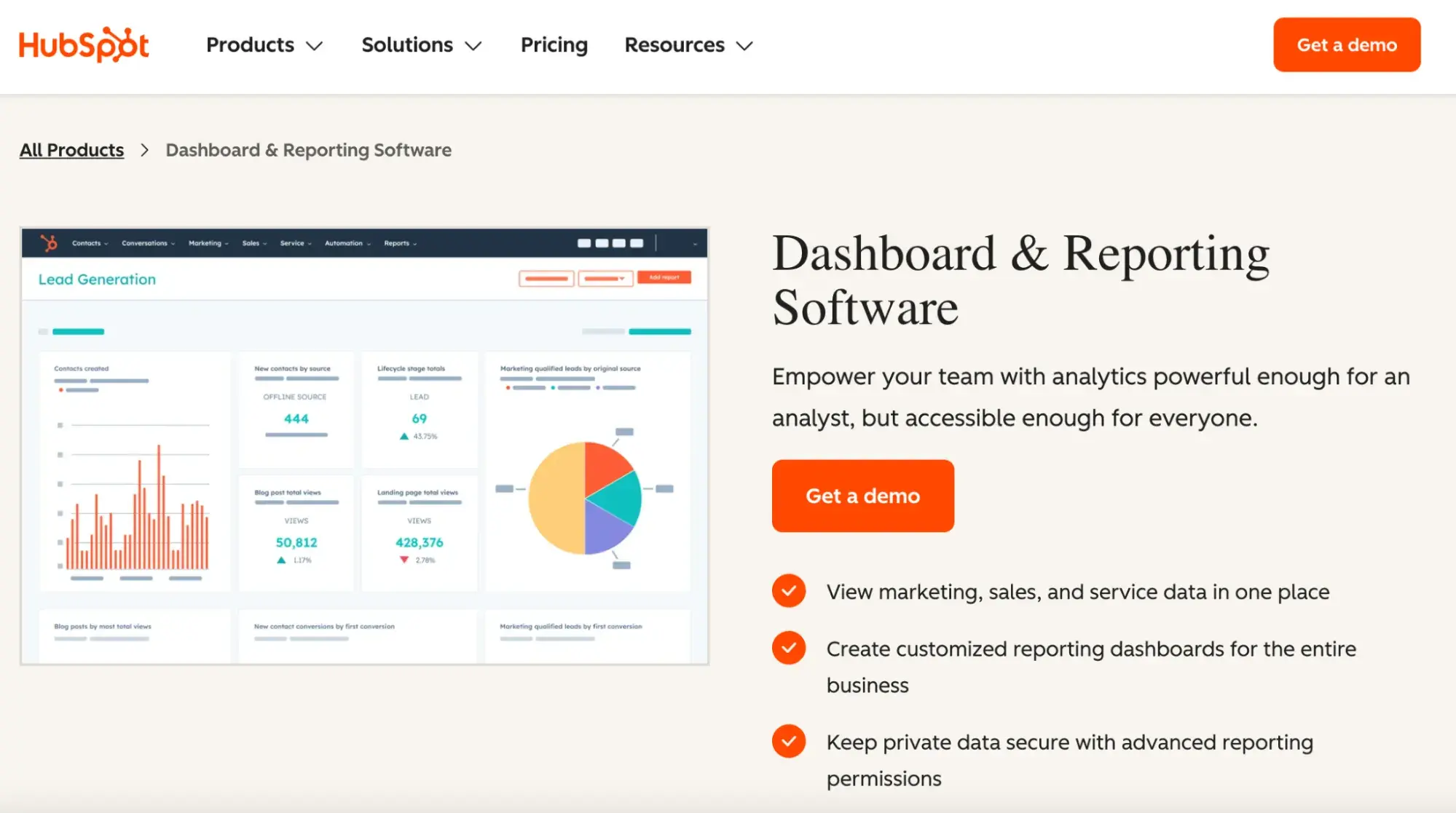
Get started with HubSpot’s Dashboard and Reporting Software
HubSpot’s Dashboard and Reporting Software is designed to bring all your critical business data into one centralized platform. It allows you to create custom dashboards and reports that reflect your marketing, sales, and service performance.
With its intuitive drag-and-drop interface, you can easily build visualizations that highlight key metrics, track campaign progress, and monitor customer interactions. The tool also integrates seamlessly with other data sources to ensure that all your important information is easily accessible in one place.
2. Tableau Desktop
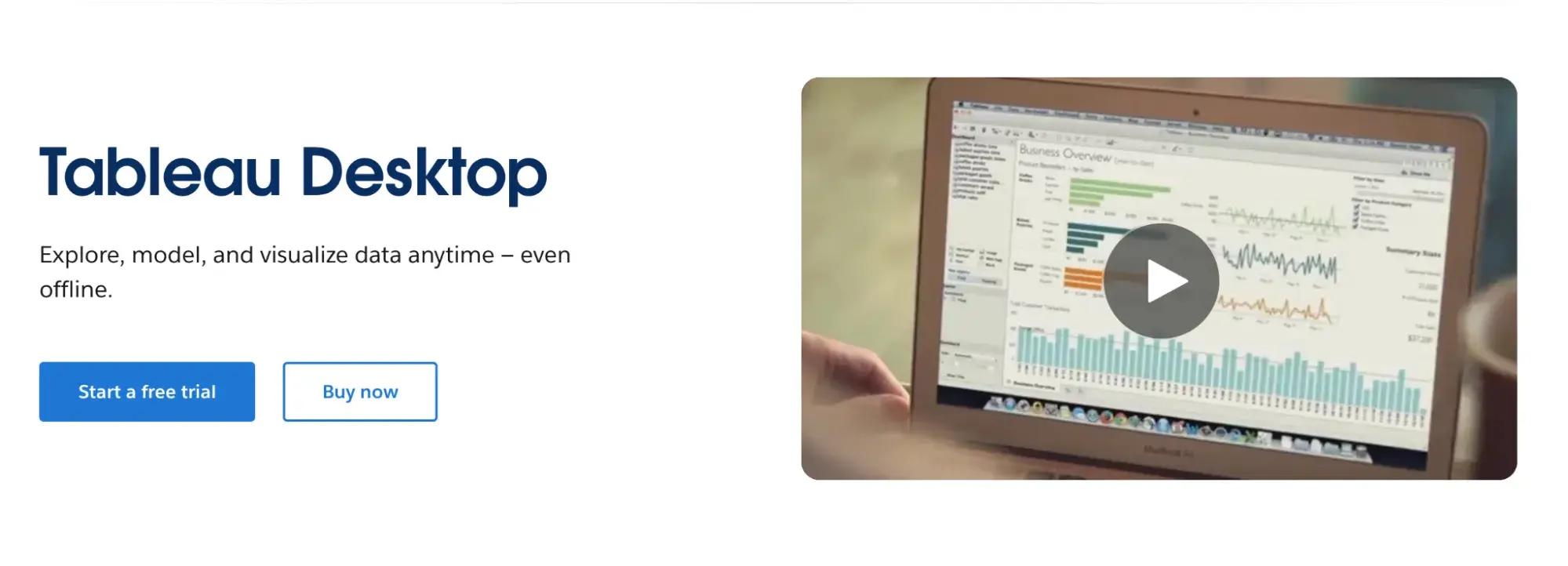
Tableau Desktop is a powerful data visualization tool that helps you connect to various data sources and create interactive dashboards with ease. There are easy-to-make maps, indicators, and many more visuals, as well as straightforward analytics that allow you to derive actionable information from calculations, reference lines, and forecasts as a result of your visuals.
With built-in analytics features and support for a wide range of data connectors, Tableau Desktop simplifies the process of exploring and sharing your data.
3. Databox
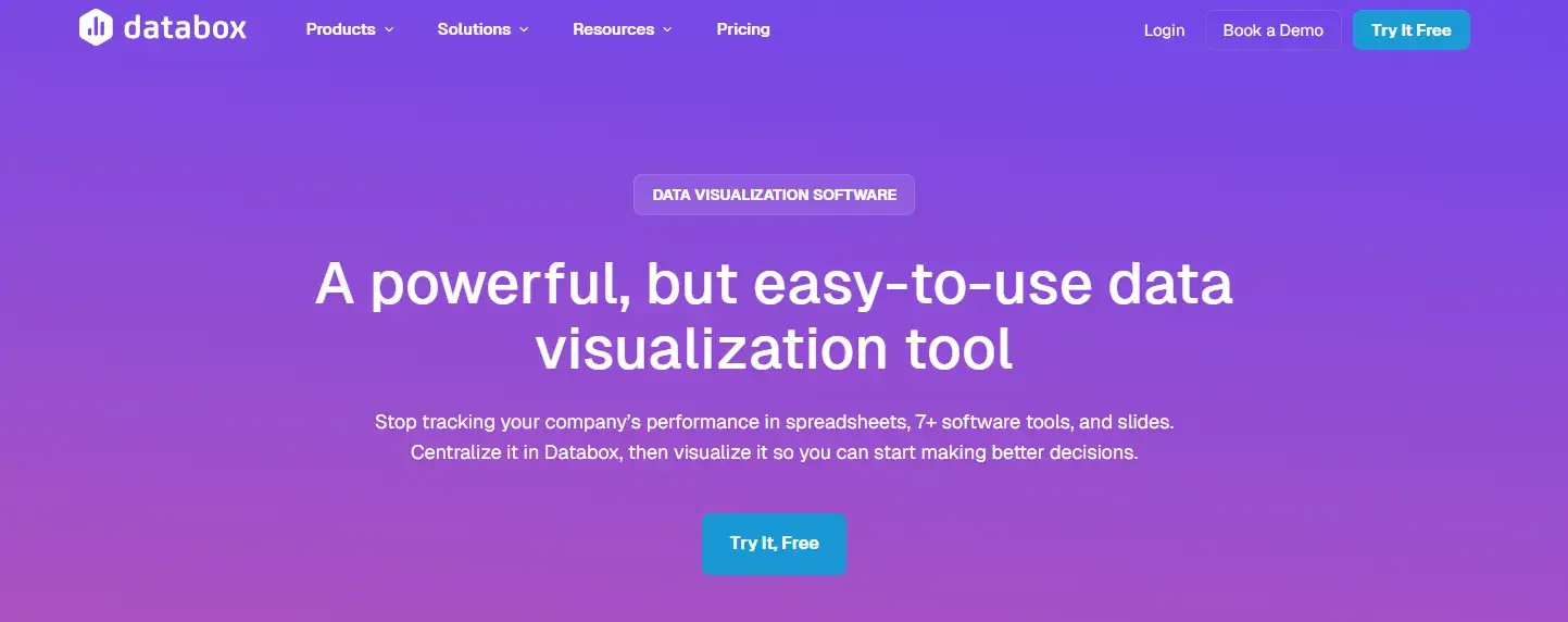
Databox is designed to bring all your data sources together into one centralized dashboard. There are over 100 integrations that can help you quickly and easily create visuals with pre-built dashboards and reports. You can also create custom metrics and monitor your KPIs in real-time.
Databox then allows you to connect to Google Sheets or an SQL database, or you can push it via API to view and share your data.
4. Google Charts

Google Charts is a free tool from Google that lets you create a wide variety of interactive charts for your website or web app. It uses HTML5 and SVG technology to render high-quality visuals that work across different devices and browsers. The tool offers a simple API that makes it easy to integrate custom charts into your projects.
With extensive documentation and many chart types available — from line charts and bar charts to more complex maps and gauges — Google Charts provides flexible customization options to meet your specific data visualization needs.
Grow better with data visualization.
Raw data can be overwhelming. It is rough on the mind and hard on the eyes. Endless rows of numbers can be hard to decipher. There can also be a lot of hidden gold buried under mountains of unexplored data.
That’s why data visualization matters. Beyond simply making data look appealing — it’s a powerful tool that helps me (and you, hopefully) quickly identify, discuss, and act on insights.
Editor's Note: This post was originally published in March 2015 and has been updated for comprehensiveness.
An Introduction to Data Visualization
Learn how to design compelling charts & graphs that are easy to understand, including:
- Tools and Software for Data Visualization
- Data Types, Relationships, and Formats
- How to Effectively Visualize Data
- A History of Data Visualization
Download Free
All fields are required.
Form not available


![What is a marketing plan & how to write one [+ examples]](https://53.fs1.hubspotusercontent-na1.net/hubfs/53/marketing-strategy-examples-1-20240801-4880441-1.webp)